What Is the Most Popular Wall Paint Color Right Now?
Right now, you’re most likely to see warm greige on best-selling walls — it blends gray’s modern edge with beige’s cozy warmth, so it works with lots of furniture and lighting. It calms rooms without feeling cold, hides minor scuffs, and adapts as your style changes. Try swatches in different light and pair with warm woods or soft linens. Keep going and you’ll find tips on undertones, lighting effects, and room-by-room picks.
The Single Most Popular Wall Paint Color Right Now
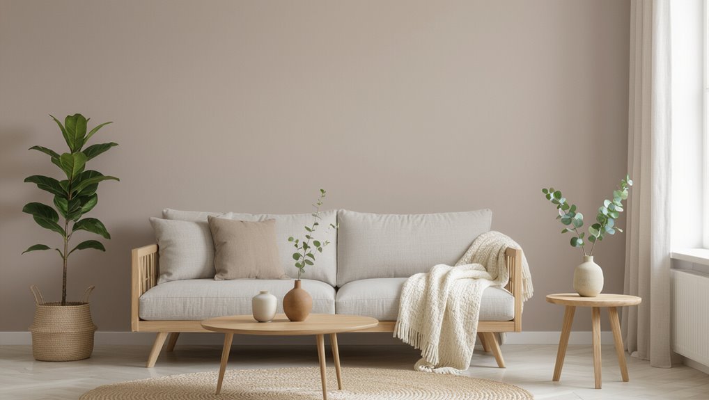
While trends shift, one wall paint color keeps rising to the top: a warm, soft greige that blends gray’s modern edge with beige’s cozy undertone.
You’ll find it adaptable, calming, and surprisingly social—color psychology shows neutral tones reduce overstimulation while supporting conversation and relaxation.
You can pair greige with warm woods or crisp whites, letting furnishings define mood.
Its popularity reflects historical influences from midcentury neutrality to contemporary minimalism, bridging eras without feeling dated.
When you choose greige, you’re picking versatility: it reads smart in small spaces, elegant in large rooms, and stays relevant as styles evolve.
Quick Answer: Why This Color Leads the Trends
Because it balances warmth and neutrality so well, greige has become the go-to wall color: it calms rooms without feeling cold, complements a wide range of furnishings, and keeps spaces feeling current as tastes shift.
You’ll pick greige because color psychology says muted tones reduce stress and encourage versatility, helping you create cohesive rooms that suit changing moods. Market influences like broad appeal and resale-friendly palettes push manufacturers and designers to spotlight greige, so you’ll see it everywhere.
Its adaptable undertones let you pair bold accents or serene palettes, making it an easy, enduring choice that adapts as your style evolves.
Why Warm Neutrals Are Dominating Design Right Now
Greige’s rise helps explain a broader move toward warm neutrals: designers and homeowners are choosing tones that feel inviting yet flexible, so rooms read as lived-in rather than staged.
You’ll notice warm neutral trends everywhere because they bridge classic and contemporary design aesthetics, calming spaces without erasing personality.
You can layer texture, wood tones, and muted accents to keep rooms interesting while staying cohesive.
These hues also adapt to changing furniture and lighting, so you won’t repaint as styles shift.
Embracing warm neutrals helps you create comfortable, timeless interiors that support varied lifestyles and evolving decor choices.
Choosing the Right Neutral Undertone for Your Walls
How do you pick a neutral undertone that actually flatters your space? You’ll weigh neutral undertone importance against your home’s style and mood.
Trust wall color psychology to guide emotion—warm undertones feel cozy, cool ones calm. Test swatches on different walls and live with them for days.
Consider existing finishes and fabrics, then choose an undertone that harmonizes.
- Compare swatches in natural and artificial light
- Use small painted patches on multiple walls
- Observe against furniture and textiles
- Note how the undertone reads throughout connected rooms
Make decisions from tests, not photos, for reliable results.
How Lighting Changes the Look of Trending Paints
Light can completely change how a trendy paint reads, so don’t assume a swatch looks the same in every room. You’ll notice lighting effects shift color perception: natural light softens paint saturation at noon, while artificial illumination can warm or cool tones depending on color temperature.
Shadow influences create depth and alter room ambiance, especially with reflective surfaces that boost highlights. Consider seasonal changes—low winter light mutes hues, bright summer sun intensifies them.
Balance mood enhancement and design balance by testing samples at different times, with lamps and daylight, to guarantee the trending color behaves as you intend.
Soft Greens and Muted Sage: Best Rooms and Pairings
When you want a calming, versatile backdrop, soft greens and muted sage deliver—pair them with warm woods and creamy neutrals to keep spaces feeling grounded and inviting.
You’ll find soft green palettes work well in living rooms, kitchens, and entryways, while sage room designs bring subtle depth without overpowering decor.
Use textiles and plants to layer texture and keep contrast gentle. Consider finishes: eggshell for walls, satin for trim. Mix metals sparingly to maintain warmth.
Layer texture with textiles and plants, favor eggshell walls and satin trim, and use metals sparingly to preserve warmth.
Ideal pairings include:
- Warm oak furniture
- Linen upholstery
- Terracotta accents
- Brass or aged gold hardware
Muted Blues and Greige: Calming Colors for Bedrooms
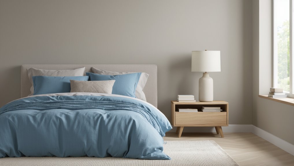
Try muted blue for a bedroom if you want a peaceful, airy backdrop that still feels modern.
Pair greige with warm wood tones and soft whites to keep the space cozy without looking dull.
Experiment with textiles and accent pieces to balance cool blues and neutral greige for a restful retreat.
Muted Blue Bedroom Ideas
Because muted blues pair so well with greige, they create a restful bedroom palette that feels both modern and timeless.
You can use muted blue palettes to set tone, mixing soft blues with warm neutrals for bedroom tranquility. Choose matte finishes to keep light gentle, add textured linens, and balance cool hues with wood or brass accents.
Consider these simple approaches:
- Paint an accent wall in dusty blue behind the bed
- Use bedding and rugs in varied muted blue tones
- Introduce warm metallics and natural wood for contrast
- Keep artwork minimal to maintain calm
These ideas help you craft a soothing space.
Greige Color Pairings
Wondering how to make muted blues feel warmer and more grounded? You can pair them with greige tones to create a calming bedroom palette. Use a greige accent wall behind the bed, and layer greige textures in rugs and throws to add depth without overpowering the blue. Keep trim crisp white for contrast and choose warm metals for fixtures to enhance coziness. Below’s a simple layout guide:
| Element | Suggestion |
|---|---|
| Wall | Muted blue with greige accent |
| Textiles | Greige textures: wool rug, linen throw |
| Accents | Warm metals, white trim, soft lighting |
Popular Accent Colors Buyers Still Love
1 timeless accent color buyers still reach for is navy, and it’s easy to see why: it grounds a room without overpowering it and pairs beautifully with neutrals, brass, and warm woods.
You’ll notice Accent color trends favor navy alongside warm earth tones and soft greens. Use Bold accent choices sparingly, mix Subtle accent tones for balance, and consider Accent color psychology to set mood.
Try Accent color combinations that include navy, terracotta, olive, or blush for layered interest.
Popular picks remain:
- Navy for depth
- Terracotta for warmth
- Olive for calm
- Blush for softness
Trending Paint Colors for Small Rentals and Apartments
For small rentals and apartments, you’ll want colors that make rooms feel bigger and calmer.
Soft greige neutrals give a warm, versatile backdrop that works with any decor.
Light airy blues bring a fresh, open vibe without overwhelming the space.
Soft Greige Neutrals
Soft greige blends warm beige and cool gray into a versatile neutral that brightens small rentals without overwhelming them.
You’ll find soft greige palettes that adapt to lighting, furniture, and seasons, making rooms feel cohesive and larger. Choose a slightly warmer tone for cozy evenings or a cooler tint to reflect daylight.
Use versatile greige applications to unify open plans, create subtle contrast with trim, or serve as a calm backdrop for art.
Tips:
- Test swatches in different light
- Pair with warm woods or black accents
- Keep trim crisp white
- Use matte finish for imperfections
Light Airy Blues
If you liked the calming versatility of greige, try light airy blues to bring a fresh, open feel to compact rentals and apartments.
You’ll find those sky inspired shades expand visual space, reflect light, and create a tranquil coastal mood without feeling thematic.
Pair them with warm woods, soft linens, and matte white trim to balance coolness and avoid sterility.
Use one or two coats for even coverage and pick low-VOC formulas for healthier indoor air.
Accent with natural textures and small greenery to keep the palette grounded.
These hues make small rooms feel breezy, modern, and inviting.
Most Sale-Friendly Wall Colors for Staging a Home
When you’re prepping a home for sale, choosing the right wall colors can make rooms look larger, brighter, and more inviting to buyers.
Selecting the right wall colors can instantly make rooms feel larger, brighter, and more welcoming to buyers.
You’ll rely on staging techniques and buyer psychology to pick versatile neutrals like warm greige, soft taupe, crisp white, and pale blue-gray that appeal broadly.
Keep contrasts low and accents subtle so buyers imagine their belongings in the space.
Use these color strategies to maximize perceived space and light:
- Warm greige for cozy living areas
- Crisp white for trim and ceilings
- Pale blue-gray for calm bedrooms
- Soft taupe for dining and hallways
These choices speed sale decisions.
Which Finishes and Sheens Work Best With Trending Paints
Because sheen affects both look and durability, choose finishes that match a room’s use and the trending hues you’ve picked. You’ll weigh finish types—matte for hiding flaws, eggshell for living areas, satin or semi-gloss for trim and kitchens—by evaluating sheen levels and light reflection.
Consider texture effects: velvety matte soaks light, satin bounces it. Address durability concerns and cleanability factors in high-traffic zones; opt for higher sheen where scrubbing’s needed.
Follow application techniques for even coverage. Use maintenance tips like gentle cleaners and touch-up kits to keep trends looking fresh without sacrificing appearance or performance.
How to Test Trending Colors Cheaply (Swatches, Samples, Apps)
Start by taping several paint swatches to different walls so you can see how light changes the tones.
Then try peelable sample patches you can stick on and remove without damage to test larger areas.
Finally, use a color-preview app to compare swatches and samples in different rooms before you buy.
Paint Swatches At Home
Testing paint colors at home doesn’t have to be expensive or time-consuming — you can use a few smart swatches, a couple of sample pots, and free apps to see how trending hues behave in your actual light and next to your furniture.
Start with paint swatch organization: label cards with room, time of day, and adjacent fabrics. Apply small painted squares on walls at different heights. Use apps to preview combos, then live-check at morning and evening. Keep notes on undertones and mood.
Try these quick steps:
- Group swatches by light exposure
- Photograph cards near furnishings
- Note undertone shifts
- Limit to three finalists
Test With Peelable Samples
Want a quick, low-risk way to see trending paints on your walls? Use peelable samples for immediate, realistic color testing.
Stick several peelable samples where light varies—near windows, in corners, and beside trim—so you’ll see hue shifts throughout the day. Live with them for a week to judge undertones under morning and evening light.
Compare samples to your furniture and flooring, and photograph them at different times for reference. Peel them off easily when done, avoiding full cans and messy trials.
This method saves money, speeds decisions, and lets you confidently pick the most popular wall paint color.
Coordinating Trim, Ceilings, and Doors With Your Wall Color
Curious how a simple trim or ceiling choice can change a room’s whole mood? You’ll find coordinating trim styles, ceiling finishes, and door hues shapes color balance and design cohesion.
Pick paint textures and accent details that respect architectural elements to keep style continuity and visual harmony.
- Use crisp white trim for contrast
- Match ceiling finishes to soften light
- Choose door hues as subtle accents
- Layer paint textures for depth
You should test combinations in your space, noting natural light and furniture tones.
Thoughtful choices tie walls, trim, ceilings, and doors into a unified, polished look.
When a Bold Wall Color Makes Sense (And When to Avoid It)
After you’ve harmonized walls, trim, ceilings, and doors, you might wonder whether to play it safe or go bold with color.
You should choose bold color applications when a space needs personality, focal points, or energy—think an accent wall, entryway, or media room.
Consider color psychology: warm hues excite sociable areas, cool tones calm bedrooms.
Avoid strong palettes in small, poorly lit rooms or when resale value matters.
Test samples at different times of day, use complementary neutrals to balance intensity, and limit boldness to one or two elements so the room feels intentional rather than overwhelming.
Room-by-Room Picks: Current Favorites and Why They Work
For your bedroom, pick calming neutrals like warm greige or soft taupe to promote rest and make bedding pop.
In the living room, choose energizing hues—muted terracotta or sunny amber—to lift conversation and anchor furniture.
For kitchens, serene greens such as sage or celery create a fresh, appetizing backdrop that pairs well with wood and white finishes.
Calming Bedroom Neutrals
When you want sleep-friendly walls, reach for soft neutrals that calm without feeling cold; warm greiges, muted taupes, and gentle greys create a cozy backdrop that lets bedding and light take center stage.
You’ll choose calming colors that promote bedroom serenity, reduce visual clutter, and pair easily with textures. Keep contrast low and finishes matte to minimize glare.
Try these simple approaches:
- Paint walls in one neutral family for cohesion
- Add layered textiles in soft tones
- Use warm wood or brass accents for depth
- Limit bold patterns to small pillows or art
These choices help you rest better.
Energizing Living Room Hues
If your bedroom benefits from soft, sleep-friendly neutrals, your living room can play a different role—energize the space where you gather and entertain with lively, mood-boosting hues. You’ll use color psychology to select warm coral, sunlit yellow, or teal that sparks conversation. Pair bold walls with neutral furniture and add vibrant accents—pillows, art, rugs—to keep balance. Test small swatches and observe light at different times.
| Hue | Effect |
|---|---|
| Coral | Warmth, sociability |
| Yellow | Optimism, energy |
| Teal | Focus, refresh |
| Accent pops | Visual interest, rhythm |
Serene Kitchen Greens
Calmness greets you the moment you step into a kitchen painted in soft greens, where sage, celadon, and muted olive create a relaxed, restorative backdrop for cooking and conversation.
You’ll find a serene kitchen balances green accents with warm woods, letting calming hues and earthy tones ground the space.
Use pops of vibrant herbs and botanical prints to add life without clutter. This nature inspired palette gives fresh vibes and longevity.
- Pair muted walls with wood and brass
- Add herb pots for color and scent
- Frame small botanical prints for interest
- Use matte finishes to enhance warmth
Brand and Paint-Line Picks That Consistently Top Bestsellers
Brands matter because they pair reliable formulas with trend-savvy colors that make choosing a bestseller simpler for you. You’ll find eco friendly paints and popular finishes from top houses, plus designer recommendations that lean on color psychology and seasonal inspirations. Use paint trends and DIY tips to test color combinations in small patches before committing.
| Brand | Line | Signature Use |
|---|---|---|
| Brand A | Classic Matte | Living rooms, neutral anchors |
| Brand B | Eggshell Luxe | Kitchens, durable sheen |
| Brand C | Low-VOC Satin | Bedrooms, soft highlights |
Trust proven lines to cut through hype and simplify selection.
Colors That Age Well vs. Short-Lived Paint Fads
You’ll want to weigh timeless neutral choices against trendy seasonal hues when picking a color that’ll last.
Consider how light, room function, and resale value affect longevity factors. That way you can choose a shade that feels current now but still works years from now.
Timeless Neutral Choices
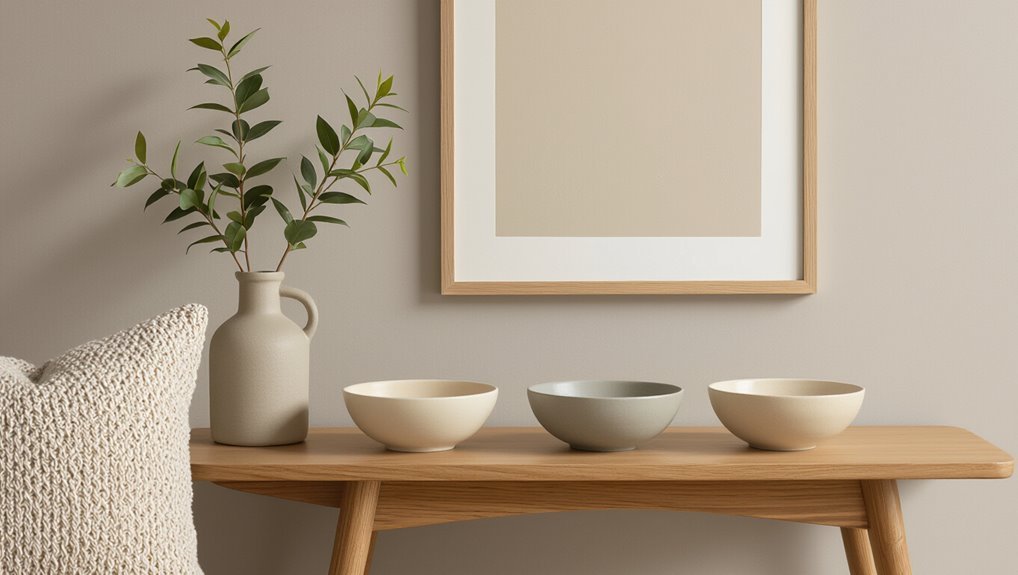
Though trends come and go, neutral paint colors offer a dependable backdrop that won’t date your space overnight; you’ll find timeless taupe trends and classic beige palettes anchor rooms with subtle warmth.
Choose neutrals that reflect light and hide wear without shouting for attention. Consider finishes and undertones to match furniture and light. Think longevity over novelty.
- Pick warm taupes for coziness.
- Use beige for flexible staging.
- Test samples in different light.
- Favor matte or eggshell for longevity.
These choices let you update accents easily, keeping walls relevant while avoiding short-lived paint fads.
Trendy Seasonal Hues
When a color captures a season’s mood, it can lift a room instantly—but some seasonal hues fade into dated trends faster than others, so you’ll want to pick shades that evolve with your style.
You can enjoy seasonal palettes without committing to fleeting fads by choosing muted or versatile tones that reference the trend rather than mimic it.
Think of color psychology to guide mood—warm terracottas energize, soft sage soothes—then test swatches in different light.
Use accent walls, textiles, or trim to trial bolder picks. That way you refresh easily while keeping a base that ages gracefully.
Longevity Factors Explained
Because paint trends cycle fast, choosing colors that age well means balancing current appeal with timeless qualities. You weigh color durability and maintenance considerations against personal preference and market demand.
Consider cultural influences and historical trends to avoid fads that date homes quickly. Think about psychological effects—calming neutrals often outlast loud seasonal hues. Also factor environmental impact when picking formulations that resist fading and need fewer recoats.
- Choose durable pigments and low-VOC formulas
- Favor classics with subtle undertones
- Test samples under varied lighting
- Prioritize repairs and easy-clean finishes
These steps extend lifespan and resale value.
Quick Checklist to Pick the Right Trending Wall Color
If you want a trending wall color that actually fits your space, start with a simple checklist: consider natural light, room size, existing finishes, mood you want to create, and how long you’ll live with the choice.
Next, test swatches on different walls and observe them at morning and evening light. Use color psychology to match hues to desired moods—calming blues, energizing yellows, grounding neutrals.
Factor in seasonal trends but don’t chase fads; pick versatile undertones. Coordinate trim, floors, and fixtures.
Finally, try a large sample area, live with it for a week, then decide confidently.
Frequently Asked Questions
How Do Trending Paint Colors Affect Home Resale Value Long-Term?
Trending paint colors can boost resale value if you align with market trends and neutral tastes; you’ll attract more buyers, but color psychology matters—bold choices may personalize homes, so you’ll likely repaint before selling to maximize appeal.
Are Any Popular Paint Colors Unsafe for Allergy Sufferers?
Think of paint as a storm: yes, some popular colors can trigger reactions if they hide high VOC levels; you’ll want allergy friendly options and low-VOC or zero-VOC paints, and you should test samples before committing.
Do Trending Wall Colors Require Special Primer or Prep Work?
Yes — trending colors often need special primer and surface preparation; you’ll use color matching primers for deep hues, spot-prime stains, sand glossy surfaces, and seal porous drywall so the new shade applies evenly and lasts.
How Do Trending Colors Perform in High-Humidity Rooms?
They’re remarkably resilient—almost outrageously so—when you pick moisture-rated paints; humidity resistance depends on finish and formulation, and color durability improves with mildewcide additives, proper primer, and ventilation to prevent peeling, staining, or fading.
Can Pet Owners Maintain Trending Paints Easily?
Yes — you can maintain trending paints easily if you choose pet friendly options with durable, washable finishes; you’ll wipe scuffs quickly, resist stains, and avoid frequent repainting by prioritizing quality, satin or semi-gloss formulations for easy maintenance.
Conclusion
So the most popular wall paint color right now happens to feel like the one you already love: a warm neutral—think soft greige or warm taupe—that coincidentally flatters every room, lighting condition, and furniture style you own. You’ll find it calming in the bedroom, cozy in the living room, and chic in the kitchen, and, by chance, it matches that vintage chair you bought on impulse. Trust it: it ages gracefully and makes choices feel right.