Which Walls Should I Paint Darker?
Pick one focal wall—usually the one you face most, like behind a bed or sofa, or the wall with architectural features—and paint it darker to add depth without overwhelming the room. Test 12–24 inch swatches on different walls and view them at various times so natural and artificial light won’t surprise you. Avoid dark paint in small, windowless, or low-ceilinged rooms unless you want a cocooned feel. Keep balance with lighter elements and contrast, and you’ll find more tips ahead.
How to Pick Which Wall to Darken (3 Quick Rules)
Think of dark paint as a tool for shaping a room—use it deliberately.
You’ll pick the wall that anchors the space: the one behind a bed, sofa, or fireplace.
Rule one, choose a focal wall to gain dark wall benefits without overwhelming.
Pick a single focal wall—gain drama and depth without overpowering the whole room.
Rule two, favor the wall you face most; painting it darker adds visual depth and draws attention.
Rule three, consider architectural features—reveal moldings, niches, or built-ins by darkening their backdrop.
You’ll avoid painting small, enclosed walls that shrink a room.
Follow these three rules and you’ll get impact with balance.
Testing Dark Paint: Swatches, Lighting, Timing
Before you commit, test dark paint in the room itself: apply several 12–24-inch swatches on different walls and observe them at various times of day and under your fixtures.
You’ll see how paint finish and color saturation shift with light. Take notes and photos morning, midday, and evening.
Consider:
- Natural light — watch shifts in hue and depth.
- Artificial light — compare warm vs cool bulbs.
- Adjacent surfaces — note reflections from floors, ceilings, and furnishings.
Let samples dry fully; gloss changes when cured.
Choose the swatch that reads well in all conditions before buying gallons.
When to Avoid Dark Paint (Red Flags)
If a room is tiny, has no windows, or feels cramped by a low ceiling, you should think twice before going dark.
Dark paint can make closets and poorly lit spaces feel even smaller and more closed-in.
Test swatches and check light at different times so you don’t end up stuck with a dreary result.
Small, Windowless Rooms
Ever wondered how dark paint behaves in a small, windowless room? You’ll want to pause: dark color psychology can shrink spaces, creating gloom without natural light.
Use windowless room tricks sparingly—reflective surfaces and layered lighting help, but they can’t fully substitute sunlight.
- Choose a single dark accent wall to avoid enclosing the room.
- Add high-CRI bulbs and mirrors to bounce light and reduce heavy shadows.
- Keep furnishings minimal and avoid matching dark textiles that deepen the cave effect.
If you need coziness, warm mids or strategic lighting beat all-over dark in windowless rooms.
Low Ceilings And Closets
When you paint low ceilings or small closets in a deep color, they’ll feel more cramped and oppressive because dark hues absorb light and visually lower heights; that’s a clear red flag to avoid all-over dark finishes in these spaces.
Instead, choose light-reflective tones on ceilings and walls to preserve openness. If you want contrast, use dark ceiling solutions sparingly—like a narrow trim or accent beam—so height isn’t swallowed.
For storage areas, prioritize practical closet color options that make items visible: pale, cool hues or soft neutrals.
Keep functionality and perceived space front and center when deciding.
Poor Natural Lighting
A small window or shaded courtyard can make a room feel dim even on sunny days, so avoid deep, light-absorbing paints in spaces that get little natural light.
You’ll want to weigh how dark color psychology affects mood before committing to saturated hues. Instead, use warmer neutrals or lighter shades if you need visibility.
If you’re intent on depth, follow these steps:
- Add layered artificial lighting to counteract gloom.
- Reserve dark accents for one wall or furniture to hint at enhancing coziness without overwhelming.
- Test samples at different times to judge true effect on the room.
Small Rooms: Best Wall to Darken to Add Depth
In small rooms, choosing which wall to darken can make the space feel deeper instead of cramped.
You can paint an accent wall behind the bed for a cozy focal point, darken the wall opposite the window to visually push the room back, or use darker narrow side walls to create a tunneled sense of length.
Consider how furniture placement and light sources will interact with whichever wall you pick.
Accent Wall Behind Bed
Think of the wall behind your bed as the room’s focal plane: darkening it draws the eye and instantly creates depth without shrinking the space.
You’ll improve bedroom ambiance by using color psychology to anchor the bed and boost style cohesion with current design trends. Balance dark paint with wall textures and fabric contrasts so the space feels layered, not heavy.
Use mood lighting to soften edges and influence spatial perception. Consider:
- A matte deep tone for calm and contrast.
- Textured panels to add dimension.
- Coordinated linens and lamps to tie the scheme together.
Opposite Window Wall
Why darken the wall opposite the window? You’ll create perceived depth: darker tones recede, pulling the room visually away from the window. Use opposite wall effects deliberately to make a small room feel larger and anchored. Dark paint psychology helps control mood—choose warmer or cooler darks depending on desired coziness. Balance with light textiles and reflective surfaces so the room stays airy. Try this simple comparison:
| Benefit | Impact |
|---|---|
| Depth | Room feels longer |
| Focus | Draws eye away from glare |
| Mood | Warmer or calmer ambiance |
| Balance | Contrasts with natural light |
Narrow Side Walls
Shifting focus from the wall opposite the window, consider darkening the narrow side walls to stretch a compact room visually. You’ll make the room feel longer when you push depth to the sides with purposeful contrast and texture.
- Paint technique: use narrow wall colors a few shades deeper than main walls to elongate perspective.
- Texture choice: introduce dark wall textures like matte or subtle plaster to absorb light without closing space.
- Balance: keep ceiling and far wall lighter, add mirrors or slim furnishings to reinforce the stretched effect without overwhelming the room.
Small Rooms: Avoid Making Space Feel Cramped
If you’ve got a compact room, painting walls darker can make it feel tighter and more closed in, so choose carefully.
You’ll use color psychology to influence space perception: lighter hues expand, while dark accents add drama.
Prioritize room functionality and lighting effects—natural light lets darker tones work; poor light won’t.
Consider paint finishes and wall textures to avoid absorbing too much light; satin or eggshell can maintain visual comfort.
Furniture placement should maximize flow so darker walls don’t trap items.
Follow current design trends sparingly; aim for mood enhancement without sacrificing openness in small spaces.
Long, Narrow Rooms: Darken the Short End for Balance
While you avoided darkening walls in small spaces to keep them feeling open, long, narrow rooms invite a different approach: paint the short end a darker tone to visually shorten the length and create balance.
You’ll get dark color benefits without closing the room if you use contrast and light placement. Focus on proportion, furniture arrangement, and accent lighting to enhance visual depth.
Try these steps:
- Choose a rich accent at the short end to anchor sightlines.
- Keep side walls lighter to preserve openness.
- Add directional lighting to emphasize texture and depth.
This strategy balances scale and feels intentional.
Square Rooms: Create a Focal Wall Without Overpowering
In a square room, pick one wall to anchor the space with a darker shade so it reads as an intentional focal point.
Keep the trim and adjoining walls lighter to prevent the room from feeling boxed in. That contrast gives you drama without overwhelming the proportions.
Anchor With One Wall
When you want a focal point without letting color dominate, pick a single wall to anchor the room—usually the one your eye hits first when you walk in or the wall behind the main seating.
Use dark color psychology to guide mood: richer tones read as cozy, not cramped, if everything else stays lighter.
Consider wall texture considerations—matte absorbs light, satin reflects subtly.
Keep furniture and art balanced so the anchored wall feels intentional, not heavy.
- Paint the anchor wall first to set tone.
- Test samples at different times of day.
- Coordinate textiles to echo the hue.
Balance With Light Trim
If you’ve anchored a single wall with a deep hue, lighten the edges to keep a square room feeling open: paint trim, baseboards, and window casings in a pale, warm tone to frame the dark wall and soften its visual weight. You’ll balance scale without losing drama by pairing contrast materials—matte paint with glossy trim—and choosing trim styles that read cleanly. Keep ceilings lighter to lift the space. Use consistent trim color on doors and moldings to unify. Small doses of the wall color on accessories will tie everything together without overpowering the room.
| Element | Purpose | Tip |
|---|---|---|
| Trim | Frame | Pale warm tone |
| Baseboard | Ground | Simple profile |
| Window casing | Lighten | Match trim |
| Accessory | Tie-in | Small doses |
| Material | Contrast | Matte vs glossy |
Make Ceilings Feel Taller: Where to Add Darker Paint
Although darker paint often feels heavy, you can use it strategically to make ceilings seem higher by drawing the eye upward and creating vertical contrast.
Use dark contrast near the top of the room to emphasize tall ceilings and guide sightlines skyward. Try these placements:
Use dark contrast near the room’s top to emphasize height and draw sightlines upward—try a narrow band or soffit.
- A dark crown band around the ceiling edge to lift perception.
- A deep painted soffit or beam to create a visual column.
- A darker chimney breast or tall cabinet top to extend vertical lines.
Keep the rest lighter so the darker strip reads as an upward extension, not a heavy cap, and maintain clean shifts for clarity.
Low Ceilings: Subtle Dark Accents That Lift the Room
Use a few well-placed darker accents to lift a low-ceilinged room without making it feel boxed in. You’ll use dark paint benefits sparingly: paint the top few inches of a focal wall or a recessed shelf to draw the eye upward without overwhelming the space.
Contrast matters—keep adjacent surfaces light so those accents read as vertical cues that create subtle ceiling height illusions. Stick to matte or low-sheen finishes to avoid reflections that flatten depth.
Positioning near windows or over furniture anchors the effect. Test samples at different heights to guarantee the lift feels natural and proportionate.
Widen a Room Visually With Side-Wall Shading
To widen a room visually, darken the side walls opposite each other so your eye stretches across the space.
You can use a subtle gradient on those side walls that fades toward the corners to deepen the sense of breadth.
Emphasize midroom verticals—like bookcases or tall art—by painting them slightly darker to anchor the expanded feel.
Darken Opposite Side Walls
When you paint the two walls that face each other a darker shade than the ends, the room immediately feels wider because your eye reads the darker planes as receding. This side-wall shading creates a subtle horizontal pull that expands the perceived space without altering furniture or layout.
You’ll choose tones informed by dark color psychology and consider wall texture impact to keep depth without heaviness. Apply consistently and test samples at different light levels.
Tips:
- Use two matching dark walls to anchor sightlines.
- Keep end walls lighter for contrast.
- Maintain ceiling and trim light to preserve openness.
Use Gradient Side Shading
If you paint a room’s side walls in a subtle gradient—from darker near the middle sliding to lighter toward the ends—you’ll create a visual pull that broadens the space without changing furniture placement.
You’ll use gradient application to guide the eye outward, making the room feel wider and airier. Start with a mid-tone at the room’s center and feather to lighter hues at corners and near trim.
Blend carefully for seamless shifts; sharp lines defeat the effect. This technique adds visual depth without heavy contrast, works with existing décor, and won’t overpower your layout or lighting.
Emphasize Midroom Verticals
You can build on the gradient side shading by sharpening focus on the room’s verticals: paint slightly darker bands or panels centered along the side walls to draw the eye outward and give the impression of greater width.
You’ll use midroom verticals to create deliberate anchors that reinforce visual continuity without overwhelming the palette. Consider placement, width, and contrast so the effect feels natural.
- Place bands at eye level for balanced expansion.
- Keep contrasts moderate to maintain cohesion.
- Repeat proportions on both sides to preserve symmetry.
This method widens perception while staying subtle and controlled.
Best Wall to Darken Behind a Bed for Impact
Which wall makes the biggest impact when you darken it behind a bed? You’ll usually choose the wall the bed placement anchors—often the wall you face entering the room.
Darkening that focal wall frames the headboard, adds depth, and leverages color psychology to set mood without repainting the whole room. Pick a richer tone if you want intimacy or a cooler deep hue for calm.
Keep adjacent walls lighter to preserve contrast and avoid overpowering the space. Align artwork and lighting to complement the dark wall, and guarantee the bed, textiles, and trim harmonize for a cohesive, intentional look.
How to Darken Behind a Bed Without Losing Light
You can create a dark accent wall behind your bed without making the room feel dim by choosing a deep tone with warm or reflective undertones.
Keep surrounding walls, trim, and bedding light to preserve natural light and balance contrast.
Position mirrors or sheer window treatments to bounce daylight back into the space.
Dark Accent Behind Bed
When you want a darker focal point behind the bed without sacrificing brightness, choose a concentrated accent—like a deep paint strip, patterned wallpaper, or a headboard panel—that stays limited in width and height so natural light and lighter wall tones still dominate the room.
You’ll balance drama and airiness by keeping darker treatments focused and coordinating decorative accents and bed placement. Consider scale, contrast, and texture so the accent reads intentional, not overpowering.
- Pick a narrow vertical or horizontal band.
- Match textures to bedding and hardware.
- Keep surrounding walls in light, reflective tones.
Preserve Natural Light
Although adding a dark backdrop can feel risky, you can keep a room bright by limiting the dark treatment and maximizing light sources; paint only the wall behind the bed, leave adjacent walls light, and choose a matte finish to reduce glare.
Position mirrors and reflective accents to bounce natural light toward darker areas. Use layered lighting—bedside lamps, sconces, and overhead—to prevent shadows.
Keep bedding and window treatments pale to maintain color balance, and consider a narrower or lower dark band rather than full-wall coverage.
These steps let you enjoy drama without sacrificing brightness or visual harmony.
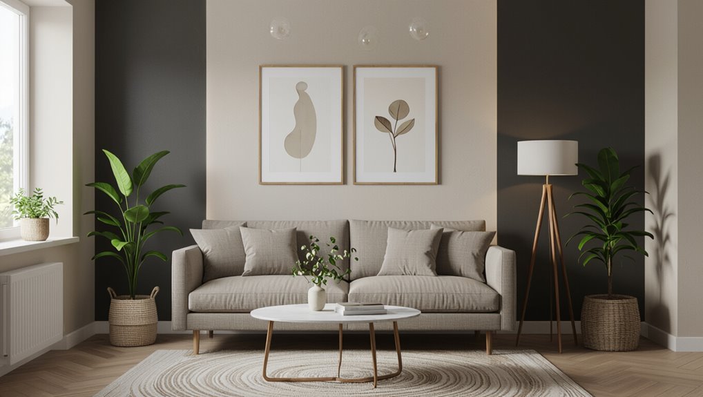
Darken the Sofa Wall for a Stronger Living-Room Focal Point
If you want a living room to feel anchored and intentional, darkening the wall behind your sofa draws the eye and instantly creates a strong focal point.
You’ll make the sofa wall cozy without overwhelming the room by picking a rich hue that complements trim and textiles. Use contrast, scale, and texture to balance depth.
- Paint: choose a saturated color that recedes slightly.
- Contrast: frame the sofa with lighter art or molding.
- Texture: add matte or plaster finish for subtle interest.
This approach highlights seating, defines the main gathering spot, and lifts overall design cohesion.
Where to Paint Darker in a Dining Room for Mood
You can set a moody tone by painting the accent wall behind your buffet to highlight serving pieces and create depth.
Try darkening the wall behind your dining table to frame meals and draw attention to your centerpiece.
For a cozy, grounded feel, paint the lower perimeter walls a deeper shade while keeping the upper walls lighter.
Accent Wall Behind Buffet
When you want to add depth and drama without overwhelming the whole room, painting the wall behind your buffet a darker shade is a smart move; it anchors the dining area, highlights serving pieces, and creates a cozy, intimate mood for meals and gatherings.
You’ll use color contrast to make glassware, art, and lamps pop. Choose a tone that complements your buffet style and room lighting.
Consider these targeted moves:
- Paint behind to frame the buffet and reduce visual noise.
- Use semi-gloss for easy cleaning and reflective warmth.
- Add a mirror or artwork to amplify depth and mood.
Wall Behind Dining Table
Shifting focus from the buffet, consider painting the wall behind your dining table darker to anchor the seating area and set a mood for meals. A deeper hue draws eyes inward, creating intimate dining ambiance without overwhelming the entire room.
Position artwork or a mirror to reflect light and prevent the space from feeling heavy. Pay attention to wall texture—smooth surfaces read richer, while textured walls catch highlights, softening contrast.
Keep surrounding walls lighter to maintain balance and use adjustable lighting to control atmosphere. This targeted dark wall gives your table a purposeful backdrop for cozy dinners and lively gatherings.
Perimeter Lower Walls
If you paint the lower perimeter of your dining room a darker shade, you’ll ground the space and create a subtle, enveloping mood without tipping the whole room into gloom.
You’ll use perimeter wall aesthetics to add depth, balancing contrast with lighter upper walls and trim. Dark wall psychology helps focus attention downward, making the room feel intimate and anchored.
Consider these approaches:
- Paint a low dado or wainscot in a deep hue to protect surfaces and define proportion.
- Use a satin finish for durability and gentle reflection.
- Coordinate chair rails and baseboards to unify the scheme.
Entryway: Add Drama With a Single Dark Wall
Because your entryway sets the tone for the whole home, painting a single wall in a deep hue instantly adds drama without overwhelming the space. You’ll draw attention to architectural details, anchor furniture, and create a memorable first impression.
Positioning that dark wall opposite natural light or near entryway lighting helps balance contrast and keeps the area welcoming. Choose dark paint finishes that suit traffic—eggshell for easy cleaning or matte for sophisticated depth.
Keep adjacent walls lighter to maintain flow, and add a mirror or art to reflect light. This targeted approach gives drama without shrinking or complicating the entry.
Open-Plan Living: Pick Walls That Guide Sightlines
How do you use darker paint to subtly steer the eye in an open-plan room? You’ll use sightline strategies to create flow and define zones without blocking openness.
Choose one anchor wall to add visual weight where you want focus, and keep adjacent walls lighter to preserve breadth.
- Paint the far wall darker to draw viewers through the space.
- Use a darker wall behind seating to make a cozy living zone.
- Frame doorways or sightlines with trim or a narrow dark strip to guide movement.
Balance contrast so changes feel intentional, not heavy.
Kitchen With Limited Light: Safe Darker-Wall Choices
In a kitchen with limited natural light, pick darker paint selectively so the room stays warm without feeling closed in. You’ll control kitchen ambiance by limiting deep hues to an accent wall or lower cabinets, balancing dark color psychology with brightness.
Consider wall texture impact—matte hides flaws, satin reflects a bit—to avoid heaviness. Use cabinet color contrast to create visual separation and preserve space perception.
Let lighting fixtures influence where you deepen tones: undercabinet and pendant light target task zones. Focus on mood enhancement through restrained palettes and practical color pairing techniques that keep the kitchen inviting and functional.
Bathroom Safety: Which Walls to Darken and Why
When you paint one wall in a bathroom a darker hue, you create a focal point without overwhelming the space.
Keep darker tones away from areas that catch bright reflections to reduce glare and slippery-looking surfaces.
Use contrast at edges—around vanities, tubs, and doorways—to improve depth perception and safety.
Accent One Wall
Pick one wall to darken and you’ll make a clear safety and style statement without overwhelming the bathroom. You’ll anchor the room, create depth, and guide movement toward fixtures or exits while using color psychology to influence mood and awareness.
Choose a wall behind the vanity or opposite the door for contrast that aids orientation.
- Pick a durable, washable finish for splash zones.
- Test paint swatches under bathroom light to judge emotional impact.
- Keep trim and fixtures lighter to maintain visual clarity.
This targeted approach boosts safety cues and style without sacrificing brightness.
Reduce Glare Areas
Although glare can make surfaces look flat and hide hazards, you can cut it by darkening only the walls that catch and reflect harsh light. You’ll improve bathroom safety through targeted glare reduction: pick walls opposite bright fixtures or windows where excessive light reflection creates blinding patches. Use a low-sheen, darker paint to absorb stray beams without removing overall brightness. Test small swatches at different times to confirm reduced hotspots. Below is a quick planning table to help you decide which wall to darken.
| Location | Why consider it |
|---|---|
| Opposite window | High light reflection |
| Behind mirror | Direct glare source |
| Near skylight | Intense midday glare |
| Shower wall | Wet surfaces amplify light |
| Entry wall | First-impression brightness |
Highlight Contrast Edges
Contrast edges help you see steps, ledges, and fixtures clearly, so darkening specific walls can make those boundaries pop without dimming the whole room. You’ll use darker paint to emphasize thresholds and shifts, highlighting textures and creating visual cues that improve safety.
Place darker tones where you want depth and separation from flat surfaces.
- Darken wall behind faucets to outline fixtures.
- Paint riser or half-wall contrast to mark step edges.
- Accent niche or shower curb with contrasting patterns for grip perception.
These moves clarify form, reduce missteps, and balance aesthetics with practical visibility.
Hallways: Darken to Add Depth Without Shrinking Them
When you paint a hallway a few shades darker than adjoining rooms, it creates a sense of depth and continuity without making the space feel cramped.
You’ll want to balance hallway lighting so darker paint enhances depth without creating gloomy spots; layer overhead fixtures with sconces or LED strips to keep sightlines clear.
Choose finishes that work with wall textures—matte hides imperfections, satin reflects helpful light.
Paint trim a shade lighter to define edges and prevent absorption.
Use darker ceilings sparingly to lower visual height intentionally.
Small art or mirrors will break monotony and keep the passage inviting.
Kid’s Bedroom: Playful Dark Walls That Don’t Feel Heavy
If you want a kid’s room to feel cozy and imaginative, pick a rich, playful dark tone and balance it with bright accents and plenty of layered light so the space never reads heavy or gloomy.
Use color psychology to choose hues that spark calm or energy, and apply wall patterns or texture contrasts to define zones.
Organize with smart storage solutions and thoughtful furniture placement.
Showcase art displays and playful accessories for personality.
Consider lighting effects to keep corners lively.
Practical decor choices tie it all together.
- Zone
- Display
- Store
Master Bedroom: Dark Walls That Boost Intimacy
In the master bedroom you can use dark paint to create a cozy, enveloping ambience that feels intimate and restful.
Try painting a single focal wall behind the bed to anchor the room without making it feel small.
Balance the look with lighter bedding, textured throws, and warm lighting so the space stays inviting.
Create Cozy Ambience
Because a bedroom should feel like a retreat, choosing a deep, warm paint can instantly lower the room’s energy and invite closeness.
You’ll layer cozy textures, warm lighting, and muted accents to soften shadows and make the space feel enveloping. Dark walls don’t have to be heavy; they set a backdrop for tactile bedding and plush rugs that draw you in.
Try these simple moves to create intimacy:
- Add layered throws and velvet pillows for touchable depth.
- Use dimmable lamps and candles to control glow.
- Keep clutter minimal so darkness reads as calm, not cramped.
Highlight Focal Wall
When you paint a single wall a deep, moody shade, it becomes an instant focal point that makes the bed and surrounding decor feel more intimate and intentional. You’ll lean into focal points and color psychology to choose a wall that anchors the room without overwhelming it. Aim the darkest hue behind the headboard to draw eyes and encourage closeness. Use lighting to soften edges and keep sightlines clear. Consider proportions and furniture placement so the wall reads as deliberate, not heavy.
| Wall | Effect | Tip |
|---|---|---|
| Headboard | Anchor | Center |
| Opposite | Enclose | Light |
| Side | Accent | Art |
| Nook | Cozy | Lamps |
| Entry | Dramatic | Scale |
Balance With Textiles
After anchoring the room with a dark focal wall, balance the mood with textiles that soften and layer—you’re adding warmth, texture, and contrast to keep the space from feeling heavy.
Choose linens and velvets that create textile contrast against deep paint, then use scale and finish to maintain fabric balance.
Think tactile mixes: matte weaves with glossy threads, lightweight sheers with plush throws.
Use a limited palette so the layers read cohesive, not cluttered.
- Mix textures: velvet, linen, knit.
- Vary scale: small patterns, large solids.
- Layer neutrals and one accent color.
Home Office: Dark Walls That Aid Focus and Contrast
If you want a home office that promotes focus and makes key items pop, darker walls can help by reducing visual distraction and increasing contrast with lighter furniture and task areas.
You’ll choose focus enhancing colors like deep blues, charcoal, or muted greens to calm attention and limit eye fatigue. Use matte or low-sheen finishes to avoid glare; wall texture effects such as subtle plaster or fabric panels add depth without creating busy patterns.
Position a lighter desk, shelving, and task lamp against the dark backdrop so documents and tools stand out, improving clarity and sustaining productive work sessions.
Media/TV Room: Ideal Dark Wall for Screen Contrast
Moving from a focused home office to a media room, you’ll want walls that enhance on-screen contrast without causing eye strain. Choose a darker accent behind the screen to boost visual depth and support the entertainment vibe.
Consider color psychology to keep moods calm, and pick a matte paint finish to minimize screen glare.
Consider calming color psychology and a matte finish to reduce glare and keep on-screen viewing comfortable
- Balance: use design balance—darker rear wall, lighter side walls for mood setting.
- Texture: subtle wall texture prevents flatness without reflecting light.
- Lighting control: dimmable fixtures and blackout treatments cut glare and refine contrast.
Test samples in real viewing conditions before committing.
Exterior Curb Appeal: Which Facade Wall to Darken
Which facade should you darken to boost curb appeal without overpowering the whole house? You’ll typically darken the primary facade or a recessed entry to add depth while respecting architectural style and neighborhood trends. Consider exterior materials and lighting influences: darker hues on masonry or trim read differently than on siding. Balance color combinations and design consistency with adjacent walls. Check paint durability and maintenance considerations for exposed areas, and factor seasonal changes that shift contrast. Use homeowner preferences to guide boldness.
| Area to Darken | Key Benefit |
|---|---|
| Primary facade | Strong curb impact |
| Recessed entry | Depth and focus |
Accent Walls That Pair Best With Wood Floors
When choosing an accent wall to complement wood floors, pick tones that either echo the wood’s undertone or provide a controlled contrast to highlight grain and warmth.
Cool grays and soft blues work with blonde or honeyed floors, while deep greens, charcoal, and navy enrich richer walnut or mahogany tones.
Cool grays and soft blues suit blonde floors; deep greens, charcoal, and navy deepen walnut and mahogany tones.
You’ll balance accent color combinations and floor color contrasts by considering light, room scale, and furniture.
Try these practical approaches:
- Match undertones: warm walls with warm floors for cohesion.
- Contrast gently: muted navy or charcoal to emphasize grain without overpowering.
- Tie with textiles: rugs and cushions bridge wall and floor.
Using Dark Walls When You Have Large Windows
With large windows, you can use dark walls to balance abundant natural light so the room feels intentional rather than washed out.
Position darker paint to frame the window views and make outdoor scenery pop.
Just watch for glare on screens or shiny surfaces and adjust finishes or window treatments as needed.
Balance Natural Light
If your room has large windows that flood the space with daylight, you can use dark walls to create a dramatic, cozy contrast without making the room feel cramped.
You’ll want to balance natural light and control wall reflection so the darkness reads intentional, not gloomy. Consider these tactics:
- Place lighter furnishings opposite windows to bounce light and reduce flat reflection.
- Use semi-gloss trim sparingly; it adds subtle highlights without overwhelming the dark plane.
- Add layered lighting (floor, task, ambient) to maintain depth as daylight fades.
You’ll keep the mood moody yet readable by planning light sources carefully.
Frame Window Views
You can use dark walls to frame and amplify a striking window view, turning the glass into a focused picture rather than just a light source. You should place darker paint around large windows to frame perspective, make foregrounds recede, and enhance scenery beyond. Contrast draws the eye outward, so balance wall tone with trim and minimal window dressing. Position seating to face the view and use low-profile furnishings so the window dominates. Consider how reflections change through the day and choose finishes that support the framed view without competing.
| Benefit | Action | Result |
|---|---|---|
| Focus | Paint trim | Depth |
| Contrast | Dark wall | Emphasis |
| Scale | Low furniture | Unobstructed |
| Mood | Matte finish | Soft glow |
Prevent Glare Issues
Although dark walls can deepen a room and frame a view, they can also amplify glare from large windows if you don’t plan for light control.
You’ll want to focus on glare reduction and smart color selection so contrasts don’t overwhelm. Consider practical solutions:
- Install adjustable shades or blinds to tame direct sun and soften reflections.
- Use matte or low-sheen paints on darker walls to scatter light instead of bouncing it.
- Add layered lighting and reflective accents away from windows to balance brightness and prevent hotspots.
With these steps, you’ll keep the drama of dark walls without uncomfortable glare.
Built-Ins: Darken Around Shelving to Highlight Contents
When you paint the back of built-in shelving a darker shade than the surrounding walls, the contents pop and the space instantly feels curated. You’ll create shelving contrast that frames books, art, and objects, making each piece read more intentionally.
Pick a deep hue that complements room tones so the darker rear doesn’t overwhelm. Use matte or low-sheen finishes to avoid glare and let textures stand out.
Consider lighting—shelves with small directional lights will highlight details and add depth. Keep adjacent trim and shelves lighter to preserve structure, ensuring the display remains organized and visually striking.
Around a Fireplace: Create a Warm, Dramatic Surround
If you want a fireplace to read as the room’s focal point, paint the surround and wall above it a richer, darker hue to add warmth and drama.
You’ll instantly boost fireplace ambiance and anchor seating, creating cozy aesthetics without overworking the palette. Consider contrast, finish, and lighting when choosing shade.
- Choose a tone that complements mantel material and room light.
- Use matte or low-sheen for depth; satin reflects hearth glow.
- Add layered lighting—sconces or uplights—to enhance texture.
Keep adjacent walls lighter so the dark surround reads intentional, not overpowering.
Framing a Doorway: Paint Darker to Define Passages
When you paint a doorway surround a shade darker, you’ll clearly define the shift between rooms and guide movement.
The contrast adds instant depth, making each space read separately without changing layout.
Use the darker tone on trim or the wall edge to accent frames and sharpen the passage.
Define Transition Spaces
Doorways act as natural frames, and painting the wall around a passage a darker shade will visually define that shift and guide the eye. You’ll use movement space design to signal movement between rooms without changing decor.
Darker surrounds emphasize thresholds, making navigation intuitive and intentional.
- Use a muted deep tone to anchor the entry, reinforcing defining movements.
- Keep trim and door colors lighter to preserve clarity and avoid visual heaviness.
- Limit darker paint to the immediate surround so adjacent rooms retain their individual lightness.
You’ll create coherent flow while marking passages as purposeful moments.
Contrast For Depth
Because a darker paint around a doorway creates a visual frame, you’ll give passages instant depth and focus without altering architecture.
Use contrast for depth by painting the wall inside or immediately surrounding the opening a shade deeper than adjacent surfaces. This tricks depth perception, making rooms feel layered and guiding movement.
Consider color psychology: cooler, muted darks recede calmly; warm darks invite and energize.
Keep ceilings and floors consistent to avoid visual dissonance, and test samples in varying light.
You’ll define connections subtly, emphasizing entryways and sightlines without heavy molding or structural change.
Accent Trim And Frames
Having edged a passage with a deeper field of color, you can sharpen that effect by painting the trim and frame even darker to make the opening read like a finished picture.
Choose accent color combinations that complement the room’s mood; a saturated frame anchors sightlines and signals shift.
Consider frame styles—simple modern profiles read crisp, ornate mouldings feel cinematic.
Try these approaches to define passages:
- High-contrast dark trim against a lighter wall for clear separation.
- Tonal trim slightly darker than the wall for subtle depth.
- Match trim to an adjacent focal wall for cohesive flow.
Hiding Stains or Imperfections With Darker Paint
If you’d like to minimize visible stains or surface flaws, painting a wall a darker color can be an effective fix because deep hues disguise shadows, scuffs, and uneven patches better than light tones. You’ll get stain camouflage and an imperfection disguise that reduces the need for patching or frequent touch-ups. Choose matte or eggshell finishes to avoid reflecting light that highlights flaws. Test a small area and clean surfaces first so the paint bonds correctly. Consider targeted darker zones rather than whole rooms to balance mood and maintenance.
| Tip | Benefit |
|---|---|
| Matte finish | Hides texture |
| Test patch | Confirms color |
| Clean first | Better adhesion |
| Targeted area | Less paint needed |
Minimalist Spaces: Subtle Dark Walls That Stay Calm
After using darker paint to mask flaws, you can apply the same restraint to create a minimalist, calming space by choosing subtle deep tones and pared-back finishes.
You’ll rely on minimalist designs and color psychology to keep the room serene: muted charcoal, warm greige, or deep olive can recede without dominating.
Keep trim low-contrast and finishes matte to avoid glare. Limit furniture and décor to essentials, emphasizing line and texture over ornament.
Consider:
- One focal wall in a soft deep shade.
- Neutral textiles to soften contrast.
- Ample negative space for visual rest.
Pairing Dark Walls With Brass or Gold Finishes
When you pair dark walls with brass or gold finishes, the metal brings warmth and focal shimmer that prevents the space from feeling heavy.
You’ll highlight texture and depth by adding brass accents—light fixtures, hardware, or mirror frames—against matte or satin dark wall finishes.
Keep metal finishes consistent in tone and scale to avoid visual clutter. Use small concentrations of shine near seating or task areas so reflections feel intentional.
If walls are very deep, pick slightly aged brass to read softer; for slightly lighter darks, polished gold can energize.
Balance is key: let metal punctuate, not overpower.
Dark Walls With Cool-Toned Furniture: Dos and Don’ts
When you pair dark walls with cool-toned furniture, keep the room feeling intentional by adding a few warm accents to create contrast.
Don’t let everything read monochrome—introduce wood, leather, or warm textiles to lift the space.
At the same time, preserve the cool undertones in your larger pieces so the scheme stays cohesive.
Contrast With Warm Accents
If you’re pairing dark walls with cool-toned furniture, use warm accents to prevent the room from feeling flat or cold.
You’ll balance cool blues or grays by introducing touches that trigger cozy dark paint psychology without overwhelming the palette.
Try these focused moves:
- Add ochre or terracotta throws and pillows to create warm color combinations that read lively against navy or slate.
- Introduce brass or warm wood finishes in lighting and frames for reflective warmth.
- Layer a rug with muted rust or coral to anchor the seating area and invite contrast.
Keep accents intentional and limited for clarity.
Preserve Cool Undertones
Although cool-toned furniture pairs naturally with dark walls, you’ll need to be deliberate to keep the undertones crisp rather than muddied—choose paints with clear blue or green bases, maintain consistent lighting that favors cool bulbs, and avoid accidentally introducing too many warm finishes that shift the palette. You’ll emphasize cool undertone preservation by testing samples at different times, using matte or low-sheen finishes to reduce glare, and selecting metals and textiles with silver or chrome tones. Understand dark paint psychology: darker cool hues recede, making furniture pop when balanced correctly.
| Do | Don’t |
|---|---|
| Test samples | Rely on store swatches |
| Use cool bulbs | Mix warm lamps |
| Pick blue/green bases | Use yellowed whites |
| Choose silver metals | Add brass accents |
Dark Walls With Warm-Toned Furniture: Styling Tips
Because dark walls create a cozy, dramatic backdrop, pairing them with warm-toned furniture lets you balance moodiness with inviting warmth.
You’ll want to think about contrast, texture, and focal points so the room feels layered rather than heavy. Use dark color palettes sparingly on three main strategies to keep things welcoming:
- Anchor seating with warm wood accents and leather to introduce natural warmth.
- Layer mixed textures—wool, velvet, and matte metals—to add depth without clutter.
- Place a light focal piece (lamp, rug, or art) to prevent absorption of light and guide the eye.
Complementing Patterned Fabrics With a Dark Backdrop
When you pick patterned fabrics against a dark backdrop, use the wall color to anchor the room so everything feels intentional.
Let the darker walls pull out one or two colors from the pattern to highlight those tones without overwhelming the space.
Balance the look with neutral accents to keep the pattern readable and the room from feeling too heavy.
Anchor The Room
If your patterned sofas, curtains, or rugs are the room’s focal point, painting a single wall—or the wall behind them—in a deep, muted shade will anchor the space and let those patterns sing without competing for attention.
You’ll use dark color psychology to create contrast and control the room’s emotional impact, grounding busy prints while adding depth.
Consider these steps:
- Paint the wall behind the main pattern to frame it and reduce visual clutter.
- Choose a muted tone that complements, not copies, dominant pattern hues.
- Keep adjacent walls lighter to preserve openness and balance.
Highlight Pattern Colors
You can take the anchoring idea further by using a darker wall to make patterned fabrics pop: pick a deep, muted backdrop that echoes a secondary hue in your sofa, rug, or curtains so the pattern reads clearer and feels more intentional.
When you match that secondary tone, color psychology helps amplify contrasts and guides the eye to motifs you want noticed. Choose a dark green, navy, or charcoal to deepen florals or geometrics without overwhelming them.
This approach sharpens visual hierarchy, supports mood enhancement, and makes patterned textiles feel curated. Test samples in different light to confirm the effect before committing.
Balance With Neutrals
Although a dark wall can make patterns sing, balancing it with neutrals keeps the room grounded and prevents the look from feeling heavy.
You’ll use neutrals contrast to let prints breathe: pale walls, textured linens, and light wood trim act as buffers so pattern and dark paint coexist without competing.
Aim for color harmony by picking neutrals that share undertones with your patterns.
Try this approach:
- Anchor with a neutral sofa that echoes a pattern’s undertone.
- Add light curtains to soften edges and reflect light.
- Use rugs or throws to bridge dark paint and patterned fabrics.
Using Dark Paint to Highlight Moldings and Trim
When you want moldings and trim to stand out, painting the walls darker is a simple, effective tactic that creates crisp contrast and draws the eye to architectural details. Darker backgrounds make lighter or glossier trim read sharper and more intentional.
You’ll get strong molding contrast that emphasizes profiles and shadow lines. Choose a hue that complements existing wood or painted trim to preserve cohesion.
Use painter’s tape and steady brushwork to maintain clean edges so trim definition stays crisp. Test samples in different light, and paint small sections first to confirm the effect before committing to the whole room.
Glossy Finishes: Where a Dark Sheen Works Best
If you want a dramatic, reflective look, dark glossy finishes work best on surfaces that benefit from depth and highlight, like built-in cabinetry, doors, and select accent walls.
You’ll use glossy finishes and dark sheens to amplify color depth and light reflection, creating shine contrast against matte surroundings. Choose sheen types and finish choices that suit the surface; avoid overusing reflective surfaces in small rooms to protect room brightness.
Consider textured walls sparingly—gloss can exaggerate imperfections. Use these targeted applications to control focal points and guide sightlines without overwhelming the space.
- Cabinetry and trim
- Doors and millwork
- Single accent wall
Gallery Displays: Best Dark Backdrops for Art
When you choose a dark backdrop for a gallery wall, you’re boosting contrast so colors and textures really pop.
Pick neutral darks like charcoal, deep taupe, or warm black to keep attention on the artwork, not the paint.
Those tones also let you mix frames and mediums without clashing.
Enhancing Art Contrast
Although darker walls can seem intimidating at first, they’re one of the most effective tools for boosting your artwork’s visual impact in a gallery setting. You’ll use color theory and lighting effects to create artistic contrast that makes pieces pop.
Consider wall textures and framing artwork to refine visual balance and space perception; mood enhancement follows. Apply these design principles with purpose:
- Position lights to sculpt form and deepen contrast.
- Match backdrop tone to the artwork’s dominant hues for cohesion.
- Use matte finishes to prevent glare and satin for subtle depth, enhancing display clarity.
Choosing Neutral Tones
After you’ve used lighting and texture to sharpen an artwork’s presence, pick a neutral dark backdrop that supports rather than competes with the piece. You’ll favor charcoal, deep taupe, or muted navy within a neutral palette to enhance color harmony and let artworks sing. Consider frame finish and viewing distance; cooler neutrals recede, warmer ones feel intimate. Test swatches by the work under gallery lighting before committing.
| Tone | Effect | Best For |
|---|---|---|
| Charcoal | Dramatic depth | Bright paintings |
| Deep taupe | Warm restraint | Portraits |
| Muted navy | Subtle coolness | Landscapes |
Two-Dark-Shade Combos: Which Wall Should Be Darkest
Which wall should get the deepest hue depends on how you want the room to feel and where you want attention to land.
You’ll use two dark shades to sculpt space: pick the darkest for the wall you want to anchor and highlight.
Consider mood enhancement and wall textures when choosing sheen and contrast; a matte charcoal absorbs light, a textured deep navy adds richness.
- Focal wall: darkest to draw the eye.
- Opposite or adjacent: slightly lighter for depth.
- Ceiling or trim: even lighter accents to lift the scheme.
Test samples in different light before committing.
Renters: Non-Permanent Ways to Darken a Wall
If you want a darker wall without risking your deposit, try removable options that give big impact with no permanent changes: peel-and-stick wallpaper, large-scale wall decals, and fabric panels hung with Command strips all create a rich backdrop you can take with you.
You can layer temporary wall treatments—like washable matte panels or textured peelables—to add depth without paint. Use renter friendly options such as adhesive-backed cork or velcro-mounted blackout fabric for a dramatic focal wall.
Measure carefully, prep clean surfaces, and test a small area. These choices let you enjoy bold, dark walls while keeping your rental intact.
Seasonal Swaps: When to Add or Remove Dark Accents
Temporary dark treatments work well year-round, but you might want to swap in different accents as seasons change to keep your space feeling fresh and balanced.
Temporary dark treatments suit any season—just refresh accents periodically to keep rooms feeling balanced and new
You’ll use seasonal palettes and decor styles to respond to mood influences and light variations. Consider practical paint techniques and temporary accent choices that suit room themes and texture contrast.
Try these swaps:
- Spring/Summer: lighter darks, cooler hues, airy textures.
- Fall: richer tones, layered textures, cozy decor styles.
- Winter: deep accents, dramatic contrasts, luxe seasonal color.
Track design trends and adjust accents without committing long-term.
Improve Perceived Luxury With Strategic Dark Walls
When you lean into dark walls with intention, they instantly elevate a room’s perceived luxury by grounding furnishings, spotlighting finishes, and deepening color richness. You’ll use dark color psychology to create intimacy, making metallics and art pop. Pair velvet sofas, silk drapes, or leather chairs — luxury textures that read richer against deep hues. Accent with warm metals and focused lighting to avoid gloom. Choose one or two walls to anchor a scheme; let lighter surfaces balance depth. Below is a quick visual guide to help you imagine combinations.
| Anchor Wall | Complement |
|---|---|
| Charcoal | Brass accents |
| Navy | Camel leather |
| Forest | Marble veins |
| Aubergine | Silk pillows |
Reduce Glare: Where to Darken in Bright Rooms
Bright rooms can feel harsh rather than inviting, so darkening targeted walls helps tame glare and brings visual comfort without dimming the whole space.
You’ll choose walls that face strong sun or reflect glare off glossy surfaces, using deeper tones to increase light absorption and achieve glare reduction.
Focus on surfaces that interrupt bright sightlines and anchor furnishings.
Consider:
- The wall opposite large windows to cut reflected light.
- Sidewalls beside windows to reduce side-glare and balance brightness.
- Walls behind media or seating to prevent screen washout and eye strain.
Paint samples in small panels before committing.
Testing Color Samples: What to Watch Across a Day
How will a color really read in your space? Test samples on multiple walls and observe morning, midday, and evening.
Note how light reflection shifts undertones; a warm hue can look cool at dusk. Photograph swatches at consistent angles to compare, and move furniture or lamps to see effects.
Pay attention to color psychology: darker tones can calm or close a room depending on light. Track how finishes (matte vs. eggshell) change perceived depth.
Don’t decide from a single glance—live with samples for a few days so your final choice responds to daily rhythms and real use.
Balancing Asymmetric Room Layouts With a Dark Wall
After living with your swatches, you’ll face the practical challenge of applying a dark wall in an uneven space—one side may have a fireplace, the other a bank of windows, or built-in shelving that shifts visual weight.
After testing swatches, plan your dark wall to anchor the room where architectural weight feels strongest.
You’ll use asymmetry balance to decide dark wall placement, leaning into features you want to anchor. Consider these steps:
- Paint the wall with the strongest architectural weight to ground the room.
- Use a dark accent opposite large openings to create depth without overpowering light.
- Tie the dark wall to furnishings or art so the eye reads intention, not imbalance.
High-Contrast Trim: Choose a Wall Color That Complements
Contrast draws the eye, so pick a wall color that complements high-contrast trim by balancing intensity and temperature. Cooler walls soften stark white or black trim, while warmer walls can cozy up brass or deep wood tones.
You’ll consider color psychology to set mood: serene blues calm, muted greens ground, and warm ambers energize.
Match finish and wall textures to trim style—matte hides imperfections against ornate trim, semi-gloss highlights clean lines.
Test large swatches near trim at different times of day, and view samples with furniture and flooring nearby so the chosen darker wall reads intentional, harmonious, and well-balanced.
Statement Ceilings: Paint the Ceiling Dark-Which Wall First?
Want to paint your ceiling a deep, moody color? Pick the wall that reads as the room’s focal point first: the wall opposite windows or the one behind key furniture. Statement ceilings create drama through dark contrasts, so choose wisely.
- Choose the wall anchoring the room—usually behind the sofa or bed.
- Prioritize the wall opposite natural light to balance brightness.
- If unsure, paint the longest uninterrupted wall to unify the space.
You’ll paint that wall first to establish rhythm, then cut in the ceiling. This approach guarantees your statement ceilings feel intentional, balanced, and striking.
Guiding Sightlines in Open Homes With Darker Walls
When you paint select walls darker in an open-plan home, you can steer where people look and move by creating visual anchors that read from multiple angles. Use sightline strategies to define zones—darker paint pulls focus, adds visual weight, and links seating, dining, or circulation. Position darker walls at corridor ends, behind a sofa, or flanking a fireplace to guide movement. Keep ceilings and adjoining walls lighter to preserve openness. Balance with art, lighting, and texture so the darker wall reads intentional, not heavy.
| Placement | Effect |
|---|---|
| Corridor end | Draws movement forward |
| Behind sofa | Anchors seating |
| Flanking fireplace | Frames focal point |
| Dining wall | Defines zone |
| Partial wall | Suggests separation |
Using Dark Walls to Boost Resale Appeal (Subtle Tactics)
If you’re aiming to maximize resale appeal, use dark walls sparingly and strategically so they read as intentional design rather than a risky personal taste.
You’ll tap dark color psychology to suggest depth and sophistication without alienating buyers. Focus on neutral, elegant tones and balance with light trim, good lighting, and minimal patterning.
Consider these subtle tactics:
- Anchor a focal wall in living rooms to create perceived luxury.
- Use dark hues in dining areas to convey formality without shrinking space.
- Employ accent walls in bedrooms to hint at designer intent while protecting resale value insights.
Quick Checklist: Pick, Test, and Commit to Your Dark Wall
You’ve seen how subtle, strategic dark walls can boost resale appeal; now get practical about picking, testing, and committing so the result reads intentional, not risky.
Choose hues with color psychology in mind for targeted mood enhancement and follow design trends sparingly. Sample swatches on varied wall textures and observe lighting effects throughout the day.
Compare paint finishes—matte hides flaws, satin reflects warmth factors. Note how darker walls alter spatial perception and preserve room flow by anchoring focal points.
Commit only after live trials, evaluating aesthetic balance with trim, furnishings, and natural light to guarantee a cohesive, confident outcome.
Frequently Asked Questions
Can Dark Paint Hide Uneven Drywall Texture Without Looking Messy?
Yes — dark paint can hide uneven drywall texture if you use texture blending techniques and choose appropriate dark paint finishes; you’ll need careful priming, satin or eggshell sheen to minimize glare, and light sanding or skim-coating where needed.
Will Dark Walls Increase My Heating/Cooling Costs?
Yes — dark walls slightly raise thermal absorption, so they’ll absorb more solar heat in sunny rooms, potentially nudging cooling costs higher; but color psychology won’t affect bills, and insulation & shading matter far more.
Can I Safely Use Dark Paint in Rooms With Ceiling Fans?
Yes — you can, though it’s a tasteful choice; dark paint won’t harm fans. You’ll still consider color psychology to affect mood and set fan orientation for airflow, ensuring comfort and efficient circulation in the room.
Do Dark Walls Affect Plant Growth or Indoor Greenery Appearance?
Yes — dark walls rarely harm plant health if light reflection stays sufficient; you’ll boost color contrast and mood enhancement, but you’ll need stronger lighting or reflective surfaces to compensate reduced light for growth and vibrancy.
How Do Pets’ Fur and Scratches Show up on Dark-Painted Walls?
They’ll scream on dark walls—fur, smudges and scratches stand out. You’ll notice every pet hair unless you use faux finishes that hide marks and boost wall durability; regular cleaning still keeps things looking sharp.
Conclusion
Pick the wall that earns the eye, test swatches at different times, and don’t rush—measure twice, paint once. Dark walls add depth when used with intention, but don’t hide flaws or overwhelm small spaces. If you’re unsure, start subtle and stand back; less is more. Trust your gut, but also the light. Remember: “Look before you leap”—a thoughtful dark wall can transform a room without costing you comfort or resale.