Is There an App to See Paint Color on Walls? Best Tools
Yes — you can use AR and photo apps to try paint on your walls instantly. They let you point your phone, overlay realistic shades, adjust for lighting, and save palettes so you can compare options. Free apps cover basic AR overlays; paid tools add advanced color accuracy, finish simulation, and measurement features. Always verify with physical samples under your room lighting. Keep going and you’ll find app picks, pros and cons, and troubleshooting tips to help you decide.
Quick Answer: Best Real‑Time AR Paint Apps?
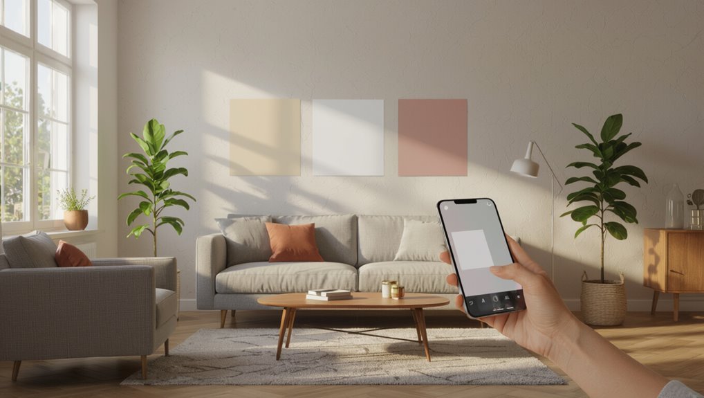
If you want instant, realistic previews of paint on your walls, real‑time AR apps are the quickest way to see colors in context.
You’ll use mobile technology to compare paint brands, read user reviews, and run app comparisons for the best user experience.
These tools blend design inspiration, color trends, color psychology, and virtual reality elements to guide DIY projects with confidence.
AR vs Photo Tools: When to Use Each?
Use AR when you want a real-time room preview to see how colors move with your space, and choose photo tools when you need high-resolution editing for fine detail.
Consider lighting and color accuracy: AR shows how paint looks under current light, while photo tools let you correct exposure and tweak hues precisely.
You’ll often use both—start with AR to get a feel, then refine with photo edits for final decisions.
Real-Time Room Preview
When you’re deciding between augmented reality and photo-based preview tools, think about how you want to interact with the space: AR shows paint live on walls as you move through a room, while photo tools let you experiment more precisely with lighting and detail from a still image. Use AR for spatial perception, virtual staging, app usability; use photo tools for color theory, paint techniques, and user reviews.
| Feature | AR | Photo |
|---|---|---|
| Interactivity | Live | Static |
| Detail | Lower | Higher |
| Content | User generated | Curated |
High-Resolution Photo Editing
Immerse yourself in high-resolution photo editing when you need pixel-perfect control over how paint looks under specific lighting, texture, and finish—photo tools let you tweak exposure, shadows, and color calibration so the result matches real-world conditions.
Use high resolution effects and image enhancement techniques to refine edges, preserve texture, and simulate finishes. You’ll prefer photo tools for detailed, editable previews before committing.
Lighting And Color Accuracy
Although augmented reality apps can show you how a color shifts across different lighting conditions in real time, photo-editing tools give you finer control for color-accurate adjustments and calibration.
You’ll use AR for spatial awareness and ambient influence, photos for color perception, color temperature, and precise color psychology tuning to manage perception shifts under natural illumination or artificial lighting.
- AR: lighting effects, spatial checks
- Photo: calibration, visual harmony
- Combine: test, adjust, finalize
What Makes a Good Paint Preview App?
What should you expect from a great paint preview app? You’ll want a user friendly interface and intuitive navigation, accurate color representation, and an extensive color library.
Look for customizable palettes, user reviews integration, social sharing features, and a virtual design community.
Good apps offer detailed tutorials and offline functionality so you can plan, experiment, and share designs without losing progress.
Free Paint Preview Apps Worth Trying
Several free paint preview apps give you powerful ways to test colors before you buy a single can.
You’ll find free app features like AR paint overlay, color matching, and saved palettes that improve your user experience.
Try dependable options to see tones in your light.
- AR overlay apps
- Photo-based editors
- Palette builders
Paid Apps With the Most Accurate Previews
When you want the most reliable look before committing, paid paint-preview apps give you advanced tools—like precise color calibration, layered lighting simulations, and manufacturer-accurate swatches—that free versions usually don’t.
You’ll evaluate paid features via app comparisons and user reviews, check trial periods and subscription options, follow installation tips, note update frequency, and rely on responsive customer support to guarantee accurate previews and smooth setup.
Brand Paint Apps You Should Try
You’ll find many brand-specific visualization tools that let you try a paint line’s exact colors on your walls.
Use paint match mobile apps from those manufacturers to sample real-room photos and get precise shade matches. They’re handy for confirming a favorite color before you buy.
Brand-Specific Visualization Tools
Curious which paint app will actually match your wall and lighting? You’ll want brand specific features, strong visual accuracy, and clear user reviews.
Consider app usability, user interface, and update frequency for reliable results. Think about paint trends, color psychology, and design inspiration, but watch for compatibility issues.
- Try vendor visualization
- Read recent reviews
- Test on your wall
Paint Match Mobile Apps
Want to know which brand paint app will give you a true match on your wall?
Try paint match mobile apps from major brands to sample shades, compare finishes, and learn color psychology tips for rooms. You’ll scan walls, tweak lighting, and save palettes.
Check user reviews for accuracy and ease, and test small samples before committing to a full paint job.
Apps That Match Other Brands’ Colors
When you need a quick way to translate a paint swatch from one brand to another, several mobile apps can scan colors, identify the closest matches across major manufacturers, and save you time at the store.
Need a fast way to translate paint swatches between brands? Try mobile apps that scan and match colors instantly.
You’ll get brand comparisons, color theory context, paint palettes, texture visualization, color psychology tips, design trends, user reviews, app features, interface usability, and reliable color matching.
- Scan swatches
- Compare brands
- Save palettes
How to Use Your Phone Camera for True Color
1 simple trick will improve your phone’s color accuracy: control the light.
You should use neutral, even lighting and avoid mixed bulbs so color perception stays consistent.
Lock exposure and focus, disable filters, and set white balance in camera settings or a manual app.
Shoot RAW if available, then compare swatches on-screen to verify hues before committing to paint choices.
Photograph Rooms for Accurate Previews
You’ll want to capture rooms in the lighting you’ll actually use, since natural and artificial light change how colors read.
Take high-resolution photos so details and subtle hues stay true when you zoom in.
Shoot multiple angles of each wall to see how color shifts across surfaces and corners.
Capture True Room Lighting
Good photos let paint previews show how a color will actually read in your room, so take time to capture true lighting instead of relying on a single snapshot.
You’ll account for natural light and artificial light, room dimensions and spatial awareness, reflective surfaces, wall textures, light fixtures, color temperature, daylight hours, seasonal lighting, shadow effects, and lighting variations to preserve true color perception.
- Shoot at different daylight hours.
- Include key light fixtures.
- Note wall finishes and color saturation.
Use High-Resolution Photos
Why not give your paint previews the clearest possible starting point? Use high-resolution photos so the app maps colors accurately and captures texture.
You’ll see high resolution benefits in truer hues, finer edge detection, and fewer artifacts. Check photo quality settings, stabilize your camera, and avoid heavy compression.
That precision makes virtual swatches more reliable for real-world decisions.
Include Multiple Wall Angles
Take photos from several angles around the room so you capture how light and perspective change across each wall.
You’ll show wall texture, room dimensions, lighting effects, and architectural features for accurate virtual staging.
Capture paint finishes and pattern mixing to test color trends and color psychology with different design styles.
- Corners and focal walls
- Opposite light sources
- Ceiling and floor junctions
How Lighting Changes What Paint Looks Like
Light changes paint the way you see a room more than the paint itself does: natural daylight, cool fluorescent light, and warm incandescent bulbs each shift a color’s tone, intensity, and perceived warmth. You’ll notice color perception, lighting effects, texture influence, ambient brightness, daylight variation, artificial light, room orientation, shadow play, light temperature, and reflective surfaces altering mood.
| Light Source | Effect | Tip |
|---|---|---|
| Daylight | True hue | Test midday |
| Fluorescent | Cooler | Add warm accents |
| Incandescent | Warmer | Balance with art |
| Mixed | Variable | Sample in situ |
| Low light | Muted | Use lighter tones |
Why Finish (Matte, Satin) Affects Previews
Because the same paint color can look very different when the finish changes, you should consider sheen as part of your color preview.
You’ll notice finish effects alter color perception and create varying texture impact. Apps may mimic sheen influence imperfectly, so check samples.
- Matte reduces visual contrast.
- Satin boosts depth and highlights.
- Gloss amplifies reflections and detail.
Calibrate Your Phone Screen for Truer Color
Seeing how finish changes color on your walls, you’ll also want your phone to show colors accurately before you pick a paint.
Use color calibration techniques and screen brightness adjustment to counter ambient light influence and color perception factors.
Account for phone model variations, display technology differences, and screen resolution impact.
Explore user customization options in settings or calibration apps for truer previews.
When AR Beats Static Photo Tools
When you need a realistic sense of how color will look across an entire room, AR often outperforms static photos by letting you walk around, view paint under different angles and lighting, and see how finishes interact with real textures in real time.
AR advantages beat static limitations in visual accuracy, color perception, user experience, and design integration.
AR surpasses static photos—providing truer color, richer perception, better UX, and seamless design integration.
- Immersive technology
- Feedback loops
- Real world applications
- Future developments
Apps That Let You Save and Compare Paint Colors
Augmented reality can show you how a shade plays across a room, but apps that let you save and compare paint colors help you make decisions over time and between options. You’ll track paint color history, use color palette organization, and access virtual color consultations. Features include collaborative design features, color trend analysis, color psychology insights, user experience feedback, mobile accessibility options, and app user demographics.
| Feature | Benefit | Example |
|---|---|---|
| Save palettes | Reference later | Project folders |
| Compare shades | Side-by-side view | Split-screen |
| Share | Team edits | Comments/notes |
Tools That Extract Palettes From Photos
If you’ve ever snapped a photo of a room, fabric, or artwork and wished you could pull its exact colors, tools that extract palettes from photos do exactly that: they analyze an image and isolate a set of coordinated swatches you can save, edit, or export to paint-matching systems.
You’ll use palette extraction techniques inside photo editing tools to sample, refine, and export palettes.
- Auto-extract swatches
- Manual sampling
- Export to paint systems
Measure Your Room for Paint Coverage
Start by measuring each wall’s width and height and tallying doors and windows so you can calculate the actual paintable square footage.
Use accurate room dimensions to estimate paint coverage for different paint types and application techniques.
Estimate paint needs using precise room dimensions to match coverage per paint type and application method
Account for wall texture, surface preparation and surface priming needs.
Test color samples under varied lighting conditions to see color psychology effects before committing.
Apps That Estimate Paint Quantity and Cost
After you’ve measured your walls and accounted for doors, windows, texture, and priming, apps can speed up the next step by estimating how much paint you’ll need and what it’ll cost.
Use a quantity calculator with good estimate accuracy, compare paint cost and cost breakdown, consult online resources and user reviews for material considerations and DIY tips to refine project planning and project budget.
- Choose accuracy
- Compare costs
- Read reviews
How to Sample Real Swatches With Apps
Want to see how a color will actually read on your wall before committing to a gallon? Use swatch selection tools in apps to compare swatch integration, test sampling techniques, and judge color perception under your light.
Focus on virtual accuracy in app comparisons, evaluating user experience and color harmony. Capture real swatches, save variants, and recheck before you buy.
Match Existing Trim and Furniture With Apps
If you’ve got established trim and furniture you want to coordinate with, use color-matching features in paint apps to sample those surfaces and find complementary or exact-match paints.
You’ll guarantee trim matching, furniture compatibility, and style cohesion while testing color harmony and texture contrast for aesthetic balance and visual flow, improving spatial perception and design synergy.
- Sample
- Compare
- Apply
Multi‑Surface Previews: Walls, Trim, Cabinets
You’ll want tools that show walls, trim, and cabinets at the same time so you can compare combinations instantly.
Check that the app keeps color consistent across different materials so what looks right on a wall won’t read differently on glossy trim or painted wood.
That way you can make confident choices without guesswork.
Simultaneous Surface Mockups
Several tools let you preview multiple surfaces at once so you can see how wall color pairs with trim, cabinets, and built-ins before you commit.
You’ll use digital mockups and virtual staging to test color harmony, material interactions, surface textures, and design trends.
Focus on app features, app usability, user experience, and color psychology to make confident choices.
- Compare palettes
- Toggle finishes
- Save presets
Color Consistency Across Materials
When different materials meet—walls, trim, and cabinets—color can look like three separate decisions instead of one cohesive plan.
So you’ll want tools that preview them together and keep tones aligned across finishes. Use apps that apply color theory to simulate material interaction and texture impact, showing how light reflection and surface finish alter color perception.
This informs paint durability choices and ensures aesthetic harmony.
Preview Accent Walls and Two‑Tone Schemes
Before you commit to painting, previewing accent walls and two‑tone schemes lets you see how colors interact with light and furniture in real time.
Preview accent walls and two‑tone schemes first to watch colors play with light and furnishings in real time
You’ll test accent wall ideas and two tone inspiration, apply color pairing techniques, visual contrast strategies, DIY paint projects, room transformation tips, color psychology effects, design theme integration, space definition methods, and mood setting colors.
- Focus focal points
- Balance tones
- Test samples
Try Wallpaper and Paint Together in One View
You can preview paint over wallpaper to see if it hides the pattern or enhances it.
Use tools that show layered texture visualization so you can judge how paint will interact with bumps and seams.
Match the pattern with color options to find combos that complement rather than clash.
Preview Paint Over Wallpaper
Try viewing wallpaper and paint together in one shot so you can judge how colors interact without committing to a single treatment.
You’ll preview paint over wallpaper to assess wall texture, wallpaper patterns, wall finishes, and color saturation.
Consider color psychology, seasonal colors, design trends, room ambiance, and your personal taste or style preferences.
- Contrast
- Balance
- Focus
Layered Texture Visualization
Mixing wallpaper and paint in a single view helps you see how textures layer and play off each other so you can choose combinations that read as intentional rather than accidental.
You’ll use layered textures and texture simulation to judge surface variation and tactile appearance, testing color layering for visual depth and dimensional effects.
Apps that enable pattern integration let you refine contrasts and harmony before committing.
Match Pattern With Color
After testing layered textures, bring wallpaper and paint together in a single view to see how pattern scale, color balance, and edge treatments interact.
You’ll judge color harmony and pattern integration faster, adjusting contrast, trim, and focal walls before you commit.
Use apps that layer images so you can preview seams and lighting in real rooms.
- Check contrast
- Adjust trim
- Test lighting
Test Colors Across Different Times of Day
Because light changes throughout the day, you should view paint samples at multiple times—morning, noon, and evening—to see how undertones shift and how the color reads in your space.
Track daylight variations, twilight effects, and seasonal changes, noting room orientation and shadow impacts.
Observe time shifts of natural lighting, take photos for comparison, and decide based on real interior design behavior rather than a single glance.
Apps Offering Pro Color Advice or Consultation
You’ve seen how light and time change a swatch on your wall, and now you can use apps to bring pro-level color insight into that real-world testing.
You’ll get color theory, color psychology, visual harmony guidance, and design trends signals through interface design focused on app usability and color accessibility.
Compare via feature comparison and user reviews; use virtual collaboration to confirm choices.
- Expert palettes
- Live feedback
- Accessibility checks
How Contractors and Designers Use These Apps
You’ll use these apps to visualize color changes on-site instantly, so clients can see choices in real time.
They help you match existing shades with high accuracy for seamless touch-ups and renovations.
And they tie into scheduling, estimates, and material lists to keep your workflow smooth.
Quick On-Site Visualization
How do contractors and designers get a reliable color preview without lugging dozens of swatches?
You use apps for quick on-site visualization that consider paint psychology, color perception, room ambiance, visual harmony, emotional impact, design trends, texture influence, color theory, spatial awareness, and aesthetic preferences.
- Real-time AR overlays
- Lighting-adjusted previews
- Client-approved palettes
Color Matching Accuracy
Moving from quick visual previews to reliable color fidelity means relying on apps that measure, compare, and reproduce hues with scientific precision.
You’ll use calibrated sensors to account for color perception and psychological effects, balancing personal preference with seasonal trends and cultural influences.
Apps reference color symbolism and color trends, ensuring visual harmony, emotional response control, and adherence to core design principles for contractor and designer decision-making.
Workflow Integration Tools
Contractors and designers integrate color apps into daily workflows to streamline quoting, specification, and client approval, letting teams share calibrated swatches, measurements, and notes in real time.
You’ll use apps for workflow automation, tie color libraries into project management software, and speed approvals so jobs start faster.
- Centralized swatches
- Automated specs
- Client sign-off tracking
Mobile Apps vs Web Tools: Pros and Cons
Wondering whether a mobile app or a web tool will make picking wall paint easier? You’ll weigh user experience, app functionality, design simplicity and mobile accessibility.
Check user reviews and do a feature comparison: offline capability favors apps, update frequency and customer support vary, while integration options often suit web tools.
Choose based on workflow, connectivity, and which features you actually need.
How to Evaluate App Color Accuracy and Realism
When judging an app’s realism, check how it handles lighting and exposure so colors look right under different room conditions.
Make sure the tool simulates paint finishes—matte, eggshell, and gloss can change a color’s appearance.
Finally, look for color accuracy metrics or comparison tools that quantify how closely the app matches real paint samples.
Lighting And Exposure
Because lighting and exposure change how colors read more than anything else, you’ll want to test a paint app under the same conditions you’ll live with the color.
Consider how natural daylight versus artificial lighting, color reflections, wall textures and surface finishes alter perception by time of day and ambient light.
Test with room size, mood influence, and color temperature in mind.
- Morning light
- Evening bulbs
- Mixed sources
Paint Finish Simulation
1 essential factor in judging an app’s color accuracy is how well it simulates paint finishes—matte, eggshell, satin, semi-gloss, and high-gloss all reflect light differently and change a hue’s appearance.
You should test texture effects across surface types and room dimensions, consider lighting conditions, apply color theory and color psychology, and weigh visual impact against style preferences and current design trends.
Color Accuracy Metrics
Although color accuracy can feel subjective, you can measure an app’s realism with clear, repeatable metrics that compare displayed colors to real-world paint under controlled conditions.
You’ll evaluate color theory fit, digital palettes fidelity, and visual perception consistency to inform user experience and color psychology.
Consider technology impact on color harmony, aesthetic choices, design trends, and virtual reality integration.
- Delta E accuracy
- Lighting tests
- Device profiling
Avoiding False Confidence: Verify App Colors
How sure are you that the color you see on your phone is the color you’ll get on the wall?
You should question app reliability and color fidelity: lighting effects, digital distortions, and app limitations alter color perception.
Rely on testing methods and real world comparisons, consider color blindness and varied user experiences, and verify swatches physically before committing to avoid costly surprises.
Best Practices: Blend App Previews With Samples
When you’re choosing a paint color, use app previews as a starting point but always verify with physical samples under the room’s actual lighting—this combo gives you a practical, reliable view of how a color will behave on your walls.
Blend digital cues with samples to judge color psychology, texture perception, spatial awareness, and visual harmony.
Combine digital previews with real samples to assess color mood, texture, scale, and overall harmony in your space.
- Test samples for mood influence and personal preferences
- Compare against color trends and design principles
- Use selection criteria to guarantee aesthetic balance
Account for Room Undertones When Choosing Color
Because walls pick up subtle undertones from lighting, furnishings, and finishes, you should identify a room’s dominant undertone before committing to a paint color. Use color theory for undertone matching, hue selection, and complementary colors to guide color harmony. Consider color psychology, mood impact, spatial perception, light reflection, and warm vs cool choices to guarantee the final scheme feels cohesive.
| Source | Effect |
|---|---|
| Light | Alters warmth |
| Fabric/Trim | Reflects undertone |
Use App Palettes to Shop Paint and Samples
Use an app to build palettes that keep your walls, trim, and accents working together so you get cohesive color schemes.
Snap or upload photos to match paint right to what you love and see how samples look in real lighting.
Then save and share your palettes with contractors or friends when you’re ready to buy.
Create Cohesive Color Schemes
Although picking a single paint swatch feels simple, turning app-generated palettes into a cohesive room scheme helps you shop smarter and avoid costly mismatches.
Use app palettes to balance color psychology and trend forecasting while shopping paints and samples.
Follow a simple checklist to finalize choices:
- Anchor: pick a dominant hue.
- Support: add two complementary tones.
- Accent: choose one bold pop for details.
Match Paint To Photos
Want to match the paint you buy to a photo you love? Use app palettes to extract hues, compare with color theory and color psychology, and follow design trends and seasonal palettes for modern aesthetics.
Check user reviews for paint durability and DIY tips, and test texture simulation or virtual staging features before ordering samples so your chosen colors perform and photograph as expected.
Save And Share Palettes
Saving and sharing palettes makes shopping for paint and ordering samples far faster and more accurate. You’ll keep palette organization tight, export codes, and link swatches to rooms so contractors and stores match colors.
Use saved sets for color trend analysis when deciding tones.
- Export swatches for sample orders
- Share links with vendors or friends
- Tag palettes by room and mood
Privacy: What These Apps Collect and Why It Matters
When you use paint-color apps, they collect more than just the photo you snap—apps often gather location data, device identifiers, usage patterns, and sometimes access to your camera roll or cloud photos. You should check privacy policies, insist on user consent, prefer data encryption and app transparency, and limit information sharing of personal data to control data collection.
| Data type | Risk |
|---|---|
| Location | Tracking |
| Photos | Exposure |
| Identifiers | Profiling |
| Usage | Targeting |
Use AR Markers for Better Alignment and Scale
When you use AR markers, the app locks onto fixed points so your virtual swatches stay aligned with walls.
That improved alignment makes it easier to compare colors across corners and trim.
You’ll also preserve real-world scale, so paint samples match actual wall dimensions.
Improve Alignment Accuracy
Although AR can overlay paint colors convincingly, it’ll only look right if your virtual swatches line up with real-world geometry—so use printed or sticker AR markers to lock position and scale.
You’ll improve color perception and virtual staging realism by stabilizing tracking.
Use markers to:
- Fix reference points.
- Maintain consistent scale.
- Reduce drift during movement.
Preserve Real-World Scale
1 simple AR marker can make a big difference: stick or print markers near corners and trim so the app can lock onto fixed points and keep virtual paint scaled correctly as you move.
You’ll get better scale representation and real world accuracy, using measurement tools to set virtual dimensions.
Improved spatial awareness, perspective alignment, depth perception and augmented visuals keep colors believable.
Apps That Connect to Smart Lighting Systems
Smart lighting apps let you match wall paint to real-time lighting conditions by syncing colors, brightness, and color temperature across bulbs so you can preview how a hue will read at different times of day.
Smart lighting apps sync bulb color, brightness, and temperature so you can preview paint hues in real-time lighting.
You’ll use smart home integration and lighting synchronization to test paints under warm, cool, or dim scenes.
Try these steps:
- Sync bulbs to the app
- Select paint swatch
- Cycle lighting scenes
Create Virtual Mood Boards With Paint Apps
Anyone can pull together a clear design story using paint apps that let you build virtual mood boards—drag swatches, upload photos of your room, and layer textures, fabrics, and finishes to see how colors interact.
You’ll use virtual design tools for mood board creation, mixing color inspiration with color psychology and trend analysis.
App features enhance user experience, design aesthetics, visual storytelling, and creative collaboration.
Which Apps Support HEX, RGB, and Paint Codes?
You’ll want to check which apps accept HEX and RGB values so you can match digital swatches precisely.
Look for tools that also recognize major paint brand codes for easy in-store matching.
Make sure they offer export and sharing options (like PNG, PDF, or code lists) so you can pass color specs to contractors or friends.
Supported Color Formats
Most paint and design apps handle at least one digital color format—HEX, RGB, or vendor-specific paint codes—but they don’t all support the same combination, so it’s important to check compatibility before you commit to a palette.
You’ll want formats that respect color theory, color harmony, visual perception, color psychology, color symbolism, color mixing, color temperature, color context, color trends, and color matching.
- HEX/RGB for digital accuracy.
- CMYK/LAB for print and pro.
- Vendor paint codes for real-world matching.
Paint Brand Code Matching
When matching digital swatches to real paint, check which apps convert HEX/RGB to specific vendor codes so you don’t end up chasing a close-but-off shade; you’ll save time.
Look for app compatibility, user reviews, and brand loyalty signals.
Use tools that respect color theory, color psychology, color mixing, seasonal color palettes, historical color trends, DIY tutorials, and design inspiration.
Export And Sharing Formats
After you confirm a close match with brand-specific codes, you’ll want to export and share the color data in formats your contractor, printer, or design team can actually use.
Use apps that support export formats like HEX, RGB, and paint codes for clear color palettes, good image quality, and app compatibility.
Share via tools that enable feedback mechanisms, design integrations, project organization, and community sharing.
- Compare export formats
- Test sharing tools
- Collect user experiences and feedback mechanisms
Translate App Colors to Real Paint Names
If an app gives you a hex code or a photo sample, you can translate that digital color into a real paint by matching its undertones, lightness, and finish rather than relying on the screen alone.
Use color translation tools and paint color databases to find nearest commercial matches, check manufacturer swatches under your lighting, and order small samples to confirm before committing to a full paint purchase.
Preview Exterior Paint on Siding and Trim
Because exterior colors read differently on siding and trim, you’ll want to preview them on the actual surfaces before buying a gallon.
Test samples show siding material influences and paint texture variations; consider seasonal color palettes, geographic color preferences, and exterior color trends.
Factor in environmental impact considerations, durability considerations, maintenance factors, neighborhood color coordination, and historical color references.
- Test in sun and shade
- Inspect texture match
- Note long-term upkeep
Best Apps for Renters, Homeowners, and Pros
You’ll find apps that make it easy to test renter-friendly color options without damaging walls or violating leases.
Homeowner-focused apps let you preview paint on photos of your rooms and compare finishes and lighting.
If you’re a pro, there are tools with advanced color matching, palette export, and project management features.
Renter-Friendly Color Options
Apartment living doesn’t mean settling for bland walls — plenty of apps make it easy to preview renter-friendly paint options, try temporary solutions, and share looks with landlords or roommates.
Use apps to explore renter friendly palettes, color trends, color psychology, wall finishes and paint types while respecting rental restrictions.
DIY tips and visual inspiration help balance design aesthetics.
- Peel-and-stick samples
- Removable paint
- Accent-wall mockups
Homeowner Paint Previews
Want to see how a color will look in every light before you commit? You’ll use homeowner paint preview apps to test color psychology, seasonal palettes, and design trends on photos of your rooms.
Try features for paint textures, wall finishes, and modern styles to explore color combinations and visual harmony. These tools respect your aesthetic preferences and focus on mood enhancement without pro-only complexity.
Pro-Grade Color Tools
When you need more precision than basic preview apps provide, pro-grade color tools give renters, homeowners, and pros the control to match paint chips to real-world lighting, measure undertones, and simulate finishes with technical accuracy.
You’ll get premium features like color blending, design integration, and color psychology insights, plus app comparisons, user reviews, interface usability, paint trends, user community feedback, and expert recommendations.
- Accurate sampling
- Workflow plugins
- Collaborative feedback
Visually Simulate Scuffs: Limits of Virtual Testing
Scuffs are one of the hardest things to predict with virtual paint tools, because they depend on surface texture, wear patterns, and how light interacts with tiny abrasions—factors most apps simplify or ignore.
You’ll notice virtual limitations: apps rarely model micro-shadowing or buildup, so scuffs can alter color perception dramatically in real rooms.
Test samples and inspect finishes in different lighting to confirm.
Combine Color Theory With App Suggestions
Noting how scuffs and surface effects can fool virtual swatches helps you use color theory more wisely alongside app suggestions.
Remember that scuffs and surface texture can trick virtual swatches—use color theory with app suggestions and real-world checks.
You’ll pair color psychology with digital aesthetics to test mood, contrast, and light. Use apps to mockups, then verify in real light.
- Test mood and saturation
- Check contrast and balance
- Compare app mockups to samples
Pick Coordinating Colors for Cabinets and Backsplashes
When you pick cabinet and backsplash colors, start by matching undertones so cool or warm hues don’t clash.
Use contrast to make features pop but keep a unifying element—like a shared neutral or metal finish—to maintain cohesion.
Test swatches together in your kitchen light before committing.
Matching Undertones Effectively
Because undertones shape how colors read in your space, matching them between walls, cabinets, and backsplashes is key to a cohesive look.
Use color theory and color psychology to guide undertone matching, considering hue saturation, warm cool balance, and color relationships for color harmony and aesthetic appeal.
Note visual perception and complementary colors to refine choices.
- Test samples
- Compare lighting
- Adjust saturation
Balancing Contrast And Cohesion
If you want your walls, cabinets, and backsplash to look intentional, balance contrast with cohesion by choosing colors that play off each other rather than fight.
Use color harmony and color relationships to guide choices, applying design principles and color psychology for aesthetic balance and visual impact.
That creates design cohesion, strengthens thematic unity, enhances room ambiance, and improves space perception without overwhelming the eye.
Document Decisions and Share Previews With Others
Before you commit to a final coat, gather clear photos, paint codes, and placement notes so you can show others exactly what you’re planning.
Before the final coat, collect sharp photos, paint codes, and placement notes to share your plan.
You’ll speed color collaboration and reach design consensus by sharing annotated previews. Use simple files and timelines so feedback’s actionable.
- Photo with markup
- Palette and codes
- Suggested room views and schedule
Use App Feedback to Buy Sample Pots Wisely
Once you’ve shared annotated previews and gathered feedback, use app insights to pick sample pots more strategically.
Rely on app user experiences and app usability feedback to judge color preview accuracy and virtual color testing.
Compare paint finish comparison notes, use swatch integration tools, and weigh color scheme inspirations.
That helps you refine sample pot selection and buy only the tests that truly reflect your space.
Troubleshoot App Glitches and Color Shifts
While apps can make color selection easier, they sometimes glitch or show uneven shifts that mislead your choices. So, you’ll want to spot and correct those issues early.
Use app updates and check device compatibility to preserve color fidelity. Gather user feedback and apply troubleshooting techniques to fix common issues, improving app performance and overall user experience.
- Calibrate screen and lighting
- Restart app/cache clear
- Report bugs with screenshots
Update Previews After Moving Furniture or Lights
If you move a couch or add a lamp, update your app previews so the color rendering matches the new arrangement. Furniture and light shifts change how paint looks by altering shadows, reflections, and perceived hue.
You should retake images reflecting furniture placement and light sources, adjust for room layout and paint layering, and check surface reflections to preserve color perception, spatial dynamics, visual balance, design consistency, and aesthetic flow.
Choose the Right App for Your Project Size
How big is your painting project and what do you need the app to do?
You’ll match app selection tips to project scope: small quick swaps need simple visualizers, larger rooms benefit from measurement and paint estimate tools, and complex renovators require AR and color matching.
Choose based on features, accuracy, and budget to save time and avoid costly mistakes.
- Simple visualizers
- Measurement tools
- AR/color matching
Final Checklist for Picking Paint With Confidence
Before you start buying samples, run through a quick checklist so you pick a paint that looks great, performs well, and fits your budget.
Assess color psychology, color harmony, and seasonal colors. Confirm finish types and application techniques, note preparation steps, and consider environmental impact.
Use trend forecasting and visual storytelling for style direction.
Finalize scope, timeline, and budget for solid project management.
Frequently Asked Questions
Can These Apps Predict How Paint Ages or Fades Over Years?
No — you won’t get precise color longevity predictions from those apps; they’ll simulate current hues and paint sheen, but can’t accurately model long-term fading, UV exposure, or surface changes over years.
Do Paint Preview Apps Account for Textured or Popcorn Ceilings?
Like viewing fabric through frosted glass, most apps won’t fully capture textured or popcorn ceilings; they’ll try, but color accuracy and texture representation vary widely, so you’ll need close inspection or physical samples for certainty.
Can Apps Simulate Paint on Non‑Vertical Surfaces Like Floors or Stair Risers?
Yes — many apps can simulate paint on floors and stair risers, but you’ll want to check color accuracy and surface compatibility settings, since lighting, texture, and angle affect results; test samples for reliable real‑world matching.
Are There Apps That Detect Underlying Stains or Discoloration Before Painting?
Like a surgeon’s lamp revealing hidden wounds, yes — some apps use color detection and stain analysis to flag discoloration before you paint. You’ll need good lighting and sometimes manual confirmation, but they’ll guide your prep.
Can Paint Apps Generate Printable Physical Swatches at Exact Scale?
Yes — some apps let you export printable swatches that match swatch accuracy and guarantee color consistency; you’ll download CMYK/PDF files calibrated for printers, but you’ll need a profiled printer and controlled lighting for best results.
Conclusion
You’ve got plenty of apps to try, so don’t overthink it—test and trust your eyes. I once used an AR app that slapped a sunny yellow on my tiny hallway; it looked brave on screen, but in real light it felt like a spotlight. Remember: 85% of pros sample paint on the wall before buying, and you should too—use apps to narrow choices, then test a real swatch to be sure it’s the color you live with.