Does Paint Dry Darker Than It Goes on
Usually you’ll find water-based paints (latex, acrylic) dry slightly darker than they go on, while oil- or alkyd-based paints can dry a bit lighter. Sheen, surface texture, pigment concentration and lighting all change perceived color as solvents evaporate and binders rearrange. Test full two-coat swatches on the actual wall, view them at different times and light, and allow full cure before deciding — keep going to learn practical tweaks and troubleshooting tips.
Quick Answer: Does Paint Usually Dry Darker or Lighter?
When you paint, the color often looks slightly different after it dries: most latex and acrylic paints dry a touch darker than they appear wet, while oil-based paints can dry a bit lighter. You’ll notice variations due to pigment concentration, binder type, and lighting.
If you want predictable results, test swatches and view them at different times of day. Consider color psychology when choosing shades—darker finishes can feel cozier or smaller, lighter ones airier.
Also factor paint durability: tougher formulations may slightly alter sheen and depth as they cure. Small tests save time and prevent costly repaints.
How Paint Sheen Affects Final Color
Although sheen might seem like a purely cosmetic choice, it actually changes how paint reflects light and consequently how the color reads in your room. You’ll notice subtle shifts: higher sheens bounce more light, making colors look brighter and slightly cooler, while lower sheens absorb light and can make tones appear richer and deeper.
Consider color psychology when picking sheen—glossier surfaces feel more energetic and modern; matte sheens feel softer and more relaxed. Also weigh paint durability: glossier finishes resist scuffs and clean better, so they suit high-traffic areas where you want consistent color over time.
Which Sheens Darken Most: Flat to Gloss Compared
When you compare flat and gloss finishes, you’ll notice flat paint hides texture and can look a touch darker because it absorbs more light.
Gloss reflects more light, often making colors read slightly lighter and sharper.
Understanding how sheen affects tone helps you pick the right finish for the mood you want.
Flat Versus Gloss Appearance
Curious whether sheen changes affect how dark paint looks? You’ll notice flat finishes hide imperfections and diffuse light, making colors appear softer but sometimes slightly deeper than their wet look.
Gloss reflects more light, so tones read brighter and cleaner; that shine can mask subtle depth. Consider color consistency and paint durability when choosing: flatter sheens offer uniform appearance across flaws, while glossier coats resist scuffs and clean easily.
You’ll pick flat for muted, forgiving walls and gloss for trim or high-traffic areas needing durability. Balance aesthetic goals with practical needs to get the look and performance you want.
Sheen Impact On Tone
Because sheen controls how light interacts with a painted surface, it directly affects how dark a color reads—flatter sheens absorb and scatter light, making tones look richer and slightly deeper.
While glossier sheens reflect more light and tend to make the same color appear brighter and a touch lighter. You’ll notice flat and matte finishes deepen perception most, satin and eggshell sit midrange, and glosses lighten appearance.
When choosing sheen, balance color consistency across rooms with finish durability needs; high-traffic areas may demand glossier, more durable coats that slightly lighten tone, while low-traffic spaces can use flatter sheens for richer color.
Why Pigment Concentration Changes Wet vs. Dry Color
Although wet paint often looks lighter, the real reason is that the same mass of pigment gets spread out in solvent or binder, so as the liquid evaporates the pigments crowd together and the film’s optical density increases. You notice color saturation rising as particles pack tighter; pigment stability matters because unstable pigments can flocculate or shift, changing hue. Think of pigment spacing visually:
| Wet film | Dry film |
|---|---|
| Particles dispersed, more light scatter | Particles concentrated, deeper absorption |
| Lower apparent chroma | Higher apparent chroma |
You can control perceived darkening by adjusting load, additives, and application thickness.
How Paint Base (Water vs. Oil) Alters Drying Appearance
The way a paint’s vehicle carries pigment changes how the color looks as it dries: water-based paints let water evaporate quickly and create a matte, slightly lighter-looking film at first.
Meanwhile, oil-based systems evaporate solvents more slowly and continue to level and deepen in tone as they cure. You’ll notice waterborne formulas (latex, acrylic) often show less gloss and reduced saturation immediately, which can affect color psychology by making spaces feel airier.
Oil or alkyd bases retain sheen longer, enhancing perceived depth and warmth. Understanding paint technology helps you choose a base that matches desired appearance and mood.
How Drying Time Changes Light Reflection and Depth
When paint is wet it often looks richer and more saturated than after it dries, so you’ll want to judge color cautiously.
As solvents evaporate and binders cure, the surface sheen changes and that alters how light reflects off the film.
Watch samples at different stages to see how depth and gloss settle over time.
Wet Vs. Dry Appearance
Because wet paint still holds a glossy, liquid layer, it reflects light differently than finished paint, and you’ll often perceive colors as lighter or more saturated while they’re drying. You notice shifts as solvents evaporate and pigments settle, affecting color consistency after each coat and during paint application.
Watch for temporary depth and sheen that fade; this helps you judge true tint only after full cure. Consider these practical points:
- Allow complete drying between coats to guarantee accurate color consistency.
- Monitor thin versus thick application; thickness alters drying rate and perceived depth.
- Use consistent technique to minimize patchy shifts and surprises.
Surface Sheen Changes
Although paint may look glossy while it’s wet, that sheen softens as solvents evaporate and binders cure, so you’ll see changing reflections and perceived depth over time. You’ll notice highlights dull, shadows deepen, and the same patch can read darker until fully cured. Sheen shifts affect perceived Color consistency and can mislead touch-ups. Slower drying lets pigments settle, improving paint durability but extending sheen progression. Use consistent lighting and test swatches to anticipate final look. Below is a quick reference to monitor sheen stages.
| Stage | Visual cue |
|---|---|
| Wet | High gloss |
| Tack | Reduced gloss |
| Dry-to-touch | Matte forming |
| Cured | Stable sheen |
| Aged | Slight fade |
How Film Thickness and Number of Coats Shift Color
If you apply a thicker film or add extra coats, the paint’s color will usually deepen and become more saturated because more pigment and binder alter how light is absorbed and scattered. You’ll notice improved color consistency across the surface as overlapping layers even out coverage, and increased paint durability reduces visible wear that can make patches look lighter.
Thicker films can slightly shift gloss, affecting perceived depth. Gauge how many coats you need for true coverage without overbuilding.
Thicker films can subtly change gloss and depth—use just enough coats for full coverage without overbuilding.
- Even wetness: thicker film reduces translucency
- Layering: each coat deepens hue predictably
- Protection: durability preserves original tone
Why Primer Matters for True Final Color
When you start with the right primer, the paint you apply afterward will show its true color instead of being skewed by the substrate. You rely on primer to block stains, even out porosity, and create a uniform base so hues dry as meant.
That consistency supports color psychology—your chosen shade will evoke the mood you expect rather than a muddied version. Primer also improves adhesion and increases paint durability, reducing peeling and uneven wear that can alter appearance over time.
Skip the primer and you risk chasing tone with extra coats instead of achieving reliable, lasting results.
Choosing the Right Primer and Tinted Base
Think about how your primer’s sheen and coverage affect the way topcoat color reads once it’s dry. A higher-coverage primer hides underlying tones better.
While a flat or low-sheen base can mute a color’s brightness. Using a tinted primer can boost coverage and reduce the number of finish coats you need, helping you get the true color faster.
Primer Sheen And Coverage
While primer might seem like just a prep step, its sheen and opacity directly affect your final color and how many coats you’ll need.
You should pick a primer sheen that matches the topcoat’s reflectivity to avoid surprises with the color wheel shifts and to preserve paint durability.
Higher gloss primers can brighten hues; flat primers hide imperfections but may mute color.
Use tinted bases sparingly to reduce topcoat layers without masking stains.
- Match sheen to finish for consistent light reflection
- Choose opacity for coverage needs and substrate color
- Consider durability and adhesion for long-term results
Benefits Of Tinted Primer
Because a tinted primer brings your topcoat closer to its final shade, you’ll need fewer finish coats and spend less time and money on paint, especially over bold or dark surfaces. You’ll notice improved coverage and truer color payoff, which matters when combating color fading or correcting uneven previous tones.
Tinted primers help hide stains and reduce the number of glaze layers, preserving the paint texture you want. They also speed project completion and cut material costs.
Choose a primer tone that complements your topcoat and substrate, and you’ll get consistent results with less effort and better long-term color stability.
How Surface Texture and Porosity Affect Color
Although two paints may share the same formula, the surface you apply them to changes how you’ll perceive the color. Surface texture scatters light differently: smooth surfaces reflect more uniformly, while rough surfaces create micro-shadows that mute saturation.
Porosity effects also matter—highly porous substrates absorb binder and pigment, often making colors look lighter or duller unless sealed.
- Smooth, glossy surfaces boost vibrancy and color depth.
- Textured or matte finishes diffuse light, softening hues.
- Porous materials need primer or sealing to prevent uneven absorption and patchy appearance.
Account for texture and porosity when predicting final color.
Lighting Effects: Natural, Artificial, and Directional Light
Pay attention to how natural light shifts your paint’s appearance through the day, warming at sunrise and cooling at dusk.
Notice that artificial light sources have different color temperatures that can make the same swatch read warmer or cooler.
Also consider how directional light creates contrast and shadows that change perceived depth and saturation.
Natural Light Shifts
When you move from morning to afternoon, natural light shifts in color temperature and intensity, and those changes can make the same paint look noticeably different. Cooler blue tones dominate early and late, while warmer, yellow light fills midday.
You’ll notice hues deepen or wash out as shadows move, affecting color psychology and how comfortable a room feels. Consider timing when sampling paint, since perceived shade can alter mood and apparent contrast.
Sun angle also influences apparent texture and can reveal flaws that affect perceived paint durability.
- Observe at multiple times
- Test full walls, not swatches
- Note directional shadows
Artificial Light Color
If you want paint to look the same at night as it does by day, remember that artificial light color shifts hue and saturation in predictable ways. You’ll notice warm bulbs deepen reds and oranges, while cool LEDs pull blues and greens forward.
Choose bulbs with high CRI to preserve the paint’s *desired* appearance and reduce surprises after drying.
Think about color psychology when selecting nighttime lighting—warm tones feel cozy, cool tones feel alert—and match paint choices accordingly.
Proper lighting also reveals surface flaws that might affect perceived paint durability, so test samples under your fixtures before committing.
Directional Light Contrast
Beyond bulb color and CRI, the direction of light shapes how paint reads on walls and how contrast appears after it dries. You’ll notice angled light deepens shadows, making hues seem richer, while diffuse light flattens contrast and reveals undertones.
Consider how color psychology shifts with highlight and shadow, and how perceived saturation can affect mood. Directional light also exposes surface texture, influencing perceived paint durability. Use controlled placement to predict outcomes before painting.
- Test samples under desired light at different times
- Position fixtures to manage glare and shadow
- Observe texture effects on hue and longevity
How Gloss and Satin Finishes Show Highlights Differently
Although both gloss and satin finishes protect your walls, they render highlights very differently. You’ll notice gloss throws sharper, brighter highlights that emphasize texture and reflect light like a mirror, while satin softens reflections for a gentler sheen.
Gloss finishes throw sharp, mirror-like highlights that emphasize texture; satin softens reflections for a gentler sheen.
Choose gloss if you want energetic accents amplified by color psychology—shinier surfaces can feel livelier—but remember its high visibility can reveal imperfections.
Satin balances aesthetic subtlety with improved paint durability, hiding flaws and offering easier maintenance without aggressive shine.
When you pick a finish, consider room function, lighting, and how pronounced you want highlights to influence mood and focus.
Sheen Examples: Flat, Eggshell, Satin, Semi-Gloss, Gloss
Now that you’ve seen how gloss and satin handle highlights, let’s look at the full range of sheens so you can pick the right one for each space. You’ll notice flat hides imperfections and shifts color perception less. Eggshead gives a subtle luster, satin balances sheen with easy cleaning, semi-gloss brightens trim and resists scuffs, and gloss maximizes reflection and paint durability.
Match sheen to use: low-traffic walls vs. high-traffic trim. Consider lighting and maintenance when choosing so the finished surface looks as intended and lasts as long as possible.
- Flat, conceals flaws
- Satin, balanced gloss
- Gloss, durable shine
Key Terms Explained: Flop, Undertone, Metamerism
Wondering how paint can look different from sample to wall? You’ll learn three key terms.
Flop describes how sheen and angle change perceived depth; it’s why satin reads richer than flat under the same light.
Undertone is the subtle hue lurking beneath the visible color; it interacts with color temperature and nearby surfaces so a “warm” white can read creamy or yellowish.
Metamerism happens when two swatches match under one light but differ under another—artificial, daylight, or mixed.
Consider paint texture too: rough surfaces scatter light, amplifying flop and revealing undertones differently across lighting conditions.
How Undertones Shift as Paint Loses Moisture
When paint loses moisture you’ll notice a wet-to-dry shift as pigments concentrate and the surface looks different.
As the binder evaporates, pigment particles sit closer together and change how light is reflected.
That subtle change in light reflection is what alters the undertone you thought you were seeing when the paint was still wet.
Wet-To-Dry Shift
Although wet paint often looks one way on the brush, it can change noticeably as it dries: you’ll see undertones emerge or recede because moisture affects how pigments and binders reflect light.
You’ll notice subtle shifts in warmth or coolness; that can alter color psychology in a room and influence perceived paint durability when finish changes from glossy to matte.
To manage expectations, test patches and observe throughout drying stages.
- Check samples at 30, 60, and 120 minutes.
- View under the room’s usual lighting.
- Consider finish and surface texture before committing.
Pigment Concentration Change
Because water or solvent evaporates, pigment particles pack closer together as paint dries, so the color’s undertones can read stronger or shift toward deeper hues. You’ll notice subtle changes as binder concentration increases and translucency drops, altering how pigments blend and reveal hidden tones.
To maintain color consistency you should control application thickness, drying speed, and pigment stability via quality formulations or additives. Test swatches let you predict final appearance; document ratios and conditions so repeats match.
Minor shifts aren’t flaws but predictable physics—understanding concentration effects helps you compensate during color selection and achieve reliable, repeatable results.
Light Reflection Alteration
As paint loses moisture, its surface and internal structure change in ways that alter how light reflects and which undertones you perceive. You’ll notice sheen shifts as tiny pores and binder rearrangements scatter light differently, so subtle undertones can emerge or recede.
You won’t always get true color until curing finishes; premature judgment risks misreading Color fading potential or misestimating Gloss durability. Consider these factors when evaluating dried tone:
- Surface microtexture: changes scattering, revealing hidden warm or cool notes
- Binder clarity: alters translucency, shifting undertone balance
- Layer thickness: affects absorption and perceived saturation
Real-World Tests: Wet-Edge Samples and Large-Panel Trials
To see how paints behave in conditions that mimic real projects, you’ll want to move beyond small chip samples and test both wet-edge swatches and larger panels. These setups reveal how sheen, pigment concentration, and application variability change appearance as paint dries.
You’ll lay wet-edge samples to watch blending, note paint texture shifts, and inspect large panels for lap marks, fading, and subtle drying darkening across breadth.
Measure overcoats and drying intervals to evaluate true color harmony with adjacent surfaces. Photograph consistently and view at different times and lights so you’ll predict final results before committing to full application.
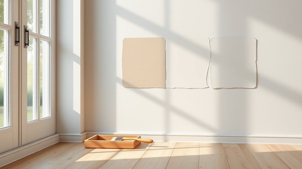
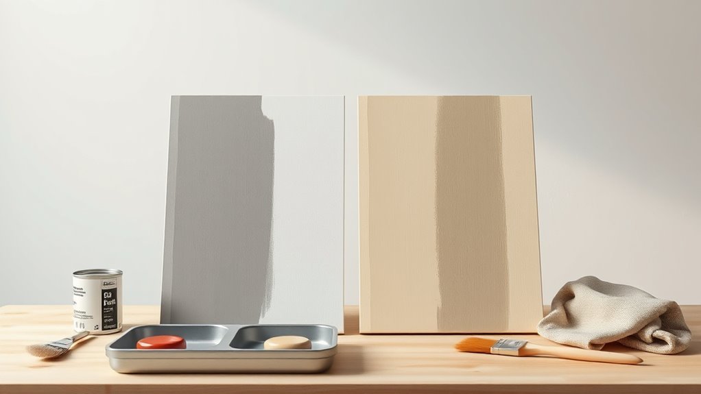
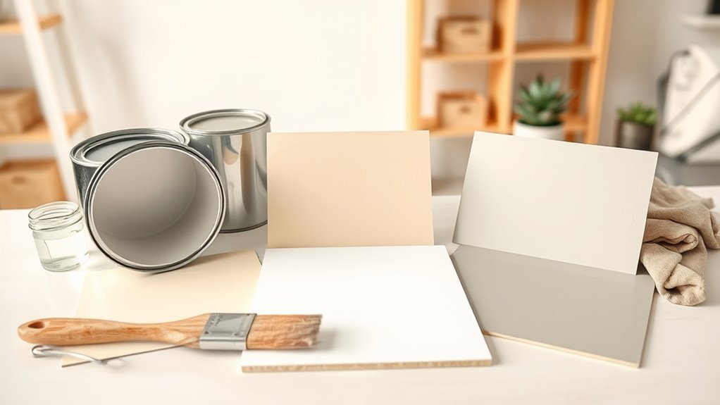
Using Paint Chips and Sample Pots Effectively
When you’re deciding on a final color, start with paint chips and sample pots so you can compare true tones under real conditions; chips give a quick reference across lighting while sample pots let you see how the paint behaves on your actual surface. Use chips to shortlist hues and note undertones; try sample pots on varied walls to judge drying shifts and sheen.
Consider color psychology for mood and room function, and check product labels for paint durability to match traffic. Test at different times of day, and evaluate finish consistency before buying gallons.
- Compare undertones in morning and evening
- Apply samples to textured and smooth areas
- Note manufacturer-rated paint durability and sheen
Application Techniques to Minimize Color Shifts
Having tested chips and sample pots, you can now focus on application techniques that keep your wet-to-dry color shift minimal.
Apply thin, even coats with quality brushes or rollers to avoid pooling that deepens hue.
Maintain consistent lighting while painting so you judge color correctly and leverage color psychology to anticipate mood changes under different intensities.
Allow full dry times between coats and avoid high humidity or cold that alter curing and final shade.
Choose compatible primers and follow manufacturer thinning recommendations to preserve paint durability.
Finish with a proper topcoat when specified to lock in color and sheen.
When to Expect Darkening vs. Lightening During Cure
Although many paints appear slightly darker as solvents evaporate and resins settle, you’ll see different behaviors depending on formulation and conditions. You’ll notice oil- and alkyd-based paints often deepen in color saturation during cure, while some waterborne and latex systems can lighten as binders crosslink and scatter light.
Paint texture also matters: thicker, glossier films hold wet depth longer; matte, porous films reveal final tone sooner. Expect darkening when solvents leave and pigments concentrate; expect lightening with increased surface scattering or oxidation.
Monitor samples under intended lighting and humidity to predict shifts.
- Film thickness effects
- Binder chemistry differences
- Environmental influences
How Long to Wait Before Judging the Final Color
If you want an accurate read on paint color, wait until the film has fully cured rather than just dry to the touch. You’ll typically need one to four weeks for full cure depending on formulation; water-based paints often cure faster than oils.
Monitor paint odor—when it fades substantially, solvents have mostly off-gassed and color is more stable. Keep drying temperature consistent and within the manufacturer’s recommended range to avoid altered sheen or pigment response.
Test a small patch and record conditions. Only judge color after cure; premature judgments can mislead you about final tone, gloss, or uniformity.
Troubleshooting: What to Do if Paint Dried Darker
When paint dries noticeably darker than you expected, don’t panic—start by confirming the change across a few spots and under consistent lighting so you know it’s not just perception or a shadow. Check sheen, substrate absorption, and whether multiple coats altered tint.
If darkness persists, consider these steps:
- Test a small strip with a thinner coat or differing sheen to compare results.
- Revisit paint mixing records; mismatched batches or added tint can deepen color.
- Use temporary fixes like lighter trim or fabrics while you decide.
Remember color psychology: darker walls affect mood, so weigh aesthetics before committing to repainting.
How to Adjust Color Choice for Different Room Lighting
Start by evaluating the room’s natural light so you know how daylight will shift your paint’s appearance throughout the day.
Then account for artificial lighting — warm, cool, and the fixture type can all change how a color reads.
Always test with sample swatches on different walls and observe them at multiple times to see the true effect.
Assess Natural Light
How much natural light pours into a room changes how paint reads on the walls, so walk through at different times of day and watch the shifts in brightness and color temperature. You’ll notice warm morning light warms hues, while north-facing rooms stay cooler; use color psychology to pick tones that support mood and function.
Test large swatches on multiple walls and observe fading or intensifying across hours to judge true appearance and potential effects on paint durability. Take notes, photos, and compare swatches against furniture finishes to guarantee harmony.
- Test swatches on east, west, and shaded walls
- Photograph at sunrise, noon, dusk
- Note perceived warmth and contrast
Account For Artificial Lighting
Because artificial light can shift paint tones as much as daylight does, you’ll need to evaluate the types and placement of fixtures before you pick a color.
Consider warm incandescent or LED bulbs that deepen reds and oranges, while cool fluorescents pull blues and greens forward. Balance fixture height and direction to avoid hotspots that alter perceived hue.
Think about color psychology—warm light fosters coziness, cool light feels energetic—and match your paint to the desired mood.
Also factor in paint durability: higher-sheen, tougher finishes reflect light differently and withstand cleaning in high-use, brightly lit areas.
Test With Sample Swatches
When you bring sample swatches into a room, view them at different times of day and under each type of artificial light you’ll use, because the same hue can read dramatically different as shadows shift and bulbs warm or cool.
You should tape swatches to multiple walls and live with them for a few days, noting how color psychology affects mood in morning versus evening.
Check finish choices for paint durability under real wear and light exposure. Decide based on observed shifts, not just online images.
- Tap each swatch to check undertones
- Photograph under each light source
- Test scuff resistance on a hidden spot
Pro Tips Painters Use to Predict Final Appearance
If you want to predict how a paint job will look once it dries, painters rely on a few practical tricks: swatch testing under the room’s lighting, applying a full two-coat sample on the actual surface, and noting sheen changes as paint cures.
You’ll evaluate color psychology to verify mood matches intent, then inspect samples at different times of day. Check how texture and substrate affect absorption, and track drying shifts between wet and cured states.
Test topcoats and finishes for paint durability and reflectance. Take photos, compare swatches against trim and furnishings, and adjust formulas before committing.
When to Hire a Pro for Complex Color Work
As color schemes get more complex—multiple tones, faux finishes, accent walls, or intricate trim work—you’ll want to bring in a pro to guarantee accurate mixing, smooth changeover, and a predictable final look.
When colors, finishes, or trim get complicated, hire a pro to ensure smooth transitions and a reliable result.
You should hire someone when color progression requires advanced brush techniques, color-matching tools, or layered glazing that risks visible seams. Pros also advise on lighting interactions and proper paint storage to preserve sample integrity.
Expect efficient prep, consistent sheen, and problem spotting before it becomes costly. Consider these reasons to call a pro:
- precise color matching and blending
- expert surface prep and finishing
- guaranteed timelines and cleanup
Quick Checklist to Ensure Paint Dries the Color You Want
Because small variables change how paint settles, you should run a short checklist before committing to a full coat. Test samples on the actual wall, observe in morning and evening light, and note how gloss affects hue. Confirm primer compatibility and substrate color to avoid tint shifts.
Check room lighting type and bulb temperature since color psychology can alter perceived mood. Swipe a wet-to-dry comparison and wait full drying time listed by the manufacturer.
Evaluate humidity and temperature during application to protect paint durability. Record product, batch, and sheen so you can match results or troubleshoot if tone drifts.
Frequently Asked Questions
Can Temperature and Humidity During Drying Change Final Paint Color?
Yes — you’ll see subtle shifts: temperature and humidity affect the paint film during the drying process, altering solvent evaporation and binder curing, so colors can deepen, lighten, or appear uneven if conditions aren’t controlled.
Do Additives or Extenders Affect How Paint Dries Visually?
Yes — you’ll notice additives or extenders change paint texture and can alter drying time, so surfaces may look different as sheen and viscosity shift; you’ll need test patches to judge final visual effects accurately.
Will Colorant Fading Occur Over Years After Drying?
Yes — you’ll notice colorant fading over years after drying, like a sun-bleached flag losing stories; paint gloss and surface texture influence pace, and you’ll see gradual dulling, chalking, or loss of vibrancy over time.
Does Mixing Paints From Different Batches Alter Final Shade?
Yes — if you mix paints from different batches, you’ll likely get slight shade shifts; maintain paint consistency and note drying time differences, because uneven pigment or base variations can alter the final shade after application and drying.
Can VOC Levels or Solvent Evaporation Cause Color Shifts?
Yes — you’ll notice VOC levels and solvent evaporation can shift hues; pigment stability and chemical interactions affect binders and dispersions, so as solvents leave and VOCs change, the paint’s final color can alter.
Conclusion
In short, trust paint to change a bit as it dries — like a chameleon settling into its new coat — so don’t pick colors on wet swatches alone. Consider sheen, pigment load and base, and test samples in your actual room light before committing. Use higher sheens for truer, lighter finishes or accept a slight darkening with flatter paints. When in doubt, get a pro to preview complex schemes and avoid costly color regrets.