Does Paint Usually Dry Lighter or Darker
Paint usually dries a bit darker than it looks when wet, so expect a subtle deepening as solvents evaporate and the film forms. Pigment load, sheen, surface texture, and primer all affect how much the tone shifts, and thicker coats or glossy sheens often deepen color more. Temperature, humidity, and airflow also change drying behavior. Test samples on the actual surface and let them fully cure before judging — keep going to learn how to control and fix shifts.
Does Paint Usually Dry Lighter or Darker?
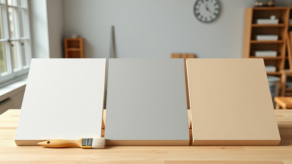
When paint dries, it usually looks a bit darker than when it’s wet, though the change is often subtle; you’ll notice variations depending on pigment and sheen. You’ll see that mid-tones shift more than pure whites, so testing matters.
For reliable Color consistency, apply small samples and let them cure under the room’s usual light before deciding. Compare finishes deliberately: gloss reflects more light when wet, so a Finish comparison with matte reveals different perceived depth once dry.
Trust observations from your actual surface rather than swatches alone, and plan touch-ups after full drying for best matches.
Short Answer and What to Do Next
Because paint often looks a touch darker once it dries, the short answer is: expect a subtle darkening and test before committing. You should sample colors on your wall, observe them at different times, and note how paint texture and sheen change perception.
Use small swatches or peel-and-stick samples to compare under your lighting. Consider color psychology when choosing hues—warm tones feel cozier, cool tones feel calmer—and match mood to function.
If a shade shifts more than you like, try a lighter tint, higher sheen, or different base. Proceed deliberately: test, live with samples, then paint the full surface.
Why Wet Paint Looks Different From Dry Paint
Although paint looks glossy and deeper while it’s wet, that sheen hides how pigments and binders will settle, so what you see on day one isn’t the final result. You notice wet paint darker because gloss increases light reflection and masks texture, altering your color perception.
As solvents evaporate, binders form a film and refractive index changes, revealing true hue and value. Paint chemistry governs pigment dispersion, binder clarity, and light scattering during drying.
Expect subtle shifts as microscopic particles pack tighter and surface finish matures. Knowing this helps you wait before judging or matching colors for touch-ups.
How Pigment Strength Changes the Final Color
Pigment strength—how much tinting power a pigment has per unit volume—directly determines the hue and opacity you’ll see once paint dries. Strong pigments keep color true at thin films, so what you pick when wet stays recognizable when dry.
Weak pigments fade toward the binder’s tone, making dried color lighter or muddier than expected. You’ll balance pigment load for coverage without sacrificing paint durability; richer mixes can resist fading and abrasion better.
Consider color psychology when choosing strength: intense pigments evoke energy, muted ones calm. Test small swatches and note how pigment concentration alters final appearance and longevity.
How Paint Sheen and Gloss Change Perceived Color
After you’ve judged pigment strength and concentration, sheen becomes the next factor that reshapes how color reads on your walls. You’ll notice gloss reflects light and deepens perceived saturation, while matte scatters light and softens hues.
High sheen highlights imperfections and emphasizes paint texture; low sheen hides flaws and flattens contrast. Sheen also interacts with drying time: as a finish cures, reflections settle and true tone emerges, so initial wet appearance can mislead.
When choosing sheen, consider room lighting and cleaning needs—glossier finishes resist stains but amplify color shifts, whereas flatter sheens keep tones gentle and consistent.
How Coating Thickness and Extra Coats Shift Tone
As you apply thicker film, the color can shift because more pigment and binder change light absorption and scattering.
Stronger tint concentrates color so each additional coat deepens the tone noticeably.
Watch how multiple coats build richness—sometimes a single heavy coat looks darker than several thin ones.
Film Thickness Effects
Want to make a color look richer or more muted? You’ll notice film thickness changes perceived tone: thicker films deepen saturation while thinner films can appear lighter. Apply even coats to maintain color consistency and improve paint durability; uneven buildup makes patches look darker or glossier.
Multiple thin coats usually yield truer color than one heavy coat, and drying times affect final appearance.
- Use consistent coat thickness for uniform appearance.
- Prefer thin, controlled layers to avoid sagging or puddling.
- Allow full cure between coats to lock in color and maximize paint durability.
Tint Strength Shift
When you add extra coats or change film thickness, the tint’s apparent strength shifts because more pigment and binder sit on the surface, deepening hue and reducing light transmission.
You’ll notice color perception changes as the layer becomes denser: saturation increases and subtle undertones emerge. Paint chemistry explains why pigments aggregate and refract less light in thicker films, so the same formula reads differently.
You should account for this when matching colors or planning touch-ups, adjusting formula or application technique rather than assuming identical appearance.
Test strips at desired thickness give the best preview of final tone under your lighting conditions.
Multiple Coat Deepening
Because each additional coat stacks pigment and binder, your paint will read progressively darker and richer than a single pass, and that shift can surprise you if you only judge samples at typical application thickness. You’ll notice color perception change as gloss, wetness, and layer depth alter reflectance.
Pigment behavior concentrates with each wet film, reducing light scattering and deepening tone. Test multiple coats on a single panel to predict the final shade. Watch drying intervals and sanding between coats to control sheen.
Consider opacity and tint strength when planning layers to avoid unexpected darkness.
- Test full build-up
- Note sheen changes
- Limit unnecessary coats
How Primer Choice Affects Final Paint Color
Curious how primer can change the way your topcoat reads? You’ll notice primer alters tint acceptance and sheen because of paint chemistry and surface porosity. A warm primer can nudge neutrals warmer; a cool primer can mute saturation. Use tinted primers to boost coverage and reduce coats. White or bright primers can make colors pop; gray primers deepen mid-tones. Consider color psychology when choosing primer—subtle undertones affect mood. Test with swatches.
| Primer Type | Effect |
|---|---|
| White | Brightens, increases reflectance |
| Gray | Deepens, reduces glare |
| Tinted | Enhances hue, improves coverage |
How the Underlying Surface Color Changes Results
When you paint over a surface, the underlying tint can subtly shift the wet and dry color you see. If the existing color contrasts strongly with your new paint, you’ll notice more change as the coat dries and the original hue shows through or bleeds.
Consider testing a small patch so you can judge how much the substrate alters the final result.
Surface Tint Influence
How does the color of what’s underneath change how paint looks as it dries? You’ll notice substrate tint shifts perceived hue through thin coats, especially when surface texture reflects light unevenly. Rough textures can reveal underlying tones faster and extend drying time variations.
Primer hides most of this, but bare or stained surfaces will alter final appearance until full cure. Test patches help you predict outcomes and adjust coats or primer choice.
- Use a tinted primer to neutralize strong undertones
- Apply thin, even coats to minimize tint bleed-through
- Inspect samples at actual drying time
Existing Color Contrast
Moving from surface tint to the contrast between existing colors and new paint, you’ll see that underlying hues can make a freshly applied coat look noticeably lighter or darker depending on their strength and proximity in value.
When you paint over a dark wall, the new layer absorbs and mixes light differently, shifting color perception toward deeper tones until opacity builds. Conversely, a pale substrate reflects more light, biasing wet paint toward brightness.
Paint chemistry and pigment load determine how quickly the topcoat overrides the base, so priming or using higher-hide formulas helps guarantee the final shade matches your intention.
How Temperature Affects Drying and Color Shift
Although you may not notice it at first, temperature plays a direct role in how quickly paint dries and whether it ends up lighter or darker than you expected. You’ll find that color consistency depends on cure rate: warm conditions speed solvent evaporation, sometimes darkening finishes briefly. Cold slows drying, trapping sheen that can make colors look lighter.
Temperature affects drying and cure rate—warm air can darken finishes briefly, cold can trap sheen and lighten color.
Paint formulation matters too—waterborne paints react differently than oil-based ones. You can manage shifts by controlling environment and timing touch-ups.
Consider these practical tips:
- Use consistent ambient temperature during application and drying
- Follow manufacturer’s temperature range for best results
- Test small areas first
How Humidity and Airflow Change Drying Color
Temperature isn’t the only environmental factor that shifts a paint’s appearance—humidity and airflow exert a big influence on drying behavior and final color.
You’ll notice high humidity slows solvent evaporation, prolonging wet look and sometimes causing a slightly darker appearance until fully cured.
Low humidity and strong airflow speed evaporation, which can lock in lighter tones but risk uneven sheen or poor color consistency across a surface.
Air movement also affects paint oxidation rates; faster drying can reduce oxidation time, altering final depth.
To control outcomes, regulate ventilation and humidity during application so colors remain predictable and uniform.
How Latex (Water-Based) vs Oil-Based Paints Behave Differently
When you compare latex (water-based) and oil-based paints, their drying chemistry and visual changes differ fundamentally. You’ll notice latex dries by water evaporation, keeping pigments more evenly suspended for better color consistency.
While oil-based paints oxidize and can deepen slightly as binders cure. You’ll also see different finish effects: latex often dries faster with matte clarity; oils level to a glossier, richer look.
Choose based on project needs and substrate. Consider these practical contrasts:
- Dry time impacting recoat and perceived depth
- Tendency for oils to amber or deepen
- Latex retaining truer pigment appearance
How Lighting Reveals the True Dried Color
Check the dried paint in natural light to see its true tone, since artificial bulbs can skew warmth and saturation.
Walk around and view the surface from different angles to catch how sheen and texture shift the color. You’ll spot subtle undertones and variations this way, so don’t judge a sample under a single lamp.
View Under Natural Light
Why step outside to inspect your paint? You’ll see how natural light reveals the true dried color, affecting color psychology and showing subtle shifts that indoor bulbs mask.
Sunlight reveals undertones, sheen, and whether the hue leans warmer or cooler as it cures, which also hints at paint durability on exterior surfaces.
When you check outdoors, focus on consistent conditions:
- Observe mid-morning or late afternoon for balanced sunlight.
- Compare painted areas to unpainted samples under the same light.
- Note changes during different weather for realistic expectations.
Natural light gives the most reliable read on final appearance and performance.
Inspect At Different Angles
How do you catch a paint color that seems different every time you glance at it? Move around the room and tilt your head to inspect at different angles; angled light exposes subtleties hidden in flat views.
You’ll notice color blending where adjacent strokes meet, and how finish textures—matte, eggshell, satin—scatter or absorb light. Walk close for edge details, step back to see overall tone, and check with both overhead and side lighting.
Compare wet areas to fully cured spots; reflections and micro-shadows reveal true hue shifts. By varying perspective and light source, you’ll identify the paint’s final appearance reliably.
When Does Paint Dry Darker? Common Causes
When paint dries darker than you expected, it’s usually due to factors like sheen change, pigment concentration, or surface absorption that alter how light reflects off the finish. You’ll notice color theory and paint texture matter: higher pigment load and a smoother wet sheen can hide undertones until drying shifts reflectance.
Uneven absorption or layering also deepens appearance.
- High pigment concentration in the mix
- Porous or previously stained surfaces
- Reduced sheen as solvent evaporates
Check substrate preparation and thinning habits; correcting these prevents surprises and keeps the dried shade predictable.
When Does Paint Dry Lighter? Common Causes
If paint can dry darker, it can also dry noticeably lighter, and that shift usually comes from factors that increase light reflection or reduce pigment saturation as the film cures. You’ll notice lighter drying when primers show through, heavy thinning dilutes color, or rapid solvent loss changes sheen. Lighting and viewing angle amplify perceived change, which affects color psychology and mood. Reduced pigment concentration can also impact paint durability over time. Consider common causes:
| Cause | Effect |
|---|---|
| Primer bleed-through | Paler appearance |
| Over-thinning | Lower pigment strength |
| High gloss loss | More reflected light |
Address causes to preserve meant hue.
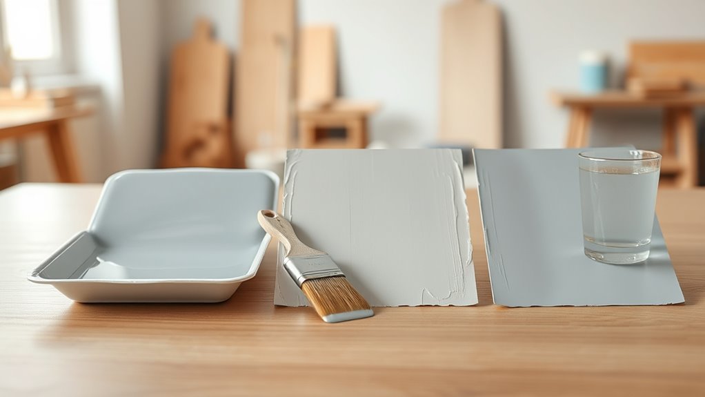
How to Test Paint Samples Correctly (Substrate, Size, Timing)
Because the surface, sample size, and drying time all change how paint looks, you should test samples on the actual substrate, in realistic patch sizes, and over the full cure period to get reliable results.
You’ll check color consistency across materials (wood, drywall, trim) and note how application techniques affect finish.
Apply samples using the same brush, roller, or sprayer you’ll use on the project. Label each patch with product, sheen, and method. Photograph in consistent light for comparison.
Record observations of texture, coverage, and sheen as the sample moves from wet to dry.
- Match substrate types
- Use real patch sizes
- Keep application consistent
How Long to Wait Before Judging a Dried Sample
Although paint can look dry to the touch within an hour or two, you should wait the full recommended cure time—often 24 to 72 hours—before judging final color and sheen.
When you assess a sample, check multiple spots under consistent light to confirm color consistency; a quick glance can mislead. Track the manufacturer’s drying times and factor in humidity and temperature, which slow curing and alter appearance.
If you’re comparing samples, label and retest after the full cure period. Only then will you see true depth, gloss, and uniformity, letting you decide confidently without premature judgment.
How to Use Primer and Undertones to Control Shade
When you want a paint color to read lighter or darker, start by choosing the right primer and paying attention to undertones: a warm primer (cream or beige) will lift colors toward warmth and lightness, while a cool primer (gray or blue) will mute brightness and deepen cool hues.
Choose primers by undertone: warm bases lift and warm colors, cool bases mute and deepen cool hues.
You’ll control the final shade by matching primer undertone to your goal, considering surface absorbency and paint texture, and anticipating color fading over time.
Test swatches on the actual wall. Use these quick checks to predict the outcome:
- Match primer warmth/coolness to desired direction
- Note surface texture and sheen effects
- Allow full cure before final judgment
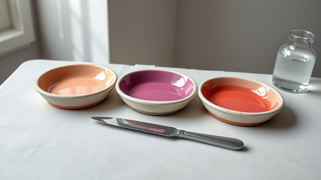
How to Adjust Tinting or Mixing to Hit Your Target Color
Now that you’ve chosen a primer to steer the paint’s base tone, you’ll need to adjust tinting or mix pigments to hit the exact shade you want. Start by adding tiny increments of stronger tints to avoid overshooting; stir and test on a sample card, letting it dry fully before judging.
Consider color psychology—warm or cool shifts change mood more than slight value tweaks. Keep records of measurements so you can replicate or reverse mixes.
For paint sustainability, favor pre-tinted bases and concentrated pigments to reduce waste. If unsure, consult the manufacturer’s tint formulas rather than guessing.
How to Choose Sheen to Preserve Color Accuracy
Because sheen changes how light interacts with pigment, choosing the right finish is key to preserving the color you mixed. You’ll use color theory to predict visual shifts: gloss reflects more light, boosting saturation; matte scatters light, muting tones.
Consider paint chemistry—binders and pigments affect sheen and final value. Test samples under real lighting and view from different angles before committing.
Balance durability needs with color fidelity: high-traffic areas may need higher sheen despite slight brightening.
- Use swatches on the actual wall.
- Compare gloss, satin, and matte in the same light.
- Note binder-driven sheen shifts.
How to Avoid Streaks, Lap Marks, and Application Errors
Get the surface clean, smooth, and primed so your paint can adhere evenly and show true color. Use consistent strokes, maintain a wet edge, and apply the recommended film thickness to prevent lap marks and streaks.
Work in steady, moderate temperature and humidity so each coat dries uniformly and you avoid application errors.
Proper Surface Preparation
Before you start painting, make sure the surface is clean, dry, and smooth so you won’t trap dust, oil, or loose paint under the new coat. You’ll prep to prevent streaks, lap marks, and uneven sheen. Sand glossy spots, fill holes, and wipe with a tack cloth.
Primer evens porosity so color psychology and paint texture show reliably. Test a small area to confirm absorption and finish.
- Sand to uniform matte
- Use appropriate primer
- Remove all contaminants
Proper prep conserves time and ensures the final hue and texture match your intent.
Consistent Paint Application
When you apply paint, work in controlled, overlapping sections so each new stroke blends into a still-wet edge; this keeps lap marks and streaks from forming and gives a uniform sheen across the surface.
You’ll maintain consistent coverage by loading your roller or brush evenly, maintaining a wet edge, and finishing each panel before moving on.
Match pressure and stroke direction, feathering at joins to avoid noticeable gradations.
Consistent application also preserves color psychology—uniform tones read as intentional, not patchy—and supports paint durability by preventing thin spots that wear unevenly.
Inspect under good light and touch up promptly.
Optimal Drying Conditions
Although drying seems passive, controlling temperature, humidity, and airflow actively prevents streaks, lap marks, and other application errors. You’ll set consistent conditions: moderate temperature, low humidity, and gentle circulation so the paint levels and cures evenly.
Learn from historical techniques—staged glazing and timed passes—to sequence coats and avoid overlaps. Consider color psychology when choosing sheen; darker sheens hide flaws differently than matte.
Monitor surface temps, use proper tools, and pace yourself to keep a wet edge. Small adjustments beat major fixes.
- Maintain steady climate control
- Work with the paint’s recommended open time
- Use appropriate rollers and brushes
Environmental Controls That Prevent Unexpected Color Shifts
If you want paint to cure to the color you desired, keep temperature, humidity, and airflow within recommended ranges so pigments and binders react predictably. You’ll monitor and control climate to avoid yellowing, cloudiness, or shift that undermines color psychology goals or the look of eco friendly paints.
Use calibrated thermostats, dehumidifiers, and gentle fans to maintain steady conditions during drying and curing. Avoid direct sunlight and drafts that cause uneven evaporation.
Store mixed paint in airtight containers between coats. Document conditions when you test samples so you can replicate successful results and prevent surprises.
How to Evaluate Dried Samples Under Real Room Lighting
When you check dried samples, view them at night under the room’s artificial lighting to see how they’ll look after lights are on.
Also compare those nighttime views with the same samples in daylight to catch shifts caused by natural light.
Doing both tests helps you predict how the color will read across typical use conditions.
View Samples At Night
Curious how your paint will actually look after the sun goes down? You should check samples at night to see how artificial light shifts hue, contrast, and the perception driven by color psychology. Observe paint texture and sheen under lamps; glossy finish can reflect bulbs, changing apparent shade.
Move around the room and note mood changes—warm bulbs cozy up colors, cool LEDs can mute them. Test for consistency across fixtures and corners, and consider how the evening atmosphere affects comfort.
- Inspect samples under each lamp type
- View from typical seating positions
- Note how texture alters light reflection
Compare Samples In Daylight
How does the paint actually read in natural light—stand in the room during the brightest part of the day and inspect your dried samples closely. You’ll notice shifts from paint formulation, sheen, and surrounding surfaces; color psychology effects become clearer when you see hues in true daylight. Compare adjacent samples, move them around, and observe warmth, coolness, and contrast. Use the table below to note quick impressions.
| Sample Location | Observed Hue | Emotional Impression |
|---|---|---|
| North wall | Softer, cooler | Calm (color psychology) |
| South wall | Warmer, brighter | Energetic |
| Near window | True to swatch | Accurate (paint formulation) |
How to Fix Paint That Dried the Wrong Shade
If your paint dried lighter or darker than you expected, don’t panic—you can usually correct the shade without stripping the entire surface. Assess the finish, note undertones, and apply color theory plus paint chemistry: pigments, binder, and sheen affect final color.
You’ll choose whether to tint, glaze, or repaint.
- Test tinting small areas first.
- Use transparent glazes to subtly shift undertones.
- Recoat with adjusted tint for full correction.
Work in daylight, use thin coats, and allow full drying between layers. If unsure, consult a pro or take a sample to the paint store for precise matching.
Checklist: Ensure the Dried Color You Want
After you’ve tried tinting, glazing, or repainting to correct the shade, use a focused checklist to confirm the dried color matches your goal before finishing the job. Walk the room at different times and light angles, noting warm or cool shifts. Compare samples to your swatch under natural and artificial light.
Consider Color psychology—does the final tone evoke the desired mood? Inspect edges, corners, and overlap areas for consistency. Test touch for texture and check Paint durability with a gentle rub after full cure.
Document results and decide: accept, touch up, or repaint to achieve the exact outcome.
Frequently Asked Questions
Can Different Brands of the Same Color Dry Differently?
Yes — you’ll see variations: different brands can alter color consistency and drying times, so shades may appear different after curing. You’ll want to test samples, match sheens, and follow manufacturer drying recommendations.
Do Additives or Extenders Change Final Dried Color?
Absolutely — they can. Like adding salt to a recipe, additives and extenders alter paint chemical composition and can shift hue; drying temperature and evaporation rates interact with those modifiers, so you’ll notice subtle or obvious color changes.
Will Textured Surfaces Alter Perceived Paint Shade?
Yes — textured surfaces alter perceived paint shade: texture influence changes surface reflection, scattering light unevenly so colors can look lighter, darker, or more muted depending on angle, type of texture, and lighting conditions.
How Do Metallic or Pearlescent Finishes Affect Drying Color?
Metallic or pearlescent finishes can produce a subtle color shift as binders cure; you’ll notice the metallic sheen stays prominent and reflections change, so the hue can appear lighter or darker depending on angle and light.
Can Sealed Vs Unsealed Wood Change Paint Appearance?
Yes — sealed versus unsealed wood changes paint appearance: you’ll notice differences because paint consistency interacts with surface preparation; sealed wood beads paint for a smoother sheen, while unsealed wood soaks paint in, altering color depth and texture.
Conclusion
In most cases, paint dries a bit darker, but don’t freak out—it’s not dramatic enough to ruin your life. You’ve learned why wet paint looks different, how pigment strength and sheen shift color, and which environmental factors matter. Test samples, match lighting, and adjust with glazing or tinting if needed. Follow the checklist, make small changes, and you’ll get the color you want without endless repainting drama.