How to Color Match Exterior Paint Like a Pro
You can match exterior paint like a pro by testing small patches, cleaning and sanding the surface, and checking samples in natural light at different times. Use spectrophotometer scans for tricky shades, match sheen and primer, and feather touch-ups with multiple thin coats. Account for material, texture, and climate-driven fading, and always verify matches on the actual wall before full application—keep going and you’ll pick up practical tips, troubleshooting steps, and pro tools to refine the result.
Who Needs Exterior Color Matching?
Whether you’re repairing a small patch after power washing, replacing a faded trim board, or matching a new addition to an older siding, you’ll need exterior color matching to keep your home looking cohesive. You’ll care if you want curb appeal, resale value, or to maintain brand consistency for a rental or business.
Color psychology matters: the hues you choose influence perceived size, warmth, and neighborhood fit. You’ll also think about paint durability—matching finish and formulation prevents premature failure.
Contractors, DIYers, landlords, and designers all benefit; anyone managing appearance or maintenance should use precise matching techniques.
Start Here: Match Old Paint or Pick a New Color?
First, decide if you need to match the existing paint to keep the look consistent or pick a new shade to refresh the exterior.
If the current color’s faded or you’re repairing a small area, matching is usually the quickest fix.
But if you’re ready for a change, testing a few new shades on the siding will tell you what works best.
Match Existing Paint First
If your goal is to keep a seamless look, start by matching the existing paint before you pick a new color—this lets you address touch-ups, trim, and faded areas without committing to a whole repaint. You’ll sample small areas, compare swatches under natural light, and use a spectrophotometer if needed.
Consider color psychology—keep hues that preserve your home’s character and curb appeal. Match sheen and material to guarantee paint durability; flat exterior on siding will weather differently than satin on trim.
Test for adhesion and fading on an inconspicuous patch before ordering full gallons.
Choose A New Shade
After you’ve tried matching the old paint and evaluated how those samples look on your home, decide whether you want to keep that exact tone or pick a new shade that updates the look.
Choose a new shade by considering neighborhood context, architectural style, and the mood you want—color psychology matters: calming blues, energetic yellows, or sophisticated grays.
Test small areas at different times of day.
Factor in trim and accent colors for contrast.
Check paint branding for durability, finish options, and color accuracy; some brands render tones warmer or cooler.
Lock in your choice only after live testing confirms the effect.
Which Exterior Surfaces Change Color Perception?
Because different materials reflect light and weather differently, the same paint can look like a different color on wood, brick, metal, or stucco. You’ll consider texture, porosity, and aging: rough stucco scatters color, glossy metal boosts saturation, and wood grain shifts hue as it weathers. Think about color psychology when selecting tones for trim or doors, and factor paint durability for high‑traffic surfaces. Test samples on each material. Compare after curing.
| Surface | Effect on Perception |
|---|---|
| Wood | Warmer, grain variation |
| Brick | Deeper, mottled |
| Metal | Brighter, reflective |
| Stucco | Softer, diffuse |
How Lighting Changes Exterior Paint Color
You’ll notice paint tones shift dramatically in different lighting, so check samples in morning, midday, and evening natural light.
Also test how warm or cool artificial lights—like incandescent or LED—change the same swatch after sunset.
Those comparisons will help you pick a color that reads right both day and night.
Natural Light Effects
How does natural light alter the way your exterior paint reads throughout the day? You’ll notice hues shift with sun angle: warm morning light enhances yellows and reds, midday sun reveals true undertones, and evening glow deepens blues and greens.
Clouds diffuse contrast, muting saturation. Consider color psychology—lighter, warmer tones feel welcoming in low light; cooler shades can seem crisp under bright sun.
Test samples at different times to judge appearance and guarantee paint durability choices match exposure: high-UV areas need tougher finishes.
Observe reflections from landscaping and neighboring surfaces, since surrounding light alters perceived color and mood.
Artificial Light Influence
When exterior lighting changes from daylight to bulbs, your paint will read differently—warm incandescent or LED tones push hues toward amber, while cool white and metal halide lights pull them toward blue or green.
You’ll notice artificial lighting shifts color perception, alters contrast, and exposes undertones you didn’t see during daylight sampling. Check paint at night and day to avoid surprises.
- Test samples under porch and street lighting.
- Compare swatches with a portable cool and warm LED.
- Photograph samples under each light for reference.
- Choose a base tone that holds under both conditions.
How Weather and Climate Affect Outdoor Paint Color
Because weather and climate change how colors read outdoors, you’ll want to take into account local conditions when choosing exterior paint. You’ll assess weather patterns—sun intensity, cloud cover, humidity, and salt air—to predict fading, chalking, and undertone shifts.
In humid or coastal climate zones, pigments mute and metallic sheens dull; in dry, sunny areas, colors bleach and warm. Pick higher UV-resistant formulas and slightly deeper or cooler shades to compensate for bleaching or heat-driven warming.
Test large swatches on north- and south-facing walls and observe them over weeks in varied conditions before committing to a full repaint.
Identify Your Existing Paint Finish and Substrate
Before you match a color, identify the paint finish and the surface beneath it so you choose the right prep and formula. You’ll inspect sheen—flat, eggshell, satin, semi-gloss, or gloss—and test adhesion with a fingernail or tape.
Different substrates—wood, fiber cement, brick, metal—need specific primers and affect color psychology because texture and sheen change perceived hue. Consider paint durability needs for exposure and traffic.
Note existing primer or sealers; failing to account for them ruins adhesion. Record findings before buying new paint.
- Check sheen and adhesion
- Identify substrate type
- Note primer/sealer presence
- Match durability to exposure
How to Take Accurate Photos for Color Matching
If you want a reliable color match, start by photographing the area under neutral, even light and keep the camera level to avoid color shifts from angle or glare. Use a gray card for white balance, shoot RAW if possible, and include context like adjacent trim. Pay attention to how shadows alter Color psychology impressions and note surfaces affecting paint durability appearance. Keep shots close and wide, steady the camera, and avoid flash. Below is a quick reference.
| Shot Type | Purpose | Tip |
|---|---|---|
| Close-up | True texture | Gray card |
| Wide | Context | Level camera |
| Detail | Flaws | No flash |
| Evening | Mood | Note light source |
How to Take Paint Samples Safely From Siding or Trim
When you need a paint sample from siding or trim, use safe tools like a utility knife with a fresh blade or a small pry bar to avoid splintering or chipping.
Protect surrounding surfaces with painter’s tape and a drop cloth so you don’t damage adjacent paint or landscaping.
Work slowly and pull small sections to keep the sample intact and your siding unharmed.
Choose Safe Sampling Tools
Because exterior paint can contain hazardous old pigments and you’ll be working at heights or around delicate trim, pick tools that minimize damage and exposure. Use non-sparking scrapers, single-edge blades with guards, and disposable collection pads so you can test for color without gouging siding or harming garden accents or interior coordination where trim meets indoors.
Wear a respirator and gloves. Work steadily and don’t rush.
- Stainless-steel putty knife — thin, controlled lifts
- Utility blade with guard — precise cuts, disposable
- Paint filter pads — capture flakes cleanly
- Small vacuum with HEPA attachment — immediate cleanup and containment
Protect Surrounding Surfaces
Want to avoid accidental scuffs, drips, or dust while you take paint samples? Protecting surrounding surfaces keeps siding, trim, garden furniture, and driveway materials pristine. Tape plastic sheeting over plants and furniture, lay drop cloths on driveways, and use small brushes for controlled swatches. Work from top to bottom and wipe spills immediately.
| Area | Protection | Tip |
|---|---|---|
| Siding | Low-tack tape | Test a hidden spot |
| Trim | Painter’s tape | Press edges firmly |
| Garden furniture | Plastic cover | Secure with clips |
| Driveway materials | Drop cloth | Anchor against wind |
Clean and Prepare a Sample Area for Matching
Before you take a sample for color matching, clean a small test patch so the paint and substrate reflect true color and texture. You’ll remove dirt, mildew, and loose paint, and you’ll assess surface porosity so your sample behaves like the rest of the facade. Think about color theory when judging hue under natural light, and consider how paint durability will affect long-term appearance. Prep lets you compare accurately.
- Wash with mild detergent and rinse.
- Sand glossy spots lightly.
- Remove chalking and mildew with a scrub solution.
- Dry thoroughly before sampling.
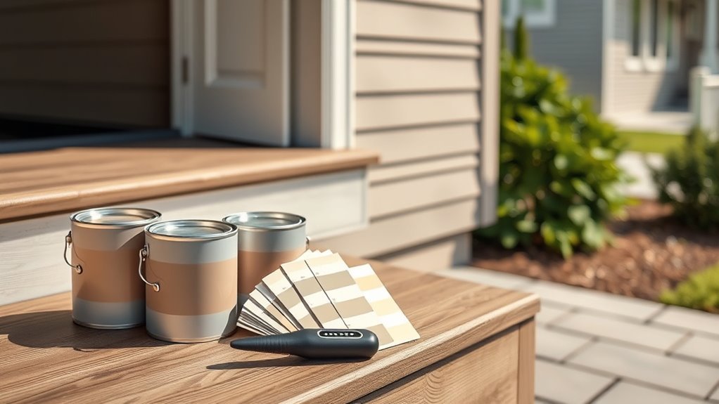
Use a Paint Chip Fan Deck Like a Pro
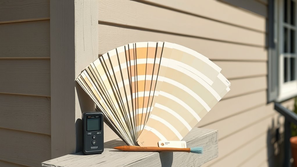
When you pull out a paint chip fan deck, flip slowly and compare chips against the cleaned sample in natural light so you catch subtle undertones and finish differences.
Hold chips flat against the surface and view from multiple angles; that reveals gloss variations and helps you judge paint durability for exterior conditions.
Note nearby elements—trim, landscaping—then narrow to three closest matches.
Think about color psychology: warm tones feel inviting, cool tones recede.
Label your picks, record codes, and take photos for reference.
Don’t rush; the fan deck’s purpose is to guide precise selection before test patches and final application.
Compare Chips On-Site Under Natural Light
Bring your top chips to the house around noon when the sun is highest so you see colors in neutral daylight.
Hold each swatch up against the siding and trim outdoors to compare how hues shift in real conditions.
Don’t decide inside under artificial light—your final choice should be based on what you see on-site.
View Samples At Noon
Why check your paint chips at noon? Natural overhead light at midday reveals true hues and reduces shadows, so you’ll see how a color wheel choice or complementary palette actually reads on your facade. Bring several chips, tape them where paint will go, and step back.
- Inspect chips directly on the surface for undertones.
- Compare adjacent colors to confirm harmony and contrast.
- Note glare and reflectivity on glossy samples.
- Photograph chips in midday light for later review.
Doing this at noon gives you reliable, repeatable color judgment before committing to gallons.
Compare Swatches Outdoors
Now that you’ve checked chips at noon, take those same samples outside and tape or hold them where the paint will be seen most. Walk around the house and view chips from different angles and distances, noting how sunlight, shadow, and neighboring materials shift hue and contrast.
Consider color psychology—how warmth or coolness affects curb appeal and mood—alongside practical factors like paint durability for siding and trim. Inspect in morning and late afternoon light too, and photograph chips for reference.
Choose the swatch that balances emotional impact with long-term performance, then confirm with a small test patch.
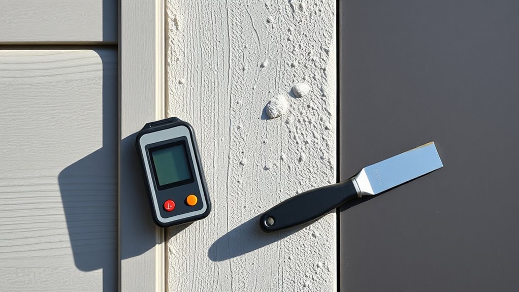
Using Handheld Color Meters (Spectrophotometers)
When you need a fast, objective way to read a paint color, a handheld color meter (spectrophotometer) gives you precise spectral data you can use to recreate or match exterior paint. You’ll aim the device at a clean, representative area, record readings under consistent light, and export formulas to a paint system.
These tools also help coordinate interior decorating accents and furniture matching by ensuring consistency across surfaces.
- Clean surface and avoid gloss spots.
- Take multiple readings around the area.
- Note lighting conditions and time of day.
- Save spectral files for lab mixing and future reference.
When to Trust a Store Color Scan : and When Not To
You can trust a store color scan for straightforward, well-lit samples like chips or flat swatches.
But you should verify scans when the sample is textured, faded, glossy, or outdoors-exposed, since scanners can be thrown off by surface conditions and lighting.
Always compare the printed or mixed sample to the original in the same light before committing.
When Scans Work
Although a store color scan can be a fast way to reproduce a hue, it works best under specific conditions. You should trust scans when samples are clean, flat, and representative; when lighting matches the site; and when you understand color psychology for the desired effect. Scans help when paint durability and finish aren’t critical variables.
- Sample is large, flat, and unweathered.
- Scanning occurs under controlled lighting.
- You’re matching a single coat on the same substrate.
- You plan to test small areas before committing.
Use scans as a starting point, not the final decision.
When To Verify
If a scan will guide your repaint, verify it before buying—especially when conditions differ from the ideal sample setup. Don’t trust a quick in-store read if lighting, texture, or age vary from your wall.
Bring a real sample or request a peel-and-stick swatch to view outdoors at different times.
Check how the scanned formula aligns with color psychology for the space: does the hue create the mood you want?
Ask about paint durability and finish options; scans don’t guarantee long-term performance.
When in doubt, get a small test pot and apply it on-site before committing.
Read L*a*b and RGB Values for Paint Matching
- Capture multiple readings under neutral light.
- Average readings to reduce noise.
- Cross-check with manufacturer spectrums.
- Log values and sample images.
Account for Paint Aging and Weathering in Matches
Because exterior paint changes over time, you need to take into account fading, chalking, dirt buildup, and film yellowing when matching colors. You’ll test aged samples, compare them to fresh swatches, and note Color fading and Weather impact patterns. Clean small areas first to see original tones. Photograph samples in consistent light and record exposure history. When formulating a match, aim for a slightly stronger fresh mix if the wall’s aged look is desired.
| Issue | Cause | Adjustment |
|---|---|---|
| Fading | UV exposure | Increase pigment |
| Chalking | Binder breakdown | Clean, seal |
How Primers and Undercoats Change Final Color
After you’ve assessed aging and surface contamination, remember that what you prime will affect the final hue you see; primers and undercoats can mute, warm, or brighten a topcoat depending on their tint, opacity, and base. You’ll choose primers to control bleed-through, improve adhesion, or adjust undertone so the topcoat reads true.
Consider how color psychology shifts with subtle warmth or coolness, and how low-odor options minimize paint scent during application.
- Use tinted primer to boost depth.
- Pick high-coverage undercoat to prevent bleed.
- Test swatches over primer outdoors.
- Note primer base (oil vs. acrylic) impacts final sheen.
How Substrate (Wood, Stucco, Brick) Alters Color
When you paint different materials, the substrate changes how light interacts with the finish, so the same color can read warmer, cooler, lighter, or deeper depending on what’s underneath. You’ll notice substrate influence immediately: wood’s grain and porosity absorb and warm pigments, stucco’s roughness scatters light and mutes saturation, and brick’s varied tones can deepen hues.
Check surface texture closely; smooth boards reflect more, rough masonry dulls and creates shadowed depth. Test swatches on each material under real light, and adjust tint or primer choice accordingly so your matched color behaves consistently across wood, stucco, and brick.
Match Glossy Trim to Matte Siding
If your trim has a glossy finish and the siding is matte, you’ll need to account for how sheen changes perceived color and contrast. You want the trim to pop without clashing; adjust hue slightly on swatches and view under natural light. Consider overall color palette and prioritize paint durability for trim exposed to weather.
Test small panels, then step back to judge balance.
- Compare swatches indoors and outside.
- Slightly lighten or deepen trim hue for separation.
- Choose durable, high-gloss formulas for easier cleaning.
- Match undertones rather than exact value for cohesion.
Blend New Paint Into Existing Exterior Seamlessly
Because new paint rarely blends perfectly at the edges, you’ll need to feather and match both color and texture to make repairs invisible. Start by cleaning and sanding the area, then test small patches at different times of day to account for color psychology effects on perceived hue.
Use the same sheen and compatible primer to guarantee adhesion and paint durability. Match substrate texture with appropriate tools—brush, roller, or stipple—keeping strokes consistent with surrounding finish.
Blend progressively outward, checking from various angles. Finish with a protective coat if original had one, ensuring uniform weather resistance and appearance.
Feathering and Overlap Techniques for Invisible Touch-Ups
Although precise overlap matters, feathering the edges lets you blend new paint into old without a visible seam. You work from the center outward, lightening pressure as you approach existing finish, matching sheen and considering color psychology to keep tones consistent. Clean tools, thin coats, and timed drying minimize lap marks. Mind proper paint disposal for leftover touch-up amounts.
- Use a soft brush or roller for tapered strokes.
- Apply multiple thin layers, not one heavy coat.
- Blend while paint is wet, then refine once dry.
- Check in varied light to confirm invisibility.
Choosing UV-Resistant Exterior Paint Formulas
When matching exterior colors, you’ll want to focus on UV-stable binders that hold film integrity under sun exposure.
Check pigment lightfastness ratings to pick colors that won’t fade or shift over time.
Also consider weatherproof additives—like UV absorbers and HALS—to boost longevity without changing the shade.
UV-Stable Binder Choices
Wondering which binders will keep your exterior color from fading? You’ll focus on UV stable binder choices to boost exterior paint durability. Pick binders that resist UV breakdown, chalking, and yellowing so your matched color lasts.
- Acrylic latex — flexible, UV-resistant, good adhesion.
- 100% acrylic — top-tier weathering performance and color retention.
- Alkyd with UV stabilizers — harder finish, improved durability when modified.
- Silicone-modified or silane-enhanced binders — excellent water shedding and UV resistance.
You’ll balance binder choice with substrate and climate to maintain accurate color and long-term performance.
Pigment Lightfastness Ratings
How long will that beautifully matched exterior color actually last in sunlight? You need to check pigment lightfastness ratings before you commit. Look for ASTM or Blue Wool scale scores—higher numbers mean better pigment stability and less fading.
Choose inorganic pigments or high-rated organic pigments for critical accents. Remember that pigment stability directly affects color longevity, so specify rated pigments when ordering custom mixes.
Test small samples in actual exposure for several months, noting any shift. Prioritize pigments with documented performance rather than novelty shades. That way your matched exterior will retain its desired hue longer under UV exposure.
Weatherproof Additive Options
Pigment choice sets the baseline for fade resistance, but additives determine how a paint performs against UV, moisture, and temperature swings. You’ll choose UV stabilizers for color retention and bactericides for mold resistance, balancing interior accents’ continuity with exterior longevity.
Pick acrylic modifiers for flexibility in temperature shifts and silane/siloxane for water repellency to boost paint durability. Match additive packages to substrate and climate; test small areas before committing.
- UV absorbers — protect pigments
- Hindered amine light stabilizers — prevent breakdown
- Hydrophobic silanes/siloxanes — shed water
- Flexibilizers — resist thermal cracking
Test Small Sample Patches Before Committing
Before you commit to a full exterior paint job, put up several small sample patches in different spots and observe them at various times of day—morning, midday, and evening—so you can see how light and shadows change the color.
Test patches let you check color psychology effects—how a hue feels in context—before scaling up. Place samples on siding, trim, and near landscaping to assess contrast and curb appeal.
Scrub and spray a patched area after it cures to gauge paint durability and adhesion. Note any chalking, fading, or uneven sheen, then decide confidently whether to proceed or adjust.
Evaluate Color at Different Times of Day
Because light shifts so much throughout the day, you’ll want to view your paint samples in morning, midday, and evening light to see true color, temperature, and contrast. You’ll notice how color psychology changes mood: softer morning tones feel calm, harsh midday reveals undertones, and evening warmth can deepen hues.
Check paint texture for sheen variation and shadowing that alters perception. Keep samples on the actual surface and step back at different times. Record observations so you decide confidently.
- Photograph samples at each time.
- Note perceived warmth/coolness.
- Inspect texture under direct and diffuse light.
- Compare against surrounding materials.
Use Complementary Colors for Trim and Accents
When you choose complementary colors for trim and accents, you create contrast that highlights architectural details and balances the main exterior hue. Use color psychology to guide mood—warm accents energize, cool trims calm—and test small swatches in sunlight. Choose high-quality finishes that improve paint durability on exposed trim. Keep contrast moderate so details pop without overpowering the main color. Balance gutters, doors, and shutters for cohesive impact. Use the table below to compare typical complementary pairings and their effects.
| Main Color | Complementary Trim | Effect |
|---|---|---|
| Blue | Orange | Energetic |
| Gray | Yellow | Inviting |
| Green | Red | Bold |
Pick Colors That Suit Your Home’s Architecture
If your home has Victorian details, midcentury lines, or a rustic farmhouse profile, pick colors that reinforce those architectural cues so the paint looks intentional rather than tacked on. You’ll consider historical palettes, silhouette emphasis, and how Color psychology shapes perception—soft neutrals calm ornate facades while bold contrasts suit modern geometry.
Match paint to your home’s architecture—period palettes and silhouettes create intentional, cohesive color that enhances style.
Also factor paint durability for exposed trim and siding so finish and maintenance match style. Follow practical steps:
- Match period-appropriate base hues.
- Use accents to highlight key features.
- Test swatches in natural light.
- Choose finishes that protect and complement structure.
Colors That Boost Curb Appeal
To boost curb appeal, choose colors that harmonize with your landscaping so plants and hardscaping feel like a unified design.
Use contrasting or complementary hues to accentuate architectural details like trim, shutters, and entryways.
Small, strategic color choices can make those features pop without overwhelming the overall look.
Harmonize With Landscaping
Want your house to feel like it’s part of the garden? Use color psychology to pick tones that echo foliage and blooms, creating a cohesive, calming facade while considering paint durability for weather-exposed areas.
Match saturation to seasons: muted greens for evergreens, warm terracotta to echo summer blooms.
- Pick a dominant hue from large plants for siding.
- Use softer complementary tones for trim to blend, not compete.
- Tie in hardscape colors—stone, mulch—for unity.
- Test samples at different times of day to confirm lasting harmony and guarantee chosen finishes withstand local conditions.
Accentuate Architectural Details
When you highlight eaves, window casings, railings, and other architectural features with thoughtful color contrasts, those details pop and instantly lift curb appeal. You’ll use color psychology to guide accent choices—choose warm trims for friendliness, cool tones for calm—and pick high-contrast shades to define lines. Balance accents with the main facade so they don’t overwhelm. Prioritize paint durability for trims exposed to weather; sheen and formulation matter. Test small areas, view in different light, and refine. Use this quick reference:
| Element | Suggested Contrast | Practical Tip |
|---|---|---|
| Eaves | Medium | Durable exterior finish |
| Window casings | High | Satin sheen |
| Railings | Bold | Rust-resistant paint |
Coordinate Roof, Landscaping, and Exterior Paint
Although your paint color will draw the eye, you should consider how it interacts with the roof and landscaping to create a cohesive curb appeal. You’ll pick a color palette that complements roof tones and plantings, balancing contrast and harmony.
Test paint durability in sun and rain; finishes matter near gutters and eaves. Think about architectural shadows, walkway lines, and garden beds to guide placement.
Use these quick strategies:
- Match undertones between shingles and siding.
- Use accent trim to echo hardscape colors.
- Choose plants that soften bold hues.
- Prioritize durable, mildew-resistant finishes on exposed areas.
Work With Historic Color Palettes and Regulations
If your home’s in a historic district, check local preservation guidelines before picking colors so you don’t run into permit problems.
Use period-accurate palettes to keep the architectural character authentic and to improve approval chances. You can often find approved color lists from your local preservation office or historic society.
Local Preservation Guidelines
Because historic districts often have rules about palette, you’ll want to check local preservation guidelines before picking your exterior paint. You’ll learn how preservation restrictions and a building’s historical significance affect acceptable colors, finishes, and application methods.
Contact your local commission, review ordinances, and request approved color lists before buying swatches.
- Find municipal or district preservation office contact info.
- Request documented guidelines and any required permits.
- Ask for sample-approved colors or vendor lists.
- Verify timelines, application rules, and appeal procedures.
Following rules saves time, avoids fines, and respects community heritage.
Period-Accurate Palettes
When restoring a historic exterior, match colors to the building’s era and documented palettes so the result looks authentic and durable. You’ll research color history through archives, paint analysis, and period photographs to identify original hues.
Use vintage palettes from reputable sources and cross-reference local preservation rules to verify compliance. Test small areas with samples in different light, then compare to historic references before committing.
Choose finishes that reflect the period, and document your findings for future owners or regulators. By blending archival research, expert tools, and careful sampling, you’ll achieve a period-accurate, lasting exterior restoration.
Use Apps to Preview and Verify Color Matches
Want to preview how a new paint will look on your house before you buy a single gallon? Use apps to mock up colors on photos, check how sunlight alters tones, and compare options for trim, siding, interior accents, and fence staining. You’ll avoid costly mistakes by verifying contrast and harmony on-screen.
- Photograph areas in even light and import to the app.
- Apply candidate colors to siding, trim, and accents.
- Toggle times of day and save variants to compare.
- Use measurement tools to confirm contrast ratios and readability.
Manufacturer Names vs. Actual Paint Hues
Have you noticed that a paint’s name often doesn’t match what you actually see on your wall? You rely on labels like “sandstone” or “oyster” but lighting, undertones, and surrounding materials change perception. Use color theory to predict how warm or cool casts shift outdoors through day and shadow.
Compare actual swatches in situ rather than trusting names. Also consider paint durability—finishes and pigment concentration alter appearance over time, especially on trim and exposed siding.
Test small areas, view at different times, and document true samples so your final choice matches reality, not just a manufacturer’s imagination.
How to Order Custom-Matched Paint From a Supplier
If you’re matching an existing exterior color, bring a clear sample and the right information to the supplier so they can reproduce it accurately. Tell them substrate type, exposure conditions, and desired paint durability so the formula suits your project.
Request a spectral scan or chip match and confirm base paint sheens. Ask about available color palette adjustments and batch tolerances.
- Provide a clean, representative sample
- Specify surface and weather exposure
- Request spectral data and formula copy
- Confirm sheen, volume, and durability guarantees
Get a small test tin before ordering large quantities.
Verify Matches After Factory Tinting
Once the supplier has factory-tinted your paint, check the match under the same conditions where it’ll be applied — same substrate, lighting, and finish — so you can spot any differences that matter in real use.
Inspect wet and dry samples at morning and late-afternoon light, and view at both close and typical distances to judge hue, gloss, and opacity. Note any shifts and document them with photos and notes.
Ask about factory calibration if you see systematic variance; a recalibration or a slight remix may restore color consistency.
Don’t accept samples sight-unseen; verify before full application.
Communicate Color Expectations With Your Painter
Tell your painter exactly what you want by setting clear color goals and pointing out which surfaces should match.
Give physical samples and written notes so they can reproduce the shade and finish consistently.
Agree that you’ll do a final approval before they finish so there are no surprises.
Set Clear Color Goals
When you meet with your painter, be specific about the look you want—describe exact shades, finish, and the level of contrast or uniformity you expect. You’ll align expectations by tying choices to color psychology (mood, curb appeal) and noting how tones shift during paint drying.
Ask how sheen affects color perception and longevity. Confirm timeline and inspection points so you can evaluate changes as paint drying progresses.
- State primary and trim colors clearly.
- Specify desired sheen and weather resistance.
- Describe perceived mood and neighborhood fit.
- Set checkpoints for progress and touchups.
Provide Samples And Notes
Now that you’ve set clear color goals, bring concrete samples and detailed notes to your painter so there’s no guesswork. Lay out swatches, trim samples, and small painted boards showing finish and aging. Note why you chose each hue—mention color psychology effects like warmth or calm—so the crew understands intent.
Include surface prep instructions, brand and sheen preferences, and concerns about paint durability for your climate. Photograph placement examples and label each sample location. Ask your painter to record mixtures and batch numbers.
Clear, concise samples and notes cut mistakes and keep the final look true to your vision.
Confirm Final Approval
Before any painting begins, get explicit final approval from your painter so there’s no ambiguity about the color outcome. You’ll review the chosen swatch under real light, discuss color psychology for curb appeal, and confirm finish and paint durability expectations. Sign off on a written agreement that lists shade codes, sheen, and touch-up plans.
- Inspect swatches on multiple walls at different times.
- Confirm brand, formula, and expected longevity for paint durability.
- Note how color psychology fits neighborhood and personal taste.
- Approve a sample panel and document acceptance.
Keep copies of approvals for reference and future repairs.
Budget for Testing, Tinting, and Touch-Ups
Although you can save money by doing some steps yourself, you should budget realistically for testing, tinting, and touch-ups so the final match holds up outdoors.
In your budget planning, include sample panels, small cans for trials, and contractor time if you need color-matching equipment.
Allocate funds for multiple tinting techniques—computerized matching and hand-tint corrections—since one method may not suffice.
Factor in primer, sealers, brushes, and travel for on-site trials.
Set aside a contingency for extra touch-up cans and labor.
Planning this way prevents surprises and ensures your matched exterior paint endures weather and wear.
Troubleshoot Common Mismatches and Fixes
When a patch looks off, first check that the paint sheen matches the surrounding area, since gloss differences can make the same color read differently.
You’ll also want to inspect and correct surface preparation—cleaning, sanding, and priming can drastically change adhesion and appearance.
If those fixes don’t work, you can move on to tint adjustments or spot-repainting.
Check Paint Sheen Levels
If your color match looks off even though the pigment is right, check the paint sheen—different sheens reflect light differently and can make the same color read as another. You’ll want a quick sheen comparison: match matte to matte or satin to satin. Finish gloss changes perceived depth and highlights, so inspect samples under daylight and shade.
Test full panels, not tiny swatches. Adjust by ordering the correct sheen from your supplier rather than tinting to compensate.
- Compare existing surface sheen to new sample.
- View samples at multiple angles.
- Note how gloss intensifies color.
- Replace with matching sheen.
Address Surface Preparation
Because surface condition affects how paint adheres and appears, start by inspecting and preparing the substrate before you blame the color match.
Clean dirt, mildew, and chalk with a mild detergent and rinse; contaminants change surface texture and interfere with paint adhesion.
Sand glossy or rough spots to a uniform profile, feather edges of old coatings, and fill cracks or gouges so light reflects consistently.
Prime bare or repaired areas to seal porous substrates and promote adhesion.
Test a small patch, view it in different light, and adjust prep or finish coat rather than chasing color formulas.
Maintain Color Consistency Across Paint Batches
To keep your home’s exterior looking seamless, track and control variables that cause batch-to-batch color shifts. You’ll monitor tint lot numbers, buy extra from the same batch, and store cans upright in a cool place to preserve paint durability and the effects of color psychology on curb appeal.
Use a small test panel before full application and note mixing ratios for future touch-ups.
- Record batch numbers and formulas.
- Buy a 10–20% overage from the same batch.
- Keep consistent stirring and thinning routines.
- Label and store leftover paint properly for longevity.
When a Perfect Match Is Impossible : Realistic Alternatives
When an exact repaint isn’t possible, pick a practical alternative that blends well with the existing surface and your tolerance for contrast. You’ll choose approaches that minimize visual disruption: accent trim, coordinated interior accents, or deliberate contrast. Test small patches and view in daylight. Use furniture matching cues to tie new tones to existing pieces. Consider tonal shifts rather than exact hues.
| Option | Effect | When to use |
|---|---|---|
| Trim repaint | Subtle refresh | Small mismatch areas |
| Accent walls | Controlled contrast | Highlight features |
| Blending glaze | Soft transitions | Faded surfaces |
| Accessorize | Quick fix | Immediate cohesion |
Document Colors and Formulas for Future Projects
If you want future touch-ups to blend seamlessly, document each paint’s brand, color name, and formula the moment you finish the job. Note sheen, batch number, mixing ratios, and any tints or reducers used.
Photograph painted surfaces in natural light and record application date and conditions to track weathering and paint durability. Keep records in a labeled folder or digital file you can search.
Photograph finished surfaces in natural light, note application date and conditions, and store images for future durability tracking.
- Brand, color name, and formula
- Sheen, batch number, and mixing ratios
- Photos with lighting notes and application date
- Notes on color theory choices and long-term performance
Frequently Asked Questions
Can Exterior Paint Matching Affect Historical Preservation Approvals?
Yes — you’ll need to guarantee historical accuracy when matching exterior paint, because preservation standards often require period-appropriate colors and documented methods; you’ll consult guidelines and approvals to avoid jeopardizing restoration permits or heritage compliance.
Can Paint Color Change When Applied Over Lead-Painted Surfaces?
Yes — you’ll notice color shifts when new paint goes over lead paint; old lead paint and environmental effects like oxidation, chalking, or staining can alter sheen and hue, so you’ll need primers and testing to stabilize it.
How Do Insects or Pollen on Siding Impact Color Perception?
About 70% of homeowners notice color shifts; you’ll see insect residue and pollen interference dull or yellow siding, so you’ll clean surfaces first, because grime alters reflectance and misleads your color-matching decisions.
Are Spray-Applied Paints Matched Differently Than Brush/Roller Finishes?
Yes—you’ll find spray-applied paints can appear different, so you’ll match for color consistency and finish compatibility. Test sprays, compare under real light, and adjust formulation or sheen to guarantee sprayed areas blend with brush or roller sections.
Can Warranty or VOC Regulations Restrict Custom Color Matching?
Yes — you’ll face limits: like a tailor constrained by fabric, warranties and VOC rules can restrict custom color mixing and paint formulation, so you’ll need approvals, compliant formulas, or specific application methods to meet legal and warranty terms.
Conclusion
So you want pro-level exterior color matching? Sure — just measure the sun, photograph at golden hour, factor humidity, sample every surface, cross-reference three paint brands, and pray the next batch’s pigment gods are merciful. Or, you know, hire a color wizard. Either way, document formulas like sacred texts, because one coat wrong and your “subtle taupe” becomes neighborhood scandal. Keep samples; paint fades, but regrets last forever.