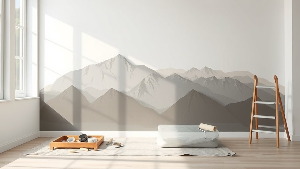
How to Paint Mountains on a Wall (Creative Guide)
You’ll start by choosing style, scale, and placement, then measure the wall and map proportions with a grid or projector. Prep the surface—clean, fill, sand, and prime—then block in bold geometric shapes or textured faces using a limited palette of 3–5 colors. Build depth with cool receding tones and warm foregrounds, add shadows, snow, and atmospheric glazes, and refine edges and details last. Keep going to pick up troubleshooting tips and advanced finishes.
What You’ll Learn: Paint a Mountain Mural
When you finish this guide, you’ll know how to plan, sketch, and paint a mountain mural that fits your wall and style. You’ll learn measuring and scaling so peaks suit the room, basic sketching to map horizons, and selecting a palette for depth.
I’ll show you color blending techniques for smooth gradients and crisp edges, plus layering to suggest light and distance. You’ll get tips on brushes, rollers, and safe materials, plus quick fixes for mistakes.
Finally, you’ll understand mural composition—balancing focal points, negative space, and rhythm—so your mountains read clearly from any angle.
Who Should Try This? Pick Your Difficulty
If you’re new to mural work but comfortable with basic painting, this project’s for you—start with simplified shapes and a limited palette so you learn scale and blending without getting overwhelmed.
If you’ve done wall work before, step up complexity: add layered ridges, gradients, and more advanced color blending techniques to suggest depth.
For experienced painters seeking a challenge, incorporate texture, glazing, and stylized compositions driven by strong artistic inspiration.
Choose a difficulty that matches your time, tools, and confidence.
Progress incrementally: master basics, then try intermediate steps, and finally tackle ambitious, detail-rich mountain murals.
Quick Weekend Plan: 1-Day vs Multi-Day Builds
Decide up front whether you want a one-day sprint or a relaxed multi-day build, because that choice shapes your design, materials, and timeline.
If you’ve got one day, pick a simple composition, limit color blending to quick gradients, and use fast-drying acrylics and rollers.
For multi-day builds, plan layers: undercoat, detailed peaks, glazes, and drying between sessions so richer color blending and more complex technique variations become manageable.
Schedule breaks for sanding and sealing. Pack appropriate brushes, tapes, and drop cloths based on duration.
Match scope to time so you finish confidently without rushing or overextending.
Choose Style, Scale, and Placement
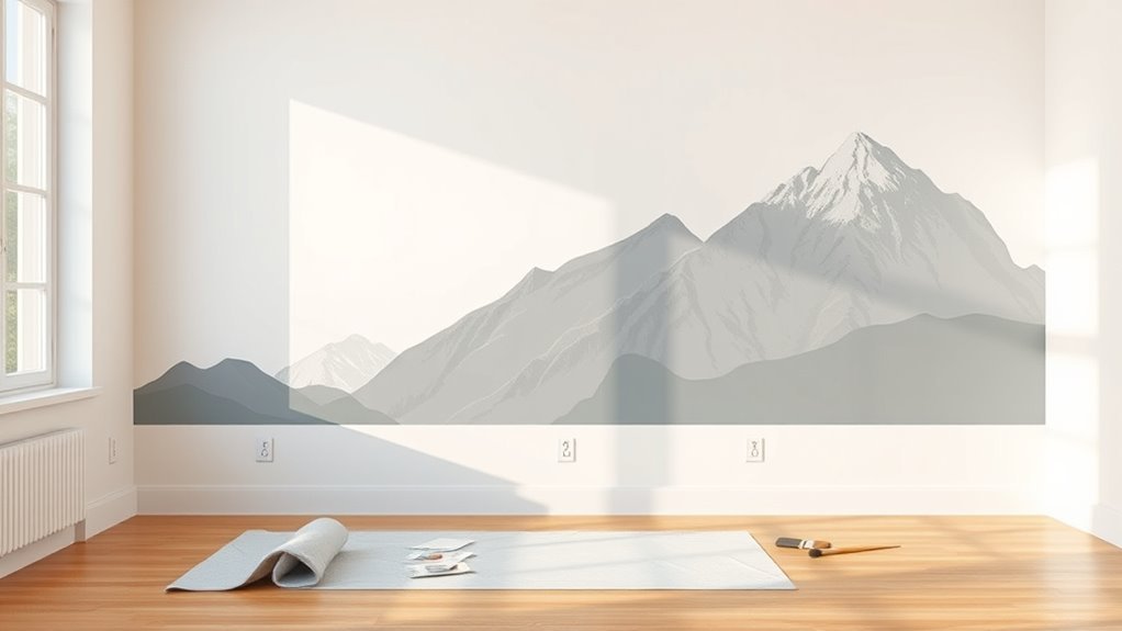
Because the style, scale, and placement determine how the mural reads in the room, pick them together rather than one at a time. Decide whether you want stylized silhouettes, photoreal peaks, or abstract ridgelines influenced by your artistic inspiration.
Match scale to sightlines: large, low mountains suit big walls; delicate ranges work above furniture. Consider focal points and traffic flow so peaks won’t clash with doors or shelves.
Use color blending to *gradually shift* sky to summit and tie the mural into existing decor. Sketch alternatives on paper or tape outlines on the wall to confirm the combined effect before painting.
Measure Your Wall and Map Proportions
Start by measuring your wall height and width so you know the exact canvas you’re working with.
Use those dimensions to set a scale for your mountains so proportions look right from your usual viewing distance.
Mark key placement points lightly on the wall to map where peaks, valleys, and the horizon will sit.
Wall Dimensions First
Before you pick colors or sketch peaks, measure the wall and note its height and width in feet or meters so your mountain design fits the space.
Next, mark floor, ceiling, and corners with a pencil or painter’s tape so reference points stay clear.
Divide the surface into a simple grid to transfer sketches proportionally, and record key measurements for peak heights and valley depths.
Consider how existing outlets, windows, and trim interrupt the composition.
Note surface type—drywall, plaster, or concrete—since it affects paint adhesion and texture techniques.
These dimensions guide your color blending choices and material planning.
Scale And Placement
When you’ve got your wall measurements, translate them into a simple scale—say 1 inch equals 1 foot—so you can map peak heights and valley widths on paper before committing paint to drywall. Use that miniature grid to position focal peaks, ridgelines, and negative space so sightlines flow naturally across the room.
Mark horizon and eye-level to keep proportions believable. Transfer key points to the wall with light pencil or chalk, measuring from floor and corners to avoid drift.
Plan areas for Color blending and designate surfaces for different Texture techniques so your composition balances depth, contrast, and tactile interest.
Materials for a Mountain Mural
Curious what you’ll need to paint a mountain mural? Gather quality acrylic or latex paints, brushes (flat, round, angled), rollers, a tray, painter’s tape, drop cloths, and a ladder.
Include sponges, palette knives, and rags for Color blending and Texture techniques that add depth.
Use a pencil and level for sketching, a projector or grid if you want precise transfer, and sandpaper for minor wall prep.
Keep a mixing palette, water bucket, and mild detergent for cleanup. Have spare containers for mixed colors, gloves, and good lighting.
These essentials keep your process efficient and your mural durable.
Best Paint Finish and Base Coat
If you want your mountain mural to look crisp and last, choose a satin or eggshell finish for the topcoat—these balances reflectivity and washability without highlighting wall imperfections—and start with a proper base coat of primer or tinted primer to guarantee true color and even coverage.
You’ll prep by repairing flaws and sanding lightly, then apply primer to seal porous surfaces. Pick a finish that suits traffic and cleaning needs.
Use tinted primer to reduce coats and make color palettes truer. Consider texture techniques sparingly: subtle knockdown or light sponging adds depth without competing with your mountain shapes.
Mountain Color Theory Basics
Now that your wall’s prepped and primed, start thinking about color relationships that make mountains read realistically and artistically. You’ll choose palettes that reflect depth: cool tones recede, warm tones advance.
Use color blending to shift ridges and valleys smoothly, mixing nearby hues on a palette before glazing on the wall. Establish light source direction and apply shade contrast to define planes—darker, desaturated tones for shadow faces, lighter, warmer tones where light hits.
Limit your core palette to three to five related colors, add one accent for interest, and test swatches on scrap board to confirm harmony before committing.
Set the Mood: Bold Peaks or Soft Ranges
When you decide whether to paint bold peaks or soft ranges, think about the emotional tone you want the room to carry.
You choose bold peaks to energize: sharp silhouettes, high contrast, and saturated hues create drama and focus.
Pick soft ranges to soothe: blended edges, muted tones, and gentle shifts support the mood—vivid ombré for intensity, pastel fades for peace.
Consider mountain symbolism too: jagged forms suggest challenge and resilience, rounded masses suggest safety and rest.
Match scale and color to function so the mural serves the room’s mood.
Sketch a Simple Mountain Layout
Start by sketching the basic outline shapes of your peaks with light, confident strokes so you can adjust as you go.
Think about placement and proportion—vary peak heights and spacing to guide the eye and keep the composition balanced.
Keep the lines simple and use reference points on the wall to maintain consistent scale.
Basic Outline Shapes
Wondering how to lay out your mountain composition? Start by sketching simple geometric peaks—triangles, trapezoids, and gentle curves—to establish silhouette hierarchy without detailing placement or scale. Use light, confident strokes so you can adjust shapes easily.
Mark ridgelines and valleys with single lines; suggest overlapping by erasing small sections where forms meet. These outlines guide later color blending and texture techniques but stay minimal now.
Avoid intricate features; focus on clear, readable shapes that read from a distance. Keep proportions flexible; you’ll refine slopes, shadows, and foreground elements in subsequent steps.
Placement And Proportion
If you want your mural to feel balanced, sketch a thumbnail grid on the wall and block in your main peaks using simple shapes that respect the rule of thirds—place key ridgelines near the intersections so focal mountains don’t sit dead center.
Start with varied triangle sizes to suggest depth, staggering heights to avoid perfect mountain symmetry unless you want a mirrored look.
Mark horizon and midground lines, then refine placement so paths and valleys lead the eye.
Consider where color blending will sit—reserve lighter tones for distant peaks and richer hues foreground—to keep proportions readable from across the room.
Use Painter’s Tape and Stencils
When you want crisp ridgelines and repeatable shapes, use painter’s tape and stencils to map out the mountain forms before you paint. You’ll apply tape for sharp edges, cutting away segments to create jagged peaks and terraces.
Use thoughtful stencil design for consistent silhouettes and to speed up layered repeats. Mask valleys to protect lower tones while you practice color blending across slopes, working wet-on-wet for smooth gradations or dry-brushing for texture.
Remove tape slowly at a 45° angle to avoid tearing paint. Keep spare stencils, clean edges between uses, and test placements on scrap before committing to the wall.
Grid the Wall for Accurate Transfer
Because accurate mountains start with a reliable map, grid the wall before you transfer your sketch so scale and placement match your design. Measure and mark a consistent grid with a pencil and level; use larger squares for big shapes, smaller for detail. Account for wall texture when choosing pencil hardness so lines stay visible but removable. Transfer reference points square by square, checking proportions as you go. Keep a swatch for color mixing nearby to test tones against the wall. Use the table below to track scale and notes.
| Grid Size | Notes |
|---|---|
| 12″ | Broad shapes |
| 6″ | Detail and edges |
Prep: Clean, Prime, and Protect the Room
Before you start painting mountains, you’ll want to clean the walls thoroughly to remove dust, grease, or loose paint so the mural will adhere properly.
Pick a primer that matches your wall type and the paint you’ll use to guarantee even coverage and true colors.
Finally, cover floors and furniture with drop cloths or plastic and tape edges to protect the room from drips and splatters.
Clean Walls Thoroughly
Although it’s tempting to jump straight into painting, you’ll get a far better finish if you clean the walls thoroughly first. Start by removing dust, cobwebs, and grease with a microfiber cloth and mild detergent; rinse and let dry.
Scrape loose paint, fill holes, and sand repaired spots so wall texture is consistent. Degrease areas near stoves or vents to improve adhesion.
Wipe down again before taping edges and protecting floors and furniture. Clean walls boost paint durability and reduce peeling or blotchy patches, giving your mountain mural a smooth, long-lasting base to work from.
Choose The Right Primer
Why choose a primer? You want an even base that helps paint adhere, hides stains, and reveals true color for your mountain mural. Pick a primer suited to your wall—drywall, plaster, or previously painted surfaces—and choose one with good tinting capability so your color blending reads accurately.
A primer with slight tooth can support texture techniques like sponging or ragging without paint sliding. Use a stain-blocking formula where needed, and consider an acrylic primer for flexibility.
Apply thin, even coats, let them dry fully, and sand lightly if you need a smoother surface before starting your design.
Protect Floors And Furniture
Now that your walls are primed and smooth, protect the rest of the room so paint mishaps don’t undo your work. Start by moving small items out; cover larger pieces with drop cloths or plastic sheeting, securing edges with painter’s tape for furniture safety.
Lay canvas or heavy-duty plastic over floors, overlapping seams and taping to baseboards to guarantee floor protection. Use cardboard or rosin paper along high-traffic paths.
Elevate furniture on blocks if you need access to baseboards. Keep a stash of rags, a trash bin, and a small broom nearby for quick cleanup.
Work methodically to avoid stains.
Mix Base Colors for Your Palette
Before you start layering details, mix a few clean base colors that’ll anchor your mountain palette: choose a mid-tone for the main slopes, a darker value for shadowed faces, and a cooler or lighter hue for distant ridgelines. You’ll test mixes on scrap paper, adjusting saturation and temperature until each reads distinctly.
Practice color blending to create smooth gradients between slopes and sky washes. Use flat and filbert brushes for broad coverage, switching to round tips for edges.
Keep mixes nearby in shallow trays so you maintain consistent hues. Clean brushes between mixes to avoid muddying tones and preserve clarity.
Mix Highlights and Shadows
With your base tones ready, start mixing highlights and shadows that will give the mountains form and depth.
You’ll adjust hue and value with subtle color blending, adding small amounts of white, warm ochre, or cool blue to shift temperature. Test mixtures on scrap paper, noting which read as sunlight or shade.
Consider shadow positioning: decide where light hits the range, then darken opposing planes and crevices for contrast. Keep edges crisp where ridges catch light and soft where snow or mist diffuses it.
Work in layers, refining highlights and deepening shadows until the mass reads believable.
Block in Large Shapes First
Start by choosing the dominant color that will set the mood for the whole range.
Then sketch the main mountain silhouettes to establish scale and composition across the wall.
Keeping these large shapes clear will make adding details and highlights much easier.
Choose Dominant Color
Which color will set the mood of your mural? Choose one dominant hue that aligns with color psychology—cool blues calm, warm ochres energize. Paint the largest planes with that color to unify space and guide focus.
Keep contrasts subtle at this stage so tonal harmony emerges across adjoining areas; mix tints and shades of the same hue rather than introducing new pigments. Working big lets you assess balance before refining.
Use large brushes and confident strokes to lay the foundation quickly. Once the dominant color feels right, you’ll have a coherent base for later details without reworking overall mood.
Establish Mountain Silhouettes
As you block in mountain silhouettes, focus on large, confident shapes that read from across the room rather than tiny details up close. Sketch bold, varied peaks with a charcoal or light paint wash, keeping edges crisp where ranges overlap.
Lay in your Sky gradients first so values guide silhouette contrast; darker skyline bands make foreground mountains pop. Use a broad brush to fill mass quickly, then refine ridgelines sparingly.
Establish Mountain shadows consistently to suggest depth—decide a light source and paint shadow planes across multiple peaks. Stand back often; adjust scale and spacing until the composition reads well at distance.
Create Soft Gradients and Atmosphere
When you glaze the mountains with thin, semi-transparent layers, you’ll build soft gradients that push distant peaks back and pull nearby ridges forward; you’ll use color blending to suggest haze and temperature shifts, creating believable atmospheric depth.
Work from light to dark, loosening edges on far forms and sharpening closer ones. Control water and pigment for smooth gradations, lifting paint for highlights. Step back often to judge values and unify tones.
- Layer cool, desaturated washes for distant planes.
- Add warmer, higher-contrast glazes on foreground ridges.
- Blur overlaps with a dry brush.
- Use subtle neutral grays to tie colors.
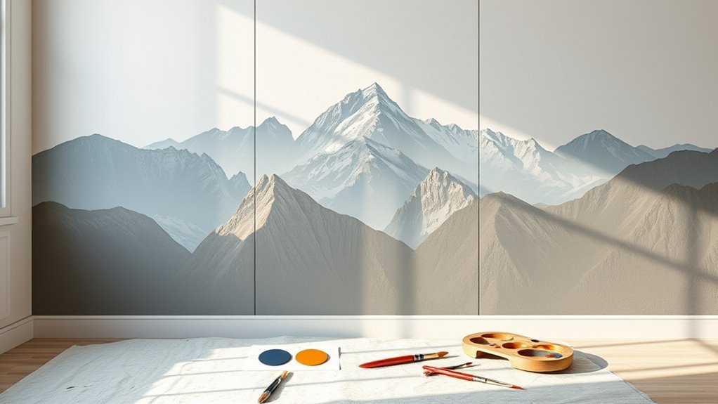
Paint Bold Geometric Mountains Step-by-Step
If you want bold, geometric mountains that read clearly from a distance, start by blocking major planes with flat, solid shapes and a limited palette; this gives you a strong graphic foundation to refine. Sketch crisp mountain shapes, tape edges for clean lines, and pick three values per peak. Apply flat fills, then use minimal Color blending at joins to suggest planes without softening edges. Step back often to check silhouette. Use contrast to separate layers and keep compositions readable.
| Stage | Tool | Tip |
|---|---|---|
| 1 | Pencil | Define silhouettes |
| 2 | Tape | Keep edges crisp |
| 3 | Brush | Layer values |
Paint Textured Rocky Mountain Faces
Before you start, you’ll want to prep the wall with patching, sanding, and a suitable primer so your texture layers will stick.
Use a mix of base coats, additive mediums, and varied tools like palette knives and stipplers to build up realistic rock surfaces.
Finish by sculpting natural shadows and highlights with thin glazes to sell the depth and form.
Surface Preparation Steps
Although the wall might look ready at first glance, you’ll need to clean, repair, and prime it to guarantee textured rocky faces adhere and look realistic. You’ll also consider sky symbolism and mountain legends to guide color choices and focal points. Follow practical steps so paint and texture last.
- Wash surface with mild detergent, rinse, and let dry completely.
- Patch holes, sand rough spots, and remove loose plaster or flaking paint.
- Apply a suitable primer for masonry or drywall; use bonding primer on slick surfaces.
- Mask edges and protect floors, then test a small texture patch for adhesion.
Layered Texture Techniques
When you start layering texture for rocky mountain faces, work from broad to fine so each pass builds believable form and depth. You’ll block in large shapes with a stiff brush or roller, adding joint compound or texture paste for high-relief areas.
Use Color blending as you apply successive layers, shifting hues while the medium’s still tacky to fuse gradations.
For Texture layering, alternate tools—palette knife, sponge, rag—to vary granularity and catch light differently. Let each layer cure enough to hold detail, then scumble or scrape selectively to suggest strata and roughness without overworking the surface.
Natural Shadow Detailing
Now that your texture layers are holding shape, focus on natural shadow detailing to suggest the rock’s three-dimensionality. You’ll study light angle, deepen crevices, and blend edges so mountain shadows read believable. Use thin washes to glaze shadow planes, then lift highlights where rock catches light. Keep strokes confident; avoid overworking rough faces. For consistency, map primary light source before darkening.
- Define major shadow blocks with a cool mid-tone.
- Enhance micro-shadow in cracks with a thin, darker glaze.
- Soften transitions using a dry brush for natural shading.
- Reserve sharp highlights to imply ridges and chips.
Add Snow Caps and Ice Details
Once your mountain shapes are established, add snow caps and icy streaks to give them realistic peaks and depth. You’ll block in Snow accents with a crisp, cool white where slopes catch light, keeping edges irregular to mimic windblown drifts.
Use a dry brush or palette knife for Ice textures along ridges and crevices, pulling thin, directional strokes downward to suggest frozen runoff. Blend minimally so highlights stay sharp against darker rock.
Step back often to check balance, and vary intensity across peaks so some look sunlit while others remain frosty, enhancing overall realism without overworking.
Paint Mist and Fog With Glazes
As you glaze over the lower slopes with thin, translucent layers, mist will read as soft, receding atmosphere rather than a solid color. You’ll use Mist layering and subtle Fog blending to suggest distance without hard edges. Work horizontally, feathering brushes and wiping excess to keep translucency. Build depth slowly; each glaze should change value slightly.
- Start with diluted neutral base to set tonal range.
- Apply successive glazes lighter toward the horizon.
- Soften shifts with a dry, clean brush or rag.
- Step back frequently to judge density and maintain aerial perspective.
Add Trees, Ridgelines, and Foregrounds
When you start adding trees, ridgelines, and foreground elements, think of them as the anchors that give your mountain scene scale and focus. Place stronger contrasts and sharper edges closer to the viewer and let forms soften as they recede.
You’ll sketch ridgelines to break mountain silhouettes, align trunks and boulders with suggested light, and use darker values for mountain shadows to suggest depth.
Vary tree size and overlap to imply distance, referencing sky gradients for subtle backlighting. Paint ground textures and pathways that lead the eye, keep edges crisper in front, and simplify shapes as they move toward the mist.
Use Sponges, Rags, and Palette Knives
Choose sponges, rags, and palette knives based on the textures you want to achieve and the scale of your mural.
Practice sponge techniques to stamp rock faces and snow highlights with varied pressure and paint load.
Use palette knives to push, scrape, and subtly blend layers for sharp ridgelines and soft gradations.
Choose Appropriate Textures
Although brushes give you control, sponges, rags, and palette knives add the irregular, tactile marks that make painted mountains feel real. You’ll match texture patterns to your wall finishes, choosing coarse tools for rough stucco or softer sponges for smooth drywall. Test combinations on a scrap board, noting how each tool alters light and shadow.
Vary pressure and angle to create strata, scree, and snowy caps without overworking the paint.
- Use a stiff palette knife for rocky ridges.
- Dab a natural sponge for weathered slopes.
- Drag a rag for wind-swept streaks.
- Layer tools for depth and cohesion.
Master Sponge Techniques
If you want textured, believable mountain faces, master a few sponge motions and you’ll transform flat paint into rugged terrain. Use natural sea sponges and torn rags to dab, stipple, and lift—vary pressure for craggy highlights and soft slopes.
Rotate tools to avoid repeating patterns; texture experimentation teaches you which motions match rock types. Work wet-on-wet for seamless color blending, then lift paint to reveal veins and ledges.
Reserve palette knives for scraping edges and small accents, not broad blending. Step back often, adjust contrast with a light touch, and let irregularity sell the illusion of real stone.
Blend With Palette Knives
When you want crisp ridges and seamless shifts at the same time, reach for palette knives alongside your sponges and rags: the knives push, pull, and feather paint in ways brushes can’t, letting you carve sharp edges, blend slopes, and add tiny highlights without overworking the surface.
You’ll expand your texture exploration and achieve controlled palette blending by alternating tools. Scrape to reveal underlayers, drag to soften a skyline, dab with a rag for mottling, then refine with a knife tip. Practice pressure, angle, and paint load to get predictable results.
- Scrape reveal
- Drag soften
- Dab mottling
- Tip refine
Fix Mistakes and Revise Composition
Because paint layers can hide proportion issues, step back regularly and spot what’s off; fix obvious mistakes first—smudges, drips, or misplaced lines—then reassess the overall composition. You’ll correct edges, adjust silhouettes, and rethink balance while preserving color blending and texture layering. Use thin washes to lift errors or scrape gently with a palette knife. Rework focal points until the scene reads from a distance.
| Issue | Fix |
|---|---|
| Smudge | Lift with solvent |
| Drip | Sand/light scrape |
| Misplaced line | Paint over |
| Off balance | Shift elements |
| Harsh spot | Soften with wash |
Crisp Edges vs. Soft Blends: When to Use Each
You’ll use crisp edges to pick out rock faces, ridgelines, and any features you want viewers to read clearly from a distance.
Soft blends work best for atmospheric effects like mist, distant slopes, and the way light wraps around forms.
Balance the two—sharp accents against gentle gradients will give your mural depth and realism.
Crisp Edges For Detail
Although soft blends give mountains atmosphere, crisp edges define form and focal points, so use them where rock faces, ridgelines, and foreground details need clarity.
You’ll sharpen mountain textures with a steady brush, carving planes and fractures so light reads correctly. Prioritize edge crispness on nearer features and where sunlight hits; this anchors composition and guides the viewer’s eye.
Avoid over-crisping distant forms. Use contrast, thin highlights, and controlled negative space to separate layers.
Practice varying edge weight to suggest scale and solidity without harshness.
- Define ridgelines
- Carve rock planes
- Add thin highlights
- Control edge weight
Soft Blends For Atmosphere
When you want to suggest distance, mood, or softness, blend edges and tones so forms recede into atmosphere rather than compete for attention. You’ll rely on subtle color blending to soften ridgelines, mute contrasts, and hint at haze.
Work wet-on-wet or use a dry brush to gradually shift transitions; thin glazes create depth without losing structure. Reserve crisp edges for focal points, then let background planes dissolve with cooler, desaturated hues.
Pay attention to light direction and layer atmospheric effects—mist, glare, and diffused shadows—to guide the eye. Your restraint will make the scene feel expansive and believable.
Paint Mountain Silhouettes for Night Scenes
If you want a dramatic night scene, start by blocking in crisp mountain silhouettes against a deep, even sky. You’ll work with high silhouette contrast to make peaks read clearly, keeping edges sharp and shapes varied.
Use a dense Night sky color behind the forms, then refine ridgelines and negative space. Keep foreground shapes darker to push distance.
- Simplify peaks into bold shapes.
- Use a flat, even wash for the sky.
- Sharpen edges with a small brush for clarity.
- Add tiny highlights sparingly to suggest moonlight on selected ridgelines.
Three-Color Mountain Palettes and Limited Schemes
Start by choosing a three-color triad that balances warm and cool tones so your ranges of light and shadow feel natural.
Try an accent-neutral contrast—use a bold hue for ridgelines or focal peaks against muted backgrounds to guide the eye.
You can also go almost monochrome and add a single pop color to create instant drama without complicating the scheme.
Balanced Warm-Cool Triads
Curious how three colors can give your mountain mural depth and harmony? You’ll pick a warm hue, a cool hue, and a muted bridge to control color contrast and guide viewers’ focus. Use texture variation—brushstrokes, scumbling, and palette knife marks—to separate planes and suggest distance.
Balance saturation so warm peaks advance, cool shadows recede, and the neutral tie keeps unity. Apply values deliberately: light on ridges, dark in creases, medium on mid-slopes.
- Choose warm dominant, cool secondary, muted connector.
- Test trio on paper for value balance.
- Layer textures per plane.
- Edit saturation sparingly.
Accent-Neutral Contrast
When you limit your mountain palette to an accent and two neutrals, the accent sings without overwhelming the scene. You pick a bold hue for ridgelines or a focal peak, then balance it with warm and cool neutrals to achieve color harmony.
Use the accent sparingly—edges, snowcaps, or a distant valley—to guide the eye. Employ texture contrast by varying brushwork: smooth washes on distant slopes, thicker strokes where the accent lands. This limited scheme keeps composition coherent, simplifies decisions, and lets mood read clearly.
You’ll craft striking mountains with minimal colors and maximum impact.
Monochrome With Pop
If you limit yourself to a single base hue plus two restrained accents, you’ll get a bold, elegant mountain mural that reads clearly from across the room. You’ll choose tones that align with color psychology—calming blues or energetic corals—and use accents to punctuate peaks or trails.
Keep contrast purposeful so forms stay legible when mural resizing shrinks the scene. Balance texture and matte finishes to keep the scheme cohesive.
- Pick base hue for mood.
- Select two accents sparingly.
- Test small-scale mockups for resizing.
- Use finishes to control depth and focus.
Scale a Mural Design From Paper to Wall
Before you paint, translate your paper sketch into a wall-sized grid so proportions stay accurate and placement feels intentional. Measure your wall, pick a grid scale (for example, 1 inch = 6 inches), and draw matching squares on your sketch.
Transfer key points—peaks, horizons, focal slopes—square by square. Consider wall texture when choosing paint types and brush sizes; rough surfaces need thicker lines and bolder shapes.
Mark approximate color blending zones on the grid to guide gradients and progressions. Use light pencil or chalk lines you can erase.
Step back often, adjust proportions, and keep measurements consistent for a faithful mural.
Time-Saving Shortcuts for Weekend DIYers
Start by prepping efficiently so you’re not scrambling for tape, primer, or the right brushes mid-job. Use paint shortcuts like pre-mixed gradient kits, multipurpose rollers, and tintable base coats to speed up layering.
Finish with quick cleanup tips—wrap rollers in plastic between coats, use disposable drop cloths, and soak brushes in warm soapy water right away.
Prep Efficiently First
While you’re excited to roll paint, efficient prep will shave hours off your weekend project and keep the final mural looking professional. You’ll tape clean lines, sand rough spots, and prime selectively so your color blending and texture techniques behave predictably. Gather tools in one tray, layout drop cloths, and mark horizon and peak guides with pencil.
- Tape edges and trim before priming.
- Sand imperfections, wipe dust, then spot-prime.
- Pre-mix small test blends to confirm color blending.
- Organize brushes, rollers, and texture tools for quick swaps.
Prep smartly and you’ll paint faster with fewer mistakes.
Use Paint Shortcuts
If you want to finish a mountain mural over a weekend without losing quality, use smart shortcuts that save time and limit rework. Start with a limited palette and premix gradient washes so color blending happens fast; keep labeled jars for touch-ups.
Use large brushes and a roller for base layers, then switch to a dry brush or sponge for quick texture techniques on ridges and snowcaps. Mask key edges with low-tack painter’s tape for crisp silhouettes.
Work wet-on-wet where practical to avoid sanding, and test swaps on scrap cardboard to confirm values before committing to the wall.
Quick Cleanup Tips
Because you’ll want to wrap up the mural weekend without drowning in brushes and paint cans, focus on a few cleanup shortcuts that save time and keep your workspace tidy. You’ll move faster if you plan cleanup as you paint: keep a jar of water and rags nearby, label trash bags, and reserve a box for leftover supplies.
Prioritize Cleaning brushes immediately to avoid hardened bristles, and follow Disposal tips for unused or hazardous materials.
- Rinse brushes in stages: water, soap, water.
- Use disposable liners for trays.
- Seal paint cans with plastic wrap under lids.
- Sort recyclables and hazardous waste.
Project Timeline: Realistic Time Estimates
When you plan your mountain mural, set a realistic timeline that breaks the job into prep, painting, detailing, and drying stages so you can avoid rushing and get a clean result.
Start with 1–2 days for surface prep and priming, depending on repairs and drying.
Allocate 1–3 days for base layers and color blending, working in sections so edges stay wet for smoother progressions.
Reserve 1–2 days for texture techniques and highlights, letting each layer cure as recommended.
Factor in overnight drying between coats and an extra day for touch-ups and sealing so you’re never pressed for time.
Budget Guide: Low-Cost vs Premium Supplies
Deciding between low-cost and premium supplies comes down to balancing your budget with the look and longevity you want for the mural. You’ll save upfront with budget paints and basic rollers, but premium brands give smoother color blending, stronger pigments, and less rework if you scale the design during mural resizing.
- Budget paints: cheap, decent for practice, may fade faster.
- Premium paints: higher pigment load, easier gradients, costlier.
- Tools: foam brushes vs professional brushes—control vs durability.
- Consumables: tape, primers, and sealers affect finish more than brand alone.
Choose where savings won’t compromise your final vision.
Indoor Safety: Ventilation, Masks, and Cleanup
Good ventilation, the right mask, and a simple cleanup plan will keep your painting project safe and stress-free. Open windows, run a fan toward an exterior vent, and avoid painting in stagnant air. Relocate indoor plants away from fumes.
Choose a certified respirator or disposable mask rated for paint vapors, fit it snugly, and replace filters as recommended.
Lay down drop cloths, seal spills immediately with absorbent material, and bag contaminated rags to prevent sudden combustion. Keep a small kit with soap, solvent per paint instructions, and gloves.
Adjust lighting effects only after fumes clear to avoid breath hazards.
Photograph Progress for Reference and Socials
Start by taking a clear, well-lit shot before you paint each major stage so you can track changes and recreate techniques later. You’ll build a visual diary that shows color harmony choices, brushwork, and layering of Artistic techniques.
Shoot straight-on plus angled detail shots for texture. Keep files organized by stage and date so you can compare progress and note what worked.
- Full-wall overview for composition
- Close-up of brushstrokes and texture
- Reference of palette and mixed tones
- Before/after paired images
Share selected shots on socials with brief notes about technique and palette decisions.
Finishing Touches That Make It Pop
When you’re nearly done, focus on small contrasts and crisp edges that give the scene depth and clarity. Step back, squint, and identify where Color contrast will heighten ridgelines and foreground shapes.
Use a fine brush to sharpen silhouettes and a dry brush to lift highlights; subtle glazing deepens shadows without overpainting.
Sharpen silhouettes with a fine brush, lift highlights with dry brushing, and deepen shadows subtly through glazing.
Add Texture variation—stippling for rock faces, soft washes for mist—to suggest material differences and catch light.
Introduce tiny focal accents, like a sun flare or distant pine highlight, to draw the eye.
Reassess balance, remove stray marks, and let the composition read from both near and far.
How to Seal Your Mural So It Lasts
Before you seal the mural, make sure the paint is fully cured and the surface is clean, dry, and free of dust or grease; this prep determines how well a protective coat will adhere. You’ll choose sealers that respect color and texture while considering mountain symbolism and mural psychology—how viewers respond to sheen and longevity.
Apply thin, even coats, allow proper dry time, and test a small area first. Consider UV resistance and moisture protection to preserve contrast and mood.
- Pick matte, satin, or gloss based on desired effect.
- Use UV-blocking formulas.
- Apply multiple thin coats.
- Maintain ventilation during application.
Adapt Murals for Rented or Temporary Spaces
If you’re working in a rented or temporary space, you can still create striking mountain murals by using removable or low-impact methods that protect the walls and your deposit. Think peel-and-stick decals, temporary wallpaper, or paint-on removable primers that lift off cleanly.
Choose materials that accommodate existing wall texture so decals adhere and wallpaper lies flat. Plan composition on paper or projector to test scale and lighting effects before applying anything permanent.
Use lightweight, layered elements—vinyl peaks, fabric snowcaps, adhesive stencils—to build depth without damage. Keep records of products and placement to simplify removal or transfer.
Common Beginner Mistakes and How to Avoid Them
Although mistakes are part of learning, you can avoid the most common ones by planning calmly and practicing basic techniques first. Focus on simple sketches, test Color blending on scrap paper, and choose the right brushes. Don’t rush layers; let paint dry between coats. Watch proportions and horizon placement so mountains read correctly.
- Overworking detail — step back often and simplify.
- Poor Color blending — mix palettes beforehand and work wet-on-wet carefully.
- Wrong brush techniques — match brush size to stroke and pressure.
- Skipping practice — rehearse gradients and textures on a sample wall.
Troubleshoot Paint Problems and Fixes
If you notice paint smudges, stop and gently lift the excess with a damp cloth before it dries so you don’t spread it farther.
For uneven coverage, add thin additional coats and feather the edges with a dry brush to blend *gradients*.
I’ll cover quick fixes and when to sand or re-prime so your mural looks clean and consistent.
Paint Smudges Fixes
When smudges appear on your mountain mural, don’t panic—most are fixable with a few careful steps. Start by letting the paint fully dry, then gently remove surface marks with a soft eraser or damp cloth before touching up with matching paint and a light feathering technique to blend edges.
Consider how mountain symbolism and color psychology influence your fixes so repairs feel intentional. Work small, test blends, and keep tools clean.
- Lift loose smudges gently with a kneaded eraser.
- Clean oils with mild soap and water; dry fully.
- Thin touch-up paint for seamless layering.
- Feather edges with a soft brush.
Uneven Coverage Solutions
Noticing patchy or streaky areas? You can fix uneven coverage by evaluating your base coat first: sand any raised bits, wipe dust, and apply a thin, even primer if needed.
Work wet-edge to wet-edge and use consistent pressure with your brush or roller to avoid lines. For thin spots, add thin layers rather than heavy coats.
Use texture techniques like stippling or dry-brushing to blend transitions and hide minor flaws.
When merging hues, practice careful color blending on a palette before touching the wall.
Step back often, let each layer dry, and correct small errors with targeted touch-ups.
Upgrade Ideas: Metallics, Glow, and Details
Even a simple mountain mural can feel luxe and alive when you add metallics, glow effects, and crisp details. You’ll refine edges with Color blending and use Texture techniques to catch light. Small upgrades lift the whole scene without overwhelming it.
- Apply thin metallic washes on ridgelines to simulate sun.
- Use phosphorescent paint sparingly for subtle nocturnal glow.
- Add fine brush stippling for rocky texture and depth.
- Highlight foreground silhouettes with sharp, high-contrast edges.
Test finishes on scrap board, layer transparently, and step back often to guarantee balance and restraint.
Integrate Furniture and Decor With Your Mural
Now that you’ve added metallic highlights and subtle glow, plan how furniture and decor will sit within the scene so the mural reads as part of the room, not an afterthought.
Position key pieces where peaks or valleys naturally frame them—beds below ridgelines, consoles at foothills—to reinforce depth.
Use color blending between painted shadows and upholstery or rugs so gradual shifts feel intentional.
Echo mural motifs in throw pillows, plants, or lamps for cohesive furniture integration.
Keep scale consistent: small accessories won’t compete with large silhouettes.
Finally, test arrangements temporarily and adjust finishes or placement until the room and mural breathe as one.
Inspiration Sources and Next Projects
When you’re ready for a new mural, look beyond paint swatches—draw inspiration from travel photos, landscape paintings, and local terrain to shape fresh compositions and palettes. You’ll explore Mountain symbolism to give your scenes meaning and use Artistic inspiration from artists and nature to push styles.
Consider scale, color, and narrative as you plan next projects; experiment with seasons, abstraction, or texture to evolve your technique.
- Photograph hikes for authentic shapes and light.
- Study painters to adapt techniques and palettes.
- Create themed series exploring Mountain symbolism across rooms.
- Build smaller canvases to test bold ideas.
Frequently Asked Questions
Can I Paint a Mural Directly Over Wallpaper Without Stripping It First?
You can, but it’s risky — wallpaper adhesion can fail over time. For proper mural preparation, test adhesion, clean and repair seams, apply a strong primer or bonding coat, and expect shorter mural lifespan unless you strip first.
How Do I Transport Large Amounts of Paint Home From the Store Safely?
You’ll obviously want to juggle five gallons like a circus act, but for safety use sturdy sealed containers, a secured vehicle area, absorbent liners, and cool ventilation—transportation tips that’ll protect paint, people, and paint safety.
What’s the Best Way to Protect Baseboards and Ceiling Moldings?
You’ll protect baseboards with low-tack painter’s tape and drop cloths for baseboard protection, and use ladder-safe painters’ tape or masking film for ceiling molding masking, running a straight edge and sealing edges before you paint.
Can Children or Pets Be in the Room While I Work on the Mural?
Yes — you can, but don’t be reckless like a medieval knight: you’ll prioritize child safety and pet supervision, keep them out of wet paint, secure ladders and tools, use non-toxic paints, and take frequent breaks to check on them.
How Do I Remove or Repaint Small Sections Later Without Visible Seams?
You’ll feather edges, match sheen, and sand lightly before repainting so seamless touch ups blend; work in layered painting steps, letting each layer cure, using thin glazes and matching pigments to hide any repair seams.
Conclusion
You’ve got everything to turn a blank wall into a mountain scene that sings. Start simple if you’re nervous, or go bold with layered peaks, metallic highlights, or glow details—each choice shapes the mood. Measure, map, and work in stages; patch problems fast and let layers dry. Tie the mural to furniture and decor so it feels lived-in. Ready? Take a brush, climb your wall, and make your room a summit.