How to Paint Test Colors on Wall Before Final Paint
You’ll want to paint a 12-inch swatch on the actual wall so you can see true color, sheen, and undertones in your room’s light and next to furniture. Prep the spot, prime any repairs, then use a brush or mini roller and apply two coats, checking morning, midday, and evening light. Label each sample and photograph it from different angles. Follow these quick steps and you’ll get reliable results — keep going to pick the perfect finish and placement.
Quick: Paint a 12-Inch Wall Swatch in 5 Steps
If you want a fast, reliable way to see how a color reads on your wall, paint a 12-inch swatch — it’s small enough to finish quickly and big enough to show true color, texture, and light interaction.
You’ll gather supplies, tape a square, sand and prime if needed, then apply two coats, letting each dry fully. Step back at different times to note shifts in bright or warm light.
Consider color psychology to predict mood and consult historical color trends for context. Record observations and photos.
Repeat with alternatives to compare before committing to the full room paint.
Who This Guide Is For and What You’ll Learn
Whether you’re a DIY homeowner testing a single room or an interior pro narrowing down a client’s palette, this guide shows you how to efficiently test paint on your wall and interpret the results. You’ll learn practical swatching, lighting checks, and how color psychology affects mood and function. You’ll compare finishes for paint durability and choose samples that match real conditions. Use the table below to quickly identify focus areas and outcomes.
| Who | What to Test | Outcome |
|---|---|---|
| DIY | Color under natural light | Confident choice |
| Pro | Client context | Faster approvals |
| Renter | Temporary options | Damage-free change |
| Builder | Finish robustness | Long-term satisfaction |
Why Test Paint on the Wall : Not Just Chips
You’ve learned who should test and what to look for; now see why swatching on the actual wall matters more than looking at small chips.
When you paint a larger patch you’ll see how light shifts hue, how gloss affects sheen, and how scale changes perception—key to color psychology decisions. Chips can’t show undertones, progressions at different times of day, or interactions with furniture and flooring.
Testing also reveals real-world performance: how the formula wears, resists stains, and its paint durability on your surface. Don’t rely on tiny samples; try several wall-sized swatches before committing.
When to Test During Your Painting Timeline
Plan to test colors at three key points so you can catch issues early, after priming, and right before the finish.
Start in the planning stage to rule out palettes you won’t love.
Then test on a primed wall and again on the final day to confirm the look under actual light and finishes.
Early Planning Stage
Because lighting and wall texture change how paint reads, test colors early in your schedule—before prepping or buying full cans—so you can adjust choices without wasting time or money. In the early planning stage, you’ll map testing to natural light cycles, peak activity areas, and furniture placement.
Include swatches that explore color symbolism for mood-setting and reference historical palettes if you’re aiming for period-accurate tones. Plan small, removable test patches on multiple walls and note time-of-day shifts.
Keep samples labeled with brand, formula, and date. This lets you refine choices, compare undertones, and avoid costly repainting later.
After Primer Applied
Once the primer’s dry, start your color tests on that neutral base so you’ll see how the paint actually behaves on a prepared surface. Apply small swatches in different lighting zones—morning, midday, evening—to note shifts and saturation.
Use test strips and labeled samples so you’ll compare tones easily. Consider color psychology: decide if you want calming, energizing, or neutral effects and see how each swatch supports that mood.
Reference historical palettes for inspiration if you’re matching period details. Don’t finalize choices yet; testing after priming reveals true opacity, undertones, and finish before full coats.
Final Day Trial
When you’re ready for the final day trial, pick a full daylight period to evaluate the color across morning, midday and evening light so you can see real-world shifts.
You’ll paint a few 2×2-foot swatches on primed wall, note how hue affects mood and use color psychology to confirm the emotional tone you want.
Check finish with your *desired* lighting and test for paint durability by rubbing gently after drying.
Take photos at each timepoint and compare.
- Morning: soft, cool tones
- Midday: true color, highest brightness
- Evening: warm shifts, shadows
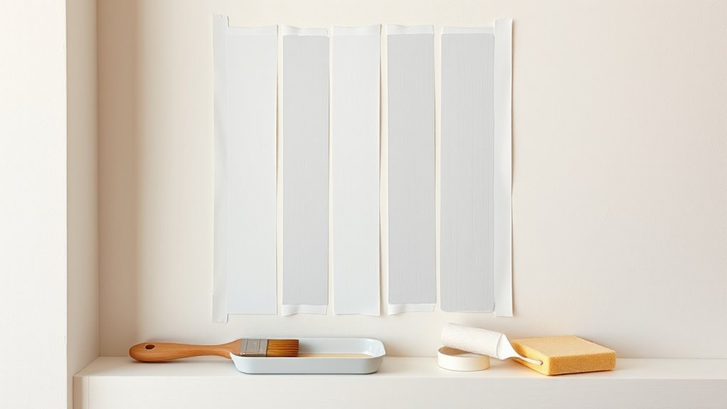
Supplies for Low-Mess Paint Test Swatches
You’ll want a few low-mess tools—foam brushes, mini rollers, and painter’s tape—to keep swatches neat and controlled.
Protect floors and furniture with drop cloths and use plastic sheeting or paper to shield nearby surfaces.
With the right supplies, you’ll get accurate color samples without a big cleanup.
Low-Mess Painting Tools
If you want clean, accurate test swatches without the usual drips and smears, the right low-mess tools make all the difference. You’ll want tools that let you judge color blending and paint durability without extra cleanup.
Choose compact trays and mini rollers that hold just enough paint, angled sash brushes for crisp edges, and disposable stir sticks. Use painter’s tape for neat borders and peel-away adhesive swatches to test layered samples.
- Mini roller + small tray
- Angled sash brush
- Disposable stir sticks and peel-away swatches
Surface Protection Essentials
Because test swatches are small but deliberate, protect the surrounding wall and floor with just the right supplies: low-tack painter’s tape to define crisp edges, disposable drop cloths or craft paper to catch drips, adhesive-backed peel-away strips for layered samples, and small corner shields for outlets and trim.
You’ll prep the area with basic surface preparation—cleaning, degreasing, and lightly sanding—so tape adheres and swatches sit flush.
Choose materials that won’t lift existing finish and confirm paint compatibility with tape adhesive and drop cloths.
Keep tools compact: a plastic putty knife, foam brushes, and labeled sample pots for tidy, low-mess testing.
Prep a Wall for Accurate Color Testing
Before you start painting swatches, clear the area and wipe the wall clean so the color reads true against a smooth, dust-free surface. Patch holes, sand glossy spots, and remove grease; uneven texture or grime will skew color psychology impressions and hide real paint durability.
Tape edges and lay a drop cloth to protect trim and flooring. Test near natural and artificial light sources to see shifts. Use primer on repaired areas so samples adhere evenly.
- Clean and degrease
- Patch, sand, and prime
- Protect surrounding surfaces
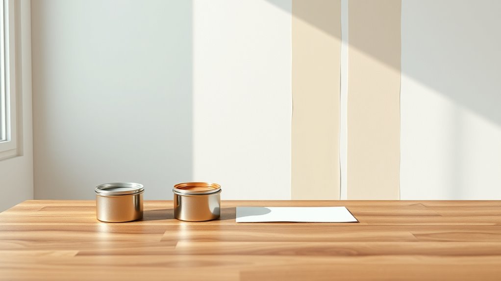
How Much Sample Paint to Buy
When you’re ready to test colors, buy enough sample paint to cover several 12″x12″ to 18″x18″ swatches on different walls and trim. Typically, one 8-oz jar per color will do for a small room, while a larger area or multiple lighting conditions may call for a 16-oz pint.
Choose sizes based on how many walls and the finish you’ll try; gloss uses less than matte. Pick a couple of adjacent shades to study color psychology in the space and note mood shifts under natural and artificial light.
Compare costs and tint accuracy in a paint brand comparison before purchasing.
Sample Pots vs. Peel-and-Stick Swatches
When you’re choosing between sample pots and peel-and-stick swatches, think about cost and how much wall each option will actually cover.
Consider how easy each is to apply and remove, especially if you’ll be testing multiple colors.
Don’t forget that pots give true paint aging on the wall, while swatches may not show how the color will hold up or change over time.
Cost And Coverage
Curious which test option gives you the most bang for your buck? You’ll weigh cost against coverage and real-world insight.
Sample pots cost more upfront but let you see color psychology in context and test paint durability on your surface.
Peel-and-stick swatches are cheap, quick, and waste less, but they don’t show finish or longevity.
- Sample pots: higher cost, larger coverage, true finish and durability tests.
- Peel-and-stick: low cost, limited coverage, good for quick color checks.
- Hybrid: a small pot plus a few swatches balances budget and realistic results.
Application Ease
Although peel-and-stick swatches make testing effortless—you just stick them on and step back—sample pots give you a more realistic sense of how paint handles. You’ll brush, roll, or spray onto the wall, see how many coats are needed, and feel the finish under different lighting.
You’ll notice application techniques influence appearance; rolling smooths, brushing leaves texture, and spraying gives uniform coverage. Sample pots let you test color blending between shades and observe paint drying in real time, so you can judge tackiness and sheen.
Use swatches for quick comparison, but rely on samples to evaluate real-world handling and coverage.
Color Accuracy Over Time
You’ll also want to think about how colors hold up over time, since what looks right on day one can shift weeks or years later. When you test, consider sample pots versus peel-and-stick swatches: pots show true finish and allow you to assess paint durability, while swatches illustrate immediate tone and influence of light.
Also factor in color psychology—how fading or yellowing changes mood. Test in multiple spots, watch over days, and simulate cleaning.
- Paint a patch with a sample pot and observe wear.
- Use peel-and-stick swatches to preview hue quickly.
- Reassess after sunlight and cleaning.
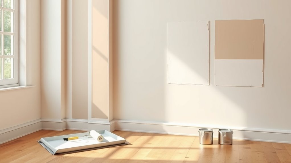
Apply a 12-Inch Vertical Paint Swatch
Wondering how to get a true sense of a color on your wall? Apply a 12-inch vertical paint swatch in a well-lit area, stretching from baseboard toward ceiling to reveal how light shifts hue.
Use a roller for even coverage and paint two thin coats, letting each dry fully.
Label the top with paint name and formula; note time of day and light direction to connect color psychology to how the shade affects mood.
Compare swatches against historical palettes if you’re matching period tones.
Stand back, view at several times, and decide before committing to full walls.
Paint a 4×4-Foot Mock-Up Panel
Pick a visible, well-lit spot for your 4×4-foot mock-up panel so you can judge the color at different times of day.
Clean, patch, and sand the surface, then apply a primer suited to your wall material to guarantee true color and even coverage.
Let the primer fully cure before rolling on your test paint.
Choose Panel Location
Before you start painting the 4×4-foot mock-up panel, choose a spot that represents the room’s typical light and viewing angles so the color reads true. Pick a wall section where you’ll live with the color and test both natural and artificial light.
Consider sightlines, furniture placement, and nearby finishes so your panel placement reflects real conditions.
- Near primary seating to see color at eye level.
- Adjacent to windows to assess daylight shifts.
- On a frequently viewed wall section that shows wear and shadows.
Place the panel where you’ll evaluate it over several days before deciding.
Prep And Prime Surface
Once you’ve chosen the panel location, prep the 4×4-foot area so paint adheres evenly and shows true color. Clean the wall with mild detergent, rinse, and let it dry completely. Sand glossy or rough spots lightly, wipe away dust, and fill holes with spackling; sand smooth when dry.
Apply a high-quality primer compatible with your final paint to make sure paint durability and consistent sheen. Use a roller for even coverage, cutting edges with a brush.
Let primer cure per instructions before testing colors—this gives you an accurate sense of color psychology on the primed surface and reliable performance.
Make Horizontal Gradients to Reveal Undertones
If you want to see how a color shifts across lighting and adjacent tones, create a horizontal gradient on the wall: start with a full-strength swatch at one end, then drag progressively thinner layers of paint toward the other end so the pigment fades evenly across the width.
Use consistent strokes and a damp brush to feather edges; Color blending and Gradient techniques reveal warm or cool undertones beyond a single patch.
Observe at different times of day. Note where the hue reads greener, pinker, or grayer. Record lighting conditions and distance from furniture to judge final impact.
- Feather edges
- Observe daily
- Record results
Test Multiple Colors Side-by-Side Without Bleeding
When you test several colors next to each other, use painter’s tape to create crisp dividing lines so pigment doesn’t wander.
Put down separate primer strips for each swatch to keep colors true and prevent show-through.
Leave a small buffer gap between taped sections if you want to compare hues without any accidental bleeding.
Use Painter’s Tape Lines
Because you’ll want crisp, bleed-free edges between swatches, use painter’s tape to create narrow vertical strips and paint each color inside its own taped section. Press tape edges firmly to guarantee color consistency and prevent seepage.
Paint one coat, let it dry, then add a second if needed. Remove tape slowly at a 45° angle while paint is still slightly tacky for clean lines.
- Use high-quality tape for sharp edges.
- Label each strip so you track sheen and formula.
- Clean edge errors with a fine brush after tape removal.
Apply Separate Primer Strips
Although you want to compare colors side-by-side, apply narrow primer strips between taped sections so each paint sits on the same base without bleeding. This gives truer color reads and prevents one shade from staining its neighbor.
You’ll roll or brush thin primer bands where colors meet, ensuring edges stay crisp. This lets you assess color psychology accurately—hues won’t shift due to underlying tones.
Primer also standardizes surface porosity, improving paint durability and revealing true sheen. Let primer dry fully, then sample your chosen paints.
Clean lines mean reliable comparisons, so you’ll pick a final color with confidence.
Leave Buffer Gap Between
If you want clean separations between test swatches, leave an unpainted buffer gap of 1–2 inches between each color so wet edges don’t touch and bleed into one another. That gap keeps hues distinct so you can judge color harmony accurately and prevents muddy overlaps that hide undertones.
Consider wall texture: rough surfaces need slightly wider gaps because paint spreads unevenly. Tape edges cleanly and use a small brush for control.
Take notes about light at different times of day.
- Leave 1–2″ gaps for smooth walls
- Increase gap for textured walls
- Label swatches and record observations
Best Places to Put Test Swatches
Where should you place your test swatches for the most accurate read on color? Place swatches where you’ll spend time and where interior lighting varies: near windows, in the room center, and by doorways. Also test high-traffic spots to assess paint durability. Avoid corners and only-test strips; use larger patches.
| Location | Why it helps |
|---|---|
| Near window | Shows natural light shift |
| Opposite window | Reveals backlit tones |
| Hallway entrance | Transition shade check |
| Mid-wall | True color under room light |
| Near furniture | Contrast with decor |
Try swatches at different times of day before choosing final paint.
Test Swatches Around Trim and Baseboards
Place swatches right up to trim edges so you can see how crisp the line will look and whether you’ll need extra edging work.
Compare swatches near baseboards to check how the wall color blends with the existing baseboard paint and any sheen differences.
If a swatch shows an awkward shift, you’ll know whether to change the wall color or touch up the trim.
Trim Edge Precision
Although trim narrows your margin for error, testing swatches right up to baseboards and moldings shows how a color truly reads in context. You’ll need trim precision to judge contrast and undertones; edge masking tape helps keep lines crisp while you assess how paint interacts with molding shadows. Work carefully so test strokes don’t overlap trim finish.
Step back under different light to confirm perception. Remove tape promptly to avoid peel.
- Use low-tack edge masking for clean separation.
- Apply vertical swatches to mimic finished brushwork.
- Inspect from sitting and standing heights.
Baseboard Paint Blend
After checking how your swatches meet the trim, shift focus to how the paint reads against baseboards—the small gap or overlap can change perceived color dramatically. Test swatches right at the baseboard edge to see contrast and harmony; lighter baseboards can make walls seem brighter, darker ones deepen tones.
Consider color psychology—how mood shifts near white versus stained trim—and note how sheen affects reflection. Use a small brush to mimic final cutting-in, observe in morning and evening light, and evaluate paint durability at the junction where scuffs occur.
Adjust sample placement until the blend feels intentional and resilient.
Evaluate Color Under Natural Daylight
When you check your test swatches in natural daylight, look at them at different times—morning, midday, and late afternoon—to see how the color shifts with changing sun angles and intensity. You’ll notice how lighting conditions affect warmth, saturation, and mood, influencing color psychology and how comfortable the room feels.
Take notes and photos at each time to compare. Move around the space to view swatches from various angles and distances. Consider how shadows and reflections change perception before deciding.
Take photos and notes at each time, viewing swatches from different angles to account for shadows and reflections.
- Observe at three times of day.
- Photograph swatches for comparison.
- Note emotional impact.
Check Paint Under Artificial Light Sources
How does the paint look under the lights you’ll actually use in the room? Test swatches with each fixture on separately to check lighting consistency and Color perception. Note warmth, shadows, and glare; LEDs, incandescents, and fluorescents all shift tones differently.
| Light Type | Effect on Hue | Notes |
|---|---|---|
| LED | Cooler or accurate | Check CRI and bulb temp |
| Incandescent | Warmer | Deepens reds/ambers |
| Fluorescent | Green/blue cast | May mute warmth |
| Mixed | Variable | Observe from seating areas |
Record observations and choose bulbs that maintain the Color perception you want.
What to Look for at Different Times of Day
Because natural light shifts so much over a day, check your test swatches at multiple key times—morning, midday, late afternoon, and evening—to see how hue, saturation, and contrast change. You’ll notice lighting conditions alter perceived warmth and depth, and the mood influence of a color can flip from calm to energetic. Take photos and notes each time so comparisons are clear.
- Morning: soft, cool light reveals undertones and low saturation.
- Midday: bright, direct light shows true chroma and reflections.
- Evening: artificial blends with dusk, deepening shadows and changing contrast.
How Room Orientation Changes Perceived Color
Where sunlight enters your room changes how a color reads, since north-, south-, east- and west-facing walls each get different natural light.
You’ll see cooler tones in north light and warmer, richer hues on walls that catch morning or evening sun.
Also watch how opposite surfaces—floors, furniture, and curtains—reflect color back onto the test patch and shift its appearance.
Natural Light Direction
Which way does the light come in, and what that direction means for your paint choice can’t be overstated. You’ll notice lighting conditions shift how hues read; color perception changes with angle and intensity, so test swatches at different spots.
Consider these quick checks:
- Observe walls at midday and late afternoon to see strength and warmth.
- View swatches from standing and sitting positions to catch directional shifts.
- Check corners and opposite walls to spot reflected tones and shadows.
You’ll choose a color that stays true in your room’s natural light, not just under store bulbs.
Morning Versus Evening
Now that you know how natural light direction affects swatches, think about how the time of day shifts that light. You’ll notice morning lighting brings cooler, clearer tones into east-facing rooms, making blues and greens appear fresher and brighter.
In contrast, evening ambiance warms west-facing spaces, enriching creamy neutrals and deepening reds. Test strips at different times: tape samples and check them after sunrise and before sunset to see these shifts.
Pay attention to shadow length and color temperature changes so you choose a paint that works both in crisp morning light and in the softer, warmer evening ambiance.
Opposite Surface Influence
Because light bounces off every surface in a room, opposite walls and nearby finishes can dramatically change how a paint color looks on your chosen wall. You’ll notice shifts depending on room orientation, nearby colors, and surface texture; that influences mood through color psychology as much as hue.
Test large swatches opposite different finishes and view at multiple times. Consider reflections from floors, curtains, and furniture.
- Test opposite a dark wall to see deepening.
- Test opposite a glossy surface to see sheen and bounce.
- Test opposite warm-toned furnishings to spot warmth shift.
How Texture and Finish Affect Color Look
When you test paint, remember that texture and finish change how a color reads. You’ll notice matte soaks light, feeling softer and calmer (useful for color psychology), while glossy reflects more, appearing brighter and bolder. Rough textures break highlights, muting tones; smooth surfaces sharpen them. Consider paint durability for high-traffic areas—gloss cleans easier. Test samples on the actual wall and view at different times.
| Finish | Texture | Effect |
|---|---|---|
| Matte | Smooth | Subtle, cozy |
| Gloss | Smooth | Vivid, reflective |
| Matte | Rough | Muted, deep |
| Satin | Slightly textured | Balanced, durable |
How Many Coats for Accurate Test Results
Although one coat can give you a hint, you should apply two to three full coats to get an accurate sense of the final color—especially with lighter or highly pigmented paints.
You’ll see true depth, undertones, and how light interacts with the hue, which matters for color psychology and mood decisions. Multiple coats also reveal how the paint lays and hints at paint durability on your surface.
Wait for full drying between coats, test on the actual wall area, and view at different times of day.
- Apply two coats, inspect.
- Add a third if coverage’s uneven.
- Note drying color shifts.
Test for Sheen and Finish Differences
If you want to see how light and texture change a color, test different sheens side by side on the wall—flat, eggshell, satin, semi-gloss, and gloss each reflect light differently and can make the same pigment read darker, shinier, or more vivid.
Apply narrow strips of each sheen with the same pigment and view at different times and angles. Note how sheen alters mood and color psychology—high gloss feels energetic, flat feels calm.
Also weigh paint durability: higher sheen resists scuffs and cleans easier. Record observations so you choose the finish that balances appearance and practical needs.
Compare Swatches With Furniture and Flooring
Because paint can read differently next to fabrics and flooring, take your swatches into the room and set them beside sofas, rugs, and wood samples to see how they interact. You’ll notice how lighting, wall texture, and surrounding tones shift perception; color psychology matters for mood and cohesion.
Compare swatches at multiple times of day and from different vantage points. Use the list below to focus your observations:
- Check contrast with upholstery and rug patterns for balance.
- Evaluate harmony with wood tones and flooring undertones.
- Observe how wall texture alters color depth and emotional impact.
Use Neutral Anchors to Judge Colors
When you judge a test color, anchor it with true neutrals—white, gray, and natural wood—so you can see its undertones without other hues skewing perception. Place small neutral cards or trim samples beside each swatch so your eye reads the paint without bias from patterned fabrics or colorful accessories.
You’ll notice subtle warm or cool shifts that affect Color psychology and inform whether a room feels cozy or crisp. Use consistent lighting for each comparison and evaluate at different times.
Neutral anchors help you decide if a hue supports mood enhancement goals like calm, energy, or intimacy before committing.
Photograph Swatches for Better Comparison
Take photos of your swatches in natural light so the colors stay true.
Include a reference object like a white card or a neutral-painted area for scale and comparison.
Keep your camera settings consistent—same exposure, white balance, and distance—so images are comparable.
That way you can review and pick the best shade without guesswork.
Photograph In Natural Light
If you want an accurate record of how your swatches will look throughout the day, photograph them in natural light rather than relying on indoor lamps. You’ll capture true hues, see undertones, and note how color psychology shifts with warm mornings or cool evenings.
Aim for consistent timing and angle so comparisons match historical palettes you admire. Use a neutral exposure and avoid flash.
- Shoot near a window during midday for balanced light.
- Take photos at morning, midday, and evening to track shifts.
- Use RAW or highest-quality JPG to preserve subtle tones.
Include Reference Objects
Although your swatches show raw color, include familiar reference objects—like a white index card, a neutral gray cloth, or a wood sample—so you can judge contrast and undertones more reliably in photos. You’ll spot warm or cool shifts, assess color psychology effects, and predict how paint durability might look over time. Place references beside each swatch, photograph from the same angle, and note surface texture. Use the table below to organize items, purpose, and quick tips for consistent comparison.
| Item | Purpose | Tip |
|---|---|---|
| White card | Neutral baseline | Keeps exposure honest |
| Gray cloth | Undertone check | Reveals blue/yellow cast |
| Wood sample | Home context | Shows warmth match |
| Metal object | Gloss/reflect | Tests sheen interplay |
Use Consistent Camera Settings
When you photograph paint swatches, keep your camera settings consistent so each image shows true color relationships; use the same white balance, exposure, ISO, and focal length for every shot to avoid misleading shifts. You’ll capture accurate comparisons if you control Camera settings and maintain Lighting consistency.
Use a tripod, lock manual mode, and don’t rely on auto white balance. Shoot at the same time of day or with constant artificial light. Review images on a calibrated screen before deciding.
Small changes skew perception, so standardize your process to make final paint choices confidently.
- Use manual exposure and white balance
- Fix ISO and focal length
- Keep Lighting consistency
Score and Record Your Swatch Impressions
Before you decide, score each swatch on key factors—hue accuracy, undertone visibility, how it reads in morning and evening light, and how it complements furnishings—and jot down short, consistent notes.
Use a simple numeric scale (1–5) for hue accuracy, undertone strength, contrast with trim, and perceived warmth. Note emotional reactions tied to color psychology and practical concerns like paint durability or coverage.
Record lighting conditions and viewing time. Photograph swatches with your consistent camera settings and label files to match written scores.
Later, sort scores to shortlist favorites and justify choices with your documented observations.
Top Color-Testing Mistakes and Fixes
If you skip common testing steps or rush decisions, you’ll misread colors and end up repainting sooner than you’d like. You should avoid testing on tiny chips, ignoring different light, or judging while paint drying.
Consider color psychology—mood and function change perception—so test in the room’s typical light and time of day. Note finish and texture, and wait full dry time before final judgment.
Consider how mood and function shift color—test in the room’s usual light, note finish and wait fully dry
- Test large patches on multiple walls to see real effect.
- Use the same finish and primer as final coat.
- Record conditions: time, light, adjacent colors, and mood response.
How to Spot Hidden Undertones
When you’re testing a swatch, look at it in morning, midday, and evening light so hidden undertones reveal themselves.
Hold a white card next to the sample to see how the color shifts against a neutral.
Also check the paint next to trim, flooring, and nearby walls to spot undertones that only show up in context.
Observe Paint At Different Times
Because light shifts throughout the day, you should check painted swatches in morning, midday, and evening to see any hidden undertones reveal themselves. You’ll notice warmth or coolness change with sunlight and artificial light, affecting color psychology and how a room feels.
Watch edges, glossy spots, and how shadows alter tone. Also consider paint durability under strong sun or lamp heat; fading can emphasize undertones over time.
Take photos at different times to compare.
- Morning: soft, cool light.
- Midday: true, bright light.
- Evening: warm, artificial or sunset light.
Compare With White Card
Now that you’ve seen how light shifts color through the day, bring a plain white card next to your swatches to reveal hidden undertones. Hold the card at eye level and glance quickly — cooler or warmer hues will jump out when contrasted with true white. Note how a beige leans pink, green, or gray; write brief notes.
Consider color psychology: subtle undertones change mood, making a room feel calm or energetic. Also think practically — undertones can affect perceived paint durability over time, showing scuffs or fading differently. Use the card test before deciding to avoid surprises.
Test Adjacent Surfaces Too
If you want your new paint to harmonize with the room, test it next to adjacent surfaces like trim, cabinets, flooring, and countertops. Place small swatches and observe at different times; light and surface sheen can reveal hidden undertones. Note how color blending changes against warm wood or cool tile. Compare edges and corners to spot shifts before committing.
- Paint a 6×6″ sample near trim and baseboard.
- Test beside cabinetry and countertops under real lighting.
- Check how gloss levels interact with both matte walls and shiny surfaces.
Decide based on overall cohesion, not isolated samples.
If the Full Wall Looks Different: Next Steps
When the full wall looks different than your sample swatches, don’t panic—you’re not stuck with a color that feels off. Step back and evaluate lighting at different times; natural and artificial light reveal hues differently.
Consider how surrounding furnishings and color psychology affect perception—warm tones can energize, cool tones calm. If the shade still jars, test a complementary trim or accent wall before repainting everything.
You can lighten or deepen with a glaze or tint rather than replace full cans; practice responsible paint recycling by using leftover paint for trims, touch-ups, or donating usable amounts. Make changes incrementally.
When to Paint a Small Mock-Up Wall (And Why)
Because a full repaint is a big commitment, paint a small mock-up wall when your samples still leave you unsure—this lets you see the color at scale, under real lighting, and next to your furniture before you buy lots of paint.
Do it when lighting shifts through the day, when you want to test color psychology effects in the room, and when you need to evaluate Paint durability finish choices.
Paint a neat 3×3-foot area, observe for several days, then decide.
- Test daytime and evening light
- Check how furniture and textiles react
- Scrub lightly to assess finish durability
Test Exterior Paints on Siding and Brick
Outdoor surfaces behave very differently than interior walls, so you’ll want to test paint directly on siding and brick before committing to a full exterior job. Pick small, visible sections—one on siding, one on brick—and prime if recommended.
Apply samples at actual coverage thickness and observe in morning, midday, and dusk light to note hue shifts and glare. Consider color psychology for curb appeal and neighborhood fit, and compare manufacturer swatches against real samples.
Note how paint branding claims match performance: adhesion, fade resistance, and breathability. Record results, then decide whether tint or finish adjustments are needed.
Test Specialty Paints and Textured Finishes
If you’re tackling specialty paints or textured finishes, test them the same way you’d standard colors—but pay extra attention to application technique and surface prep. You’ll learn how Color blending and Texture effects interact on your actual wall.
Apply small panels with recommended tools, note drying times, and inspect under different lighting. Record the method used so you can replicate it.
- Test with the exact tool (brush, roller, trowel) the finish requires.
- Try Color blending on adjacent swatches to see seams and transitions.
- Assess Texture effects at varying thicknesses and cure times.
Budget Testing Tricks for Renters
After you’ve checked specialty paints and textures on small panels, you can use low-cost methods to test colors in a rental without damaging walls. Use peel-and-stick poster board or foam core to paint swatches—they’re portable and show color psychology effects under different light.
Tape samples near windows and in corners to observe morning and evening hues. Try sample-size cans on removable trim or primed cardboard for accurate finish and to judge paint durability.
Photograph swatches at various times and live with them for several days. When you move them around, you’ll see how scale, light, and wear influence your final choice.
Get a Second Opinion Without Biasing Results
When you ask for a second opinion, choose people who’ll give honest reactions without steering you toward their favorite trends. Friends who know your style and a neutral observer—like a thoughtful neighbor or a sales associate—can balance each other.
Invite them at different times of day so lighting and perceived hue shift reveal true color psychology effects on mood.
Ask focused questions: does it feel calming, energizing, or cramped? Don’t mention brand names or prior favorites to avoid bias.
Also get feedback on perceived paint durability—does texture or finish look like it’ll wear well?
- Pick diverse viewers
- Time visits
- Ask focused questions
When to Hire a Color Consultant
Deciding to hire a color consultant makes sense when your project has high stakes—big renovation budgets, complex lighting, or the need to sell or stage a home—because they’ll save you time, money, and guesswork by recommending palettes that work for your space and goals.
You should also call one if you’re overwhelmed by choices, need cohesive flow between rooms, or face unusual surfaces.
A consultant applies color psychology to influence mood and function, tests samples under real lighting, and can advise on low-VOC paints and Environmental impact.
They’ll help you commit confidently, avoiding costly repainting.
Final Checklist Before Committing to Paint
Before you commit to a full paint job, run one last set of practical checks to avoid costly mistakes. You’ll confirm how light, furnishings, and color psychology interact in the actual room. Test samples at different times, inspect dry finish, and compare manufacturer swatches to your wall chips. Verify sheen, coverage, and compatibility with primers and a chosen paint manufacturer’s recommendations.
Consider mood, traffic, and resale appeal before signing off. If anything feels off, tweak tone or size of painted areas and re-test. Lock in the final color only when function, finish, and feel all align.
- Inspect samples in AM, PM, artificial light
- Check manufacturer instructions and sheen match
- Confirm mood via color psychology, room use
Frequently Asked Questions
Will Paint Swatches Affect My Landlord’s Security Deposit?
Yes — test swatches can affect your security deposit if they violate landlord guidelines; you should get permission, use removable methods (peel-and-stick or primer samples), document condition, and restore the wall to avoid deductions.
Can I Test Colors on Wallpaper Without Removing It?
Yes — you can test colors on wallpaper without removing it, but you’ll need to check wallpaper adhesion first and use primer or isolated test patches because varying paint absorption can alter color and potentially harm delicate paper.
How Long Should I Wait Before Repainting Over a Test Swatch?
A neighbor waited 48 hours after a swatch; you should wait 24–72 hours depending on color drying time and humidity, then perform a paint adhesion test before repainting to guarantee the new coat bonds properly.
Do VOCS or Odors Differ Between Sample Pots and Full Cans?
Yes — you’ll notice differences: sample pots can have lower VOC levels and shorter odor persistence, but formulation varies. You’ll still get smell and off-gassing; check labels and let test swatches ventilate well.
Can I Test Colors if the Wall Has Existing Stains or Smoke Damage?
Of course you can—because nothing screams “fresh” like masked chaos. You’ll need stain concealment primer and smoke masking products, so you can test colors confidently, knowing underlying stains won’t betray your final choice.
Conclusion
Testing paint on the wall saves stress, so stop guessing and start seeing. You’ll sample smartly, slice a simple 12-inch swatch, and study shades at sunrise, sunset, and under fixtures. Share samples with someone who’ll speak straight, skip shortcuts that skew results, and secure serene satisfaction before you splash. If uncertain, call a consultant; otherwise commit confidently. Small swatches lead to sure, satisfying selections—so test thoroughly, then paint peacefully.