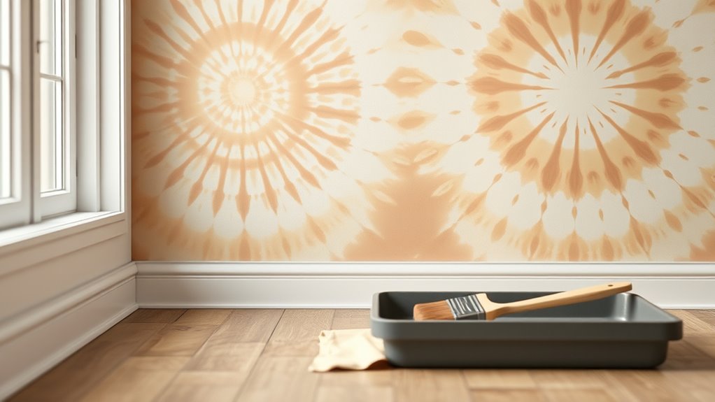
How to Paint Tie Dye on a Wall (Creative Wall Idea)
You can turn a plain wall into a vibrant tie-dye feature by prepping, priming, and planning a simple spiral or radial design, then folding, masking, or taping guides to control color placement. Mix thinned acrylic or latex paints for smooth gradients, work wet-on-wet or in layered glazes, and peel tape while tacky for crisp edges. Control drying with ventilation and finish with a clear sealer. Keep going to learn step-by-step prep, tools, and techniques.
What This Guide Covers
While you may be enthusiastic to grab a paintbrush, this guide first lays out what you’ll learn and why it matters. You’ll get a clear overview of tie-dye wall techniques, materials, and safety tips so you can plan confidently.
You’ll also explore the historical context and cultural significance of tie-dye patterns to inform respectful, inspired designs.
Practical sections preview color theory, surface prep, and common mistakes to avoid.
This guide won’t just give steps; it’ll help you decide which styles fit your space and values, so when you paint, your result is intentional, safe, and visually striking.
Quick How-To: Paint a Tie-Dye Wall in 3 Steps
First, you’ll prep the wall by cleaning, patching holes, and applying a base coat so your colors pop.
Next, mark a center point and use a pencil-guided spiral to keep your pattern even.
Finally, apply your paints in bands along the spiral, blending colors as you go for that classic tie-dye look.
Prep The Wall
Before you splash color, get your wall ready so the paint sticks and your tie-dye pattern looks crisp: clean any dust or grease with a mild detergent. Then repair holes and sand rough patches so the wall texture is even; a uniform surface helps your spiral read clearly.
Prime with a stain-blocking primer suited to your surface—primer boosts adhesion and guarantees colors pop.
Consider color psychology when choosing base and accent hues: warm tones energize, cool tones calm.
Tape trim and cover floors. Let everything dry fully before you start painting so layers go on smoothly and predictable.
Apply Spiral Paint
1. You’ll anchor the spiral at your marked center, then work outward in a steady motion to keep Spiral symmetry. Load a round brush or sponge with your first hue, follow a faint guideline, and place paint in a continuous curve.
Alternate colors as you go, slightly overlapping edges to achieve smooth color blending without muddying tones. Keep strokes consistent in width and pressure; step back often to check balance.
If a band looks heavy, feather its outer edge with a damp brush to soften gradual change. Finish by refining edges and letting the wall dry before sealing.
What Makes Tie-Dye Murals Different From Regular Murals
How do tie-dye murals stand apart from regular murals? You’ll notice they prioritize flow, color blending, and impulsive patterns over literal imagery or tight realism. Tie dye symbolism often conveys freedom, unity, and psychedelic energy, so your mural will read as mood-driven rather than narrative.
Cultural influences—from 1960s counterculture to global textile traditions—shape palette choices and motifs, so you’ll blend historical references with personal flair. Technique emphasizes wet-on-wet washes, radial symmetry, and soft shifts, so you’ll work quickly and embrace unpredictability.
Ultimately, tie-dye murals invite participation and emotion, asking viewers to feel color instead of just observe subject matter.
Which Rooms Work Best for a Tie-Dye Accent Wall
When you pick a room for a tie-dye accent wall, think about how color and energy will interact with the space’s purpose and natural light. You’ll want lively rooms—living areas, playrooms, home offices—where vibrant patterns boost creativity and mood.
Bedrooms can work if you prefer a soft palette and calming swirls. Consider interior lighting: north-facing rooms need warmer hues or supplemental lamps; bright south-facing spaces let you use bolder contrasts.
Check wall texture—smooth surfaces yield crisp patterns, while textured walls create organic, diffused effects. Match scale and furniture so the mural complements rather than overwhelms the room.
Tools for a Wall-Sized Tie-Dye Project
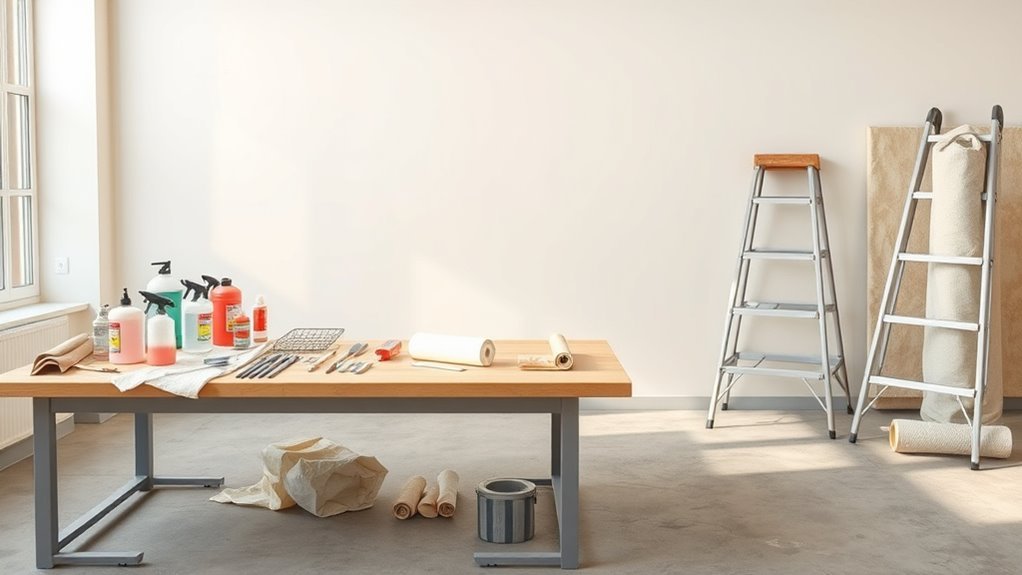
Now that you’ve picked the right room and considered light, scale, and texture, it’s time to gather the tools you’ll need for a wall-sized tie-dye effect. You’ll want drop cloths, painter’s tape, level, and chalk or pencil to map spirals and gradients.
Have several brushes and foam rollers in different sizes, plus sponges and spray bottles for blending. Use mixing trays, stir sticks, gloves, and rags for cleanup.
Include a color wheel and swatches to apply color theory confidently, and check how pigments play on your wall texture before committing. Good lighting and step ladders finish the kit.
Choosing the Best Paints for Tie-Dye Walls: Acrylic, Latex, and Wall Paint
Because tie-dye walls rely on layered color and smooth blending, choosing the right paint matters: acrylics give vibrant pigments and fast drying for crisp patterns, while latex (water-based) offers easy cleanup and good coverage for larger areas, and traditional wall paints balance durability with broader shear and opacity.
You’ll pick acrylic for saturated hues and fine control, latex for ease and less odor during large projects, and high-quality wall paint when durability and uniform finish matter.
Consider color theory to mix harmonious palettes and test samples for adhesion, finish, and long-term paint durability before committing.
Brushes, Rollers, and Sponges for Blending Tie-Dye Effects
Although the right tools won’t make the design for you, choosing proper brushes, rollers, and sponges will make blending colors smoother and give your tie-dye wall cleaner shifts.
You’ll pick brush types for edges and feathering: angled sash brushes for controlled strokes, fan brushes for soft graduations, and round brushes for detail.
Use mini rollers with low nap to cover larger gradients without texture.
For mottled or clouded effects, employ sponge techniques—natural sea sponges for organic patterns, foam wedges for subtle blending.
Keep tools damp, work wet-on-wet, and clean or swap implements often to avoid muddy colors.
Masking Materials and Tape That Won’t Peel Paint
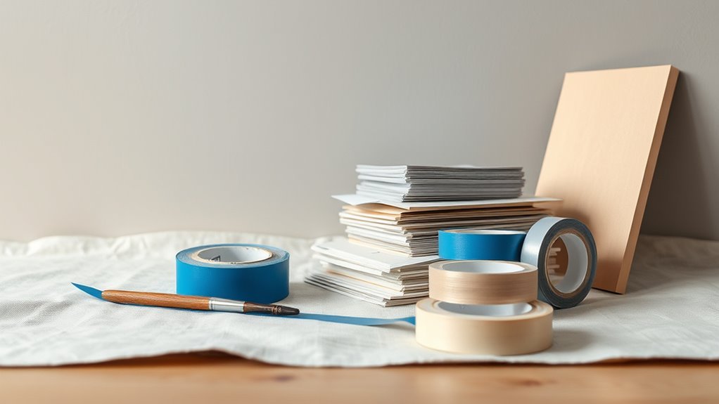
After you’ve blended colors with the right brushes, rollers, and sponges, you’ll want masking materials that protect crisp edges without pulling fresh paint off the wall. Choose low-tack masking tape formulated for delicate surfaces so paint adhesion stays strong and removal won’t strip layers. Press tape edges firmly; seal seams with a finger or plastic card to prevent bleed.
After blending colors, use low-tack masking tape and sealed seams to protect crisp edges without peeling paint.
Use paper or thin plastic masking sheets for curves and stencils. Remove tape at a 45° angle while paint is slightly tacky for the cleanest line.
- low-tack painter’s masking tape
- stencil-friendly adhesive film
- craft paper rolls
- thin plastic sheeting
- foam edge guards
Drop Cloths, Protective Sheeting, and Floor Protection Tips
When you’re ready to paint, protect floors and furniture with durable drop cloths and protective sheeting so spills and splatters never become permanent. Lay canvas or heavy-duty polyethylene sheeting, secure edges with low-tack painter’s tape, and overlap seams to prevent bleed-through.
Tape plastic up walls where furniture meets baseboards and cover vents. Wear protective gear—gloves and old clothes—while carrying trays and brushes.
Keep paint storage tidy: seal cans, label colors, and place them on a board to avoid drips. Clean spills immediately with a damp rag and replace protective layers if they become saturated to prevent transfer.
Preparing Drywall and Plaster for Paint Adhesion
Before you start painting, clean the drywall or plaster to remove dust, grease, and loose particles so the paint will stick.
Patch any holes or cracks with joint compound, sand smooth, and wipe away residue.
Finally, prime repaired or bare areas to seal the surface and guarantee even adhesion.
Surface Cleaning
If you want paint to stick and look its best, start by thoroughly cleaning drywall and plaster surfaces to remove dust, grease, and loose particles. You’ll wipe walls with a damp microfiber to capture fine dust, degrease kitchens with a mild detergent, and rinse to avoid residue that affects wall texture.
Open windows to reduce paint fumes and speed drying. Vacuum corners and baseboards, then tack cloth for a final pass. Let surfaces dry fully before painting.
- Use microfiber cloths
- Mild detergent for grease
- Soft-bristle brush for crevices
- Rinse with clean water
- Guarantee full air circulation
Patch And Prime
Start by inspecting the drywall and plaster for dents, nail pops, cracks, and loose tape, then patch each flaw with an appropriate filler—spackle for small dings, joint compound for larger seams, and patch kits for holes—to create a smooth, uniform surface. Sand feathered edges, remove dust, and apply a quality primer to lock in repaired areas and balance wall texture for even tie-dye blending. Primer also preserves Color psychology by ensuring true hue payoff. Visualize progress:
| Stage | Tool | Result |
|---|---|---|
| Patch | Spackle | Smooth |
| Repair | Joint compound | Seamless |
| Hole | Patch kit | Solid |
| Prime | Roller | Ready |
Cleaning and Repairing Dents, Holes, and Texture Issues
When you tackle dents, holes, and texture issues, clean the damaged area first so the patching materials bond properly. You’ll remove dust, grease, and loose paint with a damp cloth and light sanding.
Before patching dents and holes, thoroughly clean the area—remove dust, grease, and loose paint for proper bonding.
Fill holes with spackle, press into dents, and smooth with a putty knife; let it dry fully, then sand flush. Match surrounding texture with a light skim or texture spray.
Think of this prep like art therapy—mindful, calming—and remember color psychology when restoring surfaces so repaired areas won’t disrupt the final tie-dye effect.
- Clean thoroughly
- Use appropriate filler
- Sand smooth
- Match texture
- Inspect lighting
When to Prime and How to Choose a Primer
Before you grab paint, think about when to prime: you’ll want primer on new drywall, patched areas, stains, or when switching from dark to light colors.
Choose a primer based on surface and paint type—stain-blocking for tannins, bonding primer for glossy surfaces, or a deep-penetrating primer for porous masonry.
Picking the right primer saves coats and makes your finish look professional.
When To Prime
Curious whether you need primer for your wall project? You’ll prime when surface stains, drastic color changes, or uneven wall texture could show through your tie dye layers. Primer helps base tones for color theory to read true and evens porous spots so paint flows consistently.
- New drywall or patched areas
- Dark-to-light color shifts
- High-porosity surfaces (rough texture)
- Stains, smoke, or water marks
- Glossy or previously painted surfaces
Prime before your main colors, let it fully dry, and sand lightly if needed. Primer saves time and makes tie dye hues pop as intended.
Choosing The Right Primer
Although picking a primer might seem like an extra step, choosing the right one guarantees your tie-dye paint reads true and lasts longer.
You’ll prime when the surface is new, patched, stained, or unevenly porous. Match primer type to wall texture: smooth drywall needs a different bonding primer than rough plaster or skim-coated surfaces. Use stain-blocking primers over nicotine or water marks.
For vibrant tie-dye hues, a white or tinted primer preserves color psychology—tint toward your midtone so glazes pop.
Pick oil-based for sealing, latex for easy cleanup, and specialty primers for slick or previously painted glossy walls.
Choosing a Color Palette That Reads Like Tie-Dye
If you want a wall that feels like a stretched-out tie-dye, start by picking three to five colors that shift smoothly from one to the next—think a sunburst gradient, not random splotches. Consider historical significance and cultural symbolism of hues so your palette tells a subtle story. Balance saturation: mix vivid center tones with muted outer shades for depth. Test progressions on scrapboard. Keep value changes gradual to mimic dyed fabric.
- Pick a dominant hue
- Add two supporting tones
- Include a soft neutral
- Try a bright accent
- Swatch gradations under room light
Picking Complementary and Contrast Colors for Tie-Dye Walls
Now that you’ve settled on a smooth, sunburst-worthy palette, it’s time to choose colors that play off each other—complements to make hues pop and contrasts to add visual rhythm. Use the color wheel to pick opposite pairs for instant vibrancy or adjacent hues for softer gradations.
Balance saturated tones with muted neutrals so the design breathes. Plan contrast in value and temperature—light versus dark, warm versus cool—to guide the eye across your tie-dye sunburst.
Consider paint blending techniques at edges to soften jumps without muddying colors. Keep samples small and evaluate in the room’s light before committing.
Mixing Custom Colors and Testing Swatches
When you mix custom colors for your tie-dye sunburst, start with small test batches so you can tweak hue, value, and temperature without wasting paint. You’ll practice color blending on cardstock or scrap drywall, note ratios, and observe drying shifts.
Keep swatches labeled and photographed so you can recreate mixes across a wall while maintaining pattern symmetry. Test edges to see how washes feather and whether layering preserves vibrancy. Use these quick checks to avoid surprises when scaling up.
- Label each swatch with pigment ratios
- Note wet vs. dry appearance
- Try glazing layers
- Check edge feathering
- Photograph for reference
Planning Your Design: Spirals, Stripes, Sunbursts, and Clouds
As you sketch your wall layout, decide which motif best fits the room’s scale and mood—spirals for dynamic focal points, stripes for elongating or grounding spaces, sunbursts for radiant centers, and clouds for a soft, airy feel.
Choose a dominant motif, then test compositions with quick thumbnails. Consider traffic flow, furniture placement, and natural light so the design complements use.
Choose a dominant motif, sketch quick thumbnails, and align composition with traffic, furniture, and natural light for harmony.
Plan your Color mixing palette to keep progressions harmonious and predictable.
Think about pattern scaling intuitively—larger repeats read from afar, tighter details invite close inspection.
Mark anchor points lightly on the wall before you paint to guide confident execution.
How to Scale a Tie-Dye Pattern for Wall Size
If you want a tie-dye motif to read well across a wall, start by deciding the viewing distance and dominant focal point so you can scale the rings or spirals accordingly. Measure wall height and width, then choose a main motif size that reads from typical sightlines.
Use larger gaps between color bands for distant viewing to preserve Color blending, and tighten bands for close-up detail. Consider repeating scaled motifs for balance and use a simple palette to keep edges clean.
Pattern scaling should prioritize contrast so shapes remain legible at a distance.
- Choose motif diameter
- Test paint swatches
- Mock up small repeats
- Space color bands
- Adjust contrast
Drawing Guides and Grids to Transfer Your Design
After scaling your tie-dye motif to wall size, set up a drawing guide or grid to transfer that design accurately. Measure and mark a light pencil grid matching your scaled reference; use a level and chalk line for straight, even rows.
Break the motif into cells, copying key points into each square so proportions stay true across varied wall texture. Note where colors shift and plan sections with color psychology in mind—warm zones draw attention, cool areas recede.
Keep lines faint so they vanish under paint. Work systematically, checking alignment frequently to guarantee the final composition reads as designed.
Folding and Masking Techniques Translated to a Wall
When you scale folding and masking techniques from fabric to a wall, think in regard to controlled folds, taped seams, and layered negatives that guide paint rather than constrain it. You’ll translate Textile patterns logic from Fabric dyeing by planning repeat motifs, using craft paper folds, painter’s tape, and removable templates.
Folded paper or thin foam creates crisp symmetry; layered masks let colors bloom between shapes. Work wet-on-wet or let layers dry for clarity. Test on scrap board first. Use gentle pressure when taping to avoid paint bleed and peel slowly for clean lines.
- Plan repeat motif spacing
- Use varied mask depths
- Tape seams precisely
- Pretest color blends
- Peel slowly for edges
Creating a Spiral Tie-Dye Pattern Step-By-Step
Because spirals read well across large surfaces, you’ll start by anchoring a clear center point and working outwards in tight, even turns so your motif stays balanced; this gives you a reliable guide for folding, masking, and color placement as you translate tie-dye into paint.
Mark the center, snap a chalk spiral, and tape thin radial wedges for clean edges.
Mix paints using color theory—choose complementary contrasts or analogous blends for harmony.
Work in sections, glazing thin layers and lifting tape while paint’s tacky.
Study artist inspiration photos to refine scale and rhythm, adjusting contrast until the spiral sings.
Making Concentric Rings and Ombré Sunbursts
Spirals give you motion; concentric rings and ombré sunbursts give you calm radiance and clear focal points. You’ll map a center, use pattern symmetry to lay even rings, and blend shades outward for a soft ombré.
Rely on color theory to choose harmonious *gradations* and test swatches first. Work with diluted paint for smooth gradients, tape thin guides for crisp edges, and step back often to correct balance. Finish with a glaze to unify tones and protect the surface.
- Choose a central point and measure radii
- Select a color palette using color theory
- Thin paints for smooth blends
- Use guides for symmetry
- Seal with a protective glaze
Painting Freeform Swirls and Marbled Effects
If you want a dynamic, organic look, freeform swirls and marbled effects let you mix color and motion without strict guides. You’ll work wet-on-wet, dragging paint with brushes, combs, or even a sponge to blend hues that reflect color psychology—calming blues, energetic corals, or grounding earth tones.
Test mixes on cardboard to judge contrast against your wall texture, adjusting sheen and viscosity. Vary pressure to create veins and soft blending techniques, wiping or lifting paint for highlights.
Step back often to maintain balance, and seal the finished surface with a clear coat to protect the pattern.
Layering Translucent Washes for Depth
After you’ve experimented with swirls and marbling, layering translucent washes will add subtle depth and atmosphere to the wall. You’ll work thin glazes to build mood, using color blending to shift tones without losing underlying patterns. Apply each wash sparingly, let it flash dry, then judge contrast.
Rotate hues to create warmth or coolness, and keep edges soft to maintain tie-dye charm. Use a light touch to avoid muddiness; translucent layers preserve luminosity while deepening field and focal points. Finish by stepping back often to assess balance and stop when harmony feels right.
- Vary wash opacity
- Layer complementary hues
- Preserve highlights
- Use gradual transitions
- Let each layer dry
Blending Techniques for Tie-Dye Walls: Dry Brush, Wet-On-Wet, and Glazing
When you want crisp edges, soft washes, or luminous depth on a tie-dye wall, three blending techniques will give you precise control.
Use dry brush to lift pigment and create textured gradations; it’s ideal when you want lower color saturation and visible brush techniques.
Wet-on-wet blends colors seamlessly—apply damp paint, let hues flow, and watch gradients form without harsh lines.
Glazing preserves underlying tones: thin transparent layers boost saturation and add luminous depth.
Alternate methods as you work—start with wet-on-wet for broad blends, refine with glazing, and finish with dry brush for texture and subtle edge definition.
Achieving Crisp Edges With Masking and Timing
Because crisp edges depend as much on preparation as on brushwork, masking and timing are your best tools for clean tie-dye shapes. You’ll plan placements considering color psychology to balance warm and cool zones, and assess wall texture to choose tape and sealant.
Apply low-tack painter’s tape precisely, press edges firmly, and paint in thin layers. Wait between coats until paint’s surface loses tack—not fully cured—to prevent bleed when removing tape. Peel tape back slowly at a 45° angle while paint is still slightly tacky for sharp lines.
- Use test strips on scrap board
- Choose tape by texture
- Time short drying intervals
- Seal edges with a light glaze
- Remove tape toward painted area
Using Stencils and Negative Space to Sharpen Shapes
Masking and timing set the stage, but stencils and negative space let you lock in crisp, repeatable shapes with control and speed. You’ll cut or buy stencils sized to your design, secure them flat, then use a stipple brush or sponge to apply paint in thin layers.
Negative space around stencils frames shapes and guides your eye, so plan gaps intentionally. Rotate stencils for patterns and avoid heavy brushes that bleed under edges.
Practice stencil techniques on scrap material, then layer colors carefully to suggest color blending without overworking edges. Remove stencils while paint’s tacky, not wet.
How to Avoid Muddy Colors When Blending Multiple Pigments
If you want clean, vibrant blends, start by limiting the number of pigments you mix and planning their relationships on a swatch first. Use basic color theory to pick harmonious hues and decide whether you’ll work with warm-to-warm or cool-to-cool progressions. Test wet-on-wet blending techniques on scrap before touching the wall. Keep edges controlled and avoid overworking mixes that go gray.
Limit pigments, plan swatches, test wet-on-wet, control edges—avoid overworking to keep blends vibrant.
- Choose 3 maximum adjacent hues
- Use glazing for subtle shifts
- Clean brushes between colors
- Thin paints for smoother fusion
- Step back frequently to judge tones
These blending techniques keep colors crisp, not muddy.
Correcting Mistakes Without Repainting the Whole Wall
Mistakes happen even when you plan blends carefully, but you don’t have to repaint the entire wall to fix them. Spot-correct by feathering fresh pigment into the error with a damp sponge or soft brush, blending edges until seamless.
For stubborn stains, glaze a thin wash matching surrounding hues; this preserves color psychology intent without heavy paint layers. Use small stencils or tapered brushes for precision shapes.
Sand and prime only if texture or sheen differs. Save trimmings and test patches to reduce waste—this mindful approach lowers environmental impact while keeping your tie-dye mural coherent and vibrant.
Drying Times and Humidity: Timing Your Blends
You’ll want to know basic drying time benchmarks—like touch-dry in 1–2 hours and recoat in 4–6 hours for most latex paints—so your blends don’t smear.
Remember that high humidity slows drying and can cause tacky, uneven finishes, while low humidity speeds it up and may make edges crisp too soon.
Plan your blending windows around both the paint’s recommended times and the room’s humidity to get consistent results.
Drying Time Benchmarks
Because drying depends on paint type and room humidity, know the typical benchmarks before you start blending: latex usually skins over in 30–60 minutes and can be reworked for up to 2–4 hours. Oil-based paints take 6–8 hours to set and 24–48 hours to recoat. Acrylics fall between the two—fast skinning but longer cure.
Plan your tie-dye layering around these windows so your color theories and wall texture choices don’t muddy. Check small test patches to confirm. Keep tools, fans, and tack cloths ready.
- Test reworkability on scraps
- Note manufacturer times
- Use thin layers
- Avoid overbrushing
- Record room conditions
Humidity Effects On Paint
How humid is your room right now, and how will that change the timing of your blends? You’ll notice humidity effects immediately: high humidity slows paint drying, making colors mingle longer and increasing drip risk.
Low humidity speeds evaporation, forcing quicker edges and reducing blend time. Adjust by timing: blend more slowly in dry air, work faster or mist sparingly in damp conditions to lengthen open time.
Use small test patches to gauge local conditions before committing. Ventilation, fans, or a dehumidifier can help control drying rate.
Plan your sequence around the room’s moisture so your tie-dye gradients behave predictably.
Sealing and Protecting Your Tie-Dye Mural With Topcoats
Once your tie-dye mural’s colors have fully cured, you’ll want to lock in that vibrancy and protect the surface from dirt, UV, and everyday wear with the right topcoat. Choose a clear sealer compatible with your paint type and consider how color theory influences perceived depth; lighter glazes can revive contrast on varied wall texture.
Apply thin, even coats, sanding lightly between layers if recommended, and test in an inconspicuous spot first.
- Use a breathable sealer for older drywall
- Test adhesion on textured areas
- Avoid solvent overuse near vents
- Work in low-dust conditions
- Follow manufacturer cure times
Matte vs. Satin vs. Gloss Finishes for Tie-Dye Walls
When choosing a finish for your tie-dye wall, think about how sheen alters color, depth, and durability. You’ll pick matte for velvety, satin for balanced glow, gloss for punchy highlights. Consider color psychology: matte soothes, satin comforts, gloss energizes. Paint texture matters too—matte hides imperfections, satin reveals gentle strokes, gloss emphasizes brushwork. Choose based on mood and traffic: matte in calm spaces, satin for living areas, gloss for accents that need resilience. Test swatches. Let finish amplify your design without overpowering it.
| Finish | Feeling |
|---|---|
| Matte | Calm |
| Satin | Warmth |
| Gloss | Excitement |
Lighting Considerations to Make Colors Pop
Although lighting often feels like an afterthought, it can make or break the way your tie-dye colors read on the wall. So place fixtures to highlight contrasts, deepen shadows, and reveal texture.
You’ll want to experiment with lighting effects and color temperature to enhance vibrancy: warmer temps deepen reds and oranges, cooler temps sharpen blues and greens. Aim for adjustable sources so you can fine-tune mood and saturation without repainting.
- Use directional spotlights for focal swirls
- Add wall washers for even glow
- Include dimmers to control intensity
- Mix warm and cool bulbs sparingly
- Position fixtures to avoid glare
Furniture and Decor Choices That Pair With Tie-Dye Walls
When you work with bold tie-dye walls, choose neutral furniture to anchor the room and let the patterns shine.
Add textiles—throw pillows, rugs, and curtains—in complementary hues to echo colors from the walls without competing.
Finish with a mix of metallics and natural accents to give the space contrast and texture.
Neutral Furniture Anchors
A few well-chosen neutral pieces will ground your tie-dye walls and let their colors sing without competing for attention. Choose neutral furniture that provides calm contrast—think streamlined sofas, wood tables, and simple shelving.
Then layer in a few complementary decor accents so the room feels intentional, not busy. Keep shapes clean and finishes matte to balance the wall’s energy.
Anchor seating areas with low-profile pieces and avoid patterned upholstery that fights the wall. Let metals and ceramics act as subtle punctuation, not focal points.
- Linen sofa in beige or warm gray
- Raw wood coffee table
- Matte black or brass lamp
- Simple floating shelves
- Ceramic vases in neutral tones
Textiles With Complementary Hues
If you want the room to feel cohesive rather than chaotic, choose textiles that echo one or two tones from your tie-dye walls and temper them with softer, complementary hues. You’ll pick throw pillows, rugs, and curtains that balance bold spirals with subtle solids, using textile patterns sparingly so they support rather than compete with the wall.
Stick to a limited palette for upholstery and bedding to reinforce color harmony, then introduce small accent fabrics in analogous or muted complementary shades. That approach keeps the focus on your painted feature while ensuring seating and soft goods feel intentional and layered.
Metallic And Natural Accents
Pair two or three metallic pieces—brass lamps, matte black frames, or a chrome coffee table—with natural materials like rattan, reclaimed wood, and stone to ground your tie-dye walls and create deliberate contrast.
You’ll balance playful color with sophisticated metal accents and calming natural textures, keeping the room cohesive. Choose a statement metallic mirror, woven baskets, a live-edge console, stone planters, and linen cushions to layer warmth and shine without overwhelming the pattern.
Use finishes sparingly, repeat materials in small doses, and let the tie-dye remain the focal point while furniture and decor support its energy.
How to Create a Removable or Temporary Tie-Dye Wall
Though it looks complex, you can create a vibrant, temporary tie-dye wall without permanent paint by using removable fabric dye sheets, liquid chalk spray, or wash-off tempera mixed with water. Pick a method based on how long you want the design to last and how easy you want cleanup to be.
Choose a protected drop cloth and test sprays on cardboard.
Plan concentric patterns or spirals that echo tie dye symbolism and cultural significance, then work top-down to avoid drips.
Use stencils or elastic bands for controlled shapes, mist to blend colors, and wipe spots immediately for an easy, reversible display.
Budget-Friendly Materials and Where to Save Money
You can get great results without splurging by choosing budget-friendly paints, reusing or borrowing DIY tools, and using smart techniques like stenciling or sponge-rolling to stretch supplies.
Look for value brands, sample pots, and discounted rollers and brushes at thrift stores or community swaps.
With a few cost-saving habits, you’ll keep expenses low while still getting a professional-looking finish.
Affordable Paint Choices
Looking to refresh your walls without blowing your budget? You can pick affordable paints that still honor color psychology and let you experiment with painting techniques. Choose quality value brands, sample pots, and concentrate on versatile shades that layer well for tie-dye effects.
Save by buying eggshell or satin instead of premium finishes and using leftover paint creatively.
- Buy sample pots for test runs
- Pick mid-tier brands with good coverage
- Choose multipurpose primers to cut coat count
- Reuse tintable base paints for custom hues
- Shop sales and paint-store discounts
These moves keep costs down while preserving impact.
DIY Tools And Supplies
Start with a small, smart toolkit that covers rollers, angled brushes, a tray, painter’s tape, and a drop cloth—those basics handle most wall projects and keep costs down.
Pick multi-purpose rollers and washable brushes so you reuse them across rooms.
Buy sample or economy paints for practice swirls.
Use inexpensive sponges, plastic cups, and stir sticks for dye blending.
Borrow specialty tools for effects instead of buying.
Play music therapy playlists while you work to stay focused, and treat breaks like culinary arts sessions—simple snacks keep energy up.
Label leftovers and store properly to avoid waste and repeat purchases.
Cost-Saving Techniques
Although budget constraints can shape your choices, smart planning and a few simple swaps let you get striking results without overspending. You can use Budget hacks and DIY shortcuts to cut costs: buy sample-size paint, reuse rollers, and mix colors from basic primary tubs.
Shop clearance for drop cloths and brushes, and trade tools with friends. Practice on cardboard before committing to the wall to avoid costly mistakes. Focus purchases on quality where it counts—primer and a good brush—and economize on extras.
- Buy paint samples or test pots
- Reuse tools and salvage rollers
- Shop clearance and thrift stores
- Swap or borrow specialty tools
- Practice designs on scrap material
DIY vs. Hire a Pro?
Whether you tackle a wall painting project yourself or hire a pro depends on your goals, budget, and comfort with tools and techniques.
If you’re confident, DIY saves money and lets you experiment with color psychology and custom blends, but expect a learning curve and potential fixes for uneven wall texture.
Hiring a pro guarantees smoother transitions, durable finishes, and efficient handling of prep, masking, and cleanup—worth it for complex tie dye effects or high-traffic rooms.
Decide by weighing creativity and hands-on satisfaction against time, desired polish, and long-term durability; pick the route that matches your priorities.
Time Estimate: How Long Each Project Stage Takes
You’ll want to budget time for prep and setup—taping, furniture moving, and priming can take a few hours to a full day depending on the room.
Actual painting usually goes faster, but factor in drying time between coats, which can add several hours to a day per coat.
Knowing these stages helps you plan whether the project fits into a weekend or needs more spread-out work.
Prep And Setup Time
Before you pick up a brush, map out each stage—planning, surface prep, taping, priming, painting, and cleanup—and assign a realistic time block to each so you don’t rush or run out of daylight.
Estimate 1–2 hours for layout and color theory decisions so paint mixing goes quickly later. Allow 1–3 hours for surface cleaning and patching, and 30–60 minutes for taping.
Allocate 30–60 minutes for primer application.
Gather tools and protective coverings before you start to avoid interruptions. Final cleanup should have a dedicated 30–45 minute slot.
- Choose palettes with color theory in mind
- Mix sample swatches
- Prep surfaces thoroughly
- Tape edges precisely
- Stage cleanup supplies
Painting And Drying Time
How long will your paint job actually take? You’ll spend an hour taping and mixing colors, then 2–3 hours applying base coats, adjusting hues with basic color theory as you go.
For the tie-dye effect, plan 1–2 hours per color layer, blending quickly while paint’s tacky. Smooth wall texture speeds drying; rough or porous surfaces soak paint and add curing time.
Allow 2–4 hours between thin coats, overnight for heavier layers. Wait 24–48 hours before light handling, and 7–14 days for full cure before hanging decor.
Total active time: typically 6–12 hours across several days.
Safety Tips for Ventilation, Ladder Use, and Site Setup
Because paint fumes can build up quickly in enclosed spaces, make sure you ventilate the room and set up your ladder and work area with safety in mind before you start rolling or spraying.
Ventilate the room, set up your ladder safely, and prioritize ventilation before you start painting.
You’ll prioritize ventilation safety by opening windows, running fans, and wearing a respirator if needed.
Check ladder stability on level ground, lock spreaders, and don’t overreach.
Clear the floor, tape off edges, and protect fixtures.
Keep a partner nearby for assistance and breaks.
- Open windows and position fans for cross-ventilation
- Use a respirator when odors are strong
- Verify ladder feet grip the floor
- Keep tools within easy reach
- Remove tripping hazards from the area
Kid- and Pet-Friendly Paint Options and Cleanup
Good ventilation and a tidy workspace also make it easier to choose and clean up safer paints for homes with kids and pets. You’ll pick water-based, low-odor options, keep containers sealed, and store brushes out of reach. Rinse tools in a utility sink, capture solids, and avoid pouring wash water down storm drains to limit environmental impact. For leftover paint and paint disposal, follow local guidelines and recycle or donate usable cans.
| Task | Tip |
|---|---|
| Storage | Seal lids, high shelf |
| Cleanup | Wipe, then rinse |
| Disposal | Local facility |
| Safety | Childproof area |
Eco-Friendly Paint Choices and Low-VOC Practices
When you’re choosing paints, pick low-VOC, water-based formulas and certified eco-friendly brands to cut indoor air pollution and long-term health risks. You’ll reduce odors, protect family health, and support Sustainable marketing efforts by choosing brands that prioritize transparency and Eco friendly packaging.
Use proper ventilation, limit paint amounts to avoid waste, and recycle containers where allowed. Consider natural pigments for accents and test samples before committing.
- Choose certified low-VOC or zero-VOC labels
- Prefer water-based acrylics over solvent paints
- Look for recycled or biodegradable tins
- Buy sample sizes to minimize waste
- Ventilate and use air purifiers when painting
Common Mistakes Painters Make and How to Avoid Them
Don’t skip proper surface prep—you’ll get peeling and uneven coverage if you do.
Don’t load your brush or roller with too much paint, or you’ll end up with drips and wasted material.
And don’t ignore color harmony: test swatches in different light so your final scheme actually works.
Skipping Proper Surface Prep
Although you might be enthusiastic to start slapping on color, skipping proper surface prep is a quick way to ruin your paint job before it even dries. You need to assess surface texture, clean dirt, sand rough spots, and prime to guarantee consistent paint layering and adhesion.
Skipping this leads to peeling, uneven color, and wasted effort. Take the time to prep so your tie-dye swirls look crisp and last.
- Clean grease and dust thoroughly
- Patch cracks and holes
- Sand glossy or uneven areas
- Apply appropriate primer for porosity
- Remove loose or flaking paint
Using Too Much Paint
If you load your roller or brush with too much paint, you’ll get drips, uneven texture, and long drying times that invite smudges and dust. You should work in thin, controlled layers so color saturation stays even and vibrant without pooling.
Check paint consistency on a scrap board: it should flow but not run. Tap off excess from rollers and wipe brushes on the tray edge. Wait between coats until the surface feels dry to the touch.
If drips appear, smooth them immediately with a clean, damp brush. Less paint per pass gives you cleaner tie-dye effects and fewer fixes.
Ignoring Color Harmony
When you ignore color harmony, your mural or accent wall can feel jarring, muddy, or simply unfinished, even if each color looks good by itself. You’ll create color chaos without a plan: clashing hues, mismatched saturation, and unclear focal points.
Avoid aesthetic disregard by picking a limited palette, testing swatches, and balancing warm and cool tones. Plan progressions and use neutrals to rest the eye. Practice restraint and step back often to judge the overall effect.
- Limit your palette to 3–5 related colors
- Test swatches in different lights
- Use neutrals for balance
- Control saturation levels
- Define a focal point
Troubleshooting Color Dullness and Patchiness
Even with careful prep and quality paint, you can still run into dull or patchy areas on your walls, so it’s useful to know the most common causes and quick fixes.
First, assess lighting and primer—uneven absorption causes patchiness. For color correction, mix a small sample, test spot, then adjust saturation before repainting.
Use thin paint layering, letting each coat dry fully to avoid streaks and muddied hues. When edges look dull, feather with a dry brush or blend with a translucent glaze.
If pigments still read flat, switch to higher-pigment formulas or increase contrast with adjacent hues.
How to Touch Up and Maintain Your Tie-Dye Wall Over Time
Because a tie-dye wall relies on layered color and subtle blending, you’ll want a simple maintenance routine to keep its vibrancy and soft progression intact. Inspect quarterly for scuffs, dust with a soft brush, and spot-treat using matching glazes based on color theory so repairs read as intentional shifts.
Match finish and respect wall textures when applying touch-ups; feather edges to blend. Seal high-traffic zones with a matte clear coat if needed.
- Dust and inspect every 3 months
- Use diluted glaze for small fixes
- Test color matches on scrap
- Feather edges to blend
- Re-seal high-traffic areas annually
Photographing Your Finished Mural for Social Sharing
If you want your mural to look as striking online as it does in person, plan the shoot around light, composition, and context. Use natural, even light—golden hour or overcast skies minimize glare and reveal true color psychology choices.
Shoot from multiple angles to show scale and wall texture; include a person or familiar object for reference. Straight-on shots suit social grids, while diagonal compositions add energy.
Stabilize your camera, bracket exposures, and edit sparingly to preserve hues. Add a concise caption about inspiration and palette, tag tools or brands, and use hashtags so your mural reaches the right audience.
Creative Variations: Ombré Panels, Half-Walls, and Typography Murals
Think about ombré panel placement to guide sightlines and anchor furniture. Try half-wall techniques—like two-tone borders or chair-rail shifts—to add structure without overwhelming the room.
Use typography tie-dye to blend letterforms with color gradients for a bold, textured statement.
Ombre Panel Placement
Wondering how to place ombré panels so they transform a room without overwhelming it? You’ll balance color blending and pattern symmetry by planning panel width, gradation zones, and focal placement.
Choose vertical or horizontal bands to complement room lines, and keep contrast moderate so panels enhance rather than dominate.
- Align panels with architectural features (doors, windows)
- Use a consistent gradient scale for smooth color blending
- Mirror panel layouts for pattern symmetry in paired rooms
- Position a bold panel as a focal anchor near seating
- Leave neutral buffer zones to prevent visual clutter
Execute with measured tape and level for crisp edges.
Half-Wall Techniques
Moving from ombré panel placement to half-wall techniques lets you use color and scale without repainting an entire room. You’ll paint lower halves with tie-dye gradients to ground spaces, using color psychology to set mood while preserving upper-wall lightness for interior harmony. Choose crisp dividing lines or soft blends; both create visual interest and protect walls. Use painter’s tape, level, and sample swatches. Consider furniture height and sightlines so the half-wall complements rather than overwhelms. Small rooms benefit from lighter upper sections; bold lower hues add depth.
| Tip | Why it works |
|---|---|
| Tape guide | Clean edge |
| Test swatches | Match mood |
| Low sheen paint | Durable finish |
Typography Tie-Dye
When you blend bold lettering with tie-dye gradients, typography tie-dye turns words into living color that anchors a room without overwhelming it. You sketch large type, layer ombré washes, then sponge and drip to soften edges.
Pick a phrase that reflects mood—playful, calm, or inspiring—and balance scale so letters read from across the room. Use stencils for crispness or freehand for organic flow.
Consider motifs from fashion accessories or culinary arts to personalize a kitchen or dressing nook. Seal with matte varnish to protect pigments and texture.
- Choose font weight and scale
- Test color fades on scrap
- Mask precise edges
- Blend with sponges
- Seal and maintain
Seasonal and Holiday Tie-Dye Wall Ideas
If you want your walls to reflect the season or holiday spirit, tie-dye provides a fast, flexible way to do it without committing to permanent murals. You can tailor colors and patterns to seasonal motifs—pastels for spring, warm oranges for fall, icy blues for winter—and layer subtle symbols like leaves or snowflakes with stencils.
For Holiday themes, pick a palette that signals the event: red and green accents, or metallics for New Year. Use removable painter’s tape to control shapes, and test sprays on cardboard.
This approach keeps your walls festive, temporary, and easy to refresh throughout the year.
Inspiring Tie-Dye Wall Examples to Copy Safely
You can copy tie-dye wall examples that use safe color combinations like muted pastels or analogous hues to avoid harsh contrasts.
Before you start, you’ll prep the room with drop cloths, painter’s tape, and proper ventilation to protect surfaces and your health.
Follow those protective prep steps and you’ll get vibrant results without damage or long cleanup.
Safe Color Combinations
Although tie-dye walls can look bold and chaotic, choosing safe color combinations helps you get vibrant results without overwhelming a room. You’ll use color psychology to set mood—calming blues, energizing oranges—and think about mural symbolism so colors echo the theme you want.
Stick to balanced schemes: one dominant hue, one accent, a neutral, and two gradual shades. Test swatches on poster board and view them at different times of day to avoid surprises.
- Monochrome with a pop of coral
- Analogous blues and greens
- Complementary teal and coral
- Soft pastels with warm beige
- Deep navy with muted gold
Protective Prep Steps
When preparing to create a tie-dye wall you’ll want to protect floors, furniture, and fixtures before you open any dye bottles: lay down drop cloths or plastic sheeting, tape seams with painter’s tape, move or wrap furniture, and cover light switches and outlets to prevent stains and accidental splatters.
Next, test how your chosen paint consistency interacts with your wall texture on a scrap board or hidden corner.
Use plastic masks for trim, secure windows, and create a waste station for used rags and rinse water.
Wear gloves, old clothes, and goggles, and ventilate the room well to avoid fumes.
Printable Supplies Checklist for a Tie-Dye Wall Project
Before you start splattering color, gather everything on this printable checklist so the project runs smoothly and you don’t forget key items like dyes, protective gear, and mounting supplies. Use this list to choose hues with color psychology in mind and align the scheme with your interior design goals. Print it, tick boxes, and take it to the store.
- Assorted fabric or wall-safe dyes and color mixing guide
- Drop cloths, painter’s tape, gloves, and protective eyewear
- Spray bottles, squeeze bottles, and mixing cups
- Brushes, sponges, and disposable stir sticks
- Level, pencil, measuring tape, and mounting hardware
Next Steps: Plan, Prep, and Start Your Tie-Dye Wall Today
Now that you’ve gathered your supplies, plan your tie-dye design by sketching color placement and testing blends on scrap material.
Prep the wall by cleaning, patching holes, and applying primer so colors grab evenly.
Once your plan and surface are ready, you can start painting with confidence.
Plan Your Design
Ready to turn your idea into a plan? You’ll gather artistic inspiration and use basic color theory to choose a palette that fits the room’s mood. Sketch a few layouts—spirals, sunbursts, or soft gradients—so you know scale and focal points.
Decide on paint types and how colors will blend, and note any accent areas.
- Choose a dominant and two accent colors
- Pick a tie-dye pattern style (spiral, ombre, concentric)
- Sketch placement and scale on graph paper
- Plan blending zones and gradation techniques
- Time estimate and material checklist
Prep The Surface
Want a clean, durable base for your tie-dye wall? Start by clearing the area, removing nails, and filling holes with spackle. Sand smooth, wipe dust with a damp cloth, and prime with a stain-blocking primer suitable for your wall type.
Choose primer color with color psychology in mind—lighter tones boost vibrancy, while neutrals mellow contrasts. Tape edges and protect floors. Let each coat dry fully; imperfect prep shortens mural longevity.
If you’re painting over glossy surfaces, scuff-sand first. Proper prep saves time and keeps colors true, ensuring your tie-dye mural looks vivid and lasts.
Frequently Asked Questions
How Do I Remove Tie-Dye Paint From Clothing or Upholstery?
You should pretreat stains: rinse cold, apply a stain remover or diluted oxygen bleach, launder tie dye fabric separately, and for upholstery cleaning blot with upholstery cleaner, test a hidden spot, then steam or professional-clean if needed.
Can I Use Spray Paint for Tie-Dye Effects on Textured Exterior Walls?
About 75% of exterior paints fail prematurely if misapplied—you can use spray paint for tie-dye effects on textured exterior walls, but check texture compatibility, prep thoroughly, use exterior-grade sprays, and test adhesion before committing.
How Do Temperature Extremes Affect Long-Term Color Fading Outdoors?
Temperature extremes accelerate colorfastness issues: you’ll see faster fading from UV degradation and thermal cycling that breaks binder and pigment, so colors dull, chalk, and flake sooner unless you use UV-resistant, flexible exterior coatings and sealers.
Will Tie-Dye Walls Interfere With Wallpaper Adhesion Later?
Like a washed silk scarf, no—if you handle wall preparation properly and use paint sealing; you’ll clean, sand, prime uneven surfaces, then seal vibrant dyes so future wallpaper will adhere without lifting or staining.
What Insurance or Permits Are Needed for Mural Work in Condo Buildings?
You’ll need general liability and often professional liability insurance; check condo association rules for permit regulations and building permits, plus any city or municipal permit requirements — contractors usually provide certificates and help secure necessary approvals.
Conclusion
You’ve got this—imagine standing back as a sunburst of color blooms across your wall, each swirl echoing a memory or mood. Tie-dye turns flat paint into a living, spinning sky that lifts the room and your spirits. With a plan, a few tools, and steady breaths, you’ll transform blank plaster into a playful horizon. Start small, trust the process, and let the colors tell your story—bright, imperfect, and entirely yours.