How to Paint Wall Art for Beginners at Home
You can start painting wall art at home by prepping a clean, primed surface and gathering basic acrylics, synthetic brushes (flat, round, filbert), tape, palette, and rags. Sketch a simple design, scale it with a grid or projector, block in large shapes, then refine edges and layer thin washes for depth. Work in good light, step back often, and seal with varnish when dry. Keep going to learn layout, color mixing, and finishing tips.
Beginner’s Quick-Start: Paint Wall Art at Home
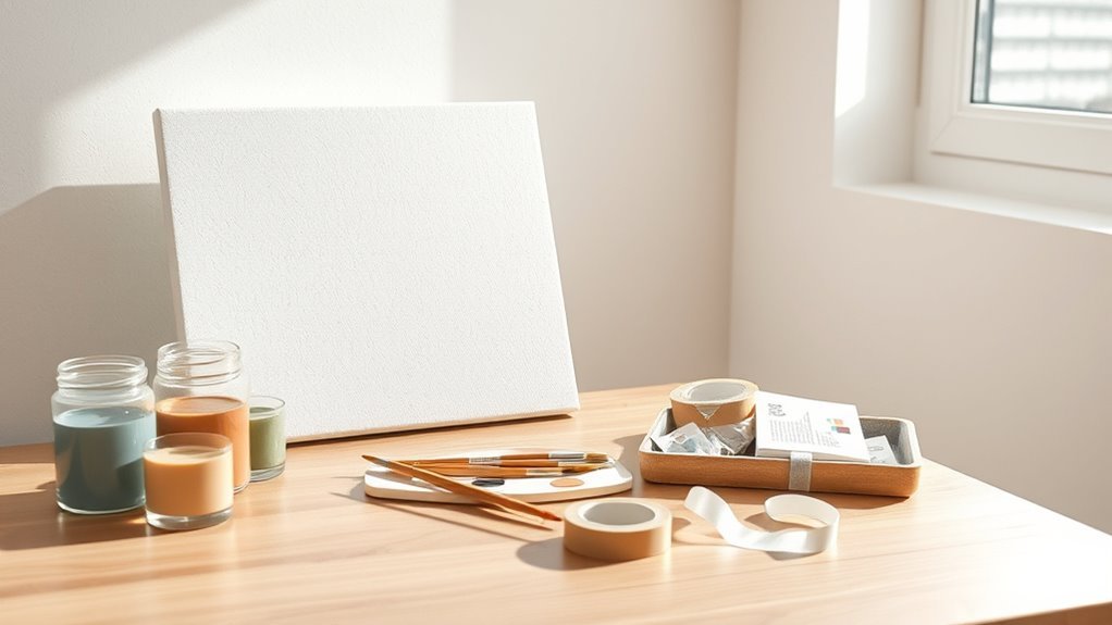
If you’re ready to try painting wall art at home, start simple: pick one easy design, gather basic supplies (canvas or wood panel, acrylics, brushes, tape, and a primer), and set up a well-lit workspace with drop cloths to protect surfaces.
You’ll want to test how interior lighting alters colors and shadows before you fix a piece to the wall.
Try small studies to see how wall textures affect paint adhesion and appearance; textured walls may demand heavier layers or a sealed backing.
Test small studies first—texture changes adhesion and look; rough walls might need heavier layers or a sealed backing.
Work deliberately, blocking in shapes first, then refining edges, and step back often to judge balance.
Essential Supplies to Start Painting Wall Art
When you’re getting started, gather a small, reliable kit: a primed canvas or wood panel, a basic set of acrylic paints (primary colors plus white and black), a few synthetic brushes in varied shapes and sizes, painter’s tape, a palette or mixing tray, and a jar for water and rags for cleanup.
Add a pencil and eraser for sketches, a spray fixative, and disposable gloves.
Learn basic color psychology to choose palettes that set mood.
Include varnish for protection and hanging hardware.
Consider framing options early so composition and edges suit the eventual display.
Acrylic vs Latex vs Chalk Paint: Which to Use
Though all three paints can create beautiful wall art, choosing between acrylic, latex, and chalk paint depends on the surface, finish, and durability you want.
All three paints yield beautiful wall art; choose acrylic for detail, latex for durability, and chalk for matte, vintage charm.
You’ll pick acrylic for detailed, fast-drying pieces and vibrant pigments that support color psychology-driven palettes; it adheres well to primed panels and canvases.
Use latex for large wall murals on drywall—it’s durable, easy to clean, and follows wall texture without cracking.
Choose chalk paint when you want matte, vintage looks on textured or uneven surfaces; it sands nicely for distressing.
Consider longevity, touch-up ease, and desired sheen when deciding.
Choose Brushes: Flats, Rounds, Filberts, and Tools
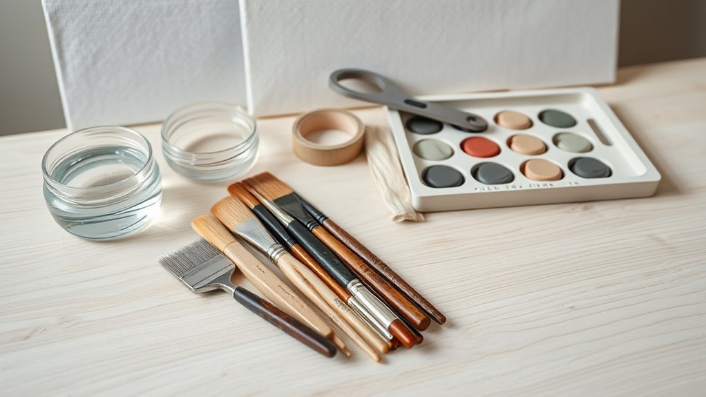
Because the right brush shapes control your marks, start by matching brush types to the effects you want: flats for broad strokes and sharp edges, rounds for detail and lines, and filberts for soft blends and tapered strokes. You’ll also use fan brushes for texture and angled brushes for corners.
Choose synthetic for acrylics and labeled natural for oils. Keep sizes small for detail, larger for backgrounds.
Practice color mixing on a palette to judge hue and value before applying.
Store brushes upright, rinse thoroughly, reshape bristles, and dry flat to prolong life—good brush maintenance saves money and improves results.
Panels, Canvases, and Cheaper Alternatives
You’ll compare canvas and wood panels to pick the surface that suits your style and paint type.
If you’re on a budget, I’ll show cheaper alternatives like MDF, stretched bargain canvases, or prepared cardboard.
You’ll also learn quick prepping steps—sanding, priming, and sealing—so your paint adheres and lasts.
Canvas Vs. Wood Panels
When choosing a support for your wall art, think about how texture, weight, and cost will shape both your process and the final look. You’ll pick canvas for flexibility and lighter hanging; wood panels give rigidity and a smooth tooth that suits detail.
Consider color psychology and wall texture when matching support to space: warm-hued canvases feel softer on textured walls; crisp panels read well on sleek surfaces.
Compare benefits:
- Canvas — breathable, primable, portable.
- Wood panel — stable, smooth, durable.
- Priming needs — varies by support.
- Finishing — varnish or oil choices differ.
Budget-Friendly Panel Alternatives
1 smart swap can save you money without sacrificing quality: instead of pricey pre-stretched canvas or premium hardwood panels, try artist-grade paper mounted on inexpensive MDF or gessoed cardboard.
You can also repurpose thrifted frames, salvaged doors, or crate wood for attractive panels. When Budget shopping, buy paper pads in bulk, hunt clearance MDF, or use secondhand stores to stretch funds further.
Pick eco friendly options like recycled cardboard, FSC-certified wood, or non-toxic gesso to reduce waste. These choices let you experiment with scale and texture without big cost, so you’ll practice freely and finish pieces that look professional.
Prepping Surfaces For Paint
Although prepping might seem tedious, getting your surface right makes every painting easier and longer-lasting. You’ll want smooth, stable panels, stretched canvases, or budget boards; sanding and priming control surface textures and improve paint adherence for better paint durability. Follow these practical steps:
- Clean surface—remove dust, grease, loose fibers.
- Sand lightly—even cheap panels benefit; wipe dust away.
- Prime—use gesso or acrylic primer for absorbency and uniform texture.
- Seal edges and backs—prevents warping and extends paint durability.
Test a small patch to confirm texture and absorbency before committing to the full composition.
Prep Walls & Canvases for Smooth Painting
Before you pick up a brush, make the surface as predictable as possible: clean away dust and grease, fill holes or cracks, sand smooth, and apply a primer suited to your wall or canvas so paint adheres evenly and colors stay true.
Next, assess wall texture and decide whether to smooth it or embrace it; heavy textures need extra primer and thicker paint for coverage.
For canvases, tighten loose fabric and gesso thin layers for tooth control.
Use tack cloths, let each coat cure, and sand between layers lightly.
Proper prep boosts paint durability and makes painting easier and more professional-looking.
Color Basics: Simple Theory for Beginners
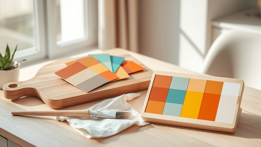
Now that your surfaces are prepped and primed, you’ll start choosing colors that work together and suit your space. Learn basic color symbolism to set mood—warm hues energize, cool tones calm.
Use primary colors (red, blue, yellow) to mix secondary hues, then practice shade mixing by adding white for tints or black for deeper tones. Keep contrast and balance in mind so your piece reads clearly from a distance.
- Pick a dominant color.
- Choose one or two accents.
- Test small swatches on your wall.
- Adjust saturation and value before committing.
Create a Room-Ready Color Palette
When you’re ready to translate those swatches into something that fits your room, start by identifying the room’s lighting and dominant finishes—natural light will make colors read cooler, while warm bulbs and wood tones push hues toward yellow and orange.
Next, pick a restrained palette: one dominant, one secondary, and one accent. Use color psychology to choose tones that support the room’s purpose—calming blues for bedrooms, energetic yellows for kitchens.
Test samples large enough to evaluate mural scaling and how values shift from different distances. Tweak saturation and contrast until the palette feels balanced in the actual space.
Sketching & Transfer Methods for Large Pieces
When you move from small sketches to a full wall, you’ll need reliable ways to scale your design. Use a grid to transfer proportions accurately, or set up a projector to trace complex shapes directly onto the surface.
Both methods save time and keep your composition true to the original.
Grid And Scale Transfer
If you’re tackling a large wall piece, use a simple grid-and-scale transfer to keep proportions accurate across the whole surface. Start by sketching your design small, then draw matching grids on both sketch and wall; scale each square proportionally.
Consider color psychology when planning hues, and note wall texture—it affects line clarity. Work square by square, transferring key points and refining shapes.
Steps:
- Measure and mark margins, divide into equal squares.
- Number rows and columns on sketch and wall.
- Scale each sketch-square to wall-square, plotting reference points.
- Connect points, smooth lines, and erase grid guides.
Projector And Tracing Methods
Although you’ll often rely on grids for accuracy, using a projector lets you trace complex designs directly onto a large wall quickly and with precise placement. You’ll position the projector, tape tracing paper or mark lightly with pencil, then refine lines considering wall textures. Projected guides speed layout and help plan color mixing zones before paint. Test contrast and focus so lines stay sharp. For irregular textures, sand or adapt strokes. After tracing, step back often and tweak proportions. Clean projector lens, secure power, and work with assistants for bigger pieces.
| Tool | Use |
|---|---|
| Projector | Trace large designs |
| Pencil | Light guidelines |
| Tape | Secure paper |
| Assistant | Hold scale and ladders |
Stencil & Masking Techniques for Crisp Shapes
Because sharp edges make a design pop, you’ll want to master stencils and masking before you tackle detailed shapes; these techniques let you control paint flow and keep lines clean without painstaking freehand work. You’ll use stenciling patterns to repeat motifs and masking techniques to block off areas for crisp geometry.
Master stencils and masking to control paint flow, repeat motifs, and achieve crisp, sharp edges without freehand strain.
Prep surfaces, secure stencils with low-tack tape or adhesive spray, and dab paint lightly to avoid bleed. Peel masks slowly while paint is tacky, not wet. Practice on scrap board.
Quick checklist:
- Choose material
- Secure edges
- Use minimal paint
- Remove carefully
Brush Techniques: Strokes, Blending, Layers
You’ll learn a few basic stroke types—like flat, round, and dry-brush—to control texture and edges.
Practice layering thin washes and letting each layer dry so colors don’t muddy.
Then use gentle blending with a soft brush or a damp sponge to smooth shifts and build depth.
Basic Stroke Types
When you learn a few core brush strokes—flat, filbert, round, and dry—you’ll quickly see how they shape texture, edges, and movement in your work. You’ll use simple strokes to suggest forms, control edges, and lay foundations before layering.
Practice these strokes slowly, keep consistent pressure, and remember basic Color mixing and brush care to keep edges clean.
- Flat: broad, even coverage for backgrounds and sharp edges.
- Filbert: rounded tip for soft petals and blended shapes.
- Round: pointed for lines, details, and controlled marks.
- Dry: minimal paint for texture and broken strokes.
Layering And Blending
Although layering starts simply, it’s the key to depth and smooth progression in your wall art, so you’ll want to plan each pass with intention. You’ll block in base colors, let them dry, then add midtones and highlights with thin glazes to build form.
Use soft brushes or dry-brush strokes for subtle blends, and a clean damp brush to feather edges. Think about color psychology when choosing hues for mood—cool layers recede, warm ones advance.
Experiment with transparent layers for luminosity. Finally, consider framing techniques in composition so layered elements guide the eye toward your focal point.
Add Texture With Palette Knives & Household Items
If you want bold, tactile marks that catch the light, grab a palette knife and everyday items to build texture quickly and affordably. You’ll explore textured techniques with simple household tools to add dimension without fancy gear. Use a knife to layer paint, scrape back, or push peaks.
Press items for patterns, then glaze to unify.
- Cardboard edges for ridges
- Bubble wrap for dotted texture
- Fork or comb for lines
- Sponge or rag for soft stipple
Work in thin layers, let each dry, and step back to judge balance as you go.
Quick Project: Geometric Wall Art in an Hour
Grab basic materials and tools—paint, brushes, painter’s tape, a ruler, and simple templates—to keep this project quick and tidy.
Use easy geometric templates like triangles and rectangles, tape them in place, and pick a limited color palette.
Apply fast painting techniques—thin layers, quick drying colors, and clean tape removal—to finish a crisp piece in about an hour.
Materials And Tools
Wondering what you’ll need to finish a clean, bold geometric wall piece in about an hour? Consider color psychology when choosing hues and check your wall texture—smooth surfaces need less prep.
You’ll want reliable tools and minimal supplies so you work fast and accurately.
- Painter’s tape (sharp edges)
- Two compact acrylic paints (contrast via color psychology)
- Small roller or brush and a foam brush for edges
- Level, pencil, ruler, and a damp cloth
Prep includes cleaning and light sanding where texture interferes. Keep tools nearby, work confidently, and test colors on scrap.
Simple Geometric Templates
While you tape and sketch, pick templates that stay bold and simple so you can finish within an hour. Choose squares, triangles, circles, or stripes in repeating patterns—keep scale consistent and edges crisp with painter’s tape.
Lay out a quick grid or stencil on paper, then transfer lightly to the wall.
Plan a limited palette to simplify color mixing and avoid muddy results.
Use flat brushes for fills and angled brushes for edges, and practice proper brush care between colors to prolong bristle life.
Work from light to dark, remove tape slowly, and step back often to check balance and spacing.
Fast Painting Techniques
Now that you’ve got simple geometric templates and a plan, let’s move into fast painting techniques that’ll help you finish a bold geometric wall in about an hour. Use tape sharply for clean edges, work top-down, and keep a wet edge. Consider color psychology when choosing hues to set mood quickly.
Prep for wall texture: sand bumps, prime rough areas.
Tools and steps:
- Tape shapes, press edges.
- Roll base coat in broad strokes.
- Fill shapes with small brush, smooth strokes.
- Peel tape slowly after tack dries.
Step back, adjust contrast, and touch up crisp corners.
Paint an Abstract Gradient or Color-Block Piece
If you want a striking yet forgiving project, try an abstract gradient or color-block piece—you’ll focus on color relationships and clean shapes instead of detailed rendering.
Choose a palette with two to four hues, test color blending on scrap paper, then map large shapes lightly with pencil.
Select two to four hues, experiment blends on scrap, then lightly sketch large shapes before painting.
For gradients, work wet-to-wet, smoothing transitions with a soft brush or sponge; for color blocks, use painter’s tape for crisp edges.
Add interest with subtle texture techniques—dry brushing, palette knife marks, or glazing layers.
Step back often, adjust balance, and seal with varnish when colors feel harmonious and edges are clean.
Minimalist Line Art: Step-by-Step
Because minimalist line art relies on restraint, you’ll focus on economy of mark and confident strokes rather than detail. Start by choosing a simple subject and a palette that uses color psychology—muted tones soothe, high-contrast energizes. Consider wall texture; smooth walls suit crisp lines, textured walls add character.
- Sketch a single continuous contour lightly.
- Pick a fine brush or pen for steady lines.
- Paint with one confident pass; avoid overworking.
- Step back, adjust composition with tiny corrections.
Frame or mount simply. Let negative space and line speak; minimalism thrives on balance and intention.
Botanical Silhouettes & Easy Leaf Art
Want a soothing, nature-inspired piece that’s simple to paint? You’ll love botanical silhouettes: pick a few leaf shapes, trace or freehand them, then fill with flat color for bold contrast.
Use botanical inspiration to choose shapes and palettes—monstera, fern, eucalyptus work well. Try negative-space leaves by painting the background and leaving leaf shapes unpainted.
Experiment with gradient washes inside silhouettes for subtle depth. Think about leaf symbolism—growth, renewal, calm—to guide composition and color choices.
Frame or mount on canvas for a clean finish. These techniques keep projects beginner-friendly while producing elegant, natural wall art.
Simple Landscape Wall Art for Beginners
Pick a simple composition—like a single horizon line with a few layered shapes—to keep your landscape clear and balanced.
Use easy techniques such as wet-on-wet gradients for skies and dry brushing or sponging for texture to build depth without fuss.
You’ll get satisfying results fast by limiting your palette and repeating basic strokes.
Choosing Simple Composition
When you’re starting a simple landscape, focus on a clear, strong arrangement—foreground, middle ground, and background—so viewers can easily read the scene. You’ll plan shapes and values first, use color psychology to set mood, and employ basic framing techniques to guide the eye. Keep elements few and bold. Consider scale, overlap, and empty space to avoid clutter.
- Limit focal points to one main subject.
- Use leading lines toward the middle ground.
- Balance darks and lights across planes.
- Reserve empty space for breathing room.
This keeps composition simple, readable, and satisfying.
Easy Painting Techniques
Although you’re keeping the composition simple, start your painting with a few straightforward techniques that build confidence: block in large shapes with a flat brush, establish values using thinned paint for quick adjustments, and add texture with dry brushing or palette knife strokes for interest. You’ll use color psychology to set mood; cool tones calm, warm tones energize. Consider existing wall texture when planning layers so paint adheres and effects pop. Practice blending skies, stippling foliage, and glazing water reflections. Use this quick reference:
| Technique | Tool | Effect |
|---|---|---|
| Blocking | Flat brush | Structure |
| Dry brush | Stiff brush | Texture |
| Glazing | Soft brush | Depth |
Faux Gallery-Ready Canvas Frame (DIY)
If you want your homemade canvas to look like a gallery piece without buying expensive stretcher bars, you can build a faux frame that’s simple, sturdy, and professional-looking. You’ll strip scrap wood to uniform lengths, sand edges, and mitre joints or butt them for a minimalist look.
Consider color psychology when choosing stain or paint to enhance your artwork. Assemble with wood glue and small finishing nails, clamp until dry, then attach the canvas with staples or tape.
Choose paint or stain thoughtfully to complement your piece. Glue, nail, clamp, then secure the canvas with staples or tape.
Follow these framing techniques to finish:
- Measure precisely
- Sand seams
- Paint or stain evenly
- Attach hanging hardware
Stamp Patterns Using Household Objects
Look around your home for simple stampers like bottle caps, sponge pieces, and folded cardboard—you’re after clean shapes that hold paint evenly. Test each object on scrap paper to see how it stamps, trims, or repeats before you use it on the wall.
Then plan a repeat pattern by spacing, rotating, or alternating stamps so your design feels intentional and balanced.
Choosing Household Stampers
When you pick household stampers, choose items with clear edges and simple shapes so your pattern reads well on the wall; you’ll make stamp patterns that read from a distance and hold up close.
Pick objects that’re sturdy, easy to grip, and washable. Consider scale, texture, and negative space so household motifs stay crisp.
- Bottle caps — consistent round shapes
- Potato halves — simple organic forms
- Cardboard cutouts — customizable edges
- Sponge pieces — absorbent, textured impressions
Test stamps on paper first, adjust paint load, and label successful stampers for your project.
Creating Repeat Patterns
Now that you’ve chosen and tested your household stampers, you’re ready to arrange them into repeat patterns that read well across a wall. Decide grid, half-drop, or random repeats, and test with pencil marks. Use color blending for depth: overlap inks lightly, then lift excess. Try stencil layering to add contrast—place simple stencils over stamped areas for crisp shapes. Work from one corner, stepping back often to check rhythm. Use this quick plan:
| Repeat Type | Tip |
|---|---|
| Grid | Align edges precisely |
| Half-drop | Offset rows vertically |
| Random | Vary scale and spacing |
Scale a Small Sketch to a Large Mural
If you’re ready to turn a small sketch into a large mural, start by choosing a reliable scaling method—grid, projector, or pouncing—that matches your space, tools, and comfort level. Measure your wall, mark reference lines, and transfer the composition, keeping proportions true. Use Color mixing notes to maintain consistent hues across large areas.
Plan Texture creation techniques—brush, roller, or palette knife—for depth. Follow these steps:
- Photograph and enlarge reference.
- Draw a proportional grid on sketch and wall.
- Transfer major lines, then refine.
- Block in colors, then layer details and textures.
Paint a Focal Accent Panel for Behind a Couch
After scaling your composition for a mural, shift focus to a smaller, high-impact project: painting a focal accent panel to sit behind your couch. Choose a simple shape or pattern that complements your room’s palette. Test color mixing on a scrap board until hues read well at arm’s length.
Consider wall texture—smooth walls show crisp edges, textured walls soften strokes—so adjust tools: rollers for flat fields, brushes for detail. Mask edges carefully, prime the panel area, and work in thin layers to avoid drips.
Seal with a clear matte or satin finish to protect the panel and unify its look.
Pick Size & Placement for Art in Any Room
Measure your wall and the furniture beneath it so your art won’t feel too small or overpowering.
Choose artwork that matches that scale—wide pieces for long sofas, taller pieces for narrow walls.
Place art at eye level and check sightlines from common standing and seated positions to make sure it reads well.
Measure Wall And Furniture
Where will your art look best: centered above the sofa, grouped on a narrow hallway, or filling a tall entry wall? Measure wall and furniture placement first so your piece fits the space and complements scale. Use a tape measure and note wall measurement width and height, plus furniture heights and clearances. Consider sightlines and mounting height—art usually hangs 6–8 inches above furniture. Balance negatives spaces and walkways.
- Measure wall width and height.
- Measure furniture placement and top height.
- Mark center points and sightline.
- Sketch proportions to test layout before hanging.
Choose Appropriate Artwork Scale
Because scale makes or breaks a composition, pick artwork that matches the wall and the room’s function so it feels intentional, not lost or overpowering. Measure wall width and nearby furniture to decide whether a single large piece, a triptych, or a gallery cluster fits best.
Aim for artwork roughly two-thirds to three-quarters the width of the furniture below it. Consider how choosing colors will affect perceived size—lighter palettes can open a space, darker tones add weight.
Select framing options that suit the scale: thin frames for delicate, minimal looks; substantial frames for bold, oversized pieces that anchor the room.
Consider Sightlines And Height
When you hang art, think about the sightlines people will have as they move through the room and at the heights where their eyes naturally rest. Aim to place the center of your artwork about 57–60 inches from the floor for general spaces.
Slightly lower in seating areas so it reads with the furniture, and higher above consoles or mantels to keep proportions balanced. Use sightline considerations and subtle height adjustments to make pieces feel intentional.
Try these quick tips:
- Measure eye level from main traffic flow.
- Lower art above sofas about 8–10 inches.
- Raise pieces over consoles for balance.
- Test with paper templates.
Hang Canvases Without Damaging Walls
If you want to display your canvases without leaving holes or sticky residue, you can use removable hanging solutions like picture-hanging strips, adhesive hooks, or tension rods that hold frames securely and come off cleanly.
For simple wall mounting, choose strips rated for your canvas weight and follow surface prep instructions—clean, dry, and smooth walls work best.
Use a level and measure once, mark lightly with pencil, and press firmly to set adhesives.
For heavier pieces, consider removable wall anchors or leaning larger canvases on furniture.
These steps prioritize damage prevention while keeping your walls pristine.
Seal & Varnish Wall Art for Longevity
Now that your canvases are hung or safely stored, sealing and varnishing your finished pieces will protect colors, texture, and surface from dust, UV light, and handling. You’ll choose appropriate seal techniques for acrylics or oils, apply thin even coats, and let each dry fully.
Pick varnish finishes (matte, satin, gloss) to control sheen and protection. Follow manufacturer instructions and work in a dust-free area.
- Clean surface gently
- Test seal technique on a scrap
- Apply thin coats with a soft brush or spray
- Cure fully before framing or hanging
Common Beginner Mistakes and Quick Fixes
You’ll run into a few predictable problems as you paint—uneven coverage, drips and runs, and colors that don’t mix like you expected. Catching them early makes fixes simple, like thinning or loading your brush correctly.
Smoothing drips before they dry is also important, as is testing mixes on scrap before committing. I’ll show quick, practical fixes so you can get back to a clean, confident finish.
Uneven Paint Coverage
Because paint soaks into different surfaces unevenly, you can end up with patchy areas even after several coats. You’ll prevent uneven coverage by prepping, testing, and applying paint thoughtfully. Check Color mixing to verify pigments don’t thin opacity. Keep Brush maintenance regular so bristles stay even and release paint smoothly.
Follow these quick steps:
- Prime porous areas before painting.
- Thin paint only per manufacturer and test on scrap.
- Work wet edges; maintain consistent stroke direction.
- Layer thin coats, drying fully between them.
If patches remain, sand lightly, re-prime, and apply another thin coat.
Drips And Runs
When paint’s too heavy on your brush or roller, it can run down the wall and leave unsightly drips that harden into raised ridges; catching and fixing them early saves time and keeps your finish smooth. You can prevent drips by loading less paint, using even strokes, and tapping excess off the roll. For drip control, sand small ridges once dry and recoat lightly. For run prevention, work top-to-bottom and inspect under good light. Quick fixes keep your art crisp.
| Tip | Action | Result |
|---|---|---|
| Load less | Dip shallowly | Fewer drips |
| Even strokes | Feather edges | Smooth finish |
| Inspect | Good light | Catch runs |
| Sand | Light grit | Remove ridge |
| Recoat | Thin layer | Blend repair |
Poor Color Mixing
Ever wonder why your painted colors turn muddy or uneven on the wall? Poor color mixing often causes this. You want clean Color blending and shade consistency, so prep and technique matter. Use these quick fixes:
- Test mixes on scrap before painting.
- Mix enough paint for the area to keep shade consistency.
- Add thin washes rather than too much white or black.
- Clean tools between mixes to avoid contamination.
Work wet edges into each other for seamless blends. If a patch goes wrong, let it dry, then glaze or recoat with a carefully matched mix for a smoother result.
Prevent Drips, Bubbles, and Uneven Coverage
Although paint can seem forgiving, you’ll get cleaner results by controlling consistency, application, and drying conditions from the start.
Thin acrylics slightly with water or medium so paint flows without running; test on scrap paper to avoid drips.
Slightly thin acrylics with water or medium so they flow—test on scrap paper to prevent drips.
Work in thin, even layers, letting each dry before adding the next to prevent bubbles and uneven coverage.
Maintain brushes—clean them frequently, reshape bristles, and avoid overloading—to keep strokes smooth and predictable.
Use a light tack cloth to remove dust, and paint in moderate humidity and temperature.
Proper color blending depends on smooth layers, so build slowly for crisp, even results.
Fix Muddy Colors & Troubleshoot Mixes
Once you’ve built smooth, even layers, you’ll notice color issues more clearly, so it helps to learn how to fix muddy mixes. You want clean, vibrant hues, so practice simple color troubleshooting to avoid muddy colors and dull blends.
Try these steps:
- Test mixes on scrap paper to see true tones.
- Add small amounts of pure color (often white, yellow, or blue) to revive or warm a mix.
- Thin with medium or water sparingly to separate pigments instead of overmixing.
- Layer transparent glazes to adjust tone without reworking opaque areas.
Stay patient and adjust gradually for crisp results.
Clean Brushes Safely and Store Leftover Paint
Always rinse your brushes until the water runs clear and reshape the bristles before drying to keep them in good condition.
Wipe excess paint into a rag and use the right cleaner for your paint type so brushes last longer.
Seal leftover paint tightly, label the container with color and date, and store it in a cool, dry place for touch-ups.
Clean Brushes Thoroughly
How will you know your brushes will last for future projects? You’ll keep them soft, clean, and safe by practicing proper brush maintenance and paint safety. Rinse until water runs clear, reshape bristles, and dry flat or hanging.
- Remove excess paint on a rag first.
- Use appropriate solvent (water for latex, mineral spirits for oil).
- Work solvent through ferrule, then shampoo with mild soap.
- Reshape bristles and store dry.
Don’t soak handles or leave brushes standing in solvent. Clean thoroughly after each session so brushes perform well and don’t contaminate new colors.
Store Paint Properly
Keeping brushes clean is only part of the equation; you also need to store leftover paint and damp brushes safely so your supplies stay usable. Rinse brushes until water runs clear, reshape bristles, wrap in plastic for short-term storage, or hang to dry. Label containers with color and date, seal lids tightly, and store cans upside down to prevent skinning. For good store organization and paint storage, keep paints in a cool, dry place away from sunlight and heat.
| Item | Tip |
|---|---|
| Brushes | Wrap or hang |
| Small cans | Seal tightly |
| Labels | Color/date |
| Storage area | Cool, dry place |
Save Money: Budget-Friendly Supply Hacks
If you want to paint wall art without breaking the bank, you can get great results with a few smart swaps and reclaimed materials. Use leftover paint, thrifted frames, and household items as tools. Remember color psychology when mixing tones to set mood; inexpensive pigments can still support art therapy benefits.
- Reuse sample paints and mix for custom shades.
- Turn cardboard into palettes and stencils.
- Buy brushes in multipacks or clean old ones carefully.
- Scout thrift stores for canvases and frames.
You’ll save money and still create meaningful, mood-driven pieces at home.
Make Art in Rentals & Small Apartments
Living in a rental or small apartment doesn’t mean you can’t create striking wall art—you just need smart, damage-free hanging solutions like removable hooks, picture ledges, or poster putty.
Pick space-saving designs such as slim canvases, vertical panels, or modular pieces that can be rearranged to fit different walls.
You’ll keep your landlord happy and your walls looking great without sacrificing creativity.
Damage-Free Hanging
You don’t need a drill or permanent holes to display your wall art—damage-free hanging gives you flexibility to arrange, change, and remove pieces without losing your deposit. Choose mounting by testing wall texture and pick adhesive strips rated for your frames.
Consider framing options: lightweight frames, canvas wraps, or clipboards to reduce strain. Use this simple checklist to hang confidently:
- Clean surface; remove dust and grease.
- Measure and mark placement with painter’s tape.
- Apply adhesive per package instructions; press firmly.
- Wait recommended cure time before hanging.
Rotate art seasonally and remove slowly to avoid residue.
Space-Saving Designs
Damage-free hanging makes it easier to experiment with art in tight spaces, so plan pieces that save room while making an impact. You’ll prioritize space efficiency by choosing slim canvases, foldable panels, or vertical triptychs that draw eyes upward without crowding floors.
Use floating shelves to layer small paintings or lean framed works for easy rotation. Pick compact designs with bold shapes or strong contrast so small pieces read as intentional focal points.
Consider multi-function art—magnetic boards, hanging planters with painted backs, or pegboards—that blends décor and utility in rentals and small apartments.
Child-Friendly Wall Art Projects to Try Together
Looking for simple, mess-manageable projects you can make with kids? You can create playful, quick pieces that match your decor and teach creativity. Try these easy projects together:
- Painted wooden shapes to hang near a play corner — coordinates wall art and furniture colors.
- Handprint rainbows on canvas squares for a cheerful gallery.
- Tape-resist geometric murals that wash off tape easily.
- Silhouette animal canvases using stencils kids trace.
Include a small music and wall art session: play favorite songs while you paint to pace the activity. Keep supplies washable and time short for success.
Personalize Wall Art With Photos & Mixed Media
When you combine favorite photos with paint, paper, and fabric, you make wall art that’s uniquely yours and packed with memories.
Start by printing photos on textured or matte paper, or transfer images with gel medium.
Print photos on textured or matte paper, or transfer images using gel medium for tactile, layered results.
Layer acrylic washes, collage scraps, and stitched fabric to add depth.
Use simple digital techniques to adjust color or crop before printing.
Balance composition by arranging elements on a board, then secure them with archival adhesive.
Consider framing options early—float frames, shadowboxes, or simple mats—to protect and showcase layers.
Seal with varnish and hang at eye level to enjoy your personalized piece.
Add Simple Lettering & Typography
After you’ve layered photos, fabric, and paint, adding simple lettering can tie the piece together and give it a clear voice. You’ll choose Lettering styles that match mood—bold sans for modern, script for warmth. Keep scale balanced and contrast high so words read from afar.
Use Typography tips: limit fonts, align to composition, and test spacing with pencil first. Practice letterforms on scrap, then trace or freehand with a steady brush. Seal when dry.
- Plan word choice and placement.
- Block out light guidelines.
- Paint letters in thin layers.
- Step back, adjust spacing.
Layer Stencils, Stamps, and Hand-Painting for Depth
Start by planning the layering order so your base shapes and background come first. Then add stencils and stamps for mid-level texture.
Mix stencils and stamps to build repeated patterns and contrast without muddying colors.
Finish by hand-painting highlights and fine details to make the design pop.
Layering Order Basics
Because each layer changes how the next one reads, you should plan the order before you touch paint. Start with Surface preparation: clean, prime, and block in base colors so Color mixing behaves predictably. Think background, large shapes, mid-tones, then details. Protect dry layers with a light seal if needed.
- Base coat and texture
- Large stencils or washes
- Stamped patterns and mid-layer accents
- Hand-painted highlights and fine lines
Work from broad to fine, letting each layer dry. Test a small corner to confirm opacity and interaction before committing to the whole wall.
Mixing Stencils And Stamps
Once your base layers are dry and sealed, you can combine stencils and stamps to build depth without crowding the wall. Start with larger stencil design shapes, apply light washes, then use stamps to introduce texture and repeat motifs.
Vary pressure and pigment load to avoid uniform prints. Use subtle color mixing on a palette to create coordinated tones; test on scrap before committing.
Work from background to foreground, letting each layer dry. Reserve bold contrasts for later layers so patterns don’t compete.
Step back frequently to assess balance, then refine placement with careful, intentional marks rather than more layers.
Hand-Painting Final Details
When your layered stencils and stamped textures have dried, step in with hand-painted details to sharpen focal points and add dimensionality. You’ll refine edges, add highlights, and deepen shadows using small brushes and deliberate strokes. Practice color blending on scrap before committing.
Keep these steps in mind:
- Load a fine brush, wipe excess, and outline key shapes.
- Use glazing and thin layers to build depth without obscuring stamps.
- Add highlights and shadow accents, blending softly between tones.
- Clean and store brushes promptly—proper brush maintenance preserves tip shape and paint flow.
Work slowly, assess often, and trust your eye.
Choose Finishes & Textures to Match Your Room
If you want your wall art to feel like it belongs, pick finishes and textures that echo the room’s materials and lighting. Consider texture contrast—smooth gloss beside rough matte or layered impasto against flat wash—to create focal points that match furniture and flooring.
Match sheen to lighting: low sheen in soft, diffused light; higher gloss where you want reflections. Test finish options on a scrap and view at different times of day.
Seal vulnerable surfaces with an appropriate varnish for protection and cohesion. Choose framing or float-mounting that complements your chosen textures so the piece integrates, not competes, with the room.
Photograph Your Finished Wall Art Well
Because good photos help your work find viewers, set up a simple shoot that shows color, texture, and scale accurately. Use natural, diffused light and a neutral background so color psychology reads true.
Because clear photos sell work, shoot with diffused light and a neutral background to show true color, texture, and scale
Straight-on shots capture composition; angled close-ups reveal brushwork and texture. Try framing options—clean frame, floater, or unframed—to show display choices.
- Shoot full artwork straight-on for scale.
- Capture three close-ups: corner, center, texture.
- Include a contextual shot with a person or furniture.
- Edit minimally: correct white balance, crop, and export high-res.
Label files clearly and keep originals for prints.
Protect Art From Sunlight and Moisture
Although sunlight and moisture can seem harmless at first, they quickly fade pigments and warp canvases, so you’ll want to act proactively to protect your work.
Place art away from direct windows and use UV-filtering glass or acrylic to provide sunlight protection without altering appearance.
Apply a clear varnish suited to your paint type to add a protective layer.
Control humidity with a dehumidifier or room ventilation to aid moisture prevention, and avoid hanging art above radiators or in bathrooms.
Use archival backing and hanging hardware to keep canvases off damp walls, and inspect pieces periodically for early signs of damage.
Refresh or Repaint Pieces Without Starting Over
When a piece isn’t working, you don’t have to toss it—start by identifying problem areas like muddy colors, lost contrast, or weak composition, then selectively repaint or glaze instead of stripping the whole surface. Assess varnish, edges, and framing; consider how Wall art lighting and Wall art storage affect perception.
Then:
- Clean and isolate trouble spots with gentle solvent.
- Scumble thin layers to restore color depth without hiding texture.
- Re-establish focal contrasts with small brushes and glazes.
- Adjust mounting or lighting to reveal fixes before committing.
Test on a corner, let layers dry, and refine gradually.
Where to Find Templates & Quick Inspiration
After you’ve fixed problem areas and tested small changes, you might want ready-made templates and quick reference images to spark new ideas or speed up a repaint.
Look for template sources like printable stencils, clipart libraries, and craft blogs that offer SVG or PDF patterns.
Search printable stencils, clipart libraries, and craft blogs for SVG or PDF patterns to jumpstart designs.
Use social platforms and image boards for finding inspiration—search hashtags, follow mural artists, and save screenshots.
Local libraries, thrift stores, and botanical guides give low-cost visuals.
Combine a few templates to customize layouts, then trace or project them onto your wall.
Keep notes on what works so future searches are faster and more focused.
Develop a Signature Style for Your Wall Art
If you want your wall art to feel unmistakably yours, start by narrowing the elements you return to—colors, motifs, textures, and scale—and practice them until they read as a cohesive visual language.
Build consistency with Color harmony and repeatable Signature techniques so viewers recognize your pieces at a glance. Refine choices through focused experiments, then apply successful combos across projects.
Keep a sketchbook or photo log to track what works.
- Choose a core palette.
- Pick recurring motifs.
- Standardize texture methods.
- Define preferred scale and framing.
Trust repetition; your style grows clearer with each deliberate piece.
DIY vs Hire Pro: When to Call an Expert
Because you can handle small, low-risk projects yourself, decide up front what you’re comfortable tackling and where a pro’s skill will save time or prevent costly mistakes.
If the piece needs complex color blending across large walls, precise perspective, structural repairs, or high-value surfaces, hire an expert.
Do it yourself when designs are simple, you enjoy learning, and you can commit to proper brush maintenance and prep.
Get quotes, check portfolios, and ask about insurance for any wall that’s difficult to access or connected to electrical/plumbing.
Balance cost, time, and your confidence—choose the route that keeps your art and space safe.
Turn Wall Art Into Gifts or Small Sales
When you finish a piece, think beyond your wall—small, handmade murals and panels make memorable gifts and easy items to sell at markets or online.
Package work simply: use clean edges, backing board, and tasteful gift wrapping to elevate perceived value.
Finish pieces with clean edges, a backing board, and simple, tasteful wrap to elevate perceived value.
Price thoughtfully, track materials and time, and photograph pieces for listings.
Promote locally and online with clear shots, hashtags, and short stories about each work to boost art marketing.
- Create consistent sizes and styles.
- Offer framing or hanging options.
- Bundle seasonal or themed sets.
- Collect reviews and repeat-customer discounts.
Eco-Friendly Paints & Low-VOC Options
Although traditional paints can off-gas harmful chemicals, you don’t have to sacrifice color or durability to choose safer options. Low-VOC and zero-VOC formulations give you vivid finishes with far fewer fumes, making them better for your health and indoor air quality.
Look for eco-friendly options labeled Green Seal or similar certifications, and test samples to confirm coverage and color.
Acrylic water-based paints often qualify as Low VOC paints and dry quickly, letting you layer without strong odors.
Store and dispose of leftovers responsibly, and ventilate while painting to maximize benefits of these cleaner choices.
Plan a Painting Session: Timing & Cleanup
If you plan your painting session around light, ventilation, and realistic time blocks, you’ll work cleaner and finish faster. Choose natural light hours, open windows for airflow, and set short blocks with breaks to avoid fatigue.
Use timing strategies like a timer for layers and drying. Prepare cleanup supplies before you start so you won’t stall.
- Lay drop cloths and tape edges
- Arrange brushes, paints, and palette
- Set a timer for coats and rests
- Keep a jar for brush rinse and a trash bag
Follow cleanup tips immediately to protect tools and walls.
Next Steps: Build a Mini Portfolio and Improve
With your session cleaned up and a few finished pieces drying, start collecting your best small works into a mini portfolio that shows what you can do. Curate 6–12 pieces highlighting variety: color psychology choices, composition, and basic framing techniques. Use photos and notes about medium and inspiration. Share online or with friends for feedback, then refine techniques and palettes. Track progress, set short goals, and repeat sessions regularly. Below is a simple checklist to compare strengths and next steps.
| Strengths | Next Steps |
|---|---|
| Color use | Explore color psychology |
| Composition | Practice framing techniques |
| Texture | Try new mediums |
Frequently Asked Questions
Can I Paint Directly Over Wallpaper Safely?
Yes — you can, but you’ll need proper wall preparation first. You’ll remove loose paper, fill seams, prime with a suitable primer, then choose paint types compatible with wallpaper, like acrylic or latex, to guarantee adhesion and durability.
How Do I Remove Stubborn Paint From Clothing or Upholstery?
You can often lift stubborn paint with careful scraping, soaking in solvent or stain removal products, and gentle laundering; test first, protect surrounding clothing protection and fibers, and don’t rub harshly to avoid spreading or damaging fabric.
What Supplies Are Okay to Dispose of Down Household Drains?
You can safely pour clear water, mild soapy rinse, and small amounts of diluted household cleaners down drains; follow drain safety and household disposal guidelines, avoid grease, paint, solvents, and large solids to prevent clogs and contamination.
How Do I Estimate Paint Quantity for Oddly Shaped Walls?
Like pie slices, break oddly shaped walls into rectangles and triangles, measure each section, total your Wall measurement, then compare to Paint coverage per can; add 10–20% waste, and you’ll buy the right amount.
Can I Legally Sell Art Featuring Copyrighted Images or Logos?
You generally can’t sell art using copyrighted images or logos without permission; you’d risk copyright infringement. You should secure logo licensing or a written release, or use public domain, licensed assets, or original designs to stay safe.
Conclusion
You’ve got your brushes lined up like soldiers and a blank panel waiting like fresh snow—now paint. Start small, let color bloom in confident strokes, and don’t worry if edges wobble; texture and surprises make a piece yours. Gift a painted sunrise or sell a moody nightscape; each session teaches you rhythm and patience. Clean up with care, breathe in the scent of accomplishment, and keep building a tiny, colorful portfolio that shows how you grew.