How to Pick Wall Paint for Any Room (Easy Tips)
Decide what the room must do and how you want it to feel, then test 2–3 swatches on different walls at day and night. Match finish to use—matte hides flaws, satin/semi‑gloss cleans easily—prime when covering stains or shifting from dark to light, and factor lighting, flooring undertones, and ventilation. Choose low‑VOC paint for health, buy extra for touch‑ups, and start simple with a neutral plus one accent; keep going to learn practical tips and pitfalls.
Quick 3‑Step Paint Decision Framework
If you’re overwhelmed by choices, use this quick 3‑step framework to decide fast.
First, assess mood: apply color psychology—pick warm tones for energy, cool for calm.
First, assess mood: use color psychology—choose warm hues to energize or cool shades to calm.
Second, test samples: paint 2–3 swatches on different walls, check at day and night, and commit to the one that feels right.
Third, plan logistics: estimate quantity, choose finish, and consider paint recycling for leftovers or proper disposal.
This keeps decisions simple and sustainable. You’ll save time, avoid buyer’s remorse, and reduce waste while getting a result that matches the room’s purpose and your taste.
Set Paint Goals for the Room
Before you pick a color, decide what you want the room to do: set functional goals (sleep, work, entertain), emotional goals (calm, energized, cozy), and practical constraints (lighting, resale value, maintenance).
You’ll use paint color psychology to match mood and purpose, and consider wall art coordination so accents don’t clash. Prioritize needs, then choose hues that support them.
Ask: will it soothe or stimulate? Will patterns distract? Will lighting alter tones? Use these quick prompts:
- Primary function: sleep, focus, socializing
- Desired emotion: calm, energetic, welcoming
- Practical limits: light, upkeep, resale-friendly tones
Which Paint Finish to Use
Think about sheen levels and how they affect light and texture on your walls. Balance durability and easy maintenance—higher sheens clean better but show imperfections.
Match the finish to the room’s function so kitchens and kids’ rooms get tougher sheens while bedrooms can be softer.
Sheen Levels Explained
Although sheen levels might seem like a minor detail, they change how your paint looks, wears, and cleans—so choosing the right finish matters as much as picking the color.
You’ll pick sheen levels based on room function and desired look. Matte hides imperfections and feels modern; eggshell offers low luster for living areas; satin adds subtle sheen for trim and light-use spaces. Consider gloss options for accents or moldings where you want pop.
Quick guide:
- Matte: low reflection, conceals walls.
- Eggshell: soft sheen, versatile.
- Satin/semi-gloss: brighter, highlights trim and accents.
Durability And Maintenance
Because rooms get different kinds of wear, pick a finish that matches how you’ll use and clean the space. You’ll want durable, washable finishes—eggshell for moderate traffic, satin for easy wiping, semi-gloss for high-moisture or scuff-prone areas.
Consider paint texture: smoother finishes clean easier but reveal imperfections; textured finishes hide flaws but can trap dirt. Balance longevity with the look you want, since color psychology still matters—calming hues may be chosen for long-term comfort while brighter tones handle wear visually.
Test small sections, scrub gently to assess maintenance, and choose a finish that fits both function and mood.
Room Function Considerations
When you match finish to function, the room stays looking better longer and cleaning gets easier. Think about traffic, moisture, and how you use the space before choosing sheen. High-traffic rooms need washable finishes; moist areas need mildew-resistant options. Also consider furniture placement and window treatments—those affect scuff risk and light reflection.
- Use eggshell or satin for living rooms and hallways where durability meets subtle sheen.
- Choose semi-gloss in kitchens and baths for moisture resistance and easy wiping.
- Pick flat or matte for low-traffic ceilings and formal rooms to hide imperfections.
When You Need Primer First
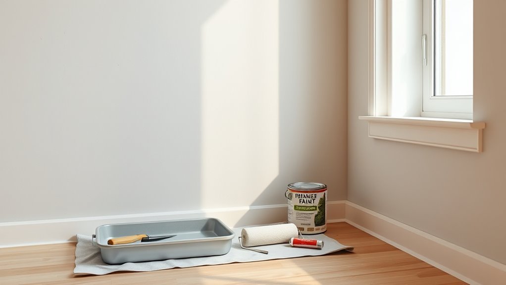
If your walls have stains, smoke damage, or other blemishes, you’ll want a primer to block them before painting.
Switching from a dark or bold color to a lighter shade also calls for primer so the new hue covers evenly.
And for porous surfaces or fresh drywall, primer seals and evens the surface so paint goes on smoothly.
Surface Stain Or Damage
Although you can cover light scuffs with a fresh coat, deep stains, smoke damage, water marks, or tannin bleed require a primer before paint so the blemishes won’t resurface or discolor the new finish.
You’ll assess surface stain and damage first: clean residue, sand flaking areas, and test for bleed-through.
Use a stain-blocking primer for tobacco, grease, or tannins. Spot-prime repairs before full coats so coverage stays even.
Choose oil- or shellac-based primers for stubborn stains; water-based works for mild issues.
Follow drying times; skip primer only when surface is clean, uniform, and undamaged.
- Clean residue
- Sand flaking areas
- Spot-prime repairs
Dark Or Bold Color Changes
Because dark or highly saturated paints can show through lighter topcoats and require more coats to build full coverage, you’ll usually need a primer first to save time, hide the old color, and guarantee true color payoff.
When you switch to bold accents or introduce a dark contrast wall, primer evens out the base so one or two topcoats deliver the intended hue. Pick a high-hide or tinted primer when covering deep tones; it reduces bleeding and minimizes coats.
Spot-prime patched areas to prevent flashing. Doing this upfront saves paint, time, and frustration while ensuring consistent, vibrant results.
Porous Or New Drywall
After handling color changes and primers for bold hues, you’ll want to prime fresh or porous drywall before painting. You’ll avoid uneven absorption on porous surfaces and get consistent drywall texture coverage. Primer seals joint compound, blocks stains, and creates a uniform base so topcoat color reads true.
- Seal new drywall seams and screw heads with a quality primer.
- Use a drywall-specific primer for high-suction areas to prevent patchy finish.
- Spot-prime repaired sections to match surrounding drywall texture.
Prime first, then sand lightly and paint. That simple step saves time and prevents costly redo work later.
How Light Changes Paint Color
One key thing to remember is that light can transform a paint color more than you expect. You’ll see hues shift with natural and artificial sources; warm sunlight boosts yellows and oranges, while cool north light mutes warmth.
Lighting effects also alter perceived saturation and value, so a deep shade can read lighter in bright rooms. Consider how fixtures, bulb temperature, and window orientation interact with color psychology: soft, warm light invites relaxation, whereas cool, bright light energizes.
When choosing paint, imagine how different lights will change mood and tone throughout the day to pick a color that truly fits.
Test Samples in Real Light
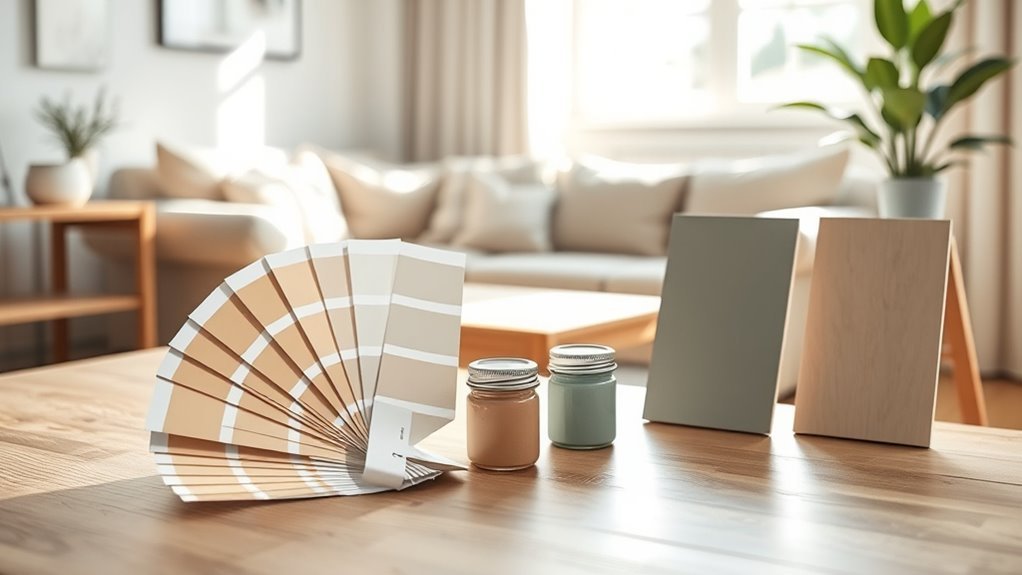
When you’re picking paint, don’t trust chips alone—apply several large swatches on different walls and observe them at various times of day. You’ll see how test samples shift under changing real light and how undertones reveal themselves. Leave swatches for at least 24–48 hours and check morning, midday, and evening.
Compare colors in different spots to avoid surprises.
See paint in multiple spots before committing—you’ll avoid surprises and find the true color.
- Put swatches near windows and in corners
- View them under artificial lights you’ll use nightly
- Photograph them at different times for reference
Decide after you’ve lived with the samples; that experience beats guessing.
How Much Paint You’ll Need
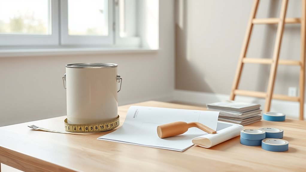
Because paint coverage depends on surface area and texture, you’ll want to calculate how much you need before you shop. Measure wall height and length, subtract windows/doors, and factor texture—rough surfaces eat more paint. Divide total square footage by the paint’s coverage per gallon on the can. Buy slightly extra for touch-ups; consider color psychology if you plan accents that need additional coats. If you have leftover paint, do paint recycling or store for future touch-ups. Quick reference:
| Room Type | Sq Ft per Coat | Gallons Needed |
|---|---|---|
| Small (100) | 100 | 1 |
| Medium (200) | 200 | 2 |
| Large (400) | 400 | 4 |
Sheen and Hiding Imperfections
Sheen affects how much light your walls reflect and which finishes are best for different rooms.
Pick lower sheens to hide surface flaws and higher sheens where you need easy cleaning and extra durability.
Consider the trade-offs so your choice balances appearance with maintenance.
Sheen Levels Explained
Although gloss levels might seem like a purely aesthetic choice, they also change how much a paint hides surface flaws, so you’ll want to take into account both look and coverage. You’ll learn sheen levels and paint gloss basics so you can pick the right finish for each room.
Lower sheens hide imperfections and diffuse light; higher glosses bounce light and clean easily. Consider traffic, lighting, and maintenance when choosing.
- Flat/Matte: low reflection, conceals texture
- Eggshell/Satin: moderate sheen, durable for living areas
- Semi-Gloss/Gloss: high shine, best for trim and kitchens
Hiding Surface Flaws
Now that you know how different gloss levels affect shine and durability, consider how they also hide—or highlight—surface flaws. You’ll want solid surface preparation before painting; skim, sand, and prime so flaws won’t show. Choose lower sheen to mask imperfections, higher sheen to reveal them. Aim for even paint application to avoid streaks.
| Sheen | Effect | Use |
|---|---|---|
| Flat | Hides bumps | Bedrooms |
| Eggshell | Soft hide | Living rooms |
| Gloss | Reveals | Trim, accents |
Match sheen to room use and preparation, then apply paint application evenly for best results.
Cleaning And Durability
When you pick a paint sheen, think about how often you’ll need to clean the walls: higher-sheen finishes stand up to scrubbing and stains much better, while flatter sheens resist showing scuffs and texture but can bruise or stain more easily. Choose based on traffic, humidity, and cleaning routines.
Test samples on problem areas to evaluate hiding imperfections and resistance. Do durability testing by scrubbing dried spots and noting color loss or sheen change.
- Use eggshell or satin in hallways and kitchens.
- Reserve flat for low-traffic ceilings or formal rooms.
- Consider washable formulas for kids’ rooms.
Finish Choice and Cleaning Needs
Because finish affects both the look and how you’ll clean a wall, pick one that fits the room’s use. Your finish choice balances sheen, durability, and cleaning needs: choose satin or semi-gloss for high-traffic or moisture-prone rooms, eggshell for living areas, and matte for low-traffic spaces. Wipeability and stain resistance matter where kids or pets roam.
| Finish | Sheen | Best for |
|---|---|---|
| Matte | Low | Low-traffic rooms |
| Eggshell | Medium | Living rooms |
| Satin/Semi-gloss | High | Kitchens, bathrooms |
Test samples and wipe spots to confirm performance before committing.
Paint for Small vs. Large Rooms
Finish and sheen matter, but room size also shapes your color and finish decisions since small rooms behave differently from large ones. You’ll choose colors and finishes that use paint psychology to alter perceived space: lighter, warm neutrals open tight areas; deeper shades add intimacy in big rooms. Consider these quick rules:
Finish and sheen matter—use light warm sheens to open small rooms and richer, low-sheen tones to cozy large spaces.
- In small rooms, pick light, warm tints and satin or eggshell to reflect light.
- In large rooms, use richer colors and matte or low-sheen finishes to reduce glare and create coziness.
- Use color psychology to balance mood—calming hues expand, bold tones anchor.
Choosing Paint for Open Plans
How do you create a cohesive look across an open-plan space without making it feel monotonous? You’ll pick a restrained palette and use color psychology to define zones—calming neutrals for lounging, energizing accents for dining or work.
Vary paint texture to add depth: matte for walls, satin for high-traffic areas, and a subtle eggshell or metallic accent on a feature wall. Keep the main hue consistent or in close tonal family, then layer in contrast with trim, textiles, and art.
Test samples in different lighting, and adjust finishes so flow feels intentional yet visually interesting.
How to Transition Colors Between Rooms
When moving from one room to the next, plan shifts so colors feel intentional rather than abrupt: pick a dominant undertone or shared neutral to link spaces, then shift saturation or temperature to signal a change in function.
You’ll use color psychology to guide mood—calmer hues for bedrooms, livelier tones for kitchens—while nodding to historical palettes for cohesion.
Consider progression techniques:
- Repeat a trim or neutral so rooms read as a sequence
- Gradually alter saturation or move along the same color family
- Use artwork or textiles to echo the linking undertone
Test samples in adjacent rooms before committing.
Picking Accent Walls That Work
Pick one focal wall—usually the one with architectural interest or the view you want to draw attention to—and paint it a bolder shade than the others.
Keep the surrounding walls neutral to let that accent sing without overwhelming the room.
That contrast creates a clear point of interest while keeping the space balanced and cohesive.
Choose A Focal Wall
If you want a room to have instant personality, choose a single focal wall—usually the one your eye hits first when you enter—and paint it a bold or contrasting color to anchor the space. You’ll use that focal wall for accent emphasis without overloading the room.
Pick the wall with architectural interest or behind furniture, then follow simple rules to keep the look intentional:
- Highlight the wall with art or a statement piece to reinforce the focal wall.
- Use a richer version of an existing room color for cohesion.
- Consider scale and lighting so the accent emphasizes, not overwhelms.
Balance With Neutrals
Although a bold accent wall can define a room, pairing it with neutrals keeps the space grounded and versatile. You’ll balance impact and calm by choosing Neutral shades for surrounding walls, trim, or furnishings so the accent reads intentional, not overwhelming. Aim for color harmony by matching undertones—warm tans with warm jewel tones, cool grays with blues or greens. Use texture and pattern in neutrals to add depth without competing. Refer to simple contrasts to plan placement:
| Accent | Neutral Wall | Trim/Fabric |
|---|---|---|
| Deep teal | Warm gray | Cream linen |
| Burnt orange | Beige | Soft white |
Using Color Temperature to Set Mood
When you choose a paint’s color temperature—warm, cool, or neutral—you’re shaping how a room feels: warm tones invite coziness and energy, cool tones calm and expand, and neutrals balance the two.
You’ll use color temperature for mood setting by matching function and feeling: bedrooms lean cool for rest, kitchens take warm hues for appetite and sociability, and living areas mix both.
Try simple swaps and observe light through the day. Tips to test quickly:
- Paint small samples on different walls to see in morning and evening light
- Consider ceiling and trim as lighter or cooler accents
- Use textiles to tweak warmth without repainting
Neutrals That Don’t Feel Boring
Neutral doesn’t have to mean forgettable; you can create depth and personality with subtle undertones, layered textures, and contrast.
Neutral doesn’t mean dull—layer subtle undertones, textures, and contrast to give neutrals real personality.
When you pick a neutral, study undertones in different lights—warm tans, cool greiges, or soft taupes—to match furniture and natural light. Use trim and accent pieces in slightly darker or lighter shades to form deliberate contrast.
Introduce texture through matte vs. eggshell finishes, woven fabrics, and wood grain to break uniformity.
Consider Neutrals psychology and Neutral paint psychology: neutrals can calm or energize depending on surroundings.
Test large swatches before committing so the room’s mood aligns with your intent.
Choosing Bold Colors That Last
If you want bold color to endure, start with quality pigments and proper prep. You’ll pick bold palettes that suit light, scale, and mood, and you’ll protect color with the right finish.
Prime bare or repaired surfaces, sand smooth, and choose low-VOC formulas with high pigment load for lasting vibrancy.
Consider undertones and test swatches at different times of day. Balance bold walls with neutral accents so the room feels intentional, not overwhelming.
Maintain color with gentle cleaning and touch-up kits. Use professional tools—rollers, angled brushes—and follow manufacturer cure times for results that stay vivid.
Paint for High‑Traffic Family Rooms
Because family rooms take the daily wear and tear of kids, pets, and guests, you’ll want paint that hides scuffs, cleans easily, and keeps its color over time. Choose a durable finish—eggshell to satin—for wipeability without glare.
Choose durable, scuff-hiding paint in eggshell to satin for easy cleaning and long-lasting color.
Pick a mid-tone neutral or warm hue so stains and touch-ups blend; use color psychology to set mood—calming blues or energetic warm grays depending on activity.
Consider washable, stain-resistant formulations labeled for high traffic.
Accent walls follow current paint trends if you want personality, but keep main walls practical.
Test samples, scrub them, then decide based on real-life performance.
Best Paints for Kitchens & Baths
In kitchens and baths you’ll want a low‑maintenance sheen that wipes clean without streaking.
Choose paints labeled washable or scrubbable so daily messes and splashes come off easily.
For rooms with steam and humidity, pick mold‑resistant formulas to protect surfaces and indoor air.
Low-Maintenance Sheen
Want a finish that wipes clean and keeps looking fresh? Choose a low-maintenance sheen that balances durability and subtlety—aim for sheen consistency across walls and trim to avoid patchy reflections and maintain gloss uniformity. You’ll get easier cleaning without shiny walls that highlight flaws.
Consider these options:
- Satin: forgiving, easy to wipe, good for moderate-traffic kitchens and baths
- Semi-gloss: tougher finish for high-moisture zones, still manageable visually
- Eggshell: softer look with improved cleanability over flat
Test samples in real light, wipe them after drying, and pick the sheen that matches your lifestyle and room activity.
Mold-Resistant Formulas
When moisture’s a regular guest, pick a mold-resistant paint formulated with mildewcides and antimicrobial additives so you won’t be fighting stains or odors later. You’ll want a product rated for damp environments and labeled for kitchens and baths; these reduce spore growth and aid mold prevention.
Choose satin or semi-gloss sheens for washable surfaces and better moisture shedding.
Prep matters: fix leaks, improve ventilation, and use a mold-killing primer on existing stains before painting. Apply according to manufacturer instructions and allow full cure time.
With the right formula and prep, you’ll keep surfaces cleaner and more durable in humid spaces.
Durable Paints for Kids’ Rooms
Because kids are hard on walls, you’ll want paint that stands up to fingerprints, scuffs, and repeated scrubbing without fading or peeling. Choose durable finishes like satin or semi-gloss for easy cleaning, and prioritize child safe paints low in VOCs and free of harsh additives. Look for washable, mildew-resistant formulas and chemical safety certifications.
Pick durable, low‑VOC paints in satin or semi‑gloss—washable, scrubbable, and mildew‑resistant for kid‑proof walls.
- Satin or semi-gloss for scrub resistance and stain release
- Low-VOC, non-toxic options labeled child safe paints
- Scrubbable and mildew-resistant formulations for longevity
Test a small area, follow manufacturer’s curing times, and use quality rollers for even, long-lasting coverage.
Paint for Rental Properties
After considering durable, kid-friendly finishes, you’ll approach rental properties with a slightly different checklist: you need paint that hides wear, minimizes turnover costs, and appeals to a wide range of tenants. Choose mid-tone neutrals that mask scuffs and work with varied wall texture. Use washable, high-hide formulas and satin or eggshell finishes for easy cleaning. Keep a labeled paint storage kit for touch-ups between tenants. Track batch numbers and room locations. Communicate color choices to tenants for coordinated decor.
| Feature | Benefit | Note |
|---|---|---|
| Neutral hue | Broad appeal | Easier re-rent |
| Durable finish | Lower maintenance | Wipe clean |
| Stored touch-up | Fast repairs | Label batches |
Picking Trim and Ceiling Colors
If you want your space to feel polished, pick trim and ceiling colors that either recede or gently frame the walls—white or soft off-white trims make colors pop and read clean. While a slightly darker trim can add definition in larger rooms, you’ll want simple ceiling choices and a thoughtful trim color strategy to control contrast and mood.
Choose trims and ceilings that either recede or softly frame walls—white or soft off-white keeps rooms polished and balanced
Consider scale, lighting, and architectural detail when choosing your colors and finishes.
Quick tips:
- Use crisp white trim for modern or small rooms to brighten and simplify.
- Try warm off-white ceilings for cozy spaces without feeling low.
- Match sheen levels: eggshell walls, semi-gloss trim for durability.
Match Paint to Your Flooring
Look at your flooring’s undertones first so the wall color complements rather than clashes with warm or cool hues.
Keep the room balanced by matching lightness levels—don’t pair very dark floors with walls that wash the space out.
Finally, coordinate paint with any floor patterns or textures so the room feels unified, not noisy.
Consider Flooring Undertones
Many homeowners overlook how flooring undertones affect paint, but matching them keeps a room feeling cohesive and intentional. You’ll create flooring harmony by noting warm or cool bases in wood, tile, or carpet before choosing paint.
Focus on undertone matching to avoid clashes and to enhance the floor’s character.
- Compare small paint swatches against the flooring in natural light.
- Choose paint with similar warm or cool undertones for seamless flow.
- Use neutral variations that echo subtle undertones if you want flexibility.
Trust your eye: consistent undertone matching makes rooms feel thoughtfully connected.
Balance Lightness Levels
When you match paint lightness to your flooring, you keep a room balanced and comfortable rather than visually top‑ or bottom‑heavy. Look at your floor’s value: dark floors call for lighter walls to lift the space, while pale floors can handle deeper hues for grounding.
Use color psychology to decide mood—lighter paints feel airy and calm; mid to dark tones add coziness and drama. Test swatches near baseboards at different times of day.
Stay aware of current paint trends but prioritize timeless contrast that suits your lifestyle. Aim for a clear, measured contrast rather than exact matching.
Coordinate Pattern And Texture
While you’re matching paint to flooring, think beyond color and consider pattern and texture so the surfaces read as a cohesive whole. You’ll use pattern coordination to echo flooring motifs without overwhelming the room, and texture selection to balance smooth walls with tactile floors.
Pick a dominant element—grain, veining, or geometric repeat—and let paint choices support it. Use contrasts sparingly to add depth.
- Mirror subtle floor grain with low-sheen paint for unity.
- Pair bold tile patterns with simple, muted wall finishes.
- Match rough stone with warmer, textured paint techniques.
This approach keeps spaces harmonious and intentional.
Coordinate Paint With Furniture & Rugs
Because your furniture and rugs set the room’s visual anchor, pick paint that either echoes their dominant tones or offers a clear, intentional contrast. You’ll create furniture harmony by sampling wall chips next to upholstery and testing paint over rug edges. Use neutral walls to calm busy patterns, or choose an accent hue pulled from a rug for cohesion. For rug coordination, match undertones—warm with warm, cool with cool—to avoid clashes. Trust small swatches in different spots. Below’s a simple table to stir feeling and guide choice.
| Emotion | Action |
|---|---|
| Calm | Soft beige |
| Cozy | Warm terracotta |
| Fresh | Sage green |
| Bold | Deep navy |
| Bright | Sunny yellow |
Lighting Fixtures and Color Appearance
Think about how natural light shifts your paint at different times of day, because morning sun and shade will show colors differently.
Match bulb color temperature to the mood you want—warm bulbs soften warm paints, while cool bulbs sharpen blues and grays.
And remember that where fixtures are placed changes highlights and shadows, so test paint under the actual lighting setup.
Natural Light Effects
Even if a room gets plenty of daylight, the type and placement of your light fixtures will change how paint actually looks—warm bulbs bring out yellow and orange undertones, cool bulbs emphasize blues and grays, and directional lighting can create hotspots or deepen shadows.
You’ll still rely on natural light to reveal true hues, but paint brightness shifts across the day. Test samples at morning, noon, and evening to see range.
Consider these quick checks:
- Observe swatches in direct sun and shade for contrast
- Note how nearby surfaces reflect color onto walls
- Track paint brightness at different times to choose confidently
Bulb Color Temperature
Natural light shows you a paint’s baseline, but the bulbs you pick will redefine that look once the sun sets. You should match bulb color to the mood you want: warm (2700–3000K) softens creams and earth tones, while cool (3500–5000K) sharpens blues and grays.
Color temperature affects perceived saturation and contrast, so test paint samples under the bulb types you’ll actually use. Use consistent color temperature in connected spaces to avoid jarring shifts.
If you need versatility, choose bulbs with adjustable color temperature or use layered lighting to balance ambiance without changing your paint choice.
Fixture Placement Impact
When you place fixtures matters as much as the bulbs you choose, because light angle and intensity change how paint reads on walls. You’ll notice fixture placement has a direct impact on light distribution, creating highlights, shadows, and perceived color temperature shifts.
Consider how fixtures sit relative to walls and furniture; moving a sconce or pendant just inches alters contrast and warmth. Test positions before finalizing, and prioritize flexible options.
- Mount fixtures higher to wash walls evenly and soften color contrasts.
- Aim directional fixtures to highlight texture or artwork without harsh glare.
- Use dimmers to control intensity and mood.
Exterior‑Facing Interior Walls Care
Because exterior-facing interior walls sit where weather, sunlight, and temperature swings meet your living space, they need paint and prep that handle moisture, UV exposure, and thermal movement.
You’ll prioritize exterior maintenance routines: inspect seals, flashings, and trim, and fix leaks promptly.
Choose paints with durable binders and good adhesion for fluctuating temperatures.
Address wall texture—smooth imperfections first, or select a paint that hides minor irregularities.
Use proper primers for porous or damp-prone surfaces.
Ventilate during application and allow full cure before exposing to moisture.
Schedule periodic touch-ups to prevent failure and extend finish life.
Low‑VOC and Eco‑Friendly Paints
When you’re choosing paint, low‑VOC and eco‑friendly options help keep indoor air healthier for you and your family. They also use more sustainable ingredients and manufacturing practices, reducing chemical off‑gassing and environmental impact.
Look for certified labels and ingredient lists so you can make a confident, safer choice.
Health And Indoor Air
Air quality matters as much as color when you pick paint, so prioritize low‑VOC and eco‑friendly options to keep your home healthy. You’ll improve indoor air and address health considerations by choosing paints with minimal emissions, ventilating during and after painting, and avoiding strong odors that aggravate allergies.
Consider these steps:
- Let fresh air circulate—open windows and run fans.
- Pick certified low‑VOC paints and check labels for emissions.
- Wait before reoccupying rooms, especially for infants or elderly.
These actions reduce irritants, protect respiratory health, and guarantee your chosen color doesn’t compromise comfort.
Sustainable Ingredients
If you want paint that looks great without worsening indoor air, choose products made with sustainable ingredients and low or zero volatile organic compounds (VOCs). You’ll reduce odors, speed safe reentry after painting, and limit off-gassing that can trigger sensitivities.
Look for certifications like GreenGuard, Green Seal, or labels noting low-VOC formulas and recycled content. Ask retailers about pigment sources and water-based binders versus solvent-heavy options.
Eco-friendly paints often perform as well as conventional ones, so test samples on your wall to confirm finish and coverage. Prioritize transparency from manufacturers to make healthier, more sustainable choices.
How to Read VOC and Labels
Although paint labels can feel like a maze, you can learn to scan them quickly for the info that matters: VOC levels, solid content, and any health or performance claims. You’ll focus first on VOC labels and paint safety—look for numbers in g/L; lower is better.
Check solids to estimate coverage and durability. Review any certifications (GREENGUARD, EPA) and hazard warnings to protect vulnerable people.
- Note the VOC number and compare to room use.
- Read hazard statements and recommended ventilation.
- Prefer paints with clear ingredient lists and third-party seals.
Trust labels that give measurable, verifiable facts.
Best Paint Brands for Quality & Value
Now that you can read VOCs and labels, the next step is choosing a brand that matches your priorities—durability, coverage, low-VOC formulas, and price. You’ll want brands known for consistency: one offering rich pigments for Paint color psychology, another for Eco friendly pigments, and a third balancing cost and performance. Test samples, check warranty, and read user reviews for scuff resistance and true color. Compare finishes for light reflection and mood. Use this quick brand comparison to narrow choices.
| Brand | Strength | Best for |
|---|---|---|
| Brand A | Coverage | Living rooms |
| Brand B | Low VOC | Nurseries |
Cost, Value, and When to Splurge
When you weigh cost vs. value, think about where paint makes the biggest difference and where you can cut corners. Do a quick cost analysis and value assessment: prioritize high-traffic areas and ceilings with premium, washable finishes; save on closets or temporary spaces with budget brands.
Consider labor, prep, and longevity when estimating total value.
- Spend on durable, low-VOC paints for family rooms and kitchens.
- Save on accent walls or guest rooms with mid-range options.
- Invest in quality primer and pro labor where imperfections show.
Balance upfront cost against long-term satisfaction and maintenance.
Avoid Common Color‑Selection Mistakes
If you pick a color based on a tiny swatch or a fleeting mood, you’ll end up with paint that looks wrong in the room — plan for light, scale, and how finishes change a hue. You should test large samples, observe them at different times, and consider Color psychology and mood influence so choices support function. Don’t assume catalog photos match your lighting. Balance bold accents with neutral fields, and factor existing furnishings. Below is a quick reminder table to keep decisions practical.
| Issue | Quick Fix |
|---|---|
| Too dark | Lighter finish, trim |
| Too cold | Warm accents |
| Too flat | Higher sheen |
| Too busy | Simplify palette |
Use Online Visualizers Wisely
Although online visualizers can shortcut trial-and-error, use them as a starting point rather than a final decision: they let you try many colors quickly, but screens misrepresent hue, saturation, and finish. You should treat an Online visualizer or color simulation as a preview tool, not proof.
Compare simulations under different lighting settings, view swatches on your walls, and order physical samples before committing. Use these quick checks to narrow choices:
- View the color simulation on multiple devices to spot inconsistencies.
- Test printed swatches or sample pots in morning and evening light.
- Note finish differences; gloss and matte change perceived tone.
When to Hire a Color Consultant
Online visualizers help you narrow options, but there are times it’s worth hiring a color consultant. You should call one when you’re juggling complex light, open-plan flow, or strong emotional goals — they apply color psychology to unify spaces. Hire help if you need accurate samples, dimensional plans, or advice on durable finishes and paint storage logistics. Consultants save time, prevent costly mistakes, and recommend palettes that suit furnishings and resale value. Below is a quick comparison to help decide.
| Situation | When to Hire |
|---|---|
| Lighting confusion | Yes |
| Emotional tone needed | Yes |
| Large remodel | Yes |
| Simple refresh | Maybe |
Frequently Asked Questions
Can I Paint Over Wallpaper Without Removing It First?
Yes — you can paint over wallpaper, but you’ll risk poor paint adhesion unless you test and prep properly. You’ll likely need to score, prime with a bonding primer, and consider eventual wallpaper removal versus full wallpaper removal.
How Long Should I Wait Between Coats at Different Temperatures?
Like bread cooling on a rack, you should wait longer in cool, humid conditions: Temperature effects slow drying times, so at 50–60°F wait 24+ hours, at 65–75°F wait 2–4 hours, above 80°F wait 1–2 hours.
Can I Mix Leftover Paints to Create a Custom Shade?
Yes — you can mix leftover paints for color mixing and shade customization, but you’ll want to test small batches, keep ratios consistent, label mixtures, and consider finish and colorfastness since results can vary and aren’t always perfectly predictable.
How Do I Store Leftover Paint for Years Safely?
You can store leftover paint safely by sealing cans tightly, labeling them, keeping them in a cool, dry place off concrete, and avoiding temperature extremes; Paint storage and Leftover paint safety matter, so check and stir before reuse.
Will My Paint Chip or Peel if I Use a Roller Incorrectly?
Yes — you’ll get chipping or peeling if poor roller technique compromises paint adhesion; you should roll evenly, avoid overworking wet edges, maintain proper nap, and apply recommended coats and drying times so the film bonds and stays put.
Conclusion
You’ve got a simple, smart system to select paint: set clear goals, study light, spot‑check finishes, and splurge where surface and style matter. Stay mindful of primer, costs, and common color traps, and try online visualizers before committing. Trust your taste, test samples in real time, and call a consultant only when decisions daunt you. With steady steps and a small toolkit, you’ll paint a polished, purposeful place you’ll proudly live in.