How to See a Paint Color on Your Wall
Decide the room’s mood and measure walls, then map windows, fixtures, and bulb types so you know how light will hit color. Shortlist 3–5 shades and buy 2–3 sample jars or peel-and-stick swatches. Paint large 3×3-foot patches on different walls and try finishes, observing them morning, midday, and night under natural and artificial light. Note undertones, metamerism, and texture, live with two finalists for a week, and keep going to learn more.
Define the Room’s Mood and Purpose

Before you pick a swatch, decide how you want the room to feel and what you’ll use it for; those choices will narrow your color options and guide their intensity and finish.
Decide the room’s purpose and desired mood first—those choices will narrow your color, intensity, and finish.
You’ll use color psychology to steer mood: cool tones calm bedrooms, warm hues energize kitchens, and neutrals ground multipurpose spaces.
Match finish and saturation to traffic and function—higher gloss hides scrubbing better, matte masks imperfections.
Consider how furnishings and lighting will interact so you don’t chase a shade that clashes.
Finally, factor in paint durability for longevity in busy areas; choose formulations that resist staining and fading.
Measure Walls and Map Light Sources
Now that you’ve settled on the room’s mood and function, measure each wall and note every light source so you can predict how paint will read. Measure height and width, mark window and door placements, and record orientation.
Note Wall textures—smooth, orange peel, or plaster—since finish and texture change sheen and shadow.
Map artificial and natural light: positions, bulb types, and any dimmers. Include Ventilation effects like vents or fans that cast shadows or reorient airflow and dust, altering finish over time.
- Measure all walls precisely
- Label light types/positions
- Record textures
- Note vents and airflow
Shortlist Paint Colors and Note Undertones
Once you’ve gathered your measurements and light map, narrow your choices to a shortlist of three to five paints so you can compare undertones and behavior more easily.
Now, get samples and place them on different walls and near windows to watch shifts throughout the day. Note warm or cool undertones, how they read against trim and flooring, and whether they feel muted or vivid.
Consider color psychology—how each hue affects mood—and cultural associations that may influence perception in your home.
Record reactions at morning, midday, and evening. Your notes will guide the final selection without relying on memory alone.
Decide Finishes to Include in Tests
How glossy should your sample be? Decide finishes to include in tests by considering room use, light, and the mood you want. Finish affects sheen, color psychology, and paint durability, so test what you’ll live with.
Consider room use, light, and mood when testing finishes — sheen changes color perception and durability, so test samples.
- Flat — hides flaws, soft look, lower durability.
- Eggshell — subtle sheen, good for living spaces.
- Satin — more durable, easy to clean, works in kitchens.
- Semi-gloss — high sheen, durable, ideal for trim and bathrooms.
Apply each finish to a small area. Observe at different times and angles to judge true tone, reflectivity, and longevity before committing.
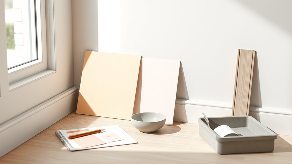
Buy 2–3 Sample Jars or Peel-And-Stick Swatches
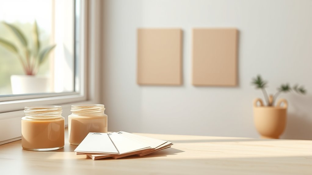
After you’ve decided which finishes to test, pick up 2–3 sample jars or peel-and-stick swatches so you can see the colors on your actual walls.
Test small areas near windows and in corners to watch how light alters hue.
Use swatches to compare undertones against trim and furniture.
Think about color psychology—warm tones can energize, cool tones calm—and match that intent to each room.
Include one option inspired by historical palettes if you want timeless character.
Label each sample with date and position, and note reactions over a few days before committing to a full can.
Test Paint Colors With Large Wall Samples
To see how a color truly reads in the room, paint two large 3-foot-by-3-foot patches on different walls—or use full-size peel-and-stick sheets—so you can judge scale, sheen, and undertone at eye level and from across the room. Stand back, view at different times, and note lighting effects.
Paint two large 3×3 patches on different walls to judge color, sheen, and undertones in varied light.
Consider color psychology—warm hues feel cozy, cool hues expand space. Also test paint durability near high-traffic areas.
- Paint samples with intended finish.
- Observe in morning and evening light.
- Check for undertones against trim and flooring.
- Wear gloves and document names for comparison.
Use Peel-And-Stick Swatches on Key Walls
Stick peel-and-stick swatches on the walls you use most to see how the color reads in daily life.
Move them around to eye level on different sides of the room and check them under morning, afternoon, and artificial light.
That way you’ll spot shifts in tone and make a confident choice.
Test Multiple Lighting Conditions
When natural light shifts through the day, the same paint can look entirely different, so put peel-and-stick swatches on the main walls where you’ll live and entertain.
You’ll observe undertones, mood shifts, and how color psychology affects perception in morning, noon, and evening.
Note which swatch complements furnishings and which clashes.
Compare swatches from different paint brands for accurate paint brand comparisons before committing.
Record your impressions.
- Check at sunrise
- Check at midday
- Check at dusk
- Check under artificial lights
Trust your notes; they’ll prevent costly mistakes and guarantee the color works in real life.
Position At Eye Level
You’ve already seen how lighting changes color; now place peel-and-stick swatches at eye level on the walls where you’ll spend the most time so you can judge the hue in its true context.
Positioning at eye level helps you evaluate color psychology—how a shade influences mood during daily activities—rather than relying on ceiling or corner samples.
Stick swatches on different wall texture areas; smooth drywall and textured plaster can alter perceived saturation and depth.
Live with the samples for several days, observing morning, afternoon, and artificial light.
Remove and reposition as needed until the chosen color feels right for the room.
Make Full-Size Painted Cards to Move Around
If you want to see how a color reads at scale and in different light, paint full-size cards you can move around the room. You’ll test color psychology and how hues interact with furnishings or nod to historical palettes without committing.
Make sturdy cards on foam core, paint two coats, and label the back with brand and formula. Move them to corners, next to textiles, over trim, and beside artwork to judge contrast and mood.
Make sturdy foam-core color cards, paint two coats, label formulas, and move them around the room to judge contrast and mood.
Don’t rely on tiny swatches; treat these as temporary wall samples. Note reactions, tweak tones, and repeat until the color feels right.
- Cut foam core
- Paint two coats
- Label info
- Move and observe
View Paint Samples in Natural Light: Morning, Noon, Evening
Because light shifts so much over the day, you should check your paint samples in the same spot at morning, noon, and evening to see how temperature and intensity change the hue.
Morning’s cool, angled light can make colors read softer and reveal undertones. Noon’s direct sun shows true saturation. Evening’s warm glow deepens and mutes tones.
Note how shadows alter contrast and how rooms with different exposures behave.
You’ll assess both aesthetic impact and practical concerns like perceived wear and paint durability under sunlight.
Consider color psychology too—moods shift with light, so choose a shade that supports desired atmosphere.
Check How Artificial Light Changes Paint Appearance
When you switch on your lamps and overheads, pay attention to how different bulbs shift a sample’s tone and warmth—LEDs, incandescents, and fluorescents each cast distinct color temperatures and can make the same paint read cool, neutral, or yellowed.
You’ll notice Artificial lighting alters Color perception; test at night to see true evening effect.
Try these quick checks:
- Turn on each fixture individually and observe the sample.
- Move the sample closer to each light source.
- Photograph the sample under each light for comparison.
- Live with a taped sample overnight before committing.
Compare Warm vs Cool Bulb Temperatures on Samples
Although warm and cool bulbs can both light a room well, they’ll pull the same paint sample in opposite directions—warm bulbs deepen yellows and reds, while cool bulbs emphasize blues and grays.
Warm bulbs pull yellows and reds; cool bulbs bring out blues and grays—light shifts a paint’s true tone.
You should place identical samples under both bulb types and observe differences side by side. Note how light temperature shifts saturation and shadow, and how color perception changes with intensity.
Take photos with consistent exposure to compare later. Decide which mood you prefer under the light you’ll actually use, not just daylight.
This simple test prevents surprises and guarantees your chosen paint behaves as you expect in real living conditions.
Examine Samples at Different Viewing Distances
Stand across the room and see how the color reads from a normal distance, since paint can shift when viewed in context.
Then move up close and inspect the wall for texture, brush marks, and subtle undertones that vanish from afar.
You’ll get the full picture by comparing both views before you commit.
View From Across Room
Look across the room and study the swatch from several distances—near, mid, and far—to see how the color and its undertones read in different viewing contexts. You’ll notice wall texture and furniture placement change perception; step back to judge overall harmony.
Observe how light pools, shadows shift, and accents pop or recede. Use this quick checklist to evaluate:
- From three paces: note true hue and subtle undertones.
- From mid-room: assess balance with furniture placement.
- From across room: judge emotional impact and cohesion.
- At different times: compare morning, afternoon, evening light.
Make decisions based on the far view.
Close-Up Wall Inspection
When you move in close, you’ll see details that change how the paint actually reads: texture, brush strokes, and subtle undertones become clearer. Nearby finishes—like trim or fabric—can shift the perceived shade.
Inspect samples at arm’s length, then step nearer and lean in to study wall texture and how light grazes imperfections. Touch the finish to judge paint durability and feel—gloss hides flaws, matte reveals them.
Compare edges where samples meet existing color. Note how undertones pop under different angles.
Photograph close-ups in natural and artificial light to track true appearance before committing.
Inspect Color at Eye Level, Low, and High Walls
Although natural light changes throughout the day, you should inspect paint at eye level, low, and high on the wall to capture how the color reads from different heights. Check wall textures and consider color psychology—warm tones feel cozier low, cooler tones recede high. Walk the room, note shifts, and decide based on usage.
- Stand at eye level and view from a few feet away.
- Kneel to see how baseboards and shadows alter the hue.
- Step back and tilt your head up to assess ceilings and upper walls.
- Compare notes under natural and artificial light sources.
Test Finishes: Flat, Eggshell, Satin, Semi-Gloss
Because finish changes how paint reflects light and resists wear, you should test flat, eggshell, satin, and semi-gloss on your wall before committing—each finish alters depth, sheen, and cleanability in measurable ways. You’ll notice flat softens hues (good for masking flaws), eggshell offers subtle warmth, satin boosts durability, and semi-gloss sharpens contrast. Consider color psychology and historical palettes when choosing sheen to match mood and period. Test swatches in different light and touch them after drying to judge cleanability. Use this quick comparison to guide you:
| Finish | Sheen | Best use |
|---|---|---|
| Flat | Low | Walls, low-traffic |
| Eggshell | Low-Med | Living areas |
| Satin | Med | Kitchens, halls |
| Semi-Gloss | High | Trim, doors |
See How Trim, Floor, and Furniture Shift Color
Think about how trim, floors, and furniture act like a frame for your wall color—they can warm, cool, mute, or make a hue pop. You’ll notice color psychology at work: white trim makes tones crisper, dark floors ground warm shades, and cool upholstery softens vivid pigments.
Also consider paint durability near baseboards and high-traffic furniture zones. Check how finishes read in different light and positions before committing.
- Compare with existing trim
- Layer samples near flooring
- Place swatches by furniture
- Observe at different times
Make choices that balance mood, function, and wear.
Test Samples Next to Metallics, Wood, and Textiles
When you test paint samples, put them next to the metallics, wood tones, and textiles that will share the room so you see how each surface shifts the color.
Hold samples beside brass or chrome fixtures to watch metallic finishes throw warmth or coolness into the hue.
Lean a swatch against wooden furniture or flooring to note undertone interactions with oak, walnut, or painted trim.
Drape fabric swatches nearby to observe how textile textures absorb or reflect light, changing perceived saturation.
Repeat at different times of day and from various distances so your choice works with all materials in the space.
Use a Gray Card to Judge True Color and Value
Place a gray card next to your paint sample so you’ve got a neutral reference.
Match your view under neutral light and use the card to compare the paint’s value rather than its hue.
That way you’ll see whether the color is lighter or darker than you thought without being fooled by surrounding finishes.
Place Gray Card Nearby
Because your eyes and the room’s lighting can skew how a paint looks, use a neutral gray card next to the swatch to reveal its true hue and value. Place the gray card close to the painted area, hold it steady, and view from several angles. The card provides a reference for color calibration so you judge undertones and brightness accurately.
- Position card adjacent to swatch.
- Compare at eye level.
- Check from different distances.
- Photograph with the card in frame.
Rely on the gray card, not memory, to decide if the color reads right in the space.
Match Under Neutral Light
If you want a paint to read true, match it under neutral light and use the gray card as your reference. Place the gray card next to your sample and view during midday or under a daylight-balanced bulb to eliminate warm or cool bias.
Look for shifts in tint and lightness against the neutral card so you can judge true color and value accurately. Consider color psychology—how the hue feels in neutral light—and test areas where wear may show, since perceived shade can affect perceived paint durability.
Take notes and photos under the same neutral conditions for consistent comparisons later.
Compare Value, Not Hue
When you hold a gray card next to your paint sample, focus on lightness and darkness rather than the hue—your eye is better at judging value than subtle color shifts. Use the card to compare how a shade reads across walls and different lights.
Value affects mood as much as color psychology, so pick the brightness that fits the room’s function. Also remember value can mask or reveal surface flaws that relate to paint durability.
Try this quick checklist:
- Place card beside sample at eye level.
- View under neutral light.
- Note contrast to existing trim.
- Repeat in morning and evening.
Photograph Samples Correctly for Digital Previews
To get accurate digital previews, photograph your paint samples under consistent, neutral lighting and keep the camera level with the wall; this prevents color shifts and perspective distortion that can trick your eye. You’ll include context—furniture, trim, and sample edges—so you judge interplay and color psychology with real surroundings. Historical palettes can inform choices, but rely on your photos to test mood. Use a neutral gray card, avoid flash, and shoot RAW or high-quality JPGs. Compare images side-by-side on calibrated screens and note ambient light times for repeats.
| Step | Tip |
|---|---|
| 1 | Neutral light |
| 2 | Level camera |
| 3 | Gray card |
| 4 | RAW/JPG |
| 5 | Calibrate screen |
Use Apps and AR Cautiously : What They Miss
Apps and AR can give you a quick idea, but they often miss how lighting shifts tones across the day. They also don’t reproduce texture and sheen, so a matte wall can look very different from a semi-gloss sample.
And virtual previews can’t fully show how neighboring colors and room proportions will change your perception.
Lighting And Tone Shift
Because light changes everything, you should treat app previews and AR demos as rough guides rather than final answers. You’ll notice hue and value shift with morning, noon, and evening light, so test samples at different times. Consider color psychology and historical influences on how tones read in period rooms versus modern spaces.
- Observe samples under natural light.
- Check samples under your artificial bulbs.
- Move swatches between bright and shaded areas.
- Photograph samples at different times for comparison.
Trust your eyes over screens; small shifts alter mood and perceived warmth or coolness.
Texture And Sheen Effects
When you rely on AR or photos, you’ll miss how texture and sheen change color perception in real life. You’ll want to test samples on your actual wall because texture techniques like sponging, rolling, or brushing catch light differently and shift apparent hue.
Touchable surfaces create subtle shadows that apps don’t render. Sheen variations—from matte to satin to gloss—alter reflectivity and depth, making the same pigment read warmer, cooler, flatter, or richer.
Apply full-size panels, view at different angles and times of day, and note how finish plus texture influence mood so you choose confidently, not digitally.
Spatial Color Interaction
Although AR and photo tools give you a quick preview, they can’t show how nearby colors and objects will change a paint’s look in real life. You’ll need to inspect spatial color interaction directly: walls borrow tones from furniture, textiles, and flooring, altering mood and color psychology.
Small samples reveal undertones that apps miss. Consider context and light across the day. Try these steps:
- Place taped samples near furniture and art.
- View samples at morning, noon, and evening light.
- Compare against fabric swatches and wood finishes.
- Test with a historical palette if you’re matching period style.
Trust observation over simulations.
Compare Color Across Rooms and Sightlines
As you move through your home, note how the same paint reads differently from one room or sightline to another; natural light, adjoining colors, and room function all change perception.
Walk slowly and view walls from multiple angles at different times; sunlight, shade, and artificial light shift hue and warmth.
Consider color psychology—how a soft blue soothes in a bedroom but may feel cold in a north-facing hallway.
Check high-traffic sightlines for scuffs and finish wear; paint durability matters where walls meet hands and furniture.
Record observations and photos to compare how one color behaves across spaces before deciding.
Strategies for Small Rooms vs Open Plans
Because scale and sightlines change how color reads, you’ll choose different strategies for small rooms than for open plans. In small spaces, you’ll favor light, reflective hues and restrained historical palettes to avoid overwhelm.
In open plans, you’ll use deliberate gradations and bolder accents guided by color psychology. Tips:
- For small rooms, pick pale base tones to amplify light.
- In open plans, define zones with complementary hues.
- Use one dominant palette and repeat accents for flow.
- Test samples at various distances and times to confirm cohesion.
These methods help you balance intimacy, continuity, and visual comfort.
Test How Fixtures and Window Treatments Change Color
When you test paint, include the fixtures and window treatments you’ll actually use so you see how they shift the hue and tone. Bring lamps, switch plates, and hardware into the room and try different fixture placement to note warm or cool reflections.
Hang the actual window treatments—sheers, blinds, or lined drapes—during tests so you assess color under both filtered and direct light. Move pendants and floor lamps where they’ll live; observe shadows and contrast near trim.
Photograph samples at different times of day. That hands-on approach prevents surprises and helps you choose a color that works with every element.
Watch for Metamerism, Glare, and Color Bleed
If two samples look the same under one light but different under another, you’re dealing with metamerism — a tricky color mismatch caused by how pigments and light sources interact. Watch how color perception shifts with time of day and bulbs. Reduce glare and prevent color bleed from adjacent surfaces.
If two paints match in one light but not another, you’re seeing metamerism — test colors in varied lighting.
- Observe samples in morning, noon, evening.
- Use varied light bulbs to note lighting effects.
- Angle samples to reveal glare hotspots.
- Isolate a swatch to spot color bleed from trim or decor.
You’ll make smarter choices when you test under real conditions and compare results.
Narrow to Two Finalists and Live-Test for a Week
After checking samples at different times and under varied lights, narrow your favorites to two paints and commit to full-size test patches. Place them on opposite walls and live with each for a week so you see morning, afternoon, and artificial light behavior.
Note how each hue affects mood, using color psychology to judge warmth, calm, or energy. Consider how the shades align with historical trends if you’re aiming for period-appropriate ambiance.
Take photos at set times, jot reactions, and test adjacent décor and textiles. After a week you’ll have practical evidence to confidently move toward a final choice.
Final Decision Checklist Before Committing
Although you’ve lived with the samples and taken notes, pause to run a final checklist so you don’t discover regrets later. You’ll confirm that the chosen swatch suits light variations, furniture finishes, and mood goals. Consider color psychology and how the hue affects energy, plus how historical trends influence resale appeal.
Check paint finish, coverage estimates, and a small patch for a week in different light. Finally, calculate budget and timeline before buying gallons.
- Test in all light
- Assess emotional impact
- Verify finish and coverage
- Confirm cost and schedule
Frequently Asked Questions
Can I Test Paint Over Existing Wallpaper Without Removing It First?
Yes — you can test paint over existing wallpaper, but you’ll likely need wallpaper removal later; use a paint primer first to promote adhesion and test a small inconspicuous area, since seams or adhesive can still cause problems.
How Long Should I Wait Between Repainting Test Areas and Evaluating Color?
Wait about 24–48 hours before evaluating color; paint drying time varies by type and humidity, so you’ll want full cure for true color. Check under different lighting conditions and at different times of day for accurate judgment.
Will Exterior and Interior Versions of the Same Color Match Visually?
About 70% of people notice subtle finish differences quickly: you won’t get exact matches between exterior and interior formulations, but with careful Color consistency and coordinated sheen choices you’ll achieve strong Visual harmony throughout your home.
Can VOC Levels in Paint Affect Perceived Color or Room Mood?
Yes — VOC impact can alter color perception and room mood; you’ll notice slight yellowing, off-gassing haze, or diminished vibrancy as solvents evaporate, so choose low-VOC paints for truer, healthier, more stable color and atmosphere.
How Do Pets, Smoke, or Cooking Odors Influence Paint Testing Results?
Pet odor and smoke influence test results by altering perceived color and finish; you’ll get dulled hues, yellowing, or lingering smells that interact with paint undertones, so you’ll test in clean, ventilated conditions for accurate judgment.
Conclusion
You’ve done the homework—measured, sampled, and watched colors shift with light—so trust what your eyes tell you. Pick the swatch that feels right for the room’s purpose and mood, then live with it a week to make sure it behaves with your fixtures and fabrics. Like a good conversation, paint should complement, not dominate. When a color still feels true after testing, commit with confidence and enjoy your refreshed space.