How to Splatter Paint a Wall for a Modern Look
You can get a modern splatter wall by planning a simple palette, protecting floors and furniture, and prepping the surface with cleaning and primer. Mix high‑flow acrylics to workable thinness, test sprays on cardboard, then map focal zones with tape or sketches. Use toothbrushes, atomizers, and pours to vary droplet size, layer light-to-dark with drying time, and add metallic or neon accents sparingly. Follow step-by-step tips below to refine technique and troubleshoot.
How to Splatter Paint a Wall Step-by-Step
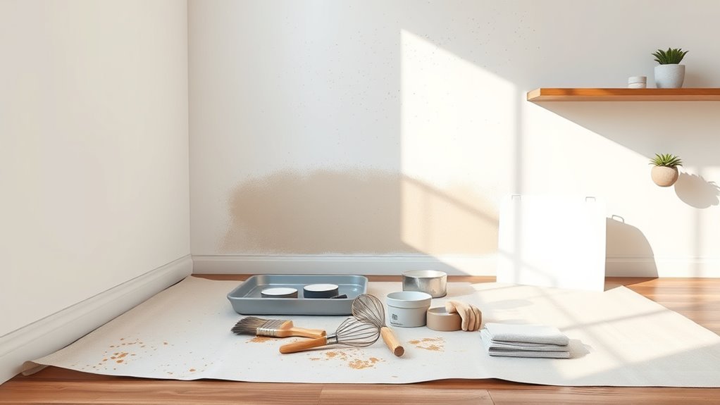
Before you start, gather your materials and protect the room: drop cloths, painter’s tape, a few jars or cups for thinning paint, various-sized brushes or a toothbrush, gloves, and goggles.
Gather supplies and shield the room—drop cloths, tape, jars, brushes (or toothbrush), plus gloves and goggles.
You’ll prep the wall—clean, sand, and prime—so paint adheres evenly.
Mix thinned paint in cups; test splatters on cardboard to control size.
Use wrists and forearms to flick paint from brushes or toothbrushes, varying distances for texture.
Work from background to foreground, letting layers dry between sessions.
Learn from historical context and cultural influences to choose colors and rhythms that give your wall intentional, modern energy.
Plan Your Splatter Design and Layout
Before you start splattering, pick a color palette that balances contrast and harmony so the wall feels intentional.
Sketch or tape a loose map to plan where dense clusters and sparse areas will go, and decide if you want focal points or an even spread.
That plan will save time and keep your final result looking cohesive.
Choose Color Palette
Ready to pick colors that’ll make your splatter wall pop? Use color psychology to set mood: energetic reds, calm blues, or playful yellows. Test swatches against your wall texture so pigments read right. Pick a dominant, secondary, and accent color; limit contrasts for cohesion. Consider gloss levels for highlights. Create small sample splatters on cardboard, view at different lights, and tweak saturation. Below’s a quick combo guide to inspire choices before you map placement.
| Mood | Dominant | Accent |
|---|---|---|
| Energetic | Red | Gold |
| Calm | Blue | Silver |
| Playful | Yellow | Teal |
Map Splatter Placement
Once you’ve settled on colors and tested swatches, map your splatter placement so each burst feels intentional rather than random. Start by sketching zones: focal areas, gradients, and quieter spaces. Mark where denser clusters will sit to guide viewers’ eyes and balance the wall.
Plan color blending gradations—decide which hues overlap and where to maintain harmony. Consider scale and distance so larger splatters anchor low areas while finer specks add lift. Note spots for pronounced texture effects, layering thicker paint or varied tools.
Tape reference points lightly on the wall, then step back often as you execute the plan.
Which Rooms Suit a Splatter Feature Wall?
Where will a splatter feature wall make the biggest impact? Think living rooms, entryways, and home offices where color psychology can energize or calm the space and where furniture coordination ties the look together.
In a living room, splatter draws attention behind seating. In an entryway, it announces personality. In a home office, it boosts creativity without overwhelming.
Avoid bedrooms where busy patterns can disrupt rest unless you balance it carefully. For dining areas, keep splatter subtle so it complements rather than competes with meals.
Measure wall size, sightlines, and existing decor before committing to guarantee harmony and lasting appeal.
Choose a Modern Splatter Color Palette
When choosing a modern splatter palette, pick colors that balance contrast and cohesion so the wall feels intentional, not accidental. You’ll want a dominant neutral, a bold accent, and a subtle highlight; test combos against room light and furniture. Consider historical techniques and cultural influences to inform tone choices—muted earths for warmth, vivid primaries for energy. Use the table below to mix moods and keep palettes focused.
| Mood | Dominant | Accent |
|---|---|---|
| Calm | Greige | Sage |
| Bold | Charcoal | Crimson |
| Playful | White | Teal |
Pick Paints That Splatter Well
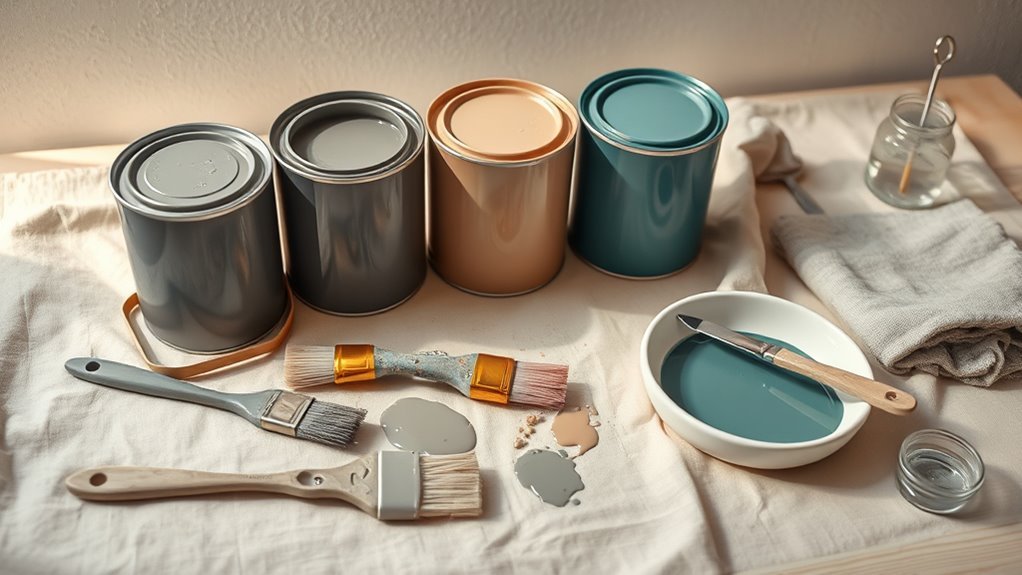
You’ll get the best results with high-flow acrylics that naturally fling and stick. Test each color’s viscosity and dilute as needed so splatters hold shape without dripping.
Choose hues that contrast your base wall and each other so every splatter pops.
Choose High-Flow Acrylics
Since splatter techniques rely on fluid motion, pick high-flow acrylics that’re formulated to move and atomize without thinning. You’ll get consistent droplets, crisp edges, and predictable drying, so your composition reflects color psychology and supports interior harmony.
Choose lightfast pigments for lasting vibrancy and low-VOC formulas for indoor air quality. Test opacity on scrap to plan layering and contrast, and pick a mix of matte and satin finishes to control reflection.
Buy artist-grade or professional craft lines labeled “high-flow” or “acrylic ink” rather than student blends. Proper paint choice makes execution cleaner and results more refined.
Test Viscosity And Dilution
Picking high-flow acrylics narrows your options, but you’ll still need to test viscosity and dilution to make them splatter reliably.
You’ll mix small batches with water or medium, adjusting until droplets form clean beads from a brush or flicker from a toothbrush.
Aim for a balance: too thin creates runs, too thick yields clumps and muted Texture variations.
Keep notes on ratios and how different pigments react—pigment load affects flow and Color blending during impact.
Test on scrap board at the angle and force you’ll use on the wall.
Adjust on the fly to replicate the effects you want.
Pick Contrast-Friendly Colors
When you choose colors for a splatter wall, think contrast first: pair light and dark hues or complementary colors so each splatter reads clearly from a distance.
You’ll select paints that maintain vibrancy when thinned, matching sheen and opacity to avoid muted results. Use color theory to balance warm and cool tones; test small swatches on the actual surface to see how pigments sit against your wall texture.
Matte backgrounds show splatters differently than glossy ones, so adjust pigment load. Limit your palette to two or three high-contrast colors to keep the design bold and readable across the room.
Calculate Paint and Supply Amounts
Before you buy anything, measure the wall area and note the paint coverage per gallon so you can calculate exactly how much paint and how many supplies you’ll need.
Consider color psychology when choosing hues—bold splatters need less coverage than base coats—and account for wall texture: rough surfaces absorb more paint.
Decide base and accent quantities, then add 10–15% for touch-ups.
Count tools: number of brushes, cups, drop cloths, masking tape, and primer.
For specialty finishes, include a sealer.
Tally gallons and items, compare prices, and buy slightly more to avoid mid-project runs to the store.
Protect Floors and Furniture Effectively
Before you start flicking paint, cover floors completely with overlapping drop cloths or plastic sheeting so no stray splatter reaches the finish beneath.
Move or shield furniture surfaces with taped plastic or canvas and weigh down corners so coverings don’t slip.
Secure drop cloth edges with painter’s tape or masking tape to create a neat barrier and prevent trips.
Cover Floors Completely
Why risk splatters and drips reaching your floors when you can cover them completely and work worry-free? Lay down heavy-duty drop cloths or contractor plastic, overlapping seams and taping edges so paint can’t sneak underneath. Protect high-traffic zones with corrugated cardboard or rosin paper for durability.
Secure connections to baseboards with painter’s tape, and weight corners with bricks or tape to prevent lifting. If your space has historical influences or cultural symbolism in flooring, use reversible protection to preserve patterns.
Remove coverings carefully after paint dries to avoid smudges, and ventilate while cleaning to speed safe drying.
Shield Furniture Surfaces
When you’re painting, shield furniture surfaces with sturdy, snug coverings so splatters won’t stain upholstery or wood—use fitted drop cloths, plastic sheeting, or washable furniture pads and secure them with painter’s tape or movable clips to keep edges from shifting.
Move small pieces to another room when possible; for immovable items, wrap arms, legs, and cushions tightly.
Wipe surfaces first as part of surface preparation so dust won’t trap paint.
Label covered items to avoid accidental unwrapping.
Choose breathable covers for delicate fabrics, and prioritize furniture protection to minimize cleanup and preserve finishes during your splatter-paint project.
Secure Drop Cloth Edges
If you want to keep paint off floors and furniture, secure your drop cloth edges so they won’t shift or let splatters escape; start by taping edges with low-tack painter’s tape, pressing fabric flat against baseboards and legs.
Weigh seams with small clamps or duct-taped rocks to prevent gaps when you fling paint for dynamic effects.
Overlap cloths and tape seams to protect varied wall textures and avoid paint seepage.
Check periodically as you work; splatter can sneak under loose edges.
Consider color theory when planning drops so protective zones match your palette, minimizing cleanup and preserving clean lines.
Prepare Different Wall Surfaces
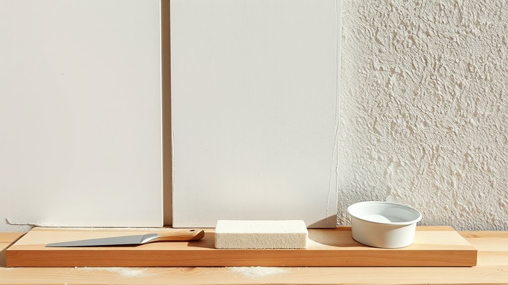
Before you splash paint, assess the surface—smooth drywall, textured plaster, brick, or previously painted walls each need different prep to guarantee the splatter adheres and looks intentional.
You’ll clean dirt and grease with mild detergent, rinse, and let dry.
For porous brick or bare plaster, prime to seal and control absorbency; for glossy paint, scuff sand or use a bonding primer so splatters don’t slide.
Adjust splatter technique to wall texture—heavier drops on rough surfaces, lighter flicks on smooth ones.
Note paint sheen choices: matte hides imperfections, satin highlights texture; pick accordingly before you start.
Repair Cracks and Smooth Texture
Although small hairline cracks might seem harmless, you’ll want to repair them so your splatter paint reads as intentional rather than neglected. Start by cleaning the area, then widen tiny cracks slightly so filler bonds. Sand smooth once cured, keeping texture consistent with surrounding drywall.
Even hairline cracks deserve repair—clean, slightly widen, fill, and sand so your splatter paint looks intentional, not neglected.
- Use lightweight spackle for hairlines, patch compound for deeper damage.
- Feather edges and sand with fine-grit for seamless shifts.
- Prime repaired spots to guarantee even absorption and true Color theory-driven hues.
Good wall preparation prevents blotches and guarantees your splatter contrasts and blends exactly where you intend.
Tape Edges and Mask Trim Cleanly
Before you splatter, pick a painter’s tape that sticks well but removes cleanly so your lines stay sharp.
Mask nearby surfaces and trim with precision so paint won’t leap onto trim or floors.
Press and seal tape edges firmly to prevent bleed-through and get crisp results.
Choose the Right Tape
Which tape should you trust to keep your splatter edges sharp? You’ll want tape that adheres cleanly during wall preparation and won’t lift when you test color mixing. Pick a tape that removes without residue and holds firm against paint mist.
- Low-tack painter’s tape: sticks for delicate surfaces, lifts cleanly.
- Medium-adhesion tape: best for standard drywall and crisp lines.
- Specialty exterior or high-adhesion tape: use only on trim that needs extra grip.
Press tape edges firmly, seal with a putty knife, and wait until your base coat fully cures before splattering.
Protect Surrounding Surfaces
Now that you’ve secured crisp edges with the right tape, protect everything else so only the wall gets splattered. Lay drop cloths over floors and furniture, taping seams to prevent paint seepage. Mask trim with low-tack tape, pressing firmly along contours to honor wall texture and avoid ridges.
Cover outlets, switch plates, and nearby fixtures with plastic and tape. If windows or floors are close, use paper-backed film for quick removal. Keep a small brush and damp cloth handy to wipe accidental spots promptly.
These steps let you focus on color blending and splatter technique without risking surrounding surfaces.
Seal Tape Edges Carefully
If you want crisp, paint-free edges, press the tape down firmly along every contour and run a clean tool—like a plastic putty knife or a credit card—over the adhesive to seal it to the wall. You’ll protect trim and define splatter zones so your Color theory choices read clearly against the base.
Consider Wall texture when selecting tape—smooth surfaces need less aggressive adhesive than textured plaster.
Remove tape at a 45° angle while paint’s tacky for the cleanest line.
Quick checklist:
- Use painter’s tape rated for the surface
- Seal edges with a burnishing tool
- Peel slowly and steadily
Thin Paint for Ideal Splatter Consistency
Because splatter relies on motion and break-up, you’ll want paint that’s thin enough to fling easily but viscous enough to retain visible droplets and texture. Thin acrylic or latex mixed with a little water or flow medium gives controlled splatters without running into drips.
Test small batches on cardboard to dial viscosity for color blending and texture variation. Aim for a consistency that splatters from a brush or spoon but holds a rounded edge on the wall.
Mix gradually, stir thoroughly, and note ratios so you can reproduce effects. Keep excess thinning minimal to avoid losing pigment coverage.
Essential Tools for Distinct Splatter Effects
When you want distinct splatter effects, choose tools that give you control over droplet size, trajectory, and texture. You’ll match techniques to different wall textures and paint sheens to get predictable marks. Use tools that let you vary force and volume quickly.
- Disposable cups and droppers for controlled drips and small, precise spots.
- Stiff toothbrushes and old toothbrushes for fine misting and short arcs.
- Mini squeeze bottles and condiment bottles for lines, blobs, and longer splatters.
Test combinations on scrap board first, noting how sheen and texture alter drying and final appearance.
Flick Splatters With Brushes
When you want crisp flick splatters, pick a brush with stiff bristles and a firm handle that feels balanced in your hand.
Practice a quick wrist flick to launch drops, adjusting angle and force for different effects.
Keep your paint thin enough to fly but not so watery that it runs, testing mixes until they behave predictably.
Choose The Right Brush
Want more control over your splatters? Choose the right brush to match paint viscosity and wall texture so your design reads the way you intend—use color psychology to pick hues that evoke mood. Consider bristle type and size to tailor droplet size and spread.
- Natural bristles: hold more paint, create softer splatters.
- Synthetic bristles: resist water, produce sharper drops.
- Fan or flat brushes: vary edge effects and coverage.
You’ll pair brush choice with paint thickness and surface prep. Test combos on scrap material before committing to the wall for predictable, modern results.
Master Flicking Technique
Once you get the rhythm, flicking paint with a brush becomes a controlled, repeatable motion that lets you dictate droplet size, direction, and energy. You grip the brush near the ferrule for precision, load it deliberately, then snap your wrist toward the wall.
Vary angle and distance to change splatter spread; a shallow angle elongates droplets, a straight-on snap makes rounder spots. Think about color psychology as you layer hues—contrasts draw attention, harmonies soothe.
Study historical influences from action painting to refine your stance and timing. Practice short sessions, evaluate results, and adjust motion to match your *desired* mood.
Control Paint Consistency
You’ve nailed the wrist snap and rhythm, now steer the paint itself—consistency controls whether droplets bead, streak, or barely register. You’ll test blends: thicker paint gives chunky, raised splatters; thinner creates misty veils. Consider Historical techniques and cultural influences—artists diluted pigments differently, shaping texture and intent.
- Thin with water for soft, distant sprays
- Use medium or acrylic gel to thicken for body and texture
- Mix small test batches on cardboard to preview behavior
You’ll adjust viscosity per effect, drying time, and surface. Keep notes so repeatable looks match your vision and room scale.
Make Fine Specks With a Toothbrush
When you need a delicate, controlled splatter, a toothbrush is the simplest tool to get fine specks across your wall. Dip the bristles lightly into thinned paint, tap excess off, and hold the brush close for concentrated speckling.
Flick with your thumb for a steady rhythm, varying pressure to change speck size. Work in layers and alternate colors to build subtle texture contrast and enhance lighting effects as paint catches highlights.
Mask edges and cover floors. Clean or replace the brush between colors to avoid muddying.
Step back often to assess balance and stop when the speck pattern feels right.
Create Large Drips and Blobs With Pours
If you want bold, organic marks that read from afar, pour paint directly onto the wall to form large drips and blobs, letting gravity and viscosity shape the result. You’ll control flow by thinning paints slightly and testing on scrap to respect wall texture.
Use color mixing sparingly so drips stay readable; layer wet-over-wet for soft blends or let layers dry for crisp edges.
Try these techniques:
- Pour from varying heights to change drip length and edge definition.
- Tilt the wall or use a slow brush to coax blobs into shape.
- Combine thicker body paints with glossier, runnier mixes for contrast.
Use Spray Bottles and Atomizers for Mists
Pick a nozzle that gives the mist you want—fine for subtle haze, coarse for textured spots—and test it on scrap paper.
Keep your distance adjustable so you control droplet size and edge softness as you spray.
Let each misted layer dry before adding another to build depth without muddying colors.
Choose The Right Nozzle
Because nozzle choice changes how paint lands, you’ll want to match your sprayer to the effect you’re after: fine mists need atomizers or mist-setting spray bottles, while chunkier splatters call for wider, coarser nozzles.
You’ll control droplet size, coverage, and interplay with wall texture, and you’ll manage color mixing by layering different nozzles.
Choose nozzles that resist clogging from thicker paints and clean easily. Consider:
- A fine atomizer for soft gradients and subtle color mixing.
- A medium nozzle for visible speckles without blobs.
- A coarse nozzle for bold, energetic splatters and pronounced texture.
Adjust Spray Distance
Now that you’ve matched nozzles to your desired effect, control over spray distance will refine how those droplets behave once they leave the tip. You’ll hold atomizers farther for fine mists that whisper color psychology across a room, letting hues blend subtly into the base.
Move closer for defined splatters that emphasize contrast and highlight wall texture. Use spray bottles for gentle gradients and atomizers for consistent fogs; test on cardboard, then the wall.
Adjust distance incrementally, note droplet size and drying feel, and choose the range that complements your palette and the room’s aimed mood.
Layer With Drying Time
When you work in layers, let each coat dry enough to hold but stay tacky so the next mist can cling and blend rather than run. You’ll use spray bottles and atomizers to create soft mists that build depth without flooding the surface.
Time your passes: short waits encourage blending; longer waits preserve distinct edges. Consider how color mixing appears over time and how Wall texture affects absorption.
- Test sprays on scrap to gauge tackiness.
- Alternate fine mists with slightly heavier droplets.
- Keep a fan or open window to control drying.
Monitor and adjust to achieve a balanced, layered finish.
Layer Splatter Colors Without Muddiness
If you want crisp, vibrant layers instead of a muddy mix, plan your colors and drying times before you splatter—work from light to dark, let each layer dry or tack up, and test combinations on scrap paper so pigments don’t neutralize.
Choose palettes with clear color harmony and follow your artistic inspiration, selecting pigments with similar opacity. Use thinner, more translucent paints over opaque bases to preserve underlying marks.
Adjust splatter force to control overlap and avoid overloading the wall. Clean tools between colors and wait for tackiness rather than full cure when adding delicate highlights to keep layers distinct and lively.
Plan Composition for Balanced Chaos
Because chaos still needs structure, start by sketching a few compositional anchors—large shapes, focal zones, and negative spaces—that you’ll repeatedly return to as you splatter. They guide movement and balance.
Consider color psychology to place warm accents where you want attention and cool tones to recede.
Factor wall texture into anchor placement so splatters read consistently across bumps or smooth areas.
Use a simple plan and trust improvisation within it.
- Choose three anchor types: bold, subtle, empty
- Map focal zones to room sightlines
- Plan layering order for clarity
Stick to the plan and tweak as you go.
Control Splatter Direction and Density
Although spontaneity drives splattering, you still control direction and density by adjusting your tools, stance, and motion. You’ll angle brushes or flick sticks to aim droplets, step closer for tight clusters or back up for fine mist. Change wrist speed to alter density; slower yields blobs, faster gives spray. Swap tools for varied splatter shapes to encourage color blending and texture variation. Practice on cardboard to refine reach and force before the wall.
| Tool | Effect | Tip |
|---|---|---|
| Brush | Medium drops | Flick at edge |
| Toothbrush | Fine mist | Hold close |
| Stick | Long streaks | Snap wrist |
| Sponge | Splotches | Dab gently |
Create Ombré and Gradient Splatter Effects
When you want a smooth progression between hues, plan your color sequence and control drop size so the splatter fades naturally from one shade to the next. You’ll work from light to dark or vice versa, testing mixes on scrap to match Color psychology goals—calming blues or energetic reds—while noting Wall texture effects.
Plan your hue progression, control droplet size, and test mixes on scrap to achieve the desired mood and seamless fade
Vary brush pressure to change droplet size and overlap zones to blend. Use masking tape at edges if needed. Try these steps:
- Start with diluted paint for gentle transitions.
- Gradually increase pigment saturation toward the focal area.
- Feather outer edges with a dry brush for seamless gradient.
Make Stencils to Protect Focal Areas
As you refine your ombré splatter, protect key areas by cutting stencils that fit your design and the wall’s texture. Measure and trace shapes—letters, geometric forms, or organic motifs—onto heavy cardstock or vinyl for durability. Cut clean edges to guarantee stencil precision; jagged cuts will blur your splatter boundaries.
Tape stencils flat with low-tack painter’s tape, sealing edges against porous surfaces to prevent bleed. Remove stencils between color blending stages to avoid unwanted overlaps. Clean or replace reusable stencils as paint builds up.
Work from light to dark splatters so protected areas stay crisp and intentional.
Add Metallics and Gloss Accents
If you want your splatter wall to catch light and add depth, introduce metallics and gloss accents sparingly to highlight focal zones and shifts. You’ll balance texture by applying thin washes of metallics over dry splatters, using gloss varnish to amplify contrast without overwhelming color blending.
Focus shine where viewers look first and use matte areas to frame highlights.
- Use a soft brush for subtle Metallic accents.
- Layer metallics after base splatters for control.
- Test gloss on scrap to ensure desired reflectivity.
Work deliberately, step back often, and keep metallics as punctuation, not the main composition.
Apply Neon or Fluorescent Splatter Safely
You can add neon or fluorescent splatters to energize focal areas while using the metallics and gloss accents as anchors for contrast.
When you work with bright pigments follow Neon safety: wear nitrile gloves, eye protection, and a respirator rated for organic vapors if using solvent-based paints.
Test a small patch to confirm adhesion and color under your lighting.
Use water-based fluorescent paints indoors when possible and ventilate the room.
Establish Fluorescent guidelines: mix small batches, label containers, and keep lights off until paint cures to avoid misleading color perception.
Clean spills promptly with recommended solvents.
Fast Techniques for Covering Large Walls
When you’re facing a big wall, plan a simple system before you splash paint. You’ll map zones, choose a dominant palette with color psychology in mind, and protect floors.
Use rollers for base coats to speed coverage, then employ large brushes or flicking tools for splatter rhythm.
Rollers lay fast, then switch to big brushes or flicking tools to build playful splatter rhythm across the wall
Consider wall texture—smooth walls need different pressure than rough ones.
Work top-to-bottom, section-by-section, and keep a wet edge to avoid lap marks.
- Zone the surface into manageable panels
- Alternate tools: roller, broom, and brush
- Step back frequently to judge balance and flow
Finish with clear sealer for durability.
Splatter Techniques for Small Accent Walls
For a small accent wall you’ll want to prep and protect surrounding surfaces and furniture with tape and drop cloths so splatters stop where you don’t want them.
Use controlled flick techniques—load a brush lightly and practice short, wrist-driven flicks to vary droplet size and placement. That way you get an intentional, artful look without a big cleanup.
Prep And Protect
Before you fling paint, get the wall and workspace ready so the splatter looks intentional, not messy. You’ll choose colors based on color theory to complement the room and note wall textures that affect drop behavior. Tape edges, cover floors, and remove hardware.
- Lay down a drop cloth and secure it to avoid slips.
- Use painter’s tape for clean borders and protect adjacent surfaces.
- Cover furniture with plastic and move delicate items out.
Prime uneven textures for consistent adhesion, test splatter on cardboard to confirm color contrast, and keep cleaning supplies handy for quick fixes.
Controlled Flick Techniques
Although splatter looks impulsive, you’ll get the best results by using controlled flick techniques that balance intention with energy.
For small accent walls, start with careful wall preparation: clean, prime, and tape edges so your flicks read sharp.
Load a brush moderately, aim from different distances, and practice wrist snaps to vary droplet size.
Use one dominant color and one contrasting tone to create subtle texture contrast without chaos.
Work in layers, letting each dry slightly so you can build depth.
Step back often, adjust rhythm, and stop when the pattern feels balanced and intentional.
How to Paint Behind Furniture and Fixtures
When furniture and fixtures sit against your walls, you’ll need a plan to reach the narrow gaps without scratching surfaces or leaving uneven paint lines. Move what you can; for fixed pieces, use protectors and painter’s tape. Consider color psychology so background splatters support mood and respect furniture placement when deciding intensity.
- Slide thin painters’ shields or cardboard behind legs to catch overspray.
- Use a sash brush and angled head to control splatters in crevices.
- Mask edges with low-tack tape and paper, removing tape while paint’s tacky.
Work patiently to keep edges crisp and surfaces safe.
Drying Times and Humidity Effects
How long will your splatter paint take to dry depends largely on temperature, airflow, and humidity, so plan your schedule around the room’s conditions. You’ll notice high humidity slows drying, causing more color blending and subtle texture variations; low humidity speeds it up, locking splatters fast. Use fans for airflow, avoid direct heat that can crack texture, and test a small patch. Check paint manufacturer times, then add buffer for layers.
| Condition | Effect |
|---|---|
| High humidity | Slower dry |
| Low humidity | Faster set |
| Good airflow | Even finish |
| Direct heat | Risky cracking |
Fix Mistakes and Unwanted Splatters
If a splatter goes where you don’t want it, act quickly: dab fresh spots with a clean, damp cloth or a soft brush to lift excess paint before it sets, then let the area dry and reassess.
If paint splatters where you don’t want it, act fast: dab fresh spots with a damp cloth or soft brush.
If dried, gently sand rough edges to match wall texture, then touch up with matching base paint. Use color psychology to decide whether to blend or contrast—soft tones hide errors, bold hues can become accents.
Consider these fixes:
- Feather edges with fine sandpaper and primer for seamless repair.
- Repaint a small section to integrate a stubborn splatter.
- Add deliberate splatters to disguise imperfections.
Remove Splatter From Floors and Surfaces
After you’ve fixed wall mistakes, it’s time to tackle paint that landed on floors, trim, or furniture.
Start floor cleanup by blotting fresh drips with a damp cloth, then use a mild detergent for dried spots. For hardwood or laminate, test a small area with mineral spirits; for tile or stone, use a non-abrasive cleaner.
Lift splatters from trim and furniture with a plastic scraper, then gently rub with a soft cloth and appropriate solvent.
Finish surface preparation by rinsing residues, drying thoroughly, and inspecting for missed specks. Protect cleaned areas before continuing other work.
Seal Splatter Walls for Durability
Now that your splatter looks right, you’ll want to choose an appropriate sealant to protect the finish and suit the paint type.
Test the sealant on a small, inconspicuous patch to confirm compatibility and colorfastness.
Once it’s approved, apply even protective coats for consistent coverage and durability.
Choose Appropriate Sealant
Because a proper seal protects your splatter paint wall from moisture, stains, and fading, choosing the right sealant is a critical step in preserving its look and durability. You’ll want to respect the project’s historical context and acknowledge cultural influences that might guide sheen and finish choices. Consider these practical points:
- Use a water-based polyurethane for indoor, low-odor protection.
- Choose a satin or matte finish to keep modern, subtle texture without glare.
- Pick a UV-resistant exterior sealer for sun-exposed or humid areas.
Apply per manufacturer directions, work in thin coats, and allow full cure before regular use.
Test For Compatibility
When you’re ready to seal a splatter paint wall, test compatibility on a small, inconspicuous area or a spare panel so you won’t risk damaging the finished surface. You’ll check for discoloration, tackiness, or lifting after the sealant cures.
Use the same applicator and environmental conditions you’ll use on the wall—avoid testing next to garden plants or near kitchen appliances that emit heat or moisture.
Wait full cure time, then inspect under different light angles. If the finish holds, proceed confidently; if it blisters, softens, or darkens, try a different sealant type or consult product data sheets before sealing.
Apply Even Protective Coats
Before you start, gather the sealant, applicators, and a clean drop cloth so you can work steadily and avoid interruptions. You’ll protect vibrancy and honor color psychology by sealing thoughtfully; durable coats stop fading and echo historical influences of preserved murals.
Apply thin, even layers with a foam roller or spray, letting each cure fully. Avoid overworking wet coats.
- Choose a clear, non-yellowing sealer.
- Use light, consistent strokes or even sprays.
- Wait recommended cure times between coats.
You’ll inspect under different lights, add a final coat if needed, and enjoy a resilient, gallery-ready splatter wall.
Clean and Maintain a Splatter-Painted Wall
Although splatter paint looks impulsive, you can keep it vibrant with simple, regular care. Treat the finish like art: dust weekly with a soft microfiber, spot-clean splashes with mild soap and water, and avoid abrasive scrubbing that strips pigment.
Note historical influences and cultural symbolism reflected in your color choices, and preserve them by using pH-neutral cleaners. Address stains promptly—dab, don’t rub—and test cleaners in an inconspicuous corner first.
Recoat protective varnish every few years in thin, even layers to refresh sheen. With gentle, consistent upkeep, your splatter wall will stay bold and meaningful.
Photograph and Stage Your Splatter Wall
When you photograph your splatter wall, pay attention to lighting and angles to capture texture and true color.
Try different props and simple compositions to give the scene context without stealing focus.
Move around, adjust lights, and test arrangements until the best shot pops.
Lighting And Angles
How do you make your splatter wall pop in photos and onstage? Use color psychology to choose hues that contrast or harmonize with ambient light, and plan lighting placement to enhance texture. Angle lights to reveal drips and layers without glare.
- Position key light at 30–45° to create depth and avoid flatness.
- Use a soft fill opposite the key to tame harsh shadows while keeping splatter detail.
- Try a low-angle kicker or backlight for rim highlights that separate the wall from background.
Move lights and camera, review frames, and adjust until the splatter reads vividly.
Props And Composition
Because props frame your splatter wall and composition guides the eye, choose elements that support the paint rather than compete with it. You’ll pick furniture, plants, or frames that echo dominant hues using color psychology—warm accents boost energy, cool tones calm the scene.
Keep scale simple: low-profile pieces won’t hide texture or disrupt focal splatters. Let negative space breathe around dense paint areas and align props along implied lines to lead the gaze.
Consider wall texture when placing items; rough surfaces add depth and may need shadow-taming lights. Photograph staged shots from several angles to find the strongest arrangement.
PPE and Safety Tips for Splattering
Although splattering paint can feel liberating, you’ll want to prioritize protective gear and safe habits to keep the fun from turning into a mess or injury. You’ll learn basic PPE, clean workspace setup, and respect for surfaces—skills informed by the historical context of studio safety and cultural influences that normalized protective practices.
Wear goggles, gloves, and a respirator or mask; cover floors and furniture; ventilate the room. Keep a first-aid kit nearby and read paint labels. Stop if fumes or dizziness start.
Maintain awareness so your creative process stays safe and your finished wall looks intentional.
- Goggles, respirator, gloves
- Covering and ventilation
- First-aid and labels
Budget-Friendly Paint and Material Alternatives
You can keep costs low by choosing budget-friendly paints like sample pots, acrylic craft paints, or leftover interior paint.
Use DIY substitutes—thinned school tempera, watered-down latex, or repurposed spray bottles—and try inexpensive tools like chip brushes, foam rollers, and plastic spoons for varied splatter effects.
With a few smart swaps, you’ll get bold results without breaking the bank.
Affordable Paint Options
When you’re working on a splatter paint wall on a tight budget, smart choices on paint type and materials keep costs low without sacrificing effect. Choose affordable acrylics or sample pots, and think about how interior lighting and furniture placement will show off contrast.
Use fewer colors, layer transparently, and test combos on scrap cardboard.
- Buy sample pots for accent splatters.
- Use mat or eggshell finishes to hide imperfections.
- Mix small amounts of cheap craft paint with acrylic for variety.
You’ll save money while creating a dramatic modern look that coordinates with room layout and highlights.
DIY Material Substitutes
If you’re working on a tight budget, clever swaps and household materials can keep your splatter paint wall looking professional without breaking the bank. Use leftover latex from previous projects, watered-down acrylic craft paints, or diluted wall primer tinted with small amounts of pigment to stretch supplies.
Substitute inexpensive rollers with clean sponge brushes for varied textures, and mix in a bit of satin finish for durability.
Consider color psychology when choosing tones—muted blues calm, warm ochres energize—and test swatches.
Coordinate with existing pieces for furniture coordination, ensuring your DIY palette complements sofas and accent pieces.
Cost-Saving Application Tools
Although budget tools might seem limiting, they can deliver professional-looking splatter effects when you pick the right substitutes and use them correctly. You’ll save money by choosing household items and learning basic historical techniques that inform splatter rhythm and movement. Additionally, you’ll respect cultural symbolism by adapting motifs thoughtfully.
Try these low-cost applicators:
- Old toothbrushes for fine misting and controlled splatter
- Balloons or sponges for larger, textured drops
- Plastic spoons and pipettes for directional drips
You’ll practice technique, protect surrounding surfaces, and mix affordable paints to mimic pricier finishes while staying creative and intentional.
Design Splatter for Kids’ Rooms Safely
Because kids love bright, unpredictable patterns, you can create a splatter-painted feature wall that’s playful and safe by choosing non-toxic paints, prepping surfaces, and controlling the mess with simple barriers and techniques.
Create a playful, safe splatter-painted wall using non-toxic paints, surface prep, and simple barriers to control the mess.
Use washable, low-VOC paints and test on scrap to check wall texture response.
Plan zones so splatters stay child-height and avoid obstructing outlets or fixtures.
Teach kids to wear smocks and goggles, supervise tossing, and limit tool force to reduce airborne droplets.
Consider color psychology for soothing versus energetic palettes, favoring softer contrasts for sleep areas and bolder combos for play corners to balance stimulation and calm.
Combine Splatter With Other Wall Techniques
You can build on a kid-friendly splatter wall by mixing in other techniques to add texture, structure, or themed elements. Use artistic inspiration from patterns, stencils, or sponged layers to guide composition, and apply color psychology to choose hues that calm or energize.
Combine approaches deliberately so the splatter complements, not competes.
- Stencil simple shapes first, then splatter for playful contrast.
- Add a soft sponge gradient beneath splatter to control mood.
- Create taped geometric bands to frame chaotic splashes and anchor the room.
Work in stages, stepping back often to balance spontaneity with intention.
When to Hire a Pro vs. DIY Splattering
You can handle a basic splatter if you’re comfortable with messy techniques, but more complex patterns and clean edges usually need a pro’s skill.
Consider how much time you’re willing to spend and whether the cost of hiring someone fits your budget and timeline.
Weigh your confidence and the project’s scale before deciding.
Skill Level Needed
Wondering whether to tackle a splatter paint wall yourself or call a pro? You can if you understand how color psychology influences mood and how wall texture affects paint behavior. Assess your comfort with controlled chaos, ladders, and cleanup before committing.
- Beginner: Try a small accent wall to practice splatter distance and paint viscosity.
- Intermediate: You’re steady with tools and can adapt technique to different wall texture.
- Pro needed: You want complex layering, precise color balance, or seamless results for high-visibility spaces.
If unsure, test a patch first. That’ll reveal whether you’ll enjoy the process or prefer hiring expertise.
Time And Cost
If you feel confident after a test patch but still weigh time and budget, consider how effort and expertise shift the equation. If you’ve learned historical techniques or explored cultural influences, you’ll better judge complexity.
DIY saves labor costs and gives control, but factor in prep, masking, cleanup, and the possibility of repainting if mistakes happen.
Hire a pro when deadlines, large surfaces, or intricate layered effects matter; pros speed work, source materials, and reproduce patterns reliably.
Get quotes, check portfolios for similar styles, and compare material plus labor costs against your time value.
Choose practicality over pride.
Common Beginner Mistakes and Fixes
Although splatter painting looks impulsive, beginners often make predictable mistakes that are easy to fix. You’ll want to plan color psychology so hues match mood and aid furniture integration rather than clash.
Common fixes are simple:
- Overly heavy splatters: thin paint, test on scrap, vary distance.
- Poor placement: mark focal zones, protect trim and outlets with tape.
- Color overload: limit palette to three harmonizing tones, step back often.
Work methodically, dry between layers, and clean tools right away. With small adjustments you’ll get controlled chaos that complements your room instead of overwhelming it.
Best Seasons and Weather to Splatter Paint
When you pick the right season and weather, splatter painting goes smoother and dries evenly—so aim for warm, dry days with low humidity and mild temperatures between about 60–80°F (15–27°C). You’ll prefer late spring to early fall; avoid windy or rainy days. Consider historical context and cultural influences when timing outdoor sessions for events or festivals. Monitor forecasts, choose mid-morning to late afternoon for consistent warmth, and test a small patch to confirm drying. Plan for at least 24 hours of clear weather post-application.
| Season | Ideal Temp | Notes |
|---|---|---|
| Spring | 60–70°F | Low rain windows |
| Summer | 70–80°F | Watch humidity |
| Fall | 55–70°F | Cool mornings |
| Avoid | <50°F | Slow drying |
Choose Eco-Friendly Paints and Disposal Tips
Because your splatter project will likely produce extra paint and runoff, choose low-VOC or water-based paints and plan safe disposal from the start. You’ll protect indoor air and curb contamination by selecting eco friendly paints and minimizing waste.
Store small amounts in sealed containers for future touch-ups; label them clearly. For larger leftovers, find local hazardous-waste drop-offs or community recycling events. Follow these Disposal tips and handle cleanup water responsibly.
- Use washable, low-VOC splatter colors.
- Strain and reuse excess paint where possible.
- Never pour paint down drains; dispose at approved sites.
Troubleshoot Flaking, Peeling, and Adhesion
If your splatter paint starts to flake, peel, or refuse to stick, you’ll want to diagnose the cause quickly to prevent bigger damage and wasted effort. Check surface contamination, humidity, incompatible primers, and poor color mixing that can affect adhesion. Sand loose areas, clean with TSP, and use a suitable primer. Test a small patch before redoing large sections. Move furniture placement away from the wall during repairs to avoid smudges. Use breathable paints on damp walls and allow full cure between coats.
| Problem | Likely Cause | Fix |
|---|---|---|
| Flaking | Poor prep | Sand, prime |
| Peeling | Moisture | Dry, seal |
| Poor stick | Wrong paint | Match primer |
Scale a Sample Design to a Full Wall
Once you’ve nailed the sample, scale it to the full wall by measuring, mapping, and repeating with intention. You’ll translate proportions, respect Color theory for balance, and adjust for wall textures so splatters sit right. Measure panels, sketch a grid, and mark key focal points. Work methodically, one section at a time, keeping spray distance and motion consistent. Check frequently from across the room to maintain rhythm and contrast.
- Use a ruler or laser to divide the wall evenly.
- Match splatter density to your sample by counting strokes per square.
- Adapt technique where textures absorb differently.
Quick Refresh Hacks for Aging Splatter Walls
When your splatter wall starts to look tired, a few targeted fixes will revive its punch without repainting the whole surface. You can patch chips, re-splatter high-traffic zones, or glaze to adjust tones using color psychology to calm or energize a room. Address grime and repair wall texture before touching paint. Use small brushes, toothbrushes, or spray bottles for controlled splatters. Consider matte or satin topcoats to unify sheen.
| Fix | Tool |
|---|---|
| Spot clean | Mild detergent |
| Texture repair | Lightweight filler |
| Re-splatter | Toothbrush/brush |
| Tone glaze | Translucent tint |
Real Modern Splatter Examples to Copy
After you’ve patched and refreshed your splatter wall, look to contemporary examples to inspire a modern redo you can copy and adapt. You’ll study real rooms that use controlled chaos: muted bases with pops of neon, layered drips, and deliberate gaps.
Focus on Color blending to make seamless transitions feel intentional, and add Texture variation so light plays across the surface. Try these quick models you can replicate:
- Soft gradient splatter: three tones blended, sparse high-contrast flecks.
- Geometric mask with splatter: crisp shapes interrupted by organic splatters.
- Directional strokes: motion-based splatters guiding the eye across the room.
Frequently Asked Questions
Can Splatter Paint Be Applied Over Wallpaper Safely?
Yes — you can, but you’ll need proper wall preparation and paint selection. You’ll clean and prime the wallpaper, test adhesion, pick flexible, high-adhesion paint, and tape edges; otherwise the splatter might peel or soak through.
Will Pets or Children Ruin the Splatter Finish Over Time?
Think of your wall as a garden: you’ll protect blooms by fencing and gentle care. You’ll prevent pet damage with durable sealant and supervise for child safety, and regular touch-ups will keep the splatter fresh.
Can I Splatter Paint a Textured Popcorn Ceiling?
Yes — you can splatter paint a textured popcorn ceiling, but you’ll need to test adhesion first. You’ll prep by cleaning, using primer suited for ceiling texture, and applying thinner splatters to guarantee good paint adhesion.
How Do I Match Trim and Baseboard Colors to a Splatter Wall?
Pick a dominant splatter hue for color coordination, then sample trim swatches against it; match sheen by finish matching (eggshell wall, semi-gloss trim). You’ll test small areas, adjust undertones, and seal for durability.
Are There Insurance or Rental Deposit Issues With Splatter Walls?
Yes — you might face insurance concerns and rental deposit issues. You should check your policy and lease, get landlord permission, document the wall, use removable paint, and be prepared to restore or compensate if required.
Conclusion
You’re ready to step back, heart racing—because the wall you’ve just splattered isn’t finished until you decide. Will you leave bold, chaotic flecks that catch evening light like city rain, or tame them with a soft glaze that whispers instead of shouts? Walk around, squint, then tweak: add a concentrated cluster here, feather a few edges there. Pause. The room holds its breath—then you know if it sings.