How to Test Paint Colors on Walls the Right Way
You’ll want to test paint on your actual walls, so clean the area, tape a board or patch two coats from a small sample pot, and place samples at eye level and in corners to see shadow effects. Try each sample on different walls and check them morning, afternoon, and under artificial light, noting sheen and durability. Compare against trim, flooring, and furniture, label everything, and live with samples for a week to decide — keep going to learn practical tips and pitfalls.
What to Prepare Before You Start Testing Paint Colors
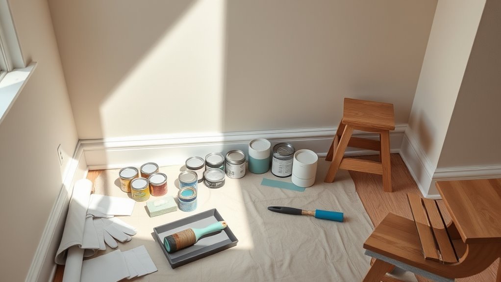
Before you grab a brush, gather the essentials so your color tests give you useful results. You’ll want sample pots, a few reliable brushes or rollers, painter’s tape, a neutral primer, and test cards or small boards.
Gather your essentials—sample pots, brushes or rollers, tape, neutral primer, and test cards—before starting color tests.
Consider color psychology—note how hues affect mood in morning and evening light—and wear clothing you don’t mind staining.
Clean the wall and mark testing spots at eye level and in corners to see shadow effects.
Test multiple finishes to evaluate paint durability in high-traffic areas.
Keep notes on brand, sheen, and drying time so comparisons stay clear.
Narrow Your Choices: How to Shortlist Paint Colors Fast
When you’ve narrowed the field from dozens to a handful, use a quick three-step filter to finalize your shortlist. First, assess Color psychology—pick tones that match mood and room function. Second, consider Paint durability for high-traffic areas. Third, test in real light and live with samples for a day. Use this visual guide:
| Step | Focus | Quick Action |
|---|---|---|
| 1 | Mood | Eliminate colors that clash with intended vibe |
| 2 | Durability | Prioritize finishes suited to use |
| 3 | Light | Observe samples morning to night |
Trust instincts, but rely on these practical checks.
Choose the Right Sample Type: Swatches, Pots, or Peel-and-Stick
You’ll want to pick the sample type that matches how confidently you’re committing to a color. Swatches are cheap and quick but can mislead because they lie flat on the page.
Small sample pots let you paint true swatches on the wall, and peel-and-stick tiles give a removable, full-coverage look. Try one or two methods to see which shows the color most accurately in your light.
Paint Swatches Pros/Cons
Although small, the type of paint sample you pick makes a big difference in how a color reads on your walls, so weigh swatches, sample pots, and peel-and-stick tiles against your needs. Swatches are cheap, easy to compare, and let you consider color psychology—how tones affect mood—across rooms.
They don’t show true finish or paint durability, though, and can mislead under different lighting. Use swatches to narrow choices quickly, pin several near trim and flooring, and view at various times of day.
If you need texture, sheen, or real-world performance, opt for a larger test solution.
Small Sample Pots
Want to see how a color really behaves on your wall? Use small sample pots: you’ll paint actual swatches, observe color psychology in your space, and test paint durability over time. They show finish, light shifts, and texture better than strips.
| Purpose | Tip |
|---|---|
| True color | Paint 2×2 foot patches |
| Finish | Test gloss vs. matte |
| Wear | Rub after drying |
| Lighting | Check morning/evening |
| Coordination | Compare adjacent walls |
Buy quality samples, label them, and live with patches for a week to verify the hue and durability match your needs before committing.
Peel-and-Stick Tiles
If small sample pots show how a color reads over time, peel-and-stick tiles let you see pattern, scale, and actual surface interaction instantly. You’ll apply a tile to a few spots—high, low, and near light—to judge hue and sheen against existing finishes.
Because peel and stick tiles mimic full coverage, they reveal how wall texture affects perceived color and whether seams or patterns distract. Remove them after a day or two to evaluate fading, reflection, and how the shade reads with furniture.
Use several tiles in different lighting conditions before ordering paint so you don’t rely on guesswork.
How Much Paint to Buy and How Many Samples You Need
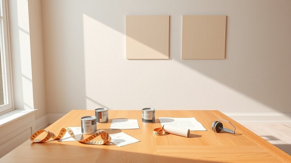
Before you start sampling, figure out how much paint you’ll actually need and how many test pots to buy so you don’t waste money or run short mid-project. Measure wall square footage, subtract windows and doors, and use the manufacturer’s coverage rate to estimate gallons.
Buy extra for touch-ups and account for finish—high-traffic areas need coatings with better paint durability. For samples, get one small pot per major wall or light condition; two coats per sample show true color.
Consider color psychology when choosing tones: test neutrals and bolds to see mood shifts. Return unopened cans to save costs.
Where to Place Test Patches for Honest Results
Once you’ve got the right amount of paint and your sample pots, pick spots that show how the color behaves under different lighting and viewing angles. Test near natural light sources, like windows and opposite walls, so you see daytime shifts.
Put patches where artificial light falls—overhead and task lighting—to compare. Try high-traffic and tucked-away areas to judge lasting appeal.
Apply samples on sections with varying wall texture to see shadowing and sheen effects. For small rooms, limit patches to avoid overwhelming a wall; in large rooms, spread samples across walls to capture how Room size changes perception.
Which Sheen to Test (Finish Matters) and Why
Because finish can change a color’s look as much as the pigment, you should test the sheens you plan to use—flat, eggshell, satin, semigloss, or gloss—to see how light and surface texture alter appearance and durability. You’ll notice sheen selection affects reflectivity, hiding power, and cleaning needs. Test the actual finish on the wall, view at different times, and note wear potential in high-traffic areas. Below is a quick comparison to guide decisions.
| Sheen | Look | Use |
|---|---|---|
| Flat | Low sheen | Ceilings, low-traffic |
| Eggshell | Soft sheen | Living rooms |
| Satin | Slight gloss | Trim, kitchens |
| Semigloss | Noticeable gloss | Doors, baths |
| Gloss | High shine | Accents, trim |
How to Apply Patches So Colors Read Accurately

When you apply test patches, do it the same way you’ll paint the room so the color reads true: clean and lightly sand the wall, tape off a 6–12 inch square, and lay down two even coats of the exact paint and sheen, allowing full dry time between coats.
You’ll see how undertones shift and how Color psychology affects mood in your space.
Follow these steps:
- Wipe, sand, and prime glossy spots.
- Use painter’s tape for crisp edges.
- Apply two thin, uniform coats; let dry fully.
- Label each patch with brand, formula, and historical palettes reference.
Compare patches before choosing.
Test Paint Colors Under Different Lighting Conditions
Although light changes how color reads, you can control the variables by checking your patches at different times and with different sources—natural morning and evening light, midday sun, and the room’s artificial fixtures.
Check paint patches under morning, midday, evening, and artificial light; use a white card and note sheen and impressions.
Notice how hues warm or cool; you’ll see that color psychology shifts with light, affecting mood and perceived size. Use consistent patch placement and compare adjacent samples under each source.
Bring a white card to judge true tint and check sheen for paint durability clues, since gloss reveals wear differently under varied illumination.
Record impressions so your final choice performs visually and practically.
When to Check Samples: Times of Day and Night
If you want an accurate read, check your paint samples at key moments through the day and once after dark so you see how natural and artificial light change the color. Test mid-morning, noon, late afternoon, and night to capture shifts and mood changes tied to color psychology and perceived paint durability.
Watch how warmth or coolness alters contrast and finish. Note reflections, shadows, and gloss differences under bulbs you’ll actually use. Record impressions and photos at each moment.
Then weigh aesthetics alongside practical wear: some finishes hide scuffs better, affecting long-term satisfaction and perceived paint durability.
- Mid-morning
- Noon
- Late afternoon
- Night
Compare Samples on Different Walls and Near Furniture
Because walls catch light and context differently, place samples on multiple walls and right next to key furniture so you see how the color interacts with each surface and item.
Test near sofas, cabinets, trim, and any accent pieces to observe contrast and harmony.
Move samples up and down to account for shadows and ceiling reflections.
If you’re considering faux finishes, try a small technique patch to verify texture reads well beside upholstery.
For custom palettes, compare swatches together to confirm balance across the room.
Photograph each placement in consistent light so you can review differences without memory bias.
See How Undertones and Nearby Colors Change a Shade
When you hold a paint sample against trim, fabric, or a neighboring wall, you’ll quickly see how undertones shift the whole look. You’ll notice warm or cool hints that alter mood and feel, important for color psychology and for matching a historical palette.
Test in different light and beside materials to catch surprises.
- View at morning, noon, and evening.
- Place near upholstery and artwork.
- Compare against adjacent wall hues.
- Photograph under real lighting.
Trust your eyes over names. Small undertones can read dramatic or muted depending on surroundings, so confirm before committing.
Test With Fixed Elements: Trim, Flooring, and Cabinets
Although paint looks different on bare walls, you’ll want to judge swatches against fixed elements like trim, flooring, and cabinets to see how their tones anchor the space.
Place large samples near baseboards and beside cabinet doors to observe reflection and shadow across the day. Note how wood warmth or cool tile shifts perceived hue—this ties into color psychology, influencing mood and perceived room size.
Consider how gloss levels and paint durability affect maintenance where trim and cabinets meet walls. Test edges and corners to guarantee crisp shifts, and live with samples for several days before committing.
Quick Checks for Contrast, Value, and Warmth
If you want to quickly judge whether a color will work, focus on three simple checks: contrast, value, and warmth. You’ll see fast results by testing small swatches in different lights. Consider color psychology and historical trends briefly to understand mood and context without overthinking.
- Contrast: Compare swatch to trim and furniture; ensure readability and interest.
- Value: Step back to judge lightness/darkness; avoid flattening the room.
- Warmth: Note undertones against natural light; warm tones cozy, cool tones calm.
- Movement: Observe across dayparts to confirm consistent harmony.
Common Testing Mistakes and How to Avoid Them
Because small testing errors can mislead you, watch for a few common mistakes that skew results. Don’t judge swatches under one light—check them in morning, afternoon, and artificial light so color psychology effects aren’t surprising later.
Don’t judge swatches in one light—test colors at different times and lighting to avoid misleading results.
Avoid tiny samples stuck in corners; paint larger test patches on main walls to see real interactions with furniture and trim.
Skip testing on glossy primed areas; use the same finish to evaluate true hue and paint durability.
Don’t compare colors side-by-side too close—give each patch breathing room.
And retest after 24–48 hours to catch drying shifts before deciding.
Decide: Keep, Tweak, or Reject a Color (Simple Checklist)
Stand in the room at morning, midday, and evening to see how the color shifts with light.
Compare the swatch against neutral samples like white or greige to judge contrast and balance.
Finally, ask whether the hue supports the room’s purpose—calm for bedrooms, energizing for kitchens—and then keep, tweak, or reject accordingly.
Observe At Different Times
When you check your painted samples at morning, noon, and evening, you’ll see how light shifts the color and your mood toward it; note reactions and note wear. You’ll test color psychology in real conditions and gauge paint durability over days.
- Note hue in cool morning light.
- Observe saturation and glare at noon.
- See warmth and shadows at dusk.
- Revisit after artificial lighting at night.
After each check, ask if the tone energizes, calms, or feels off. If durability shows streaks or fading, reject or retest with a different finish.
Compare Against Neutrals
If you want to judge a paint sample fairly, put it next to neutral swatches—white, off-white, gray, and beige—to see how undertones and contrast shift perception. You’ll notice the same hue reads warmer or cooler depending on its neighbors.
You’ll also want to test each sample at varying distances and alongside trim, flooring, and a plain fabric to evaluate background harmony. Ask: does the color enhance or clash with neutrals?
Keep it if it complements and balances light; tweak saturation or undertone if it fights the neutrals; reject it if it creates visual tension or muddiness you can’t resolve.
Consider Room Function
Why does the room’s purpose matter? You’ll judge colors differently based on use: lively hues for playrooms, calming tones for bedrooms, focused shades for offices. Consider color psychology and paint durability when deciding to keep, tweak, or reject a swatch.
- Note traffic: durable finishes for hallways and kids’ spaces.
- Think mood: warm or cool affects activity and rest.
- Check light: adjust saturation for north or south exposure.
- Match function: stain-resistant gloss for kitchens, softer matte for lounges.
Use this checklist to decide quickly—keep if fit, tweak if close, reject if mismatched.
Frequently Asked Questions
How Long Should I Wait Before Making a Final Color Decision?
Wait at least 48–72 hours before deciding; you’ll see color consistency as paint cures and lighting influence across different times. Don’t rush—observe morning, afternoon, and evening light to guarantee the shade truly works for you.
Can Testers Damage Existing Wall Finishes or Wallpaper?
Yes — testers can cause wall damage, especially on delicate surfaces; you’ll need to check wallpaper safety first. Use low-tack samples, test in inconspicuous spots, and peel slowly to avoid lifting or tearing the paper.
Should I Test Colors on Ceilings or Only Walls?
You should test colors on ceilings and walls; ceiling paint reflects differently, so you’ll see true tone variations. Do proper wall preparations and prime samples where needed, then view them under natural and artificial lighting before deciding.
How Do Temperature and Humidity Affect Test Results?
In a humid summer, a contractor saw color consistency shift as paint dried slowly—so you’ll control testing conditions, because temperature and humidity alter drying, sheen and hue; test in realistic conditions and at multiple times of day.
Are There Eco-Friendly or Low-Voc Tester Options?
Yes—you can use eco friendly paints and low VOC options as testers: buy small sample pots, eco-friendly peel-and-stick swatches, or aerosol-free samples, and let them cure indoors to judge true color and odor before committing.
Conclusion
You’ve done the work, so don’t panic—this isn’t a life-or-death paint duel, it’s just color. Stand back, squint, breathe, and imagine living there: if the swatch sings with your stuff, keep it; if it whispers or screams, tweak or toss it. Trust daylight tests, trust multiple patches, trust your gut—but don’t be dramatic: repainting is reversible, exciting, and oddly therapeutic, so pick the shade that makes you grin every morning.