Is Painting One Wall Out of Style? Accent Wall Trends
You’re not stuck with one loud wall—accenting a single surface can still work if you treat it as layered design, not a gimmick. Choose scale, finish, and placement that relate to furniture, light, and traffic. Favor subtle texture, grouped accents, or removable options for flexibility. Avoid overly bold hues, test samples in different light, and fix surface issues first. Want practical steps, room-by-room advice, and smart mistakes to avoid?
Are Accent Walls Still in Style?
Wondering if accent walls are still a thing? You’ll find they’ve evolved rather than vanished.
You can still use one wall to anchor a room, especially with updated touches: pair vintage patterns on a single paneled wall with neutrals to keep charm without overwhelming. Or flip the idea—make statement ceilings the focal point, painting or papering overhead so the room feels intentional and modern.
You’ll want balance: consider scale, light, and furniture to avoid a gimmick. When done thoughtfully, a lone painted wall still brings character and cohesion to contemporary interiors.
Why the Accent-Wall Trend Shifted
As tastes shifted toward cleaner, more flexible spaces, the accent-wall concept evolved from bold, single-wall statements into subtler, integrated approaches you see today. You’ve noticed how color psychology nudged people toward neutrals and muted tones that calm and broaden rooms rather than dominate them.
Designers started favoring layered accents—textiles, artwork, textured paint—so walls support a cohesive palette. Also, furniture placement became a key tool; anchoring seating with rugs and console tables creates focal points without relying on one painted wall.
As a result, accents feel intentional and adaptable, letting you change mood without repainting an entire room.
When a Painted Accent Wall Still Makes Sense
Although trends lean toward layered, subtle accents, a painted accent wall still makes sense when you want a quick, high-impact change that defines a room’s mood or function; it’s the fastest way to introduce color, create depth, or highlight an architectural feature without overhauling your furnishings. You’ll use color psychology to set tone—calming blues for bedrooms, energizing yellows for studios—and control visual clutter by limiting boldness to one plane. Imagine textures and pieces arranged like this:
| Feature | Feeling |
|---|---|
| Deep blue wall | Calm, cozy |
| Sunny yellow | Energetic, focused |
| Charcoal behind TV | Dramatic, grounding |
| Soft green | Restful, fresh |
Quick Checklist: Should You Keep an Accent Wall?
Think about how the wall affects the room size—you’ll want lighter colors or smaller patterns in compact spaces so the room doesn’t feel squeezed.
Consider whether you’re ready for a long-term commitment, since bold accent walls can be harder to repaint or match when trends change.
If you aren’t sure, test with removable options first so you can change your mind without major work.
Room Size Impact
If your room feels cramped, an accent wall can either open it up or make it feel smaller depending on placement and color contrast. You’ll use color psychology to push walls back or pull them forward; darker tones cozy up, light tones expand. Think about furniture placement—keep big pieces off the accent wall to avoid crowding. Place the focal wall opposite the entry to draw your eye and add perceived depth. Test swatches at different times of day.
| Emotion | Effect |
|---|---|
| Calm | Expands |
| Drama | Contracts |
| Warmth | Cozy |
| Airy | Spacious |
Long-Term Commitment
Wondering whether that accent wall is a short-lived thrill or a lasting choice you’ll love? You should weigh long term commitment before painting. Think about resale, changing tastes, and whether the color still suits new furniture.
If you move often or enjoy frequent updates, a bold wall may feel limiting. Address durability concerns: choose washable paint, proper prep, and finishes that resist scuffs so the wall stays fresh longer.
Consider removable alternatives like wallpaper panels or temporary paint techniques if uncertainty nags you. Ultimately, pick an option that fits your lifestyle—commit when you’re confident, or keep it flexible.
Rooms That Benefit Most From a Painted Accent Wall
When you want to add personality without renovating, a painted accent wall can transform specific rooms quickly and affordably.
Add personality instantly—an accent wall refreshes a room quickly and affordably without a full renovation.
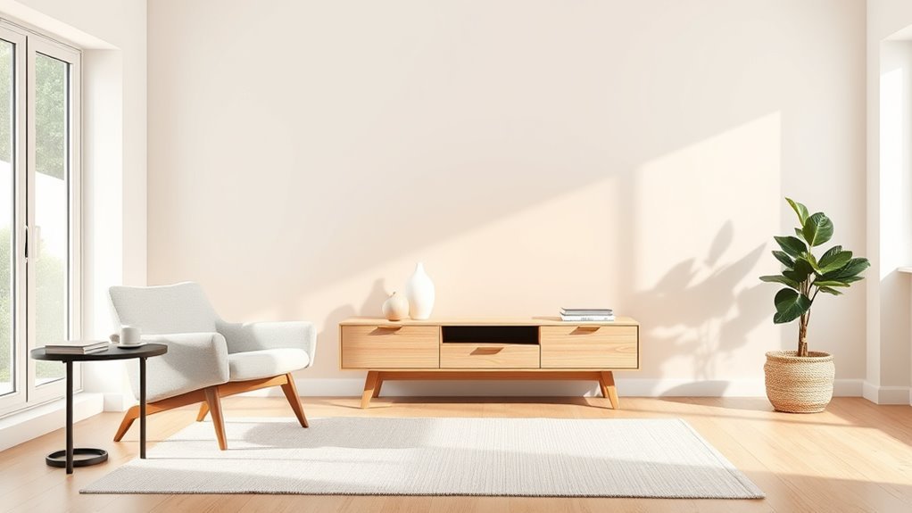
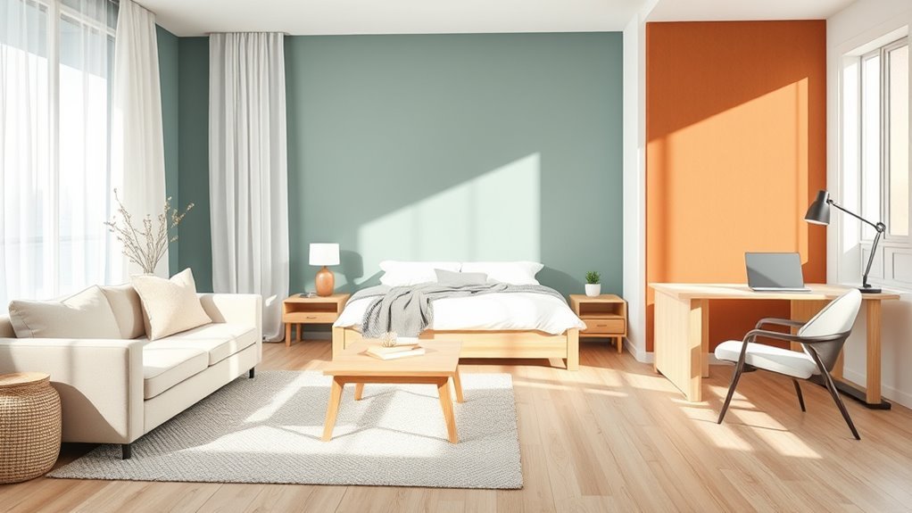
In living rooms, you can anchor seating and highlight art; color psychology helps set mood—calming blues or energizing ochres.
In bedrooms, a deep hue behind the bed creates intimacy and improves focus on textiles.
Home offices benefit from a crisp, motivating backdrop that frames your workspace on video calls.
Dining rooms gain drama for gatherings, while hallways use contrast to guide traffic.
Avoid bathrooms and kitchens where moisture, splatter, or frequent style changes make upkeep tedious.
Small Rooms: When an Accent Wall Helps or Hurts
In a small room, you can use a lighter or cool-toned accent wall to make the space feel larger by drawing the eye outward.
Just be careful—bold patterns or too many competing colors can create visual clutter and make the room feel cramped.
We’ll look at when to simplify versus when to make a statement.
Make Room Feel Larger
If you’re working with a small room, an accent wall can either open the space or make it feel boxed in depending on color, placement, and finish.
Choose light, cool hues to recede visually; color psychology shows blues and pale greys expand perception.
Place the accent on the far wall to draw the eye outward, not on a side wall that shortens depth.
Keep finishes matte to avoid reflecting and shrinking the room.
Coordinate furniture placement so larger pieces sit against the accented wall, anchoring the view and leaving walkways clear to maintain openness and flow.
Create Visual Clutter
Because small rooms leave little visual margin, an accent wall can either organize your space or overload it depending on pattern, contrast, and accessories. You should pick scale and restraint: busy patterns or high-contrast hues will multiply visual elements, making the room feel cluttered.
Use color psychology to choose calming tones that recede, or energizing hues where you want focus, but avoid competing prints. Keep furnishings minimal and limit wall decor so the accent reads as intentional, not chaotic.
Also consider paint durability—matte finishes hide flaws but scuff more easily—so choose finishes that maintain a clean look over time.
Accent Walls in Open-Plan Spaces
Looking to define zones without closing them off? You can use an accent wall to anchor a living, dining, or workspace while keeping flow. Try faux finishes for texture or bold color blocking to signal separate areas. Use scale and furniture to tie spaces together.
Define zones without walls: anchor areas with an accent wall, texture, and furniture to maintain flow and cohesion.
- Paint the wall behind a sofa or bed to create a focal point.
- Use a muted tone on adjacent walls for cohesion.
- Introduce rugs and lighting that echo the accent’s palette.
You’ll keep openness intact, add personality, and guide movement without building barriers.
When an Accent Wall Will Make a Room Feel Dated
You can make a room look dated if you go too heavy on one bold color that overwhelms the space.
Clashing busy patterns or layering multiple statement finishes will also feel chaotic rather than intentional.
And relying solely on a fleeting trend instead of considering timeless balance will date the whole room quickly.
Bold Color Overuse
If you go all-in on an ultra-bright or overly specific hue, an accent wall can quickly tie your room to a moment in time instead of enhancing it. You should consider color psychology so the wall supports mood rather than shouting trend.
Pair bold paint with subtle material accents instead of piling on more saturated surfaces. Ask yourself: will this still feel right in five years? Use a restrained palette around the feature wall and let furniture anchor the space.
Practical steps:
- Test swatches in different light.
- Balance with neutral textiles.
- Choose timeless finishes over novelty effects.
Busy Pattern Clashing
When multiple patterns compete for attention, an accent wall can make the whole room feel chaotic and quickly dated. You notice busy pattern clashing when wallpaper, upholstery, and rugs all demand focus; a color mismatch amplifies the discord. Step back, simplify, and choose one dominant motif. Use the table below to visualize contrast, scale, and tone so you can edit boldly.
| Pattern | Scale | Tone |
|---|---|---|
| Floral wallpaper | Large | Warm |
| Geometric rug | Small | Cool |
| Striped sofa | Medium | Neutral |
| Paisley curtains | Small | Warm |
| Accent wall | Large | Bold |
Trend-Only Choices
Why pick a trendy motif for an accent wall if it’ll date the room in a few seasons? You want a space that lasts, so avoid trend-only choices that shout “right now” and feel tired later. Think beyond vintage murals and fleeting color blocking fads; choose elements you’ll still enjoy.
- Pick neutrals or subtle textures that age well.
- Use removable treatments if you crave novelty.
- Anchor choices with lasting furniture and art.
If you love a trend, apply it sparingly. That way, you get current style without committing to a look that’ll force early repainting.
How Color Changes an Accent Wall’s Impact
Although an accent wall can change a room’s mood instantly, the color you choose determines whether it energizes, soothes, or anchors the space. You’ll use color psychology to pick hues that match purpose: warm reds or yellows boost activity, cool blues and greens calm, and deep neutrals ground.
Consider surrounding light and furniture so the wall complements rather than competes. Don’t forget paint durability—high-traffic areas need washable finishes and quality pigments to keep impact over time.
Test samples at different times of day, then commit to the shade that supports the room’s function and your aesthetic.
Tonal Palettes as an Accent-Wall Alternative
If you want the subtlety of an accent wall without a single bold stripe, tonal palettes let you layer shades of the same color to create depth and cohesion across a room. You’ll use subtle shifts to guide focus, relying on color psychology to set mood while keeping progressions soft.
Think about furniture placement to emphasize those shifts rather than overpower them. Try these simple approaches:
- Anchor with the deepest tone behind seating to draw the eye.
- Use midtones on adjacent walls for a seamless flow.
- Highlight trim and textiles in the lightest shade for contrast and balance.
Using Texture Instead of a High-Contrast Wall
When you want drama without loud color, texture gives you a tactile focal point that reads as intentional rather than overpowering. You can swap a high-contrast painted wall for textured finishes like plaster, shiplap, or reclaimed wood to add depth without screaming for attention.
Use pattern contrasts subtly—vary grain direction, joint spacing, or finish sheen—to guide the eye and define a zone. Texture absorbs and reflects light differently, so place furniture and lighting to highlight contours.
This approach feels modern and layered, keeps the room cohesive, and gives you a sophisticated accent that’s quieter than bold color.
Wallpaper and Murals for Updated Focal Points
Because wallpaper and murals can transform a whole room without repainting, they’re an efficient way to update a focal point and set the tone for your space. You can choose bold prints to explore color psychology, or subtle botanicals to calm a bedroom.
Wallpaper and murals instantly redefine a room—use bold prints for energy or soft botanicals for calm.
Consider how texture contrast—matte paper against glossy furniture—adds depth. Think about scale and placement, then pick a mural that anchors seating or a bed.
Options to try:
- Large-scale scenic mural for immersive impact.
- Geometric wallpaper to energize a workspace.
- Grasscloth for tactile warmth.
Install thoughtfully and the wall becomes intentional, not dated.
Painted Trim and Dado as Subtle Accents
Wallpaper can make a room bold or serene, but painted trim and a dado offer a quieter way to define your space without competing with pattern. You’ll use subtle contrasts to guide the eye, anchoring furniture and circulation without overpowering artwork.
Choosing a low-contrast trim taps into color psychology to calm a room; a deeper dado adds coziness and resilience in high-traffic areas. Through design psychology, you’ll balance proportions—shorter walls feel grounded, taller walls feel loftier.
These treatments let you articulate architecture, highlight moldings, and refresh a room affordably, all while keeping the overall palette cohesive and intentional.
Two-Tone Walls and Modern Color-Blocking
If you want a bolder statement than painted trim without committing to full-wall color, two-tone walls and modern color-blocking give you crisp, intentional contrast that reshapes a room’s proportions. You’ll use Color blending to shift hues or create sharp divides that highlight architecture. Pair blocks with Wall murals for focal drama, or keep geometry minimal for calm.
Try these approaches:
- Horizontal split to widen spaces.
- Vertical division to add height.
- Asymmetric panels for modern rhythm.
You’ll balance scale, furniture, and natural light so the scheme feels purposeful, not overwhelming, and fits your room’s function.
Statement Ceilings vs. a Single Accent Wall
When you want drama that feels integrated rather than pasted on, choosing between a statement ceiling and a single accent wall changes how a room reads. You’ll weigh visual flow: a ceiling draws eyes upward, expanding perceived height, while an accent wall anchors a view and defines function.
Consider color saturation—ceilings tolerate bolder hues in large rooms, walls need balance with furnishings. Think about material durability: high-traffic walls demand tougher finishes; ceilings avoid scuffs but require careful prep for sheen.
Pick the strategy that complements light, architecture, and your lifestyle instead of competing with existing elements.
Strategic Furniture Placement as a Focal Strategy
Place a bold sofa or console against your accent wall to anchor the space and draw the eye.
Use matching pairs or mirrored arrangements to balance the room and reinforce that focal point.
Then add targeted lighting—like wall sconces or a floor lamp—to highlight textures and color.
Anchor With Statement Pieces
Though an accent wall draws the eye, you’ll anchor the room by arranging a few bold furniture pieces that reinforce that focal plane. Use color psychology to pick a sofa or console that complements the wall. Then layer texture options—velvet, woven, metal—to add depth. Choose pieces that speak confidently without crowding sightlines.
- Pick one dominant piece (sofa, credenza, or bed).
- Add a sculptural chair or lamp to punctuate the plane.
- Use a low-profile rug or bench to ground the setup.
This keeps focus clear and makes the accent wall feel intentional.
Balance With Symmetry
Anchoring a statement piece on the accent wall works best when you mirror elements on either side to create visual stability. You’ll arrange matching chairs, lamps, or shelving to frame the focal point and guide the eye.
Use color psychology to balance bold hues with neutrals so the wall reads as intentional, not overwhelming. Repeat material accents—wood, metal, textile—in small doses on opposite sides to reinforce symmetry and cohesion.
Keep proportions equal; pair similar heights and masses to avoid visual tug-of-war. With deliberate placement, your accent wall becomes a calm, confident centerpiece that feels thoughtfully composed.
Emphasize Through Lighting
When you highlight an accent wall with layered lighting, your furniture becomes the supporting cast that guides focus—position sofas, consoles, or a statement chair where pools of light naturally fall so they read as intentional anchors rather than afterthoughts.
Use Lighting effects to sculpt depth and create accent wall illusions that shift perception. Consider scale, sightlines, and contrast so each piece reinforces the focal plane.
Balance ambient, task, and accent fixtures to choreograph attention. Apply these steps:
- Place seating in illuminated zones to invite use.
- Float a console under a picture light for vertical emphasis.
- Angle a lamp to dramatize texture and shadow.
Art, Shelving, and Displays to Anchor a Wall
If you want a wall to feel intentional, use art, shelving, and curated displays to give it purpose and personality. You’ll mix art installations with practical shelving displays to balance form and function. Arrange pieces at eye level, layer frames with small sculptures, and rotate objects seasonally. Consider symmetry or a deliberate asymmetry to guide sightlines. Use varied textures and colors to create depth without painting. Below’s a simple visual guide:
| Top row | Middle row | Bottom row |
|---|---|---|
| framed art | floating shelf | woven basket |
| sculpture | stacked books | plant pot |
Anchor pieces, then edit ruthlessly.
Lighting’s Role in Accent-Wall Perception
Art, shelving, and displays set the scene, but lighting shapes how you’ll actually see those choices—what reads as warm and inviting or flat and lifeless depends on it. You can use Lighting effects to sculpt tone and draw focus, and Mood enhancement through dimmers or color temperature shifts helps make an accent wall read cohesive.
Consider practical tactics:
- Layered light: ambient, task, and accent to control depth.
- Directional fixtures: wall washers, sconces, or track to emphasize texture.
- Smart controls: presets for scenes that shift contrast and warmth.
Try variations and trust your eye to balance intensity and color.
Material Accents: Wood, Tile, and Plaster
Because material immediately communicates texture and tone, choosing wood, tile, or plaster for an accent wall changes a room’s personality as much as color does. You’ll use color psychology to decide warmth or calm, and you’ll think about furniture placement so the accent supports function. Wood adds coziness and grain that invites touch; tile offers pattern and resilience; plaster gives subtle depth and a handcrafted feel. Each choice shifts mood and scale, so pick material that complements light and purpose. Let the wall anchor the room without overpowering it.
| Material | Emotional Effect |
|---|---|
| Wood | Cozy, grounded |
| Tile | Energetic, crisp |
| Plaster | Soft, refined |
Mixing Patterns and Finishes Without Looking Busy
You can pair patterns by keeping one bold motif and one subtler print to create balanced pattern pairing. Follow simple finish contrast rules—matte against gloss or natural wood against painted surfaces—to keep textures readable.
Think about scale and placement so larger patterns sit on main walls while smaller repeats accent niches or trim.
Balanced Pattern Pairing
When you pair patterns and finishes thoughtfully, an accent wall can feel curated rather than chaotic. You’ll balance scale, texture and color so Color harmony supports Pattern contrast instead of competing.
Choose one dominant motif and one subtle companion, repeat a hue from nearby furnishings, and keep metallic or matte treatments restrained.
- Limit scale differences: large vs. small patterns.
- Anchor with a shared undertone or neutral base.
- Vary texture, not intensity, so surfaces read cohesive.
You’ll create rhythm and depth without noise, making the accent wall feel intentional and modern.
Finish Contrast Rules
If you want a polished look, contrast finishes with intention: pick one finish family to dominate (matte, satin, or high-gloss) and introduce a secondary finish sparingly as an accent. You’ll control Color blending and Texture contrast by limiting sheen variety and repeating tones. Use metallic or gloss only on trim or a focal stripe to avoid visual clutter. Test samples under real light before committing. The table below helps you decide focal uses versus subtle accents.
| Dominant Use | Accent Use |
|---|---|
| Walls (matte) | Trim (satin) |
| Cabinets (satin) | Hardware (gloss) |
| Ceilings (flat) | Fixtures (metallic) |
| Large fabric (matte) | Small decor (sheen) |
Scale And Placement
Although variety brings personality, keep your eye on scale and placement so patterns and finishes read as intentional, not chaotic. You’ll balance bold motifs with quieter surfaces by thinking in proportion and distance. Use Color harmony to link contrasts and establish Design rhythm across sightlines.
Consider practical steps:
- Anchor large patterns on a single wall; pair with subtle texture nearby.
- Repeat a small motif or hue at intervals to guide the eye.
- Leave negative space—unpatterned walls, trim, or furniture—to prevent visual crowding.
When you plan scale and placement this way, mixed finishes feel curated, cohesive, and calm.
Minimalist Wall Treatments That Create Subtle Focus
Because subtlety draws the eye without shouting, minimalist wall treatments let you create a calm focal point that feels intentional rather than decorative. You choose muted tones and rely on texture variations—matte paint, soft plaster, or subtle wood slats—to give depth without busy patterns.
Use color psychology sparingly: a gentle hue can shift mood without dominating the room. Keep surrounding decor restrained so the wall breathes; one well-placed light or a slim shelf enhances focus.
You’ll avoid visual clutter by prioritizing proportion, materials, and restraint, making the wall purposefully present without demanding attention.
Color Psychology for Contemporary Accent Decisions
When you choose an accent color, think beyond appearance and consider how it will shape mood and behavior in the space. You’ll use Color trends as inspiration, but prioritize the Mood influence you want: energizing, calming, or grounding. Consider contrast with neutrals and natural light to predict emotional effect.
- Warm hues boost energy and conversation—use selectively.
- Cool tones calm and expand small rooms—pair with soft lighting.
- Earthy shades create comfort and stability—anchor communal areas.
Trust your instinct, test samples at different times, and let psychology guide contemporary accent decisions without following fads blindly.
Budget-Friendly Focal-Point Ideas
One smart way to make a room sing without overspending is to pick a single, high-impact focal point and build the rest around it. Choose an affordable statement—an antique mirror, bold artwork, or a thrifted rug—and let vintage decor or a standout lamp anchor the space.
Arrange furniture placement to face or frame that piece, creating flow and purpose. Layer with inexpensive textiles, plants, and targeted lighting rather than repainting whole rooms.
Swap accessories seasonally and hunt secondhand for character. This approach saves money, reduces risk, and lets you update style quickly without a major overhaul.
DIY Techniques for Subtle Wall Treatments
If you want a subtle update that won’t dominate the room, try small-scale DIY wall treatments that add texture and depth without a full repaint. You can refresh a space using gentle techniques that keep balance and personality.
Consider:
- Light faux finishes like sponging or glazing to introduce warmth and texture.
- Strategic wall decals placed in groupings to create interest without commitment.
- Narrow painted stripes or a stenciled band for rhythm and scale control.
Work in test patches, use quality tools, and keep treatments proportionate so the room feels updated, not overwhelmed.
Accent-Wall Ideas for Rentals and Temporary Homes
Rentals and temporary homes can still get a standout accent wall without risking your deposit—use removable, damage-free options that add personality fast. You’ll work around renting restrictions by choosing peel-and-stick wallpaper, tension rods with fabric, temporary decals, removable panels, or lightweight art grids. These choices suit temporary decor needs and let you personalize without paint. Below’s a quick visual guide to match style with effort and permanence.
| Idea | Best For |
|---|---|
| Peel-and-stick wallpaper | Pattern impact |
| Tension rod fabric | Soft texture |
| Removable decals | Graphic pops |
| Lightweight panels | Sculptural depth |
| Art grid | Gallery feel |
Common Mistakes When Updating or Removing One Wall
When you update or remove an accent wall, don’t pick a color so bold it overwhelms the room. Pay attention to how the new or removed color shifts to adjacent walls so the change feels intentional.
Also check the wall’s texture—sanding, patching, or matching finishes can make or break the final look.
Overly Bold Color Choices
Although a dramatic hue can feel exciting, choosing an overly bold color for an accent wall often backfires—clashing with furniture, overwhelming small rooms, or making resale harder.
You should consider color psychology and how intense tones alter mood; don’t forget texture contrast, which can soften or exacerbate boldness. Before committing, test samples in different light and live with them for days.
Think about scale and balance so the wall complements rather than competes.
- Try muted variations first.
- Compare samples with existing fabrics.
- Use accessories to tie the shade in.
Poor Color Transition
If you decide to update or remove a single accent wall, plan how the new color will meet the surrounding paint and finishes so the change looks intentional rather than patchy. You’ll need to contemplate Color harmony and Design consistency to avoid abrupt, distracting shifts.
Test transitional shades, use gradual undertones, and sample at different times of day. Edge blending, a slim border, or a shared neutral can unify spaces.
Keep fixtures and trim complementary. Use the table below to compare quick approaches and expected effects.
Ignoring Wall Texture
Because texture can catch light and create contrast, don’t overlook how a wall’s finish will read once you update or remove an accent wall. You’ll want to assess wall texture before painting or demolition so smooth transitions look intentional.
Uneven surfaces change color perception and affect paint durability, so prep matters.
- Sand or skim to match textures.
- Choose primers and coatings suited for the surface to guarantee paint durability.
- Test a small patch to confirm visual continuity.
If you ignore texture, repairs will show and a fresh color can look patchy. Address texture early to assure a seamless result.
How to Update an Old Accent Wall Step-by-Step
When you’re ready to give an old accent wall new life, start by evaluating its condition and deciding the look you want—paint refresh, wallpaper swap, or a textured finish—so each step that follows is purposeful and efficient.
Next, prep: clean, repair holes, sand glossy spots, and prime if needed.
Choose colors using color psychology to set mood and scale. Test samples on the wall and view at different times.
Select material accents like trim, shelving, or panels to add depth.
Paint or apply covering carefully, finish edges, and inspect lighting to ensure the updated wall reads cohesive and intentional.
Rules Designers Still Use: And the Ones to Break
Though designers rely on time-tested guidelines—like balancing scale, limiting palettes, and anchoring furniture around focal points—you don’t have to follow them slavishly; knowing which rules to bend or break comes from understanding their purpose and your space.
You can use vintage charm on an accent wall without copying a period room, and color psychology can guide mood rather than dictate choices. Consider:
- Break symmetry to create movement.
- Bend contrast rules for cozy, layered looks.
- Keep scale flexible when pieces are eclectic.
Trust intent over dogma, experiment in small doses, and commit when the result feels right.
How to Choose the Right Focal Strategy for Your Home
Start by thinking about how you use the room so your accent wall supports its function rather than competes with it.
Keep visual weight balanced—choose a focal point that doesn’t overwhelm the space or other features.
Finally, make sure your accent ties into the room’s palette so the look feels intentional and cohesive.
Consider Room Function
Because each room has a purpose, choose an accent strategy that supports how you actually use the space—calm, energizing, focused, or social. You’ll pick color, texture, or a painted wall to reinforce function.
Think about wall art and furniture placement so sightlines and activity zones match mood and flow. Consider practical needs like light, acoustics, and traffic.
Use a focal plan tailored to room tasks:
- Bedroom: soothing tones, minimal art, bed-centered layout.
- Home office: focused contrast, task lighting, desk-forward furniture placement.
- Living room: sociable accents, gallery wall, flexible seating for conversation.
Balance Visual Weight
How do you make one wall draw the eye without letting the room feel lopsided? You balance visual weight by considering scale, placement, and furnishings.
Use color psychology to pick a tone that reads as intentional rather than overwhelming; deeper hues advance, lighter ones recede.
Anchor the accent wall with furniture or art so visual weight spreads evenly across the room.
Repeat small touches—a pillow, lamp, or accessory—to echo the focal color and create visual harmony.
If the wall still dominates, soften it with texture or pattern instead of stronger color, keeping the room cohesive and comfortable.
Coordinate With Palette
When you pick an accent wall, let your room’s existing palette lead the decision so the focal point feels deliberate, not pasted on. You want harmony, not a competing stripe. Assess dominant hues, note undertones, and decide how bold your Color contrast should be. Use Wall texture—matte, satin, wood, or plaster—to add depth without clashing.
Consider these steps to coordinate with your palette:
- Sample paint with furniture nearby to test undertones and lighting.
- Match one accent shade to an accessory hue for cohesion.
- Introduce subtle texture to bridge tones and avoid flatness.
Frequently Asked Questions
How Do Accent Walls Affect Home Resale Value?
They can help or hurt resale value: you’ll attract buyers with tasteful decorative wallpaper or subtle textured finishes, but bold colors or trendy patterns may limit appeal, so neutral, high-quality accents usually boost interest and offers.
Can an Accent Wall Improve Acoustics in a Room?
Yes — studies show rooms with added soft surfaces can cut reverberation by up to 30%. You can boost sound absorption and achieve noticeable noise reduction by applying fabric, textured paint, or acoustic panels to one wall.
Are There Health or VOC Concerns With Painted Accent Walls?
Yes — you should consider VOC emissions and paint toxicity; choose low‑VOC or zero‑VOC paints, ventilate well, and avoid lead or high‑chemical formulations. You’ll reduce health risks, odors, and long‑term indoor air concerns.
How Long Does an Accent Wall Trend Typically Last Historically?
Historically, accent walls tend to cycle every 7–20 years; you’ll see historical popularity rise and fall as trend longevity depends on cultural shifts, design movements, and mainstream adoption before tastes shift again.
Do Accent Walls Impact Indoor Lighting Energy Use?
Yes — accent walls can affect lighting efficiency and energy conservation; if you choose dark, light-absorbing colors they’ll require stronger artificial lighting, while lighter reflective tones help reduce energy use and improve overall illumination.
Conclusion
You don’t have to banish accent walls to the past — think of them as a spice: a little goes a long way. If your room already sings, keep the flavor; if it’s shouting, tone it down or blend it in. Use the checklist, avoid the common missteps, and pick a focal strategy that fits how you live. Done thoughtfully, a painted wall can still make a room feel intentional and whole.