Should I Paint My Walls and Trim the Same White
You can paint walls and trim the same white to simplify upkeep, unify connected spaces, and make rooms feel brighter and larger; it softens edges so textures and furnishings stand out and speeds touch-ups. Choose matching undertones and appropriate sheens—matte or eggshell on walls, semi-gloss on trim—for durability and cohesion. Use contrast when you want architectural emphasis or depth. Keep your lighting, flooring, and fabrics in mind, and keep going to see practical tips and examples.
What This Guide Covers and How to Use It
Before you pick up a brush, this guide tells you what to contemplate when deciding whether to paint your walls and trim the same white and how to use the advice in real rooms. You’ll get focused explanations of visual effects, practical trade-offs, and how lighting and scale influence choices.
Learn how color psychology shapes mood and how sheen and paint durability affect upkeep. Use the checklists to assess room function, traffic, and furniture contrast. Follow the short testing steps to sample whites, evaluate them at different times, and note maintenance needs so you make a confident, room-specific decision.
Quick Answer and Decision Framework: Same White or Contrast?
When you want a fast decision, think of two goals: simplify or define.
If you want calm, cohesive spaces, choose same white—it’s clean, minimal, and uses color psychology to soothe.
If you want edges and personality, pick a contrasting trim to frame features and add intentionality.
Ask practical questions: will the trim face heavy use? If so, prioritize paint durability and pick a tougher finish even if it contrasts.
Consider maintenance, resale, and your style.
Decide quickly by matching your main goal—simplify for unity, define for detail—and select finishes that fit daily wear.
How Same White Affects Room Size and Light
If you chose same white to simplify a space, you’ll also change how light and scale feel in the room. Using identical white on walls and trim makes surfaces read as a single plane, boosting perceived volume and brightness. You’ll rely less on shadows and more on Color psychology to influence mood, so pick a white with the undertone that supports warmth or cool calm.
Painting walls and trim the same white unifies surfaces, brightens space, and shifts mood through subtle undertones.
Without contrasting Interior accents, details soften, so furniture and art become focal. Consider these effects when planning layout:
- Unified surfaces increase apparent ceiling height and room breadth.
- Reflections amplify natural and artificial light.
- Minimal detailing promotes a tranquil, airy atmosphere.
How Contrasting Trim Adds Definition and Depth
Although matching whites create unity, choosing a contrasting trim immediately sharpens edges and brings rooms into focus, giving your space clearer definition and perceived depth.
When you pick a trim hue that contrasts, lines read crisper and your eye tracks architectural details, making ceilings seem higher and rooms more layered. Color psychology plays a role: darker trims can anchor a room, while soft contrasts add subtle sophistication.
Also consider paint durability for trim—it’s touched more and needs a finish that resists scuffs. Thoughtful contrast lets you sculpt visual planes without altering structure, enhancing both form and function.
Styles That Work Best With Same-White Walls and Trim
Because same-white walls and trim create a seamless backdrop, they suit styles that prize simplicity and cohesion—think minimalist, Scandinavian, modern farmhouse, and many contemporary interiors. You’ll appreciate how consistent white amplifies natural light, supports color psychology that calms, and lets texture and form take center stage.
Same-white walls and trim create a calm, cohesive backdrop—amplifying light and letting texture and form take center stage.
It’s practical too: choosing a durable, easy-clean finish boosts paint durability in high-traffic zones. Use uniform white to unify open plans and gallery-like spaces.
Consider these strengths:
- Enhances airy, uncluttered aesthetics
- Highlights materials and furnishings without distraction
- Simplifies maintenance and touch-ups across rooms
Styles That Benefit From Contrast or Different Whites
When you want rooms to read as layered and intentional, using contrasting whites or pairing wall and trim whites with subtle differences gives each architectural element its own voice—walls can feel soft and enveloping while trim reads crisp and defined, or vice versa.
You’ll favor contrast in modern, eclectic, or traditional styles that rely on definition—midcentury, farmhouse, and classic Victorian all benefit.
Color psychology matters: warmer whites create coziness; cooler whites read cleaner and more formal.
Choose finishes for paint durability where trim gets scuffs—eggshell or satin for walls, semi-gloss for trim—to keep the effect sharp and lasting.
Natural Light: Choosing White for Your Exposure
If your room gets warm morning light, you might pick a cooler white to balance that glow.
In north-facing rooms that stay cool and blue, a warmer white can make the space feel inviting.
Also consider how your fixtures and bulbs will shift those whites after dark so walls and trim still read the way you want.
Morning Light Warmth
How does morning light change the way white paint reads in your room? You’ll notice warm, low-angle sunlight makes whites feel creamier and more inviting, shifting mood and affecting color psychology. That glow can blur contrast between walls and trim, so test samples at sunrise.
Consider paint maintenance: warmer tones hide dust differently, and subtle sheen differences show up in early rays. Balance aesthetics and upkeep by observing real light.
- Sample both wall and trim whites before committing
- Note how warmth alters perceived contrast at different times
- Choose finishes that simplify cleaning and minimize sheen differences
North-Facing Coolness
Morning’s warm glow can make whites feel cozy, but north-facing rooms flip that script: they bathe your paint in cool, indirect light that pulls blues and grays forward. You’ll want whites with subtle warmth or pure clarity so spaces don’t feel sterile.
Consider color psychology: cool-leaning whites calm and elongate rooms, while warmer off-whites add balance. If you paint walls and trim the same white, pick a formula that reads consistent under that light.
Matte or eggshell on walls softens reflections; semi-gloss on trim boosts definition. Test swatches at different times to confirm the interplay before committing.
Artificial Light Interaction
What happens to a white paint when the sun sets and your lamps come on? You’ll see whites shift under artificial light—warm bulbs bring creaminess, cool LEDs push bluish tones.
Consider your lighting fixtures and Color psychology: warm light feels cozy and softens stark whites; cool light reads crisp and clinical. Match trim and wall whites only if your fixtures deliver consistent color temperature. Otherwise, slight contrast helps maintain depth.
- Test paint swatches under each fixture at night.
- Choose bulbs with consistent Kelvin ratings.
- Use dimmers to control mood and perceived warmth.
Artificial Light and Bulb Temperature: Impact on White
When you pick a white, consider the bulb color temperature because warm bulbs (around 2700K) and cool LEDs (5000K+) will make the same paint read very differently.
You’ll also notice that higher light intensity can wash out subtle undertones while lower intensity can emphasize them. Think about the fixtures and bulb types you’ll actually use so your walls and trim look cohesive at any hour.
Bulb Color Temperature
How bright—or warm—should your bulbs be to make white walls and trim look their best? You’ll choose bulb color temperature knowing it shifts perceived white: cooler temps read crisper, warmer temps feel cozy. Consider lighting fixtures and color psychology when aiming for harmony between walls and trim. Match temperature to room function—task areas benefit from clarity, lounges from softness.
Test with samples before committing.
- Try bulbs at different temps in your main fixtures.
- Observe whites at day and night for true effect.
- Use dimmers to adjust mood without repainting.
Warm vs Cool LEDs
Although LEDs span a wide range of color temperatures, you’ll notice a clear difference between warm and cool options in how they render whites. You’ll prefer warm LED lighting (2700–3000K) for trims if you want cozy, slightly yellow tones that soften white paint. Cool LEDs (4000–5000K) make whites appear crisp and bluish, which suits modern walls. Consider consistent color temperature in connected rooms so walls and trim read together. Use bulbs labeled for accurate rendering and check samples at night and day.
| Warm LEDs | Cool LEDs |
|---|---|
| 2700K | 4000K |
| Softer whites | Crisp whites |
| Cozy feel | Modern feel |
| Slight yellow | Slight blue |
| Good for trims | Good for walls |
Light Intensity Effects
If you change a bulb from a low-output lamp to a brighter one, you’ll notice whites shift in perceived warmth and texture—higher intensity light can wash out subtle undertones and reveal brushstrokes or wall imperfections.
Lower intensity tends to deepen color and soften edges. You should test whites under different intensities and bulb temperatures to see how hue and finish play in your space.
Higher lux highlights flaws and can influence color psychology, making ceilings feel more clinical; softer light feels cozy but may hide wear, affecting how you perceive paint durability and maintenance needs.
- Test samples at night and day
- Use consistent bulb types
- Consider finish sheen
White Undertones Explained: Warm, Cool, and Neutral
When you look at a white paint swatch up close, you’ll notice hints of color beneath the surface—those are undertones, and they shape whether a white reads warm, cool, or neutral in your space.
You’ll see warm whites lean creamy or yellow, cozying a room and supporting color psychology that promotes comfort.
Cool whites carry blue or green hints, making spaces feel crisp and airy.
Neutral whites balance subtly, adapting to surrounding light and décor.
When choosing, test samples on walls at different times of day and consider how trim and paint finishes will interact to achieve your desired mood.
Best Sheens for Walls vs. Trim
Because walls and trim serve different visual and practical roles, choosing the right sheen matters. You’ll pick eggshell or matte for walls to hide imperfections and support color psychology that calms a room.
While trim benefits from semi-gloss for durability and easy cleaning. Consider surface and light: higher sheen reflects more, highlighting profiles; lower sheen absorbs light, softening color.
During paint application, use appropriate brushes and thinner coats for trim to avoid drips, and rollers for walls for even coverage.
- Walls: matte/eggshell for subtlety
- Trim: semi-gloss for resilience
- Doors/cabinets: gloss for impact
Same-White Maintenance: When It’s Easier
If you use the same white on walls and trim, you’ll find touch-ups much easier because you won’t have to match two different tones.
Cleaning can also be faster since similar sheens and pigments respond the same way to soaps and wipes. That consistency cuts down on time and guesswork when maintaining your paint.
Easier Touch-Up Matching
Although matching touch-ups is never completely foolproof, using the same white for walls and trim usually makes fixes quicker and less frustrating. You’ll save time blending edges and avoid mismatched sheens that draw the eye; color psychology also favors uniform fields that feel calmer and more cohesive.
When you stick to one formula, you know the paint durability and finish, so you can touch up high-traffic spots fast. Keep a small labeled sample can handy and match shear and gloss.
- Store one touch-up tin for both surfaces
- Use the same primer and sheen
- Test in natural light before committing
Faster Cleaning Routine
Matching touch-up supplies also makes daily upkeep simpler: when your walls and trim share the same white, you can clean both with the same products and techniques without worrying about altering a contrasting finish. You’ll save time and avoid second-guessing whether a cleaner dulls a glossy paint finish or a flat wall. That steady look supports subtle color psychology—calm, cohesive spaces feel cleaner. Create a quick routine: dust, spot-clean, and wipe down with a microfiber and mild soap. Visual checklist:
| Task | Tool | Time |
|---|---|---|
| Dust | Microfiber | 2 min |
| Spot-clean | Sponge | 5 min |
| Wipe | Mild soap | 5 min |
| Inspect | Touch-up pen | 1 min |
When Separate Trim Paint Improves Durability
When you want paint that stands up to knocks, scuffs, and frequent cleaning, choosing a separate, more durable trim paint makes sense. You’ll protect high-contact areas like baseboards and door frames while keeping walls softer to touch and easier to repaint.
Consider how color psychology interacts with durability: a crisp white trim can read cleaner and more resilient, even if walls use a warmer white. Prioritize paint durability for trim in busy rooms, kids’ spaces, and entryways to reduce maintenance and touch-ups.
- High-traffic areas benefit most
- Easier spot repairs on trim
- Preserves overall room appearance
How Finish Affects Scuffs, Cleaning, and Touch-Ups
Your choice of finish changes how easily surfaces resist scuffs and stand up to cleaning.
You’ll find glossier trims handle scrubs and touch-ups better, while matte walls hide imperfections but can mark more easily.
Think about how often you’ll clean and patch when picking a finish so you don’t regret it later.
Finish Durability And Scuffs
Although paint color matters, finish often has the biggest impact on how well walls and trim hold up. You’ll notice finish sheen affects scuff resistance and how easy marks are to spot; higher sheen hides wear and wipes cleaner, while flat finishes mask imperfections and show stains more.
Color consistency between surfaces can be altered by sheen alone, so matching sheens helps maintain a uniform look as scuffs and touch-up spots age differently. Choose tougher sheens for high-traffic trim and moderate sheens for walls.
Consider trade-offs: appearance, durability, and repair visibility.
- High sheen: durable, easy to clean
- Eggshell/satin: balanced wear and look
- Flat: hides flaws but scuffs easier
Cleaning And Touch-Up Ease
Because sheen changes how dirt and scuffs behave, you’ll find some finishes much easier to clean and touch up than others. You’ll notice semi-gloss and satin resist marks and allow repeated wiping, which helps maintain clean lines where walls meet trim.
Flat or matte hides imperfections but soaks stains, complicating spot repairs. When deciding if walls and trim should share the same white, weigh paint durability against aesthetic goals and color psychology: brighter, glossier trim reads cleaner and more structured, while softer sheens feel calmer.
Match function to room use—high traffic needs tougher sheens for simple touch-ups and lasting appeal.
How to Test Whites: Swatches, Sample Patches, and Photos
When you’re deciding between whites, don’t rely on a single swatch; test multiple samples on the wall, paint small 4×4-inch patches in different lighting areas, and photograph them at various times of day to see how undertones shift. You’ll notice how color psychology changes mood—cooler whites feel crisp, warmer ones cozy—and how finish affects paint durability in high-traffic trim versus walls. Label each patch with brand and formula. Take notes about morning, midday, and evening light, and how photos alter perception.
- Test near windows and in corners
- Try both wall and trim finishes
- Record application method and dry time
Comparing Swatches: Checklist for Accurate Tests
Now that you’ve gathered swatches and painted sample patches, it’s time to compare them systematically so you pick the white that behaves best in your space.
Stand in morning, midday, and evening light; note shifts in warmth or coolness. View swatches on both wall and trim heights, and record reactions—does a shade feel calming or stark? Consider color psychology: which tone supports the room’s purpose?
Test textures and sheen for paint durability and cleanability. Photograph samples under consistent exposure, label each, and wait 48 hours before final notes.
Rank options by mood, maintenance, and true appearance.
Choosing Whites That Flatter Your Furniture and Textiles
When you pick a white, consider the undertones in your fabrics so wood, leather, and linens don’t clash. Test swatches right next to sofas, curtains, and rugs to see how light and texture change the effect.
Aim for a balance between warm and cool whites so the room feels cohesive and comfortable.
Match Undertones With Fabrics
Because fabrics absorb and reflect color differently than painted surfaces, you’ll want to match the undertones of your whites to the textiles in the room so everything feels cohesive. Look at linens, rugs, and upholstery under natural light.
Warm-beige or creamy undertones pair with ivory whites, while cool-grays suit crisp, bluish whites.
Consider color psychology when choosing warmth or coolness to influence mood, and remember paint durability matters less for visual blend but more for high-traffic trim.
Balance is key: pick a white that complements dominant fabrics and repeat that undertone in accents.
- Check dominant textile undertones
- Coordinate warm vs. cool
- Repeat undertone in accents
Test Swatches Near Furniture
If you want your paint to harmonize with existing furniture and textiles, hold several white swatches against key pieces and view them in different light throughout the day. Test near sofas, rugs, and wood finishes to see how undertones shift with morning sun and evening lamps.
Note which swatch makes upholstery pop or recede; color psychology matters when you want a calming versus energetic feel. Also check trim samples against high-traffic zones to judge paint durability—gloss, sheen, and recipe affect longevity.
Photograph favored swatches in each light for reference before committing, ensuring cohesion with your decor.
Balance Warm And Cool
Although cool whites can make a room feel crisp and warm whites can cozy it up, you’ll want to match the undertone to your dominant furnishings so everything reads as intentional. You’ll assess textiles, wood tones, and metals, using Color psychology to set mood: cools feel calm, warms feel inviting.
Test samples near sofas and rugs in different light.
Consider contrast with trim and the impact of paint finishing on sheen and perceived color depth. Small shifts change ambiance, so choose a white that harmonizes rather than competes with your pieces.
- Test near fabrics
- Note wood undertones
- Compare trim sheen
How Flooring Color and Material Shift the Decision
When you choose paint for walls and trim, your flooring’s color and material can make the same white read warm, stark, or muddled, so think of the floor as a visual anchor that sets the room’s overall temperature and style.
You’ll weigh hardwood’s warm undertones against cool stone or pale carpet; color psychology tells you how warm floors cozy up whites while cool floors crisp them.
Match sheen and durability needs—glossier paint finishes on trim pop against matte walls and textured floors.
Consider contrast level: high contrast highlights trim, low contrast unifies space, so pick based on mood and use.
How Architectural Details Change the Impact of One White
If your room has pronounced molding and trim, using the same white can either make those details vanish or feel intentionally seamless depending on their profile.
Built-in shelves, window seats, and cabinetry change how light hits white surfaces, so you’ll want to contemplate whether you want them to recede or stand out.
Think about which elements you want to highlight before committing to one white.
Highlighting Molding And Trim
Because molding and trim catch light differently than flat walls, painting them the same white can either sharpen or soften a room’s details depending on profile and sheen. You’ll notice how subtle shadows, highlights, and gloss choices influence perception; color psychology affects whether trim reads as crisp or cozy.
Thoughtful paint application—brush strokes, edges, and number of coats—determines clarity. Decide if you want architectural lines to pop or melt into walls, then test in different light.
Consider these quick checks before committing:
- Inspect profiles in morning and evening light.
- Test sheen contrasts on sample boards.
- Evaluate finish durability in high-touch areas.
Affect Of Built-In Features
Although a single white can unify a room, built-in features like bookcases, window seats, and fireplace mantels change how that white reads by introducing depth, texture, and shadow that your eye tracks differently than on flat walls.
You’ll notice trim on a mantel pops or recedes depending on sheen and contrast, altering perceived scale and triggering subtle color psychology—calm, crisp, cozy. Match or contrast thoughtfully: same white simplifies sightlines, while a brighter trim highlights details.
Also consider paint durability where hands touch built-ins; tougher finishes resist scuffs. Test samples on real features to confirm how light and wear affect the outcome.
Ceiling Color Choices That Pair With White Walls and Trim
When you’re deciding on a ceiling color to go with white walls and trim, think about how high and bright you want the room to feel. You’ll choose warm creams to lower and cozy a space, cool whites to lift it, or a soft contrast for personality.
Consider color psychology—cool tones feel calming, warm tones feel inviting—and pick finishes with good paint durability for ceiling traffic and cleaning. Match sheen thoughtfully: flat hides flaws, satin cleans easier.
Use these quick guidelines to decide:
- Keep ceilings lighter than walls for openness
- Use subtle contrast for depth
- Test samples under real light
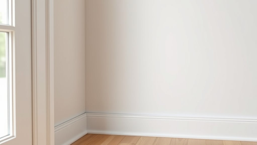
Coordinating Baseboards, Doors, and Window Trim
After you pick a ceiling color that complements your white walls and trim, decide how baseboards, doors, and window trim will reinforce that look. Choose consistent sheen and undertone so baseboards and casings read as a unified frame.
Paint doors slightly darker or in the same white for subtle contrast; bold door colors can anchor a room with accent walls or patterned wallpapers.
Window trim should balance light control and style—consider stain if you want warmth against white.
Keep profiles simple across rooms to maintain flow, and test samples in different light before committing to the final cohesive scheme.
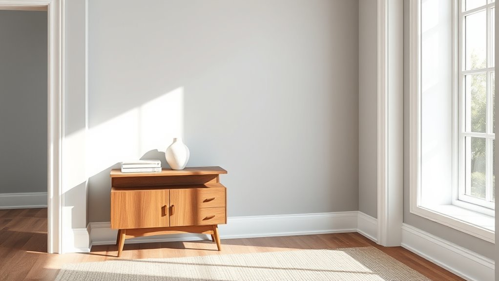
Picking One White That Flatters Multiple Connected Rooms
Because light and sightlines change from room to room, you’ll want a single white that reads consistently across connected spaces, so test candidates in the brightest, dimmest, and midpoint spots before committing.
Choose a white with neutral undertones so it won’t shift wildly as daylight moves. Consider color psychology—warmer whites feel cozy, cooler ones feel crisp—and match the mood you want throughout.
Also factor paint durability for high-traffic zones. Sample large swatches and live with them for several days. Trust your eyes over swatches alone.
- Test in morning, noon, and evening
- Use large taped swatches
- Note wall finishes and light sources
Creating Subtle Contrast Without Clashing Whites
You can create a soft contrast by pairing a warm or cool white on the walls with a subtly different trim white that shares a compatible undertone.
Look for undertone matches—like a creamy base with warm trim or a slightly blue-tinted wall with cool trim—to keep the whites harmonious.
Also consider a glossier trim sheen and smoother texture to make the contrast feel intentional, not clashing.
Warm vs. Cool Whites
While both whites read as neutral at first glance, their underlying temperature—warm or cool—makes a subtle but essential difference when you pair walls and trim. You’ll want to think about color psychology: warm whites feel cozy, cool whites feel crisp, and that mood guides your choices.
Pairing a slightly warmer trim with cooler walls (or vice versa) creates subtle contrast without clashing. Also consider paint durability where trim gets more scuffs; a durable, washable finish in the chosen temperature keeps the look coherent.
- Use temperature to set mood
- Keep trim finishes durable
- Test samples in real light
Undertone Matching Tips
If you want subtle contrast without clashing whites, start by identifying each paint’s undertone—warm (yellow, peach), cool (blue, gray), or neutral—and compare them side by side in natural light. You’ll notice tiny shifts that affect mood; color psychology tells you warm trims feel cozy while cool trims read crisp.
Test samples on multiple walls at different times, then observe after paint application—light changes can reveal hidden casts. Pair a warm-wall white with a slightly cooler trim for depth, or match neutrals for unity.
Keep swatches handy and trust your eyes over names or labels.
Trim Sheen And Texture
Although undertone sets the mood, trim sheen and texture give you an easy, intentional way to create subtle contrast without swapping whites. You can keep wall and trim colors identical yet make the trim pop by choosing different sheen preferences and texture options.
Higher sheen reflects light, highlights profiles, and reads cleaner; lower sheen blends and feels softer. Match durability needs—hallways want tougher finishes; bedrooms can be gentler.
Think of texture: satin trim vs. eggshell walls, or smooth trim against subtly orange-peel walls. Use finish and finish feel to craft separation without risking clashing undertones.
- Prioritize durability for high-touch areas
- Test pairings in different light
- Balance sheen with room function
Using Lighting and Accessories to Enhance a Unified White
When you paint walls and trim the same white, lighting and accessories become your main tools for adding depth and personality—so choose them deliberately.
Use layered lighting—ambient, task, accent—to sculpt planes and prevent flatness. Select bulbs with appropriate temperature to influence color psychology and the emotional impact of a room; warmer light feels cozy, cooler light feels crisp.
Layer lighting—ambient, task, accent—to shape space; choose bulb temperatures to set mood, from cozy warm to crisp cool.
Add texture through rugs, throws, and metallic or matte finishes to create focal interest without color contrast.
Place mirrors to amplify light and accessories thoughtfully so each piece contributes to warmth, scale, and visual rhythm in a unified white space.
Using Contrast to Highlight Moldings, Built-Ins, and Trim
Because trim and moldings frame a room’s architecture, using contrast is one of the quickest ways to make them read as intentional details rather than afterthoughts. You can pick a deeper white or soft gray for trim to create depth, leverage color psychology to guide mood, and use a finish that emphasizes edges.
Contrast draws eyes to built-ins and crown moldings, so choose tones that complement wall white without clashing. Also prioritize paint durability on high-touch trim to keep crisp lines.
Consider these approaches:
- Slightly warmer or cooler trim white
- Semi-gloss for easy cleaning
- Dark accent on built-ins for drama
Budget and Time: Single White vs. Different Paints
Choosing one white for both walls and trim can save you money on extra paint and simplify touch-ups. You’ll also cut down on labor and the careful edging that different finishes demand.
If you’re short on time, a uniform color gets the job done faster with less fuss.
Cost Of Extra Paint
1 simple choice — painting walls and trim the same white — can save you both money and time. When you pick one white, you cut paint costs, reduce wasted cans, and simplify decisions influenced by color psychology and favorite paint brand options.
You’ll buy fewer gallons and avoid mismatched sheens that force repurchasing.
- Fewer paint cans lowers upfront and disposal costs.
- One color reduces the chance of buying touch-up shades.
- Consistent white trims supply predictable finish and fewer returns.
Calculate coverage per gallon, compare brand prices, and decide if the single-white savings fit your budget and style.
Time Saved By Uniformity
If you use the same white for walls and trim, you’ll cut project hours considerably because you won’t be switching brushes, rollers, or tape between colors. You’ll move faster through prep, cutting in, and recoats, saving labor whether you DIY or hire pros.
That streamlined approach trims corners of scheduling, reduces drying-time juggling, and lowers the chance of mistakes that require touch-ups.
Fewer product types also simplify cleanup and disposal, which saves time and money.
Keep in mind how color psychology affects perceived effort—uniform white reads calm and finished—and choose a finish with proven paint durability to avoid frequent redoing.
Labor And Detail Work
When you paint walls and trim the same white, you’ll cut down on the most fiddly labor—less cutting-in, fewer brush swaps, and simpler masking—so the job moves faster and stays cleaner. You’ll save on time and often on budget because uniform coating reduces touchups and simplifies product choices.
Choose a white with the right color psychology to keep rooms feeling bright or cozy, and pick a finish that balances sheen and paint durability for trim traffic. Contractors charge less for straightforward jobs, and you’ll finish sooner.
- Fewer tools and supplies
- Shorter labor hours
- Easier maintenance and touchups
Paint and Labor Cost Considerations for Walls and Trim
Although matching walls and trim in the same white can simplify paint selection, it won’t always cut your costs—labor and surface prep drive most of the price. You’ll save time picking one hue, but consider how color psychology affects perceived brightness and room size, which might push you toward higher-quality finishes.
Trim demands precise cutting, sanding, and often a semi-gloss for durability, increasing labor. Paint longevity varies by finish and prep, so investing in priming and better coatings can reduce future repainting expenses.
Get contractor quotes itemized by prep, coats, and trim detail so you can compare true costs.
Common Mistakes When Matching Wall and Trim Whites
Because whites vary in undertone and finish, matching wall and trim whites often trips people up in ways that are easy to avoid. You’ll misjudge undertones, confuse matte and semi-gloss finishes, or ignore how light shifts across surfaces. Those choices affect color psychology and how durable the look feels; glossy trims read cleaner and resist scuffs, while walls set mood.
Avoid rushing sample tests and assuming identical names mean identical hues. Consider surface prep and paint durability when picking formulas. Check these common pitfalls before committing:
- Ignoring undertone differences
- Mixing finishes without intent
- Skipping real-room samples
Quick Fixes If Your Whites Look Mismatched After Painting
If your whites end up looking off, don’t panic—you can fix most mismatches without repainting everything. First, check lighting: swap bulbs for a consistent temperature to improve color harmony.
Clean trim and walls—grime and yellowing can shift perceived white. Try satin on trim and eggshell on walls to manage texture contrast; small touch-ups with the correct sheen often blends appearances.
Use a white tint or glaze sparingly along the trim edge to soften harsh shift. If single panels stand out, repaint just those sections after feathering edges.
Test changes in different light before declaring success.
When to Hire a Pro for Color Matching or Trim Work
When color differences persist after you’ve tried lighting fixes and touch-ups, call a pro—especially if the mismatch involves multiple coatings, aged trim, or complex surfaces like stained wood or textured plaster.
You’ll save time and avoid costly mistakes when a color expert assesses undertones, recommends paint brands, and matches sheen.
Pros also advise on color psychology to guarantee the trim complements the room’s mood.
Hire a pro if you need precise custom matching, restoration of historic trim, or large-scale repainting.
Benefits include speed, warranty, and consistent results.
- Precise color matching
- Historic or damaged trim
- Large projects and warranties
White Families: Warm, Cool, and Versatile Options
After a pro helps you sort stubborn color mismatches, you’ll be better positioned to choose the right white for walls and trim. You’ll weigh warm whites (yellow or cream undertones) for cozy, inviting rooms and cool whites (blue or gray undertones) for crisp, modern spaces.
Versatile, neutral whites bridge both, letting furniture and art take center stage. Think about color psychology: warm tones feel nurturing, cool tones feel calm, neutrals feel balanced.
Also consider paint preservation—sheen and pigment affect wear and cleaning. Test swatches in your lighting, live with them several days, then decide confidently.
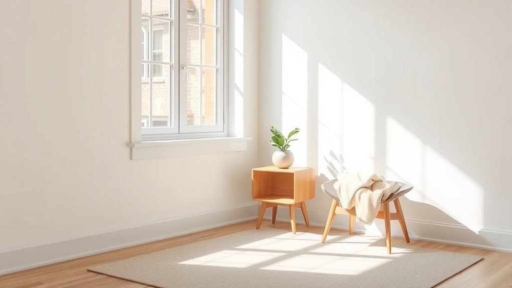
Examples of Rooms That Work Well With Same White
Because you want cohesion and simplicity in many spaces, several rooms actually benefit from using the same white on walls and trim. You’ll create a calm backdrop that supports Color psychology goals—promoting focus in home offices and serenity in bedrooms—while simplifying upkeep with consistent paint durability across surfaces.
Using the same white on walls and trim creates a calm, cohesive backdrop that supports focus and serenity.
Use this approach where continuity matters and furnishings provide contrast.
- Small rooms feel larger with unified white.
- Hallways gain flow and visual continuity.
- Open-plan living rooms read as one cohesive space.
Choose a white that suits light levels and traffic, balancing aesthetics with practical maintenance.
Examples of Rooms That Benefit From Contrast
While unified white works wonders in many spaces, some rooms gain energy and definition when you contrast walls and trim.
You’ll find living rooms benefit from deep walls and crisp white trim to anchor furniture and use color psychology to evoke warmth or drama.
Entryways and stairwells gain clarity with darker trim that frames movement and hides scuffs, improving perceived paint durability.
Kitchens tolerate bold islands or accent walls against white trim for clean lines and focal points.
Bedrooms can feel cozier with saturated walls and light trim that balances intimacy and architectural detail for restful appeal.
Decision Checklist: Finalize Your Walls-and-Trim Plan
When you’re ready to commit, run through a short checklist to make sure your walls-and-trim plan fits the room, your lifestyle, and your long-term goals.
Consider how Color psychology affects mood—choose warmer whites for cozy spaces, cooler whites for calm. Test samples in different light, live with them for days, and evaluate maintenance needs.
Think about color psychology—warmer whites feel cozy, cooler whites calm. Test samples in varied light for days.
Prioritize paint durability where traffic or little hands are expected. Confirm finishes: matte for walls, washable semi-gloss for trim if you want contrast and longevity.
Finalize budget and timeline, then schedule painting.
- Test samples in natural and artificial light
- Prioritize wipeable finishes for high-use areas
- Match long-term maintenance expectations
Frequently Asked Questions
Will Painting Doors the Same White Hide Fingerprints Better Than Darker Paint?
Yes — painting doors the same white can hide fingerprints better than darker paint because it reduces contrast; you’ll get color consistency and aesthetic harmony, though finish and cleaning frequency still affect visible smudges.
Can I Use the Same White for Crown Molding and Exterior Trim?
Like a matching frame around a photo, you can use the same white for crown molding and exterior trim; you’ll achieve cohesive color coordination and paint consistency, but consider sheen, durability, and weather-rated exterior formulations.
How Do Baseboard Shoe Moldings Affect Perceived Color Matching?
They’ll subtly change perceived color matching: you’ll get better color consistency and visual harmony when shoe moldings bridge wall and base, but differing sheen or shadow can make whites look distinct, so test samples in place.
Should Closet Interiors Match Wall-And-Trim White or Differ Slightly?
You should let closet interiors differ slightly; subtle color contrast enhances depth and prevents monotony. You’ll create softer shifts and can use decorative accents inside closets to highlight storage or display without overpowering the room’s white scheme.
Does Same-White Trim Influence Resale Appeal or Buyer Perception?
A staging firm found buyers preferred consistent palettes; you’ll boost perceived upkeep and color harmony by using same-white trim, conveying aesthetic consistency. For bold buyers, offer swatches showing subtle contrasts to suggest intentional design.
Conclusion
So, now you’re at the finish line—pick what makes you smile daily. Matching walls and trim in the same white keeps things calm and spacious, like a gentle nod to simplicity, while contrasting trim gives rooms a little personality wink. Trust the light, your style, and the mood you want to live in. Whatever you choose, it’s just paint—an easy, tasteful tweak that freshens your home and feels right for you.