Should I Paint My Walls White or Grey
If you want maximum light, a clean versatile backdrop, and rooms that feel larger, choose white; it bounces light and suits kitchens, circulation paths, and modern trim. Pick grey when you want depth, a stabilizing neutral that hides wear, or a cozier, contemporary mood for seating and media zones—match undertone to your finishes. Test large swatches across the day, note light shifts, and live with samples for 48 hours to confirm—keep going for practical testing and painting tips.
Should You Paint Your Walls White or Grey? Quick Answer

Whether you want a bright, airy backdrop or a soothing, modern tone, choosing between white and grey comes down to how you use the room and the mood you want to create.
You’ll pick white when you need clarity, light, and a versatile canvas that amplifies natural light and makes spaces feel larger.
Choose grey when you want subtle depth, sophistication, and a neutral that grounds furniture and textures.
Consider color psychology—white feels clean and open; grey feels stabilizing and contemporary.
Look at historical trends: whites dominated minimalism, greys rose with modern interiors.
Match tone to function and light.
Pick White or Grey in 60 Seconds
If you’ve got a minute and a tape measure, decide by light and purpose: pick white when the room’s short on natural light or you want walls to fade into the background; pick grey when you want warmth, depth, or to anchor furniture and textiles.
Stand in the room at midday, note light direction and ceiling height, then choose: bright white enlarges, soft white keeps things clean, warm grey cozies, cool grey modernizes.
Stand in midday light, note direction and ceiling height—bright white expands, soft white refreshes, warm grey cozies, cool grey modernizes
Think Color psychology—white feels open and pure, grey feels stable and introspective. Consider Cultural influences on perceived formality.
If unsure, favor the option that complements your lifestyle.
Test Paint Samples Effectively (And Interpret Results)
When you’re ready to commit, paint large swatches and view them at different times of day so you can see how light shifts tone and temperature; tape small chips won’t tell the whole story. Test multiple finishes and pair swatches with furniture to judge contrast.
Consider color psychology—warm whites read cozy, cool greys feel calm—and note how each affects mood. Remember historical trends: greys shifted popular in modern minimalism, while whites cycled through classical and contemporary tastes.
Record impressions and photos.
- Paint 2×2-foot swatches
- Photograph morning, noon, evening
- Live with each for 48 hours
- Compare against textiles and art
How Natural Light Will Change White or Grey Walls
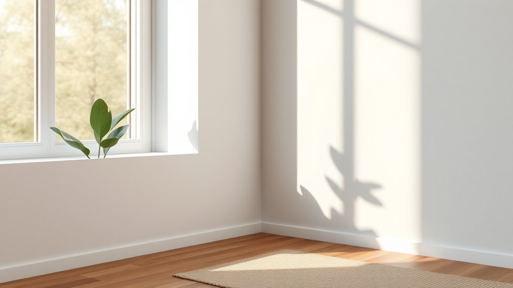
Because natural light shifts in color and intensity through the day, it can make the same white or grey look like a different paint entirely. You’ll notice warm morning light adds cream or taupe hints, while midday sun reads truest, and evening light cools tones. Consider color psychology: softer whites calm, cooler greys feel modern. Track light changes at different times before committing, since perceived hue affects mood and contrast. Also factor paint durability—higher-quality finishes hide wear under shifting light.
| Time of day | Effect on wall color |
|---|---|
| Morning | Warmer, softer |
| Midday | True color |
| Afternoon | Bright, intense |
| Evening | Cooler, muted |
How Different Light Bulbs Affect White and Grey
How will the bulbs you choose change a white or grey room? You’ll shape mood, perceived temperature, and how durable paint appearance seems with bulb choice. Consider color psychology and how light shifts emotion; cool LEDs feel crisp on grey, warm incandescents cozy on white.
Also note paint durability: harsh UV-rich bulbs can fade pigments faster, so choose lower-UV options.
- Warm (2700K): soft, cozy, whites lean creamy.
- Cool (4000K+): crisp, clinical, greys gain clarity.
- Dimmable LEDs: control mood, reduce perceived wear.
- High-CRI bulbs: reveal true tones, aid color judgment.
Warm vs Cool Undertones: Choose the Right White or Grey
Lighting shapes how paint reads, but undertones determine whether a white or grey will feel warm or cool regardless of bulb choice. You’ll notice warm undertones—cream, beige, soft yellow—make spaces feel cozy and inviting, while cool undertones—blue, green, violet—feel crisp and modern.
Use color psychology: warm tones evoke comfort and relaxation; cool tones convey calm and clarity. Test swatches on different walls and observe at various times before paint application.
Consider furniture, flooring, and natural light; mix undertones between rooms for flow. Trust your reaction: pick the undertone that supports the room’s purpose.
Which Whites Make Rooms Look Brighter and Cleaner
If you want a room to read brighter and cleaner, pick whites with neutral to cool undertones—soft blues, very pale greys, or true neutrals—because they reflect light without adding yellowish warmth that can look dingy. You’ll want shades with crispness for perceived cleanliness and an uplifting Color psychology effect.
Also consider paint durability for high-traffic areas so the bright look lasts.
- Pure cool white for maximum reflectance.
- Off-white with slight blue for soft contrast.
- Warm-neutral white sparingly to avoid yellowing.
- High-sheen durable formula where scuffs occur.
Test samples in different light before committing.
Which Greys Warm a Room vs Create a Cool Look
When you pick a grey, start by checking its undertone—warm greys have beige or taupe hints, while cool greys lean blue or green. That choice sets the mood.
You’ll also want to note the light reflectance value (LRV), since higher LRV greys read lighter and airier while low LRV greys feel denser and moodier.
Finally, think about the materials you pair with the paint—wood, metal, and textiles will either amplify warmth or emphasize coolness.
Undertone Matters Most
Because undertones steer how every grey reads in your space, you’ll want to pay attention to them before you pick a swatch. Color psychology and emotional impact matter: warm greys with beige or taupe undertones cozy up a room, while blue or green-leaning greys feel calm and cool. Match undertone to mood and furnishings so the paint supports your intent.
Test large patches and view them at different times. Consider contrast, trims, and textiles to balance the feel.
- Beige/taupe undertones — warm, inviting
- Yellow undertones — sunny, energetic
- Blue undertones — serene, modern
- Green undertones — fresh, restful
Light Reflectance Value
Undertones set the mood, but Light Reflectance Value (LRV) tells you how a grey will actually read in your space. You’ll use LRV to predict brightness: higher LRVs bounce more light, making cool greys feel airy; lower LRVs absorb light, deepening warmth when paired with warm undertones.
Consider color psychology—lighter greys feel calming and open, darker greys feel intimate or moody. Historical trends show shifts between pale, almost-white greys and strong charcoal statements; pick an LRV that matches your era preference and functional needs.
Test samples at different times of day to confirm the temperature and perceived lightness.
Pairing With Materials
Although grey is often seen as neutral, the materials you pair with it decide whether a room feels warm or cool, and you’ll want to choose deliberately. You’ll use color psychology and historical trends to guide choices: warm greys with wood and brass feel cozy; cool greys with chrome and glass read modern.
Consider texture, finish, and era influences to match mood.
- Warm greys + oak, leather, matte finishes — inviting, traditional.
- Cool greys + steel, glass, high gloss — crisp, contemporary.
- Mixed metals + textured fabrics — balanced, layered.
- Stone accents + woven rugs — grounded, timeless.
How Room Size Changes With White or Grey Walls
If you want a room to feel bigger, white walls reflect more light and open up the space.
Choosing grey can make a room feel cozier, but darker greys may visually tighten the area.
Think about light levels and furniture scale when deciding which effect you want.
White Makes Rooms Appear Larger
Want a quick way to make a small room feel bigger? White reflects light, so you’ll notice corners, ceilings, and floor edges more clearly, expanding perceived space. Color psychology and historical trends show people have long used white to brighten compact interiors.
Use these tactics to maximize effect:
- Paint ceilings bright white to lift the room.
- Choose satin or eggshell finishes to reflect light subtly.
- Keep trim and furniture in lighter tones for continuity.
- Position mirrors and light sources to bounce daylight.
You’ll create airy, open-feeling rooms without structural changes, just smart color choices.
Grey Can Tighten Space Perception
How does grey change how a room feels? You’ll notice grey absorbs light and can make corners recede, so spaces feel cozier and sometimes smaller.
Color psychology explains why muted tones encourage introspection and restraint, shifting perception compared with expansive white. Your choice of shade matters: warm greys soften, cool greys compact.
Wall texture alters the effect—matte surfaces mute reflections and tighten perception, while subtle sheen or textured finishes catch light and add depth, softening the enclosure.
Use grey deliberately: in tight rooms pick lighter, warmer greys and textured finishes that prevent an overly cramped, boxed-in sensation.
How Ceiling Height Affects Your Color Choice
Because ceiling height changes how light and space feel, it should guide your wall color choice. You’ll match paint to architecture: tall ceilings invite moodier greys; low ceilings benefit from crisp whites. Consider ceiling height and wall proportions together so rooms feel balanced, not top- or bottom-heavy.
- High ceilings — use deeper greys to create intimacy without shrinking space.
- Low ceilings — choose bright whites to reflect light and raise perceived height.
- Mixed heights — employ mid-tones on lower walls, lighter shades above trim.
- Sloped or vaulted — paint ceilings slightly lighter than walls to unify volume.
How Flooring Color Should Guide Wall Color
When you pick a wall color, consider the floor as your room’s foundation—it sets the temperature and contrast your walls must work with.
Treat the floor as your room’s foundation — it defines the warmth and contrast your wall color must meet.
If you have warm wood tones, lean toward warm whites or greiges to harmonize via color psychology and avoid sterile contrasts.
Cool-toned floors like gray tile call for crisp white or cool greys to maintain balance.
Dark floors handle mid-tone walls; light floors open the space and suit slightly darker walls for depth.
Also factor in paint durability where scuffs hit lower walls—choose harder finishes and slightly forgiving tones near traffic paths.
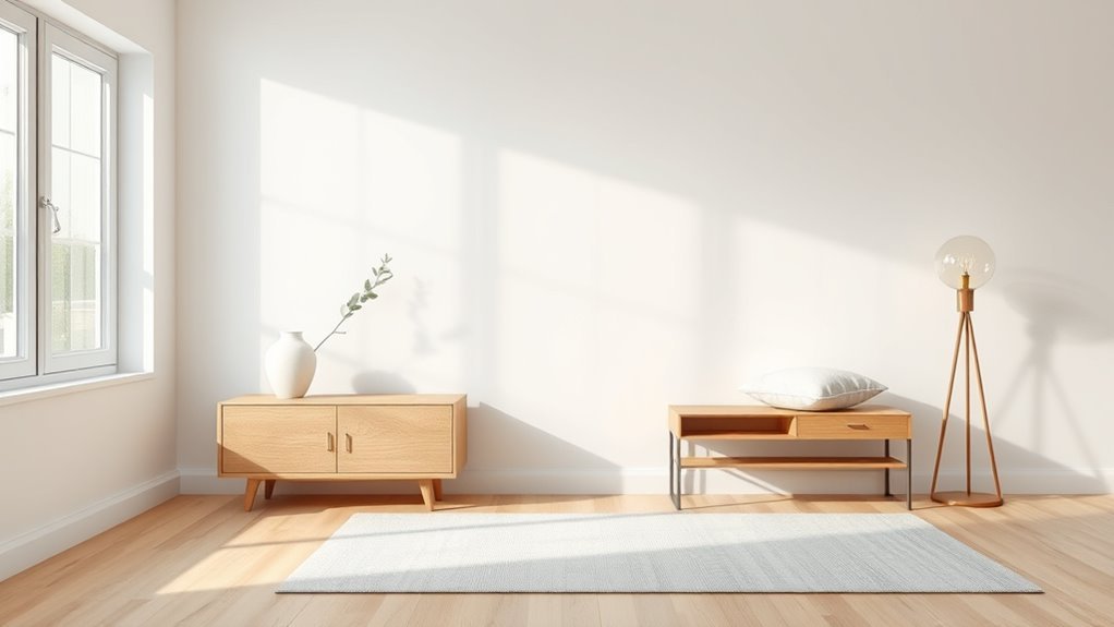
How Furniture and Finishes Steer White vs Grey Decisions
If your furniture and finishes lean warm—oak, brass, leather—you’ll want whites with cream or yellow undertones or warm greiges so the walls feel integrated rather than disconnected. Choose cool greys when steel, chrome, or glass dominate to maintain modern balance and support Color psychology cues about calm versus coziness.
Consider historical trends: mid-century pieces often pair with warmer neutrals, industrial with cooler tones. Decide by sampling against your main pieces, then follow these priorities:
- Match undertones of dominant wood.
- Accent metal finishes for cohesion.
- Test fabric colors in different light.
- Keep trim slightly lighter for depth.
How to Layer Textures and Patterns With White or Grey Backdrops
Although a neutral white or grey backdrop reads as a calm canvas, you’ll create depth and personality by layering varied textures and patterns that play off undertones and light.
Start with a dominant texture—linen drapes, a boucle sofa, or a matte plaster wall—then add patterned rugs or pillows to introduce rhythm without clutter. Match pattern scale to room size and choose contrast levels that respect color psychology: soft contrasts feel soothing, high contrast feels energizing.
Consider historical trends for inspiration—Victorian florals or Midcentury geometrics—but keep finishes contemporary. Repeat a motif to unify the palette and maintain visual flow.
How White Vs Grey Pair With Bold Accent Colors
Choose white for a crisp stage or grey for a nuanced backdrop, and you’ll see how bold accents change character. You’ll use color psychology and Cultural influences to choose impact: white amplifies saturation; grey tempers it. Consider these approaches:
- High-contrast pops: white walls let reds and blues sing, creating energetic focal points.
- Muted bolds: mid-grey softens bright yellows or emeralds for sophisticated drama.
- Warm vs cool accents: white keeps colors true; grey shifts temperature, altering mood.
- Cultural influences matter: local symbolism and lighting affect which accent feels appropriate.
You’ll test samples under real light before committing to a final scheme.
Quick Color-Pairing Palettes: White-Based Schemes
When you start with white walls, you get a clean, flexible canvas that makes selecting accents fast and forgiving; pairings feel bright and intentional. Try these quick palettes: navy and brass for classic contrast, sage and natural wood for calm earthy vibes, or blush and matte black for modern warmth.
Use color psychology to set mood—navy steadies, sage soothes, blush uplifts. Keep accent proportions deliberate: 60/30/10 (white/secondary/accent).
Consider paint durability for high-traffic trims and touchpoints—choose washable sheens. Swap textiles and art seasonally to refresh without repainting.
White lets you experiment confidently.
Quick Color-Pairing Palettes: Grey-Based Schemes
If you’re leaning toward grey walls, pick a cool grey base and add navy accents for a crisp, contemporary look.
For a cozier vibe, choose a warm grey and pair it with terracotta to introduce earthy warmth.
Both combos let your furnishings and textures stand out without overwhelming the room.
Cool Grey + Navy Accents
Though cool grey sets a calm, modern backdrop, pairing it with navy accents gives the room depth and a crisp, tailored look. You’ll notice color psychology at work: grey soothes, navy grounds, and together they create focused sophistication.
Choose high-quality navy for trim, cushions, or an accent wall to contrast without overwhelming. Consider paint durability for high-traffic areas—satin or semi-gloss trims resist scuffs.
Balance textures: matte walls, glossy accents, and warm woods. Keep metals minimal and cool-toned.
Use lighting to shift mood from serene daytime to cozy evening with layered lamps and dimmers.
- Accent wall
- Trim & moldings
- Soft furnishings
- Lighting
Warm Grey + Terracotta
Moving from the cool, tailored feel of grey-and-navy, try warming the mood with soft greys paired with terracotta for an inviting, grounded palette.
You’ll paint walls in a warm grey that reads cozy without feeling heavy, then layer terracotta accents through pillows, pottery, or a feature wall to add earthen warmth.
In rooms with abundant natural light the terracotta pops and the grey shifts slightly warmer; in dimmer spaces keep finishes matte to preserve softness.
Balance proportions—grey as the canvas, terracotta as punctuation—and add warm metals or natural wood to complete a harmonious, lived-in look.
How White and Grey Work in Open-Plan Living Spaces
When you open up a space, white and grey play different but complementary roles: white expands sightlines and bounces light, while grey anchors zones and adds depth without breaking cohesion. You’ll use color psychology to set mood—white for airiness, cool grey for calm, warm grey for intimacy—while considering paint durability in high-traffic areas.
White brightens and opens; grey grounds and defines—use their tones and finishes to shape mood, flow, and durability.
Balance textures and finishes so progression feels intentional. Use furniture, rugs, and lighting to define function without walls.
- Use white in circulation paths.
- Apply grey to seating or media zones.
- Match finish sheen for flow.
- Test swatches in real light.
How White and Grey Perform in Kitchens and Bathrooms
In kitchens and bathrooms you’ll notice white bounces more light while grey can mute glare and add depth.
Think about how each color hides or shows stains and how often you’ll need to touch up splashes and fingerprints.
Also consider how your fixtures and finishes—cabinets, taps, and tiles—will read against white or grey to keep the space cohesive.
Light Reflection Differences
Curious how paint color changes the way a room feels? You’ll notice white bounces light, opening kitchens and bathrooms and supporting color psychology that promotes cleanliness and interior harmony.
Grey absorbs more light, creating depth and a calmer mood but can feel dim without adequate light.
- White: maximizes natural and artificial light, brightens corners, reflects task lighting.
- Cool grey: softens glare, mutes contrast, suits relaxed atmospheres.
- Warm grey: keeps some reflectivity while adding coziness.
- Balance: combine white trim with grey walls to retain brightness and maintain layered harmony.
Maintenance And Stains
Light behavior affects upkeep too: white walls show smudges, splatters, and grout discoloration more quickly, while grey hides everyday marks but can reveal grease or water rings depending on its undertone.
You’ll clean white more often in kitchens and bathrooms to maintain that crisp look; stains jump out and demand immediate attention. Grey lets you relax on maintenance, but you shouldn’t ignore splatter buildup that dulls the tone.
Consider color psychology and the emotional impact of cleanliness: spotless white feels sterile and bright, muted grey reads calm but can feel neglected if dingy. Choose based on lifestyle and cleaning willingness.
Coordinating Fixtures And Finishes
When you’re pairing fixtures and finishes with white or grey walls, think about contrast and undertone to keep the room cohesive. You’ll choose metals, countertops, and tiles that either pop or blend, guided by color psychology and the room’s light. Proper paint application preserves that *desired* effect.
Consider these approaches:
- Use warm brass or wood with warm greys to add warmth and prevent clinical vibes.
- Pair crisp white walls with chrome and cool stone for a sleek, modern look.
- Match undertones: blue-grey needs cooler fixtures, beige-grey needs warmer ones.
- Test samples under real light before finalizing.
How White and Grey Work in Bedrooms for Sleep and Relaxation
Although both white and grey can create calm, they do it in different ways: white brightens a room and feels clean and airy, while grey absorbs light and reads warmer or cooler depending on undertones.
White lifts and brightens for airy calm; grey soaks light, shifting warm or cool with its undertones.
You’ll use color psychology to shape mood: white promotes alert relaxation and clarity, ideal if mornings matter, while mid to deep greys encourage cocooning and slower evenings.
Choose based on natural light, room size, and how you wind down.
Consider paint durability where you’ll touch walls often; glossier finishes resist scuffs.
Layer textiles, lighting, and accent hues to balance serenity and comfort.
Which Trim and Ceiling Colors Work With White or Grey
When you’re choosing trim for white or grey walls, crisp bright whites and soft off-whites are classic options that sharpen the room.
Deeper greys or even black can add drama and definition.
For ceilings, sticking with pure white keeps the space feeling open.
But a very light grey or a slightly warmer white can create coziness without closing the room in.
Consider contrast level and how natural light plays in the room to pick the best trim and ceiling pairings.
Trim Color Options
If you want your walls to read crisp or cozy, choosing trim and ceiling colors is the simplest way to set the mood. Pick trim that balances white or grey walls—bright white for contrast, soft white for warmth, or deep charcoal for drama.
Consider color psychology: cool trims calm, warm trims energize. Also factor paint durability for high-traffic trim. Match sheen to function: gloss hides scuffs, satin is forgiving.
- Bright white trim for modern contrast
- Soft white trim for cozy warmth
- Charcoal trim for bold framing
- Muted beige trim for subtle harmony
Ceiling Color Choices
Want a ceiling that lifts the room or tucks it in? You’ll choose based on scale, light, and mood.
White ceilings reflect light and raise perception of height; they pair cleanly with white or grey walls and follow historical trends favoring bright, airy rooms.
Painting the ceiling a soft grey or pale blue can cozy a large space and add subtle contrast with white trim.
Use color psychology: cooler ceilings feel calm, warmer tones feel intimate.
Match sheen to trim for cohesion, and sample at different times of day.
Trust proportion and natural light to guide your final pick.
Common Mistakes When Choosing White or Grey (And How to Avoid Them)
Although neutral on the surface, choosing between white and grey can trip you up in predictable ways, and knowing those pitfalls helps you make a confident decision. You’ll avoid regrets if you consider color psychology and paint durability early, plus light, undertones, and finish.
- Ignoring light: test swatches at different times so shadows don’t turn white dingy or grey green.
- Overlooking undertones: compare swatches next to trim and flooring to prevent clashes.
- Skipping finish trials: sheen affects durability and scuffs—matte hides flaws, satin cleans easier.
- Rushing decisions: live with samples for days before committing.
Paint Cost Tiers for White and Grey (Budget Tips)
When you’re budgeting for white or grey paint, start by mapping cost tiers so you know where to save and where to splurge. Divide choices into economy, mid-range, and premium: economy covers basic whites/greys that mask little and need more coats; mid-range offers better pigments and durability; premium delivers richer undertones and easier coverage.
Prioritize quality on focal walls and trim, save on hidden areas. Consider how color psychology and historical trends influence perceived value—classic whites read timeless, certain greys feel modern and pricier.
Factor labor, primer, and touch-ups so your budget matches the finish you want.
Best Paint Finishes for White vs Grey Walls
How do you choose the right finish for white or grey walls? You’ll pick based on room use, light, and desired mood. Color psychology suggests gloss feels energetic while matte reads calm.
How do you choose the right finish? Consider room use, lighting, and mood—gloss energizes, matte soothes.
Historical trends show high gloss in formal rooms, matte in modern minimalism. Consider these finishes:
- Matte: hides imperfections, softens white and grey tones.
- Eggshell: subtle sheen, durable for living spaces.
- Satin: easy to clean, brightens greys without glare.
- Semi-gloss: best for trim or high-traffic areas needing frequent cleaning.
Match finish to function and atmosphere for a confident, cohesive result.
Final Checklist: Choose, Test, Paint Confidently
Since you’ve narrowed your color and finish, use this checklist to confirm choices, test them in the room, and prep for a smooth paint day.
Verify the white or grey sample looks good at morning, noon, and evening light; note how color psychology affects mood in each light.
Tape large swatches on different walls and live with them 48–72 hours.
Confirm sheen, primer needs, and surface repairs.
Review historical trends for your home’s era to honor style or deliberately contrast it.
Gather tools, drop cloths, and proper tape.
Schedule painting when humidity is low and you’re rested.
Paint confidently.
Frequently Asked Questions
Will White or Grey Hide Wall Imperfections Better Over Time?
Grey will hide imperfections better over time; you’ll benefit from color consistency and reduced glare, and lighting effects won’t spotlight flaws as much. White shows blemishes sooner, so you’ll need touch-ups more frequently.
How Do White and Grey Affect Home Resale Value?
About 90% of buyers prefer neutral tones, so you’ll boost curb appeal and resale: white reads timeless and bright, grey conveys modern sophistication—use color psychology and design versatility to match trends and appeal to broader buyers.
Are White or Grey Walls Easier to Touch up and Match Later?
White is usually easier to touch up and match later, but grey can hide scuffs better; you’ll consider color coordination and wall durability when storing leftover paint, labeling batches, and testing small patches for consistent sheen and fading.
Do Pet Hair and Stains Show More on White or Grey?
Generally, pet hair shows more on dark greys, stains stand out more on whites. You’ll influence mood via color psychology, balance aesthetics with maintenance challenges, and choose based on shedding, stain types, and cleaning willingness.
How Do White and Grey Influence Perceived Room Temperature?
White feels cooler, grey can feel warmer or moodier depending on shade. You’ll notice lighting effects amplify color psychology: warm bulbs make grey cozier, cool light makes white crisper, so pick based on desired temperature perception.
Conclusion
Choosing white or grey is like tending a garden: white’s the sun-loving rose—bright, honest, and forgiving—while grey’s a quiet cedar—layered, moody, and grounding. You’ll pick white when you want space to breathe; pick grey when you want depth that soothes. Test swatches in different light, mind undertones, and match finish to use. Whichever you plant, water with samples and patience, then enjoy the room as it grows into you.