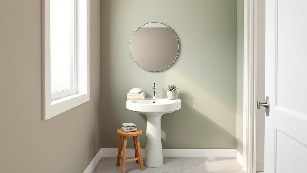
What Color Paint for Bathroom Walls
Pick a paint color that balances light, size, and fixtures so your bathroom feels brighter and fresher. If your space is small or north-facing, go with pale cool hues—soft blues, greens, or warm neutrals—to open it up. Larger bathrooms can take deeper, cozy tones like navy or charcoal, with satin or semi‑gloss for easy cleaning. Match undertones to your tile and test swatches under your lights; keep going to get tips on finishes, pairing, and maintenance.
Quick Answer: Best Bathroom Paint Colors
When you want a fast, reliable choice, go with soft neutrals like warm whites, pale grays, or greiges—they make small bathrooms feel brighter and larger.
You’ll also consider cool blues for a calming vibe, soft greens for a spa feel, and deep navy or charcoal as dramatic accents.
Pick semi-gloss or satin for durability and easy cleaning.
Coordinate paint with bathroom accessories—towels, mats, fixtures—to unify the look.
Don’t forget ventilation tips: proper exhaust and humidity control protect paint and prevent mold.
Test swatches in your light before committing to a full room.
How to Choose Bathroom Paint: Size, Light, Finish
Because bathrooms vary so much in size, light, and function, you should pick paint with those factors in mind. Assess natural and artificial light to choose a hue’s value — lighter shades brighten dim rooms; richer tones read well in sunlit spaces.
Consider ceiling and trim for contrast, and pick a semi-gloss or satin finish for durability and easy cleaning.
Prioritize paints labeled for high humidity, and guarantee proper bathroom ventilation to reduce moisture.
Combine moisture-resistant paint with good ventilation and routine cleaning for effective mold prevention.
Test samples on your wall and inspect them at different times of day.
Small vs Large Bathrooms: Color Rules
If you’ve got a small bathroom, choose lighter, cooler hues and reflective finishes to visually open the space.
For larger bathrooms, you can embrace richer tones to create intimacy while balancing with ample lighting.
Apply color psychology to match function: calming blues for relaxation, energizing yellows for morning routines.
Use mood enhancement through contrast, accents, and textures rather than chaotic palettes.
Think proportionally: walls, trim, and cabinetry should work together.
- Small: light, cool, glossy accents
- Large: deep, warm, matte zones
- Both: purposeful accents for mood enhancement and cohesion
Colors That Make a Small Bathroom Look Bigger
1 simple rule: pick hues that reflect light and reduce visual clutter so your small bathroom reads as more open and continuous. You’ll favor pale, warm neutrals or soft pastels—off-white, pale gray, blush, or muted aqua—because color psychology shows lighter tones expand perceived space.
Keep contrast low between walls, trim, and ceiling to maintain continuity. Choose a satin or eggshell paint texture to bounce light without highlighting imperfections.
Limit bold patterns and high-contrast accents; use mirrors, consistent fixtures, and vertical lines to elongate sightlines. Paint choices and finishes together make small bathrooms feel brighter and larger.
Colors That Make a Large Bathroom Feel Cozier
If you want a large bathroom to feel cozier, choose warm neutral tones like beige, taupe, or soft greige to add inviting depth without overwhelming the space.
For a more dramatic effect, try deep moody hues—navy, forest green, or charcoal—on walls or cabinetry to create intimate pockets.
You can also use an accent wall in a contrasting shade to anchor the room and bring it into balance.
Warm Neutral Tones
When you want a spacious bathroom to feel more intimate without sacrificing brightness, warm neutral tones are your best tool. Soft beiges, muted taupes, and warm greiges add depth and a subtle glow that makes the room feel cozier and more inviting.
You’ll balance warmth with light by pairing these hues with layered bathroom lighting and reflective surfaces. Choose water resistant finishes for longevity and easy cleaning, and test paint samples at different times of day.
Consider these design moves to amplify comfort and cohesion:
- Uniform warm walls with white trim for contrast.
- Natural wood accents to add texture.
- Matte finishes to minimize glare.
Deep Moody Hues
Although large bathrooms can feel cavernous, deep moody hues will quickly make the space feel cozier and more grounded. You’ll choose navy, charcoal, forest green, or plum to bring intimacy without shrinking functionality.
With careful lighting and reflective fixtures, these tones read rich rather than oppressive. Use moody accents in textiles, cabinetry, and hardware to layer depth while maintaining cohesion.
Color psychology tells you darker shades encourage relaxation and privacy, ideal for a serene soak. Keep trim crisp and finishes slightly glossy to prevent flatness.
Balance is key: rich walls, lighter surfaces, and thoughtful contrast create a sophisticated refuge.
Accent Wall Contrast
Want to make a large bathroom feel cozier without repainting the whole room? Use an accent wall to anchor the space: choose a richer shade guided by color psychology and adjust paint texture to add warmth. You’ll create focus and intimacy while keeping most surfaces light.
- Pick a deep, warm tone (terracotta, navy, forest) to pull the room in visually.
- Use matte or velvety paint texture on the accent wall to absorb light and feel soft.
- Balance with light trims and reflective fixtures so the room stays bright but comfortably scaled.
How Natural Light Changes Paint Color
Because natural light shifts throughout the day, the same paint can read very different in your bathroom depending on the hour and the season. You’ll notice natural light warms toward sunset and cools at dawn, altering paint perception and revealing undertones you didn’t expect.
Test swatches at multiple times—bright midday, soft morning, and evening—to see real behavior. Use large samples on different walls, observe for several days, and choose finishes that forgive variation. That way your color feels consistent in everyday life.
South- or west-facing rooms get brighter, intensifying color; shaded mornings make hues look muted.
Best Colors for North-Facing Bathrooms
If your bathroom faces north and gets mostly cool, indirect light, pick colors that counteract that blue cast and bring warmth or brightness into the space. Choose warm neutrals, soft yellows, or muted terracottas to lift the mood and support Bathroom feng shui principles by balancing yin energy.
Consider satin or eggshell paint texture to reflect light without glare and resist moisture. Keep contrast subtle to maintain calm.
Opt for satin or eggshell finishes to gently bounce light, resist moisture, and keep contrasts soft for a calm bathroom.
- Warm beige — cozy, versatile, enhances light.
- Pale butter — cheerful without overwhelming.
- Dusty terracotta — earthy anchor, invites warmth.
Best Colors for South-Facing Bathrooms
Since south-facing bathrooms get warm, direct light for much of the day, you can choose cooler or muted hues to keep the space feeling fresh and balanced; think soft blues, cool grays, and pale greens that counteract warmth without looking washed out. You’ll use color psychology to calm intense sunlight and select a matte or eggshell paint texture to reduce glare. Consider accents in deeper teal or charcoal for contrast. Use the table below to weigh mood, maintenance, and recommended finish for quick decisions.
| Mood | Maintenance | Finish |
|---|---|---|
| Calm | Moderate | Eggshell |
| Fresh | Easy | Matte |
| Crisp | Moderate | Satin |
Best Colors for Windowless Bathrooms
Windowless bathrooms can feel cramped and gloomy, but the right paint will make the space look brighter and bigger. You should lean toward pale, warm neutrals and soft pastels that reflect light and soothe; color psychology favors hues that calm and expand perception.
Windowless bathrooms need pale, warm neutrals and soft pastels to reflect light, soothe, and visually expand the space.
Choose satin or semi-gloss for durability and easier paint application to resist moisture. Add contrast with trim or an accent wall to prevent flatness.
- Soft ivory or warm grey to open the space.
- Pale blue-green for a tranquil, airy feel.
- Blush or muted peach to add warmth without closing in.
How Bathroom Lighting (Warm vs Cool) Affects Color
When you pick a paint color, the type of light in your bathroom will change how that hue actually looks on the walls—warm bulbs boost yellows and reds, making creams and peaches feel cozier, while cool bulbs bring out blues and greens, crisping whites and pale blues. Test swatches under your actual fixtures and consider bathroom ventilation when drying paint. If you repaint, plan for paint removal safely. Use the table below to compare effects.
| Lighting Type | Effect on Warm Tones | Effect on Cool Tones |
|---|---|---|
| Warm bulbs | Intensifies | Muted |
| Cool bulbs | Subdued | Enhanced |
| Mixed light | Balanced | Variable |
Matching Paint to Common Tile Palettes
If your bathroom already has tile, match paint by reading the tile’s dominant undertone—warm (yellow, red, brown), cool (blue, green, gray), or neutral—and choosing a wall color that complements rather than competes. You’ll use color psychology to set mood: warm tiles want muted cools for balance; cool tiles welcome soft warms for contrast; neutrals allow richer accents.
Consider paint texture—eggshell hides minor flaws, satin boosts light reflection. Follow these quick guidelines to harmonize tile and wall without overthinking.
- Warm tile: pick soft blues/greens.
- Cool tile: try warm beiges or blush.
- Neutral tile: use deep accent or crisp white.
Paints That Hide Water Spots and Wear
Because bathroom surfaces constantly get splashed and scuffed, you’ll want paints formulated to hide water spots and everyday wear. Choose satin or semi-gloss sheens that resist staining and wipe clean without leaving ghost marks.
Pick satin or semi-gloss paints designed to hide water spots and wipe clean without ghost marks.
Look for products labeled waterproof finishes or ones that create effective moisture barriers; these reduce penetration and staining on trim and lower walls.
Pigment-rich, mid-tone colors mask mineral deposits better than pure white, while high-quality binders improve abrasion resistance.
Apply proper priming and follow manufacturer drying times to guarantee the surface performs.
Regular gentle cleaning preserves appearance without stripping protective layers.
Low-Maintenance Colors for Busy Bathrooms
When you want a bathroom that looks good with minimal effort, choose durable neutral finishes like warm grays or soft greiges that hide wear.
Pair those tones with easy-to-clean, high-quality paints—especially satin or semi-gloss—to resist stains and moisture.
That combo keeps maintenance simple and your space looking fresh longer.
Durable Neutral Finishes
Though you might want bold hues, neutral, durable finishes are the smart choice for busy bathrooms because they hide wear, resist stains, and keep maintenance quick. You’ll pick shades like warm greige, soft taupe, or cool dove gray to complement bathroom decor and simplify tile coordination. These tones make fixtures pop without demanding constant touchups.
- Warm greige: masks smudges, pairs with wood tones.
- Soft taupe: hides water spots, balances marble or porcelain tile.
- Cool dove gray: disguises grime, modern with subway tile.
Choose satin or eggshell sheen to balance durability and subtlety.
Easy-To-Clean Paints
If you want a bathroom that looks fresh with minimal effort, pick easy-to-clean paints that combine stain-resistant formulas with forgiving colors. You’ll choose semi-gloss or satin finishes that wipe down, and you can still embrace vintage color schemes like soft sage or muted teal for charm. Look for eco friendly finishes that cut VOCs without losing durability. Pair practical hues with durable trim paint and routine quick wipes. Below is a simple comparison to guide choices.
| Feature | Benefit |
|---|---|
| Satin finish | Wipes clean, low sheen |
| Semi-gloss | Very durable, moisture resistant |
| Eco friendly finishes | Low VOCs, safer air |
| Vintage color schemes | Timeless look, hides wear |
How Undertones Change Color Perception
Because your eye reads undertones before it registers the main color, a paint that’s labeled “soft gray” can feel warm, cool, or even slightly green depending on the pigments beneath the surface. You notice Undertone influence immediately, and Perception shifts happen with light, fixtures, and tile.
Consider how those subtle hints alter mood and coordination.
- Observe samples on multiple walls to see true reaction.
- Test at different times to capture daylight and artificial light effects.
- Pair with existing finishes to guarantee harmony and avoid unexpected clashes.
Cool Undertones That Suit Modern Baths
When you want a crisp, contemporary look, cool undertones like blue-gray, soft aqua, and slate lend bathrooms a clean, airy feel that plays well with chrome and white tile. You’ll choose hues that visually expand small spaces, reflect natural light, and create calm.
Use color psychology to steer mood—paler blues foster relaxation, deeper slate adds sophistication without heaviness. In paint psychology, finish matters: satin reflects light for brightness, matte hides flaws for a soft spa vibe.
Balance cool walls with warm wood or textured towels so the room feels intentional, not sterile.
Warm Undertones That Suit Traditional Baths
Although cool tones suit modern baths, warm undertones bring a traditional bathroom to life by adding depth and a welcoming glow. You can pair buttery creams, muted terracottas, or soft olive to complement vintage fixtures and wood trim.
Choose eco-friendly paints with good pigment to preserve that cozy feel without harsh chemicals. Focus on contrast and texture rather than bold color shifts so the room feels collected, not cluttered.
- Buttery cream — brightens while honoring period details.
- Muted terracotta — adds richness to brass or bronze.
- Soft olive — grounds antiques and woodwork gracefully.
Neutral Bathroom Shades That Always Work
If you want a fail-safe palette, neutral shades give your bathroom a timeless, flexible backdrop that’s easy to update with accessories. Choose warm taupes, soft greiges, or pale ivories to keep the room calm and spacious.
You’ll pair neutrals with contrasting hardware or textured towels for instant style without repainting. Consider satin or eggshell paint textures to resist moisture while reflecting light subtly.
Neutrals also simplify bathroom decor decisions—art, plants, and rugs stand out against an understated wall. Stick to two or three complementary neutral tones to maintain cohesion and make future updates effortless.
When to Pick Blue or Green Hues
If you want a cool, calm vibe, blue or green hues can set a soothing tone that feels spa-like. Consider how much natural light and space you have, since pale blues open tight, dim bathrooms.
Deeper greens suit larger, well-lit rooms. Also think about mold and maintenance—greens and blues can hide water stains differently and some finishes resist mildew better than others.
Cool Calm Vibes
When you want your bathroom to feel like a spa, reach for blue or green hues—these colors calm the mind, evoke water and foliage, and make small spaces feel more open. You’ll pick shades based on color psychology and the feel you want. Softer blues soothe; muted greens ground.
Consider paint texture—matte lends softness, satin adds subtle sheen for easy cleaning. Balance tones with fixtures and towels so the room stays cohesive.
- Choose a dominant cool tone for serenity.
- Add a mid-tone for depth and contrast.
- Use accents to introduce warmth sparingly.
Space And Light
Because light changes how colors read, pick blues or greens that suit your bathroom’s natural and artificial lighting—cool, pale blues brighten north-facing rooms, while warmer greens soften harsh southern sun.
You’ll assess mirror placement and fixture temperature to decide hue depth: soft aqua and sage reflect light, while deeper teal adds drama in well-lit spaces.
Consider wall textures—matte hides imperfections, satin bounces light subtly—and test swatches at different times.
If you plan seasonal swaps, label and rotate samples, and keep extra paint in proper paint storage for touch-ups so you maintain color consistency without redoing entire walls.
Mold And Maintenance
Since bathrooms stay humid, pick blue or green paints that resist mold and stand up to frequent cleaning. You’ll want semi-gloss or satin finishes labeled for bathrooms; they block moisture, support mold prevention, and wipe clean without dulling hues.
Pair paint choice with effective ventilation systems and routine care so color stays fresh. Consider cool blues for a crisp, clean feel or muted greens to hide mineral stains. Make decisions based on upkeep, not just looks.
- Choose mildew-resistant formulas.
- Install/examine ventilation systems regularly.
- Clean weekly to reinforce mold prevention.
Using Gray Tones: Pairings and Style Tips
Though gray often gets labeled as neutral, it actually sets a versatile foundation that you can tailor from soft and serene to bold and modern. You’ll use color psychology to choose warmer or cooler grays that calm or energize, depending on natural light.
Pair mid-tone grays with wood or brass to add warmth, or choose charcoal for dramatic impact against matte tiles. Employ texture contrast—glossy subway tiles, plush towels, or woven baskets—to prevent flatness.
Keep trim and fixtures intentionally simple so the gray remains cohesive. Test samples in different lighting before committing to a full coat.
White and Off-White: Avoiding a Sterile Look
When you choose white or off-white for bathroom walls, layer warmth and texture so the space feels inviting rather than sterile. You’ll use color psychology to balance calmness with comfort: choose warm off-whites, wood accents, and soft metals to prevent clinical vibes.
Consider paint texture to add subtle depth—eggshell or matte with a slight tooth hides imperfections and reflects light gently. Combine textiles and finishes deliberately.
Choose eggshell or matte finishes with a subtle tooth to add depth; layer textiles and finishes for gentle, tactile warmth.
- Add warm lighting and wood tones to counter cool whites.
- Use varied paint texture and matte tiles for tactile interest.
- Bring in plants and soft towels for organic warmth.
When Bold Colors Work in Bathrooms
You can make bold hues work by matching color intensity to your bathroom’s scale and the natural and artificial lighting it gets. Balance those strong colors with fixtures and trim—think matte white vanities or brass hardware—to keep the look grounded.
Also pick durable, moisture-resistant finishes so the color stays vibrant and the walls hold up.
Scale And Lighting
If your bathroom has good natural light and a generous footprint, bold paint can energize the space rather than overwhelm it. You’ll use color psychology to shape mood—deep teal feels calming, bright coral wakes you up.
Consider scale: large walls take color differently than tiny alcoves, so test swatches at various times. Lighting alters hue; warm bulbs deepen reds, cool LEDs sharpen blues.
Also weigh paint durability for humid rooms—choose mildew-resistant, washable finishes.
Follow these three prompts as you decide:
- View swatches at day and night.
- Paint a large test patch.
- Prioritize durable, moisture-rated finishes.
Balance With Fixtures
Good lighting and scale set the stage, but fixtures determine whether a bold wall color feels intentional or jarring. You should assess finishes: chrome, brass, matte black, or ceramic anchor the room and guide color choice.
Match or contrast fixtures thoughtfully so towels, mirror frames, and bathroom accessories harmonize rather than compete. Keep plumbing and cabinetry tones consistent to avoid visual clutter.
Use bold paint around a neutral sink or tub to create drama without overwhelming the space. Confirm ventilation solutions won’t clash visually or be hidden; vents and fans should integrate with your fixtures for a polished, cohesive result.
Durable Finishes Choice
When bold paint meets bathroom moisture, choose finishes that resist wear and stand up to steam so the color stays vivid rather than fading or peeling. You’ll pair color psychology with paint durability to make bold hues feel intentional, energetic, or calming while surviving splashes.
Pick satin or semi-gloss for walls that need scrubbing, or an eggshell in low-splash areas. Seal trim and high-touch spots to protect contrast and keep accents crisp.
- Satin: balances sheen and cleanability for lively colors.
- Semi-gloss: best for high-moisture zones and trims.
- Moisture-resistant primer: boosts adhesion and longevity.
Accent Walls and Color-Blocking Ideas
Although a full coat can feel safe, adding an accent wall or color block instantly gives your bathroom personality and depth without overwhelming the space. You can highlight a niche, the wall behind a tub, or a single vanity wall to create focus.
Pair bold color blocks with neutral surroundings to keep balance. Use vintage fixtures nearby for contrast, but don’t match everything—let the wall speak.
Try geometric blocks, horizontal bands, or a vertical stripe to change perceived height. Consider textured finishes like a matte or subtle plaster for tactile interest that still reads clean and modern.
Coordinate Paint With Fixtures and Finishes
Think about how paint undertones will sit next to your vanity, sink, and cabinetry so everything feels intentional.
You can create contrast by pairing warm or cool paints with chrome, brass, or matte black fixtures.
Match or echo the main tile hues to tie the whole room together.
Match Undertones With Fixtures
Because your fixtures set the room’s visual temperature, match paint undertones to them so everything reads as intentional, not accidental. You’ll create undertone harmony by sampling paint beside your vanity, tile, and cabinet finishes. Focus on subtle shifts—warm creams with brass, cool grays with chrome—to preserve cohesion. Use small swatches at different times of day to confirm results.
Prioritize fixture matching over trendy hues so the space feels unified and restful.
- Compare swatches next to fixtures in natural light.
- Test larger samples on multiple walls.
- Choose the swatch that complements all main finishes.
Contrast With Metal Finishes
When you pair paint with metal finishes, aim for contrast that highlights each element rather than competing with it. Choose wall colors that let hardware pop: dark charcoal or navy against brass warms the room, while soft greys or pale blues let chrome feel crisp.
Think about metal contrast intentionally—warm metals benefit from cooler paint, cool metals from warmer tones. Test swatches near sinks and mirrors so bathroom fixtures read clearly in real light.
Keep finishes consistent; mixing too many metals can muddle the look. Small accents, like towel bars, become focal points when your paint supports them.
Coordinate With Tile Hues
Although tile often sets the room’s tone, you can use wall paint to reinforce or soften those hues so fixtures and finishes read cohesively. You’ll consider color psychology to influence mood and choose paint texture to complement tile sheen.
Match undertones—warm tiles with warm neutrals—or pick a muted contrast to highlight metalwork. Test large swatches near fixtures and in different light.
Think about grout color and pattern scale when selecting depth and warmth.
- Pick a paint undertone that echoes tile.
- Use matte or eggshell paint texture to balance glossy tile.
- Sample near fixtures for true color.
Match Paint to Vanity, Countertop, and Floor
To make your bathroom feel cohesive, pick a wall color that ties your vanity, countertop, and floor together rather than competing with them. Look for undertones that echo wood grains, stone veining, or tile accents so surfaces feel deliberately paired.
Use color psychology to set mood—calming blues, warm neutrals, or energizing greens—while matching intensity to fixtures. Test swatches near your vanity and counter under different lights.
Choose eco-friendly finishes like low-VOC paints to protect surfaces and indoor air quality.
If your floor pattern’s busy, opt for a subdued wall hue to balance visual weight and maintain flow.
Trim and Ceiling Colors That Elevate a Bath
Use crisp white trim to frame your bathroom and make colors pop. Then pick a contrasting ceiling shade to add depth or a soft contrast.
You can boost durability and shimmer with a gloss finish on trim and moldings for easy cleaning and a polished look. These small choices will instantly elevate the room’s style and perceived height.
Crisp White Trim
When you pair crisp white trim with painted walls, the effect is instantly cleaner and more intentional, framing architectural details like baseboards, window casings, and crown molding so they read as design features rather than afterthoughts. You create trim contrast that sharpens edges, brightens the room, and makes even small baths feel curated.
Choose a durable, semi-gloss finish for easy cleaning and longevity. Consider undertones—cool whites suit modern schemes, warm whites flatter traditional palettes. Balance is key: don’t let trim overpower wall color.
Use these guiding moves to elevate the space:
- Define edges for visual clarity.
- Increase perceived brightness.
- Reinforce style cohesion.
Contrasting Ceiling Shades
Pairing crisp white trim with a contrasting ceiling color shifts the room’s proportions and adds a deliberate layer of style—think of the ceiling as another design plane rather than invisible white space.
You can pull a darker hue upward for dramatic ceiling contrast, making low ceilings feel intentional and cozy. Conversely, a soft pastel ceiling lifts the space without competing with your walls.
Use the ceiling to echo a secondary wall accent or introduce a fresh color that complements wall accents. Keep progressions clean at the trim line and test swatches under bathroom lighting to guarantee harmony and mood control.
Gloss Finish Accents
Although often subtle, glossy trim and ceiling paints can instantly sharpen a bathroom’s look and resist the humidity that dulls flat finishes. You’ll find a gloss finish highlights architectural lines, reflects light for a brighter space, and pairs with muted walls or bold accent walls without competing.
Use it sparingly so the sheen reads intentional, not overpowering. Consider these focused strategies:
- Paint crown molding and baseboards in a high-gloss white to frame softer wall tones.
- Use a semi-gloss ceiling to bounce light in small bathrooms.
- Apply gloss on one focal wall or around mirrors to accent walls and fixtures.
Best Bathroom Paint Sheens and Where to Use Them
Because bathrooms face high humidity and frequent scrubbing, choosing the right paint sheen matters more than color alone. You’ll pick flat or matte for ceilings and low-traffic walls to hide flaws, while eggshell works in guest baths with moderate moisture.
Satin is your go-to for most walls—it balances bathroom decor appeal with excellent paint durability and cleans easily. Semi-gloss suits trim, doors, and cabinetry where moisture and handling are highest.
Use gloss sparingly for accents or hardware to avoid overwhelming shine. Match sheen to function: prioritize cleanability and resistance where water and soap contact are frequent.
Mildew-Resistant Paint Features to Consider
When you pick paint for a bathroom, prioritize moisture and mold resistance to prevent stains and structural damage.
Look for products with antimicrobial additives that actively inhibit mildew growth.
Also choose a durable, washable finish so you can clean soap scum and mildew without stripping the coating.
Moisture And Mold Resistance
If your bathroom struggles with humidity, choosing a paint with strong moisture and mold resistance will make upkeep much easier. You’ll want paints formulated for wet rooms that resist water penetration and discourage mold growth.
Combine paint choice with proper ventilation systems and moisture barriers for best results. Look for durable, washable finishes and clear manufacturer guidance on wet-area use.
- Choose a high-quality semi-gloss or satin formulated for bathrooms.
- Confirm product testing for mold/mildew resistance and cleanability.
- Pair paint with exhaust fans, sealed grout, and moisture barriers to prevent recurring issues.
Antimicrobial Additives Present
Beyond choosing a mildew-resistant finish and improving ventilation, check whether the paint itself contains antimicrobial additives that inhibit mold and mildew growth on the surface. You’ll want paint formulated with proven antimicrobial coatings so spores can’t colonize the film.
Manufacturers often list active ingredients and test standards; review those to confirm effectiveness and safety.
Choosing paints with antimicrobial technology delivers clear hygiene benefits in high-moisture zones, reducing odor and stain risks.
Remember to balance additive claims with VOC levels and certifications, and follow proper surface prep and application for the additives to perform as advertised.
Durable Washable Finish
Because bathroom walls take constant exposure to moisture, traffic, and cleaning, you’ll want a paint that stands up to scrubbing without losing color or sheen. Choose mildew-resistant, washable formulas so cleaning’s quick and finishes stay true.
Color psychology still matters, since durable sheens affect perceived brightness and mood. Prefer eco-friendly paints with low VOCs to protect indoor air while resisting mold. Consider finish, pigment quality, and manufacturer testing to guarantee longevity.
- High-sheen latex: easy wipe, resists stains.
- Mold-inhibiting additives: prevents mildew growth.
- Certified eco-friendly paints: safer for you and lasting performance.
How to Test Swatches in Your Bathroom
Want to know how a color will actually look once it’s on your walls? Tape several small swatches at eye level, near the sink and shower, so you see them in varied light. Observe at morning, midday, and under artificial light to note shifts.
Tape small swatches at eye level and observe morning, midday, and artificial light to see true color shifts.
Consider color psychology—does the hue feel calming or energizing in each condition?
Rub a fingertip to test paint texture and sheen; glossy finishes reflect more and alter perceived color.
Live with the samples for a few days, clean them gently to confirm stain resistance, and trust what your everyday view tells you before committing.
How Many Paint Samples to Try and Where
You don’t need to test every shade—pick about three to five samples to compare side by side.
Place them on different walls and near fixtures, mirrors, and the shower to see how light and reflections change the color.
Move samples around at different times of day to confirm which one reads best in your actual bathroom conditions.
Number Of Samples
When testing paint for your bathroom, try at least three to five samples so you can compare tones, undertones, and finish under different light.
You’ll want options that reflect color psychology—calming blues, energizing yellows—and finishes that suit paint durability needs in humid spaces.
Sample multiple sheens if you can.
- Pick three core colors: neutral, warm, cool to see contrasts.
- Add one bold accent to test mood impact and one muted choice for longevity.
- Limit to five to avoid decision fatigue; note how each ages with steam and cleaning.
Record impressions and elimination criteria.
Best Sample Placement
Although lighting changes across a bathroom, place your three to five paint samples where you’ll actually live with the color—around the vanity, near the shower, and on a wall that catches natural light—so you can compare tone, sheen, and how steam and reflections alter each swatch. Test spots by the exhaust fan to assess effects when bathroom ventilation runs, and beside tile for true tile coordination. Observe samples at different times and with mirrors. Use this quick chart to note results and pick the winner.
| Location | Time Tested | Notes |
|---|---|---|
| Vanity | Morning | |
| Shower | After steam | |
| Natural wall | Afternoon | |
| Near tile | Evening |
When to Pick Paint During Your Bathroom Reno
Because paint ties together fixtures, tile, and lighting, you should pick your bathroom color early enough to guide finish choices but late enough to see how materials read together. You’ll balance practical issues like bathroom ventilation with aesthetic goals like tile coordination.
Pick bathroom paint after major surfaces so color guides fixtures, yet test samples in final light and ventilation conditions.
Choose paint after selecting major surfaces but before ordering vanities or lighting, so color informs hardware and grout choices. Time samples near finished materials and test in morning and evening light.
Plan to finalize color before sealing or caulking to avoid mismatches.
- Select tiles and ventilation plan first.
- Test paint with installed samples.
- Decide color before final fixtures.
Budget Paint Strategies That Look High-End
Once you’ve locked in tile and fixtures, you can make smart paint choices that elevate the whole room without blowing your budget. Choose high-impact hues guided by color psychology: soft greens or warm neutrals feel calming, while deep navy adds drama.
Buy quality satin or eggshell finishes for durability and subtle sheen—they mimic luxury without premium pigment costs. Use paint texture strategically: a light roller nap hides imperfections and looks refined; consider an accent wall with a brushed or stippled effect for depth.
Sample swatches, paint trim in a crisp contrasting shade, and prioritize coverage over trendy colors.
Hiring a Pro vs DIY Color Selection
You can weigh the pros and cons of hiring a pro versus doing your own color selection to see which fits your needs. A pro can save time and offer expert color pairing, but you’ll pay more.
DIY saves money but may take longer and risk mistakes. Consider your budget, schedule, and confidence with color decisions before choosing.
Pros And Cons
When deciding between hiring a pro and choosing paint colors yourself, weigh control and cost against expertise and convenience. You’ll balance color psychology and paint texture knowledge with personal taste. A pro guides choices, tests samples, and predicts finish behavior; you keep full creative control and can experiment.
- Expertise: Pros read light, space, and color psychology to pick shades that calm or energize.
- Control: DIY lets you try bold colors and tactile paint texture options without compromise.
- Risk: Mistakes in undertones or sheen cost time; pros reduce that risk.
Cost And Time
Although hiring a pro costs more up front, it can save you time and prevent costly mistakes. You’ll get expert advice on color psychology, finishes, and paint durability, and they’ll finish faster. If you DIY, you’ll save labor but invest time testing swatches and correcting errors.
| Option | Time Investment | Risk |
|---|---|---|
| Pro | Low | Low |
| DIY | High | Medium |
| DIY w/consult | Medium | Low |
Decide based on budget, schedule, and how much you value expert input on moisture-resistant finishes and mood-driven palettes.
Common Color Mistakes and How to Fix Them
If a bathroom’s paint feels off, it’s usually because of lighting, undertones, or scale—mistakes that are easy to fix once you spot them. You can adjust choices using color psychology to match mood and confirm paint durability for humidity.
Start by testing swatches at different times; finish and sheen affect perception. Consider trim and fixtures before committing.
- Rebalance: swap a swatch with a warmer or cooler hue to correct undertones.
- Resize: use lighter shades or high-contrast trim to change perceived scale.
- Protect: choose mildew-resistant, high-durability finish for longevity.
Real Bathroom Color Combinations That Work
To create a bathroom that feels intentional, pair a dominant wall color with one or two complementary accents and consistent finishes—this keeps the space cohesive without looking forced. Choose a soft blue dominant with matte white trim and brass accents for calm energy; color psychology supports blue for relaxation.
Pair a dominant wall color with one or two accents and consistent finishes for a calm, cohesive bathroom feel
Try sage green walls, terracotta towels, and black fixtures for grounded warmth.
For small powder rooms, go bold with charcoal walls, high-gloss white trim, and mirrored surfaces to bounce light.
Consider paint texture—flat hides flaws, satin resists moisture—so match finish to function while keeping your palette simple and purposeful.
Quick Checklist to Finalize Your Bathroom Paint Choice
When you’re ready to commit, run through a short checklist that guarantees your paint choice performs and looks right. Consider how color psychology affects mood—soft blues calm, warm neutrals cozy—and test swatches under your bathroom lighting. Factor humidity and choose a mildew-resistant finish, since paint maintenance matters for longevity.
- Test swatches on multiple walls and view at morning/evening light.
- Confirm finish (eggshell, satin) matches durability needs and cleaning ease.
- Pick a primer and mildew-resistant formula; note cleanup and touch-up plan.
Follow this checklist and you’ll pick a color that feels right and stands up to use.
After You Pick: Painting, Care, and Next Steps
Now that you’ve narrowed your color and finish, it’s time to move on to the practical steps: prepping surfaces, choosing tools and techniques, and planning care so the job lasts. You’ll clean, sand, and prime; pick semi-gloss or satin for moisture resistance; use quality rollers and angled brushes for trim. Plan ventilation solutions, towel hooks, and coordinated Bathroom decor to protect finishes. After painting, cure times matter—avoid steam for 48–72 hours. Maintain with mild cleaners and touch-up kits. Schedule regular checks for peeling or mold; good habits extend life and keep your bathroom looking fresh.
| Step | Tool | Outcome |
|---|---|---|
| Prep | Sandpaper, primer | Smooth base |
| Paint | Roller, brush | Even coat |
| Care | Ventilation solutions | Longer finish |
Frequently Asked Questions
Will Paint Color Affect Resale Value of My Home?
Yes — your paint color can affect resale value. You’ll use color psychology to appeal to buyers and choose durable finishes; neutral, well-applied colors and high paint durability help maximize perceived value and attract broader interest.
Can I Use Chalk or Washable Paint for Bathroom Walls?
Yes — but choose carefully. You can use chalk paint for a matte, vintage look, though it’s porous; washable paint’s better for moisture and stains. You’ll want a water-resistant topcoat to protect both finishes.
Do Allergies Require Specific Bathroom Paint Formulations?
Yes — you should choose hypoallergenic paints and VOC free formulations when allergies’re a concern; they minimize irritants, off-gassing, and residues, helping you reduce triggers and improve indoor air quality for sensitive household members.
How Soon After Tiling Can I Paint Bathroom Walls?
You can paint once grout and substrate fully cure—usually 24–72 hours; after that, apply tile sealing where needed and use moisture resistant primers before painting so your finish adheres and resists bathroom humidity long-term.
Can Smart/Led Lighting Change Perceived Paint Color Over Time?
You bet — lighting can totally flip paint tones like magic! You’ll see LEDs shift hues as color temperature and lighting ambiance change, so pick paints and bulbs together to avoid surprise shifts and preserve your desired look.
Conclusion
You’ve got this—you can pick a bathroom color that feels both functional and fabulous. Trust your light, size, and finish choices, and don’t be afraid to test swatches: paint’s power is practically magical when it transforms a tiny space into something airy or a big one into a cozy retreat. Remember contrast, moisture-resistant paint, and a final test patch. When you’re ready, paint confidently and enjoy your refreshed bathroom every single day.