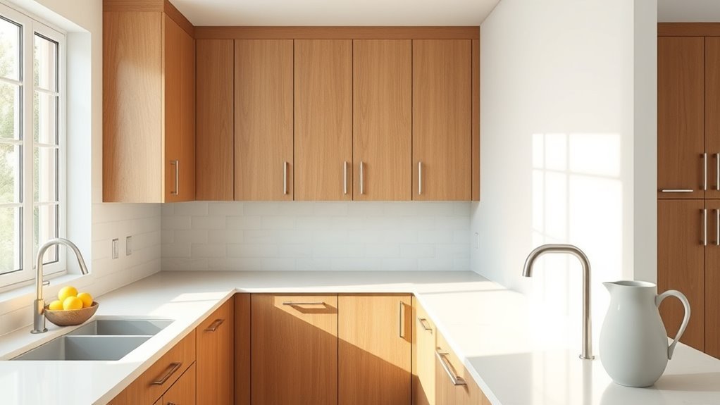
What Color to Paint Kitchen Walls With Wood Cabinets
Pick a wall color that either echoes your cabinet’s undertone or gives a clear, balanced contrast so the wood looks intentional, not dated. If your cabinets read warm (honey, oak, cherry), lean creamy beiges, warm greiges, sage or muted terracotta. For cool woods (walnut, gray-stained), try soft grays, muted blues or pale greens. Use natural-light tests and small swatches at different times. Keep finishes and hardware in mind — more tips follow if you want them.
Quick Answer: Best Wall Colors for Wood Cabinets
When choosing wall colors for wood cabinets, pick tones that balance the wood’s warmth and the room’s light—soft neutrals like warm whites, greiges, and pale taupes brighten and let the grain stand out, while cool light grays or muted blues offer contrast without clashing; for a bolder look, deep navy, forest green, or charcoal create drama and make natural wood pop. You’ll coordinate paint with kitchen organization to keep visual flow, using lighter hues near prep zones and darker accents around dining spaces. Consider appliance placement when choosing contrast so major appliances either blend in or act as intentional focal points.
Identify Your Cabinet Wood Tone: Warm, Cool, or Neutral
Start by looking for warm versus cool undertones in your cabinets—golden, reddish hues read warm while grayish or bluish casts feel cool.
Check the wood grain and overall hue to see how pronounced the pattern is and whether it skews light or dark.
If you want a safe bet, match wall neutrals to the cabinet’s underlying tone so everything reads cohesive.
Warm vs Cool Undertones
Curious whether your cabinets read warm, cool, or neutral? You’ll notice undertones by comparing wood against white paper in natural light. Warm woods show golden, red, or amber hints; cool woods lean toward gray, green, or blue. Neutral woods don’t strongly favor either.
Use color psychology to match mood: warm undertones feel cozy and inviting; cool ones feel calm and modern. For paint application, test swatches beside cabinet edges at different times of day to see interactions.
Pick wall colors that complement the undertone—contrasting for balance or harmonizing for a seamless, intentional look.
Wood Grain And Hue
Although grain and hue often get lumped together, they tell you different things about your cabinets: grain reveals species and texture while hue signals warm, cool, or neutral undertones. You’ll examine wood grain textures closely and note Hue variations to decide wall colors. Use the table below to categorize what you see and how it influences paint choices.
| Grain Pattern | Common Species | Hue Clues |
|---|---|---|
| Straight, fine | Maple, Birch | Neutral to cool |
| Prominent, wavy | Oak | Warm golden |
| Smooth, tight | Cherry | Warm red undertone |
| Varied, rustic | Walnut | Cool to neutral |
Matching Neutral Tones
When you’re matching neutrals to wood cabinets, identify whether the wood reads warm, cool, or neutral so your walls support—rather than fight—its undertones.
If cabinets read warm (honey, golden oak), pick creams, warm greys, or soft taupes to enhance comfort and use color psychology to promote appetite and sociability.
For cool woods (ash, walnut with gray tones), choose greige, cool greys, or pale blues to calm and modernize.
Neutral woods pair with both extremes—test samples.
Prioritize paint durability in kitchens: choose scrubbable finishes and high-quality pigments so your neutral choice stays true over time.
Measure Natural Light and How It Changes Color
Stand by a window and note which direction the light comes from, since north, south, east, and west exposures hit wood tones differently.
Take samples of your paint options and observe them at several times of day so you can track hourly shifts in color and warmth.
That way you’ll pick a wall color that complements your cabinets under real lighting conditions.
Assess Light Direction
Curious how sunlight will change your cabinet-and-wall combo throughout the day? You’ll stand in the room, note window orientation, and judge how lighting placement and wall texture interact with wood tones. Face the windows, observe direct vs. diffuse rays, and imagine finishes under warm morning or cool afternoon light. Use this quick reference to relate direction to mood:
| Direction | Effect on Wood |
|---|---|
| East | Warm highlights, textures pop |
| South | Even, saturated color |
| West | Golden late glow |
| North | Cooler, muted tones |
Decide paint undertones that flatter the dominant light direction.
Track Hourly Shifts
After noting how light direction shapes wood tones, start tracking hourly shifts to see exactly how color changes through the day. You’ll record wall and cabinet appearance each hour, noting warmth, shadow depth, and reflective highlights.
Treat this like employee scheduling: set regular observation times and assign someone to note results. Use simple photos and short notes to map color behavior from sunrise to dusk.
This shift management approach helps you predict how paint undertones perform under varying light. With clear hourly data, you’ll choose a paint that complements wood across all conditions, avoiding surprises once the kitchen’s in use.
Pick the Mood: Cozy, Airy, Modern, or Dramatic
When you choose a wall color, you’re really choosing the kitchen’s mood—cozy, airy, modern, or dramatic—and that single decision shapes how wood cabinets read in the space. Use color psychology to guide warmth or calm, and pick a paint finish that complements cabinet sheen.
Consider how light and hardware affect perception, then decide which feeling you want daily.
- Cozy: deep, muted tones for intimacy.
- Airy: pale neutrals to expand space.
- Modern: crisp greys or cool whites for contrast.
- Dramatic: rich, saturated hues for boldness.
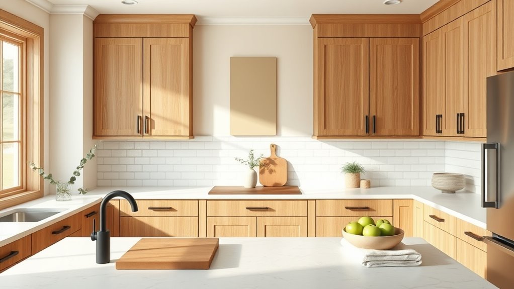
Match Wall Color to Warm Wood Cabinets (Honey, Oak, Cherry)
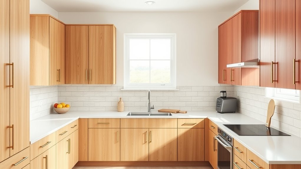
With honey, oak, or cherry cabinets, you’ll want wall colors that enhance their warmth without overpowering the wood. Consider complementary neutrals like creamy beiges or greys.
Soft contrasting shades such as sage or muted blue can also work well.
Richer warm accents like terracotta or mustard can add pops of personality.
Try swatches on the wall to see how light shifts the balance before committing.
Complementary Neutral Tones
Want your warm wood cabinets—honey, oak, or cherry—to feel balanced rather than overpowering? Choose complementary neutral tones to calm warmth, highlight grain, and invite comfort.
Use color psychology to steer mood: soft greiges soothe, warm creams welcome, muted taupes ground, and pale sage adds subtle life.
Match paint finish to function—eggshell in living zones, satin near sinks—so light behaves and cleaning stays easy.
Consider these emotional cues:
- Soft greige — calm reassurance
- Warm cream — cozy embrace
- Muted taupe — steady grounding
- Pale sage — gentle refresh
Pick one and let the cabinets breathe.
Soft Contrasting Shades
If you prefer a bolder but still gentle look, pick soft contrasting shades that let warm honey, oak, or cherry cabinets stand out without fighting them.
You’ll choose muted teals, sage greens, or dusty blues to balance warmth while applying color psychology to create calm, inviting energy.
Test swatches against cabinet tones at different times of day, then select a sheen that highlights grain without glare.
Prioritize paint durability in high-traffic kitchens—scrubbable finishes resist stains and retain color.
Coordinate trim and backsplashes in lighter or deeper variants of the wall hue to keep the palette cohesive and intentional.
Warm Accent Colors
Soft contrasting shades calm warm wood tones, but you can also lean into warmth and amplify honey, oak, or cherry cabinets by choosing complementary warm accent colors. You’ll create coziness through deliberate Color psychology and thoughtful paint application, making the kitchen feel inviting and energized. Pick hues that highlight grain and undertone.
- Golden ochre — cozy, uplifting.
- Terracotta — earthy, grounded.
- Warm sage — soft, balanced.
- Muted coral — lively, intimate.
You’ll test swatches in different light, apply samples in full panels, and observe how each accent shifts mood before committing.
Match Wall Color to Cool Wood Cabinets (Maple, Birch, Ash)
Because cool woods like maple, birch, and ash have subtle gray or creamy undertones, you’ll want wall colors that either highlight their crispness or gently warm them up without clashing.
Choose soft grays, muted greens, or pale blues to echo cool undertones; warm off-whites or buttery neutrals can add subtle contrast.
Consider seasonal color trends when picking hues so your kitchen feels current year-round.
Test samples in different light, and pick paint finish options—matte for hiding flaws, eggshell or satin for easy cleaning.
Balance contrast with cabinetry tone and keep trim a complementary, slightly brighter shade.
Match Wall Color to Dark Wood Cabinets (Walnut, Mahogany)
With dark walnut or mahogany cabinets, you’ll want wall colors that either lift the room or deepen its warmth.
Try contrasting light neutrals like creamy white or soft greige to brighten the space and highlight the wood’s grain.
If you prefer moodier tones, choose rich complementary hues—deep teal, olive, or warm charcoal—to enhance the cabinet’s luxurious feel.
Contrasting Light Neutrals
When you pair dark walnut or mahogany cabinets with contrasting light neutrals, you create instant visual balance that brightens the room and highlights the wood’s rich tones. You’ll feel calm choosing warm creams or soft greiges; color psychology shows neutrals soothe and expand space.
Pick finishes that resist scuffs—paint durability matters in active kitchens. Combine with texture and metallic accents to avoid flatness.
- Choose warm cream for comfort.
- Try soft greige for modern calm.
- Add matte white trim for contrast.
- Use durable satin finish for longevity.
These choices make your cabinets sing without overwhelming.
Rich Complementary Hues
If you want your walnut or mahogany cabinets to feel intentional rather than just background, pair them with rich complementary hues that amplify their warmth and depth. Choose deep teal, olive green, or warm navy to contrast wood tones without clashing. Consider color psychology: teal calms, olive grounds, navy commands sophistication. Test samples in different light, and pick high-quality finishes for paint durability in kitchens. Balance bold walls with lighter counters or metallic accents. Use this quick palette guide:
| Hue | Mood | Recommended Finish |
|---|---|---|
| Teal | Calming | Satin |
| Olive | Grounding | Eggshell |
| Navy | Sophisticated | Semi-gloss |
Match Wall Color to Light Wood Cabinets (Pine, Blonde)
Though light wood cabinets like pine or blonde bring warmth and a casual vibe, choosing the right wall color is key to balancing their golden tones and keeping your kitchen feeling fresh. You’ll want hues that enhance grain without overpowering it.
Think cool greens or soft blues to calm warmth, or muted terracotta for contrast. Consider color psychology and paint durability when selecting finishes—satin hides scuffs better than flat.
Imagine how each mood feels:
- Soft sage for serenity
- Dusty blue for calm
- Muted terracotta for energy
- Pale gray-green for balance
Test samples in varied light before committing.
Use Neutrals With Wood Cabinets: Best Beige, Taupe, and Greige
When you pair warm beige with wood cabinets, you’ll bring out the wood’s honeyed tones and keep the room cozy.
Check taupes for their undertones—look for warm or cool hints so the walls don’t clash with the cabinet finish.
For greige, aim for a balanced mix that tempers yellow or red in the wood while keeping the palette modern.
Warm Beige Pairings
Want a safe, cozy backdrop that still flatters wood cabinets? You’ll love warm beige pairings that balance Color psychology and paint durability while highlighting grain and warmth. Choose tones that invite comfort without muddiness.
- Creamy beige — brightens, soothes, supports natural wood warmth.
- Honeyed sand — deepens coziness, complements amber undertones.
- Soft greige — adds modern restraint, keeps warmth grounded.
- Pale ochre — energizes subtly, pairs well with brass accents.
You’ll want a satin or eggshell finish for easy cleaning and longevity; test swatches beside cabinets at different times of day.
Taupe Undertone Tips
If warm beiges feel cozy but sometimes blend too much with the wood, look to taupe undertones to give your kitchen a subtle, sophisticated counterpoint. You’ll choose taupes with cool or warm bases depending on your cabinets’ warmth; color theory helps you read undertones against oak, walnut, or cherry.
Test samples at different times of day and view them next to the cabinetry and countertops. For paint application, use roller and brush combos to capture smooth, even coverage that reveals true undertones.
Keep trim crisp and lighting neutral so the taupe complements wood without competing or flattening the space.
Greige Balance Ideas
How do you strike the perfect neutral chord between beige and taupe without letting your wood cabinets disappear? You’ll favor greige to bridge warmth and coolness, using color psychology to set mood—calm yet grounded. Pick a greige with undertones that complement your cabinet grain, test swatches at different times, and plan paint application for even coverage.
- Choose warm greige to lift oak tones.
- Choose cool greige to calm cherry or mahogany.
- Use satin finish to reflect soft light.
- Sample large areas to confirm harmony.
You’ll balance cabinets and walls with deliberate, confident choices.
Use White and Off-White With Wood Cabinets Without Washing Them Out
When you pair white or off-white walls with wood cabinets, you can keep the room bright without letting the paint overpower the wood’s character. You’ll balance color psychology by choosing warmer whites for cozy vibes or cooler creams for crisp contrast, and consider paint durability in high-traffic zones. Accent trims, lighting, and textured backsplashes prevent a washed-out look. Test samples at different times of day and view them against your cabinets.
| White Tone | Effect | Where to Use |
|---|---|---|
| Warm Ivory | Cozy, inviting | Small kitchens |
| Crisp White | Clean, airy | Modern spaces |
| Soft Beige | Gentle contrast | Traditional homes |
Use Gray Walls With Wood Cabinets: Warm vs. Cool Grays
Although gray can read as neutral, choosing warm or cool grays will change how your wood cabinets look and feel, so pick a tone that complements the wood’s undertones rather than competing with them. You’ll influence mood and color psychology: warm grays bring cozy richness to honey or cherry wood, while cool grays create sleek contrast with pale or oak cabinets.
Consider light levels and paint durability for kitchens. Test samples near cabinets. Think about the emotion you want to evoke:
- Comfort — soft warm gray
- Calm — muted cool gray
- Cozy — gray with brown undertones
- Modern — blue-leaning gray
Add Deep-Contrast Colors Without Overpowering Wood
You can add deep-contrast colors without letting them compete with wood by starting with neutrals that share the cabinets’ undertones.
Then introduce jeweltones—like emerald or sapphire—as accents on an island, a range hood, or open shelving.
Keep the strongest contrasts in limited areas so the wood still reads as the room’s anchor.
Balance With Neutral Undertones
If you want to introduce deep, contrasting hues without letting them compete with warm wood tones, anchor them with neutral undertones that soften the shift and keep the palette cohesive. You’ll use color psychology to calm bold choices and select paint texture that complements grain.
Balance feels intentional when neutrals bridge warmth and depth, so test swatches in different light.
Consider:
- Soft greige to mute and unify.
- Warm taupe to honor wood warmth.
- Slate-neutral to add quiet drama.
- Ivory-leaning beige to brighten subtly.
You’ll create contrast that supports, not overwhelms, your cabinets.
Accent With Deep Jeweltones
After grounding your scheme with neutral undertones, bring in deep jeweltones to add richness without fighting the wood’s warmth. You’ll choose emerald, sapphire, or burgundy accents to create mood through color psychology while keeping the wood dominant. Use them sparingly on an island wall, a single cabinet face, or open shelving backs so they contrast without overwhelming. Pick finishes and products rated for paint durability in kitchen conditions to maintain depth and resist scuffs. Balance saturation with surrounding neutrals and natural light, and test samples at different times of day before committing to a full coat.
| Accent Area | Suggested Tone |
|---|---|
| Island face | Emerald |
| Shelving back | Sapphire |
| Cabinet face | Burgundy |
| Nook wall | Deep teal |
Use Strategic Contrast Areas
When you want punch without stealing the spotlight from wood cabinetry, place deep-contrast colors in deliberate, limited zones—think a single backsplash strip, the inside of a glass-front cabinet, or the tongue-and-groove of a breakfast nook. You’ll harness color psychology to guide mood, then balance intensity so grain and warmth stay central.
Use high-contrast paint sparingly; test samples under different light. Prioritize paint durability in high-touch areas. Consider these targeted placements to stir feeling without overwhelm:
- Backsplash accent behind stove
- Inside open shelving
- Island base panel
- Alcove or window seat trim
Each choice thrills without dominating.
Choose Blue Tones That Complement Wood Cabinets
Although blue might seem bold next to warm wood, the right shade can harmonize and highlight your cabinets’ grain and tone. You’ll use color psychology to calm or energize: soft blues soothe, muted slate adds sophistication, and deeper navy anchors golden or honey cabinets.
Test swatches in different light, pairing blue walls with neutral backsplashes and hardware that pick up warm wood undertones. Consider paint durability for kitchens—choose scrubbable, washable formulas with satin or eggshell finishes.
Balance proportions: limit intense blues to accent walls or islands if you want subtle contrast without overwhelming the wood’s natural warmth.
Choose Green Tones That Flatter Wood Cabinets
If you want a natural, calming palette that brings out wood’s warmth, green’s your best ally—pick shades that echo the undertones in your cabinets to create cohesion. You’ll feel grounded choosing greens that respect wood grain and hue.
Use Color psychology to decide mood: sage soothes, olive comforts, moss energizes, and mint refreshes. Test samples in morning and evening light, and match Paint finish to traffic—eggshell for easy cleaning, satin for durability.
Consider these emotional prompts as you sample:
- Calm
- Cozy
- Invigorated
- Refreshed
Trust green to unify and uplift your kitchen.
Choose Pinks and Blushes for a Soft Kitchen Look
Because pinks and blushes bring warmth without overwhelming, they’re a great choice for softening wood cabinets and creating a welcoming kitchen. You can use blush palettes on walls to balance rich wood tones, and add Pink accents through textiles, art, or small appliances. Stick to muted, dusty shades for subtlety, or choose warmer blushes to cozy up the space. Pair with neutral countertops and metallic hardware for contrast. Test samples by cabinets and natural light before committing.
| Element | Recommendation |
|---|---|
| Walls | Muted blush palettes |
| Accents | Pink accents only |
| Hardware | Warm metals |
| Lighting | Soft, warm bulbs |
Use Black and Charcoal Strategically With Wood Cabinets
When you pair black or charcoal walls with wood cabinets, the dark tones sharpen the grain and lend a modern, grounded feel without stealing warmth from the wood. You’ll create contrast that feels intentional and refined.
Use black accents sparingly—handles, light fixtures, or a sink—to anchor the space. Charcoal accents on trim or an island add depth without overpowering warmth.
Anchor the room with black details—hardware, lighting, or a sink—while charcoal trim deepens without cooling the warmth.
Balance is key: introduce soft textiles and warm metals to keep the room inviting.
Consider these emotional cues:
- Confidence — bold contrast that feels curated.
- Calm — depth that soothes.
- Warmth — wood remains cozy.
- Modernity — updated, sophisticated style.
Try Warm Terracotta and Earthy Reds With Wood Cabinets
Though it might feel bold, pairing warm terracotta or earthy reds with wood cabinets lets the wood’s natural grain sing while bathing the kitchen in cozy, sunlit tones.
You can lean into color psychology: terracotta evokes warmth, appetite, and comfort, making cooking spaces inviting. Choose a tone that complements your cabinet’s undertones—orange-based for golden woods, deeper reds for mahogany.
Test samples in varied light and consider finishes that highlight paint durability in high-traffic kitchens; washable eggshells or satin finishes resist scuffs and clean easily.
Balance bold walls with neutral countertops and hardware to keep the room grounded.
Pastels That Work With Wood Cabinets for a Fresh Feel
If you want a fresh, airy kitchen without losing the warmth of wood cabinets, pastels can be your best tool—soft mint, powder blue, blush pink, and pale sage all pair beautifully with natural grains. You’ll tap into color psychology to set mood: mint relaxes, blue calms, pink soothes, sage refreshes.
Consider paint durability for high-traffic zones and choose washable finishes. Balance pastel walls with natural wood tones and simple hardware so the room feels intentional, not saccharine.
- Soft mint for calm mornings
- Powder blue for clarity
- Blush pink for comfort
- Pale sage for renewal
Two-Tone Wall Color Ideas With Wood Cabinets
You can use two-tone walls to highlight wood cabinets by contrasting a lighter upper with a darker lower for visual balance.
Try an accent stripe or paint a nook to create focal points without overwhelming the space. These techniques let you play with color while keeping the wood as the star.
Upper And Lower Contrast
When you split the walls into two tones, upper-and-lower contrast lets you highlight wood cabinets without overwhelming the room. You can balance warmth and calm while drawing the eye. Choose a lighter upper to open space and a richer lower to ground cabinetry. Coordinate with kitchen backsplash and pick cabinet hardware finishes that echo the lower tone for cohesion.
Consider mood and scale:
- Soft cream above, deep olive below for cozy serenity.
- Pale gray above, charcoal below for modern drama.
- Sky blue above, navy below for uplifting depth.
- Warm beige above, chocolate below for classic comfort.
Accent Stripe Or Nook
Because an accent stripe or a painted nook breaks up a kitchen wall without committing to full coverage, it’s a smart way to introduce a contrasting tone that highlights wood cabinets.
You can paint a slim accent stripe along a backsplash height to draw the eye and echo cabinet hues, or create a nook design behind open shelving for focused color impact.
Choose a shade that complements wood undertones—cool blues for warm woods, olive or terracotta for cooler grains.
Keep lines crisp, use painter’s tape, and balance scale so the accent stripe or nook feels intentional, not overpowering.
Accent Wall Strategies to Highlight Wood Grain
If you want the wood’s grain to sing, choose an accent wall color that either contrasts enough to define the cabinetry or complements the undertones to deepen the texture. You’ll use color psychology to set mood—warm tones cozy, cool tones calm—while considering paint durability near prep zones.
Pick a finish that resists scuffs and wipes clean. Balance contrast so grain reads clearly without overwhelming.
- Deep contrast for drama and focus.
- Muted complement to enrich natural patterns.
- Textured finishes to add subtle depth.
- Strategic placement to frame key cabinet runs.
Spot Paint Undertones: Blue, Yellow, or Pink
Hold a small paint sample against your cabinets in natural light to spot undertones like blue, yellow, or pink.
Once you’ve identified the undertone, pair cool blues with gray-toned woods, warm yellows with honey or golden woods, and soft pinks with pale or whitewashed finishes.
These simple checks will help you choose a wall color that complements rather than clashes with your wood.
Spot Undertones Detection
When you test a paint swatch on your wall, look for tiny shifts that reveal its undertone—blue, yellow, or pink—because those subtle hints decide whether the color will harmonize or clash with your wood cabinets. You’ll want to note color psychology and paint texture as you observe in different lights. Sit with the swatch morning, noon, and evening. Touch it; rough texture can mute undertones.
Follow this quick checklist to feel confident:
- View in natural light—does blue emerge?
- Check near wood grain—does yellow warm it?
- Step back—does pink soften edges?
- Test next to trim for final confirmation.
Undertone-Based Pairings
Because undertones steer harmony, matching paint to wood means reading those blue, yellow, or pink cues and pairing them deliberately. You’ll use color psychology to set mood: blue-leaning cabinets call for warm neutrals or soft corals to balance coolness; yellow undertones pair well with muted blues or cool grays for contrast; pink undertones suit sage greens or creamy whites for gentle warmth.
Test samples under your kitchen light, then evaluate how gloss and paint durability interact with daily wear. Choose finishes that resist scuffs in high-traffic zones.
Trust the undertone, pick complementary hues, and you’ll create consistent, lasting cohesion.
How Paint Sheen Affects Wood Cabinet Appearance
Although gloss level might seem like a small choice, it dramatically changes how your wood cabinets look and feel. Sheen effects alter color depth and texture perception; gloss impact can highlight grain or conceal imperfections. You’ll choose sheen to set mood and maintenance level. Consider how light plays across surfaces and how hands-on your kitchen is.
- High gloss: vivid, modern, reflective — bold energy.
- Semi-gloss: durable, lively, slightly softened shine.
- Satin: warm, elegant, forgiving of flaws.
- Matte: cozy, subtle, hides wear.
Match sheen to style, light, and lifestyle.
How to Sample Paint Near Your Cabinets
Now that you’ve thought about sheen and how it plays with wood grain and light, start sampling paint directly beside your cabinets to see the combined effect. Apply several small swatches—use brush and roller Painting techniques—to compare texture and edge crispness. Label each swatch with brand and formula.
View from typical standing positions and at different distances to judge contrast and harmony with cabinet tones. Consider color psychology: warm hues cozy up to honeyed wood, cool tones calm darker stains. Live with samples for a few days to note shifts.
Narrow choices before committing to a full wall to avoid costly mistakes.
Lighting Hacks to Preview Paint at Different Times
Put samples on the wall and check them in the morning to see cool, shadowed tones.
Come back at midday with bright sunlight on them to judge true color and contrast with your cabinets.
Finally, assess the same swatches in the evening under artificial light to confirm the mood they’ll create after dark.
View Paint Samples Morning
When you check paint samples in the morning, the cool, indirect light can make undertones and true brightness easier to see, so tape several chips on the wall and step back to compare them.
You’ll notice how Paint finishes alter sheen and depth, and Color psychology hints—cool tones calm, warm tones energize—become clearer.
Use morning views to decide mood and contrast with your wood cabinets. Try this quick emotional checklist:
- Calm — soft blue-gray beside oak
- Warmth — muted terracotta with maple
- Fresh — pale green for brightness
- Sophistication — greige to ground the room
Trust what morning light reveals.
Check Samples Midday
Because midday light is brighter and more direct, you’ll see how paint interacts with your wood cabinets under the clearest, truest conditions—colors look more saturated, warm undertones pop, and subtle contrasts between finish and grain become obvious. You should check samples midday on different walls, noting glare and true hue against cabinet tones. Ignore quick judgments and color pairing myths; record what repeats in bright sun. Use small swatches moved around, photograph them for comparison, and trust what consistently reads well.
| Wall | Sample | Note |
|---|---|---|
| North | Pale gray | Cool shift |
| South | Cream | Warm glow |
| East | Sage | Muted depth |
| West | Blue | Vibrant contrast |
Assess Colors Evening
How will the same paint read once the sun dips and your kitchen lights take over? You’ll want to see evening hues before committing. Color psychology shifts with light; warm bulbs cozy up greens and blues, while cool LEDs can mute warmth.
Test swatches on different walls, observe under ambient, task, and accent lighting, and note reflections from wood cabinets. Also consider paint durability—scuffs and stains look different at night.
Follow this quick checklist to feel confident:
- View swatches after sunset.
- Turn on all fixture types.
- Photograph under each light.
- Live with samples 48 hours.
Coordinate Trim, Ceiling, and Island Colors With Cabinets
If you want a cohesive kitchen, coordinate your trim, ceiling, and island colors with the cabinets so each element supports the room’s style rather than competing with it. Choose trim in a neutral that picks up undertones in the wood—cream for warm oak, soft gray for cooler woods—so moldings frame rather than fight.
Paint the ceiling a lighter version of the wall or a crisp white to lift the space.
For islands, match or contrast deliberately: a painted island can echo cabinet stains or introduce a complementary tone.
Consider artistic wall murals or vintage paint techniques for focal accents, sparingly.
Pairing Backsplash Colors and Materials With Painted Walls
Once you’ve settled trim, ceiling, and island tones, let the backsplash reinforce those choices while adding texture and visual interest. You’ll want materials that respond to kitchen lighting and complement cabinet hardware, so pick finishes that reflect warmth or coolness as needed.
Let the backsplash echo your trim and island tones, adding texture and finishes that flatter your kitchen lighting.
Consider contrast level: subtle for calm, bold for drama. Match grout and metal finishes to hardware for cohesion. Use tactile surfaces to invite touch and look lively under different lights.
- Glass tiles for sparkle and modern joy
- Textured subway for cozy familiarity
- Marble for elegant calm
- Patterned ceramic for playful energy
Floor Colors That Harmonize With Walls and Cabinets
When you pick floor colors, think of them as the foundation that ties walls and wood cabinets together—choose tones that either anchor the palette with depth or lighten the whole room for an airy feel.
You’ll use color psychology to set mood: dark, warm floors ground heavy wood; pale, cool floors expand space and highlight painted walls.
Match floor undertones to cabinet hues for cohesion, or contrast subtly to define zones.
Consider wall texture—smooth paint reflects light differently than plaster, changing perceived floor color.
Test samples at different times of day and with rugs to guarantee harmony before committing.
Hardware and Fixture Finishes That Harmonize With Wall Color
Because your wall color sets the room’s mood, pick hardware and fixtures that either echo that tone or provide a deliberate contrast to sharpen the look. You’ll want Decorative hardware that complements warmth or coolness in the paint, and Fixture styles that reinforce your *desired* vibe—modern, rustic, or classic.
Consider finishes as emotional cues you can control:
- Brushed nickel for calm, contemporary balance.
- Oil-rubbed bronze for cozy, grounded depth.
- Polished brass for sunny, energetic contrast.
- Matte black for bold, graphic definition.
Choose consistently so your metal finishes harmonize with both walls and wood.
Styling Tips: Textiles and Decor to Tie Wall Color and Wood Together
Although your wall color and wood cabinets set the foundation, textiles and decor are what make the room feel intentionally finished—you’ll use rugs, window treatments, cushions, and accessories to bridge tones, introduce pattern, and control scale. Use Color psychology to choose calming blues or energizing yellows, then repeat those hues in soft textiles. Embrace Texture layering—woven rugs, linen curtains, and leather stools add depth while tying wood warmth to paint. Balance scale: large rugs for open plans, small mats for galley kitchens. Use metallic accents sparingly to echo cabinet hardware.
| Item | Purpose | Tip |
|---|---|---|
| Rug | Anchor space | Match undertones |
| Curtains | Soften light | Layer fabrics |
| Cushions | Add pattern | Repeat color |
Modern Kitchen Palettes With Wood Cabinets
Now that you’ve learned how textiles and decor can bridge paint and wood, let’s look at modern palettes that make those elements sing together. You’ll favor clean contrasts: cool grays with walnut, soft whites against maple. Consider how kitchen ventilation integrates into your palette—hoods in matte black or stainless can anchor color choices.
Now explore modern palettes that unite paint and wood—clean contrasts, anchored by ventilation finishes like matte black or stainless
Coordinate appliance finishes with cabinet tones for cohesion. Pick finishes and lighting that highlight crisp lines and textures.
- Moody charcoal for drama
- Soft greige for warmth
- Pale sage for calm
- High-contrast black-and-white for edge
These choices keep looks current and functional.
Farmhouse and Rustic Palettes for Wood Cabinets
When you want a cozy, lived-in kitchen, farmhouse and rustic palettes pair wood cabinets with warm neutrals, muted greens, and soft blues to create layered, approachable looks. You’ll lean into textured finishes, shiplap accents, and open shelving that complement varied kitchen cabinet styles, from distressed to reclaimed.
Choose chalky or matte wall paints to soften reflections and highlight wood grain. Prep matters: follow paint preparation techniques like cleaning, sanding, and priming to guarantee adhesion and longevity on older surfaces.
Finish with durable, wipeable topcoats near sinks and stoves so the rustic charm stands up to daily use.
Traditional and Classic Palettes That Enhance Wood
Because classic kitchens rely on balance, you’ll want wall colors that highlight wood’s warmth without competing with it. You’ll choose hues that feel timeless, drawing on color psychology to evoke comfort, tradition, and calm.
Stick to muted blues, warm creams, soft greys, and deep greens that respect grain and finish while enhancing formality. Prioritize paint durability in high-traffic zones so the look lasts.
Consider these emotional directions:
- Soft cream — cozy, enduring.
- Muted blue — composed, trustworthy.
- Warm grey — refined, steady.
- Deep green — rich, grounding.
These choices honor wood and tradition.
Scandinavian and Minimal Palettes for Light Wood
If you prefer a lighter, airier feel over the formality of classic schemes, Scandinavian and minimal palettes pair beautifully with light wood. You’ll choose soft whites, pale greiges, muted pastels, and cool grays to highlight the grain and keep the room bright.
Color psychology favors calm, uncluttered tones that reduce visual noise and support focus while enhancing natural light. Opt for low-sheen, high-quality paints for easy cleaning; paint durability matters in kitchens, so pick scrubbable finishes and reputable brands.
Finish with simple accents—textured linens, matte hardware—to maintain a serene, functional space without overpowering the wood.
Midcentury and Retro Color Combos With Wood Cabinets
Though rooted in midcentury modernism’s clean lines and bold hues, retro palettes let you inject playful color into wood‑cabinet kitchens without sacrificing warmth. You’ll use color psychology to pair teak or walnut with saturated teal, mustard, or avocado for a nostalgic yet balanced look.
Rooted in midcentury modernism, retro palettes pair teak or walnut with saturated hues for nostalgic, warm kitchens.
Choose finishes that emphasize paint durability in high‑traffic zones. Consider these combinations to stir feeling and functionality:
- Teal walls + warm walnut — lively comfort.
- Mustard + light oak — sunny, grounded.
- Avocado + dark mahogany — cozy revival.
- Coral + mid‑tone birch — energetic charm.
Trust contrast and finish to set mood.
Common Color-Picking Mistakes With Wood Cabinets to Avoid
Playing with retro hues is fun, but it’s easy to make color choices that clash with your wood cabinets or wear poorly over time. Don’t ignore color psychology: bold shades can overwhelm warm grain or create cold contrast against rich tones.
Avoid picking trendy tints without testing them in your kitchen’s light; small swatches can reveal undertones that fight the wood. Skip overly dark colors that hide details and show dust, and beware high-gloss sheens that reveal flaws.
Prioritize paint durability for kitchens—stain-resistant, washable finishes last longer. Test samples, consider undertones, and balance contrast for lasting harmony.
Budget-Friendly Paint Ideas for a Quick Refresh
When you want a quick, budget-friendly refresh, a fresh coat of paint can transform your kitchen without replacing cabinets. Focus on strategic updates like accent walls, island facings, or trim to stretch paint farther and cut costs.
You’ll pick colors that lift mood and balance wood tones by using color psychology—soft greens calm, warm grays modernize.
Prioritize paint durability in high-traffic areas and test small swatches.
Consider these emotional, simple moves:
- Swap only the island color for drama and warmth.
- Paint trim to frame wood and brighten.
- Add a soft accent wall for calm.
- Refresh cabinet interiors for surprise joy.
Final Checklist to Choose the Perfect Wall Color With Wood Cabinets
Before you pick a paint can, run through a short, practical checklist that guarantees your wall color works with your wood cabinets in light, finish, mood, and maintenance.
Inspect natural and artificial light at different times, testing samples next to cabinet edges.
Match undertones—warm wood suits creamy or soft terracotta, cool wood pairs with muted grays or greens.
Consider color psychology: choose hues that encourage appetite or calm, depending on your kitchen’s role.
Verify contrast for visibility and cohesion.
Check paint durability for high-traffic areas and cleanability.
Finalize with a small painted patch, live with it a week, then decide.
Frequently Asked Questions
Can Wall Color Make Small Kitchens Feel Larger With Wood Cabinets?
Yes — you can make small kitchens feel larger with wood cabinets by using low color contrast, cool accents, and warm neutrals to balance warmth. You’ll open sightlines, reflect light, and create a cohesive, airy feel.
How Do I Coordinate Wall Color When Replacing Cabinets Later?
Like a trusted map guiding you home, you’ll pick wall paint that complements current wood tones while considering future cabinet color; choose versatile neutrals or warm whites so your new cabinets’ll blend or contrast gracefully.
Will Wall Color Choices Affect Resale Value With Wood Cabinets?
Yes — your wall color can affect resale value: buyers react to Color psychology, so neutral, well-lit tones appeal broadly, and using high-quality paints with strong paint durability shows care, making your kitchen feel updated and well-maintained.
What Paint Cleanup or VOC Considerations Suit Wood Cabinet Kitchens?
Clean, careful cleanup and choosing low-VOC paints keep you safe: use mild solvent for paint removal, ventilate well, wear gloves and masks, apply water-based finishes, and let surfaces dry fully to reduce VOC safety concerns.
Can Wallpaper or Textured Finishes Replace Paint Behind Wood Cabinets?
Yes — you can use wallpaper options or textured finishes behind wood cabinets; you’ll get visual interest and durability, but pick moisture-resistant materials, seal edges well, and guarantee patterns and textures complement your cabinet tones and kitchen lighting.
Conclusion
You’ve learned how to pair walls with wood cabinets—now pick a direction and trust your light. Remember: 67% of homeowners say kitchen color makes them feel happier, so choose hues that make you smile every morning. Test swatches in different light, favor contrast or harmony depending on mood, and avoid trendy extremes if resale matters. With a simple swatch-and-wait ritual, you’ll find a wall color that flatters your cabinets and fits your life.