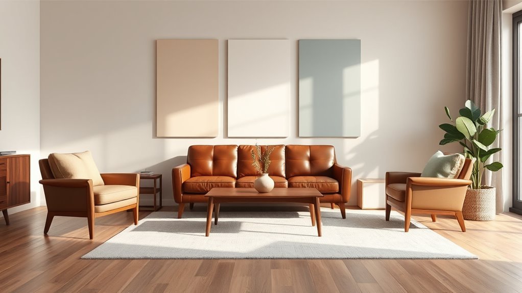
What Color Wall Paint Goes With Brown Furniture?
You can make brown furniture stand out by choosing cooler, lighter walls like soft gray, sage, or pale blue, which add contrast and modern calm. Warm neutrals such as beige, warm greige, or muted terracotta deepen coziness around reddish browns. Consider natural light, room size, and fabrics when picking intensity, and test samples at different times. Opt for mid-tone neutrals in kid spaces and eggshell or matte finishes for durability—keep reading for specific shade and styling tips.
Quick Guide: Pick a Wall Color for Brown Furniture
When you’re pairing wall paint with brown furniture, aim for contrast and balance: lighter, cooler walls make dark wood pop, while warm neutrals or muted greens complement lighter brown tones.
You’ll assess natural light, room size, and existing textiles to decide intensity. Use color psychology to choose hues that support the room’s function—calming blues for bedrooms, energizing ochres for activity zones.
Create cohesion by repeating accent shades in rugs or cushions. Test samples on multiple walls, observe them at different times, and pick the shade that enhances room ambiance without overwhelming the furniture’s texture or grain.
Best Wall Paint Families for Brown Furniture
Although your brown furniture can pair with many hues, certain paint families consistently give the best results: cool neutrals, warm neutrals, muted greens, soft blues, and earthy ochres.
Brown furniture thrives with cool or warm neutrals, muted greens, soft blues, or earthy ochres—test samples and watch light before committing.
You’ll rely on color psychology to shape room ambiance, so choose families that complement grain and finish. Consider these reliable directions:
- Cool neutrals: grays and taupes to calm and modernize.
- Muted greens: sage and olive for organic warmth without overwhelming.
- Soft blues and ochres: light blues for freshness, ochres for cozy depth.
Pick one family, test samples, and observe light changes before committing to a full paint job.
Decide Warm vs Cool Walls for Brown Pieces
If you want your brown furniture to feel cozy or contemporary, decide whether warm or cool walls will set the mood before you pick a specific shade.
You’ll assess color temperature: warm walls (creamy beiges, terracottas) amplify brown’s warmth and create intimate wall harmony, while cool walls (soft greys, muted blues) contrast brown and lend a fresher, modern vibe.
Think about lighting and the furniture’s undertones—reddish browns pair well with warm paints, while ashy browns suit cool hues.
Test samples on different walls at different times of day to confirm the emotional effect and overall wall harmony you want.
Why Neutral Walls Are a Safe Match for Brown Furniture
Because neutral walls recede visually, they let your brown furniture take center stage while keeping the room cohesive; you’ll get a calm backdrop that complements a wide range of brown tones without competing for attention.
You’ll enjoy flexible neutral palettes that adapt as your decor evolves, creating instant wall harmony. Neutrals simplify styling, highlight texture, and make mixing woods easy.
Consider these benefits:
- Enhances focal pieces without overpowering them
- Makes small rooms feel airier and more open
- Lets accents—rugs, pillows, art—define mood and color
Choose neutrals for timeless balance and effortless coordination.
Best Beige and Taupe Shades for Dark Brown Wood
When pairing beige and taupe with dark brown wood, pick tones that balance warmth and contrast so the wood’s richness pops without making the room feel heavy.
Choose beiges with warm beige undertones—creamy, slightly yellow or soft almond—to complement mahogany or espresso without washing them out.
For depth, select taupe shades that lean greige or warm mushroom; they provide subtle contrast and modern elegance.
Test samples near your furniture to see how light shifts color.
Keep trim a shade lighter for definition, and avoid pink or cool beige undertones that clash with dark brown’s warmth.
Soft Grey Walls to Modernize Brown Furniture
Choosing a soft grey with cool undertones can instantly modernize your brown furniture by creating a crisp, neutral backdrop.
Consider adding accent colors like mustard, teal, or blush in pillows and art to bring warmth and personality.
Pay attention to natural and artificial lighting plus wall texture, since they’ll shift the grey’s appearance and affect how the wood tones read.
Cool Undertone Pairings
If you want to give brown furniture a contemporary lift, soft grey walls with cool undertones create an elegant, neutral backdrop that highlights wood grain without overwhelming it.
You’ll find cool color palettes calm the room and let brown tones read richer. Use texture and finishes to add depth while keeping the scheme restrained.
Consider these pairing strategies:
- Pair soft blue-greys for a serene, cohesive look that complements walnut or chestnut.
- Use pale lavender-greys to introduce subtle cool contrast without clashing.
- Select slate greys to anchor darker woods while preserving a modern, airy feel.
Accent Color Suggestions
One smart way to lift soft grey walls and brown furniture is to add a focused accent color that ties the room together without competing with the wood’s warmth.
You can choose accent color combinations like soft teal and muted mustard for a calm yet lively feel, or dusty rose paired with charcoal for subtle sophistication.
If you want energy, try bold accent choices such as deep navy or forest green in pillows, art, or a single chair.
Keep accents limited so they connect visually to brown tones, reinforcing cohesion while modernizing the palette without overwhelming the grey backdrop.
Lighting And Texture Effects
After you’ve picked an accent palette, think about how lighting and texture will make those colors and your brown furniture sing against soft grey walls.
You’ll use lighting styles and texture contrasts to shift mood: warmer bulbs cozy up wood tones; cooler light modernizes.
Balance matte paint with glossy or tactile fabrics to add depth. Consider placement to highlight grain and silhouettes.
- Place lamps to accent wood grain and artwork.
- Mix velvet cushions and woven rugs for tactile contrast.
- Use dimmers and layered fixtures to change ambiance quickly.
These choices elevate soft grey into a backdrop that flatters brown furniture.
White Paint Tones That Work With Brown Furniture
Pick a white with purpose: cool whites with a touch of gray or blue will brighten a room and contrast nicely with warm brown furniture, while creamy, warm whites will soften the look and create a cozier, more unified feel.
When choosing, consider white paint undertones—blue, green, gray, or yellow shift how your brown reads. Test samples next to furniture in different light; inspect matte, eggshell, satin and gloss white paint finishes to see sheen effects.
Cool whites open spaces and highlight wood grain; warmer whites mute contrast and blend tones. Trust samples over names for final selection.
Creamy Off-Whites to Warm Brown Pieces
If you liked how cool whites lift a space, creamy off-whites offer the opposite effect: they warm the room and harmonize with brown furniture for a cozier, more layered look.
You’ll use creamy whites with warm undertones to create inviting shades that blend into cozy neutrals and earth tones. Choose subtle hues that keep light contrasts gentle, enhancing soft textures and calming palettes.
Try mixes that emphasize warm tones without becoming yellow. Consider these simple approaches:
- Use a warm off-white as a backdrop to highlight wood grain and fabric.
- Layer textiles in cozy neutrals.
- Add accents in subtle earth tones.
Blue Hues That Complement Brown Furniture
Pairing blue with brown gives you a range of moods: pale sky blue keeps the room airy and soft.
Teal and turquoise add lively contrast that highlights warm wood tones.
A deep navy accent brings drama and anchors the space without overpowering your furniture.
Pale Sky Blue
A pale sky blue brings a soft, airy contrast to brown furniture, and it can make wood tones feel lighter and more contemporary. You’ll create a calming ambiance that balances warmth without washing out rich grains.
Use it to open a room, highlight trim, or frame seating areas for subtle elegance.
- Pair with creamy neutrals to maintain warmth.
- Add natural textiles (linen, jute) for texture.
- Choose matte finishes to keep it serene.
You’ll find pale sky blue versatile: it reads modern in sleek spaces and cozy in layered, rustic ones, always letting brown furniture remain the focal point.
Teal And Turquoise
Two closely related blue-green shades—teal and turquoise—bring lively depth to brown furniture without competing with its warmth. You can use teal accents on throw pillows or a rug to anchor the room, creating contrast that feels rich rather than heavy.
Turquoise accessories—vases, lamps, artwork—introduce bright, energetic notes that lift dark wood tones. Balance saturated hues with neutral walls or soft off-whites so the colors pop without overwhelming the space.
You’ll want to test paint samples in natural light and coordinate finishes, keeping metal and textile tones consistent to maintain a cohesive, inviting look.
Deep Navy Accent
When you anchor a room with deep navy accents, the rich blue heightens brown furniture’s warmth and adds dramatic contrast without stealing focus. You can use deep navy on a single wall or in textiles to create depth and sophistication.
Pair with warm woods and brass for balance, and keep trim crisp to avoid heaviness.
- Use accent walls behind sofas or headboards for focal impact.
- Introduce navy throw pillows or rugs to echo the wall color.
- Add warm metallics and creamy neutrals to soften the palette.
Choose deep navy deliberately; it amplifies brown’s richness while remaining timeless.
Green Wall Colors for Leather and Wood Brown Pieces
1 clear advantage of green walls is how they bring out the warmth in both leather and wood brown pieces, letting their natural tones feel richer without overwhelming the room. You can use green paint to create leather contrast with vibrant greens or choose soft olive and mint accents for subtle wood synergy. Nature inspired hues and earthy tones pair well with accent plants and botanical themes, making spaces feel calm and cohesive.
| Shade | Effect | Pairing |
|---|---|---|
| Vibrant Green | Bold contrast | Leather highlights |
| Soft Olive | Warm blend | Wood synergy |
| Mint | Fresh lift | Botanical decor |
Terracotta and Rust Tones to Pair With Brown
Choose terracotta and rust to amplify brown furniture with warm, earthy pairings that feel grounded and cozy.
You can pick complementary accent hues—like muted teal or soft mustard—to add contrast without overpowering the room.
Think about texture and finish too: matte or eggshell walls soften the look, while a satin or low-sheen finish highlights depth and wearability.
Warm Earthy Pairings
If you want a cozy, grounded look, terracotta and rust tones bring warmth that complements brown furniture without competing with it.
You’ll create a layered, inviting room by pairing those hues with natural materials and subtle contrasts. Use earthy textures and warm palettes to build depth while keeping the scheme cohesive.
Consider these approaches:
- Paint an accent wall in muted terracotta to anchor seating areas and highlight wood grain.
- Add rust-colored textiles—throw pillows or a rug—to echo the wall without overwhelming.
- Introduce woven baskets or clay accessories to reinforce texture and keep the mood warm.
Complementary Accent Hues
To build on those warm, earthy foundations, use terracotta and rust as accent hues to add depth and visual interest without stealing the show from your brown furniture. You’ll balance complementary color schemes by placing these warm accents against neutral or muted walls. Think cushions, lamps, and art to introduce controlled pops; accent color psychology shows warmth, comfort, and energy, so use sparingly for impact. Below is a simple guide to pairings and uses:
| Element | Tone | Placement |
|---|---|---|
| Cushions | Terracotta | Sofa clusters |
| Rug | Rust | Under coffee table |
| Art | Terracotta/Rust | Above credenza |
| Throws | Rust | Armchair drape |
Texture And Finish Choices
When you pair terracotta and rust accents with brown furniture, think beyond color and focus on texture and finish to amplify warmth and contrast. Matte, nubby, and lightly distressed surfaces work especially well because they echo the earthy tones without competing with them.
You’ll use texture contrast to make walls feel intentional, not flat. Try finish variations to control sheen and depth:
- A matte terracotta wall with a nubby throw for cozy layering.
- Rust-painted trim in eggshell to catch light subtly.
- Distressed terracotta accent with smooth brown wood to balance rustic and refined.
Blush and Muted Pinks to Soften Brown Furniture
Although brown furniture anchors a room with warmth, blush and muted pinks can soften its presence and make the space feel lighter and more inviting.
You’ll find blush tones and muted pinks pair beautifully with wood’s richness, balancing depth without competing. Use pale, dusty shades on walls to reflect light and create an airy backdrop for dark pieces.
Accent with textiles or art that echo the pink undertone to unify the palette. Keep trim and ceilings neutral to avoid visual clutter.
Echo the pink undertone in textiles or art to tie the room together; keep trim and ceilings neutral.
This approach keeps the room cozy yet fresh, letting brown furniture remain the focal point while feeling softer.
Jewel Tones That Make Brown Furniture Pop
If you want brown furniture to feel more vibrant, pair it with jewel tones like emerald, sapphire, and amethyst—these saturated hues create high-contrast depth that makes wood finishes pop.
You’ll use jewel tone pairings to add richness without overpowering natural grain. Try them as bold accent walls or as framed panels, then balance with lighter textiles and metallic accents.
Consider these approaches:
- Emerald walls for warm brown woods, adding warmth and a luxe feel
- Sapphire to cool richer mahogany, offering crisp contrast
- Amethyst for walnut or espresso, bringing a regal, modern touch
Keep furnishings and trim simple to maintain balance.
How Dark, High-Contrast Walls Affect Brown Pieces
Because dark, high-contrast walls absorb light and frame your brown furniture, they intensify grain, silhouette, and finish—making pieces read sharper and more sculptural against the backdrop.
You’ll notice dark walls create strong visual impact and alter space perception, shrinking or deepening a room depending on scale and light.
Use high contrast to highlight form and material; it sharpens design dynamics and reinforces bold aesthetics.
Be mindful of mood influence—intimate, dramatic, or cozy—and balance with textiles, metallics, or art to achieve color harmony.
When you plan lighting and layout, contrast becomes a deliberate tool, not just decoration.
Light Pastels to Brighten Rooms With Brown Furniture
Dark, high-contrast walls make brown furniture read bold and sculptural, but light pastels flip that effect—softening edges and opening the room to feel airier and more expansive.
You’ll find light pastel inspiration in muted mint, blush, or pale lavender, each lifting brown tones without competing. Use soft hues to amplify bright room effects and keep the atmosphere calm.
- Pair warm walnut with blush for cozy brightness.
- Combine cool espresso with mint to refresh the palette.
- Let pale lavender highlight grain while maintaining serenity.
Choose finishes with subtle sheen to reflect light and maintain balance.
Use an Accent Wall Behind Brown Sofas or Beds
When you anchor a brown sofa or bed with an accent wall, you create a focal point that raises the room’s style without overwhelming it.
You can pick accent wall ideas that play with contrast—deep navy, forest green, or terracotta—so the brown pops.
Consider color intensity: choose saturated hues for drama or muted tones for subtlety.
Paint only the wall behind the furniture to keep balance, and coordinate throw pillows or a rug to tie colors together.
If the room’s small, lighter accent shades prevent heaviness.
Test samples on different lighting before committing to a full coat.
Trim and Ceiling Color Choices With Brown Furniture
If you want your brown furniture to feel grounded and intentional, choose trim and ceiling colors that frame the room without competing for attention.
You’ll use trim styles to define edges and add polish; pick crisp whites for contrast or a warm off-white to soften shifts. For ceiling finishes, keep it light to lift the room or match a diluted wall hue for cohesion.
Consider these approaches to finish the space:
- Crisp white trim for modern contrast and clean lines
- Warm cream trim to harmonize with wood tones
- Matte ceiling finishes to minimize glare and feel cozy
Coordinate Walls With Brown Flooring
Beyond trim and ceilings, your walls play the biggest role in how brown flooring reads—whether it anchors the space or fades into the background.
You’ll assess undertones: warm floors pair best with warm neutrals or soft terra cotta, cool browns benefit from greige, muted blue, or sage.
Aim for color harmony by echoing undertones rather than matching value exactly. For bold choices, increase flooring contrast with lighter or cooler walls to lift the room.
Keep sample swatches near the floor to judge in different light. Trust small test patches before committing—they reveal true relationships between wall paint and brown flooring.
Best Paint Sheens Near Brown Furniture (Matte vs Eggshell)
Because sheen affects both light reflection and perceived color, choosing between matte and eggshell will shape how your brown furniture reads in the room. You’ll pick based on room traffic, lighting, and how much contrast you want.
Matte hides imperfections and deepens tones, while eggshell adds slight luster and makes colors pop subtly. Consider paint durability where kids or pets frequent: eggshell cleans easier, matte may need touch-ups sooner.
Match sheen preferences to your lifestyle and the mood you want.
- Matte: richer, cozy, less reflective
- Eggshell: durable, easy to clean
- Balance: contrast versus maintenance
Test Paint Samples With Your Brown Furniture
Now that you’ve narrowed sheen and understand how light and traffic affect appearance, try paint samples next to your brown furniture to see real results.
Place several 12×12 swatches on the wall and on tabletops, then step back to assess contrast and harmony. Live with each for a few days; moods shift with time.
Use samples to test color combinations—pair warm browns with cool grays, soft greens, or muted blues to find balance.
Don’t forget to sample different shades of the same hue to refine undertones. Photograph choices at different times for a clear comparison before committing.
How Lighting Changes Wall Color Near Brown Furniture
When you switch on different lights, the same paint can read very different next to brown furniture: warm bulbs deepen undertones and make walls feel cozier, while cool light can mute warmth and pull out gray or green hints.
Different lights change paint beside brown furniture — warm bulbs deepen coziness, cool light can mute warmth and reveal gray or green tones.
You’ll notice lighting effects shift color perception throughout the day, so test at multiple times.
Consider these quick checks:
- View samples under warm incandescent or LED bulbs to see richer, yellowed warmth.
- Check under cool daylight or higher-K LEDs to reveal cooler, bluer or grayer notes.
- Try dimmed and full-bright settings to observe contrast with brown tones.
Pair Patterned Wallpaper With Brown Furniture
When pairing patterned wallpaper with brown furniture, think about scale so large prints don’t overwhelm smaller pieces and tiny motifs don’t get lost against bulky silhouettes.
Match at least one wallpaper hue to tones in your furniture or trim to create a cohesive look, and use neutral accents to bridge bolder colors.
Test samples on the wall next to your furniture to confirm the balance and color coordination before committing.
Scale And Pattern Balance
How big should your wallpaper pattern be next to brown furniture? You’ll use color theory and design harmony to choose scale that feels intentional.
Match pattern size to furniture mass: large-scale prints suit chunky sofas; small repeats fit slim chairs. Consider visual breathing room and focal points so patterns don’t compete with wood grain.
- Use one dominant motif and two smaller supporting patterns.
- Keep contrast moderate so the wallpaper complements, not overpowers, the brown tones.
- Test a sample panel behind the piece to check balance in different light.
Trust your eye; balanced scale makes the room feel cohesive.
Color Coordination Tips
After you’ve settled on scale and pattern balance, think about color relationships that will make patterned wallpaper and brown furniture feel intentionally paired.
Choose one dominant wallpaper hue and pick two supporting tones—one echoing the wood’s warmth, one contrasting coolly—to guide accessories.
Use color psychology to set mood: muted greens calm, deep blues feel sophisticated, warm ochres cozy.
Test swatches next to the furniture at different times of day to judge room ambiance.
Keep trim and large surfaces neutral so patterns read clearly.
Balance intensity: let wallpaper be the star, with furniture anchoring the palette through repeat accents.
Palettes for Mid-Century Brown Furniture
Because mid-century brown furniture pairs so well with bold and muted tones alike, you can create looks that feel both vintage and fresh by choosing a focused palette.
Because mid-century brown anchors bold or muted palettes, a focused color story keeps spaces feeling vintage yet freshly modern.
Embrace mid-century aesthetics and design inspirations that highlight color contrasts and vintage charm while adding modern updates to furniture styles. Aim for artistic pairings that echo retro vibes without feeling dated.
Try these focused palettes:
- Warm mustard, teal, and walnut for playful retro vibes and strong color contrasts.
- Soft olive, cream, and brass accents to balance vintage charm with modern updates.
- Slate blue, beige, and walnut for subtle artistic pairings and timeless cohesion.
Wall Colors for Rustic Brown Furniture
For rustic brown furniture, you’ll want warm neutral backdrops like creamy taupe or soft sandstone to highlight the wood’s texture without competing with it.
Add earthy accents—terracotta, olive, or deep mustard—to bring warmth and a lived-in feel.
These combinations keep the room cozy while letting your furniture stay the focal point.
Warm Neutral Backdrops
When you want your rustic brown furniture to feel grounded and inviting, warm neutrals like beige, taupe, and soft greige create a cozy backdrop that highlights wood tones without competing with them.
You’ll choose warm undertone choices that balance warmth and light, using neutral color palettes to unify the room.
Pick finishes and lighting that deepen or soften the tone depending on mood.
Consider these simple approaches:
- Soft beige to brighten while complementing grain
- Taupe for subtle contrast and sophistication
- Greige for modern warmth that reads neutral yet layered
These options keep focus on your furniture’s texture and form.
Earthy Accent Choices
If you want your rustic brown furniture to feel rooted and expressive, choose earthy accent walls—deep olive, terracotta, warm ochre, or rich moss—that amplify wood tones and add depth without overpowering the room.
You’ll create contrast that highlights grain and silhouette while keeping the mood grounded. Pair these earthy tones with natural textures—linen drapes, woven rugs, raw wood shelves—to reinforce warmth and tactile interest.
Use accents sparingly: one wall or a recessed niche keeps balance and prevents heaviness. Test samples in different light, then commit to the shade that complements your furniture’s undertones and the room’s scale.
Best Colors for Modern Brown Leather Furniture
Although brown leather brings warmth and texture, choosing the right wall color will make it feel distinctly modern; think crisp contrasts or muted complements that highlight the leather’s richness without overwhelming the room.
Let brown leather feel modern by pairing it with crisp contrasts or muted complements that highlight its richness.
You can use modern color trends to refresh a living area while maintaining leather furniture care routines.
Consider these contemporary palettes to keep lines clean and style current:
- Soft dove gray: cool backdrop that sharpens brown tones.
- Deep navy: dramatic contrast for a sleek, tailored look.
- Warm greige: subtle, sophisticated complement that keeps the room cozy and cohesive.
Paint Choices for Small Rooms With Brown Pieces
In small rooms with brown furniture, you’ll want light, warm neutrals to keep the space feeling open and cozy.
Use soft beiges, greiges, or pale terracotta to complement the wood tones without overwhelming the room.
Then consider a strategic accent wall in a deeper, warm hue to add depth without shrinking the space.
Light, Warm Neutrals
When you’re working with brown furniture in a small room, choosing light, warm neutrals helps open the space while keeping it cozy; creams, soft beiges, and pale greiges reflect light and complement wood tones without feeling cold or washed out.
Pick shades that add warmth without overpowering: light beige, soft cream, and pale camel keep balance, while muted almond or toasted almond introduce subtle depth.
Consider these go-to options:
- sandy tan or light mocha for gentle contrast
- creamy mushroom for modern warmth
- soft khaki or warm taupe when you want grounding without heaviness
Strategic Accent Walls
A carefully chosen accent wall can make a small room with brown furniture feel deliberate and spacious, so pick a hue that complements the wood’s undertones while drawing the eye.
You’ll want contrast without overwhelming the scale: use a single dark or saturated wall behind a sofa or bed to anchor the space and reflect warmth.
Try accent wall techniques like vertical stripes or a painted panel to add height, or a matte finish for subtlety.
For lively rooms, consider bold color combinations—teal with walnut or mustard with chestnut—to energize while letting the furniture remain the focal point.
Colors That Make a Large Room With Brown Furniture Feel Cozy
Although large spaces can feel airy, you can make them inviting by pairing brown furniture with warm, enveloping wall colors like deep terracotta, muted mustard, or rich olive—these tones add depth without overpowering the room.
You’ll layer texture and light to create coziness: use cozy textiles, warm lighting, and scaled accessories so the space feels human-sized.
Try these approaches:
- Paint a full wall in a deep hue and add soft rugs and throws to anchor seating.
- Introduce muted mustard accents through pillows and art to lift warmth.
- Use rich olive in alcoves to create intimate reading nooks.
Balance Multiple Brown Tones in One Room
If you’re working with several brown pieces, pull the room together by choosing one dominant brown as your anchor and letting the others play supporting roles through texture, scale, and finish; this keeps the palette cohesive without feeling flat.
Build color harmony by coordinating undertones—warm tans with warm chocolates, cool taupes with espresso that reads cooler.
Vary finishes: matte upholstery, satin wood, and woven rugs add depth without competing.
Use visual balance to distribute weights—place darker, heavier pieces opposite lighter groupings so the eye moves evenly.
Keep patterns restrained so layered browns feel intentional, calm, and unified.
Accent Colors to Layer With Brown Furniture
You can lift brown furniture with warm metallic accents like brass or copper to add sparkle and cohesion.
For a sharper look, pair those pieces with cool contrast hues—think slate blue or soft teal—to balance the warmth.
Mix metals and cool tones sparingly so the room feels intentional, not cluttered.
Warm Metallic Accents
When layered with brown furniture, warm metallic accents like brass, copper, and gold lift the room by adding depth and subtle glamour; they catch light and create contrast without overpowering the natural warmth of wood.
You can introduce metallic finishes through lighting, frames, and small accent decor pieces to highlight grain and enrich tones. Use them sparingly to avoid visual competition; let brown remain primary.
- Brass lamps and copper trays add instant warmth.
- Gold picture frames and mirror edges amplify light.
- Mixed-metal accessories create layered, collected style without feeling fussy.
Cool Contrast Hues
Cool tones like teal, slate, and icy blue offer a crisp counterpoint to brown furniture, making grains and warm undertones pop while keeping the room feeling fresh.
You can layer accent pillows, rugs, or art in these cool color schemes to create depth without overwhelming warmth. Pair them with natural wood and metallic finishes, and use contrasting textures—velvet against leather or a nubby wool rug—to add tactile interest.
Keep larger surfaces neutral so accents read clearly, and pick one dominant cool hue plus a supporting shade for balance.
You’ll get a modern, balanced space that highlights your brown pieces.
Calming Bedroom Palettes for Brown Furniture
Want a bedroom that soothes after a long day? You can create serene environments with brown furniture by choosing calming hues and muted shades that promote restful colors and soothing vibes.
Lean into natural palettes and earthy tones to craft tranquil spaces that feel grounded.
- Soft greige or warm taupe pairs with wood for subtle contrast.
- Pale sage or dusty blue adds cool calm without clashing.
- Creamy off-white brightens while keeping warmth consistent.
You’ll keep the room cohesive by using textiles and low-contrast accents that enhance the peaceful mood without overwhelming the brown.
Lively Living Room Palettes for Brown Sofas
If you’ve used soft, muted hues in the bedroom to foster rest, bring more energy into the living room by pairing brown sofas with livelier palettes that still feel curated.
Choose warm terracotta, deep teal, or mustard accents to lift the space without clashing. Balance bold walls with neutral trims and textured rugs to keep the room grounded.
Add lively accent ideas like patterned cushions, brass lamps, and a vibrant area rug to tie colors together.
Select playful artwork options—abstract canvases or colorful prints—to inject personality and rhythm, and position lighting to highlight those focal pieces.
How to Style Dining Rooms With Brown Dining Sets
When you style a dining room around a brown dining set, aim for contrast and cohesion so the wood feels intentional rather than dominant. Choose wall paint that complements grain and scale, then plan dining room layouts to balance traffic and sightlines.
Layer textiles—rugs, curtains, seat cushions—to soften wood tones and add pattern.
- Pick a wall hue that contrasts warm brown, like muted blue or soft sage.
- Use lighting and mirrors to brighten darker wood and define the table.
- Try table centerpiece ideas that echo wall color and bring seasonal texture.
Keep proportions right and accents consistent for a polished look.
Paint Colors That Hide Scuffs Near Brown Furniture
Because scuffs and dings often cluster where brown furniture sits, pick paint colors that disguise marks while complementing the wood’s undertones.
Choose mid-tone neutrals—warm greige, muted taupe, or olive-gray—to mask smudges; they pair with both cool and warm browns.
Use scuff resistant paints in high-traffic zones for durability and easier cleaning.
Consider wall texture options like eggshell or satin to hide imperfections without glossy shine.
If you want pattern, subtle two-tone or low-contrast grasscloth can distract the eye.
Test samples near furniture edges and observe at different times of day before committing.
Blend Wall Color With Brown Furniture in Open Plans
Although open plans let light and sightlines flow, you’ll need a cohesive wall strategy to tie brown furniture across connected spaces.
You want color harmony that respects each zone while preserving spatial flow. Pick a dominant neutral, then use accents to define areas without abrupt contrasts. Consider finishes and trim color to unify sightlines.
- Use a warm greige as your base to complement wood tones.
- Introduce muted accent walls in terracotta or olive to anchor seating or dining spots.
- Keep ceilings and trim lighter to maintain openness and seamless changes.
Seasonal Paint Swaps for Brown Furniture Looks
Think about swapping wall hues with the seasons to keep your brown furniture looking fresh.
In fall, warm terracottas and deep mustards cozy up to wood tones; spring calls for bright, airy pastels to lift the room; and winter suits cool grays or muted blues to add layered sophistication.
Small, strategic changes can shift the whole mood without touching your furniture.
Warm Fall Tones
A warm fall palette can instantly cozy up a room with brown furniture, so swap out summer brights for rich rusts, muted mustard, and deep olive to highlight wood tones and create a snug, layered look.
You’ll use fall color psychology to make spaces feel grounded and welcoming while following seasonal decor trends that favor texture and layered neutrals.
Choose one dominant wall color and accent with trims or textiles. Consider matte finishes for warmth.
- Rust or terracotta as a feature wall
- Muted mustard for accents and pillows
- Deep olive for cabinetry or built-ins
Bright Spring Refresh
One quick seasonal swap can brighten rooms with brown furniture: switch to fresh, airy spring hues like soft aqua, pale lemon, and blush to lift the wood’s richness without competing with it. You’ll pick a spring palette that feels light and balanced; add vibrant accents through pillows, art, or a rug to energize the space. Aim for cool pastels near windows and warmer tints in cozier corners. Test samples on walls and view them at different times of day to guarantee harmony with your furniture’s undertones.
| Hue | Mood | Accent idea |
|---|---|---|
| Soft Aqua | Calm | Teal throw |
| Pale Lemon | Sunny | Gold vase |
| Blush | Warm | Rose pillow |
| Mint | Fresh | Patterned rug |
Cool Winter Layers
When winter’s light turns crisp, swap in cool, layered paint tones to make your brown furniture feel cozy and contemporary. You’ll choose muted blues, soft grays, or deep sage to contrast warm wood without fighting it.
Pair paint swaps with winter decor and cozy textiles to complete the season’s atmosphere. Try layering saturation: a pale main wall, richer accent, and a trim in cool white.
Consider texture and finish so surfaces reflect the low light kindly. Simple adjustments refresh the room quickly and affordably, letting your brown furniture anchor a serene, wintry palette.
- Pale steel blue main wall
- Deep sage accent
- Cool white trim
Choose Paint When Mixing Brown and Metallic Accents
Although metallic accents can add glamour, you’ll want paint that balances warmth and reflectivity so the brown furniture feels cohesive, not competing.
Choose mid-tone neutrals—warm greige, soft taupe, or muted olive—that let metallic finishes pop without overwhelming.
Opt for mid-tone neutrals—warm greige, soft taupe, or muted olive—to showcase metallics without overpowering the room
Test samples near windows and lamps to see how accent materials like brass, copper, or chrome shift with light.
If you prefer drama, deep charcoal or navy grounds shiny metals and rich brown safely.
For subtle sparkle, pick a paint with low sheen; for bolder contrast, use eggshell or satin.
Tie it together with textiles that echo both brown and metal.
Kid-Friendly Wall Colors That Work With Brown Furniture
If you’ve been balancing metals and brown tones, think about how kids will use the room next—playful, durable color choices can make brown furniture feel both cozy and lively.
You’ll want hues that hide scuffs and brighten playtime without clashing with wood. Consider soft, washable shades that pair with natural browns and allow accents to pop.
- Soft mint or blush for playful pastels that calm and energize
- Warm eggshell or creamy yellow to lift dark wood tones
- Pale teal for a modern, gender-neutral backdrop
Choose durable finishes and easy-clean paints to keep the space looking fresh.
Rental-Friendly Paint Options With Brown Furniture
Because you’ll likely need to restore the walls before moving out, pick paint options that protect your rental deposit and still flatter brown furniture: go for neutral, landlord-approved tones like warm greige, soft taupe, or pale warm white that harmonize with wood grain while keeping touch-ups easy.
Check rental restrictions before painting, bring color swatches and paint samples, and use removable wallpaper or wall decals for bolder looks. Temporary solutions like peel-and-stick panels preserve walls.
Plan furniture layout, accent pillows, and art choices to add contrast without permanent changes. Coordinate with flooring options to maintain cohesive, renter-friendly style.
Common Color Mistakes to Avoid With Brown Furniture
When you pick colors that clash with brown furniture—like high-contrast neons, overly cool grays, or muddied olives—you’ll make the room feel off-balance and smaller than it really is.
You want color contrast that supports design balance and room ambiance without fighting the wood’s visual warmth.
Watch how light reflection changes space perception and avoid hues that kill texture harmony or obscure accessory integration.
Consider mood influence and style cohesion so pieces feel intentional.
Common pitfalls include:
- Using too-bright tones that wreck visual warmth and overwhelm accessories
- Choosing flat grays that crush texture harmony and mood influence
- Mixing many competing contrasts, harming design balance
Quick Checklist to Choose the Perfect Wall Paint for Brown Furniture
After avoiding common color missteps with brown furniture, you’ll want a simple, focused checklist to pick wall paint that complements rather than competes.
Start by identifying your brown furniture styles and their undertones—warm mahogany or cool walnut—so you can choose coordinating hues.
Check natural light: brighter rooms handle deeper colors; low light needs lighter tones.
Match finish to function; matte hides flaws, satin cleans easily.
Consider current wall color trends but prioritize timeless pairings.
Test samples on large sections, view at different times, and live with each swatch for several days before committing.
Frequently Asked Questions
Can Wall Color Affect Perceived Wood Grain or Texture of Brown Furniture?
Yes — you’ll notice wall color alters perceived wood grain and texture; color psychology shifts contrast and warmth, so cooler walls can mute grain while warm hues enhance depth, changing texture perception and overall furniture character.
How Do Wall Colors Influence Resale Appeal With Brown Furniture?
Think of your home as a stage where neutral walls let brown furniture star; you’ll boost resale value by choosing calm, popular hues. You’re using color psychology to evoke warmth, trust, and broader buyer appeal.
What Wall Colors Hide Pet Hair on Brown Upholstery Best?
You’ll choose warm neutrals and mid-tones—taupe, beige, and muted olive—since pet friendly colors mask fur and simplify wall maintenance; they’ll hide pet hair on brown upholstery while keeping rooms cozy and low-maintenance.
Are There Paint Additives to Protect Walls Near Brown Furniture?
Smart, sturdy solutions: you can add paint protection like scuff-resistant polymers or clear sealers to boost wall durability. You’ll also want washable, high-performance paints and protective trims to keep walls pristine near brown furniture.
How Quickly Should I Repaint if My Brown Furniture Changes Finish?
You should repaint within a few weeks to a couple months after your furniture finish changes, especially if contrast or sheen shifts; use maintenance tips like testing swatches, spot-touching, and using compatible primers to speed and protect the process.
Conclusion
Choosing the right wall color for your brown furniture is like picking the perfect playlist for a road trip: the wrong song jars, the right one makes the ride. I once painted my living room soft sage and friends stayed three hours longer—comfort rose, complaints fell to zero. With warm or cool neutrals, kid-safe hues, or renter-friendly options, match tones and contrast thoughtfully. Use the quick checklist, trust your lighting, and let the room sing.