What Colour to Paint Exterior of House? Expert Guide
Pick a color that boosts curb appeal, fits your home’s style, and stands up to your climate. Start by noting your neighborhood, architectural details, and sun exposure, then test swatches on different elevations at varying times. Use a three-color plan—body, trim, accent—favoring neutrals for resale and one bold accent for personality. Choose UV-resistant, easy-clean finishes and follow prep and maintenance steps. Keep going to get practical steps, sample tips, and timing advice.
Quick Decision Framework for Picking an Exterior Colour
Start by narrowing choices with three quick checks: neighborhood context, architectural style, and practical constraints like maintenance and local climate.
Begin by narrowing options with three quick checks: neighborhood context, architectural style, and practical constraints like maintenance and climate.
You’ll use a quick colour selection checklist: note dominant surroundings, pick palettes that honor period details, and assess sunlight’s effect.
Apply exterior design principles—balance, contrast, and hierarchy—to decide trim, accent, and body hues.
Test small swatches on different elevations and view at various times.
Factor durability, cleaning, and local regulations before committing.
When you follow this framework, you’ll streamline decisions, avoid costly mistakes, and arrive at a cohesive, practical colour scheme that fits setting and structure.
Why Exterior Colour Matters for Curb Appeal
Your home’s exterior color is the first thing people notice, so it shapes their immediate impression.
Choosing the right hue can make your property feel well cared for and inviting.
The color you pick can also influence perceived value, so a smart choice pays off whether you’re staying or selling.
First Impressions Matter
Because most people form an opinion in seconds, the color you pick for the exterior sets expectations about your home’s style, upkeep, and value.
You want first impressions that create a lasting impact, so choose hues that reflect the character you want to project.
Picture how passersby react: brightness suggests cheer, muted tones convey sophistication, bold accents signal personality.
Imagine these scenes:
- A warm cream that invites neighbors to linger.
- A slate gray that reads as modern and well-kept.
- A deep blue with white trim that feels classic and confident.
These choices guide perception immediately.
Perceived Home Value
Curb appeal influences buyers more than you might think: a well-chosen exterior color can make a home look newer, better maintained, and worth more on the market. You’ll boost perceived value by aligning color psychology with buyer preferences and neighborhood norms. Track market trends to pick hues that enhance aesthetic appeal and resale potential. Small, strategic contrasts can signal quality and raise investment return. Use this quick reference:
| Benefit | Buyer Signal | Action |
|---|---|---|
| Perceived value | Well-maintained | Refresh main color |
| Resale potential | Current style | Follow market trends |
| Aesthetic appeal | Emotional draw | Apply color psychology |
Choose Colour Before or After Renovations?
Wondering whether to pick paint now or later? You’ll weigh pre renovation considerations against post renovation choices.
If structure or trim will change, wait; if only refresh is planned, pick now. Visualize outcomes:
- A worn porch before repairs — muted base, forgiving of flaws.
- Fresh siding and new trim — bold contrast, crisp edges.
- Landscaping completed after painting — colours framed by greenery.
You’ll save time by selecting tones that survive dust and touchups, but avoid final accents until finishes are fixed.
Balance practicality with vision: plan for temporary protection, then refine colours once renovations settle.
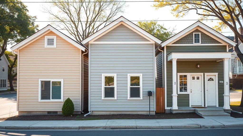
Match Colour to Your Home’s Architectural Style
When you match paint to your home’s architectural style, you highlight its defining lines and historical character rather than fighting them. You’ll choose palettes that respect proportions—muted tones for Craftsman woodwork, crisp whites for Colonial symmetry, and contrasting trims for Victorian details.
Prioritize architectural harmony: let moldings, shutters, and porches share a restrained relationship so features read clearly. Maintain style consistency across rooflines, doors, and trim to avoid visual conflicts.
Test samples on different elevations and view them at various times of day. By aligning color choices with form, you preserve authenticity and boost curb appeal without overpowering the design.
How Sunlight and Climate Change Paint Colour
Pay attention to how sunlight shifts your chosen hue through the day, making warm tones glow and cool tones look muted.
Also consider climate-driven fading—intense UV, heat, or salty air can wash out colors faster, so pick pigments and finishes rated for your conditions.
Finally, think about microclimates around your home (shaded north sides, sun-soaked facades, or wind-exposed corners) and adjust colors accordingly.
Sunlight’s Effect On Hue
Morning sunlight can drastically change how a paint color reads on your house, shifting warm tones toward gold and cool tones toward blue as the day progresses.
You’ll notice sunlight intensity alters colour perception, boosting colour saturation in full sun and muting tones in shade variations. Natural light direction and reflective qualities from nearby surfaces shift appearance.
UV effects subtly alter pigments over time, while seasonal changes change ambient light temperature.
Picture it:
- Dawn: soft, warm highlights on facades.
- Noon: vivid saturation under direct rays.
- Dusk: cool, flattened hues as light wanes.
Climate-Driven Fading Risks
Although sunlight will always affect paint, rising temperatures and more intense UV exposure from climate change are speeding up colour degradation and making fading a more urgent concern for homeowners. You should assess climate impact factors—UV index, heat cycles, and humidity—when picking pigments and finishes. Use proven fading prevention techniques: UV-resistant primers, lighter tones, and regular maintenance. Match product specs to your local projections. Quick reference:
| Factor | Effect | Action |
|---|---|---|
| UV increase | Breaks pigments | UV-stable coatings |
| Heat spikes | Accelerates breakdown | Heat-reflective finish |
| Humidity | Encourages chalking | Breathable paints |
| Maintenance | Slows fade | Scheduled recoats |
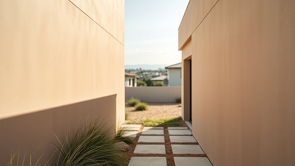
Microclimate Colour Choices
After you’ve matched pigments and finishes to broad climate risks, turn your attention to microclimates around your home—those sun- and shade-patterned pockets that change how paint ages.
You’ll assess microclimate considerations and adapt color choices to local climate nuances. Think about contrast, maintenance, and heat gain:
- South-facing walls: intense sun, pick UV-resistant, lighter tones to reduce fading and heat.
- North-facing eaves: persistent shade, choose mid-tones to avoid looking washed out.
- Sheltered corners: trapped moisture, favor mildew-resistant pigments and satin finishes.
Match samples on-site over weeks before committing to a full coat.
How Roof and Brick Colours Shape Your Palette
Because your roof and brick are large, permanent elements, they set the tone for every paint choice you make; you’ll want colors that harmonize with their dominant hues and undertones.
Start by identifying whether the roof and brick lean warm or cool. Pick a colour palette that either echoes those undertones for cohesion or contrasts subtly for interest.
Use trim and accent colors to bridge differences—lighter trims brighten dark roofs, muted accents calm vivid brick.
Test samples against the materials at different times of day. Prioritize harmony and balance so your house reads as a unified composition.
Coordinate Paint With Landscaping and Gardens
Think about how your paint choices will play off the colors and textures in your beds and borders.
You can pick hues that echo perennial tones for a complementary planting palette, or select neutrals that let seasonal blooms take center stage.
Plan for seasonal color harmony so your home looks intentional from spring blooms through winter evergreens.
Complementary Planting Palettes
When you coordinate exterior paint with your landscaping, the result should feel intentional—house and garden working together to enhance curb appeal.
You’ll use complementary colour schemes and planting colour coordination to make choices that read as one design. Pick dominant paint tones, then layer plantings that echo or contrast subtly.
Imagine:
- Soft sage siding with white blooms and deep purple accents.
- Warm terracotta trim paired with golden grasses and blue salvias.
- Charcoal exterior highlighted by silver foliage and bright red blooms.
You’ll keep balance, repeat colors, and guarantee the plant palette complements rather than competes.
Seasonal Color Harmony
As seasons shift, plan your exterior palette to change with them so your house and garden feel cohesive year-round. You’ll use seasonal palettes to echo blooming hues, autumn foliage, muted winter tones, and fresh spring greens. Consider paint accents that work with perennial color cycles so colour shifts feel intentional. Swap accessories—pots, cushions, wreaths—to bridge gaps between plant peaks and siding. Use the table below to pair seasons with quick exterior adjustments that reinforce harmony.
| Season | Quick Exterior Adjustment |
|---|---|
| Spring | Soft trim, pastel pots |
| Summer | Bright accents, vibrant blooms |
| Autumn | Warm trims, rusty accessories |
| Winter | Deep neutrals, evergreen focal points |
Trim, Sash, and Door Contrast Rules That Work
Although your main siding color sets the house’s personality, trim, sash, and door contrasts are what sharpen its lines and add curb appeal; pick contrasts that balance visibility and harmony so details read clearly from the street.
You’ll use trim styles to frame windows, choose sash finishes that reduce glare, and select door shades as focal points.
Apply contrast techniques sparingly: bold on one element, subtle on others.
Visualize combinations:
- Crisp white trim, matte black sash, deep red door.
- Soft taupe trim, warm bronze sash, navy door.
- Stone trim, charcoal sash, bright yellow door.
Read Paint Swatches: What to Look For
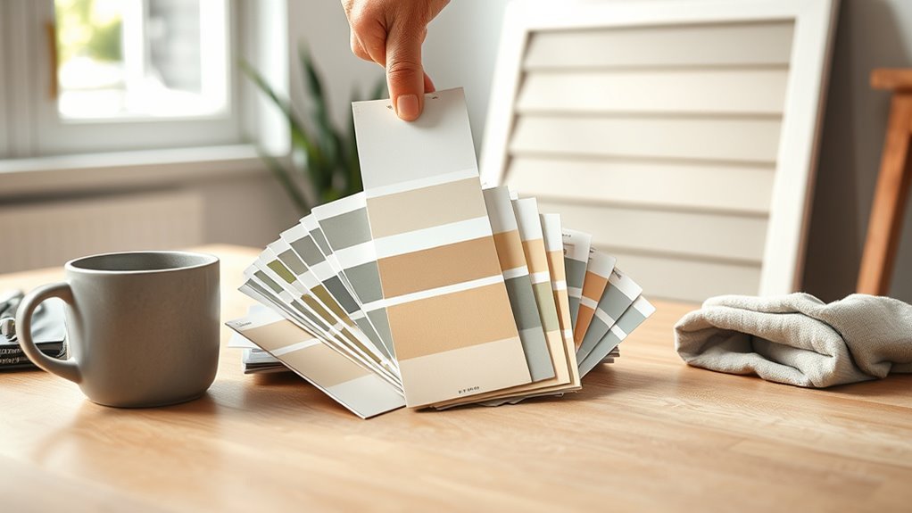
After you pick contrast roles for trim, sash, and doors, you’ll need to read paint swatches to confirm how those choices behave in real light and next to materials like brick or stone.
Hold swatches at different times of day, against siding and hardscape, noting undertones that shift. Use swatch comparison techniques: layer samples, place them side-by-side, and photograph under natural light.
Hold swatches in varying daylight against siding and hardscape; layer, compare, and photograph to reveal shifting undertones.
Think about paint color psychology—how warmth, coolness, and saturation change curb appeal and mood.
Prioritize swatches that harmonize with fixed elements, and shortlist options before moving to larger test areas to avoid surprises.
Test Exterior Paint Colours on Your House
Ready to see how your shortlisted colors really perform on the house? You’ll want to test swatch placement across varied facades and light.
Paint 12×12-inch panels or use peel-and-stick samples, then observe at different times of day. Take photos and notes so you can compare colour samples objectively.
- Morning: soft light on east walls, cooler tones reveal.
- Midday: harsh sun on south exposure, true pigment shows.
- Evening: warm glow on west-facing surfaces, contrast changes.
Rotate samples between trim, siding, and accents to judge balance.
Make decisions from real-world views, not just the chip.
How Undertones Shift Outdoors
When you step outside, undertones in paint reveal themselves differently than they do under store lighting. A beige that looked neutral inside might pick up pink or green against natural light and surrounding materials.
You’ll notice outdoor lighting and seasonal changes shift how warm or cool those undertones read, especially beside foliage, brick, or roofs. To maintain colour harmony, test large swaths on the actual façade and observe them over weeks.
Also consider paint durability: some formulations resist fading and yellowing, which preserves desired undertones. Make decisions based on real-world viewing, not just swatches under artificial light.
How Light Direction Alters Colour Through the Day
Because the sun moves, the same paint can look warm and glowing in the morning, flat and neutral at midday, then cool and shadowed by evening—you’ll want to evaluate colours at different times so you know how they’ll read across the day.
You’ll notice light temperature shifts warmth or coolness and shadow impact deepens or softens hues.
Walk around your house and observe:
- East-facing walls: glowing, warmer tones at sunrise.
- South-facing walls: consistent, truer midday colour.
- West-facing walls: cooler, lengthened shadows at sunset.
Use samples on large boards and view them across these conditions before deciding.
Finish and Gloss: Appearance and Durability
Your choice of sheen changes how colors read — higher gloss makes hues pop but also highlights imperfections.
Different finishes offer varying weather resistance, so pick a gloss level suited to your local climate and exposure.
Consider maintenance and longevity too, since shinier finishes are easier to clean but may need touch-ups more often.
Sheen Level Effects
While color grabs attention, the sheen you choose shapes how that color reads and how well the exterior stands up to weather and wear. You’ll weigh sheen levels and gloss types against durability factors, using simple finish comparisons to pick what suits trim, siding, and accents.
Imagine the effect:
- Low sheen: soft, hides flaws, matte elegance on broad walls.
- Satin: subtle glow, easy to clean, balanced for wood and masonry.
- High gloss: sharp highlights, shows detail, best for trim and doors.
Choose based on curb appeal, maintenance needs, and the architectural contrast you want.
Weather Resistance Differences
When you pick a finish and gloss level, you’re also choosing how well your paint will repel moisture, resist UV fading, and stand up to dirt and scuffs. Higher-gloss finishes shed water and grime more effectively, while flatter sheens hide surface imperfections but absorb more moisture and show wear sooner.
You’ll favor semi-gloss or gloss on trim and doors where weather resistance matters, and use satin on siding for balance.
Consider exposure: sun-facing walls need UV-resistant formulas, coastal homes require salt-and-mildew tolerant coatings.
Match sheen to substrate and climate to optimize paint longevity without compromising style.
Maintenance And Longevity
Choosing the right finish and gloss does more than affect look and weather resistance; it determines how much upkeep your exterior will need and how long it stays attractive.
You’ll pick satin or semi-gloss for easier cleaning; flat hides flaws but needs repainting sooner. Consider color durability in sun-exposed areas and higher-gloss trims for scuff resistance.
Good paint maintenance extends life: wash siding, touch up chips, and inspect seals annually.
Imagine these scenarios:
- A glossy trim wiped clean after a storm.
- A faded wall needing repainting every decade.
- A well-sealed porch resisting mildew and peeling.
Timeless Neutrals That Never Date
1 timeless strategy for a home exterior is to lean on neutral shades, because they give you lasting curb appeal and make future updates easier.
You’ll find timeless shades like warm taupe, soft greige, and classic beige blend with landscaping and architecture, creating a calm backdrop. Neutral palettes let you change trim, door, or hardware color without repainting the whole house.
They hide dirt and weathering better than stark white, and they suit resale trends. When choosing, test swatches in different light, consider undertones, and pick finishes that balance durability with the subtlety you want.
Use Bold Colours Without Overpowering the Facade
You can make a bold color pop without letting it dominate by pairing it with neutral accents like trim, stone, or soft siding.
Use the bold hue sparingly—on the front door, shutters, or an accent wall—to draw the eye where you want it. That way the facade stays balanced and visually appealing.
Balance With Neutral Accents
Bold hues can make a home sing, but pairing them with neutral accents keeps the facade grounded and prevents the color from overwhelming the design. You’ll use neutral accent benefits to calm bold paint while highlighting architectural lines.
Choose contrasting texture choices—matte stucco against glossy trim—to add depth without more color.
Visualize combinations:
- Deep teal body, warm beige trim, stone porch.
- Charcoal siding, soft cream windows, wooden door.
- Mustard door, dove gray walls, concrete steps.
You’ll balance impact and restraint, letting color pop where desired while neutrals provide a cohesive, sophisticated backdrop.
Limit Bold To Features
When a striking color feels tempting, reserve it for doors, shutters, or a single accent wall so the rest of the facade stays composed; this keeps the eye focused and prevents the hue from dominating the whole design. You’ll highlight architecture without overwhelming your curb appeal by pairing bold accents with neutral fields. Follow current colour trends, but test samples in different light and consult seasonal palettes to keep choices versatile. Use contrast sparingly, repeat the accent in small details, and maintain balance. Practical restraint lets bold color feel intentional rather than chaotic.
| Feature | Tip | Impact |
|---|---|---|
| Door | Test in sun | Focal point |
| Shutters | Match trim | Cohesion |
| Trim | Subtle hue | Definition |
| Accent wall | Single side | Balance |
Build a Cohesive Three-Colour Exterior Scheme
Although choosing three exterior colors can feel tricky, a clear hierarchy—primary field, trim, and accent—keeps the scheme cohesive and intentional.
You’ll pick a dominant field color, a trim that defines edges, and a small accent for focal points. Use colour psychology to set mood and study trending palettes for inspiration, but adapt them to your home’s style.
Visualize placement with this simple checklist:
- Field: largest surface, sets overall tone.
- Trim: outlines windows, eaves, gutters—adds structure.
- Accent: small areas like shutters or porch details for contrast.
Test samples in daylight before committing.
Accent Colours for Front Door and Trim
After you’ve established your field and trim, the front door and small trim accents give you a chance to add personality and focal interest. Choose a door colour psychology that matches the vibe you want—bold reds for energy, deep blues for calm, or cheery yellows for welcome. Use trim colour trends sparingly on window casings, shutters, and fascia to modernize without overpowering. Test samples at different times of day. Keep contrast balanced so accents pop but don’t fight the main palette.
| Accent Area | Suggested Approach |
|---|---|
| Front Door | High-contrast focal colour |
| Window Trim | Subtle complement |
| Shutters | Slightly darker shade |
| Fascia | Neutral anchor |
| Small Details | Metallics or pops |
Use Colour to Highlight or Hide Features
Use color strategically to draw attention to architectural strengths or to downplay elements you’d rather not highlight. You’ll use highlighting features and hiding flaws with intentional color contrasts and shade selection to achieve visual balance and architectural harmony.
Consider:
- Paint trim lighter for feature emphasis—creates color layering and visual depth.
- Darken recessed areas to hide flaws and enhance texture interplay.
- Use mid-tones on large planes so accents pop without overwhelming.
You’ll experiment in small swatches, observe at different times, and adjust contrasts so feature emphasis feels natural, balanced, and tied to the home’s materials and proportions.
Match Paint to Existing Materials (Brick, Stone)
When you’re working with existing brick or stone, let the material’s dominant tones guide your palette so paint complements rather than competes; start by sampling adjacent hues to see how light shifts color.
You’ll pick mortar-friendly trim and accent colors that respect brick color schemes and enhance curb appeal.
Match sheen and finish to stone texture compatibility—matte for rough stone, low-sheen for smooth brick—to avoid spotlighting imperfections.
Test small areas at different times of day, and photograph results.
Choose a unifying neutral for large surfaces, then add a contrasting door or shutters to create balance without overpowering the masonry.
Factor Neighbourhood Context and HOA Rules
Matching your paint to existing brick or stone sets a strong visual foundation, but you’ll also want to weigh the neighborhood context and any HOA rules before committing.
You should check HOA guidelines and local regulations to verify design consistency and comply with community standards.
Consider how your choice affects architectural harmony and property values, and whether it fits prevailing color trends.
Picture the street:
- A row of muted, cohesive facades creating calm curb appeal.
- Contrasting accents that punctuate but don’t clash.
- A bold outlier that disrupts neighborhood aesthetics and unity.
Balance personal taste with rules to protect value.
Buyer-Friendly Exterior Colours When Selling
When you’re prepping a house to sell, stick with neutral tones like soft greys, beiges, or off-whites to appeal to the widest range of buyers.
Use accent colors sparingly—on the front door or trim—to boost curb appeal without turning off potential buyers.
These small, strategic choices can make your property feel fresh and move-in ready.
Neutral Tones For Resale
Because buyers picture themselves living in a home, choosing neutral exterior tones helps them imagine their own belongings on your property and increases curb appeal.
Pick shades like warm greige, soft taupe, or muted clay to create a welcoming, versatile backdrop that complements landscaping and architectural details. You’ll follow neutral colour trends that appeal broadly and protect resale value.
Consider these simple scenarios to visualize impact:
- Warm greige softening modern lines against green shrubs.
- Soft taupe unifying brick and siding for a cohesive look.
- Muted clay adding subtle warmth near stone walkways.
Keep trim crisp and finishes matte for broad appeal.
Curb Appeal Accent Colors
How do you pick accent colors that attract buyers without overpowering your neutral base? You’ll choose subtle, on-trend hues that highlight doors, shutters, and trim. Use curb appeal strategies: limit accents to focal points, test swatches, and match landscaping. Follow current accent color trends—muted navy, deep green, and warm terracotta—to add personality without alienating buyers. Keep contrasts clean and maintain consistency across features. Below’s a quick guide to mix and match options for a buyer-friendly exterior.
| Feature | Suggested Accent |
|---|---|
| Front door | Muted navy |
| Shutters | Soft charcoal |
| Trim | Creamy white |
| Garage | Warm terracotta |
Exterior Colours for Historic and Period Homes
If you’re working on a historic or period home, choosing exterior colours means balancing authenticity with your personal taste; you’ll want hues that respect the era’s palette while accommodating modern maintenance and materials.
Use historic palettes and restoration guidelines to preserve architectural integrity and period accuracy. Consider traditional influences and regional styles to honor color heritage and vintage aesthetics.
Lean on historic palettes and restoration guidance to maintain period authenticity while honoring regional color traditions.
Visualize details:
- Weathered trim in muted cream against deep, aged siding.
- Accented shutters in restrained, earthy tones with subtle patina.
- Decorative molding highlighted by soft, contrasting neutrals to reveal craftsmanship.
Follow guidelines; test samples in natural light.
Adapt Trends Without Dating Your House
Respecting a home’s historic palette doesn’t mean you can’t incorporate current looks; you just want to borrow trends in ways that feel intentional and timeless.
Choose one trendy accent—door, shutters, or trim—against a neutral base drawn from timeless palettes so the core stays classic while small elements feel fresh.
Use seasonal updates like a new front-door hue or temporary accessories to test a bolder choice without commitment.
Avoid repainting entire facades for every fad; instead, let durable, traditional tones anchor the design and swap limited, reversible details to keep the house current without locking you into a date.
Low-Maintenance Colours for Busy Households
When you want a low-maintenance exterior, pick colors that hide dirt and weathering while keeping touch-ups minimal.
You’ll favor low maintenance options and family friendly hues that suit busy lifestyles. Choose weather resistant colors with durable finishes for easy upkeep and time saving solutions.
Practical choices reduce chore time and stress.
Practical color choices cut upkeep and stress, letting you enjoy your home more and worry less.
- Soft taupe that masks dust and fingerprints.
- Mid-gray that camouflages road grime and stains.
- Warm sage that hides pollen and mud.
These suggestions deliver durable finishes, easy upkeep, and practical choices so you can enjoy your home without constant maintenance.
Plan for Fading and Long-Term Colour Stability
Think about pigments that resist fading so your colour stays true longer.
Match paint choices to the sun exposure on each side of your home, since UV intensity varies by orientation and shading.
Finally, plan a repaint schedule and inspections so small fade or chalking issues don’t become big jobs.
Choose Fade-Resistant Pigments
Because sunlight and weather will gradually wash out even the best paints, pick pigments known for fade resistance so your home’s color stays true longer.
You’ll focus on pigment selection and fade durability when choosing formulas. Look for lightfast, inorganic or high-performance organic pigments and ask manufacturers for accelerated fade test results.
Picture how tones age:
- Fresh, vibrant façade under noon sun.
- Subtle softening after seasons of rain and heat.
- Long-term depth retained by UV-stable pigments.
Choose pigments with proven lab data, prefer quality binders that protect color, and test samples on different elevations before committing.
Consider UV Exposure Zones
If your house faces strong sun on one side, map UV exposure zones so you can predict where colors will fade fastest and plan accordingly.
You’ll assess sunlight effects across walls and trim, noting areas with constant sun, shade, reflection, and wind-driven debris.
Consider environmental factors like coastal salt, altitude, and humidity that accelerate fading.
Prioritize higher paint durability on high-exposure façades and choose formulations with proven color retention.
Conduct small color testing panels in representative outdoor conditions and monitor them through seasonal shifts to see real-world performance.
Use those results to balance aesthetic goals with long-term stability.
Plan Repaint Maintenance
A maintenance plan helps you stay ahead of fading and keeps colors looking consistent over time. You’ll extend paint longevity by planning inspections, touch-ups, and full repaints based on exposure and coatings.
Create a simple maintenance schedule and stick to it so small issues don’t become big problems.
- Spring: inspect for chalking, flaking, and sun-bleached areas; touch up trims.
- Autumn: clean surfaces, check caulking, and note fading patterns for next season.
- Every 5–10 years: assess overall finish; consider repainting with UV-resistant formulas to preserve color and protect substrates.
Coordinate Exterior and Visible Interior Colours
When passersby glimpse your foyer or living room through windows and doors, you want those interior colors to feel like a natural extension of the exterior palette; pick tones that echo or gently contrast so the change reads intentional and cohesive.
You’ll create interior harmony by selecting hues that share undertones with siding, trim, or accents—warm creams with warm greys, soft blues with muted navy.
Test swatches under the same light visible from outside. Keep trim and shift areas consistent to preserve exterior balance.
Small accent ties, like a door or curtain color, unify sightlines and elevate curb appeal.
Use Colour Psychology to Set Your Home’s Mood
Think about how you want your home to feel and pick colors that evoke those emotions—calm blues for relaxation, warm yellows for cheer.
Match the hue to the function of each space so the exterior signals what’s inside. Your color choices will set expectations and shape visitors’ moods before they even step through the door.
Choose Colors By Emotion
Because color affects mood, choose exterior paints that reflect how you want to feel at home and how you want others to perceive it. Use color psychology to guide choices: warm tones energize, cool tones calm, neutrals reassure.
Think about emotional associations before committing.
- Sunny yellow — welcoming, optimistic, draws attention.
- Slate blue — tranquil, trustworthy, fades into nature.
- Warm taupe — grounded, sophisticated, broadly appealing.
You’ll balance curb appeal and personality by prioritizing feelings over trends. Test swatches in daylight, imagine arriving home each day, and pick the palette that consistently makes you feel the way you want.
Match Hue To Function
If you want each room or exterior zone to do a specific job, match the hue to that function so the color supports how you live and use the space. Use hue psychology to pick tones that encourage action, calm, socializing, or focus. Consider functional aesthetics: a porch needs welcoming warmth, a study needs cool clarity. Test samples at different times of day, noting shadows and context. Balance bold accents with neutral grounding to keep curb appeal cohesive.
| Function | Suggested Hue |
|---|---|
| Relaxation | Soft blue |
| Energy | Warm coral |
| Focus | Cool gray |
| Social | Golden ochre |
| Neutral | Greige |
Colour Strategies for Duplexes and Multi-Units
How do you create a cohesive look across a duplex or multi-unit property without erasing each unit’s identity? You balance duplex design and multi unit aesthetics by prioritizing exterior harmony and colour continuity.
Consider architectural balance and neighbourhood integration to lift rental appeal while respecting community standards. Choose durable coatings for paint durability and modern finishes.
Use a simple palette that links units but lets doors or trim differ. Visualize with three focal elements:
- Shared base colour tying façades together.
- Contrasting trims or doors per unit for personality.
- Repeated accent placements to reinforce rhythm and scale.
Work With Paint Brands and Colour Families
Start by matching your design goals to a handful of reputable paint brands and their colour families so you get consistent results across projects.
You’ll review paint brand comparisons to see durability, sheen options, and environmental ratings. Stick to a few families—neutrals, modern greys, coastal blues—so samples translate accurately in sunlight and on different textures.
Watch colour family trends for resale appeal but choose tones that fit your architecture and landscape. Ask retailers for sample tins and note how formulas affect coverage.
Read and Compare Paint Codes and Names
Why does a paint name sometimes mean less than its code? You’ll rely on paint code comparisons to match batches and avoid surprises: names vary by brand, lighting alters perception, and undertones hide in codes.
Check swatches and digital samples, then compare codes side-by-side.
- Visualize a warm beige (code X123) next to a cool beige (code Y456).
- Picture the same “cream” name across three brands, each with different codes.
- Imagine a trim colour whose code reveals a subtle grey undertone not obvious from the colour name.
Understanding colour name meanings and codes prevents mismatches and guarantees consistency.
Estimate Paint Quantity and Repaint Budget
Measure the elevations and multiply by height to calculate the total surface area you’ll paint.
Use the paint’s coverage rate to convert area into gallons and remember to budget for at least one recoating.
Add labor, primer, and waste allowances so your repaint budget covers the whole job.
Calculate Surface Area
Before you pick colors, you need to know how much paint you’ll actually use, so calculate the exterior surface area of walls, trim, doors, and shutters to estimate gallons and cost accurately.
Use basic surface area calculation: measure length and height of each plane, subtract windows and large openings, then add trim and features. For clear exterior paint measurement, sketch elevations and label dimensions.
Picture areas to total:
- Long wall: length × height minus window rectangles.
- Gable: triangle area from base and height.
- Trim and shutters: individual rectangles summed.
Convert total square footage to required paint and budget accordingly.
Paint Coverage Rates
A good rule of thumb is that one gallon of exterior paint covers about 250–400 square feet per coat, but exact coverage depends on the paint type, surface texture, and how many coats you plan to apply.
Calculate total square footage, then divide by your chosen coverage rate to estimate gallons needed, allowing 10–15% extra for waste and touch-ups.
Consider primers, porous siding, and uneven surfaces, which increase material needs.
During paint application, maintain coverage consistency by using correct thinning, brush/roller types, and steady technique.
Note: this helps estimate quantity and plan timing without diving into detailed recoating budgets.
Budget For Recoats
Plan for at least one full repaint cycle when you estimate recoats, since color changes, weathering, and wear will dictate future needs and costs.
You’ll calculate gallons by measuring façade area, factoring primer and two coats, then add 10% for touch-ups. Use budgeting strategies and cost saving tips: buy contractor-grade paint for durability, time purchases off-season, and combine projects to cut labor.
- Measure walls, doors, trim to visualize scope.
- Sketch zones to allocate primer vs. topcoat.
- List consumables (tape, brushes, caulk) to avoid surprise expenses.
Track receipts to refine future estimates.
Prep Surfaces So Colour Looks Its Best
Start by stripping away loose paint, dirt, and mildew so your new colour can stick and look even. You’ll do surface cleaning with the right preparation tools—pressure washer, scrapers, brushes—and follow with texture assessment to spot rough patches.
Repair damages like rot, cracks, and loose trim before paint priming; primer seals substrates and evens absorption for different finish types. Control moisture by drying surfaces and checking humidity; avoid painting when weather conditions predict rain or high humidity.
Work methodically so coats adhere, drips are avoided, and the final colour reads true and lasts longer.
Avoid Common Colour-Matching Mistakes
Don’t pick colors without checking how different light—morning sun, afternoon glare, and evening shade—changes their appearance.
Make sure your paint coordinates with fixed elements like roofs, brickwork, and trim you can’t replace.
Test samples on the house at various times of day before committing.
Consider Lighting Conditions
Because light shifts throughout the day, the same paint can look dramatically different at noon, dusk, or under streetlights, so you should view samples at multiple times to avoid surprises.
Pay attention to lighting effects and shadow considerations: natural light warms or cools hues; overcast skies flatten contrast; artificial lamps create hotspots.
Walk around the house at different hours, note reflections, and photograph samples. Imagine how tones read from the street and close-up.
- Morning: soft, cool highlights.
- Afternoon: vivid, high contrast.
- Night: muted colors, warm glows.
Trust what you see in varied light.
Match Fixed Elements
After checking samples at different times of day, turn your attention to fixed elements—roofing, brick, stone, trim, and any permanent metalwork—since they set the palette you have to work with.
You’ll evaluate undertones and temperature so your chosen paint achieves color harmony rather than clashing. Match warm bricks with warmer paints, cool stones with cooler hues, and pick trim that ties elements together.
Use architectural contrast to highlight features without overwhelming them: a darker body color can make light trim pop, or vice versa.
Test small areas, view from the street, and adjust until the balance feels intentional.
Choose Colours by Material: Wood, Vinyl, Brick
When selecting exterior paint, consider how the material—wood, vinyl, or brick—affects color appearance and longevity; each surface soaks up light and weather differently. A hue that looks great on painted wood might read flat on vinyl or fade unevenly on brick.
You’ll pick tones that honor wood finishes, respect vinyl textures, and accent brick patterns while matching color combinations to architectural influences. Think material durability and seasonal trends; follow maintenance tips for repainting schedules.
Visualize these scenes:
- Warm stain on clapboard catching morning light.
- Crisp white vinyl trim resisting grime.
- Deep mortar-shadowed brick anchoring the facade.
Use Digital Tools and Visualizers Realistically
Anyone can benefit from digital paint visualizers, but treat them as guides rather than guarantees: they help you test palettes quickly and see how colors interact with your home’s features, yet screen settings, lighting, and sample sizes will alter the final result. Use digital color tools like virtual paint visualizers and interactive design apps to shortlist options, then verify with physical swatches. Try color palette generators, augmented reality painting, 3D modeling software, and online color resources to explore combinations. Check color selection interfaces for trims and accents. Test under real light, on different walls, and at different times before committing.
| Tool type | Purpose |
|---|---|
| AR apps | Quick on-site previews |
| Swatches | Final confirmation |
When to Hire a Colour Consultant or Pro Painter
Digital tools can narrow your options, but there are clear signs it’s time to bring in a colour consultant or professional painter: you’re overwhelmed by choices, unsure how colors will read on complex architectural details, or you want a cohesive scheme that boosts curb appeal and resale value.
Hire help when you want expert interpretation of current colour trends, precise samples on-site, or color harmony across materials. A pro gives professional advice, realistic palettes, and measurement for paint quantities.
Visualize impact with:
- a sunlit facade study
- trim and shadow contrast
- full-street curb appeal mockup
Repaint Timeline: What to Expect During Work
Expect the repaint process to take anywhere from a few days for a small, well-prepped section to several weeks for a full exterior, depending on weather, surface prep, and the number of coats required.
Expect a repaint to take from a few days to several weeks, depending on weather, prep, and coats.
You’ll get a timeline that lists surface repair, priming, drying windows, and each coat’s work duration. Crews often schedule around temperatures and humidity to meet drying times.
Plan for daily start/stop routines, possible scaffold moves, and brief access restrictions. Ask your contractor about repaint frequency recommendations and warranty work.
Clear communication keeps the project efficient and helps you anticipate interruptions and completion dates.
Maintain Painted Exteriors to Preserve Colour
Once the crew finishes and the paint cures, you’ll want a routine to keep that fresh look lasting longer.
Use paint preservation techniques like gentle washing with a soft brush and mild detergent to remove dirt and mildew. Inspect trim and joints quarterly, touching up chips before moisture worsens them.
Follow seasonal maintenance tips: clear gutters in autumn, rinse pollen in spring, check caulking after winter.
Visualize maintenance as simple steps:
- Soft wash to remove grime and prevent staining.
- Touch-up small nicks immediately to stop peeling.
- Re-caulk seams yearly to keep moisture out and colour vibrant.
Signs It’s Time for a New Exterior Colour
If your home’s paint is chalking, flaking, or noticeably faded, it’s time to contemplate a new exterior colour—these signs mean the finish is no longer protecting or representing your house well.
You’ll notice fading signs and peeling paint after weather damage or prolonged maintenance issues. An outdated style or shifting neighborhood trends can prompt change, as can seasonal changes that expose flaws.
Balance color trends with your personal preference and budget; pick a hue that boosts curb appeal and simplifies upkeep.
If repainting solves structural issues and refreshes appearance, you’re making a practical, aesthetic investment.
Frequently Asked Questions
What Paint Sheen Is Best for Exterior Masonry Repairs?
Use a satin or semi-gloss sheen for exterior masonry repairs; you’ll get durability and washability. Match masonry paint types to substrate, follow thorough repair preparation, prime repaired areas, and feather edges for a seamless finish.
Can Paint Colour Affect Home Insurance or Appraisal?
Studies show 85% of buyers judge curb appeal instantly, so yes: your paint can influence insurance rates and appraisal values. You’ll boost perceived value with tasteful colors, lowering risk perceptions and potentially raising offers.
How to Handle Colour Choices for Rental Properties With Frequent Turnovers?
You’ll choose neutral palettes to appeal broadly, balancing durability and low-maintenance finishes. You’ll survey tenant preferences, stick to timeless tones, document approved accent options, and keep repainting costs minimal with easy-to-repair, renter-friendly surfaces.
Are There Eco-Friendly Exterior Paint Options With Similar Durability?
A Portland landlord tried BioShield paints and proved you can; yes, you’ll find eco-friendly exterior options matching durability. Choose sustainable brands using eco friendly pigments and low-VOC formulas, and you’ll get long-lasting, resilient finishes.
Can Exterior Colour Choices Influence Energy Bills?
Yes — you’ll save energy: lighter colours increase light reflection and help with temperature regulation, reducing cooling loads in summer, while darker hues absorb heat, raising indoor temperatures and potentially increasing air‑conditioning use in warm climates.
Conclusion
Think of your home’s exterior like a book jacket: the colour you pick tells its first story. Use the quick framework, match shade to style, and let sunlight and climate be your editor. Paint before heavy renos if you want a clean draft, or after for final edits. Call a pro when choices blur. With regular maintenance, your cover stays vivid—replace it when chips and fading start to whisper that a new chapter’s due.