What Is the Best Color to Paint Your Walls? Ideas
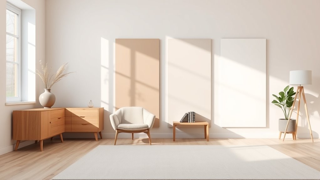
Choose a versatile neutral like warm gray, soft beige, or muted green to flatter light, furniture, and mood while giving you flexibility for seasonal accents and evolving décor. Consider natural and artificial light—north-facing rooms benefit from warmer tones, south-facing can handle cooler shades—and match scale to room size, using lighter hues for small spaces and deeper ones for larger areas. Test large swatches at different times, pick a finish for durability, and keep going to see practical tips and pairings.
Quick Answer: Best Versatile Wall Colors
Think neutral—it’s the simplest way to make a room work for years. You’ll pick versatile shades that balance Color Psychology and Space Ambiance, so Mood Enhancement feels natural rather than forced.
Consider warm grays, soft beiges, and muted greens for Design Harmony with furniture and light. Blend Personal Preference with Trend Analysis: note Color Trends and Seasonal Colors but don’t chase every fad.
Test samples at different times of day to confirm how hues shift. Ultimately, choose neutrals that support versatility, adapt to changing décor, and let accents carry seasonal or trendy statements without overwhelming the space.
How to Use This Guide
You’ve got a solid starting point with neutral, versatile shades—now use this guide to turn that idea into a plan you can act on. Follow quick steps: test samples, note room light, and think about wall color psychology to match mood. Check seasonal color trends for timely accents, then prioritize durability and finish. Use the table to organize choices and next actions.
| Room | Mood Goal | Action |
|---|---|---|
| Living | Calm, social | Sample + observe |
| Bedroom | Restful | Soft neutrals |
| Kitchen | Energetic | Accent color |
Four Criteria to Choose a Wall Color
Before you pick a swatch, consider four practical criteria that’ll keep your room looking intentional: light, scale, mood, and finish.
First, assess light—natural and artificial—to pick tones that read well without clashing.
Second, match scale: small rooms suit lighter hues; large spaces can handle deeper shades.
Third, use color psychology to set mood—calming blues, energetic yellows—and think about how seasonal trends might influence longevity.
Fourth, choose finish for durability and sheen; flat hides flaws, satin cleans easier.
Test samples on multiple walls and view them at different times before committing.
How Natural Light Changes Wall Color
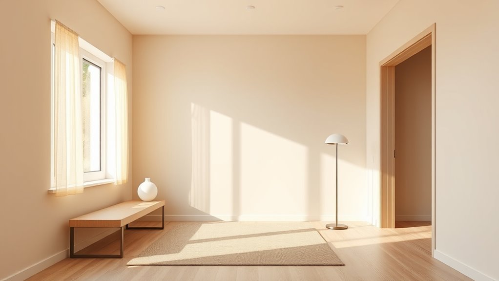
As you pick a paint, remember natural light shifts color throughout the day, warming at sunrise and cooling at dusk.
Consider your window orientation—south- and west-facing rooms get stronger, warmer light while north-facing ones stay cooler and dimmer.
Test swatches at different times and lighting intensities to see how the hue will actually read in your space.
Time Of Day
Natural light shifts throughout the day and can make the same paint read warm, cool, flat, or vibrant, so you’ll want to view swatches at different times before deciding. You’ll notice morning light lifts cool blues and greens, while evening shadows deepen tones and reveal undertones. Midday sun shows true color; overcast afternoons mute saturation. Walk the room at each period, pin swatches to walls, and take photos for comparison. Use this quick guide:
| Time of Day | Effect on Color |
|---|---|
| Morning light | Colors look crisper, cooler |
| Midday | True, saturated tones |
| Afternoon | Softer, subdued hues |
| Evening shadows | Deeper, warmer undertones |
Window Orientation
Although your room’s orientation might seem like a small detail, it has a big impact on how paint reads—north-facing rooms get cool, consistent light that mutes warm hues.
East-facing windows bring crisp morning light that brightens cool tones.
South-facing exposures deliver strong, warm midday sun that makes colors pop, and west-facing rooms pick up rich, golden late-afternoon light that deepens and warms shades.
You should test swatches at different times, watching how natural light shifts color and reveals or conceals wall texture.
Pick tones that complement your orientation: cooler shades for north, balanced neutrals for east, vivid or warm hues for south and west.
Light Intensity Effects
How bright is the light in your room at different times of day, and how does that shift the paint you choose?
Think about light intensity effects: morning sun softens cool tones, midday glare washes pale hues, and evening glow deepens warm shades.
You’ll notice light perception alters saturation and contrast, so test samples at several hours.
Use color psychology to match mood—brighter rooms tolerate vivid colors, dim rooms benefit from lighter, warmer paints to feel inviting.
Adjust sheen and undertone to compensate: matte hides glare, satin reflects more.
Plan for changing daylight to keep colors consistent and pleasant.
Ceiling Height, Room Size, and Wall Color
If your room has low ceilings or is small, you’ll want lighter paint and warm tones to keep the space feeling open and cozy.
In contrast, high ceilings can handle darker shades that add drama without shrinking the room.
Think about how ceiling height and size work together to choose a color that fits the scale.
Low Ceilings, Lighter Paint
When your ceiling sits low, choosing lighter paint can make the whole room feel taller and more open—so pick shades that reflect light and reduce visual weight.
You should favor light hues and subtle pastels to boost airy ambiance and visually extend room height.
Use ceiling contrast sparingly—paint the ceiling a shade lighter than walls to lift the eye.
Try vertical stripes or narrow moulding to create upward lines without overwhelming space.
Add reflective surfaces like gloss trim, mirrors, or metallic accents to amplify natural light.
Rely on color psychology to choose calming, spacious tones that suit your style.
Small Rooms, Warm Tones
Low ceilings benefit from lighter paints to heighten a room, but in small spaces you can also use warm tones to make the area feel cozy rather than cramped. You’ll rely on small space strategies: choose muted warm hues, keep trims lighter, and use consistent flooring to unify sightlines. Warm color psychology helps you create inviting moods without overwhelming scale. Balance saturation and reflectivity to maintain perceived space. Consider accent walls or warming textiles instead of full saturation. Use the table below to compare impact, then pick tones that suit light levels and function.
| Effect | Tone | Tip |
|---|---|---|
| Expand | Light warm | Reflective trim |
| Cozy | Medium warm | Accent wall |
| Intimate | Deep warm | Limit coverage |
High Ceilings, Dark Shades
Because high ceilings give you vertical freedom, you can confidently use darker shades to add drama without making the room feel boxed in.
You’ll anchor the space with rich colors on tall walls, creating intimacy while preserving airiness. Pair dark shades with lighter ceilings or trim to craft bold contrasts that draw the eye upward.
Use architectural accents—moldings, beams, or recessed panels—to break expanses of color and add texture.
Balance scale by introducing larger furniture and reflective surfaces to prevent heaviness.
With thoughtful lighting and proportion, your high ceilings become a canvas for sophisticated, dramatic wall color choices.
Undertones: Warm, Cool, Neutral
Although two paints can look similar in the can, the undertone—warm, cool, or neutral—changes how a color reads in your room. You’ll want to test samples on different walls and at different times of day.
You’ll notice warm undertones (yellow, red hints) cozying a space and influencing color psychology toward comfort, while cool undertones (blue, green hints) calm and open rooms. Neutral tones bridge both, keeping balance and flexible color harmony.
Consider color temperature and undertone nuances: lighting, furnishings, and finishes shift mood effects. Choose an undertone that supports the function and feel you want to create.
How to Test Paint Without Committing
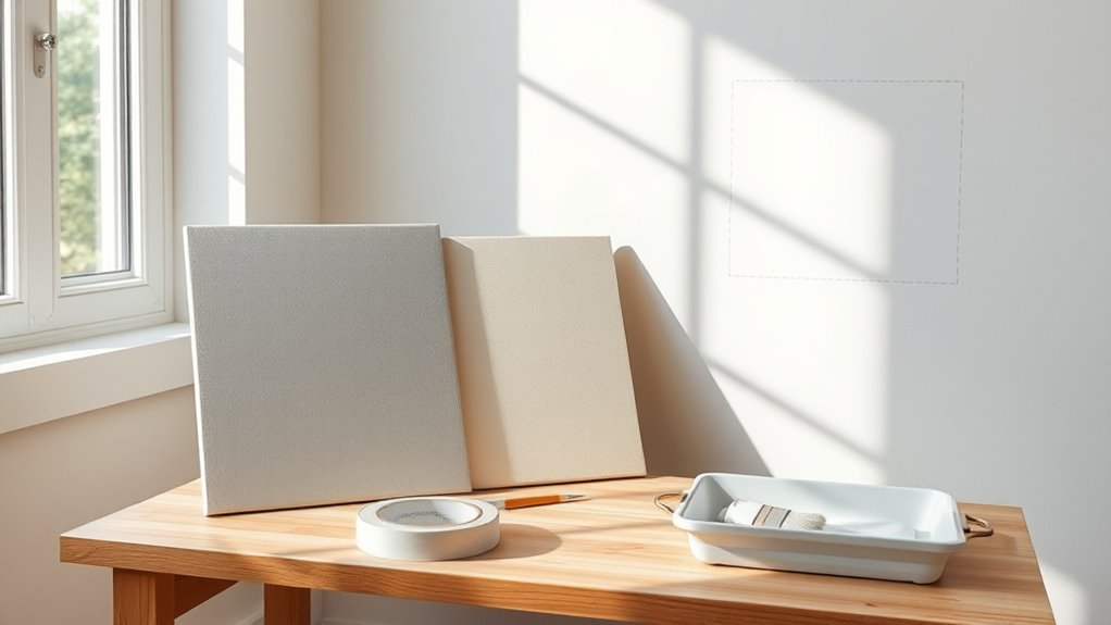
Want to be sure a color will work before you commit? Use paint samples and color swatches to explore options.
Create sample boards and test areas on different walls, noting how lighting tests change tones.
Create sample boards and test patches on different walls, observing how varied lighting shifts paint tones and mood.
Try small cans for color mixing to tweak shades, and examine how wall textures affect appearance.
Build mood boards with photos, fabrics, and swatches to visualize the room.
- A bright morning light on a pale blue swatch
- A lamp-lit corner showing warmer undertones
- Textured plaster catching shadow on a sample board
- Two-tone test areas for comparison
- Fabric and paint swatches layered on a mood board
Paint Finishes: Matte to Semi-Gloss
When you pick a finish, you’re deciding how a color behaves as much as what it looks like: matte hides imperfections and absorbs light, while semi-gloss reflects more sheen and resists wear.
You’ll choose matte finishes for low-traffic rooms where you want a soft, velvety look that conceals minor flaws.
Pick a semi gloss sheen for trim, doors, kitchens, and bathrooms because it cleans easily and stands up to scuffs.
Consider mid-sheen options like eggshell or satin if you need a balance between durability and subtle reflection.
Match finish to function: durability, maintenance, and the surface’s condition.
How Lighting Type Alters Paint Color
When you pick a paint, remember that natural light shifts color through the day—warm morning sun and cool afternoon light can make the same hue read very differently.
You’ll also notice that artificial lighting changes tones: incandescent bulbs warm colors, while LEDs and fluorescents can make them look cooler or flatter.
Test swatches at different times and under each light source to see how the color actually behaves.
Natural Light Effects
Although natural light seems constant, its color temperature and direction change throughout the day, and that shifts how paint looks on your walls. You’ll notice warm morning hues deepen soft creams, while midday coolness can make blues feel crisper.
Natural light and wall reflections interact, altering perceived depth and tone. Test swatches at different times, observe shadows, and imagine daily routines to pick a hue that stays true.
Consider these scenes to guide you:
- Morning sun casting golden bands across a pale wall
- Midday glare sharpening cool tones near windows
- Afternoon warmth mellowing bright whites
- Soft dusk washing colors muted
- Diffuse overcast light leveling contrast
Artificial Light Influence
Because artificial light varies so much in color temperature and intensity, it can drastically change how paint reads in a room, and you’ll want to contemplate the bulbs as much as the swatch.
Choose warm LEDs and incandescent bulbs to deepen warm tones, while cool LEDs and fluorescents will mute them and emphasize blues.
Mix lighting layers—ambient, task, accent—to control shadows and highlights that alter color perception.
Test paint samples under the fixtures you’ll actually use at different times of day. That hands-on check prevents surprises and guarantees the painted result matches your mood and purpose.
Best Neutral Wall Colors for Any Home
Anyone can create a timeless backdrop by choosing the right neutral—think warm greiges, soft taupes, or crisp off-whites—to make rooms feel cohesive and flexible for decor changes.
Choose the right neutral—warm greiges, soft taupes, or crisp off-whites—for a timeless, flexible backdrop.
You’ll use neutral color palettes to harmonize furniture and accents, while wall color psychology guides mood and perceived space. Aim for undertones that suit your light—warm for cozy, cool for airy.
Test samples on multiple walls and live with them through day and night.
Picture finishes and pairings:
- Sunlit living room with pale greige and linen curtains
- Cozy corner with warm taupe and wood grain
- Minimalist kitchen in crisp off-white
- Entryway with soft mushroom gray
- Gallery wall framed by creamy beige
Calming Bedroom Colors That Promote Sleep
For a restful bedroom, choose soft muted blues that soothe the mind and lower stress.
You can also go with warm neutral tones—like greige or soft taupe—to create a cozy, grounded atmosphere.
Both palettes help signal your body that it’s time to unwind and sleep.
Soft Muted Blues
When you choose soft, muted blues for your bedroom, you’re inviting a calm that helps lower heart rate and quiet the mind—ideal for better sleep.
You’ll find soft blue palettes create a serene backdrop, reflecting morning sky and quiet water while giving calming vibes that support rest.
Pair pale navy accents and white linens, avoid harsh contrasts, and keep finishes matte to maintain serenity.
Light-blocking curtains and layered textures deepen comfort.
These tones work with wood and woven fibers for a cozy retreat that feels both airy and grounded.
- misty shoreline walls
- linen sheets, pale gray-blue
- driftwood nightstand
- soft wool throw
- low, warm lamp light
Warm Neutral Tones
While cool blues soothe by quieting your mind, warm neutral tones comfort by wrapping you in soft, consistent warmth that lowers stress and eases you toward sleep.
You’ll find beige, taupe, and creamy greiges calm without chilling the room, creating a cozy cocoon you want to retreat into.
Use matte finishes and layered lighting to maintain a gentle, diffuse glow that supports circadian rhythms.
In choosing paint, rely on color psychology: warmer neutrals signal safety and rest, reducing arousal before bed.
Pair with natural textures and minimal contrast to keep your space serene and sleep-friendly.
Energizing Home Office Color Ideas
Looking to boost focus and motivation in your home office? Choose energizing hues that suit your workflow: vibrant yellows spark creativity, revitalizing greens calm and improve concentration, and cool blues steady your pace.
Accent walls, trim, or a painted nook make impact without overwhelming the room. Pair color with good lighting and tidy surfaces to keep energy high.
Use an accent wall, trim, or painted nook plus bright lighting and clutter-free surfaces to maintain lively focus.
- A sunny yellow accent behind your desk
- A sage green wall near plants
- A cobalt blue shelf backdrop
- White trim to brighten edges
- A muted coral for small pops
Pick one dominant color and keep furniture neutral.
Living Room Colors That Flatter Furniture
Pick colors that make your furniture sing by considering its dominant tones, materials, and scale; cool grays and soft ivories amplify light wood, deep charcoals and jewel tones ground leather pieces, and pale, warm hues lift pastel upholstery. You’ll balance furniture contrast with overall color harmony by testing swatches near main pieces and in varied light. Coordinate trim and accent walls to reinforce texture and mood. Keep rugs, pillows, and drapes within a shared palette to unify eclectic items. Sample before committing, and choose finishes that enhance material depth without overpowering the room.
| Furniture Type | Suggested Hue | Finish |
|---|---|---|
| Light wood | Soft ivory | Matte |
| Leather | Deep charcoal | Satin |
| Pastel upholstery | Pale warm | Eggshell |
Kitchen Colors That Hide Stains and Feel Fresh
When you want a kitchen that stays looking clean and inviting, choose colors that both conceal everyday marks and keep the space feeling fresh—muted warm grays, olive-greens, and soft greiges hide splatters and smudges better than pure whites, while still reflecting light.
Pair them with semi-gloss or satin finishes on high-contact surfaces so you can wipe away stains without dulling the paint. You’ll boost durability with stain resistant coatings and arrange kitchen lighting to minimize harsh shadows that spotlight flaws.
Select cabinetry and trim in slightly darker tones to mask wear while keeping surfaces practical and easy to maintain.
- A bowl of lemons on an olive-green counter
- Warm gray cabinets with brass pulls
- Soft greige backsplash behind a busy stove
- Satin finish reflecting under pendant lights
- Dark trim framing a sunlit window
Bathroom Colors for a Clean, Spa Look
Choose soft seafoam greens for your bathroom walls to create a calm, spa-like feel that still reads fresh.
Pair them with crisp white accents—trim, towels, and tiles—to keep the space bright and clean.
You’ll get a soothing, airy room that feels both modern and restorative.
Soft Seafoam Greens
Anyone can turn a cramped bathroom into a serene retreat by painting the walls a soft seafoam green; its muted mix of blue and green calms the eye, reflects light, and pairs beautifully with white fixtures for a clean, spa-like feel.
You’ll create beachy vibes and a tranquil atmosphere that soothes morning routines and late-night soaks. Choose satin or eggshell for easy cleaning, add warm wood or natural stone accents, and keep metallics minimal.
Small windows look larger, and patterned tiles gain subtle contrast. Imagine these details:
- Driftwood shelf with rolled towels
- Pale glass pendant light
- Sea-spray scented candle
- Smooth river-rock mat
- Linen shower curtain
Crisp White Accents
Because crisp whites brighten and simplify a bathroom, they make everything feel cleaner and more spa-like without overwhelming the space.
You can use crisp white accents—towels, trim, floating shelves, and subway tile—to reflect light and create a fresh backdrop.
Pair them with warm woods or soft neutrals for balance, or with matte black fixtures for contrast.
Keep finishes minimal and surfaces uncluttered so the vibe stays serene.
This approach gives your bathroom modern elegance while remaining timeless.
You’ll achieve a calm, airy retreat that’s easy to update with color through accessories or plants.
Small-Room Tricks to Make Space Feel Larger
Small rooms can feel airy and open with a few smart choices: paint in light, cool tones to reflect more light; keep trim and ceilings the same color to blur boundaries; and use vertical stripes or a single-color floor-to-ceiling scheme to draw the eye upward.
You’ll use space illusions like color contrast and ceiling mirrors to expand perception. Focus on mirror placement opposite windows, light furniture, open shelving, and multi functional furniture.
Keep strategic decor minimal and proportionate, and pick wall art that lifts the gaze.
- slim sofa beneath tall wall art
- mirrored panel near a window
- vertical stripes on one wall
- floating shelves with neat displays
- daybed that folds into storage
Large-Room Strategies to Create Coziness
In a large room, you can make the space feel cozier by painting a warm accent wall to anchor the seating area.
Add a layered lighting plan—overhead dimmers, floor lamps, and task lights—to create pockets of intimacy.
Use rugs to scale down zones and tie furniture together so the room reads as several comfortable areas instead of one cavernous space.
Warm Accent Walls
When you want a large room to feel cozy without shrinking its sense of space, try a warm accent wall to anchor the area and draw the eye. You’ll use warm color psychology to introduce depth—terra cotta, mustard, deep ochre—and follow accent wall trends that favor matte finishes and sculptural panels.
Place the color on the wall behind a seating grouping, fireplace, or media console so it reads as intentional. Balance with lighter surrounding walls and fabrics. Consider texture and scale to avoid overpowering the room.
- Burnt clay behind a linen sofa
- Mustard niche with wooden shelving
- Deep ochre fireplace wall
- Rust paneled media wall
- Cinnamon headboard backdrop
Layered Lighting Plans
Although overhead fixtures set the scene, you’ll create true coziness in a large room by layering ambient, task, and accent lighting so each zone feels intentional and flexible.
Start with dimmable ambient adjustments to control overall mood, then add task lamps for reading nooks and work surfaces.
Use wall sconces and directional fixtures to highlight art or architectural features, and include low-level accent lights to define seating clusters.
Position fixtures to play with reflective surfaces—mirrors, glossy tables, metallic trims—to amplify warmth without brightness.
Plan circuits and dimmers so you can mix layers easily for any activity or evening.
Scale Down With Rugs
Layered lighting helps define zones, but rugs do the heavy lifting for physical scale—anchor seating groups, warm bare floors, and visually shrink a generous space so it feels intimate.
Choose rug materials that suit traffic and texture: wool for plush warmth, flatweave for pattern, jute for earthiness. Position rugs so front legs of sofas rest on them to unify conversation areas.
Pick rug colors that complement wall paint to pull the palette together—muted blues, warm neutrals, or a bold accent under a coffee table. Layer smaller rugs atop larger ones to create cozy islands within the room.
- A deep-pile wool rug under a sofa
- Striped flatweave tying dining and living areas
- Natural jute by a sunlit reading nook
- A saturated jewel-toned rug anchoring a seating cluster
- A neutral base rug with a patterned topper
Accent Wall Ideas: Where and Which Colors
Looking for a bold way to add personality without repainting every wall? You can pick one focal wall—behind the bed, the fireplace, or a media unit—to showcase accent color trends and make bold choices that feel current.
Choose deep navy or forest green for cozy depth, terracotta or mustard to warm a neutral scheme, or a soft pastel to modernize minimal rooms. Position the accent where furniture naturally draws the eye and balance it with art, lighting, and textured textiles.
Test samples in different light, keep surrounding walls neutral, and commit to a single accent for cohesive impact.
Trim and Ceiling Colors That Complement Walls
When you pick wall color, your trim and ceiling are the finishing notes that can sharpen or soften the whole room, so choose them with intent: crisp white trim brightens and frames, off-white or warm creams add softness, and a contrasting deep trim can give modern drama.
You’ll use trim styles to define proportions and mood, while ceiling finishes affect perceived height and light. Keep molding simple for contemporary spaces, ornate for traditional, and match sheen to function. Balance contrast so walls remain primary.
Visualize combinations, test samples, and let small details guide the final choice.
Visualize pairings, test large samples in real light, and let subtle details steer your final decision.
- High-gloss white crown molding
- Soft matte cream ceilings
- Deep charcoal baseboards
- Thin shadow-line trim
- Satin-finish tray ceilings
Coordinating Paint With Wood and Flooring
Wood tones and flooring set the room’s personality, so pick wall colors that either harmonize or purposefully contrast to highlight those elements.
You’ll assess undertones—warm woods pair with warm neutrals or muted greens; cool woods suit soft grays, blues, or crisp whites.
For color harmony, choose shades that echo or gently offset flooring hue without competing. If you want contrast, go deeper or lighter than the floor to create depth.
Test samples near baseboards and observe in morning and evening light.
Keep finish choices consistent: eggshell or satin walls complement most wood tones and make maintenance easier.
Pairing Wall Color With Upholstery and Textiles
Because your upholstery and textiles bring pattern, texture, and scale into the room, choose wall colors that either support those elements or let them take center stage.
Let your upholstery’s pattern, texture, and scale guide your wall color—support them or let them shine.
You’ll use color psychology to set mood setting, aiming for color harmony with fabric textures and pattern mixing.
Consider fabric contrast and textile layering for depth, and pick seasonal palettes to refresh looks.
Achieve aesthetic balance and style cohesion by testing swatches in different light.
Visualize combinations:
- Linen sofa against warm dove-gray walls with brushed-wood accents
- Jewel-toned velvet with muted clay backdrop
- Striped cushions on soft cream walls
- Floral drapes beside sage paint
- Monochrome textiles with charcoal walls
Choosing Bold Colors Without Overwhelming Rooms
Choosing a bold paint color doesn’t mean you have to commit to an overpowering room; you can balance intensity with strategy so the hue energizes rather than dominates.
Start by testing small areas—an accent wall, a closet interior, or trim—so you see how light affects saturation. Anchor the scheme with neutral furnishings and introduce bold accents through pillows, art, or a rug to maintain color balance.
Use proportion: limit vivid paint to one or two focal planes and keep other surfaces muted. If you want drama without chaos, repeat the bold tone in measured doses to unify the space.
Using Color Temperature to Set Mood
When you pick warm or cool paint tones, you’re not just changing color—you’re shaping how a room feels: you use color temperature to steer mood, applying color psychology to enhance calm, energy, or focus.
Warm hues invite coziness and sociability; cool tones encourage serenity and concentration. Consider lighting and furnishings so the emotional impact aligns with purpose.
- A sunlit kitchen glowing with buttery yellow
- A bedroom hushed in soft blue-gray
- A study trimmed in cool sage for clarity
- A living room warmed by terracotta accents
- A bathroom refreshed with crisp seafoam green
Trend Paint Colors for 2026 and Beyond
Curious which hues will define homes in 2026 and beyond? You’ll see futuristic palettes blending muted metallics with soft neutrals, creating spaces that feel modern without screaming for attention.
Expect nature-inspired tones—deep moss, warm terracotta, and oceanic blues—paired with sustainable hues like low-VOC greens and recycled-pigment finishes.
You’ll embrace contrast through matte and satin combos, plus accent walls in bold, tech-infused colors that read as sophisticated rather than trendy.
Lighting and finishes will shape perception, so pick samples and view them at different times.
These trends favor longevity, environmental responsibility, and adaptable style as you update rooms.
Timeless Palettes That Keep Resale Value
A handful of classic palettes will keep your home appealing to buyers without feeling dated—think soft warm neutrals, crisp greige, and muted blues that read calm and versatile across styles.
You’ll choose timeless hues that highlight light and flow, making rooms feel larger and more cohesive. Prioritize tones that complement natural wood and stone so you boost resale appeal without exotic statements.
Use consistent trim and ceiling colors to unify spaces. Consider these visuals to guide choices:
Use consistent trim and ceiling colors to unify rooms—these subtle links create flow and a cohesive, move-in-ready look
- Sunlit beige living room with white trim
- Greige kitchen with marble accents
- Muted blue bedroom with linen textiles
- Soft taupe hallway with oak floors
- Pale gray bath with subway tile
Budget Paint Choices That Preserve Color
When you’re on a tight budget, choosing low-cost durable finishes can keep walls looking fresh longer without breaking the bank.
Pair those with color-retaining primers to stop stains and fading from seeping through new coats. Together they give you lasting color and fewer touch-ups down the road.
Low-Cost Durable Finishes
One smart way to keep your walls looking fresh without overspending is to choose budget paints labeled for durability and fade resistance. You’ll find durable materials in affordable brands that resist scuffs and maintain pigment.
Pick satin or eggshell sheens for easy cleaning, and look for UV-stable pigments. These cost effective solutions let you refresh rooms less often. Prep properly and apply thin, even coats for longevity.
Imagine the end result:
- A welcoming entryway that wipes clean after muddy shoes
- A sunlit living room holding warm hues
- A kid’s room shrugging off crayon marks
- A busy hallway staying scratch-free
- A rental bedroom with consistent color
Color-Retaining Primers
Budget-friendly durable paints work even better when you pair them with a color-retaining primer, because primers lock in pigments and prevent underlying stains or old colors from bleeding through.
You’ll get truer hues and save on coats when the primer benefits include adhesion, stain blocking, and uniform porosity. Choose a primer designed to enhance color depth so your chosen shade reflects the meant color psychology—cool blues calm, warm neutrals cozy.
Apply according to instructions, let it dry fully, and spot-prime problem areas. That prep step keeps touch-ups simple and extends paint life, making budget choices perform like premium options.
Eco-Friendly and Low-VOC Paint Options
Because the air you breathe at home matters, choosing eco-friendly, low-VOC paints cuts indoor pollution without sacrificing color or durability.
Because indoor air matters, choose eco-friendly, low-VOC paints to reduce pollution without losing color or durability.
You’ll enjoy eco-friendly options that deliver rich pigments and easy cleanup, and you’ll notice low VOC benefits like reduced odors and faster reoccupation times.
Pick reputable brands, check certifications (Green Seal, GREENGUARD), and test small swatches.
Consider washable finishes for high-traffic areas and non-toxic primers to boost adhesion.
Visualize results:
- Soft sage living room bathed in natural light
- Warm beige hallway that hides scuffs
- Crisp white kitchen reflecting brightness
- Calm blue bedroom for restful sleep
- Deep charcoal accent wall for depth
Common Mistakes When Choosing Wall Color
Wondering why your chosen paint looks different once it’s on the wall? You’re probably underestimating light—natural and artificial shift hues dramatically.
Don’t ignore undertones; they betray your sample swatch under varied lighting. Avoid picking colors solely from trends; color psychology matters, but trends don’t guarantee comfort.
Don’t forget scale: oversized patterns or saturated tones can overwhelm small rooms. Resist forcing a palette that clashes with existing finishes or fabrics—personal preference should guide balance, not impulse.
Skipping test patches, choosing finishes blindly, or neglecting trim contrast are common missteps. Test, observe, and adjust before committing.
Quick Checklist: Pick Your Paint in Seven Steps
Start by considering the room’s function so the color supports how you’ll use the space.
Next, grab samples and test them on the walls at different times of day to see how light changes the hue.
Use these quick checks to narrow choices before you commit.
Room Function First
Although color can be fun, think about how you’ll use the room before you pick a shade; the function should guide your choices. You want paint to support room purpose and atmosphere creation: choose calming tones for bedrooms, energetic hues for play areas, or focused neutrals for home offices.
Consider light, traffic, and furniture when deciding warmth and contrast. Match finish to use—washable for kids’ zones, matte for cozy lounges. Prioritize practicality without losing style so the color serves daily life.
- A serene bedroom with soft gray-blue
- A lively playroom in sunny yellow
- A focused office in cool taupe
- A cozy reading nook in warm beige
- A durable family room in muted green
Test Colors In-Space
Now that you’ve matched color to function, it’s time to see how those choices behave in the room itself. You’ll test paint patches on different walls and observe them at various times.
Use large swatches, not tiny samples, and view them in daylight and artificial light to catch shifts in hue and saturation. Note how color psychology plays out: does a soft blue calm or feel flat?
Record how each option affects perceived size, warmth, and the mood influence on activities. Live with samples for a few days before deciding—your reaction over time reveals what truly works in your space.
Example Color Pairings by Popular Styles
Curious which combinations will bring your style to life? You’ll use color psychology and paint trends to guide style inspiration, balancing room atmosphere with personal preference.
Choose pairings that offer mood enhancement and design cohesion, employ color blocking for space definition, and respect cultural influences. Below are vivid examples to spark ideas.
Pair colors to lift mood and unify design—use color blocking for zones and honor cultural roots for authentic style.
- Soft dove gray with warm ochre for Scandinavian calm and cozy contrast.
- Deep navy with blush pink for modern elegance and subtle romance.
- Olive green with terracotta for earthy warmth and global flair.
- Charcoal with crisp white for minimalist drama and clear lines.
- Teal with brass accents for retro vibrancy and luxe polish.
Final Test, Timing, and Painting Order
Once you’ve settled on a palette, run a final test before you buy full gallons: paint sample swatches on each wall at different times of day to see how light and adjacent colors affect the hue.
Note how color psychology influences mood in morning versus evening light. Consider seasonal trends—warm tones feel cozy in winter, cool tones feel fresh in summer—and how they play with your furnishings.
Plan painting order: ceiling, trim, then walls, working from farthest corner toward exit. Time sessions to avoid extreme humidity or heat.
Let samples cure 24 hours before judging, then decide confidently and buy paint.
Frequently Asked Questions
How Do I Remove Old Wallpaper Before Painting?
You remove old wallpaper by scoring, steaming or using solution, then scraping gently, rinsing residue, sanding, and priming. You’ll follow wall preparation tips and proven wallpaper removal techniques to guarantee a smooth, paint-ready surface.
Can I Paint Over Mold or Mildew Safely?
No, you shouldn’t paint over mold or mildew; you’ll clean and treat it first. You should remove growth, apply mildew treatment, fix moisture sources for mold prevention, then prime and paint with mold-resistant products to prevent recurrence.
What Tools Do I Need for Cutting in Like a Pro?
You need steady Cutting techniques, quality Paint brushes, Edge tape, and solid Prep steps: you’ll use angled sash brushes, a trim brush, a steady hand, clean edges with tape, sand, prime, and practice consistent brush strokes.
How Long Should I Wait Between Paint Coats?
Think of patience as a lighthouse: you’ll wait 2–4 hours between coats for most water-based paints, longer for oils—check drying times and paint types on the can, and let humidity and temperature guide your timing.
How Do I Dispose of Leftover Paint Responsibly?
You should dry small amounts, donate usable cans, and use eco friendly solutions like community hazardous waste programs or paint recycling centers; don’t pour paint down drains, and label disposals so collectors can handle them properly.
Conclusion
You’ve learned key criteria—light, layout, and style—to select a color that feels right. Trust testing, tweak tones, and take time to try samples in three lighting scenarios before committing. Start small, scale smart, and swap accents to see subtle shifts. With patience and practical planning, you’ll paint a peaceful, polished place that reflects your personality. Go confidently, choose color courageously, and create a calming, character-filled corner you’ll cherish.