What Paint to Use on Bedroom Walls
You should pick a low- or zero-VOC latex paint in eggshell or satin for bedroom walls — it’s durable, easy to clean, and won’t glare or highlight flaws. Use flat or matte on ceilings and low-traffic walls to hide imperfections, and semi-gloss for trim and moldings. Choose colors based on light and mood, test large swatches at different times, and spot-prime repairs. Keep going to see tips on sheen, prep, and maintenance.
Quick Answer: Best Paints for Common Bedroom Needs

Want a quick guide to the right paint for your bedroom? You’ll pick eggshell or satin for durability and soft reflection. Flat paint is ideal for a cozy, matte look on ceilings or low-traffic walls. Semi-gloss is just for trim.
For vintage finishes, choose paints formulated for subtle texture or use glazing techniques to achieve that aged look without heavy sheen. If you’re sensitive or eco-conscious, opt for low-VOC or zero-VOC formulas with eco-friendly dyes to reduce odors and toxins.
Test samples on your wall at different times of day to confirm color and finish before committing.
Decision Checklist: Choose Paint by Light, Use, and Budget
Because light, use, and budget each shape how paint will look and perform, start by evaluating those three factors before you buy.
Note how much natural and artificial light the room gets.
Consider what activities the space must withstand (sleeping, kids’ play, pets, or frequent cleaning).
And think about how much you’re willing to spend on paint quality and prepping.
Prioritize durable, washable formulas for high-traffic rooms.
Use softer tones for dim spaces.
Opt for mid-range brands if you need balance.
Consider eco-friendly coatings to reduce VOCs.
Choose between modern and vintage paint finishes to match style without overspending.
How Sheen Affects Bedroom Look and Care
Think about sheen when choosing bedroom paint because matte and eggshell give different looks and hide flaws differently.
You’ll usually use semi-gloss for trim since it stands up to cleaning and shows crisp lines.
Balance durability and cleanability against how much shine you want on walls and woodwork.
Matte Versus Eggshell
When you’re choosing between matte and eggshell for bedroom walls, consider how sheen changes both the look and the upkeep.
Matte hides imperfections and supports texture enhancement, giving a cozy, velvety finish; it’s great if you want subtle, modern walls and eco-friendly options are widely available.
Eggshell reflects a touch more light, making colors read truer and rooms feel slightly brighter while still masking minor flaws. You’ll clean eggshell more easily than matte, so pick eggshell where scuffs occur and matte in low-contact zones.
Balance appearance with maintenance when assigning finishes around the room.
Semi-Gloss For Trim
If you want trim that pops against softer wall sheens, semi-gloss gives you crisp, reflective edges that highlight moulding and door frames while standing up to frequent cleaning.
You’ll love how semi-gloss contrasts with matte or eggshell walls, making trim a deliberate design element that plays with light and shadow. Consider bedroom wall textures—smooth walls reflect differently than textured ones—so test samples beside your molding.
Paint color psychology matters: glossy white trim can brighten and calm, while a darker semi-gloss adds drama and frames focal points. Use semi-gloss sparingly to balance sheen without overwhelming the room.
Durability And Cleanability
Semi-gloss trim shows how finish changes both look and maintenance, and the same goes for wall sheens: they determine how durable your paint will be and how easy it is to clean. You’ll pick flat for hiding flaws, eggshell for low-traffic softness, satin for easier wipe-downs, and semi-gloss for high-clean needs. Also weigh eco friendly paints and VOC considerations; low-VOC options often clean well when paired with appropriate sheen.
| Sheen | Best Use |
|---|---|
| Flat | Low-traffic walls |
| Eggshell | Bedrooms |
| Satin | Family rooms |
| Semi-gloss | Trim, doors |
Best Matte Finishes for Hiding Wall Imperfections

When you want to mask bumps and small flaws, ultra-matte paints are your best bet because their low sheen reduces light reflection and hides texture.
Choose a high-quality flat primer and skim any major imperfections before painting to get the smoothest result.
Apply thin, even coats with a good brush or roller and you’ll cut down on lap marks and uneven coverage.
Ultra-Matte Paint Options
Looking for a paint that masks dents, seams, and texture without reflecting light? Ultra-matte paints deliver a deep, flat finish that hides imperfections and reduces glare.
You’ll appreciate formulations labeled ultra-matte or flat enamel; they absorb light and make bumps less obvious. Seek eco-friendly options with low VOCs so your bedroom stays healthier while maintaining performance.
Some ultra-mattes include slight texture enhancement to disguise minor flaws without looking heavy. Pick a quality brand and choose a shade with modest contrast to walls and trim.
Ultra-matte works best on mature walls where smoothing isn’t practical or desired.
Application Tips For Imperfections
Ultra-matte finishes can do a lot of the heavy lifting, but how you apply them determines how well they hide dents, seams, and texture.
You’ll prep by cleaning, sanding rough spots, and filling holes; smooth surfaces let matte paint blur imperfections. Use a high-quality roller with a short nap to minimize stipple that clashes with existing wall texture.
Apply two thin, even coats rather than one thick coat, letting proper dry time prevent lap marks.
For rooms with ceiling contrast, tape carefully and feather edges to avoid stark lines.
Finish by inspecting under different light angles and touching up as needed.
When to Choose Eggshell for Balanced Sheen
If you want a subtle sheen that hides imperfections better than satin but still wipes clean more easily than flat, choose eggshell—it balances durability and softness for most bedrooms.
You’ll find the Eggshell sheen gives walls a gentle luster without glare, creating a balanced finish that complements most lighting and décor.
Choose eggshell when traffic is moderate, you want easier spot-cleaning, and you prefer a softer look than satin.
It’s ideal for adult bedrooms, guest rooms, and halls where scuffs are occasional.
Avoid in high-moisture areas or where frequent heavy scrubbing is needed.
Why Satin Works for Durability and Cleanability
Because satin has a slightly higher sheen than eggshell, it resists scuffs and wipes clean without showing streaks, making it a practical choice for bedrooms that see regular use.
You’ll appreciate satin sheen for its subtle glow that hides minor imperfections while providing a tougher surface than flatter finishes. It boosts wall durability against daily contact, toys, and furniture rubs, so you can clean marks with a damp cloth without worrying about paint loss.
Choose satin when you want easy maintenance and a refined look that endures. Apply properly and touch up as needed to keep walls looking fresh.
When Semi-Gloss or Gloss Makes Sense in Bedrooms
When you need maximum durability and easy wipe-downs in high-traffic or moisture-prone bedroom areas, semi-gloss or gloss finishes make sense. You’ll favor them on trim, doors, and feature walls where scuffs happen or dampness can appear.
Their reflective surface highlights architectural details and supports creative color schemes, making small rooms feel larger or accents pop. Choose eco-friendly finishes to minimize fumes and indoor impact while retaining that durable sheen.
Keep most walls in lower sheens to balance warmth and light reflection; reserve semi-gloss or gloss for practical, stylish focal points you can maintain easily.
Water-Based vs Oil-Based Paint for Bedrooms
Although both types can cover well, you’ll usually pick water-based (latex) paints for bedrooms because they dry fast, emit fewer fumes, and clean up with soap and water. You’ll find latex easier for touch-ups, with quicker repaint cycles and a range of paint texture from flat to satin.
Oil-based offers durable finish for trim but takes longer to dry and needs solvents. Consider eco friendly options within water-based lines to reduce impact without sacrificing performance.
Think about room use, finish, and cleanup when choosing.
- Faster drying and easy cleanup
- Range of paint texture choices
- Durable trim option with oil-based
When to Prioritize Low- and Zero‑VOC Paint
If you’re pregnant or bringing home a newborn, choose low- or zero‑VOC paint to minimize exposure to off‑gassing during a sensitive time.
The same applies if you or a household member has severe chemical sensitivities—these formulas cut down on headaches, nausea, and respiratory irritation.
Prioritize ventilation and give painted rooms extra time to air out before regular use.
Pregnancy And Newborns
Because your household’s air quality matters more than ever with a pregnancy or newborn, prioritize low- and zero‑VOC paints to cut harmful fumes and reduce irritation. You’ll protect developing lungs and reduce headaches or nausea during pregnancy safety planning, and you’ll create a gentler environment for a newborn nursery.
Paint when the expectant parent can stay elsewhere during application and drying, and ventilate thoroughly. Choose certified low‑odor formulas, wait several days before returning, and schedule final cleaning after full cure.
- Pick certified low‑ and zero‑VOC brands
- Ventilate during and after painting
- Delay occupancy until fumes dissipate
Severe Chemical Sensitivities
When someone in your home has severe chemical sensitivities, choose low- and zero‑VOC paints without exception to prevent reactions from lingering fumes and off‑gassing. You’ll reduce triggers by checking labels, asking suppliers about chemical formulation, and letting freshly painted rooms ventilate thoroughly. Prioritize certified products, avoid added fragrances, and paint when the sensitive person can stay elsewhere until air quality is restored. Use HEPA filtration during and after painting, and test a small area first. Below is a simple comparison to guide choices.
| Feature | Benefit | Tip |
|---|---|---|
| VOC level | Lower emissions | Look for zero |
| Certification | Verified safety | Check third-party |
| Fragrance | Fewer irritants | Avoid added scents |
| Dry time | Less exposure | Ventilate continuously |
Best Paints for Humid Bedroom Climates
Although humid bedrooms can make paint choices seem tricky, you can still pick finishes that resist moisture, prevent mildew, and stay attractive for years. Choose semi-gloss or satin for bathrooms-adjacent rooms; they wipe clean and repel moisture.
Although humid bedrooms can complicate paint choices, moisture-resistant semi-gloss or satin finishes keep walls clean and mildew-free.
Look for mold-resistant, low-VOC formulas—eco friendly paints help indoor air quality while handling dampness.
Use color psychology to select soothing, cooler tones that feel fresher in muggy conditions.
- Semi-gloss or satin for washable surfaces
- Mold-resistant, low-VOC or eco friendly paints
- Cooler hues via color psychology to feel fresher
Choosing Paints for Rooms With Kids and Pets
When you’re painting a room used by kids and pets, pick low-VOC formulas to keep indoor air safe.
Choose durable, washable finishes so scuffs and spills wipe away without repainting.
Look for stain-resistant pigments to hide accidents and keep walls looking fresh.
Low-VOC Options
Why not pick paints that keep the air in your child’s or pet’s room safe to breathe? Low-VOC paints cut harmful emissions and help you maintain healthier indoor air.
Look for certifications and labels, and favor formulations using eco-friendly pigments derived from natural pigment sources when possible. You’ll also want to evaluate odor levels and drying times so rooms can be reoccupied quickly.
- Check third-party certifications (Greenguard, ECOLOGO)
- Ask retailers about formulation details and acrylic base types
- Test a small sample on the wall and monitor odor over 24–48 hours
Durable, Washable Finishes
Because walls in kids’ and pet rooms take more scuffs, spills, and scrubbing than other spaces, pick paints labeled “durable” and “washable” so you can clean them without stripping finish or leaving ghost marks.
You’ll want a satin or semi-gloss sheens for easier wiping; they resist moisture and hold up to repeated cleaning.
Look for eco friendly options that combine low-VOC formulas with durable binders to protect indoor air without sacrificing toughness.
If you appreciate vintage looks, you can mimic historical paint styles in finish and color while still choosing modern washable formulas that endure family life.
Stain-Resistant Pigments
Durable, washable finishes are a great start, but picking paints with stain-resistant pigments takes longevity a step further for kids’ and pet rooms. You’ll want pigments formulated to repel oils and dyes so spills don’t set; they work with durable binders and a smooth paint texture to make cleaning easy.
Consider how color psychology affects mood when choosing shades—calming blues hide smudges differently than tans. Look for low-VOC, scuff-resistant labels and test a swatch before committing.
Quick tips:
- Test a small patch with common stains to check cleanability
- Choose satin or eggshell for balance of sheen and washability
- Prefer labeled stain-resistant formulations
Best Options for Allergy‑ and Asthma‑Prone Households
What can make a paint truly suitable for allergy- and asthma-prone households is a combination of low chemical emissions, mold resistance, and ease of cleaning. You should choose low-VOC or zero-VOC formulas and seek eco friendly options labeled by trusted third parties.
Look for mildew-resistant, washable finishes so dust and spores don’t accumulate. Non toxic finishes reduce off-gassing risks, letting you occupy the room sooner after painting.
Use satin or semi-gloss where cleaning is frequent; flat hides imperfections but traps allergens. Ventilate during application and cure fully before reoccupying to minimize respiratory irritation and maintain indoor air quality.
How Paint Color Temperature Affects Bedroom Mood
Think about how warm tones like reds, oranges, and golden yellows can energize a bedroom and make it feel cozier.
In contrast, cool tones such as blues, greens, and soft grays tend to promote calm and help you relax.
You can mix temperatures to balance vibrancy and serenity depending on how you use the room.
Warm Tones Energize Spaces
Because warm paint colors lean toward reds, oranges, and golden yellows, they tend to boost energy and create a cozier, more inviting bedroom atmosphere. You’ll choose hues that enliven morning routines, encourage conversation, and make compact rooms feel snug.
Consider how wall texture catches light; rough surfaces deepen color and add interest. Use low-VOC options to minimize paint fumes and protect sleep quality. Balance intensity with neutrals and textiles so warmth doesn’t overwhelm.
Try these approaches to get the effect right:
- Accent wall in terracotta behind the bed for focus
- Soft golden trim to reflect light subtly
- Muted coral for a lively, restful mix
Cool Tones Promote Calm
When you want your bedroom to feel restorative, cool tones like soft blues, muted greens, and pale lavenders help lower visual temperature and soothe the mind. You’ll choose hues that calm rather than excite, guided by color psychology to reduce stress and encourage rest.
Pairing those colors with matte paint texture absorbs light and deepens the tranquil effect, while satin finishes add subtle warmth if you need balance.
Use cooler accents—pillows, throws, art—to reinforce the mood without overwhelming. Test swatches at different times of day, because natural and artificial light shift perceived temperature and overall serenity.
Picking Warm vs Cool Colors for Sleep Quality
If you want your bedroom to promote restful sleep, choosing warm or cool paint tones matters more than you might expect. You’ll use color psychology to guide emotion: cool blues and soft greens calm; warm muted peaches and terracottas soothe when not overstimulating.
Choose calming cool blues or soft greens, or warm muted peaches and terracottas to soothe and promote restful sleep.
Also consider paint odor—low-VOC options reduce irritation that can disrupt sleep. Pick based on how you respond: some find cool tones more restorative, others prefer the embrace of warm hues.
Test swatches at night. Balance saturation and contrast to avoid alertness. Trust your reaction, then commit to a finish that supports relaxation and minimal maintenance.
- Test samples at night
- Choose low-VOC paints
- Prefer muted over bright tones
How Light Reflection Changes Perceived Room Size
Think about how light and surface choices change how big your bedroom feels. Higher-gloss paints bounce more light and can make walls seem farther away.
Matte finishes absorb light and cozy up a space.
Also consider window placement—natural light direction and size will interact with your paint sheen to either open the room or keep it intimate.
Light And Space Perception
How does wall paint change how spacious a room feels? You can use color psychology and lighting effects to manipulate perception: lighter hues and cooler tones reflect light, making corners recede and ceilings feel higher. Choose colors that enhance natural light and pair them with strategic artificial sources. Avoid cluttered patterns that break visual flow. Consider contrast sparingly to define architectural features without shrinking the space. Test samples at different times to see real behavior.
Small adjustments to shade and placement give a big sense of openness, so pick paints that boost brightness and create a calm, airy atmosphere.
- Try swatches near windows
- Use soft, cool tones
- Keep trims light
Gloss Level Impact
Curious how finish choice changes a room’s feel? You’ll notice gloss level alters light bounce: high gloss reflects more, making small bedrooms seem airier, while matte absorbs light, creating cozy depth.
Choose satin or eggshell for balanced shimmer that accentuates paint texture without glare. If you want subtle scale changes, selective glossy trims or one feature wall can broaden perceived space.
Don’t overdo shine in intimate areas where softness matters. Also pick eco-friendly finishes to reduce odors and VOCs—these modern formulas deliver reliable sheens so your aesthetic and indoor air quality both improve.
Window Placement Effects
Beyond finish and sheen, where you place windows changes how that finish behaves and how big the room feels. You’ll notice paint looks different when light hits it directly versus grazing it, so consider Window placement to manipulate perceived space.
Natural lighting brightens colors and makes walls recede, while shadowed corners feel smaller. Position windows to maximize even illumination or highlight an accent wall.
- Place windows opposite long walls to widen perception.
- Use high windows to draw eyes upward and add height.
- Combine sheer treatments to diffuse natural lighting for softer, larger-feeling rooms.
Choosing Paint to Make Small Bedrooms Feel Bigger
When you’re working with a small bedroom, the right paint can open up the space visually by reflecting light and creating a sense of airiness. Choose pale, warm neutrals or soft pastels to bounce natural and artificial light.
Flat or matte finishes minimize glare but satin adds slight reflection for depth. Use a consistent ceiling and wall color to blur edges, and paint trim a shade lighter to elevate perceived height.
Employ subtle artistic techniques—like a faint ombre or vertical brush strokes—to suggest scale, and avoid heavy patterns or pronounced wall textures that eat visual space and make the room feel cramped.
Choosing Paint to Make Large Bedrooms Feel Cozier
Want to make a large bedroom feel cozier without shrinking it? Use color psychology to pick warm, muted hues—soft terracotta, deep sage, or dusky blue—applied on an accent wall or all-around in a matte finish. Keep trim slightly lighter for depth. Choose low- to mid-sheen paint for subtle warmth and easy maintenance.
Remember paint ventilation during and after painting to protect air quality and allow true colors to settle. Combine paint with layered textiles, rugs, and warm lighting to complete the cozy effect.
- Try a single rich accent wall
- Layer complementary neutrals
- Add textured finishes for warmth
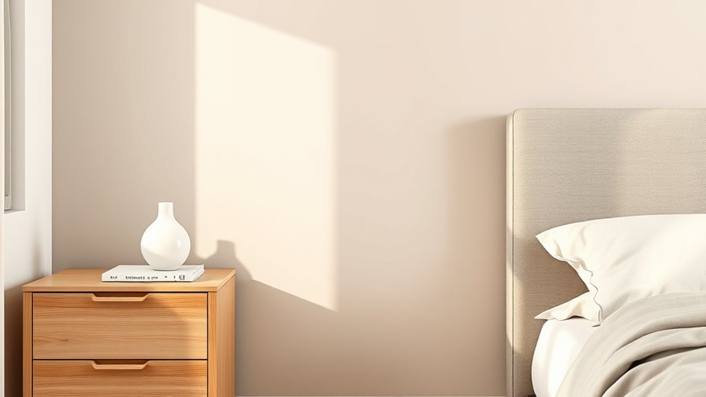
How Natural and Artificial Light Change Paint Appearance
How will the same paint color look different at 9 a.m. versus 9 p.m.? You’ll notice natural morning light is cooler and brighter, revealing subtle undertones and emphasizing paint texture.
Morning light is cooler and brighter, revealing undertones and texture that evening bulbs will soften and mute.
Midday sun increases light intensity, making colors read truer and highlights sharper.
As evening arrives, warm artificial bulbs soften hues, deepen shadows, and can mute cooler tones. Different fixtures—LEDs, incandescents—shift warmth and saturation, so consider bulb temperature when choosing finishes.
Matte finishes hide flaws and absorb light, appearing richer in low light, while eggshell or satin reflect more, seeming lighter.
Test in both natural and artificial conditions before deciding.
Best Test Methods: Swatches, Sample Pots, and Patches
Because lighting, finish, and surrounding décor all change how paint reads, you should always test colors at full scale before committing. You’ll want swatches, sample pots, and patched sections so you can judge hue, sheen, and feel in situ. Remember color psychology when choosing tones—observe how they affect mood in your actual room.
Use small patches across different walls, layer sample pots for blended looks, and keep ventilation on during drying to avoid fumes and altered appearance. Check painted patches after they fully cure for true color and finish before buying full cans.
- Try vertical and horizontal patches
- Test with real furniture nearby
- Note dry-time changes
How to Evaluate Paint Under Morning, Afternoon, and Night Light
When you test paint, check it in the morning to see how cool, soft light brings out undertones.
Revisit the same swatch in the afternoon to note any warm shift from stronger sunlight.
Finally, view the color at night under your bedroom lighting to judge how hues read when natural light is gone.
Morning Light Effects
Although morning light is soft and cool, it reveals a paint’s true undertones and can make warm hues look subdued while cool tones appear brighter. Stand in your bedroom at sunrise and view paint samples on different walls to see which shades read as you expect.
Morning glow highlights subtle pigments, and light diffusion through curtains changes contrast. You’ll notice blues pop and creams mute. Test paired trim and textiles.
Consider sheen: flat hides imperfections, eggshell reflects a bit. Make notes each morning for several days to account for weather and seasonal angle.
- Compare samples on north and east walls
- Observe with curtains open and closed
- Photograph at the same time each day
Afternoon Color Shift
If you want a paint to behave consistently, check it in the afternoon light—direct sun and warmer daylight will deepen warm hues and soften cool ones, revealing contrasts you might not have seen at sunrise. You’ll notice an afternoon color shift that alters perceived paint temperature; walk around the room, view from corners, and test large swatches. Use neutral bedding and furniture to judge true effect. Record observations and photos for comparison. The table below helps you note changes quickly.
| Area | Observed Hue | Paint Temperature |
|---|---|---|
| North wall | ||
| South wall | ||
| East wall | ||
| West wall |
Nighttime Hue Perception
You’ve seen how afternoon sun shifts warmth and softens cool tones, and now check how colors behave after dusk. You’ll notice a Nighttime hue often looks deeper and less saturated; artificial light causes a clear perception shift, so test paint swatches under multiple bulbs.
Walk the room at night and early morning, comparing how white balance and shadows alter mood. Consider these quick checks:
- View swatches under warm incandescent or warm LED to see cozy depth.
- Use cool LED to reveal muted, bluish undertones at night.
- Observe with lamps on and off to gauge contrast and shadow play.
Make choices that suit real living.
Primer Basics: When Bedrooms Need a Primer
When should you skip primer and when is it essential? You can skip primer when painting the same color or a slightly different shade on smooth, well-adhered finishes.
Use primer if you’re covering bold colors, repairing patches, or dealing with uneven wall texture after paint removal. Primer evens porosity, guarantees uniform sheen, and improves adhesion on new drywall or bare plaster.
If surfaces are glossy, stained, or previously water-damaged, prime first. Spot-prime patched areas to avoid flashing.
Choose a latex primer for general use; pick an oil-based or specialty primer only when specific adhesion or sealing needs require it.
Stain‑Blocking Primers and When to Use Them
Because stains can bleed through even the best topcoats, you’ll want a stain‑blocking primer whenever walls show water marks, smoke discoloration, grease, or tannin seepage from wood trim. You’ll use these primers to lock stains, improve adhesion, and create a neutral base so your chosen hues and color psychology read true.
Apply with consistent paint application—brush for edges, roller for fields—and let dry fully before topcoating.
Choose oil‑based or shellac primers for severe staining; water‑based for light jobs. Consider odor, ventilation, and drying time when planning a bedroom repaint.
- Seal stains promptly
- Improve topcoat attachment
- Maintain intended color psychology
Best Primers for Covering Dark Paints and Repairs
If you’re covering dark paint or blending patched repairs, pick a primer formulated for high-hide performance so you don’t waste coats or time. Choose a high-opacity, stain-blocking primer—usually shellac- or oil-based for stubborn colors and tannins, or a premium acrylic high-hide for easier cleanup.
Test adhesion on patched areas and sand glossy spots first. For sustainable projects, seek products labeled eco friendly finishes or low-VOC formulas that still offer strong coverage.
If you plan decorative accents, pair the primer with vintage paint techniques for authentic depth. Follow manufacturer dry times before topcoating to guarantee uniform results.
How Many Coats Do Bedroom Walls Need?
Before you start rolling, consider how well the walls are prepped—patches, stains, and texture can change how paint sticks and covers.
Your choice of paint (primer/paint combo, sheen, and pigment load) also affects coverage and whether one coat will do.
Generally you’re looking at one to three coats depending on prep and paint type, so plan accordingly.
Surface Preparation Need
When you’re deciding how many coats your bedroom walls need, consider the paint’s opacity, the wall’s current color and condition, and the finish you want. Most rooms require two coats for even coverage and durability.
You should assess surface contamination and address stains, grease, or dust before painting.
Check for moisture control issues—fix leaks and allow drying to prevent peeling.
Prep includes patching holes, sanding rough spots, and priming bare or repaired areas.
Proper prep reduces coats needed and improves finish longevity.
- Clean surfaces thoroughly
- Repair and sand imperfections
- Prime problematic areas
Paint Type Influence
You’ve prepped the walls, so now consider how the type of paint affects coat count: high-quality, high-opacity paints often cover in one coat, while lower-quality or low-hide paints usually need two or more.
You’ll find matte and eggshell hide differently than satin or semi-gloss, so pick finish by room use and desired durability.
If you’re choosing eco-friendly finishes, expect some low-VOC formulations to vary in opacity, so test samples.
For restorations or period rooms, match historical color schemes and sample before committing.
Always test a small area to confirm coverage and color under your room’s light.
Number Of Coats
Typically, two coats of paint will give bedroom walls a consistent, durable finish, but the exact number depends on factors like paint quality, color change, and wall texture.
You’ll usually need two coats for mid-to-high-quality paints; a drastic color shift or porous surface may require a third.
Consider primer to reduce coats and enhance color psychology effects.
When finishing, store leftover paint responsibly for touch-ups or paint recycling programs.
- Use primer for deep color changes
- Inspect walls after drying for thin spots
- Save labeled leftovers for touch-ups or recycling
Estimating Paint Quantity for Common Bedroom Sizes
Estimating how much paint you’ll need for a bedroom is simple once you measure wall area and account for windows, doors, and coats. Measure perimeter times height, subtract openings, then divide by coverage per gallon (typically 350–400 sq ft).
For a small 10×10 with 8-ft ceilings, one gallon covers two coats. Medium 12×12 needs about 2–3 gallons. Large 14×16 might need 3–4.
Factor in primer if walls are raw or drastically color-changing. Remember color psychology and paint texture choices may affect coverage—matte can hide flaws but needs more, while satin reflects more light and can stretch a gallon’s effective coverage.
Budget-Friendly Bedroom Paints That Still Perform Well
When money’s tight but you still want durable, attractive walls, you can find several budget-friendly paints that deliver solid coverage and easy cleanup. You’ll choose affordable latex or acrylic blends with satin or eggshell finishes for durability and simple maintenance.
Consider how Color psychology influences mood when picking tones, and plan furniture coordination to guarantee cohesion without pricey samples. Test small swatches to confirm light and texture.
Think about color psychology when choosing tones, plan furniture to ensure cohesion, and test swatches for light and texture.
- Look for reputable store brands with good reviews.
- Choose mid-tone neutrals to hide imperfections.
- Use primer only where needed to save money.
Higher-End Paint Benefits: What You Pay Extra For
Although higher-end paints cost more upfront, they give you better coverage, truer color, and longer-lasting finishes so you repaint less often. You’ll notice smoother application, richer pigments that honor color psychology, and fewer coats to reach the shade you envisioned.
Premium formulas often include low-VOC or eco-friendly options, so you can prioritize indoor air quality without sacrificing performance. You’ll also get improved stain resistance and easier cleaning, meaning touch-ups are simpler.
Choosing higher-end paint is an investment in appearance and comfort: you spend more now to enjoy more accurate hues and a healthier bedroom environment longer.
Durability: Scuff Resistance and Lifespan Expectations
How long will your bedroom paint actually hold up under daily wear and occasional bumps? You’ll want products with proven scuff resistance and strong color durability so touch-ups are rare. Choose finishes designed for low-impact rooms—some eco friendly finishes now match performance of traditional options.
Expect higher-quality paints to resist marks and fading for 8–15 years depending on light exposure and traffic. Consider surface prep and primer; they extend lifespan. Pick a finish that balances appearance with durability for your routine.
- Look for scuff-resistant formulations
- Prefer paints with documented color durability
- Use eco friendly finishes when possible
Washability: Best Bedroom Paints for Regular Cleaning
If you want bedroom walls that stay fresh after spills, fingerprints, or the occasional crayon mark, pick paints labeled for washability or scrubbability and pair them with a good primer.
You’ll want satin or eggshell finishes for bedrooms—more forgiving than flat yet easy to wipe. Test-clean a hidden patch to confirm resistance to mild detergents and abrasion.
Consider eco friendly options if indoor air quality matters; many low-VOC washable paints exist.
Remember color psychology: darker tones hide marks but show dust, while lighter hues reveal stains sooner.
With proper prep, you’ll clean walls without repainting prematurely.
Eco Certifications: What Green Seal and Greenguard Mean
When you’re choosing paints labeled as “green,” look for third-party certifications like Green Seal and GREENGUARD that verify low chemical emissions and safer ingredient profiles. You’ll want eco certifications to guide healthy choices, especially if you’re focused on green building or a low-impact bedroom.
Certifications confirm independent testing and ongoing compliance, so you get consistent performance and reduced indoor pollutants without guessing.
- Green Seal: verifies product chemistry and environmental impact.
- GREENGUARD: focuses on chemical emissions and indoor air quality.
Use both: they complement each other for greener, safer paint choices.
Understanding VOC Ratings and Label Claims
Having eco certifications like Green Seal or GREENGUARD helps, but you’ll still want to read VOC ratings and label claims to understand real indoor-air impacts.
You should check measured VOC levels (grams per liter) and note whether ratings reference wet or dry state.
Know local VOC regulations, since allowable limits vary and affect product availability.
Look for transparent label compliance statements detailing test methods, limits met, and certifier names.
Beware vague terms like “low odor” without numbers.
Ask retailers for technical data sheets when unsure.
That way you’ll choose paint that genuinely minimizes off-gassing in your bedroom.
Color Families That Work Best in Bedrooms
When you pick bedroom paint, start with soft neutrals and crisp whites to keep the space light and flexible.
Consider calming blue variations to promote rest and make the room feel cooler.
If you want cozier warmth, try warm earthy tones that add depth without overwhelming the space.
Soft Neutrals And Whites
Though you might think bold colors bring personality, soft neutrals and whites create the calm foundation bedrooms need. You’ll choose shades that reflect light, blend with textiles, and make the room feel larger. Opt for low-VOC formulas to reduce paint odor and preserve air quality, especially if you love vintage finishes on furniture.
Neutrals let you layer texture and pattern without competing for attention.
- Use warm whites to cozy a north-facing room.
- Pick greige for a modern, versatile backdrop.
- Try soft taupe to ground wood tones and linens.
Calming Blue Variations
If you want a bedroom that soothes and anchors at once, turn to calming blues—muted sky, dusty denim, and soft teal all help lower stress and encourage sleep.
Choose matte or eggshell sheens to minimize glare and highlight subtle wall texture without overwhelming the room. Pair blues with crisp trim or soft linens to keep the palette fresh.
Test swatches at different times of day to see undertones and how light shifts color.
If you’re repainting, plan for careful paint removal from trim or affected surfaces to guarantee clean lines.
Blues feel restorative and versatile for bedrooms.
Warm Earthy Tones
After cooling blues settle the mood, warm earthy tones bring the room back to grounded comfort—think clay, terracotta, ochre, warm taupe, and mossy olive.
You’ll create a cozy, enveloping space by pairing these hues with earthy accents and natural textures like woven rugs, wooden furniture, and linen bedding.
Choose a dominant warm neutral, then layer deeper accents to add depth without overwhelming rest.
Use matte or low-sheen finishes to enhance warmth and hide imperfections.
Consider light direction and room size when picking saturation to keep the space airy yet intimate.
- Layer texture for interest
- Balance saturation with light
- Add subtle accent walls
Accent Walls: When to Paint One and What Finish to Use
When you want to add personality without repainting the whole room, an accent wall can create focus, depth, or drama with minimal effort. Choose a wall behind the bed or a focal architectural feature.
Use color psychology to pick hues that energize or soothe—deep blues for calm, warm ochres for coziness.
Finish matters: eggshell or matte hides imperfections and feels cozy; satin adds subtle sheen and is easier to clean; high-gloss suits small focal trims or bold panels.
Consider paint texture—smooth for modern spaces, subtle texture for warmth.
Keep other walls neutral so the accent truly stands out.
Trim and Ceiling Paint Choices to Complement Walls
Although trim and ceiling paint might seem secondary, they dramatically shape how your wall color reads and how the room feels. Choose crisp white or a soft off-white for trim to frame walls and make accent walls pop; consider a satin or semi-gloss for durability.
Trim and ceiling choices subtly redefine a room—pick crisp whites and satin or semi-gloss trim for durability and impact
For ceilings, pick flat or matte to minimize glare and hide imperfections, or a slightly lighter shade of your wall color for cohesion. If you use textured finishes on walls, keep trim smooth to balance visual weight.
Remember contrast levels—subtle contrast feels calm; high contrast feels energetic.
- Use semi-gloss trim for easy cleaning
- Keep ceiling matte to hide flaws
- Match trim undertones to wall paint
Coordinating Paint With Flooring and Textiles
Because your floors and textiles set the room’s base layer, pick wall paint that connects rather than competes—pull a subtle undertone from wood grain, tile, or rug fibers to create harmony, or choose a contrasting hue to highlight pattern and texture. Consider color psychology to match mood: warm woods suit cozy neutrals; cool tiles welcome soft blues. Test swatches near baseboards and textiles in different light. Confirm paint ventilation during application and drying. Use the table below to compare approaches.
| Flooring | Textile Cue | Paint Strategy |
|---|---|---|
| Oak | Wool rug | Warm beige |
| Tile | Linen | Soft gray-blue |
| Concrete | Cotton | Muted taupe |
| Pine | Patterned | Accent color |
Paint Options for Rented Bedrooms and Temporary Solutions
If you’re renting or want a short-term refresh, peelable temporary paint gives you bold color without risking your deposit.
You can also use removable wallpaper for patterns and texture that come off cleanly when it’s time to move.
For an easy, nonpermanent touch, try washi-tape murals, stick-on trim, or freestanding accent panels to change the vibe without painting.
Peelable Temporary Paint
Looking for a renter-friendly way to change your bedroom color without committing or risking your deposit? Peelable finishes offer a smart solution: they apply like paint, dry to a removable film, and come off cleanly when you need the original wall back.
Temporary coatings let you experiment with bold hues, accents, or seasonal looks without sanding or primers. You’ll appreciate fast application and low-odor formulas designed for rented spaces.
Consider these tips:
- Test a small patch for adhesion and ease of removal.
- Choose water-based peelable finishes for cleaner removal.
- Follow manufacturer cure-time instructions to avoid residue.
Removable Wallpaper Options
Want a big style change that won’t cost your deposit? Removable wallpaper lets you transform rented bedrooms quickly without damaging walls.
You can pick subtle textures, bold patterns, or faux panels to complement vintage furniture or modern pieces.
Installation is straightforward: clean surfaces, align panels, and smooth bubbles; removal peels off cleanly when you move.
Use patterns to frame wall art or create a focal wall behind the bed.
Choose high-quality, low-tack adhesive options rated for drywall.
Test a small strip first to guarantee compatibility, then enjoy a stylish, temporary update that’s renter-friendly and reversible.
Nonpermanent Accent Techniques
When you’re renting but crave a fresh, painted look, nonpermanent accent techniques let you change a room without risking your deposit. You can layer peelable paints, removable decals, or temporary panels to mimic painted features.
Focus on contrast, simple patterns, and how wall textures and lighting effects interact to avoid heavy commitment. Try techniques that remove cleanly and won’t damage drywall.
Coordinate with trim and furniture so accents feel intentional. Experiment small before committing, and keep tools for touch-ups handy.
- Peelable paint for focal stripes
- Removable fabric panels for texture
- Decals to simulate moldings and art
Best Paint Brands and Lines for Bedroom Walls
Because your bedroom needs both durability and the right finish, choosing the best paint brand and line matters more than you might think. You’ll want paints that balance color psychology with eco friendly formulations so your space feels restful and safe. Consider lines known for low-VOC, true pigments, and washable finishes.
| Brand | Notable Line |
|---|---|
| Benjamin Moore | Natura, Regal Select |
| Sherwin-Williams | Emerald, SuperPaint |
| Behr | Premium Plus, Marquee |
Pick based on finish preference (eggshell for bedrooms), warranty, and odor levels to suit your needs.
Testing Durability and Color Before Committing to a Brand
Before you commit to a brand, put up sample paint patches on different walls to see the color in morning and evening light.
Rub and wash those patches after they dry to check for scuff resistance and colorfastness.
That quick testing will save you from surprises and repainting later.
Sample Paint Patches
Although swatches hint at color, you should always apply sample paint patches to your walls to see true hue and finish in your room’s light and to test durability under real conditions.
You’ll observe how color psychology shifts with morning and evening light, and how paint texture reads up close. Apply small 12×12-inch patches in multiple spots: near a window, by a lamp, and on an accent wall.
Live with samples for several days, noting perceived warmth, gloss, and how surfaces reflect light. This hands-on check helps you pick a shade and finish you’ll actually enjoy and trust.
Wear And Wash Tests
Once you’ve lived with sample patches long enough to judge color and finish, put the paint through a wear-and-wash test to see how it withstands everyday life.
Rub a damp cloth on a hidden patch, scrub gently, then more firmly to mimic kids, pets, and movers. Note scuffs, color shift, and sheen loss.
Try mild detergent and water, then a restorative wipe for stains.
Test textured areas to confirm wall texture techniques don’t trap grime or shed when cleaned.
Prefer eco friendly finishes? Confirm durability matches claims.
Record results before committing to a brand for the whole room.
Common Painting Mistakes That Ruin Bedroom Results
If you rush prep work or skip the right tools, you’ll quickly see how small mistakes turn into big, visible problems on bedroom walls. You’ll pick a color without considering color psychology or ignore furniture coordination, creating clashes that feel off. Skipping primer, using low-quality rollers, or painting in poor light leaves streaks and uneven coverage.
Rush prep or skip tools and small mistakes become glaring—wrong color, poor primer, bad light, streaky walls.
- Not testing swatches in different light
- Skipping primer on patched or dark walls
- Using glossy finishes where you wanted matte
Avoid these errors, plan with your room’s function in mind, and your paint will flatter both mood and furnishings.
Quick Fixes: Touching Up Scuffs and Chips Without Repainting
When you spot scuffs or small chips, you don’t need to repaint the whole wall—quick touch-ups can make the damage disappear fast. First, clean the area with mild soap and water, let it dry, and gently sand rough edges to match surrounding wall texture.
Use leftover paint or a matched sample, applying thin coats with a fine brush or foam applicator. Feather edges to blend; let each coat dry fully to avoid noticeable overlap.
Ventilate the room to minimize paint fumes and wear a mask if sensitive. For larger damage, fill and sand before painting.
When to Call a Pro vs DIY for Bedroom Painting
Deciding whether to tackle bedroom painting yourself or hire a pro comes down to scope, skill, and schedule.
Deciding whether to paint your bedroom yourself or hire a pro depends on scope, skill, and timing.
You can DIY if walls are smooth, damage is minor, and you’ve got time and basic tools.
Call a pro for complex wall texture, high ceilings, or uneven plaster.
Pros also manage paint storage, disposal, and color matching.
- DIY: saves money, good for simple rooms.
- Pro: faster, better finish on tricky surfaces.
- Hybrid: hire for prep, do finish coats yourself.
Weigh cost, safety, and desired outcome before committing to either route.
Maintenance Schedule: When to Repaint or Refresh Walls
Because bedroom walls show wear at different rates, you should follow a simple schedule to know when to repaint or just freshen up with touch-ups. Inspect annually for scuffs, fading, or stains.
High-traffic rooms need repainting every 3–5 years, low-traffic every 7–10. Touch up chips and marks as they appear to extend intervals.
If your paint boasts superior outdoor durability or moisture resistance, expect longer life. Choose eco-friendly options to reduce fumes during touch-ups and full repaints.
Keep a record of paint type, sheen, and color code so future refreshes match perfectly.
Final Checklist: Choose the Perfect Paint for Your Bedroom
Although you’ve weighed color, sheen, and durability, this final checklist helps you confirm the last essentials before buying paint.
Check wall texture—rough surfaces need thicker or textured formulas; smooth walls can use standard finishes.
Test samples on multiple walls and view in daylight and evening light.
Confirm paint ventilation for application and drying; plan fans or open windows and consider low-VOC options for health.
Measure area to buy enough and allow for touch-ups.
Review warranty and return policy.
- Test sample swatches in room corners
- Verify finish against furniture and trim
- Confirm ventilation plan and cleanup supplies
Frequently Asked Questions
Can I Paint Bedroom Walls Myself in a Rented Apartment Without Losing My Deposit?
Yes — you can, but check lease and landlord approval first. Use DIY painting tips, neutral colors, drop cloths, low-VOC paint, and follow rental apartment restrictions; you’ll avoid deposit issues by restoring original color if required.
How Long Should I Wait Between Coats to Prevent Roller Marks?
Wait about two to four hours between coats to prevent roller marks; check paint drying time on the can. Use a light brush technique to cut in edges, keep a wet edge, and avoid heavy overlapping for smooth results.
Can I Mix Two Paint Colors to Create a Custom Shade Safely?
Yes—you can mix two paint colors to create a custom shade; practice color mixing on a small batch, record ratios, and follow paint safety by using proper ventilation, gloves, and compatible paint bases to avoid settling or adhesion problems.
What’s the Best Way to Remove Adhesive Residue Before Painting?
Like peeling tape off a sun-warmed apple, you’ll soften residue with warm soapy water, then use adhesive remover or rubbing alcohol for stubborn bits. You’ll finish with gentle sanding for smooth wall prep before priming and painting.
Are There Paint Options That Reduce Nighttime Glare From Screens?
Yes — you can choose matte finishes that offer glare reduction; they absorb light, cutting reflections from screens and creating a calmer nighttime environment, so you’ll see less shine and enjoy more comfortable, low-glare walls.
Conclusion
You’ve got the facts—now pick the paint that fits your light, budget, and lifestyle, because a stitch in time saves nine. Go matte to hide flaws, eggshell for durability and easy cleaning, or satin for a subtle sheen in high-traffic rooms. Touch up small scuffs, repaint when colors fade or damage builds, and call a pro for tricky prep or large jobs. Trust your judgment and enjoy your refreshed, comfortable bedroom.