What’s the Best White Paint for Walls? Top Picks
You’ll usually get the cleanest, most versatile result with a true white like Benjamin Moore’s Chantilly Lace or a neutral option from Sherwin‑Williams, Behr, or Farrow & Ball. Pick warm whites for cozy bedrooms and cool, crisp whites for active zones or modern looks. Test swatches in the room and check undertones against your furnishings and light direction. Choose eggshell for walls and gloss for trim for durability. Keep going to see room-specific picks and testing tips.
Quick Answer: Best White Paint for Walls
If you want one quick recommendation, go with Benjamin Moore’s Chantilly Lace for a clean, true white that works in most rooms. You’ll find it’s versatile, bright, and pairs well with warm or cool accents.
For other options, check popular brands like Sherwin-Williams, Farrow & Ball, and Behr; each offers whites with subtle undertones.
Keep an eye on white paint trends—soft warm whites and crisp cool whites alternate in popularity, so pick what complements your lighting and furnishings.
You’ll save time by sampling swatches on your walls before committing to a full gallon.
Quick Guide: Choose a White by Room Goal
When choosing a white for each room, start with the room’s purpose and natural light—those two factors will determine whether you want a warm, cool, or neutral white.
For restful spaces, choose warm whites to promote comfort; for active zones, pick crisp, cool whites to boost focus—white color psychology matters.
In small rooms, lighter neutrals expand visual space; in large rooms, richer whites add coziness—room size influence guides contrast.
Kitchens benefit from clean, slightly cool whites for brightness; bedrooms favor soft, warm whites for calm.
Test samples on several walls before committing to verify the mood and scale feel right.
How Light and Direction Change White Paint
Because light shifts throughout the day and comes from different angles, the same white paint can read warm, cool, or flat depending on exposure. You’ll notice north-facing rooms tend to pull blues into whites, while south- and west-facing rooms warm them up.
You should test samples at different times to see how light intensity alters color perception. Place large swatches on multiple walls and observe morning, midday, and evening light.
Overhead fixtures, shaded corners, and reflective surfaces all change how white reads. By checking in varied conditions, you’ll pick a white that behaves predictably in your specific space.
Undertones: Warm vs Cool and What to Pick
Think about whether you want a warm or cool undertone, because that tiny hint of beige or blue changes a room’s feel.
Match the undertone to your light — warm morning sun will make cool whites look icy, while north-facing rooms benefit from warmer whites.
Test swatches on your walls at different times so you’ll know how the color reads in your actual light.
Warm Vs Cool Undertones
If you want your room to feel cozy or crisp, start by identifying whether your white paint leans warm (yellow, beige, or pink undertones) or cool (blue, green, or gray undertones); that subtle bias will change how other colors and light read in the space. You’ll pick warm undertones to soften wood and add warmth, and cool undertones to sharpen modern palettes. Test samples on different walls. Compare against furniture and fabric before committing.
| Feature | Warm Undertones | Cool Undertones |
|---|---|---|
| Feel | Cozy | Crisp |
| Best with | Natural wood | Sleek metals |
Matching Light Conditions
When natural light shifts throughout the day, it changes how a white’s undertone reads, so you’ll want to match paint to your room’s dominant lighting rather than to a paint chip under store lights.
Consider the direction your room faces: north-facing rooms get cooler, softer natural light, so lean toward warm whites to avoid a blue cast. South-facing rooms get stronger, warmer light and can handle cooler whites.
Also note light intensity—bright rooms reveal subtle undertones, while dim rooms mute them.
Test full-size samples at different times to see how undertones react to your real-life natural light.
Paint Base & Pigments: Why They Change White
Although white looks simple at first glance, the paint base and pigments you choose determine its final tone and performance, so you’ll want to understand the differences before you buy.
You’ll notice pigment variations drive undertones—cool blues, warm yellows, or neutral grays—so swatch in your room.
The paint formulation matters too: water-based acrylics dry quicker and resist yellowing; oil-based alkyds level nicely but can amber over time.
Fillers, binders, and TiO2 concentration affect opacity and coverage.
Consider VOCs, durability, and touch-up ease when choosing.
Test samples on large patches to see real-world color and finish.
Which Sheen to Use : Walls, Trim, Ceilings
Choose the right sheen and you’ll balance appearance, durability, and ease of cleaning across a room.
For walls you’ll usually pick an eggshell or satin, while trim benefits from a glossier finish for crisp definition and wear resistance.
Keep ceilings flat or matte to hide imperfections and reduce glare.
Best Sheen For Walls
Picking the right sheen makes a bigger visual and practical difference than you might think: you’ll balance durability and appearance by choosing between matte, eggshell, satin, and higher-gloss options. For most rooms, eggshell or satin are ideal finishes — they hide imperfections while resisting scuffs. Consider traffic, lighting, and cleaning needs when evaluating sheen levels.
| Sheen | Best Use |
|---|---|
| Matte | Low-traffic, hides flaws |
| Eggshell | Living rooms, versatile |
| Satin | Kitchens, halls, washable |
| Semi-gloss | Durable, shows texture |
| Gloss | Accent, high-clean areas |
Trim And Ceiling Sheen
Now that you’ve got a feel for wall sheens, think about how trim and ceilings should contrast or blend with them.
You’ll usually pick a glossier trim sheen—satin, semi-gloss, or gloss—so moldings clean easily and pop against flat or eggshell walls.
For ceilings, stick to a flat or matte ceiling sheen to hide imperfections and reduce glare.
In kitchens or bathrooms you might choose a slightly higher ceiling sheen for moisture resistance, but keep it subtle.
Match overall finish levels to room function and lighting so white paints read consistent and intentional throughout your home.
Best White Paint for North-Facing Rooms
Why does the direction your room faces matter when you pick a white paint?
In north facing nuances, light is cooler and softer, so you’ll want whites that avoid blue or gray undertones that make spaces feel chilly. Choose warm whites with subtle cream or beige hints to balance the cool natural light and lift room ambiance.
Consider slightly higher reflectance for dimmer rooms, but avoid stark, clinical whites that emphasize shadows.
Test samples at different times of day on large swatches. That way you’ll see true color interactions and pick a white that feels inviting, not flat or cold.
Best White Paint for South-Facing and Sunny Rooms
In bright, south-facing rooms you’ll want whites with cool undertones to balance warm sunlight.
Pick paints with high light reflectance to keep the space feeling open without glare.
Also look for UV-resistant formulas so the finish and color stay true over time.
Cool Undertones Preferred
A cool white can tame the warm, golden light that floods south-facing and sunny rooms, so you’ll want paints with bluish, greenish, or slight gray undertones rather than warm creams.
Choose a cool white that balances brightness without feeling sterile; blue-leaning whites feel crisp, green-leaning whites read calming, and subtle grays add sophistication.
Think about color psychology: cooler neutrals lower perceived temperature and soothe overstimulated spaces.
Test swatches at different times of day, focusing on how undertones shift with direct sun.
Pair cool whites with warm wood or metallic accents to keep the room inviting rather than icy.
High Light Reflectance
Since you’ve chosen a cool white to tame warm sunlight, next think about light reflectance: high-LRV (Light Reflectance Value) whites will bounce more daylight around the room, brightening shadows without adding warmth.
In south-facing, sunny spaces you’ll want high reflectance benefits to amplify natural light, reduce contrast, and keep surfaces looking crisp.
Pick paints with documented LRVs and test swatches at different times of day to gauge color temperature impact; cooler whites can appear bluer in direct sun.
Balance sheen and finish to control glare, and layer samples on large boards so you’ll see true performance before committing.
UV-Resistant Formulas
Because south-facing rooms get intense sun, pick white paints formulated for UV resistance so they won’t yellow, chalk, or break down over time.
You’ll want coatings labeled uv resistant finishes or those containing UV stabilizers and pigments designed to maintain brightness.
Choose a durable satin or semi-gloss for trim and high-traffic walls; flat sheens can still work if UV-rated.
For sun-drenched exteriors or sunrooms, use products rated for outdoor applications to guarantee long-term color stability and film integrity.
Prep and prime properly, follow manufacturer cure times, and expect longer-lasting whiteness with purpose-built UV-protective formulas.
Best White Paint to Make Small Rooms Feel Bigger
Want small rooms to feel larger without knocking down walls? Choose bright, cool whites with subtle blue or green undertones to reflect light and open sightlines.
Use space enhancing techniques: paint ceilings a shade lighter than walls, keep trim crisp white, and extend the same color onto woodwork to blur edges.
Paint ceilings lighter than walls, keep trim bright white, and carry wall color onto woodwork to blur edges and open the space.
Pair with minimal, low-profile furniture and illusionary decor like vertical stripes or glossy finishes that bounce light.
Matte walls reduce glare but still benefit from strategic lighting.
You’ll create airy, continuous spaces that feel less boxed-in, making compact rooms appear noticeably bigger without structural changes.
Best White Paint for Cozy, Warm Living Spaces
Looking to make your living space feel warm and inviting? Choose whites with subtle undertones—creamy, beige, or soft gray—that complement cozy textures and let warm accents pop.
You’ll want paints that create a relaxed backdrop without feeling flat. Consider sheen for easy cleaning and light reflection. Test samples in morning and evening light to see undertones shift.
- Try samples with warm beige undertones for layered comfort.
- Pair soft whites with wood tones and plush textiles.
- Use warmer whites on walls and a slightly lighter white on trim.
These choices help you craft a snug, lived-in room.
Best White Paint for Crisp, Modern Minimal Interiors
For a crisp, modern minimal interior you’ll want clean, cool whites that feel bright without being harsh.
Choose low-reflective finishes to keep surfaces understated and reduce glare.
Pay close attention to undertone coordination so your white reads consistent against floors, trim, and metal accents.
Clean, Cool Whites
If you’re aiming for a crisp, modern minimal look, cool whites give you clean, airy walls without feeling sterile.
You’ll pick shades with slight blue or green undertones that keep rooms bright and calm, and you’ll rely on bright finishes where appropriate to enhance subtle contrasts.
Pay attention to color balance against flooring and textiles so whites won’t read too cold.
Choose samples, test them at different times, and prefer paints that render true undertones in real light.
- Try a soft blue-white for north-facing rooms.
- Pair cool white with warm wood accents.
- Test swatches at multiple times.
Low-Reflective Finishes
When you want walls that read crisp without glare, choose low-reflective white finishes that mute shine and reveal texture. You’ll appreciate how subtle light diffusion softens contrasts, keeping rooms calm and modern. These finishes highlight texture impact—plaster, linen, or brushstrokes—so you’ll balance smooth planes with tactile interest. Matte or eggshell sheens work best for minimal interiors, hiding imperfections while maintaining depth. Use low-reflective whites where you want understated sophistication and controlled brightness; they perform well under varied lighting and photograph cleanly.
| Finish | Benefit |
|---|---|
| Matte | Minimal sheen, hides flaws |
| Eggshell | Slight luster, durable |
Undertone Coordination
Low-reflective finishes set the stage, but undertone coordination determines whether your whites read crisp or lukewarm in modern minimal interiors.
You’ll want to assess undertone impact against flooring, trim, and lighting so whites stay vibrant, not muddy. Test large swatches, observe them at different times, and note how artificial light shifts warmth.
Aim for consistent color harmony across connected rooms to maintain that clean, pared-back feel. Keep contrasts subtle: pick whites that complement rather than compete with adjacent materials.
- Test swatches on multiple walls
- Compare with trim and floors
- Observe under morning and evening light
Budget-Friendly White Paints That Perform
Although you might expect premium price tags to guarantee crisp results, plenty of budget-friendly white paints deliver durable coverage, easy touch-ups, and true-to-swatch tones; pick the right formula, and you’ll get professional-looking walls without overspending.
You’ll find affordable options from national brands that balance hide, flow, and stain resistance. Look for paints with higher pigment load and washable finishes; test swatches in your light before committing.
In a quick performance comparison, prioritize one-coat coverage and low VOCs. Buy small sample sizes, paint a 2×2 foot patch, and evaluate after drying to confirm the white reads correctly in your space.
Midrange White Paints With Pro-Level Results
Midrange white paints give you pro-level results without the contractor-only price tag, offering richer pigment, smoother flow, and better hide than budget options.
You’ll find midrange options that balance durability and ease of application, so your walls look crisp with fewer coats. Choose paints with good tinting stability and low VOCs for safer, truer whites.
Expect consistent coverage and simpler touch-ups, plus finishes that read like pro level finishes in photos and real life.
- Better coverage per coat reduces labor and time.
- Improved leveling minimizes brush and roller marks.
- Reliable color consistency across batches.
Premium White Paints Worth the Splurge
When you opt for premium white paints, you’ll notice richer pigment quality that stays true over time.
They give a long-lasting finish that resists yellowing and holds up to cleaning.
That professional-level coverage means fewer coats and a smoother, more consistent result.
Luxe Pigment Quality
Think of luxe pigment quality as the difference between a good coat and a showroom finish—you’ll notice depth, richness, and consistency the moment the paint goes on.
You want pigments that create a luxe texture, reflect light evenly, and resist banding so walls feel intentional. Luxury finishes rely on pigment concentration and grind—higher-quality mills yield smoother, truer whites.
Choose paints that balance tinting strength with subtle undertones so your room reads as clean, not flat. Consider application tools and primer compatibility to maximize effect.
- Higher pigment load for depth
- Even reflectance for true white
- Smooth application for showroom results
Long-Lasting Finish
Investing in a premium white means you’ll get a finish that stays crisp longer—resisting yellowing, scuffs, and frequent touch-ups—so your walls look fresh without constant maintenance.
You’ll notice a clear durability comparison when you test samples: higher-end formulas resist abrasion, cleanability, and fading far better than budget options.
Pick based on finish types—eggshell for subtle sheen and wipeability, satin for higher traffic, semi-gloss where moisture or stains matter.
Premium binders and UV inhibitors justify the cost by prolonging appearance and reducing repaint cycles.
Spend more now to save effort and keep rooms bright longer.
Professional Coverage Benefits
You’ll notice professional-grade whites cover more uniformly with fewer coats, so you spend less time painting and avoid patchy, streaky walls.
You’ll get professional results that justify the price: richer pigments and superior binders hide flaws, resist yellowing, and make touch-ups nearly invisible.
Follow expert recommendations when choosing sheen and base for your room’s lighting and traffic.
You’ll also appreciate faster dry times and better flow, which cut labor and frustration.
- Better hide and opacity
- Easier application and smoother finish
- Longer-lasting color fidelity and durability
Low‑VOC and Eco-Friendly White Paint Options
While low‑VOC and eco‑friendly whites often cost a bit more upfront, they keep indoor air cleaner and reduce off‑gassing for weeks after painting.
You’ll want eco friendly options that still deliver good coverage, fade resistance, and easy touch-ups. Look for certifications like GreenGuard or EPA Safer Choice and check VOC levels listed on labels.
Sustainable brands tend to use recycled packaging and lower‑impact pigments, so compare sheen and durability rather than assuming lower performance.
Test samples on your walls to confirm color and adhesion.
Prioritize ventilation during application and allow longer cure times for best results.
White Paints That Hide Imperfections (And Which to Avoid)
If your walls have dings or uneven texture, consider high‑build formulas that level and fill as you roll.
You’ll also want to weigh matte finishes, which mask flaws better than eggshell, against eggshell’s easier cleaning.
And don’t forget paint‑and‑primer combos—some hide imperfections well, while others need extra sanding or a true primer to perform.
High-Building Paint Options
Because thicker white paints fill and mask tiny surface flaws, they’re the best choice when you want walls to look smooth without extensive prep. You’ll prefer high opacity formulas that spread evenly and create uniform color while minimizing visible repairs.
Choose products with durable finishes so scuffs clean up and trim lasts longer. Avoid ultra-thin budget whites that highlight bumps and seams.
- Pick a high-build primer and matching topcoat for one-step coverage.
- Test small sections to confirm hide and leveling before committing.
- Skip heavy textures; they defeat the smoothing benefit of high-build paints.
Matte Versus Eggshell
When you want to hide small dents and seams, matte finishes do a better job than eggshell because they scatter light and mask surface flaws, whereas eggshell’s slight sheen can highlight bumps and touch-ups; choose matte for problem walls and eggshell when you need a bit more durability and washability. You’ll pick matte finish for low-sheen, forgiving coverage in living rooms or ceilings. Use eggshell sheen in higher-traffic areas where cleaning matters. Consider surface prep: smoother walls tolerate eggshell, textured or repaired walls benefit from matte. Match finish to function, not just appearance.
| Use case | Benefit | Drawback |
|---|---|---|
| Living room | Hides flaws | Less washable |
| Hallways | Durable | Shows bumps |
| Ceilings | Uniform | Hard to clean |
| Bedrooms | Cozy look | Marks easily |
| Bathrooms | Moderate | Moisture issues |
Paint And Primer Combined
Someone choosing a paint-and-primer combo expects faster coverage and fewer coats, but you’ll want to know which white formulas actually hide imperfections and which make them worse.
You’ll prefer flat or matte paint finishes when surfaces have bumps; they minimize glare and disguise flaws.
Avoid high-sheen combined paints on uneven walls — they highlight texture.
Consider primer types built for adhesion and stain-blocking if stains or repairs are present; some all-in-one products include these qualities but vary in opacity.
- Use matte paint-and-primer for patchy walls.
- Pick stain-blocking primer types when needed.
- Skip glossy combos on rough surfaces.
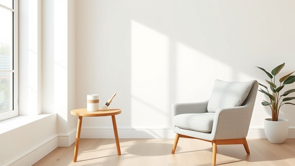
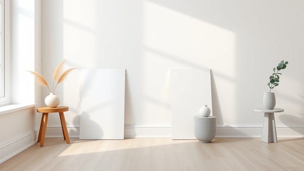
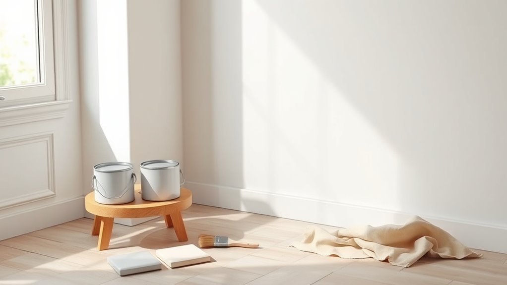
How to Test White Paint at Home: Samples & Painted Boards
If you want to know how a white will actually read in your space, test it with samples and painted boards before committing to a full can.
Buy sample pots or peel-and-stick paint swatches and apply at least two coats to sample boards so the color shows true. Move boards around the room, placing them near windows and typical sightlines.
Observe at different times of day and under artificial light. Label each board with brand and formula.
Live with the samples for several days—you’ll notice undertones and how the finish reacts. Choose the white that feels balanced and consistent.
How Lighting, Furniture, and Flooring Shift Your White
You’ve tested samples and seen how whites behave on boards; now look at the room itself, because lighting, furniture, and flooring will change how a white actually reads.
Consider real lighting effects and how natural or artificial light shifts color perception across walls. Your furniture impact alters perceived warmth or coolness, while flooring influence anchors the room atmosphere.
Balance these for design harmony and better space perception.
- Observe whites at different times to judge lighting effects and room atmosphere.
- Compare upholstery and wood tones to gauge furniture impact on color perception.
- Test with your flooring to guarantee aesthetic balance and design harmony.
Pairing Wall White With Trim, Baseboard, and Ceiling Colors
You’ll pick a wall white, then decide if you want crisp edges or soft shifts. Use a brighter, cooler white on wall trim to frame windows and doors for a clean, architectural look, or match slightly warmer trims for a unified, cozy feel.
For ceiling contrast, going one shade lighter opens the room; matching the ceiling to walls keeps focus horizontal.
Test swatches together in different light, and commit to what reads best throughout the day.
Common Mistakes When Choosing White Paint: And How to Avoid Them
Choosing a white paint seems simple, but small mistakes—like ignoring undertones, skipping large swatches, or relying on can colors alone—can leave a room feeling cold, muddy, or washed out; you’ll avoid that by understanding undertones, testing paints in actual light, and considering finish and trim relationships before you commit.
You should check samples on different walls and at different times, factor in furniture and flooring, and remember how color psychology shapes mood. Don’t assume one white fits all. Use consistent paint application tips and observe results before buying gallons.
- Test large swatches near windows and lights
- Compare whites with trim and upholstery
- Note warm vs cool undertones
Coverage, Primer Needs, and How Many Coats to Plan
Once you’ve settled on the right white, think about how much paint and prep you’ll need: coverage varies by paint quality, wall texture, and the undertone you’re covering. You’ll assess coverage factors, surface stains, and whether primer is needed. Use primer types suited to your substrate—stain-blocking for discoloration, bonding for glossy surfaces, or standard latex for new drywall. Expect 2 coats of quality paint over primer for most jobs; dark or deeply toned walls may need 3. Plan square footage, coat counts, and drying times so you buy enough paint and schedule prep efficiently.
| Surface | Primer Needed | Typical Coats |
|---|---|---|
| New drywall | Yes (standard) | 2 |
| Dark paint | Yes (stain-blocking) | 3 |
| Glossy | Yes (bonding) | 2 |
Quick Decision Checklist: Choosing Your Final White Paint
If you want a fail-safe finish, start by matching the white’s undertone to your room’s mood—cool blues for modern, warm creams for cozy—and test swatches in different light at several times of day.
Match a white’s undertone to your room—cool blues for modern, warm creams for cozy—and test swatches in varied light.
You’ll narrow choices faster by focusing on function, finish, and how white aesthetics interact with furnishings. Consider traffic, cleaning, and desired sheen before buying sample pots.
Use color psychology to decide if you want energizing crispness or calming softness.
Then follow this quick checklist to finalize confidently:
- Test three swatches on different walls and view morning vs. evening light
- Compare finishes for durability and maintenance
- Confirm undertone with textiles and trim
Frequently Asked Questions
Can White Paint Colors Yellow Over Time, and Why?
Yes — white paint can yellow over time; you’ll see white paint longevity affected by yellowing causes like UV exposure, nicotine, dust, low-quality binders, or heat. You’ll minimize it by choosing quality formulations and proper ventilation.
Are Tinted Whites Safe for Bathrooms and High-Humidity Areas?
About 60% of homeowners report early yellowing, so you shouldn’t assume safety—tinted whites can work in bathrooms if you pick mildew-resistant, high-quality formulas; choose paints labeled for bathroom durability and maintain ventilation to prevent problems.
How Do Exterior White Paints Differ From Interior Whites?
Exterior whites prioritize exterior durability, using UV-resistant, mildew-resistant formulas and tougher binders; interior whites focus on interior brightness, offering smoother sheens and easier cleaning. You’ll choose based on exposure, finish, and long-term protection needs.
Can I Paint Over Wallpaper With White Paint Safely?
Yes — you can paint over wallpaper, but juxtaposing smooth paint against textured seams shows risks: if you skip wallpaper removal, you’ll fight poor paint adhesion and trapped moisture, so prepare surfaces meticulously for lasting results.
Do White Paints Contain Allergenic Chemicals or Fragrances?
Yes — some white paints include allergenic chemicals and added fragrances, so you should practice allergen awareness; choose fragrance free options and low‑VOC or zero‑VOC formulations, test a small area, and ventilate while painting.
Conclusion
You’ve got options, and you’ll make the right one: pick a warm white for cozy rooms, a cool white for bright, modern spaces, and a neutral white when you want flexibility. Consider light, direction, and undertones; test samples on all walls; factor in base, sheen, and primer needs. Trust coverage numbers, plan coats, and coordinate trim and ceiling. Take your time, compare swatches, and commit once a sample looks right in every light.