Which Wall to Paint Dark? Design Tips
Pick the wall that frames your focal point — behind the bed, sofa, fireplace, or opposite the main window — to create drama, depth, or coziness. Choose a wall visible from entry paths to set the tone and anchor your layout. Use darker shades on the farthest wall to increase depth in small rooms, and sample swatches under natural and artificial light. Match furniture, finishes, and layered lighting for balance; keep going to learn room-specific tips and fixes.
Decision Framework: Choose Focal Point, Depth, or Coziness
Want your room to draw the eye, feel larger, or hug you with warmth? You decide by weighing three goals: focal point strategies, depth perception, and coziness.
If you want drama, paint the wall behind a bed or fireplace to anchor the view. To expand space, choose a darker shade on the farthest wall to boost depth perception; keep adjacent walls lighter.
For snug comfort, coat one enclosure in a rich tone while keeping the rest neutral so warmth reads intentional, not overwhelming.
Match your furniture and lighting to reinforce the chosen effect and keep proportions balanced.
When to Paint a Wall Dark: 5 Clear Reasons
You’ve picked whether you want drama, depth, or coziness—now decide when a dark wall will help. Use dark color psychology to set mood: pick a wall when you want an intimate lounge, a dramatic focal point, or to visually push back a far wall.
Choose a backdrop that highlights art or furniture without overpowering it. Paint a textured wall to add richness, or anchor an open-plan zone to create separation.
Consider light levels—low natural light needs careful contrast. Always test samples and prioritize choosing harmony with existing finishes, fabrics, and flooring before committing.
Read Room Sightlines to Pick the Right Wall
Because sightlines guide how a room reads, pick the wall people see first or most often when choosing where to paint. You’ll steer attention, set mood via color psychology, and balance wall proportions to support furniture and focal points.
Stand at doorways and main paths, then note where eyes land.
- From the entry: choose the wall that greets guests to set tone.
- From seating: pick the wall behind the sofa or TV to anchor the layout.
- From adjacent rooms: select the wall that creates the strongest visual link to maintain flow.
Use Natural Light to Choose Which Wall to Paint Dark
Face the wall opposite the window if you want a rich focal point without losing natural brightness.
Check how intense the light is through the day—bright, direct sun can wash out dark paint while soft light will deepen it.
Also note the sun’s path so the wall looks right in morning and evening light.
Face The Window Wall
When deciding which wall to paint a deep, dramatic color, stand facing the windows and watch how natural light hits each surface throughout the day; the wall that stays richest in tone under changing light is the best candidate for a dark hue.
Position yourself at different times, notice window treatments and how light reflections move across walls. Choose the one that maintains depth without looking muddy.
- Pick the wall opposite or adjacent to the main window if it holds consistent color under sun.
- Avoid walls with glare or harsh midday wash.
- Test with swatches during morning and evening.
Consider Light Intensity
You’ve already scoped how different walls hold color by standing near the windows; next, pay attention to light intensity throughout the day to decide which wall can handle a dark paint.
Walk the room morning, noon, and evening to note where natural light spreads and where artificial light sources fill gaps. Bright, consistent illumination will keep a dark wall from feeling heavy, while dim corners can swallow it.
Also examine wall textures—smooth surfaces reflect light differently than rough ones, altering perceived depth.
Choose the wall that balances steady light and texture for a rich, intentional result.
Account For Sun Movement
Because the sun’s path shifts light and warmth across your room, map its movement before committing to a dark wall. Note where direct sunlight hits at different times and how sunlight angles change from morning to evening. Track over a week to catch seasonal changes and cloud variability.
- Observe: mark bright spots at morning, noon, evening to see which wall stays lit.
- Test: tape a dark swatch on candidate walls and watch how color reads under varied sunlight angles.
- Decide: pick the wall that benefits from consistent light or intentionally choose a moody spot for contrast.
Make Small Rooms Feel Bigger: Which Wall to Darken?
If you want a small room to feel more spacious, darkening the right wall can add depth without shrinking the space.
Choose the farthest wall from the entrance or the wall opposite a window to use visual tricks that draw the eye inward and improve spatial perception.
Place the darkest paint on the wall farthest from the door or opposite the window to visually expand the room.
Paint horizontally aligned walls lighter to keep ceilings airy.
Keep the dark color limited to one wall, trim, and maybe an accent to avoid overpowering sightlines.
Use matte finishes to minimize glare and add a large mirror or strategic lighting to amplify the depth the dark wall creates.
Place a Dark Wall in Open-Plan Spaces to Create Zones
Taking the idea of a single dark wall to add depth, you can apply the same principle in open-plan layouts to define separate zones without building walls.
Use a dark-painted anchor wall to signal a living area, dining nook, or workspace; zoning techniques like contrast and texture guide the eye, and color psychology helps set mood.
Balance the dark wall with lighter furnishings and rugs so the space feels intentional, not heavy. Consider scale and sightlines, then commit.
- Anchor a seating area with a charcoal wall.
- Define dining space with deep warm tones.
- Mark a workspace using cool, dark hues.
Which Wall to Paint Behind a Bed for Balance and Drama?
For a bold but balanced look, paint the wall directly behind the headboard to anchor the bed and frame the room.
Choosing a darker or contrasting shade creates an accent wall that adds drama without overwhelming the space.
Keep the rest of the walls lighter so the painted backdrop reads as intentional, not heavy.
Behind The Headboard
One strong rule to follow is painting the wall behind the headboard to anchor the bed and create instant drama — it becomes the room’s focal point and visually balances scale.
You’ll enhance bedroom ambiance and emphasize headboard contrast without overworking the space. Choose a shade that complements linens and lighting, then use texture or matte finishes for depth.
Consider scale, ceiling height, and natural light when deciding darkness.
- Pick a color that ties existing tones together.
- Use trim or molding to frame the headboard wall.
- Balance with lighter walls and layered lighting.
Accent Wall Behind Bed
When you choose which wall to paint behind the bed, pick the one that naturally anchors the room—usually the wall you see first when you enter or the one with architectural interest like a fireplace or window niche. You’ll create bedroom aesthetics and mood enhancement by selecting a wall that balances furniture and sightlines. Use color psychology to decide intensity; darker hues add drama, lighter ones expand spatial perception. Consider symmetry with bedside tables or an off-center focal point for tension. Evaluate natural light and headboard scale before committing.
| Benefit | Consideration |
|---|---|
| Drama | Light levels |
| Balance | Headboard size |
| Depth | Room proportions |
Best Wall to Paint Dark in a Dining Room for Mood
Although a dark accent can instantly deepen the mood, pick the wall that naturally frames the room—usually the one behind a buffet, fireplace, or main focal point—so it anchors the dining space and draws guests’ attention.
Use dark color psychology to create intimacy without overpowering light. Balance scale, furniture placement, and lighting so the dining room ambiance stays warm.
- Paint the wall facing the main entrance to guide sightlines.
- Choose the wall behind the table to create a cozy backdrop for meals.
- Opt for the wall with architectural detail to highlight texture and depth.
Dark Walls in Hallways and Entryways: Where to Put Them?
If you want a dramatic yet welcoming entry, paint the wall opposite the front door or the wall that frames a stairwell in a rich, dark tone to anchor the space and guide movement. You’ll create contrast without overwhelming narrow corridors.
In hallways, focus the dark hue on a single accent wall at the far end to draw the eye and improve hallway aesthetics.
For small foyers, choose the wall behind a console or coat hooks so your entryway choices feel intentional and functional.
Balance with crisp trim, reflective accents, and layered lighting to keep the passage inviting and clearly defined.
When to Paint the Ceiling Dark : and Which Rooms Suit It?
Where should you consider a dark ceiling? You’ll pick rooms where lowered perceived height and intimacy help: cozy bedrooms, media rooms, and dining spaces. A dark ceiling can enhance room atmosphere and provide dark ceiling benefits like visual focus and reduced glare.
- Bedrooms — creates a cocooned, restful feel and makes large rooms cozier.
- Media rooms — deep ceilings minimize reflection and boost cinematic immersion.
- Dining areas — draws attention inward, framing lighting and conversation.
Keep ceilings uniform and test swatches; balance with lighter walls and strategic lighting so the room atmosphere stays inviting, not oppressive.
How Windows, Fireplaces, and Built‑Ins Affect Your Wall Choice
Think about how windows can be framed with a contrasting or lighter shade to make natural light pop.
Use a richer or darker color to highlight the fireplace and create a cozy focal point.
Paint built‑ins in a coordinating or bold hue so they read as intentional features rather than afterthoughts.
Accent Around Windows
Because windows, fireplaces, and built‑ins break up your wall surface, you’ll want to treat the surrounding paint as an intentional frame rather than leftover background.
You can use darker shades to anchor the opening, or lighter hues to push it outward—either choice should respect window framing and create clear color contrast.
Consider these focused approaches:
- Paint the trim a crisp contrasting hue to define the opening and protect muntins visually.
- Make the jambs match wall color for seamless flow when you want windows to recede.
- Use an accent band inside the reveal to add depth without overpowering the room.
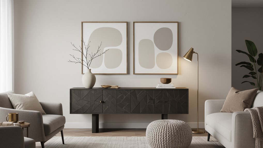
Highlighting The Fireplace
How do you make a fireplace read as the room’s focal point rather than just another patch of wall?
Position a darker wall behind the mantel to create depth, then use lighter trim so fireplace accents pop. Keep surrounding walls neutral to avoid competing focal points.
If the mantel is ornate, a subtle dark hue will highlight details; if it’s simple, choose stronger color contrasts to add drama.
Balance scale: a large hearth can handle a bold wall, a small one benefits from softer tones and accent accessories.
Let the fireplace anchor seating and sightlines, guiding paint choices for cohesion and emphasis.
Built‑Ins As Focal
When built‑ins frame a wall, they naturally command attention, so choose paint that either highlights their craftsmanship or lets them blend into the background depending on their role.
You’ll assess whether windows, a fireplace surround, or shelving should pop or recede, matching built-in styles to purpose and scale for visual harmony.
- Highlight: Paint a dark wall behind ornate built‑ins to make details stand out and create a focal point.
- Blend: Match trim tones to the wall so minimalist built‑ins disappear and the room feels cohesive.
- Contrast: Use muted darks to balance light fixtures and furnishings without overwhelming the space.
Test Paint Placement: Samples, Lighting Checks, and Timing
Before you commit to a full coat, place several paint samples on different walls and observe them at various times of day; this lets you see how light, shadows, and adjacent colors change the hue and tone.
Use paint swatches in varying sizes and finishes, taping them at eye level and near corners. Check lighting variations morning, noon, and evening, including artificial sources.
Note how textures, trim, and reflective surfaces alter perception. Live with the samples for several days before deciding.
If a shade reads too heavy or flat under real conditions, try a lighter tint or different finish before painting.
Pair Dark Paint With Furniture and Finishes That Complement It
Once you’ve lived with samples and settled on a deep hue, think about how furniture and finishes will play off that darkness.
Dark color psychology can add drama or coziness, so choose pieces that balance mood without overwhelming the room. Keep scale and texture in mind, and introduce light-reflective materials sparingly.
- Contrast: use lighter upholstery and wood tones to lift the space and define silhouettes.
- Texture: mix matte paint with velvet, leather, or woven fabrics to add depth.
- Accents: bring in metallics, mirrors, and complementary accent pieces to punctuate the palette.
How Trim, Moldings, and Doors Change a Dark Wall’s Impact
Although dark walls set a strong tone, trim, moldings, and doors decide whether that tone reads dramatic, cozy, or refined—so choose their color, sheen, and profile to shape the room’s final mood.
You’ll use trim contrast to define edges: crisp white trim feels sharp and modern, while muted tones blend for subtler shifts.
Vary molding textures to add depth—simple flat boards keep focus on the wall, ornate profiles create classic richness.
Pick door styles that match intent: paneled doors for formality, flush doors for minimalism.
Balance elements for wall harmony so the dark wall enhances rather than overwhelms.
Choosing Finishes and Sheens for Dark-Painted Walls
When you choose a finish for a dark wall, matte and satin will give you very different results.
Matte absorbs light and keeps color looking rich and velvety, while satin reflects more light and can add subtle depth and dimension.
Think about how much sheen you want to reveal texture and shadow in the room.
Matte vs. Satin
If you’re leaning toward a dark wall color, choosing between matte and satin finishes will shape how that color reads in your space.
You’ll weigh a sheen comparison: a matte finish downplays light reflection and hides imperfections, while a satin finish offers subtle luster and easier cleaning.
Consider texture effects and durability differences based on room use.
- Matte finish — cozy, conceals flaws, low light reflection; great for low-traffic areas.
- Satin finish — slightly reflective, shows texture more, more durable for handling.
- Choose by function: pick matte for mood, satin for practicality.
Sheen Impact On Depth
Because sheen changes how light plays across a surface, your finish choice will shape whether a dark wall feels deep and enveloping or slightly luminous and dimensional.
You’ll use low-sheen mattes to absorb light, enhancing depth perception and hiding imperfections for a cocooning effect.
Choose a satin or eggshell when you want subtle sheen effects that reveal texture and add liveliness without glare.
High gloss will bounce light, highlight flaws, and reduce perceived depth, so reserve it for trim or accent panels.
Test samples under real lighting; your eye will confirm which sheen best delivers the mood you want.
Common Mistakes That Make Dark Walls Feel Heavy (and Fixes)
Although dark walls can feel cozy, a few common mistakes will make them seem heavy and cramped instead of elegant. You should consider dark wall psychology and the emotional impact before committing. Fixes are often simple.
- Overpainting every wall — keeps light trapped; instead paint a feature wall to balance weight and openness.
- Poor lighting — don’t rely on one dim fixture; add layered, warm lighting to lift darkness without washing color out.
- Cluttered, matching furnishings — avoid matching too many dark tones; introduce contrast with lighter accents and reflective surfaces to prevent heaviness.
Layering Color: Coordinating Dark Walls With Palettes and Textiles
When you pair dark walls with layered neutrals, you create depth without overwhelming the room.
Mix patterns and textures at different scales so they balance the weight of the paint, and place bold accents strategically to draw the eye.
Keep textiles and accent colors consistent across the space to tie everything together.
Layering Neutrals With Dark
If you’re working with dark-painted walls, layer neutrals to soften the space and highlight texture—think warm creams, muted greys, and natural linens that sit between the wall color and bright accents.
You want neutral tones to mediate dark contrasts, creating depth without heaviness. Use fabrics, upholstery, and simple furnishings to build calm passages and maintain visual warmth.
Follow three practical moves:
- Anchor seating in warm creams to balance a dark feature wall.
- Introduce muted greys on rugs or throws to bridge color shifts.
- Choose natural linens for curtains and pillows to keep the room airy yet grounded.
Balancing Patterns And Textures
Because dark walls make a bold statement, you’ll want to balance patterns and textures so the room feels layered, not loud.
You’ll anchor large-scale patterns against the dark field, then introduce smaller repeats to create pattern harmony without competing.
Mix matte and lustrous finishes to achieve texture balance: a velvet sofa, nubby rug, and smooth wood surfaces play together.
Keep printed textiles in a restrained palette so they read cohesive rather than chaotic.
Vary scale and tactile weight—light linens beside heavy wools—to guide the eye and soften contrast.
Edit thoughtfully; less is often more with strong walls.
Accent Color Placement
Now that you’ve balanced patterns and textures against dark walls, think about how to layer accent colors so they pop without overwhelming the space.
You’ll want deliberate contrast techniques and consistent color harmony to guide placement. Start with one bold hue, then add supporting tones in textiles and accessories. Place accents where light hits to amplify them, and repeat colors in three spots to unify the room.
- Anchor a focal piece (art, rug, lamp) with your strongest accent.
- Use softer variants in cushions and throws for gradual shifts.
- Mirror tiny accents (vases, frames) to reinforce rhythm and balance.
Practical Painting Tips: Edges, Transitions, and Clean Lines
Clean, crisp edges make a painted room look professionally finished, so take time to master cutting in, handling changes, and preventing bleed-through.
You’ll start with paint preparation and color calibration so tones match across surfaces. Use tape application sparingly on smooth wall texture; remove it while paint’s tacky.
Choose brush selection and roller choice for line precision: angled sash brushes for corners, dense rollers for even finish uniformity.
Practice edge techniques—short strokes, steady pressure—and employ blending between where walls meet different shades.
Work methodically, keep tools clean, and check lighting frequently to guarantee seamless, sharp results.
Troubleshooting: What to Change If the Dark Wall Looks Wrong
If a dark wall reads flat, muddy, or just off compared with the rest of the room, start by evaluating light, contrast, and undertone rather than blaming the paint alone.
You’ll use dark wall troubleshooting like a checklist: assess natural and artificial light, test samples at different times, and note reflections.
Consider color temperature adjustments for bulbs and adjacent finishes. Make small swaps before repainting.
- Change lighting: warmer or cooler bulbs, add directional fixtures to reveal depth.
- Increase contrast: lighter trim, brighter art, or a glossy accent.
- Trial undertones: swatch alternatives and view in situ.
Frequently Asked Questions
Can I Paint a Dark Accent Wall in a Child’s Bedroom Safely?
Yes — you can paint a dark accent wall in a child’s bedroom safely. Consider safety considerations like non-toxic, low-VOC paint and proper ventilation; use color psychology to choose calming tones and balance with lighter walls and decor.
Will Dark Paint Hide Wall Imperfections or Make Them More Visible?
I’ve seen a matte black stage curtain hide scuffs like a shadow; dark paint effects can both mask stains and accentuate bumps, so you’ll weigh wall texture considerations and choose finish, prep, and lighting to control visibility.
How Does Flooring Color Affect Which Wall I Should Darken?
Higher-contrast flooring lets you darken a feature wall boldly, while low-contrast flooring needs subtler dark tones to maintain color harmony; you’ll balance mood and depth by matching undertones and testing swatches in different light.
Are There Specific Dark Colors That Increase Resale Value?
Ironically, yes: you’ll favor navy, charcoal, and deep greige—they tap dark color psychology and align with resale value trends; buyers see sophistication, not gloom, so you’ll boost appeal while keeping tones neutral, versatile, and broadly marketable.
Can Wallpaper Replace a Painted Dark Accent Wall Effectively?
Yes — you can; wallpaper patterns can replace a painted dark accent wall effectively if you choose scale and color wisely, and use texture contrast to add depth, focal interest, and easy removal for future resale updates.
Conclusion
Don’t be afraid to paint a wall dark — it’s not permanent and you can always repaint if it feels wrong. Use a dark wall to anchor a focal point, add depth, or cozy up a corner, and pick the wall that follows sightlines and light. If it seems heavy, lighten textiles, add trim or a mirror, or switch to a softer shade. Try a sample first; you’ll know quickly if it’s right.