Which Wall to Paint Darker in a Small Room?
Pick the wall that becomes the room’s focal point—usually the wall opposite the entry or the one behind your main furniture like the bed or sofa—and paint it darker to add depth and intimacy. If natural light is strong, use the sunlit wall for a richer tone; if windows face one side, consider the wall opposite them to widen views. Keep surrounding walls and trim light, anchor with larger furniture, and try swatches at different times of day to refine the choice—more tips follow.
Quick Answer: Which Dark Wall to Choose
Which wall should you paint darker? Pick the focal wall—usually the one opposite the room’s entry or behind a main piece like the bed.
You’ll use dark color psychology to create intimacy without closing the space; darker pigment draws the eye and anchors the room.
Paint the wall with the least visual clutter so furnishings pop, and avoid wrapping dark shades around narrow walls.
Choose the wall with the cleanest backdrop so furniture stands out—skip dark paint on narrow, wrapping walls.
Consider wall texture effects: smooth finishes read richer, while textured surfaces soften contrast.
Test swatches at different times of day and stand back; choose the darker wall that supports your room’s function and focal point.
How a Dark Wall Changes Perceived Width and Depth
After you pick the focal wall, think about how a darker paint will change the room’s perceived width and depth: darker tones visually recede, so painting the wall opposite the entry or behind a bed can make the room feel deeper, while applying dark color to side walls narrows perceived width and creates a cozier, more intimate corridor effect.
You’ll use color psychology and design principles to control perceived space and room ambiance. Consider spatial awareness, light interaction, wall texture and color saturation to avoid overpowering the room.
A dark wall can create an optical illusion that shifts visual balance, anchoring furniture and guiding movement.
Pick a Focal Dark Wall to Add Depth
When you pick a focal dark wall, choose the surface that naturally draws the eye—usually the wall behind the bed, a fireplace, or the one you see first when you enter—so the deeper tone adds instant depth without overwhelming the room.
You’ll reinforce a focal point and boost visual interest while maintaining room balance as a smart design strategy.
Consider color psychology to set mood, experiment with wall textures for contrast, and use lighting effects to control depth perception.
Try these simple actions:
- Paint the primary focal wall darker.
- Add texture or wallpaper accents.
- Layer directional lighting.
Dark Wall Opposite the Main Window to Widen Views
If you paint the wall opposite your main window a darker tone, you’ll visually push the far side of the room back and make the space feel wider.
You’ll use contrast and light to create depth: natural light softens the dark wall, while the darker hue draws the eye outward, expanding perceived width.
Consider a matte finish to reduce reflections and maintain sophisticated dark wall aesthetics.
Keep adjacent walls lighter to preserve brightness and balance.
Position mirrors or low-profile furniture to amplify the visual impact without clutter.
This approach subtly broadens your room while staying elegant and intentional.
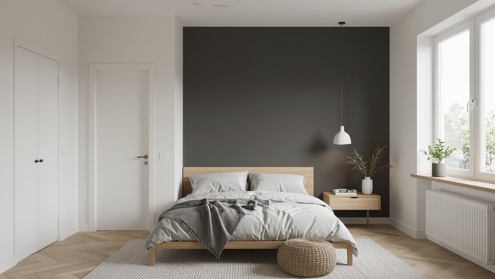
Dark Wall Behind the Bed to Anchor a Bedroom
Put a darker accent wall behind your bed to give the room a clear focal point and a cozy, grounded feel.
You’ll want to balance that weighty backdrop with lighter paint on the surrounding walls so the space still feels open.
Keep bedding and decor lighter or mirrored to maintain contrast without closing in the room.
Accent Wall Behind Bed
Because the bed naturally anchors the room, painting the wall behind it a darker hue instantly grounds the space and creates a focal point.
You’ll shape bedroom ambiance and use wall color psychology to influence space perception while highlighting personal style and room functionality.
Consider texture contrasts and lighting effects to avoid heaviness, and plan bedding coordination and art placement for color harmony.
- Choose a dark tone that supports bedding and art placement.
- Add textured finishes or trim to enrich surface feel.
- Use layered lighting to balance mood and maintain usable light.
Balance With Lighter Walls
When you paint the wall behind your bed a deep, grounding color, counterbalance it by keeping the surrounding walls in lighter, neutral tones so the room feels open and fresh. This contrast preserves the focal impact of the dark wall without making the space seem small or heavy.
You’ll create color harmony and clear visual contrast that enhances design cohesion. Lighter walls boost light reflection and improve spatial perception, while the dark wall’s wall texture and finish anchor mood setting and color psychology.
Maintain room balance by repeating subtle accents from the dark wall in bedding or art to unify aesthetic appeal.
Paint Behind Seating to Create a Cozy Living Area
If you want to make a small living area feel snug without shrinking the room, paint the wall behind your sofa or chairs a richer, darker shade than the surrounding walls.
You’ll anchor the space and define a focal point that invites sitting. Consider your seating arrangement and use color contrast to frame cushions, art, and lighting.
Try these simple approaches:
- Paint just the wall behind the main seat and add a warm lamp.
- Use a deep tone with lighter surrounding walls to emphasize depth.
- Match accent pillows or a rug to tie the darker wall into the room.
Use a Dark Wall to Highlight Built‑Ins and Trim
Paint a single wall a deep hue to make your built-in shelves pop and draw the eye to your curated objects.
You’ll create crisp contrast by keeping trim a lighter shade, which frames the architecture and sharpens the room’s lines.
Use the darker backdrop to emphasize textures and styling without overwhelming the small space.
Accent Built-In Shelving
A deep, moody wall turns built-in shelving into a deliberate focal point, so try painting the recess behind your shelves a darker hue while keeping the trim and shelves crisp and light to create contrast and depth.
You’ll emphasize shelf styling and color contrast, using decorative accents and wall art to punctuate negative space.
Consider material choices and texture variation—wood, metal, woven baskets—and plan shelf organization for balance.
Use lighting effects like strip LEDs or spot lamps to boost drama and visibility.
Tip list:
- Group by color and scale.
- Mix textures and materials.
- Layer lighting for depth.
Frame Trim With Contrast
Shifting focus from built-in shelves, use a darker wall to outline and elevate trim and moldings so they read like architectural jewelry rather than background detail.
You’ll create frame contrast by painting the wall deeper while keeping trim styles lighter or glossier, which draws the eye and adds visual depth.
Consider color harmony between wall and trim, balancing bold hues with neutrals for design balance.
Match paint finishes to function—satin or semi-gloss on trim, matte on walls—to emphasize edges and simplify cleaning.
Factor wall texture so shadows behave predictably, and test swatches in different light before committing.
Avoid a Dark Wall Facing the Door
Why would you make the first thing people see feel smaller and heavier? You shouldn’t place a dark wall directly opposite or facing the door; dark wall placement at the entrance creates an immediate entrance impact that can shrink the room’s perceived size and mood.
Consider these quick options to avoid that effect:
- Paint the far wall darker to draw the eye inward.
- Use accent pieces near the entrance instead of full dark paint.
- Keep the doorway wall light, adding contrast on side walls.
These choices help you welcome visitors, maintain openness, and control focus without overpowering the room.
Choose Based on Natural Light Direction
If your room gets strong light from one wall, consider keeping that Light Source Wall lighter to reflect brightness.
Painting the Opposite Shadow Wall darker can add depth without making the space feel closed in.
You’ll get contrast where it counts while preserving overall light.
Light Source Wall
Pick the wall with the most natural light and paint it darker to anchor the room and make the space feel intentional rather than cavernous.
You’ll use wall orientation and light intensity to decide which surface should carry depth without overpowering. Consider how windows, sun path, and view interact with the paint to create balance.
Use darker paint where light is strongest so contrasts read as design choices.
- Measure peak light intensity during day to find the dominant wall.
- Choose the wall facing the primary window or sun path.
- Test swatches at different times to confirm the effect.
Opposite Shadow Wall
Because shadows fall predictably opposite your light source, paint the wall across from windows or the brightest wall a darker tone to reinforce depth and create a deliberate contrast.
You’ll use natural light to sculpt space: the darker opposite wall enhances shadow play and anchors the room without shrinking it.
Place key furniture and art there so the contrast reads as intentional, boosting visual impact.
Keep surrounding walls lighter to maintain openness, and choose a finish that reads rich but not heavy.
Test paint at different times of day to confirm the effect under morning and evening light before committing.
When Ceiling Height Changes Which Wall to Paint
Noticing a step in ceiling height? You’ll want to evaluate ceiling height and wall proportions before choosing a darker wall. Use darker paint to balance or emphasize the change rather than hide it.
- Paint the taller section darker to pull the eye upward and make ceilings feel intentional.
- Paint the lower section darker to ground the room if you want a cozier, layered look.
- Use color contrast sparingly on the shift wall to avoid chopping the space; keep trim and molding light to preserve flow.
Trust your eye, test samples, and adjust based on natural light.
Paint a Short Wall Darker to Make a Room Feel Wider
If you’ve decided how to handle changing ceiling heights, you can apply a similar strategy to room proportions by painting a short wall darker to visually widen the space.
You’ll use visual tricks to shift focus, creating a spatial illusion that makes room dimensions feel broader. Rely on color psychology—cool, muted darks recede, opening the view.
Choose paint finishes and wall textures that control light reflections; satin or eggshell softens sheen, textured finishes break glare.
Position lighting to avoid highlighting the dark short wall, and arrange furniture to emphasize lateral flow so the effect reads intentional, not cramped.
Paint a Long Wall Darker to Add Drama Safely
Pick the longest wall as your anchor to create instant drama without shrinking the room.
Balance that darker wall with lighter paint or furnishings on the opposite surfaces so the space still feels open.
Use strategic lighting—wall washers, floor lamps, or sconces—to highlight texture and keep the contrast feeling intentional.
Choose The Longest Wall
Wondering where to apply a bold shade first? Choose the longest wall to create impact without overwhelming the room. You’ll exploit long wall benefits and subtle wall color psychology to guide mood and perceived depth.
Paint that wall darker to anchor the space and draw the eye along its length. Consider these steps:
- Measure and pick the true longest uninterrupted expanse.
- Test swatches in different light at various times of day.
- Position key furniture and artwork against that wall for cohesion.
This approach keeps drama controlled, maximizes perceived space, and makes your bold choice feel intentional.
Balance With Lighter Opposites
Once you’ve anchored the room with a darker long wall, balance it by keeping the opposite or adjacent walls lighter so the space feels open rather than heavy.
You’ll use contrast to control color psychology: darker hues add intimacy and focus, while lighter tones expand and refresh.
Paint choices should guide spatial perception, preventing the dark wall from dominating. Keep trim, ceiling, and three remaining walls in a lighter family or neutral to reflect visual weight evenly.
Use accent accessories that echo the dark tone sparingly, so the room reads cohesive, intentional, and comfortably scaled.
Enhance With Strategic Lighting
When you paint a long wall darker to add drama, layer your lighting so the color reads rich without shrinking the room—combine overhead ambient light with wall washers or directed sconces to highlight texture and depth while keeping adjacent areas bright.
You’ll use light layering to balance mood and scale: choose lighting fixtures with adjustable color temperature so warm tones won’t close in. Rely on natural light when possible and add task lighting for function. Use reflective surfaces to bounce light into corners.
Follow these steps:
- Install ambient illumination plus dimmable overheads.
- Place wall sconces or washers to accent.
- Add task lighting near seating.
Match Dark‑Wall Choice to Room Function
If you want a room to feel cozy and intimate, choose a rich, enveloping dark like charcoal or deep navy. For a space where you need focus or drama, lean toward black or jewel tones that heighten contrast and visual interest.
You’ll match dark-wall choice to room function by applying color psychology and design principles: pick hues that support room functionality and mood enhancement.
Consider wall aesthetics, light effects, and spatial perception so darker paint creates visual balance without shrinking the space.
Balance dark walls with thoughtful lighting and furnishings to avoid a cramped, visually heavy feel.
Keep style consistency and theme coherence with furnishings and accents, ensuring the dark wall feels intentional and purposeful.
Best Dark‑Wall Spots for Small Bedrooms
For a small bedroom, you’ll get the most impact by painting the wall behind the bed as an accent to anchor the space.
A short wall opposite the window can deepen the room without swallowing light, while a wall with recessed lighting lets you highlight texture and control mood.
Consider how each spot interacts with bed placement, natural light, and fixtures before you commit.
Accent Wall Behind Bed
Because the wall behind your bed naturally frames the room, painting it a darker shade instantly grounds the space and creates a focal point without shrinking the room.
So choose a rich color that complements your bedding and keeps sightlines open. Use wall color psychology to boost bedroom ambiance and mood enhancement; consider sleep quality when picking tones and lighting effects.
Pay attention to wall texture impact for depth and design cohesion with furniture. Balance personal preference with room functionality.
Try these quick approaches:
- Deep accent with light bedding.
- Textured dark paint for coziness.
- Two-tone color combinations for balance.
Short Wall Opposite Window
Shifting focus from the bed wall, consider painting the short wall opposite the window a darker shade to anchor the room and control natural light. You’ll create deliberate window contrast that makes daylight feel intentional rather than overwhelming.
Choose a hue that complements the room’s palette so the short wall design reads as an anchor, not a block. Keep trim and ceiling lighter to preserve openness, and position low-profile furniture or a slim console to avoid visual clutter.
This approach balances scale in compact spaces, draws the eye inward, and gives you a focal point without sacrificing brightness or flow.
Wall With Recessed Lighting
When recessed lighting washes a wall, paint it darker to turn those pools of light into intentional highlights rather than glare; you’ll control mood and depth without shrinking the room.
You’ll use recessed lighting to emphasize wall features and create layered lighting effects that enhance room ambiance.
Consider light placement and fixture styles so highlights land where you want them. Choose a color contrast that reads richer under an ambient glow yet keeps balance.
- Place darker paint behind focal wall features to catch subtle highlights.
- Match fixture styles to the mood you want.
- Test lighting effects at night.
Best Dark‑Wall Spots for Small Living Rooms
If you want to add depth without shrinking the space, pick the wall that naturally draws the eye—usually the one behind the sofa, the fireplace wall, or the wall opposite the room’s largest window—and paint it a rich, dark shade to anchor the layout and create a focal point.
You’ll use dark color psychology to make the room feel cozy and deliberate rather than cramped. Choose the wall that frames seating or a media center, keep adjacent walls light, and balance with mirrors, layered lighting, and slimline furniture.
These small space tricks maintain openness while giving character.
Best Dark‑Wall Spots for Home Offices
For a home office, consider painting the wall behind your desk a darker shade to frame your workspace and reduce visual distractions.
You can also paint the ceiling darker and add lighter trim to create depth without making the room feel boxed in.
Both options help focus attention on your work area while keeping the space feeling intentional.
Accent Wall Behind Desk
Looking to make your home office feel sharper and more focused? Paint the wall behind your desk darker to anchor desk placement and use color psychology to enhance workspace vibes for a productivity boost.
Balance wall decor and lighting effects so the dark backdrop reduces glare and highlights key pieces. Aim for design harmony while adding texture contrast and visual interest to avoid heaviness. Reflect personal style with framed art or shelving.
- Back wall: focus, depth, fewer distractions.
- Accent color: energize or calm via tone choice.
- Lighting: task plus ambient to prevent gloom.
Dark Ceiling With Trim
When you paint the ceiling a deep tone and highlight the trim in a lighter or contrasting shade, you visually lower the room’s height while framing your workspace for a defined, cozy feel. This technique directs attention to your desk area, tames overhead glare, and creates an intentional, polished backdrop without overwhelming the space.
Use a dark ceiling to absorb light and reduce distraction, then employ trim contrast around windows, doors, and built-ins to outline zones and boost perceived craftsmanship.
Keep surrounding walls neutral and surfaces reflective where needed, position task lighting to complement the darker plane, and test samples before committing.
Best Dark‑Wall Spots for Dining Areas
Pick one focal wall—usually the wall behind the dining table or the side that frames a view—and paint it a deep, rich hue to anchor the room and make other surfaces pop.
You’ll shape dining ambiance and room flow by choosing wall textures and material choices that support color psychology. Balance lighting effects with furniture contrast to keep space perception generous. Use artistic accents sparingly for design cohesion.
- Behind table: dramatic backdrop, highlight centerpiece.
- Window frame wall: ties view to interior without overpowering.
- Nook or buffet wall: creates a cozy, functional focal point.
Rooms With Many Windows or Little Light
If your room has lots of windows or feels dim, you can use a darker wall to anchor the space without closing it in.
Try painting the wall behind seating as an accent, the wall opposite the windows to balance light, or one of the shorter side walls to add depth.
Each choice changes how light reads the room, so pick the spot that supports your layout and view.
Accent Wall Behind Seating
In rooms with lots of windows or limited natural light, painting the wall behind your seating a darker shade grounds the space and creates a cozy focal point without making the room feel smaller.
You’ll boost cozy ambiance and anchor the seating arrangement while maintaining design harmony. Use color contrast and texture play to add visual interest and frame the wall as intentional wall framing that defines your comfort zone.
- Choose a deep hue that complements upholstery.
- Add tactile materials (rugs, cushions) to balance depth.
- Use artwork or shelves to emphasize scale and focus.
Wall Opposite The Windows
One wall opposite the windows can handle a darker color and still keep the room feeling bright, because it reflects light back into the space rather than swallowing it.
When you assess window placement and natural light, choose a hue that boosts light reflection while creating visual balance with other surfaces.
Consider wall texture to prevent glare and maintain color harmony across furnishings.
Match the darker wall to room function—calmer tones for bedrooms, bolder for living areas—so spatial perception stays true.
Use that wall for focal points and artwork to create design cohesion without overpowering the room’s light.
Shorter Side Walls
You can also consider painting the shorter side walls darker when a room has many windows or limited natural light. Doing so emphasizes depth, controls glare, and balances brightness without shrinking the space.
Use darker hues strategically, guided by color psychology to create coziness or drama while keeping main sightlines light.
- Anchor the space: a dark short wall benefits focal cohesion and prevents the eye from drifting.
- Preserve openness: contrast with lighter ceiling and long walls to maintain airiness.
- Adjust mood: choose warm or cool tones via color psychology to match desired atmosphere.
Quick Tape‑and‑Paint Tests to Try
Want to see how a darker wall will actually change your room before committing? Use a simple tape technique: apply painter’s tape to mark a darker accent area, then paint small swatches with paint samples.
Position swatches on different walls to judge visual impact, lighting effects, and texture contrast. Walk around to assess room flow and how the darker patch guides movement or focal points.
Note emotional reactions—color psychology shapes mood enhancement—so try warm and cool tones.
Remove tape after drying to evaluate crisp edges. Repeat on alternative walls until you clearly see which placement works best.
Use Photos and Moodboards to Preview
After trying taped swatches, bring those results into photos and moodboards to see the bigger picture. Use photo examples and moodboard inspiration to test color combinations and visual impact before committing. You’ll judge room atmosphere, accent color placement, wall textures, and spatial perception more confidently.
- Layer clipped photos to compare lighting, wall textures, and contrast.
- Mix current furniture shots with trend-forward palettes to check design trends and artistic expression.
- Save variations to revisit at different times of day for true visual impact.
This preview step reduces risk and helps you pick a darker wall that enhances the room.
Let Furniture Placement Guide the Dark Wall
Think about where your furniture naturally anchors the room and make that focal wall the darker one.
Place a deep tone behind seating to make sofas and chairs pop, and use the darker shade on opposite empty corners to visually balance the space.
That way your layout, not just aesthetics, guides the paint choice.
Anchor With The Focal Wall
When you arrange your furniture first, choose the wall behind the main seating or bed as your dark accent to instantly ground the room and define its focal point.
By letting placement dictate the darker wall, you create clear color contrast and visual balance. Consider these steps to anchor the space:
- Position your largest piece (sofa/bed) against the chosen wall to draw eyes naturally.
- Use a darker paint to frame that furniture, then keep surrounding walls lighter for depth.
- Add minimal accessories on the dark wall so the focal point stays strong without clutter.
Highlight Behind Seating Areas
Anchoring the room with a focal wall naturally leads to using furniture to decide where to go darker next: let your seating placement determine the accent so the paint highlights where people gather.
Position sofas or chairs against the chosen dark wall to frame conversations and draw the eye. Use darker paint to emphasize upholstery lines, artwork, and shelving, highlighting textures like woven fabrics or wood grain.
Contrast between seating and wall deepens the sense of depth, enhancing contrast without overwhelming the space. Keep nearby walls lighter to maintain airiness, and balance proportions so the darker area reads intentional, cozy, and inviting.
Darken Opposite Empty Corners
If your main seating hugs one side of the room, go darker on the opposite empty corner to visually balance the space and create depth.
You’ll use furniture placement to justify a darker wall, enjoying dark corner advantages without overwhelming the room. Place accessories and lighting to support that focal point.
- Add a slim lamp to soften the edge and emphasize visual depth.
- Introduce a low-profile console or plant to anchor the corner.
- Keep adjacent walls light to maintain openness and let the dark corner read as intentional, balanced, and cozy rather than shrinking the space.
Align Dark Walls With Art and Focal Points
Because dark paint naturally draws the eye, align it with your room’s art and focal points so those elements stand out rather than get lost.
You’ll plan art placement to exploit color contrast and wall texture, creating intentional visual balance. Consider lighting effects—spotlights or flanking lamps—to boost mood enhancement and make frames pop.
Arrange furniture so sightlines lead to that wall, supporting style cohesion and room function.
Dark walls change spatial perception, so keep scale appropriate and avoid overcrowding. Use consistent finishes and measured accents to guarantee the darker wall anchors the space without overwhelming it.
Trim, Door, and Window Color With a Dark Wall
When you paint a wall dark, the colors you choose for trim, doors, and windows suddenly become focal players rather than background details. You’ll want trim color that frames without fighting the wall, crisp whites or muted tones depending on contrast.
Consider these practical choices:
- Match door finishes to either trim or wall for cohesion; matte doors soften, glossy add punch.
- Coordinate window treatments with trim color and fabric texture to balance light and shadow.
- Use hardware choices and molding details as subtle room accents—metal finishes tie elements together.
Keep palettes tight so each element supports the dark wall.
Flooring, Rugs, and a Dark Wall: What to Know
Pay attention to how a dark wall contrasts with your flooring—light floors will make the wall pop, while dark floors can create a cozy, enveloping feel.
Choose rug size carefully: a large, light rug can break up darkness and open the space, whereas a small rug may make the room feel fragmented.
Use texture and warm or cool tones in rugs and floors to balance the wall’s intensity and keep the room feeling intentional.
Contrast With Flooring
Think about how your flooring sets the stage for a dark wall: light floors brighten and visually lift a space, while dark floors deepen the drama and can make a room feel cozier or smaller depending on the scale.
You’ll use flooring contrast to guide wall choice and achieve color harmony; pair warm-toned woods with rich, warm paints, and cool floors with cooler deep hues.
Consider texture and sheen so shifts feel intentional.
Quick tips:
- Use light floors to offset a single dark accent wall for balance.
- Match undertones for seamless flow.
- Keep high-traffic floors durable.
Rug Size Impact
Flooring sets the tone, but your rug will determine how a dark wall reads in the room: a small rug can fragment the floor and make a deep-painted wall feel more dominant, while a large rug that reaches under furniture ties the plane together and softens the contrast.
Choose rug sizes that anchor seating and create a clear border so the dark wall doesn’t swallow the space. Use rug patterns to direct sightlines toward lighter areas, and pick rug colors that relate to both floor and wall to balance depth.
Measure carefully; placement matters as much as scale.
Texture And Tone
Several layers of texture and shifts in tone will determine whether a dark wall reads cozy or overwhelming: smooth, reflective floors will bounce light and soften a deep-painted surface, while matte, nubby rugs absorb light and make that same wall feel richer and heavier.
You’ll balance texture contrast and tone harmony by choosing materials that either amplify or tame depth. Consider these practical moves:
- Use low-sheen wood or polished concrete to reflect light and lighten a dark wall.
- Layer a textured rug to anchor the space without swallowing it.
- Add soft textiles and metallic accents to bridge dark paint and flooring.
Lighting Strategies to Balance a Dark Wall
When you add a dark wall in a small room, lighting becomes your most powerful tool for keeping the space feeling open and balanced. You’ll plan lighting placement to wash the dark wall evenly, combining ambient lighting with targeted wall sconces.
Use layered lighting: overhead fixtures, sconces, and lamps to avoid harsh shadows. Favor higher bulb brightness and a cooler color temperature if you’d like contrast, or warmer tones for coziness.
Maximize natural light and add reflective surfaces like mirrors or glossy finishes to bounce light. Choose light fixtures that complement wall colors and maintain proportional scale for balance.
Picking the Right Dark Tone for Small Rooms
Although dark paint can shrink a space visually, choosing the right tone lets you add depth without closing it in; you’ll use hue, value, and undertone to control room size perception and tap dark color psychology.
Pick a direction based on mood and function:
- Deep charcoal for drama—neutral undertones minimize visual weight.
- Warm navy for coziness—blue reduces perceived boundaries without feeling heavy.
- Soft forest or slate with gray undertones—adds depth while reflecting subtle light.
Test samples on multiple walls at different times of day.
Trust samples over swatches to confirm how light, furnishings, and contrast affect the final perception.
Finish Choice: Matte vs Satin vs Eggshell
Pick a finish based on how much texture and light you want the darker wall to show: matte hides imperfections and soaks up light for a velvety, intimate look; eggshell gives a soft, low-sheen balance that’s easier to clean; satin reflects more light and reads brighter, making colors appear livelier but also highlighting surface flaws. Choose matte finish for cozy room mood and subdued color psychology, eggshell texture for balance, or satin sheen for energy. Consider durability comparison and maintenance tips: satin cleans easiest, matte shows wear.
| Finish | Best use |
|---|---|
| Matte | Cozy, hides flaws |
| Eggshell | Balanced, moderate care |
| Satin | Bright, durable |
| Notes | Light reflection guides choice |
Using Texture or Wallpaper Instead of Solid Paint
If you want depth without relying solely on color, texture and wallpaper give you tactile and visual interest that changes how a darker wall reads in a small room.
You can choose textured wallpaper or three dimensional textures to add shadow and scale, or patterned finishes and color gradients to guide the eye.
Try these approaches to layer interest without overwhelming:
- Statement murals or nature inspired designs that become focal points.
- Fabric panels, layered textiles, or wall decals for softness and flexibility.
- Artistic stencils and subtle reliefs for permanence with restrained impact.
Tactics to Prevent a Dark Wall From Feeling Heavy
When you want the drama of a dark wall without it feeling heavy, balance is key: introduce contrast, reflective surfaces, and strategic lighting to keep the space airy. You’ll use dark wall psychology to control mood: pair deep paint with lighter furnishings, trim, and ceilings so visual weight shifts away from one plane. Layer lighting—ambient, task, and accent—to lift shadows. Keep large patterns minimal and scale furniture low-profile to avoid competing mass. Add small bright accents and leave breathing room around the wall so it reads intentional, not oppressive.
| Contrast | Lighting | Scale |
|---|---|---|
| Light trim | Ambient | Low furniture |
| Bright accents | Task | Minimal patterns |
| Open space | Accent | Proportion |
Combine Mirrors and Reflective Surfaces With a Dark Wall
A single well-placed mirror can instantly lighten a dark wall by bouncing natural and artificial light back into the room. Position it opposite or adjacent to a window or lamp to multiply brightness.
Use mirror placement and reflective decor to create light amplification and visual expansion. Combine metallic accents for space enhancement and color contrast while balancing texture play and artistic framing to avoid glare.
Mirrors create depth illusion and aid mood setting when paired with softer finishes.
Practical tips:
- Hang a large mirror opposite light.
- Add small metallic trays or lamps.
- Frame art with reflective edges for cohesion.
Common Mistakes Choosing a Dark Wall
Although darker paint can add drama and depth, people often pick a wall for the wrong reasons and end up shrinking the room or highlighting flaws. You might choose the wall opposite the window, ignore dark wall considerations, or follow trends without testing light. Dark color psychology can mute energy; you should balance mood with function. Don’t paint cluttered walls; they’ll appear heavier. Test swatches at different times of day and step back to judge. Use this simple table to reflect feelings and guide decisions:
| Mood | Effect | Action |
|---|---|---|
| Cozy | Intimate | Limit to one wall |
| Gloomy | Draining | Add light |
| Bold | Energizing | Accent carefully |
Budget Alternatives to a Full Dark Wall
If you’re worried a full dark wall will overwhelm your small room or blow your paint budget, there are smart, cheaper alternatives that give the same impact without committing to paint everywhere.
You can try budget friendly options that mimic dark paint techniques with less cost and hassle.
- Use removable wallpaper or wall stencils for strategic patterns and color blocking that read like a dark accent.
- Hang fabric panels or DIY artwork to create depth without paint.
- Explore paint alternatives like temporary solutions—peel-and-stick tiles or large framed prints—for drama that’s easy to change.
Decision Checklist: 7 Questions to Pick the Right Wall
Wondering which wall will give you the most impact? Use this checklist to choose confidently. Consider sightlines, natural light, focal points, and how color psychology shapes mood. Check wall materials for paint adherence and texture. Ask: will furniture align, will art pop, does the wall face windows, and does it balance the room? Answer honestly, then paint a test swatch.
| Question | Emotion | Action |
|---|---|---|
| Sightlines | Anticipation | Stand and look |
| Light | Calm | Observe at noon |
| Texture | Trust | Touch the wall |
Seven questions guide your final pick.
Quick Recap: How to Pick Your Dark Wall
You’ve just answered seven focused questions to narrow your choice, so now sum up the essentials that actually guide the paint decision.
You’ll use practical cues—light, focal points, and mood—to pick which wall to paint darker.
Consider how dark color psychology shifts perceived depth and atmosphere, and how small space illusions stretch or anchor the room.
Dark hues change depth and mood—use them to either visually expand tight spaces or create cozy, anchored drama.
Ask: do you want intimacy, drama, or expansion? Then choose the wall that supports that aim.
- Face natural light: paint away from windows to deepen space.
- Highlight a focal wall to create intentional drama.
- Balance contrast with trim and furnishings to avoid overwhelm.
Frequently Asked Questions
Will a Dark Wall Affect My Room’s Temperature or HVAC Efficiency?
A dark wall won’t noticeably change your HVAC efficiency; it increases heat absorption slightly from sunlight, but modern HVAC compensates. You might notice quicker color fading where sun hits, so use UV-resistant paint to minimize it.
Can Pets or Kids Damage Dark-Painted Walls More Visibly?
By and by, yes — you’ll notice scuffs and hair more on dark walls, so use pet proofing tips like washable finishes and durable trim, choose kid friendly colors for accents, and keep touch-up paint handy.
How Often Will I Need to Touch up a Dark Wall Compared to Lighter Walls?
You’ll need touch-ups slightly more often on a dark wall because color durability is lower at showing marks; expect higher maintenance frequency, especially in high-traffic areas, though durable finishes and regular cleaning’ll reduce touch-up needs.
Are There Paint Brands or Ingredients Better for Rich Dark Colors?
Absolutely—ye olde tip: you’ll want high pigment, high color saturation formulas like Benjamin Moore Aura or Farrow & Ball; they’re durable, resist fading, and pair best with matte or eggshell paint finish to hide imperfections and touch-ups.
Can I Safely Use Dark Paint on Walls With Existing Stains or Repairs?
Yes — you can, but you’ll need proper stain coverage and repair methods first. You’ll prime stains, sand and patch repairs, then use a high-opacity dark paint or tinted primer so the finish hides blemishes and lasts.
Conclusion
Pick the wall that strengthens the room’s purpose and flow — a focal wall behind the bed to anchor sleep, the wall opposite the main window to widen the view, or the farthest short wall to add depth. You might worry a dark wall will feel heavy, but imagine it like a velvet backdrop that makes furniture pop and light bounce off the ceiling; choose a rich hue and it’ll feel dramatic, not oppressive.