Does Paint Dry Darker or Lighter Than Swatch
Most paints dry slightly darker than the wet swatch, so you should expect a subtle deepening as solvents evaporate and the binder and pigments settle. How much shifts depends on sheen, pigment strength, coat thickness and surface—gloss shows less change, strong tints deepen more, and thin or fast-drying coats can look lighter or uneven. Test large, primed patches and wait for full cure before deciding; keep going and you’ll find practical tips to predict and control the final color.
Quick Answer: Will Paint Dry Darker or Lighter?
When you paint a sample, it’ll usually dry slightly darker than it looks wet, though the exact change depends on the paint’s sheen, pigment, and thickness of application. You’ll notice most finishes deepen as solvents evaporate and light interacts with dry film.
Expect subtle shifts rather than dramatic ones; high-sheen paints often show less change. Color consistency hinges on mixing, batch variation, and uniform application, so sample panels matter.
Also watch substrate and prep—poor paint adhesion can alter appearance and lead to peeling or uneven sheen that skews perceived color.
In short: anticipate a small darkening and test strategically.
What to Do First: How to Test Before You Paint
Before you start, pick a few test spots in different lighting and on different surfaces so you can compare results.
Prime those spots first to match the surface you’ll be painting, then apply your paint swatches.
Let the samples dry completely and evaluate them at different times of day to see the true color and sheen.
Choose Test Spots
Pick a few test spots that represent the room’s variety—sunny wall, shaded corner, next to trim—and apply small swatches so you can see how light and adjacent colors affect the paint.
Check each swatch at different times of day to judge color consistency; take photos in morning and evening light.
Rub and lightly scratch cured swatches to assess paint durability where traffic or contact happens.
Note how trim, flooring, and furnishings shift perception.
Label spots and jot observations so you compare accurately.
These targeted tests help you predict the finished look and performance before committing to a full coat.
Use Primer First
After you’ve evaluated swatches around the room, prime those test spots and any large area you’ll paint so the color you chose reads true and the finish performs well. You’ll prevent underlying stains from skewing color consistency and create a neutral base for accurate comparisons. Apply primer before any paint layering so each coat adheres evenly; that reveals the real hue and sheen. Test on primed patches under different lights. Use this quick checklist:
| Step | Area | Purpose |
|---|---|---|
| 1 | Test spot | True color |
| 2 | Large wall | Consistency |
| 3 | Trim | Adhesion |
| 4 | Ceiling | Uniformity |
Evaluate Dry Samples
When paint’s fully dry, check your samples in the rooms where you’ll live with them—natural light, artificial light, and evening shadows can change how a hue reads. Walk around at different times, noting shifts and photographing swatches next to furniture and trim.
Scrutinize color consistency across panels and walls; inconsistent batches or application reveal themselves once dry. Test paint opacity by layering one and two coats on a white primer patch to see coverage and true depth.
If a tone surprises you, don’t guess—adjust sheen, add samples, or consult the vendor before committing to a full room.
How Long to Wait Before Judging Dried Color
Because paint continues to change as it dries, you shouldn’t judge the color immediately after application; wait until the finish reaches its true dry state. Give at least 24 hours for touch-dry water-based paints and up to 72 hours for full color consistency, though manufacturer drying time ranges vary.
Apply test patches in the room’s light and record times so you can compare wet, tacky, and fully cured appearances.
Humidity and temperature extend or shorten drying time, so control ventilation. If you need certainty, wait a week before committing to large areas or final decisions about trim, accents, or furniture placement.
How Paint Sheen (Matte → Gloss) Changes Appearance
When you compare matte to gloss, you’ll notice the contrast can make colors read differently across a room.
Higher sheen tends to deepen perceived color and sharpen edges because it reflects more light.
Think about how light reflection alters depth and highlights so you can choose the right finish for the effect you want.
Matte Versus Gloss Contrast
Curious how the same color can look different just because of sheen? You’ll notice color consistency shifts between matte and gloss finishes because sheen influence changes how light interacts with the surface.
Matte scatters light, softening contrast and hiding minor imperfections; gloss reflects light, boosting perceived saturation and creating sharper highlights.
When you compare swatches, place matte and gloss samples side by side under typical room lighting to gauge the real effect.
Choose matte to minimize glare and create a more uniform look; pick gloss when you want a vibrant, reflective surface—but remember each alters visual contrast differently.
Sheen Alters Color Depth
If you swap a matte sample for a gloss one, you’ll immediately notice the color seems deeper and more saturated on the glossy surface. You’ll see how sheen influence shifts perception: the same paint color can feel richer with gloss and softer with matte. That change affects mood and decision-making—so test finishes, not just swatches. Use small painted panels to compare finishes under typical room conditions before committing. The table below echoes the emotional pull finishes have.
| Finish | Feeling | Decision |
|---|---|---|
| Matte | Calm | Subtle choice |
| Satin | Warmth | Balanced pick |
| Gloss | Vibrant | Bold commitment |
Light Reflection Effects
How does light change the way a color reads on your wall? You’ll notice sheen shifts how light reflects, so matte absorbs more and appears richer, while gloss bounces light and looks brighter.
That shift affects color consistency across a room: a glossy finish can reveal variations and highlights, matte hides imperfections and blends tones.
Consider lighting effects—directional sunlight, cool LEDs, or dim ambient lamps—all interact with sheen to alter perceived hue and depth.
When choosing sheen, test samples in your actual light at different times. That simple check preserves the look you designed and avoids surprises.
How Pigment Strength (Tinting) Shifts Color as It Dries
When you add different amounts of pigment to a paint base, the drying shift changes predictably: stronger tints tend to deepen and enrich as solvent evaporates, while weaker tints dry closer to the base color. You’ll notice color saturation rises with tint strength, producing richer, more permanent-looking hues.
Transparent pigments behave differently than opaques: pigment transparency lets underlying layers and binder show through, muting the final appearance, while opaque pigments conceal the base and keep saturation high.
When you test mixtures, use consistent application thickness and lighting so you can judge how tinting levels alter the dried color.
How Binders and Solvent Evaporation Affect Color
As the paint cures, you’ll notice the binder forms a clear film that locks pigments in place and changes how light reflects.
You’ll also see color shift as solvents evaporate—loss of solvent alters refractive index and can make the wet swatch look darker or lighter than the dry film.
Keep an eye on drying speed and binder type, because they control how pronounced those changes will be.
Binder Film Formation
You’ll notice the drying process changes sheen and apparent hue because binder density and surface smoothness shift light scattering. To maintain color consistency, apply even coats and follow manufacturer flash times so the film forms uniformly.
Thicker films often look richer, while thinner films may appear paler. Temperature and humidity influence coalescence speed, so control the environment to avoid mottling or gloss variations that distort the intended color match.
Solvent Evaporation Effects
Because solvents leave the paint film at different rates, you’ll see the color shift during drying as binder particles consolidate and pigments settle into their final positions. You notice changes in color saturation as solvent loss alters refractive index and film thickness, while pigment dispersion and binder clarity determine whether the dried tone reads lighter or darker.
Control drying to predict results: slower evaporation often deepens color by improving pigment dispersion and binder leveling; fast drying can trap opacity variations and lighten appearance.
Tips to manage outcomes:
- Test on scrap with same drying conditions
- Adjust solvent blend for desired rate
- Stir thoroughly before application
- Use retarder for slower cure
- Apply consistent film thickness
How Coat Thickness and Number of Coats Change Tone
When you apply thicker coats or add extra layers, the paint will generally look deeper and less like the thin swatch you saw on the card. You’ll notice improved color consistency as more pigment accumulates, reducing patchiness and helping the hue reach its desired value.
Increased paint opacity from additional coats masks underlying tones and prevents substrate influence, so the result appears richer and sometimes slightly darker. Thin single coats may read lighter or translucent, especially with low-opacity formulas.
Plan coats to balance finish and drying time: multiple even layers give predictable tone, while uneven thickness can create mottled or misleading color.
Why Substrate Color and Surface Texture Matter
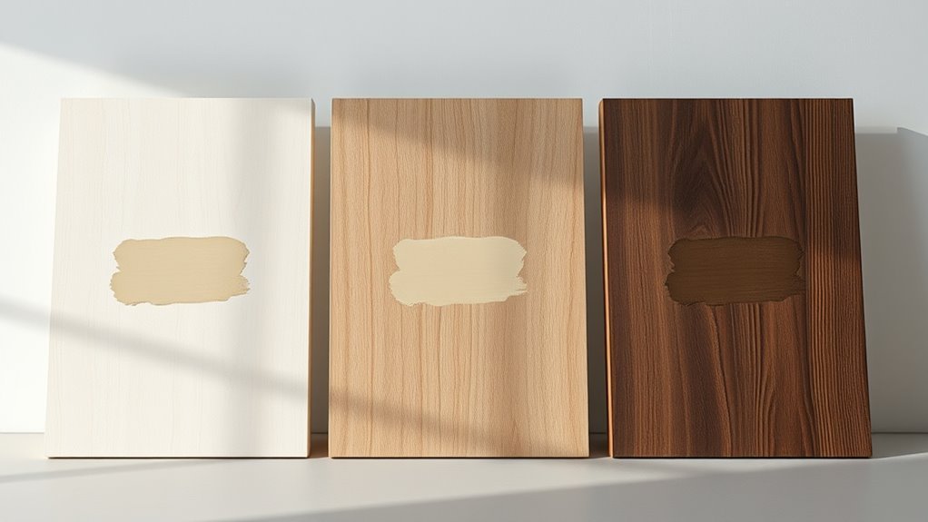
If your wall or trim isn’t a neutral base, the underlying color will shift the paint’s final appearance, especially with lighter or semi-transparent formulas. You’ll notice that substrate preparation matters: poor priming lets old hues bleed through, while texture scatters light and alters perceived tone.
Use proper paint mixing techniques to maintain consistency, and address surface defects before coating.
- Check for stains and prime over them
- Sand glossy surfaces for adhesion
- Test a small patch before full application
- Thin only as recommended when mixing
- Apply consistent coats to minimize texture effects
Will Lighting Make Paint Look Darker or Lighter?
Although lighting can seem subtle, it’s one of the biggest factors that makes paint read darker or lighter in your space. You’ll notice how directional light deepens shadows, while diffuse light softens tones; Paint texture and color saturation interact with light to change perceived depth. Cooler light can mute warm hues; warmer light can boost saturation. Test samples at different times and angles to predict effects.
| Light Type | Effect on Tone | Tip |
|---|---|---|
| Direct sunlight | Lighter, higher contrast | Check midday |
| Overcast | Softer, truer | Observe morning |
| Artificial warm | Richer saturation | Try evening |
Why Store Sample Cards and Fluorescent Lights Mislead
Because store sample cards are designed for display, they rarely show how paint will behave under the fluorescent lights you find in many big-box aisles, so you can easily get a misleading impression of both hue and value. You should test on your wall because fluorescent lamps boost cool tones and flatten subtle shifts.
Store cards lie—fluorescent store lights skew cool tones and flatten subtleties. Test paint samples on your wall first.
Color consistency varies between chips and cans; paint formulation (pigment load, binder, sheen) changes appearance as it dries. Bring home samples, apply several coats, and view at different times.
Consider these practical reminders:
- Test full-size swatches on your wall
- Compare under daylight and artificial light
- Note sheen differences
- Wait for full cure
- Record batch numbers
Which Colors Typically Dry Darker and Which Lighten
Now that you know how store chips and lighting can mislead, you’ll want to pay attention to which pigments typically shift as paint dries. You’ll find darker dries common with deeply saturated blues, greens, and some reds because their pigments darken as solvents evaporate.
Pale neutrals, like some beiges and pastels, often lighten slightly, revealing underlying base tones.
Metallics and translucent glazes may change unpredictably, so test them.
Maintain color consistency by sampling full-size patches on your wall and observing under your room’s lighting effects at different times of day. Small tests beat surprises.
How Finish Choice (Matte, Eggshell, Satin, Gloss) Alters Shifts
When you pick a finish, you’re also choosing how much light the paint will reflect—and that directly affects whether the color looks darker or lighter once it’s dry. You’ll notice glossier finishes bounce light, making hues appear brighter and sometimes slightly lighter; flatter finishes absorb light, deepening tones.
Consider color consistency across samples and the room: sheen changes perceived saturation. Also weigh finish durability—higher sheen resists scuffs but alters look. Choose based on traffic and the exact look you want.
Remember sheen affects perceived saturation—higher gloss hides wear but changes the color; pick finish for traffic and look.
- Matte hides flaws, looks richer
- Eggshell softens light, subtle sheen
- Satin balances depth and cleanability
- Semi-gloss brightens details
- Gloss maximizes sheen and punch
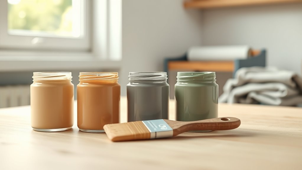
Simple Home Tests That Give Reliable Results
Start by brushing a sample of the paint onto a white poster board so you can move and compare it easily. Let it dry fully.
Then hold the board under different lighting—natural daylight, warm indoor bulbs, and shaded areas—to see how the tone shifts. You’ll get a reliable sense of whether the color will read darker or lighter in your space.
Test On Poster Board
Although a swatch can give you a hint, testing your paint on poster board lets you see how color, sheen, and drying behavior will really look in different lights and on a surface you can move around. You’ll check color consistency across strokes and note any sheen shifts as it dries. Use multiple panels to compare batches or mixes, and avoid wall commitment until you’re satisfied. Keep notes on drying time and texture.
- Paint a large patch and a thin wash
- Label paint brand, batch, and mix ratio
- Photograph at the same time each day
- Note temperature and humidity
- Stack boards to compare edges
Observe In Different Light
Because light changes how you see paint, check your swatches in multiple lighting conditions to know what you’ll actually get. Take samples into bright sunlight, shaded daylight, warm incandescent, and cool LED rooms.
Observe each swatch at different times—morning, noon, evening—so you track color consistency and pigment behavior under varied spectra. Tilt samples to catch gloss shifts and view at arm’s length and a few feet away to spot perceived value changes.
Note any fading, metamerism, or undertones that appear only in certain lights. Record findings before you commit, and choose the tone that holds up across conditions.
Quick Fixes If Color Dries Darker Than Expected
If your paint dries darker than the swatch, don’t panic—you can correct it without stripping everything back. First, assess color consistency across walls and note where application techniques varied. Then try small fixes before committing to repainting.
If paint dries darker than the swatch, stay calm—assess consistency, try small fixes, then decide on repainting.
- Lighten edges with a thinned glaze to blend tones.
- Add a topcoat in a slightly lighter shade for subtle correction.
- Adjust lighting to reveal true hue before more work.
- Feather in a skim coat where coverage was heavy.
- Test a small patch using consistent rollers and strokes.
These steps save time and keep your finish uniform while you decide next steps.
Decide: Accept the Shift or Repaint?
Now that you’ve tried quick fixes and tested small patches, decide whether to live with the darker result or repaint. You’ll weigh practical and aesthetic factors: is the shift subtle or glaring? Consider color consistency across rooms, lighting changes, and how long you’ll tolerate the variation.
Check the paint formulation—sheen and pigment load affect appearance—before committing. If mismatched areas are limited and acceptable, keep it and adjust décor or trim to unify the look. If inconsistencies bother you or cover large surfaces, repainting with sample-tested batches is wiser.
Choose the option that fits your timeline, budget, and tolerance.
Pro Tools and Techniques to Predict Final Color
When you need reliable foresight on how paint will settle, professional tools and techniques cut guesswork and help you predict final color with confidence. You’ll use spectrophotometers, sample boards, and controlled lighting to compare wet versus dry hues, factoring in sheen and substrate.
Consider color psychology to match mood once pigment settles, and check paint durability ratings for long-term appearance. Test multiple coats and document drying stages. Combine objective readings with your eye to decide if a shade meets goals before full application.
- Spectrophotometer readings under D65 light
- Large, painted sample boards
- Varied sheens tested
- Substrate absorption checks
- Timed drying observations
Final Checklist to Avoid Surprises When Choosing Paint
Before you commit to gallons, run through a quick, practical checklist to prevent surprises. Test large swatches on different walls and observe them at varied times; daylight, evening, and under your fixtures reveal shifts tied to pigment chemistry.
Note sheen differences and how texture or primer alters reflectance. Consider color psychology—how the hue affects mood in each room—before finalizing.
Verify brand batch consistency and request a sample pot if possible. Take photos under consistent light for comparison.
Confirm cleanup, VOC level, and touch-up availability. Only then buy full cans, confident the dried result matches intent.
Frequently Asked Questions
Can Humidity During Application Change Final Paint Color?
Yes — humidity impacts drying color: if you’re painting in high humidity, the paint dries slower, changing sheen and pigment appearance. You’ll notice subtle shifts; controlling humidity minimizes humidity impact and preserves desired final color.
Do Primers Ever Alter the Dried Color Noticeably?
Yes — primers can change the drying color noticeably. You’ll see primer impact when tinting, concealment, or substrate show-through alter the final hue, so always test samples over your surface before committing to full coverage.
Will Paint Color Shift Over Years or UV Exposure?
About 80% of painted surfaces show visible change within a decade, so yes—you’ll see color fading over years from UV exposure. Check pigment stability; higher-quality pigments resist fading, while cheap dyes and light damage shift hues noticeably.
Can VOCS or Additives in Paint Affect Drying Shade?
Yes — VOCs impact drying and can temporarily deepen sheen and color, and additives influence pigment dispersion and film formation, so you’ll see modest shade shifts during curing that often mellow as solvents evaporate and binders settle.
Does Painting Over Wallpaper Change the Apparent Color?
About 70% of homeowners notice subtle shifts when painting over wallpaper. You’ll see wallpaper transformation affect paint color consistency, because patterns, adhesive residues, and texture can alter sheen and hue, so priming’s essential for uniform results.
Conclusion
So, you tested a swatch, waited the agonizing eternity, and the paint still lied—drier and moodier or sunnier than promised. Don’t panic; you’re not cursed, you’re repainting history. Stop blaming the brush, blame chemistry (and your optimism). Tweak sheen, thin for translucence, or slap on another coat. Or accept the dramatized transformation and call it “artistic intent.” Either way, enjoy the thrill of being vaguely betrayed by color.