What Color to Paint Walls With Black Furniture?
With black furniture, go for warm neutrals, crisp whites, soft pastels, or deep jewel tones to balance drama and warmth; choose bright hues in small, low‑light rooms to keep space open, and richer, moody paints in larger or sunny rooms to add intimacy. Use glossy white trim for contrast, test swatches under morning and evening light, and consider an accent wall if you want focus without overwhelming the space — keep looking for tips on pairing trim, textiles, and lighting.
Best Wall Colors to Pair With Black Furniture

Wondering which wall colors make black furniture pop? You’ll favor warm neutrals like taupe or greige for subtle elegance, crisp whites for stark drama, and deep jewel tones—emerald, navy—for moody sophistication.
Use soft pastels—blush, sage—to lighten the scene without losing edge. Think about color psychology: blues calm, greens refresh, warm hues energize—pick what supports the room’s purpose.
Balance sleek black with texture contrast: matte paint, plaster, or wood-paneled walls prevent flatness and add depth.
Keep trim and ceilings lighter to frame pieces, and test swatches under your lighting before committing.
How Room Size and Natural Light Shape Your Paint Choice
If your room is small, you’ll want bright colors to keep the space feeling open and to balance black furniture.
In larger rooms you can lean into moodier hues that add depth without overwhelming the scale.
Also consider how light direction and tone change the paint—north-facing rooms benefit from warmer shades, while southern light can handle cooler colors.
Small Spaces, Bright Colors
How much light does your room really get, and how does that change through the day? In small spaces with black furniture, measure natural light and note its direction.
Use bright, warm hues to boost space perception and counterbalance dark pieces; color psychology tells you warm pastels and soft yellows feel inviting.
Reflective finishes and white trim amplify daylight, while a single vivid accent wall adds depth without overwhelming.
Keep contrast moderate so furniture pops but walls stay airy. Test samples at morning and evening to confirm the chosen shade reads bright when light shifts throughout daily hours.
Large Rooms, Moody Hues
Because a large room gives you breathing room, you can embrace moody, saturated paints without closing the space in—especially when black furniture anchors the palette.
You’ll use color psychology to choose deep teals, charcoal greens, or indigo that feel intimate yet expansive. Balance is key: introduce lighter accent walls or trimmed openings to prevent heaviness.
Consider texture pairing—velvet curtains, woven rugs, matte painted walls—so surfaces read layered, not flat. Keep furnishings minimal and reflective accents to bounce light.
With thoughtful contrasts and tactile elements, a big room becomes dramatic, cozy, and sophisticated rather than overwhelming.
Light Direction And Tone
Large rooms can handle deep, moody paints, but the way light enters the space will change everything—direction, intensity, and color temperature all affect how black furniture reads against your walls.
You’ll assess light direction and tone to pick a paint that balances contrast, respects color psychology, and keeps the room comfortable. North light cools tones; south light warms them. East and west bring shifting moods.
Consider finish and accent lighting to tweak perception.
- North-facing: cooler, use warm undertones
- South-facing: enhances warm palettes
- East-facing: morning warmth, soft contrasts
- West-facing: dramatic evenings, richer hues
- Artificial: match light temperature
Warm Neutrals That Soften Black Furniture
When you pair black furniture with warm neutrals, the result feels grounded rather than stark—those soft beiges, greiges, and muted terracottas gently temper black’s intensity while keeping the room cozy and sophisticated. You’ll like warm beige or creamy taupe on larger walls to soften contrasts, while a muted terracotta or greige accent adds depth without competing. Balance matte finishes with textured fabrics and natural wood. Use layered lighting to enhance warmth.
| Tone | Use | Effect |
|---|---|---|
| Warm beige | Main walls | Softens black |
| Creamy taupe | Trim/ceilings | Subtle contrast |
| Muted terracotta | Accent | Adds depth |
Crisp Whites and Off‑Whites for High‑Contrast Modern Rooms
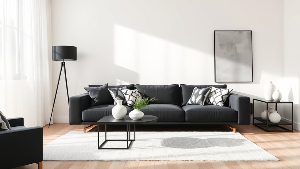
If you want a sharp, modern look, crisp whites or warm off‑whites make black furniture pop while keeping the space bright and airy. You’ll get strong contrast that reads clean and sophisticated.
Use high-quality eggshell or satin finishes to balance light reflection and hide imperfections. Add texture with rugs, throws, and matte black accents so the space feels layered, not stark.
Consider natural light and test samples at different times of day to choose the right white.
- Pure bright white walls for graphic contrast
- Soft off whites for a gentler edge
- Satin finish near high-traffic areas
- Textured fabrics to warm the palette
- Black trim for deliberate framing
Soft Pastels That Add Warmth Without Overpowering Black Furniture
Try soft pastels like warm blush, muted sage, or dusty peach to add cozy color without letting your black furniture dominate.
These tones soften the room and create a gentle contrast that still feels grown-up.
Mix accents in similar or slightly deeper shades to tie the palette together.
Warm Blush Tones
Although black furniture anchors a room with bold contrast, soft blush walls let you warm the space without competing for attention. You’ll find blush undertones soften stark lines and create a cozy backdrop that highlights black pieces.
Use complementary accents in brass, cream, or muted terracotta to lift the palette and add depth. Keep trim crisp and pick a matte finish to prevent glare.
Layer textiles—pillows, throws, rugs—in varied tones of pink and neutral to maintain balance. Light plays well on warm blush, so prioritize warm bulbs and sheers to complete the look.
- Blush undertones for warmth
- Brass complementary accents
- Matte finish trim contrast
- Layered textiles in pinks
- Warm lighting and sheers
Muted Sage Greens
When you pair muted sage walls with black furniture, the green’s soft, dusty undertones warm the room without stealing focus, creating a calm, collected backdrop that makes black pieces read as intentional anchors rather than heavy focal points.
You’ll find muted color palettes like sage let you layer textures—linen, wood, woven fiber—without visual competition. Use nature inspired tones to bridge indoor and outdoor vibes, adding potted plants or botanical prints to enhance cohesion.
Keep trim and ceiling lighter to maintain brightness, and choose soft matte finishes to emphasize subtlety. The result feels restrained, cozy, and modern without overpowering your black furniture.
Dusty Peach Hues
If you want a soft, warm backdrop that keeps black furniture looking crisp rather than heavy, dusty peach is a great choice.
You’ll find dusty peach palettes that balance warmth and restraint, letting black pieces anchor the room without overpowering it. Choose shades with warm undertones to create cozy contrast, pair with matte black frames, and add natural wood or brass accents to enhance depth.
Keep trim bright to prevent muddiness, and use textiles to vary texture.
- Soft dusty peach walls
- Matte black furniture contrast
- Warm undertone accents
- Light trim for clarity
- Mixed textures for depth
Jewel Tones to Create a Dramatic, Luxe Backdrop for Black Pieces
Because jewel tones have deep, saturated color, they make black furniture feel intentional and elevated rather than stark or heavy. You can use jewel tones to craft dramatic contrast, pairing emerald, sapphire, or amethyst walls with sleek black pieces for a luxe vibe. Keep trim lighter to prevent overwhelm and introduce metallic accents to reflect warmth.
| Tone | Mood | Accent idea |
|---|---|---|
| Emerald | Regal | Brass lamps |
| Sapphire | Calm | Velvet pillows |
| Amethyst | Sophisticated | Gold mirrors |
| Ruby | Bold | Leather ottoman |
Pick one dominant hue and layer textures for depth.
Earthy Greens and Blues That Balance Black’s Intensity
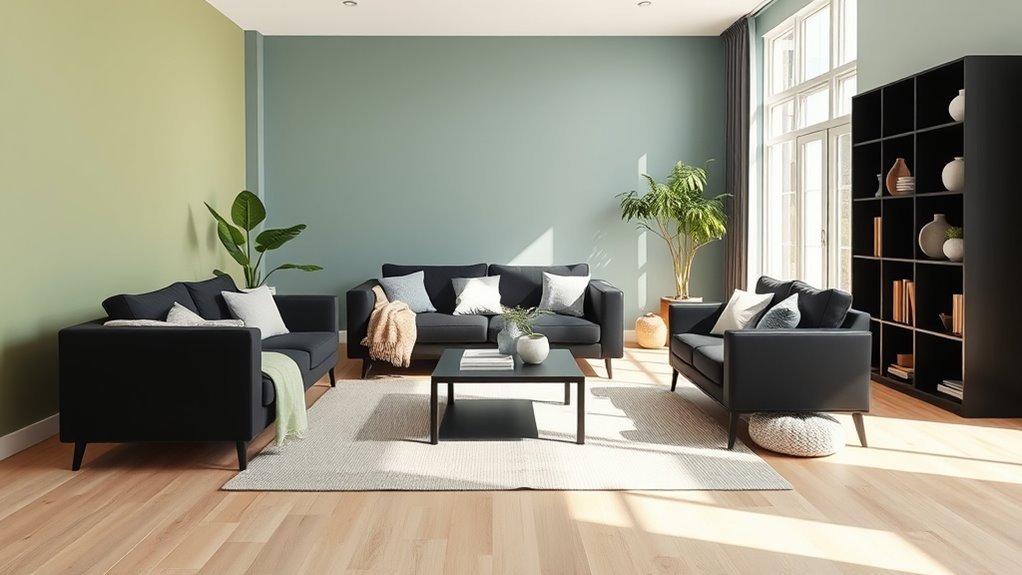
Although black furniture reads bold, pairing it with earthy greens and muted blues softens the look and brings warmth and calm to the room.
Pair bold black furniture with earthy greens and muted blues to soften contrast, add warmth, and evoke calm.
You’ll create nature inspired palettes that balance black’s intensity and highlight texture without overwhelming the space. Choose olive, sage, slate, or dusty teal to keep contrast gentle. Those tones offer calming effects, grounding dark pieces and letting light surfaces pop.
Use finishes and fabrics to layer depth, and keep trim crisp for definition.
- Olive walls with natural wood accents
- Sage backdrop for matte black frames
- Slate blue in a cozy reading nook
- Dusty teal for kitchen cabinetry
- Moss green in a bedroom
Accent Wall vs. All‑Over Color: When to Choose Each
If you want a bold focal point, an accent wall lets you make a strong statement without overwhelming the room.
In small spaces you’ll often prefer an all-over color to keep things airy, while larger rooms can handle a darker or richer painted wall.
Think about how each choice affects the flow to adjacent rooms so your black furniture feels intentional and cohesive.
Accent Wall Impact
When you have black furniture, deciding between an accent wall and painting the whole room comes down to how bold and balanced you want the space to feel; an accent wall creates focus and contrast without overwhelming, while all-over color unifies and can soften the starkness of dark pieces.
You’ll choose an accent when you want a focal point, drama, or texture; go all-over to calm and enlarge. Use practical accent wall techniques and durable accent wall materials to guarantee longevity and visual impact.
- Position focal pieces against the accent
- Pick complementary or muted hues
- Add texture or wallpaper
- Test paint samples in daylight
- Coordinate trim and ceiling colors
Room Size Considerations
Because room dimensions change how color reads, you’ll want to match your paint strategy to the space before you pick a hue.
If you’ve got a small room with low ceilings, an all-over light color will open the space and keep black furniture from feeling heavy.
In taller or larger rooms, an accent wall can add depth without swallowing the room, especially when placed behind focal pieces.
Consider room proportions and how your furniture layout directs sightlines: align the accent with seating or the bed to anchor the space.
Test samples in different light to confirm the balance feels right.
Cohesive Color Flow
After sizing up how light and ceilings affect black furniture, decide how color should flow through the whole room—will you paint every wall the same or reserve color for an accent?
You’ll use color psychology to set mood: all‑over color soothes and unifies, an accent energizes or anchors.
Consider spatial scale, focal points, and material contrast with black pieces. Choose all‑over for calm cohesion, an accent for drama or to highlight textures.
Plan trim and ceiling coordination so changes feel deliberate. Test samples across daylight and evening before committing.
- All‑over for unity
- Accent for focal impact
- Contrast with materials
- Scale and sightlines
- Sample in different light
Trim, Ceiling, and Baseboard Pairings With Black Furniture
Though black furniture already anchors a room, your trim, ceiling, and baseboards decide whether that anchor feels crisp or heavy; choose finishes that balance contrast and cohesion. You’ll mix trim styles, ceiling finishes, baseboard designs, contrasting colors, and texture variations to frame furniture without competing. Use glossy white trim for crispness, matte warm ceilings for softness, and tall baseboards to ground pieces. Consider subtle moulding or flat profiles per style.
| Element | Finish | Effect |
|---|---|---|
| Trim | Glossy white | Crisp outline |
| Ceiling | Soft matte | Intimate feel |
| Baseboard | Tall matte | Grounding presence |
| Moulding | Subtle | Cohesive frame |
How Natural and Artificial Lighting Alters Color Perception
When you stand in a room at different times of day, light will change how your black furniture and wall colors read—natural light brings cooler, bluer undertones in the morning and late afternoon warmth through direct sun, while artificial sources shift hues depending on bulb temperature and fixture direction.
You’ll notice color psychology shifts as moods change with light; cool blues feel calming in daylight, warm ambers cozy at night. Consider testing swatches at multiple times.
Use lighting effects intentionally to flatter black pieces and wall paint, avoiding surprises when the sun moves or you switch lamps.
- Morning: cool, crisper tones
- Noon: neutral, true color
- Evening: warmer cast
- Warm bulbs: deepen hues
- Cool bulbs: brighten contrasts
Styling Tips: Fabrics, Metals, and Accessories to Finish the Look
Because black furniture anchors a room, you’ll want fabrics, metals, and accessories that both balance and highlight its presence.
Choose fabric choices with texture—linen, boucle, velvet—to soften hard lines and add depth. Introduce color through pillows or throws in muted tones or jewel shades to create contrast without competing.
Use metallic accents sparingly: brass warms, chrome brightens, matte black keeps cohesion. Incorporate rugs and curtains to define zones and control scale.
Add reflective surfaces like mirrors or a glass coffee table to bounce light. Finish with curated art, plants, and lighting for a polished, intentional look.
Frequently Asked Questions
Will Black Furniture Make My Room Feel Colder?
Yes — black furniture can make your room feel colder, but you can counteract color psychology effects by adding warm accents, layered lighting, and wood tones so the space feels cozy, balanced, and inviting rather than stark.
How Do I Coordinate Rugs With Black Furniture?
Match rug color combinations to your room’s palette and mood, and use texture contrasts for depth; pick warm neutrals or bold jewel tones, layer a plush rug over a flatweave, and anchor black furniture confidently.
Are Patterned Wallpapers Suitable With Black Furniture?
Yes—you can use patterned wallpapers with black furniture. Picture bold patterns like oversized florals or geometric prints framing sleek black silhouettes; mix color combinations (contrasting brights or muted neutrals) to balance drama and cohesion throughout the room.
What Paint Sheen Works Best Around Black Furniture?
A satin or eggshell sheen works best around black furniture; you’ll get subtle reflectivity without glare. Consider sheen options for durability and wipeability, and balance color contrasts so finishes and hues complement rather than fight.
How to Mix Different Black Finishes in One Room?
You’ll balance different black finishes by pairing matte and glossy pieces, blending black furniture styles with mixing textures for contrast, using consistent accents, strategic lighting, and tactile rugs or cushions to unify the room’s polished and muted elements.
Conclusion
You can choose a soft beige to warm the room or a crisp white to sharpen the drama—either way, black furniture anchors the scene. Let light pull color toward airy or cozy: big windows brighten whites, small rooms benefit from warm neutrals. Pair pastels for gentle contrast or deep hues for bold flair. Mix brass and linen for texture, then step back and watch stark and soft, shadow and light, balance into a confident, lived-in space.