What Color Makes a Room Look Larger: Best Shades for a Spacious Feel
Choose light, cool-toned colors to make your room feel larger—soft whites, pale blues, and light grays reflect light and open sightlines. Use low-contrast trim or a monochromatic palette so walls, trim, and furniture blend and don’t chop the space. Satin or subtle matte finishes keep brightness without glare; mirrors and light wood flooring help too. Warm neutrals can work if they’re pale and low-contrast. Keep going to discover specific shades and practical tips.
Which Colors Make Rooms Look Larger?
When you want a room to feel larger, choose light, cool hues—think soft whites, pale blues, and light grays—because they reflect more light and visually open up walls and ceilings.
You’ll use color psychology to calm contrast and extend sightlines; low-contrast trims and monochromatic schemes improve spatial perception.
Keep ceilings lighter than walls and avoid heavy, dark accents that compress the space.
Quick Steps to Make a Room Look Larger
If you want a room to feel larger, start with a few simple changes that boost light and open sightlines: paint walls and ceiling in light, cool tones, keep trim low-contrast, choose low-profile furniture, and declutter to reveal floor space—each move makes the room read as more expansive without major renovations.
Then refine spatial organization and furniture arrangement: align pieces to create clear pathways, use multifunctional items, and keep surfaces tidy.
Why Light Colors Visually Expand Space
To understand why light colors make a room feel bigger, look at what they do to light and edges: pale paints reflect more natural and artificial light back into the space, softening shadows and brightening corners so walls recede visually.
| Effect | Why it helps | Tip |
|---|---|---|
| Reflection | boosts brightness | choose high LRV |
| Contrast reduction | blurs edges | avoid dark trims |
| Mood | aids color psychology | keep accents minimal |
Cool Tones That Make Rooms Feel Open
Try pale blue on the walls to reflect light and give the room an airy, calm backdrop.
Add soft mint accents to introduce a fresh, open feel without overpowering the space.
Use light gray neutrals for furniture or trim to anchor the palette while keeping the overall look spacious.
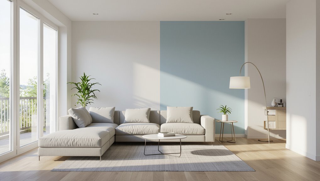
Pale Blue Walls
When you paint walls a pale blue, the room instantly feels airier and more open because cool tones visually recede, creating depth without shrinking the space. You’ll tap into pale blue psychology to foster serene environments; pair with white trim and reflective surfaces to boost light and perceived size.
| Benefit | Tip |
|---|---|
| Calming | Use soft whites |
| Expands | Add mirrors |
Soft Mint Accents
Although soft mint carries a gentle coolness, it brightens a space without feeling sterile.
So you’ll get an airy, open vibe by using it as an accent. Pair mint decor with white trim and light wood to reflect light and widen sightlines.
Choose a few mint accent pieces—pillows, a throw, or a small vase—to create cohesion without overwhelming the room.
Light Gray Neutrals
Light gray neutrals give rooms an instant sense of airiness, and they’ll make furniture and natural light stand out without stealing the show. You can use light gray texture on walls and fabrics to add depth, and choose shades with cool light gray undertones to visually expand space while keeping a calm, modern feel.
| Tip | Effect |
|---|---|
| Matte finish | Softens light |
| Sheen finish | Reflects light |
| Warm accents | Prevents chill |
| Layered textiles | Adds depth |
Why Warm Neutrals Can Still Feel Airy
Because warm neutrals reflect your light and expand sightlines, they can feel surprisingly airy rather than heavy.
You’ll keep rooms bright by choosing warm neutrals with low saturation and cool undertones trimmed out by white or pale accents.
Use sheer textiles, glossy surfaces, and strategic lighting to maintain depth without weight so airy spaces stay inviting and visually open.
Best White Shades to Make a Room Feel Bigger
When you want a roomy, modern feel, crisp cool whites bounce light and sharpen edges without feeling clinical.
If you prefer a cozier openness, warm soft whites keep the space bright while adding subtle warmth.
Choosing between them lets you tailor the mood—cool for airy clarity, warm for gentle spaciousness.
Crisp Cool Whites
Although cool whites can feel stark if chosen poorly, the right crisp shade will bounce light and visually expand your space. You’ll pick a crisp white to create a clean, modern, spacious ambiance that reflects daylight. Use matte or eggshell for subtle diffusion, pairing with minimal trim.
| Shade | Undertone | Best Use |
|---|---|---|
| Pure white | Blue | Small rooms |
| Snow | Gray | Hallways |
| Arctic | Green-blue | Kitchens |
| Bright | Cool | Bathrooms |
Warm Soft Whites
If crisp cool whites can widen a room with clean, bright light, warm soft whites will open a space while adding inviting depth.
You’ll choose whites with warm undertones to soften shadows and reflect cozy, natural light.
Pair them with light textures—linen, matte paint, soft wood—to keep airiness.
These shades make small rooms feel larger without sterile chill, encouraging a welcoming, roomy atmosphere.
Soft Gray Shades That Open Up a Small Room
Because soft gray reflects light without feeling cold, it’s one of the smartest choices for making a small room feel larger and more inviting.
You’ll use soft gray textures on walls and textiles to diffuse light, while gray accent pieces add depth without clutter.
Pair with warm metallics and crisp white trim so sightlines stay open and the space feels airy and intentional.
Pale Blue Options for a Spacious, Calming Feel
When you choose pale blue for walls and accents, you’ll tap into a color that visually expands a room while calming the senses. Its cool undertones bounce light and create a sense of depth without overpowering other elements.
You’ll use pale blue psychology to craft calming environments—pair with crisp whites, light woods, and minimal patterns to maximize openness and serenity while keeping the space airy and cohesive.
Subtle Green Hues That Add Depth and Airiness
Try soft sage on trim or an accent wall to introduce warmth without closing in the room.
Pair pale mint accents in textiles and accessories for a fresh, airy lift.
For a serene backdrop, go with cool seafoam walls to add depth while keeping the space light.
Soft Sage Tones
Soft sage brings a cool, muted green that instantly makes a room feel calmer and more open, without overwhelming your senses.
Use soft sage inspiration to layer neutrals and natural textures, creating depth while keeping light reflective.
Pair with warm woods and white trim to maintain airiness.
Choose calming green palettes for bedrooms or living areas to broaden sightlines and promote relaxed flow.
Pale Mint Accents
Pale mint brings a whisper of green that lifts a room without stealing focus. You can use it as an accent on trim, textiles, or a single statement wall to introduce depth and airiness.
Pair pale mint furniture with neutral walls to maintain openness. Add pale mint accessories for cohesion, and balance with warm woods and bright lighting to enhance the airy, layered effect.
Cool Seafoam Walls
If you liked the light touch of mint accents, consider extending that freshness across your walls with cool seafoam.
You’ll create airiness and subtle depth without overwhelming the room. Seafoam accents tie furnishings to walls, enhancing flow.
Relying on color psychology, this soft green calms, reflects light, and visually expands space, making rooms feel brighter, balanced, and effortlessly open.
Cream and Beige Tones That Keep Rooms Bright
When you choose cream and beige tones, they reflect light and make ceilings feel higher and corners less pronounced.
You’ll layer cream textures for depth without dark shadows, pairing subtle beige accents to warm the space.
Opt for matte finishes to diffuse glare, coordinated trim in slightly lighter hues, and natural fabrics.
These choices keep rooms bright, calm, and visually expansive.
Off-White vs Pure White: Which Enlarges a Room?
You’ll notice off-white adds a warm, cozy glow that softens shadows and feels inviting.
Pure white, by contrast, reflects more light and gives a room a crisp, airy look.
Which works best depends on your light levels and the mood you want to create.
Off-White’s Warmth Benefits
Though pure white can feel crisp and airy, off-white often makes a room feel both larger and more inviting because its subtle warmth reduces stark contrasts and softens shadows.
That gentle glow reflects light without the clinical edge of true white, so your space reads as expansive yet comfortable rather than cold.
You’ll leverage off white textures and off white undertones to create depth, warmth, and visual continuity.
Pure White’s Brightness Edge
If you want maximum reflectivity and a clean, airy feel, pure white gives you the brightness edge: its neutral, high-reflectance surface bounces more natural and artificial light around a room, minimizing shadow and making edges recede so spaces feel larger.
You’ll use pure white to visually expand rooms; color psychology also links it to clarity and openness, though it can feel stark without soft accents.
Choosing Undertones: Blue, Green, Pink, or Yellow?
Wondering which undertone will make your room feel airier? You’ll find blue versus green shifts coolly open spaces—blue feels crisp and expansive, green adds a natural calm that still reads spacious.
Pink undertones can bounce warm light without shrinking the room, while soft yellow brightens corners.
Choose based on light direction and the mood you want: cooler for crispness, warmer for cozy openness.
How Paint Finish (Matte Vs Satin) Affects Perceived Size
Color and undertone set the mood, but finish changes how that color reads in your space: matte absorbs light and softens walls, making surfaces recede, while satin reflects more light and can highlight imperfections but also visually lift and expand a room.
You’ll choose matte for cozy depth or satin to enhance light; test paint effects with your color combinations to confirm perceived size.
Using Trim and Ceiling Color to Increase Height
When you paint trim and ceilings with intention, you can visually lift a room and make ceilings feel higher than they are.
Choose trim colors slightly lighter or warmer than walls to create upward contrast.
Paint ceiling trim and crown molding the same as the ceiling to blur edges and enhance perceived ceiling height.
Subtle contrasts and consistent trim colors raise perceived ceiling height without dramatic changes.
Painting Ceilings Brighter to Make Rooms Feel Taller
You can build on trim and crown-molding choices by making the ceiling itself brighter to boost the sense of height.
Use lighter ceiling colors to reflect light and improve height perception.
Lighter ceiling colors reflect light, visually lifting the room and enhancing the feeling of height.
Try these approaches:
- Pure white for maximum lift.
- Soft warm white to avoid starkness.
- Pale cool tones for contrast.
- High-gloss finishes to bounce light and exaggerate vertical space.
Coordinating Baseboards and Walls for Seamless Flow
A few simple choices on baseboards can make your walls read as one continuous plane, so rooms feel larger and more cohesive.
Choose a subtle baseboard color that either matches or is a shade lighter than the wall to avoid visual breaks.
Keep wall texture minimal and consistent, since heavy texture creates shadow lines that interrupt flow and shrink perceived space.
Monochromatic Palettes to Make Rooms Look Bigger
Because sticking to one color family simplifies visual layers, a monochromatic palette makes a room feel more open and unified.
Sticking to a single color family simplifies layers, making a room feel more open and cohesive.
You’ll use monochromatic schemes to unify furniture, trim, and textiles while subtle color layering adds depth.
Try these steps:
- Pick a base hue.
- Select three tonal variations.
- Match large surfaces to mid-tones.
- Add accents in the lightest or darkest tone.
Two-Tone Walls Without Shrinking a Room
Shifting from a monochromatic base, two-tone walls can add interest without making space feel smaller if you use contrast thoughtfully.
You should pick light, related color combinations and place the darker hue low to anchor the room. Keep changes crisp, use the same sheen, and avoid heavy wall textures so sightlines stay clear.
Balanced contrast boosts depth without crowding the space.
Vertical Stripes and Patterns That Make Ceilings Higher
Use vertical stripes to trick the eye into seeing taller walls, choosing narrow, evenly spaced patterns for the strongest upward pull.
Place those stripes strategically on the wall faces you want to emphasize, and keep the pattern aligned from floor to ceiling for seamless continuity.
When the stripe color extends all the way up, your ceiling will read higher without changing its actual height.
Vertical Stripe Illusion
When you paint vertical stripes or install tall, narrow patterns, your room will feel noticeably taller because the eye follows the lines upward.
This simple optical trick stretches low ceilings without structural changes. You can use vertical line patterns and optical illusion techniques to enhance height.
- Choose contrasting tones
- Keep proportions slim
- Align with natural light
- Maintain simple furniture
Narrow Pattern Placement
One smart way to visually raise a low ceiling is to place narrow vertical stripes or tall, slim patterns on walls that draw the eye upward.
Position them on the longest wall or on the wall opposite a window to maximize the effect.
You’ll use narrow patterns and careful placement techniques to emphasize height—keep contrasts subtle, spacing regular, and surrounding decor minimal to sustain the illusion.
Ceiling-To-Floor Continuity
If you want to make a room feel taller, extend patterns continuously from ceiling to floor so the eye travels uninterrupted upward; vertical stripes, elongated motifs, or a narrow panel of contrasting color all reinforce that lift.
You’ll pair ceiling color with matching stripes and choose subtle wall texture to avoid breaks.
- Thin vertical stripes
- Continuous mural
- Contrasting panel
- Subtle texture blend
Horizontal Stripes: When They Help Versus When They Hurt
Although horizontal stripes can visually widen a room, they only help when you match their scale, color contrast, and placement to the space; too-busy stripes or high-contrast bands can actually make a ceiling feel lower or a room feel chopped up.
You should choose subtle horizontal stripe patterns, align stripes with furniture lines, and use visual balance techniques so stripes enhance width without overwhelming sightlines.
Accent Walls That Don’t Create Visual Compression
Anyone can use an accent wall without shrinking a room, but you’ve got to plan it so it adds depth rather than compressing the space.
Choose accent wall materials and finishes that reflect light; use visual depth techniques to extend sightlines.
Try:
- Low-contrast color
- Vertical texture
- Mirrored panels
- Subtle matte-gloss mix
These keep rooms airy, not boxed in.
How to Pick an Accent Color for a Small Room
When you pick an accent color for a small room, stick to light, low-contrast hues so the space feels airy rather than chopped up.
Use vertical or horizontal accents—like a stripe or painted trim—to guide the eye and enhance height or width.
Tie the accent to existing tones in furniture or textiles so everything reads as a cohesive, expanded whole.
Choose Light, Low-Contrast Hues
If you want a small room to feel larger, pick an accent color that’s light and low-contrast so it blends smoothly with your base walls rather than cutting the space in two.
You’ll favor light pastel palettes and airy color combinations that unify surfaces.
Try these steps:
- Choose muted tint
- Match undertones
- Use 10–20% saturation
- Test in daylight
Use Vertical Or Horizontal Accents
Try painting one tall wall or a single vertical stripe in a slightly darker or richer shade to draw the eye upward and give the room a sense of height.
Or go the opposite way with horizontal accents—like a low band or contrasting trim—to visually widen the space.
Use vertical lines sparingly for lift, and subtle horizontal patterns to broaden without overwhelming the room.
Tie With Existing Tones
Shifting from line work to color, pick an accent that complements the tones already in the room so everything feels cohesive rather than pasted-on.
You’ll use color psychology and consider space perception when choosing a hue.
Try these steps:
- Pull one undertone from main paint.
- Test small swatches.
- Balance warm/cool contrasts.
- Limit to two accent pieces for harmony.
Using Cool Dark Colors Strategically in Small Spaces
When you use cool dark colors deliberately, they can make a small room feel deeper and more cohesive rather than cramped.
You’ll balance dark color psychology with contrast—trim, ceilings, and reflective surfaces—to prevent heaviness.
Use strategic lighting: layered fixtures, dimmers, and targeted lamps to reveal depth.
Pair cool charcoals or deep blues with light furnishings and mirrors to keep the space airy.
When a Dark Wall Can Actually Make a Room Feel Larger
If you paint a single wall in a deep, cool tone and keep adjacent surfaces lighter, that dark plane will recede visually and make the room feel wider and more layered.
Use a dark accent thoughtfully so your furniture and trim pop.
Consider:
- Positioning
- Contrast level
- Scale of pattern
- Balance with light furnishings
These choices exploit visual perception.
How Lighting Interacts With Paint Color to Enlarge Space
When you want a room to feel bigger, natural light will amplify your paint’s true hue and make colors read lighter.
Be aware that artificial lights can warm or cool those tones, so test swatches under the bulbs you’ll actually use.
Also consider finish: higher gloss reflects more light and can open up a space, while matte soaks light in and softens depth.
Natural Light Amplifies Hues
Because natural light changes throughout the day, it dramatically alters how paint hues read and can make a room feel much larger or noticeably smaller.
Choose colors that work with your light source rather than against it. You should test swatches at different times to judge natural light and color intensity:
- Morning coolness
- Midday brightness
- Evening warmth
- Cloudy diffusion
Artificial Light Shifts Tone
Although it’s easy to assume bulbs just provide light, the type and color temperature of your artificial lighting can dramatically alter paint tones and the perceived size of a room. You should test bulbs with samples to see how artificial light shifts color perception and depth, then choose warmer or cooler LEDs to visually expand or cozy up spaces.
| Bulb Type | Temp (K) | Effect |
|---|---|---|
| Incandescent | 2700 | Warmer, cozier |
| Warm LED | 3000 | Soft, slightly enlarges |
| Cool LED | 4000 | Crisper, more open |
| Daylight LED | 5000 | Bright, maximizes space |
Gloss Levels Affect Perception
Lighting choice doesn’t just change color temperature—it also interacts with paint sheen to shape how roomy a surface feels.
You can use gloss levels to direct light, balance glare, and expand perceived space. Consider these effects:
- High gloss: boosts natural light with reflective surfaces.
- Satin: soft glow, less glare.
- Eggshell: muted reflection, cozy depth.
- Matte: minimizes shine, flattens texture.
Natural Light Vs Artificial Light and Color Choices
When you pick paint and furnishings, consider how natural and artificial light will change their colors throughout the day: sunlight brings out true, warm tones and shifts with the sun’s angle, while artificial bulbs can cast cool or yellow hues that alter perception.
Test swatches at morning, midday, and evening, and choose shades that maintain openness under both natural light and artificial light.
Use Reflective Surfaces to Make a Room Feel Bigger
Because reflective surfaces bounce light and visually double space, you can instantly make a room feel larger by adding mirrors, glossy finishes, or metallic accents.
Reflective surfaces bounce light and visually double space, instantly making a room feel larger with mirrors or metallic finishes
Use mirrored furniture and reflective decor sparingly to avoid clutter.
Try these ideas:
- Large wall mirror
- Glossy paint or lacquered cabinets
- Metallic light fixtures
- Mirrored side tables or trays
Matching Furniture Color to Walls to Reduce Visual Clutter
If you want a calmer, more open look, match your furniture to the wall color so pieces blend instead of competing for attention. You’ll create color harmony, simplify sight lines, and make furniture placement feel intentional. Keep contrast minimal; use texture for depth.
| Strategy | Effect |
|---|---|
| Match tones | Unified space |
| Subtle contrast | Depth without clutter |
| Textured fabrics | Visual interest |
| Minimal accents | Clear sight lines |
Flooring Colors That Support Spaciousness
While you might instinctively reach for dark floors, lighter, neutral flooring shades generally open up a room by reflecting more light and reducing visual weight; choose pale woods, cool grays, or soft beiges to make spaces feel airy and continuous.
- Favor light wood or cool grays over dark flooring.
- Use subtle flooring finishes and minimal texture contrast.
- Anchor with area rugs, avoid busy patterned carpets.
- Plan flooring shifts to keep multi tone floors cohesive.
Window Treatments and Wall Color Coordination
Match your trim to the walls to create seamless lines that make the room feel bigger.
Use curtains that contrast gently with the wall color so they stand out without breaking the visual flow.
Add sheer layers to soften light and keep the space airy.
Match Trim To Walls
When you paint trim the same color as the walls, windows and doors melt into the background and the room instantly feels larger and calmer.
You’ll want to contemplate trim textures and wall finishes to keep cohesion.
Try these tips:
- Use satin trim for subtle sheen.
- Match matte walls to matte trim.
- Coordinate patterns minimally.
- Blend tones for seamless sightlines.
Contrast Curtains Lightly
A single, subtle contrast between your curtains and walls can define windows without shrinking the room. So choose fabrics that sit a few shades darker or lighter than the paint to create depth without distraction.
You’ll explore contrast curtain styles that complement trim and furniture; pick fabric color choices that echo accents, maintain light reflection, and keep the visual field airy while framing views neatly.
Consider Sheer Layers
If you liked the light-touch contrast of slightly darker or lighter curtains, try adding a sheer layer to keep brightness while softening edges and views.
You’ll balance color and light using sheer curtains and layering fabrics to add depth.
Tips:
- Match undertones.
- Keep neutral sheers.
- Use floor-length panels.
- Layer textures for contrast and translucence.
Small Room Color Plans: Studios
Because studio living blends sleeping, cooking, and living into one compact space, your color choices have outsized impact on how roomy it feels and functions.
Choose a cohesive light palette—soft whites, pale grays, warm beiges—to unify zones. Use accent tones sparingly to define areas without clutter.
Coordinate studio organization and furniture arrangement with matching hues to streamline sightlines and maximize perceived space.
Small Room Color Plans: Bedrooms
For a small bedroom, paint the walls in light neutrals to open up the space and keep sightlines clean.
Pair monochromatic bedding—varying tints and textures of the same hue—to create cohesion without clutter.
Add reflective accents like mirrored nightstands or glossy lamps to bounce light and enhance depth.
Light Neutral Walls
When you paint bedroom walls in light neutrals, the room immediately feels airier and more open; soft shades like warm white, pale greige, or muted sand reflect light and create a calm backdrop that lets furniture and textiles stand out.
Choose light neutral palettes and airy texture options to enhance space:
- Use matte finishes.
- Add sheer drapes.
- Limit contrast.
- Keep clutter low.
Monochromatic Bedding Schemes
If you stick to a single color family for your bedding, the room instantly feels more cohesive and spacious; varying tones and textures within that hue add depth without visual clutter. You’ll use monochromatic textures and subtle bedding patterns to layer interest while keeping harmony.
| Element | Purpose |
|---|---|
| Sheets | Base tone |
| Duvet | Mid-tone |
| Throw | Accent texture |
| Pillows | Pattern play |
| Rug | Grounding layer |
Reflective Accent Surfaces
You can boost that cohesive, monochromatic look by introducing reflective accent surfaces that catch and bounce light around a small bedroom.
Use reflective finishes and glossy accents sparingly to avoid glare while amplifying space.
Consider:
- Mirrored headboard
- Lacquered nightstand
- Metallic lamp
- Glass shelving
These choices brighten, add depth, and keep the scheme unified.
Small Room Color Plans: Kitchens
Because kitchens are where meals and memories happen, choosing colors that open the space matters more than you might think. You’ll use kitchen color psychology to pick pale, warm neutrals and cool blues, maximizing kitchen light with glossy cabinets and reflective backsplashes. Plan contrast for depth and keep ceilings light to lift sightlines.
| Element | Tip |
|---|---|
| Walls | Soft warm neutrals |
| Cabinets | Glossy light finishes |
| Backsplash | Reflective tiles |
| Accents | Pale cool hues |
| Ceiling | Brighter than walls |
Small Room Color Plans: Bathrooms
Kitchens benefit from light-reflecting finishes, and bathrooms can use the same principles on a smaller scale to feel roomier and more serene.
You’ll pick pale, warm neutrals, glossy tiles, and cohesive fixtures.
Consider:
- Maximize bathroom lighting with layered sources.
- Use design mirrors to bounce light.
- Choose pale grout and trim.
- Keep finishes minimal for visual continuity.
Hallways and Narrow Spaces: Best Color Tactics
To make a hallway feel wider and brighter, use light-reflective colors on walls and ceilings so natural and artificial light bounces around the space.
You can add vertical accent stripes to draw the eye upward and suggest higher ceilings.
Try a pale base with slightly darker narrow stripes for contrast without closing the space.
Light Reflective Colors
When you paint hallways and narrow spaces with light-reflective colors, they’ll seem wider and brighter because those hues bounce natural and artificial light around the room; choose soft whites, warm creams, and pale pastels with subtle sheen to maximize that effect.
You’ll apply light color psychology and reflective paint finishes to create airy flow.
- Pick soft whites
- Use warm creams
- Try pale pastels
- Favor subtle sheen
Vertical Accent Stripes
Although a narrow hallway can feel cramped, vertical accent stripes make ceilings seem higher and walls stretch taller, giving an instant sense of openness.
You can use subtle contrast—soft cream with pale gray—or bolder two-tone vertical stripe patterns to draw the eye upward.
Combine with consistent lighting and trim color for maximum visual height enhancement, creating a streamlined, airy passage.
Open-Plan Living: Unifying Colors to Feel Larger
If you want an open-plan space to feel larger, unify your color palette across adjoining areas so sightlines stay uninterrupted and light travels freely.
You’ll create open plan harmony and cohesive palettes that read as one. Try subtle shifts and consistent undertones:
- Use a single base hue.
- Vary finishes, not shades.
- Repeat accent tones.
- Keep trim neutral throughout.
Test Paint Samples for a Roomy Look
Before you commit, test paint swatches on the wall to see how each hue reads in your space.
Check those samples at different times of day and under artificial light so you notice shifts.
For a truer sense of scale, paint large temporary panels rather than tiny chips.
Test Paint Swatches
When you’re choosing colors for a more spacious feel, testing swatches on your walls is essential; small chips won’t show how light, texture, and surrounding furnishings change a shade.
You should do paint testing and watch color trends, then:
- Apply large swatches.
- View from different angles.
- Compare adjacent finishes.
- Note how furnishings alter tone.
Observe Samples At Different Times
Why check your swatches at sunrise, midday, and after dark? You’ll see how light shifts hue and contrast, so you can match color psychology to mood and function.
Observe warm morning glow, bright midday clarity, and cooler evening tones to judge true undertones and reflections. This lets you predict how colors alter spatial perception and choose a shade that consistently expands the room.
Use Large Temporary Panels
After checking swatches at different times, you’ll want to see how a full wall of color reads in your space—small samples can lie.
Use large temporary panels to simulate scale and light, testing hues before committing.
Benefits include:
- true color context
- scale perception
- quick removal
- cost-effective trials
These temporary installations show large panel benefits and guide confident choices.
Common Color Mistakes That Make Rooms Feel Smaller
Because color shapes how you perceive space, a few common painting mistakes can make even a generous room feel cramped; choosing dark, overly saturated hues, painting all walls the same intense color, or ignoring the ceiling and trim can visually close in the space and highlight awkward proportions.
| Mistake | Effect |
|---|---|
| Dark hues | Shrinks space |
| Saturation | Overwhelms |
| Uniform walls | Flattens depth |
| Ignored trim | Lowers ceiling |
| Busy patterns | Clutters room ambiance, color psychology |
Budget-Friendly Paint Strategies to Maximize Space
Want to make a room feel larger without spending a lot? You can use affordable paint options and simple DIY color techniques to open up space.
Try these steps:
- Choose pale, warm neutrals.
- Paint ceilings a lighter shade than walls.
- Use gloss sparingly to reflect light.
- Keep trim and doors monochrome for visual continuity.
Professional Paint Tools and Techniques That Help
Equip yourself with a few pro tools and simple techniques to get a smooth, roomy-looking finish without overcomplicating the job.
Use professional rollers and painter’s tape, practice paint brush techniques, and follow wall preparation strategies for even coverage.
Apply color mixing tips grounded in color theory principles, try controlled spray painting methods, and limit texture application techniques to enhance depth without shrinking the room.
Color-Blindness and Accessibility Considerations for Size Cues
While color choices can make a room feel larger, you’ll also want to guarantee those cues work for people with color-vision differences by relying on contrast, value, and texture rather than hue alone.
Make spaces feel larger while ensuring cues work for color-vision differences—prioritize contrast, value, and texture over hue.
Use these tactics for color blindness and visual accessibility:
- High contrast between walls and trim.
- Vary lightness (value) for depth.
- Add tactile textures.
- Test with simulators and real users.
Seasonal Color Shifts and Maintaining a Spacious Feel
If you shift your palette with the seasons, you can keep rooms feeling open without a full repaint; swap lightweight, cool-toned accents and textiles in spring and summer for warmer, low-contrast pieces in fall and winter to preserve perceived space.
Use seasonal trends sparingly, rely on color psychology to guide contrast and brightness, and choose textiles and small decor that maintain visual continuity and an airy feel.
How to Update Color Schemes Without a Full Repaint
You don’t need a full repaint to refresh a room’s color story—small changes to trim, textiles, and focal accents can shift mood and perceived space quickly.
Use color layering techniques and subtle accent color strategies to expand depth.
Try:
- Swap pillows and throws.
- Paint trim or door.
- Add a large rug.
- Replace lampshades or hardware.
Match Art and Decor to Enhance Spacious Color Schemes
Because art and decor anchor a room’s palette, choosing pieces that echo your spacious color scheme will reinforce openness and cohesion.
Use minimal, light-toned artwork and strategic art placement to draw the eye upward and outward.
Mix complementary decor styles—modern, Scandinavian, or coastal—to maintain visual flow.
Keep frames slim, patterns subtle, and scale proportional so pieces enhance rather than clutter the space.
Quick Checklist for Choosing Colors That Make Rooms Look Larger
Now that your art and decor reinforce an airy palette, use this quick checklist to pick colors that make rooms feel larger.
Balance color psychology with function and test swatches in different light. Prioritize light reflection, cohesive trim, and contrast sparingly.
- Choose pale, warm neutrals
- Maximize natural light
- Use satin finishes for bounce
- Keep accents muted and consistent
Frequently Asked Questions
Can Warm, Patterned Rugs Make a Room Feel Smaller or Cozier?
Yes — warm, patterned rugs can make a room feel smaller or cozier. You’ll create intimate zones with cozy textures and color contrast, so use scale, lighter surrounding walls, and minimal clutter to avoid overwhelming the space.
Do Ceiling Beams or Exposed Joists Affect Perceived Height?
Yes — ceiling beams or exposed joists can affect perceived height. If you keep ceiling color light and consistent, beam placement running parallel to sightlines can draw eyes upward; heavy dark beams or low placement will make ceilings feel lower.
How Do Large Potted Plants Influence Room Spaciousness?
Picture a tall ficus drawing your eye upward: you’ll use large potted plants to create depth, guide sightlines, and add visual balance. Place them thoughtfully—corners, flanking furniture, or mid-room—to enhance spaciousness, not clutter it.
Can Trim Molding Styles Change the Room’s Visual Size?
Yes — you can use trim color and molding height to alter perception; lighter trim and taller molding draw the eye upward, making spaces feel taller, while darker, lower trim can visually shorten and cozy a room.
Will Glossy Furniture Finishes Reflect Light and Enlarge Space?
Yes — glossy finishes do reflect light and can visually enlarge a space; you’ll want to balance gloss with matte accents, position lighting to maximize light reflection, and avoid overpowering patterns that reduce the airy effect.
Conclusion
You’ve got the tools to gently “unwrap” your room and let it breathe — think pale blues, cool grays, and soft creams that whisper space into every corner. With subtle shifts, layered accents, and light-minded furnishings, your room will feel less boxed-in and more like a light-filled nook for living. Take small steps, keep tones airy, and enjoy the pleasantly roomy atmosphere you’re quietly inviting into your home.