What Does a Primer Look Like? Appearance and Uses Explained
You’ll recognize a primer by its flat, matte look, even high-opacity color, and slightly toothy feel that helps paint stick. Depending on type it can be thin and milky on drywall, velvety on wood, or show a faint metallic sheen on metal for corrosion resistance. Water-based primers dry faster and feel smoother; solvent-based ones are thicker and glossier. Check for tack and uniform coverage to judge adhesion—keep going and you’ll learn how to match primer to every surface.
Who This Primer Guide Is For and Why It Helps
Who’s this primer for?
You’ll find this guide useful if you need clear primer characteristics and concise primer applications to choose the right product.
You’ll learn how different surfaces, projects, and performance goals shape selection.
At a Glance: How Primers Look
Now that you know who benefits from this guide and what to look for, let’s look at how primers actually appear and feel.
You’ll see thin to creamy textures, matte or glossy finishes, and neutral hues. Inspect labels for viscosity, drying time, and surface grip.
Knowing primer benefits helps you pick the right product; consider common primer applications like sealing, adhesion, and base-coating.
How Primer Appearance Differs by Industry
You’ll notice primers look different depending on whether they’re made for makeup or machinery.
Cosmetic primers often feel silky or gel-like and aim for a smooth, invisible finish on skin.
Industrial primers tend to be thicker or matte and focus on coverage and protection rather than appearance.
Cosmetic Primer Textures
Curious how primers can look so different across industries? You’ll find cosmetic primer textures range from cream formulations and silicone bases to gel-serums.
They deliver matte finishes or luminous effects, offer color correcting and pore minimizing, and balance hydration levels with oil control.
Choose formulas for long lasting wear that feel weightless, match skin needs, and improve makeup application.
Industrial Primer Finishes
Think of industrial primers as the workhorse cousins of cosmetic primers: they’re formulated to protect, bond, and prep surfaces rather than flatter skin, so their appearance and texture vary with application and substrate.
You’ll see matte, glossy, textured or thin film finishes depending on industrial primer types and primer application techniques; choose based on corrosion resistance, adhesion, and final coating compatibility for efficient, durable results.
Paint Primers: Visual Cues to Identify Them
How can you tell a primer at a glance? You’ll spot muted, uniform coats signaling paint primer types and common primer application techniques.
Look for coverage consistency and lack of gloss; these cues reveal function rather than finish.
- flat, even color blocking surfaces
- minimal sheen compared to topcoat
- visible overlap patterns from rollers or brushes
Paint Primer Texture and Feel
Many primers feel noticeably different from topcoats: you’ll sense a slightly toothy, matte surface that helps paint grip and evens out minor imperfections.
When you touch cured primer, textures vary with paint primer types—shellac, oil, latex—so you adapt primer application techniques accordingly.
Light sanding smooths tooth without removing adhesion, and your fingertip can often distinguish primer from smoother finish coats.
Paint Primer Colors and Opacity
Texture can hint at a primer’s purpose, but color and opacity determine how well it hides old hues and primes substrates for topcoat tinting.
Texture suggests purpose, but primer color and opacity control hiding old hues and prepping for topcoat tinting.
You’ll choose based on surface, topcoat color, and desired coverage. Consider paint primer types and color variations to optimize hiding power and reduce coats.
- White or tinted for coverage
- Gray for balanced hiding
- Bonding primers for adhesion
Paint Packaging and Label Clues
When you inspect a primer can, the label gives you the quickest clues about performance and designed use: look for terms like “stain-blocking,” “bonding,” “high-build,” or “tintable.”
Check the VOC level and recommended substrates, and note coverage estimates and dry time so you can match the product to your project.
Also check packaging materials—metal cans or plastic tubs—and listed compatibility with paint finishes to guarantee proper application.
How Drywall and Joint‑Compound Primers Look
Drywall and joint‑compound primers usually look like thin, milky paints that go on smoothly and dry to a slightly matte, uniform film; they’re formulated to soak into porous paper and mud, sealing surfaces so topcoats spread evenly and avoid flashing.
Thin, milky drywall primer soaks into paper and mud, drying to an even, low‑sheen film that prevents flashing
You’ll notice texture differences during drywall application and after joint compound dries.
- Pale, translucent milky white
- Low sheen, even finish
- Absorbs into surfaces
Joint Compound vs Primer: Visual Differences
You’ll notice joint compound feels thicker and more paste-like, while primer goes on much smoother and thinner.
Color-wise, joint compound is often stark white or off-white and dries matte, whereas primers can vary in tint and finish depending on their formula.
These texture and color differences help you tell whether a surface has been patched or primed.
Texture And Consistency
Texture matters a lot here: joint compound feels pasty and thicker under your trowel, while primer goes on much thinner and smoother like a light coat of paint.
You notice texture variation and different consistency levels when you touch and spread them.
- Joint compound: tacky, holds peaks.
- Primer: fluid, levels out.
Application feels distinct and purposeful.
Color And Finish
Color and finish give you the quickest visual clue: joint compound usually looks matte and chalky—an opaque white or off-white that absorbs light—while primer often has a slightly glossier, uniform tint that evens out the surface and can be tinted to match paint.
You’ll use color psychology when selecting primer tints, and expect greater finish durability from primer vs. compound.
Visual Traits of Wood Primers
When you inspect a wood primer up close, you’ll notice a uniform, matte finish that hides wood grain and seals pores without adding shine; this makes it easy to spot missed areas and judge coverage.
You’ll observe wood primer characteristics and primer visual differences in texture, opacity, and tint.
- Smooth, velvety texture
- Even, high-opacity coverage
- Subtle off-white or gray tint
How Metal Primers Look and What Finishes Mean
Metal primers usually appear thinner and more uniform than wood primers, giving metal a slightly satin or matte base that levels out surface imperfections and resists flashing.
You’ll notice variations: some bring a faint metallic sheen for corrosion resistance, others prioritize high primer opacity to hide bare metal.
Choose finish based on topcoat gloss, adhesion needs, and exposure to weather or abrasion.
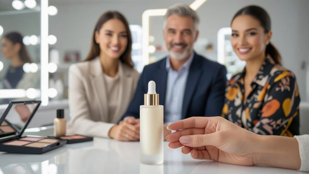
What Cosmetic Primers Look Like in Tubes and Jars
Because cosmetic primers come in tubes and jars for different uses, you’ll usually see clear distinctions in texture and packaging:
- Tube designs offer controlled dispensing, travel-friendliness, and hygienic squeeze application.
- Jar shapes signal thicker, balm-like products you scoop or press with a spatula for targeted use.
- Labels, caps, and spatulas guide usage, so you’ll pick tube designs or jar shapes based on convenience and application preference.
Makeup Primer Textures and Finishes
You’ll choose primers for different effects—matte for oil control or dewy for glow.
Look for lightweight gel textures if you want breathable feel, or silky powder finishes to blur pores and set makeup.
Each texture changes how foundation applies and wears, so pick what matches your skin and look.
Matte vs. Dewy
Wondering whether to reach for a matte or dewy primer? You choose based on skin and desired finish: matte finishes control shine and blur pores, while dewy looks add glow and hydration.
Match primer to your routine and foundation.
- For oily skin, pick matte.
- For dry skin, pick dewy.
- For balance, mix or spot-apply.
Lightweight Gel Textures
If you liked the balance of matte and dewy primers, lightweight gel textures give you a middle ground: they feel barely there, control shine without flattening skin, and add a fresh, hydrated look.
You’ll appreciate gel application techniques like warming a pea-sized amount between fingers, tapping into skin, then blending outward.
The lightweight formulation benefits include quicker absorption, minimal residue, and smoother makeup grip.
Silky Powder Finishes
Silky powder primers mattify and blur pores without feeling heavy, so your skin looks smooth and soft rather than flat. You’ll love the lightweight feel and subtle silky finish that reduces shine and helps makeup last. Apply with fingertips or a brush for seamless powder application.
- Blurs texture quickly
- Sets foundation subtly
- Controls oil all day
Shades and Sheer Levels in Cosmetic Primers
While many primers advertise universal tones, their shade ranges and sheer levels actually affect how your foundation looks and lasts; choosing the right one means matching not just color but coverage intensity.
You’ll pick tinted primers for subtle color correction or sheer, skin-like smoothing. Matte vs luminous options alter finish and longevity, and a light shimmer effect can boost radiance without masking your natural skin.
Reading Cosmetic Primer Labels and Ingredients
Think of a primer label as a roadmap that tells you what the product will actually do for your skin. You’ll scan ingredient breakdowns, spot active claims, and make label comparisons to match texture and finish.
Read order of ingredients, note allergens, and check preservatives so you’ll choose primers that suit your needs.
- Ingredient breakdown clarity
- Compare active ingredients
- Note preservatives and allergens
Primer Sprays and Mists: Appearance and Packaging
When you pick up a primer spray or mist, the bottle’s shape, nozzle type, and labeling tell you as much about its performance as the ingredient list. You’ll judge spray application quality by nozzle design and mist coverage by cap and orifice; clear bottles show product consistency, opaque ones suggest light protection.
| Feature | Means |
|---|---|
| Nozzle | Controls spray application |
| Bottle | Shows consistency |
| Label | Claims coverage |
| Cap | Affects mist coverage |
Specialty Primers: Stain‑Blockers, Bonding, High‑Build
Spray bottles and labels give you quick cues about application and coverage, but specialty primers demand a closer look at formulation and purpose.
You’ll note stain blocker characteristics, bonding agent properties, and high build applications through primer color variations and texture performance analysis.
Compare application methods comparison to pick the right product.
- Stain-blockers: hides tannins, seals.
- Bonding: adheres slick substrates.
- High-build: fills uneven surfaces.
Water‑Based vs Solvent‑Based Primers: Visual Clues
You’ll notice water‑based primers often go on smoother with a matte, low‑sheen finish while solvent‑based ones can look glossier and feel slightly tacky.
Expect water‑based formulas to dry faster and show true color sooner, whereas solvent types take longer to cure and may deepen slightly as they dry.
Check coverage too: water primers usually spread thinner for easy touchups, and solvent primers can lay down thicker coats that hide stains more effectively.
Texture And Sheen
Texture and sheen give you the quickest visual clues to whether a primer is water‑based or solvent‑based: you’ll notice texture variety and differing sheen levels that hint at composition and application.
Scan for telltale signs, then choose accordingly.
- Water‑based: thinner, matte to low sheen
- Solvent‑based: thicker, glossier finish
- Mixed formulas: intermediate texture and sheen
Drying Time Differences
How fast does a primer dry, and what can its surface tell you about the speed?
You’ll see water‑based primers dry faster, forming a smooth, matte film, while solvent‑based ones stay tackier longer.
Inspect sheen, tack, and breathability to judge drying time.
Remember environmental factors — temperature, humidity, and airflow — directly affect cure speed, so adjust expectations accordingly.
Color And Coverage
One quick way to tell water‑based and solvent‑based primers apart is by their color and how they cover: water‑based primers usually go on milky or slightly translucent and level out to a uniform matte white, while solvent‑based formulas often appear creamier or off‑white and can give a denser, more opaque first coat.
- Check primer color against the substrate.
- Note coverage factors like opacity and leveling.
- Test a small patch to confirm finish and hide.
How Consistency Predicts Drying Time and Coverage
Because consistency determines how a primer flows and levels, you’ll see a direct link between its thickness and both drying time and coverage.
Thicker primers slow solvent evaporation, so drying indicators like tackiness persist longer. Thinner primers spread farther, improving coverage factors but drying faster.
You’ll adjust consistency—by stirring or thinning—to balance open time and uniform coverage for your project.
Signs a Primer Has Gone Bad or Separated
Watch for clear signs that your primer has gone bad: the texture will get lumpy and uneven, and it may refuse to spread smoothly.
You’ll also notice an unpleasant, sour odor that wasn’t there when the can was new.
If you see either issue, don’t risk using it—dispose of the primer and replace it.
Texture Becomes Lumpy
If your primer starts feeling gritty or you notice small clumps when you squeeze it out, the texture has likely gone lumpy from separation or contamination.
You should stop using it and assess lumpy texture causes, then try fixing lumpy primers only if reversible.
Consider these steps:
- Check expiration and storage
- Shake or roll to remix gently
- Discard if clumps persist or color changes
Unpleasant Odor Develops
When a primer gives off a sour, chemical, or musty smell you haven’t noticed before, it’s a strong sign it’s gone bad or started to separate; stop using it and check the label for expiration and storage instructions.
You should discard contaminated primer—no amount of mixing restores its odor control or mildew resistance.
Using spoiled primer risks poor adhesion, stains, and lingering smells on walls.
What Primer Tack and Sheen After Drying Tell You
Feel the tack and inspect the sheen once a primer’s dry—you’ll get quick clues about adhesion, compatibility, and whether the surface is ready for topcoat.
Use tack indicators and note sheen variations to judge cure and surface energy.
- Slight stickiness means partial cure or poor adhesion.
- Smooth, even sheen signals good bonding.
- Patchy or dull areas suggest contamination or uneven application.
How Primer Color Affects Topcoat Look and Coverage
Noting tack and sheen gives you a sense of readiness, and the primer’s color then determines how your topcoat will look and how much paint you’ll need.
You’ll choose gray to neutralize stains, white to brighten, or tinted primers to boost depth. Understanding color impact guides coverage estimates and reduces coats.
Match primer tint with your application techniques to save time and guarantee even finish.
Choosing by Surface: Wood, Metal, Drywall, Masonry
When you pick a primer, match it to the surface—wood needs a sealing primer while masonry and metal require formulations that block moisture and resist rust.
Using the right product improves adhesion and durability so your topcoat looks and performs its best.
Next we’ll compare specific primer types and application tips for wood, metal, drywall, and masonry.
Wood Surface Primers
If you’re prepping wood for paint or stain, choosing the right primer makes the biggest difference between a long-lasting finish and peeling trouble.
You’ll pick a primer that seals knots, evens wood grain, and improves adhesion after proper surface preparation.
Consider these options:
- Shellac or oil-based for knot bleed
- Acrylic for general sealing
- Bonding primer for slick or previously finished wood
Masonry And Metal Primers
Masonry and metal demand different primers because their porosity, rust risk, and surface chemistry affect adhesion and durability; you’ll pick high-penetrating, masonry-specific primers for concrete and block, and rust-inhibiting, etch or zinc-rich primers for bare or rusty metal to prevent corrosion and guarantee the topcoat bonds.
You’ll prep surfaces, choose primers that respect masonry textures and improve metal finishes, then apply per instructions.
DIY vs Pro Primers: Visual and Texture Differences
Although both DIY and professional primers aim to prep surfaces, you’ll notice clear visual and texture differences once you look closely:
DIY primer benefits often show simpler, matte finishes and thinner bodies, while pro primer advantages include richer pigmentation and denser formulation for smoother coverage.
- DIY: thinner, easy to sand, budget-friendly
- Pro: thicker, uniform film, higher hide
- Texture cues guide your choice
Recognizing Primer Quality From Packaging and Branding
You can learn a lot about a primer before opening the can by reading its branding and label claims, so check for specific performance notes like adhesion, stain blocking, or VOC level.
Inspect packaging quality too—sturdy seals, clear batch codes, and intact lids suggest better manufacturing control and freshness.
Don’t rely solely on marketing slogans; match the labeled features to your project needs.
Branding And Label Claims
When you’re evaluating a primer, the label and branding give quick clues about what’s inside and whether it’s worth your money; reputable manufacturers list key specs like VOC levels, recommended substrates, coverage rates, and drying times right on the can.
You’ll spot branding strategies and label aesthetics that signal transparency and performance.
- Clear ingredient and VOC disclosure
- Specific substrate recommendations
- Verifiable performance claims and certifications
Packaging Quality Indicators
While a glossy label or sturdy can won’t guarantee top-tier chemistry, packaging quality gives you quick, practical signals about a primer’s reliability and the manufacturer’s care. You assess packaging design, container materials, labeling standards and visual branding for quality assurance and consumer trust. Check texture evaluation tips on labels and brand perception cues.
| Signal | What to check | Why it matters |
|---|---|---|
| Materials | Container materials | Durability |
| Labels | Labeling standards | Accuracy |
| Look | Visual branding | Perception |
| Feel | Texture evaluation | Application |
How Primer Samples and Swatches Show True Appearance
Because lighting, surface texture, and application method all affect how a primer looks, testing samples and swatches is the fastest way to see its true appearance.
You’ll judge finish, tone, and feel directly, using swatch comparisons to confirm color accuracy. Try small areas, note drying changes, and compare under different lights.
- Test on designated surface
- Let primer cure fully
- Record results for reference
Photography Tips to Show Primer Accurately Online
Although lighting and camera settings can betray a primer’s true look, you can capture accurate online images by controlling five essentials: consistent light, neutral white balance, proper exposure, sharp focus, and true-to-scale framing. Use lighting techniques and manage color contrast; shoot RAW, include a neutral gray card, and show texture.
| Tip | Purpose |
|---|---|
| Gray card | Color accuracy |
| RAW | Flexibility |
| Even light | Reduce glare |
| Macro | Capture texture |
| Scale | True size |
Safety and Storage: Reading Container Markings
When you handle primer containers, read their markings carefully so you’ll store and use them safely: labels tell you flammability, VOC content, shelf life, cure times, and recommended storage temperatures, and they often include hazard symbols and first-aid instructions you shouldn’t ignore.
Follow safety precautions and storage guidelines:
- Note hazard symbols and PPE requirements.
- Observe recommended temperature and ventilation.
- Check expiry, batch, and disposal instructions.
When Appearance Misleads: Lookalikes and Fakes
If you judge a container by its label or color alone, you can be misled—lookalike products and counterfeit primers mimic packaging, viscosity, and even odor to fool buyers and users.
You should inspect batch codes, test a small area, and buy from trusted suppliers.
Watch for misleading colors and counterfeit packaging; if something seems off, don’t apply it—return or report the product.
How Surface Prep Alters Primer Appearance After Application
How you prepare a surface changes how primer looks once it’s applied.
Rough textures and high porosity can make primer appear uneven, more matte, or darker as it soaks in.
You’ll notice smoother, sealed surfaces show a more uniform sheen and true color.
Surface Texture Effects
Surface preparation shapes the way primer looks after it dries, so you’ll see different textures depending on the substrate and prep methods you used.
You’ll notice texture variations tied to sanding, wiping, or leaving profiles intact, and you should match products for surface compatibility. Choose methods to control sheen, grip, and uniformity.
- Sanded: smoother, thinner appearance
- Brushed: visible strokes, matte finish
- Profiled: more grip, textured look
Porosity And Absorption
Because different materials soak up primer at different rates, you’ll see noticeable shifts in color, sheen, and thickness once the coat dries.
You should sand, clean, and seal porous surfaces to control porosity effects; otherwise high absorption rates mute color and thin the film.
On nonporous substrates, primer pools and shows sheen differences.
Test a small area to predict final appearance.
Troubleshooting Primer Appearance: Wet vs Dry Clues
Wondering why your primer looks odd after application? You’ll spot clues by comparing wet appearance to dry appearance and acting fast to fix problems.
Check surface, film, and timing.
- If it beads or pools when wet appearance is glossy, you’ve got adhesion or contamination issues.
- A patchy dry appearance signals uneven absorption.
- Recoat only after full cure.
Checklist: Visually Judge the Right Primer for Your Project
Now that you know how wet versus dry clues reveal problems, use a quick visual checklist to pick the right primer for your job. Look for hue consistency, sheen, and texture; think color psychology for final tone and check primer longevity labels. Scan this table for quick cues:
| Condition | Visual Cue | Action |
|---|---|---|
| Staining | Brown spots | Seal |
| Roughness | Grainy | Sand |
Visual Glossary: Primer Looks and Terms
Think of this glossary as your visual cheat sheet: it shows the common looks primers take—flat, eggshell, glossy, chalky, or patchy—and explains what each appearance tells you about surface condition and readiness.
Think of this glossary as your visual cheat sheet, showing primer finishes and what each reveals about surface condition and readiness
You’ll learn visual characteristics linked to primer applications so you can pick and prep correctly.
- Flat: hides flaws, low sheen.
- Eggshell: subtle texture, balanced coverage.
- Glossy: durable, highlights imperfections.
Frequently Asked Questions
Can Primers Cause Allergic Reactions on Skin?
Yes — you can have allergic reactions to primers. If you’re sensitive, primer ingredients like fragrances, preservatives, or silicones can trigger irritation. Patch-test products, check ingredient lists, and stop use if skin sensitivity or redness appears.
How Long After Priming Until Painting Is Safe?
You should wait until the primer drying feels dry to the touch and manufacturer’s recoat time has passed—typically 1–24 hours—so paint adhesion is secure; colder or humid conditions can extend cure time before painting.
Are Primers Recyclable or Eco-Friendly?
Generally they aren’t fully recyclable, but you can choose eco friendly options. You’ll want to check primer materials—water‑based and low‑VOC primers reduce waste and toxicity, and containers may be recyclable if emptied and cleaned properly.
Can Primer Be Applied Over Wallpaper?
Yes — you can apply primer over wallpaper if it’s well-adhered and clean. You’ll gain primer benefits like improved adhesion and stain blocking; consider wallpaper types, sealing loose seams first and using a bonding or shellac primer.
How to Dispose of Leftover Primer Legally?
Picture stirring cloudy, paint-scented cans; you’ll follow safe disposal methods: don’t pour down drains, treat unused primer as hazardous waste, take it to household disposal events or hazardous waste facilities, or use licensed waste haulers.
Conclusion
You’ve got the eye now—primer’s look tells you a lot about its job. Whether satin-gray paint primer or translucent makeup base, you’ll spot clues in color, sheen, and texture that hint at adhesion, coverage, and drying stage. Trust those visual cues, prep surfaces well, and you’ll avoid surprises; a good primer acts like a backstage crew—unseen but essential—so choose what matches your project and the finish you want.