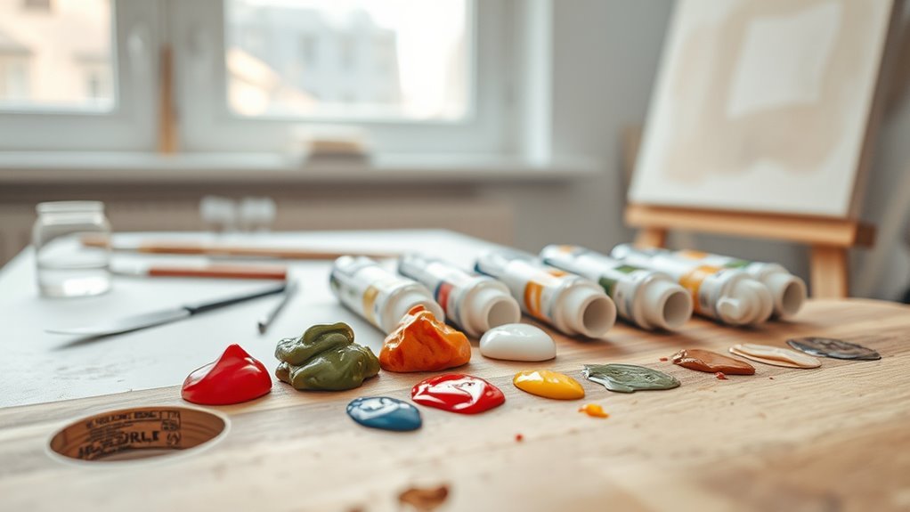
Do Acrylic Paints Dry Lighter or Darker
Acrylics usually dry slightly darker or flatter than they look when wet because water evaporates and the binder concentrates, changing sheen and value. How much shifts depends on pigment, layer thickness, surface absorbency, and additives—thin washes and absorbent grounds tend to dry lighter, while thicker, glossy films dry richer. You can test swatches and note mixes to predict outcomes, and keep going to learn practical fixes and how different pigments and mediums behave.
Do Acrylic Paints Generally Dry Lighter or Darker?
Although results can vary with pigment and medium, acrylic paints most often dry darker than they appear when wet. You’ll notice glossy wet strokes shift as water evaporates and binders settle, changing color consistency across layers.
If you want predictable outcomes, test pigments on scrap surfaces and note their wet-to-dry behavior. Adjusting drying techniques—like misting, using retarders, or working thicker—helps control the shift and maintain hue intensity.
Remember that additives and varnishes alter final appearance, so record mixtures and methods. With simple tests and deliberate drying techniques, you’ll manage expectations and achieve more consistent color results.
Short Answer: Typical Wet-to-Dry Shift for Acrylics
When you paint with acrylics, expect most colors to dry slightly darker than they look wet because water evaporates and the binder becomes more concentrated, reducing surface gloss and perceived lightness.
You’ll usually see a modest shift—often just a few percentage points in value—so plan layers accordingly. For reliable color consistency, test mixes on a scrap surface and let them fully cure before judging.
Use appropriate drying techniques like thin layers, controlled humidity, and retarding mediums if you need slower drying. These habits help predictably manage the wet-to-dry shift and keep your palette decisions consistent.
How Wet Sheen Changes Perceived Value and Hue
Wet sheen changes how you read both value and hue because a glossy surface reflects more light, boosting apparent brightness and contrast compared with the same pigment when matte.
You’ll notice sheen influence immediately: wet areas look lighter, punchier, and cleaner, while matte drying mutes highlights and deepens midtones.
That shift alters perceived hue too—saturated blues can read greener or cooler when glossed, whereas drying removes specular reflections and reveals the pigment’s true, often duller, tone.
Work knowing wet appearance isn’t final; compare wet and dry under consistent light to predict value and perceived hue changes.
Main Causes of Wet-to-Dry Color Change in Acrylics
Because acrylics are waterborne films that change as they lose moisture and the binder sets, several predictable factors drive the shift from wet to dry color. You’ll notice pigment concentration alters perceived value as water evaporates, affecting color consistency across a panel.
Binder refractive index shifts reduce gloss, making hues look paler. Film thickness and layering change light scattering, so thin glazes dry differently than impasto.
Additives and medium residues can leave drying artifacts like bloom or microcracking that scatter light unevenly. Surface texture and absorbency of the substrate also influence final appearance, so test swatches before committing.
Why Water-Based Acrylics Often Look Darker When Wet
If you look closely at a freshly painted acrylic wash, you’ll notice colors often sit noticeably darker than they’ll once dry because the water temporarily changes how light interacts with the pigment and binder.
When you apply a wet layer, suspended pigment and clear binder scatter and absorb light differently, increasing saturation and sheen. As water evaporates, refractive indices shift and the paint film becomes more matte, so perceived value lightens.
Thinning with water boosts translucency and alters color consistency across strokes. Monitor drying to predict final tone, and test small swatches rather than relying on wet appearance alone.
Why Acrylics Dry Lighter on Absorbent Surfaces
When you paint on absorbent surfaces, faster pigment absorption pulls binder and color into the substrate so less pigment stays on the surface.
That increased absorption thins the binder film, reducing gloss and perceived saturation.
As a result, colors often dry noticeably lighter than they looked when wet.
Pigment Absorption Rate
Although the surface soaks up binder and medium, the pigment particles often stay closer to the substrate, so your acrylics will appear lighter on highly absorbent supports. You notice pigment absorption rate affects color stability: faster absorption pulls binder away, reducing gloss and perceived saturation. To control this, test supports and adjust dilution or use primers so pigments remain near the surface. Compare materials, pigments, and additives to predict outcomes.
| Variable | Effect on Tone | Practical Tip |
|---|---|---|
| High absorption | Lightens | Prime or size |
| Low absorption | Retains depth | Thin or glaze |
| Medium absorption | Moderate | Test first |
Binder Film Thinning
Why does a paint layer look paler on an absorbent support? You’ll see binder film thinning as the substrate sucks water and dispersant away, leaving a thinner, less reflective film. That reduced thickness scatters light differently, so colors read lighter.
Sheen influence matters: a thinner binder film lowers gloss, cutting deep reflections and perceived saturation. You can control it by adjusting application and surface sizing.
- Pre-seal absorbent supports to preserve binder film
- Use heavier-bodied acrylics to resist thinning
- Layer slowly to rebuild sheen influence
- Test pigment load; stronger pigments withstand thinning better
How Binder and Gloss Level Influence Color Shift
Pay attention to the binder you choose, because acrylic binders with higher solids can make colors appear richer. Weaker binders may dry looking paler.
Gloss level also changes perceived value—glossier finishes deepen color and saturation, while matte finishes scatter light and often read lighter.
And remember that adding mediums or additives (retarders, gloss mediums, or matte agents) will shift both binder behavior and finish, so test mixes before committing.
Binder Type Effects
Because the binder binds pigments and determines surface sheen, it plays a major role in whether acrylics dry lighter or darker. You’ll notice color consistency changes with different binders: heavier acrylic polymers can trap pigments, often yielding richer, slightly darker dries, while more elastic or diluted binders may look lighter.
Understand binder effects to predict shifts and choose mediums that preserve hue. Consider how opacity interacts with binder film and pigment load so you can control outcomes.
- Use high-quality acrylic mediums to stabilize color consistency.
- Thin binders can reduce pigment saturation.
- Flexible binders may appear lighter when dry.
- Strong binder films deepen perceived color.
Gloss Level Impact
When you change an acrylic’s gloss level, you also change how light interacts with the binder film, which alters whether the color looks lighter or darker when dry. You’ll notice gloss influence directly: high gloss yields deeper, more saturated appearance because specular reflection preserves chroma, while matte scatters light and can mute tones.
To maintain color consistency across finishes, test swatches and let films fully cure; identical pigment loads can read differently under varied sheen. Visual perception shifts with viewing angle and lighting, so choose gloss purposefully when matching pieces or planning varnish to avoid unexpected tonal shifts.
Mediums And Additives
Although pigments largely determine hue, the binder and any mediums or additives you mix into acrylics can noticeably shift how that color reads once dry. You’ll notice heavier binders or gloss mediums deepen tones, while matte additives often mute them. Mixes affect color consistency across layers and change surface texture, so test combinations before committing. Keep ratios consistent to maintain predictable shifts and record recipes for repeatability.
- Gloss mediums increase saturation and apparent depth.
- Matte pastes scatter light, reducing perceived brightness.
- Flow improvers thin without weakening binder strength.
- Heavy gels alter translucency and texture, shifting value.
How Film Thickness Changes Dry Value and Saturation
How does the thickness of an acrylic film change the way a color looks once it’s dry? You’ll notice thin layers dry faster, often appearing lighter and more transparent. Thicker films trap more binder, yielding deeper, richer tones and higher saturation.
Maintain color consistency by applying uniform layers and respecting drying times. Surface preparation matters: a primed, absorbent ground pulls binder into the substrate, making thin washes look paler. Conversely, slick surfaces let pigments sit on top, enhancing gloss and depth.
Adjust brushwork and layer thickness deliberately to predict wet-to-dry shifts, and test samples when precise values matter.
How Pigment Type Affects Wet-to-Dry Shifts (Overview)
You’ll notice that pigment transparency plays a big role in whether a color shifts as it dries, since transparent pigments often show less dramatic value change than opaques.
Organic pigments tend to be more transparent and can dry with subtler shifts, while many inorganic pigments are more opaque and may darken or lighten more noticeably.
Keep these distinctions in mind when choosing colors for predictable wet-to-dry behavior.
Pigment Transparency Effects
Because pigments sit somewhere between pigment particles and binder, their inherent transparency or opacity plays a big role in how a color looks as it dries. You’ll notice transparent pigments often deepen or appear glossier as binder recedes, while opaque ones usually show less shift.
Pay attention to color consistency and pigment stability: manufacturers’ formulations and particle size influence the wet-to-dry change. You can predict shifts by testing swatches and noting layering effects.
- Transparent pigments show more depth when dry
- Opaque pigments maintain surface reflectance
- Thin layers amplify transparency effects
- Mixing alters final transparency and drying appearance
Organic Versus Inorganic
After noticing how transparency and particle size influence wet-to-dry shifts, it helps to look at pigment chemistry—organic and inorganic pigments behave quite differently as acrylics cure.
You’ll find organics (dyes, phthalos, quinacridones) often show stronger wet-to-dry shifts because their finer particles and higher pigment saturation interact with binder differently, altering perceived value and chroma as solvents evaporate.
Inorganics (oxides, ultramarine, cadmiums) are usually more stable, resisting shifts due to larger particles and inertness.
Chemical reactions during film formation—oxidation, crosslinking, binder-pigment adsorption—also affect outcomes, so test mixes to predict final appearance.
Which Acrylic Pigments Reliably Dry Lighter
While some pigments keep their wet appearance when they dry, several common acrylic pigments reliably dry lighter, and knowing which ones helps you predict final values. You’ll want to monitor color consistency and pigment stability when planning layers and glazing.
While some acrylics retain their wet look, many pigments dry noticeably lighter—test mixes and note values beforehand.
Lightfast, semi-opaque whites and some organic yellows tend to shift toward paler values as water evaporates and binder cures. Use samples and note mixes to maintain control.
- Quinacridone or Hansa yellow: dries noticeably paler
- Titanium white mixtures: appear lighter when cured
- Transparent azo yellows: lose chroma, read lighter
- Thinned washes of cadmium alternatives: shift toward pale tones
Which Acrylic Pigments Reliably Dry Darker
If some pigments dry lighter, others reliably deepen as the binder cures and pigments settle, so you should plan mixes and layers with those tendencies in mind.
Pay attention to earth tones like burnt sienna, raw umber, and some oxides—they often dry richer and slightly darker. Transparent quinacridone and phthalo variations can deepen too, especially in glazes.
Manufacturers’ notes on color permanence and pigment durability matter: longer-lasting, lightfast pigments usually behave predictably, so test unfamiliar tubes.
Swatching wet-to-dry comparisons for each pigment you use will save surprises. Rely on stable pigments when consistent drying value is essential.
How Mixing White or Medium Changes Final Dry Value
When you mix white into a color, it usually raises the value but can also shift the hue and saturation, changing how the paint looks when it dries.
Adding glazing or retardant mediums can alter the final dry tone by increasing transparency or slowing drying, which affects perceived darkness.
Watch how small amounts of white or medium change a swatch as it dries to predict the finished value.
How White Affects Value
Because adding white or a glazing medium doesn’t just lighten color, it also changes how the paint dries. You need to know that mixing white tends to increase opacity and can make the final dry value read lighter or flatter.
While thinning with medium often preserves translucency and can keep the dried value closer to the original hue. You’ll notice whites mute chroma and shift perceived temperature, affecting color psychology in composition.
Adjust white gradually and test swatches. Refine with controlled brush technique to avoid streaks.
- Test mixes on scrap
- Note opacity vs translucency
- Use thin layers for glow
- Keep values consistent
Mediums Alter Dry Tone
Although mixing white or a glazing medium might seem like a simple tweak, those additives consistently shift the paint’s finished value and character.
You’ll notice that adding white raises opacity and lightens the dry tone more than wet appearance suggests, so plan mixtures accordingly.
Glazing mediums thin pigment, keeping chroma but altering perceived value once dry; they also slow drying speed, giving you longer working time but changing final look.
Heavy body mediums can deepen sheen and slightly darken dry value.
For reliable results, test swatches to guarantee color consistency and record ratios so you can replicate the outcome.
How Surface Color and Texture Alter Perceived Drying
If you lay acrylic over a dark, glossy canvas, the paint will often look deeper and wetter as it dries, while the same stroke on a primed white surface will appear lighter and more matte. You notice surface texture and color perception change during drying. Sheen, absorption, and reflected light shift how pigment reads.
Smooth, glossy grounds preserve vibrancy; rough, absorbent surfaces mute and mattify. You adjust application knowing the ground will alter perceived value and saturation.
- Gloss enhances wet look and depth
- Matte grounds diffuse highlights
- Texture scatters light, lowering saturation
- Underlying color shifts apparent value
How Underpainting Alters the Final Dried Appearance
When you lay an underpainting, you’re not just sketching shapes—you’re setting the tone, value, and temperature that will read through subsequent layers and alter the final dried appearance. You choose warm or cool grounds to influence hue shifts and perceived saturation.
Thin glazes let underpainting show, changing color consistency across the painting; opaque layers hide it. Surface absorption matters: highly absorbent grounds mute glazes and deepen values, while sealed surfaces keep colors brighter and truer.
Plan contrasts so the underpainting supports highlights and shadows rather than competing. Test small areas to predict how layers will interact when fully dry.
How Humidity and Temperature Change Drying Color
If you paint in high humidity, colors can stay darker and glossier longer because the water in the film evaporates more slowly.
Higher temperatures speed drying and often make pigments look slightly lighter or more matte as the binder cures faster.
Keep in mind that controlling humidity and temperature lets you predict and tweak the final dried tone.
High Humidity Effects
Because moisture in the air slows water evaporation, high humidity makes acrylics dry darker and tackier than you expect, so you’ll see colors deepen and gloss increase as they set. You’ll notice altered color consistency because pigments stay suspended longer, and surface absorption changes as the binder remains wetter.
Work slower, test swatches, and anticipate longer tack times. Controlled ventilation helps, but avoid strong drafts.
- Expect richer-looking values until fully cured.
- Thin layers can remain gummy and attract dust.
- Matte mediums may retain unwanted sheen.
- Test on your actual support to gauge drying behavior.
Temperature Speed Influence
Although temperature interacts with humidity, you’ll usually see faster drying at higher temperatures and slower drying in the cold. That speed change directly affects how acrylics look as they set.
You’ll notice temperature effects through altered sheen and slight color shifts: rapid drying can lock in a lighter, more matte appearance, while slow drying often yields richer, darker tones as pigments settle and bind.
Control drying speed by adjusting room heat, airflow, or using retarders. Be mindful that extremes can cause cracking or bloom.
Test changes on scrap pieces to predict final color before committing to a painting.
Why Drying Time and Film Formation Affect Value
When acrylics dry, the time they take and the way the film forms directly shape how you perceive value, because drying affects pigment packing, gloss, and light scattering on the surface. You’ll notice color saturation shifts as particles settle; slower drying often yields denser pigment layers and richer midtones, while fast skins can trap binder, raising surface reflectivity and apparent lightness.
Drying pace and film formation govern perceived value—slower dries deepen midtones, fast skins boost surface reflectivity and apparent lightness.
Film thickness and micro-texture change how highlights read, so control drying to predict value. Consider how medium, humidity, and brushwork alter film formation to manage tonal outcomes precisely.
- Pigment packing density
- Binder sheen level
- Micro-texture scattering
- Thickness-driven contrast
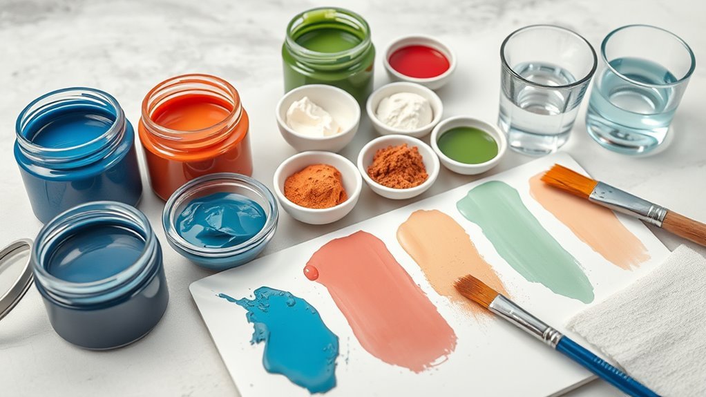
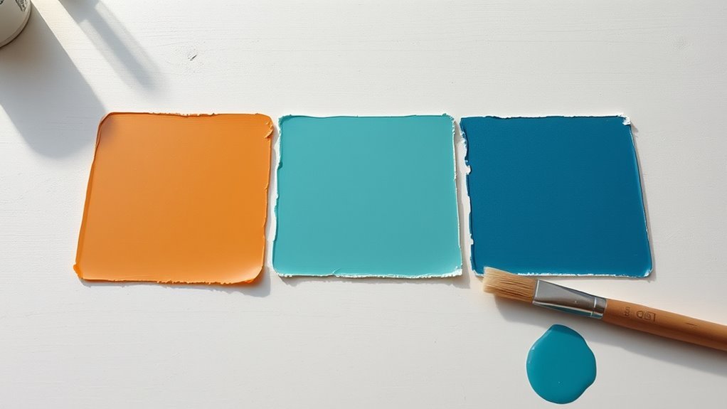
Test a Swatch to See a Color’s True Dry Value
When you’re unsure how a paint will dry, swatch it on white card so the true value shows.
Compare the wet patch to the fully dry sample to see whether it lightens or darkens.
Repeat with the same thickness to get a reliable comparison.
Test On White Card
Because acrylics often shift value as they dry, you should always test a swatch on white card to see the color’s true dry tone. You’ll check color consistency and confirm your surface preparation is appropriate—white card reveals tinting strength, opacity, and any visual shift once film forms. Apply a small, even patch, let it dry fully, and evaluate under your working light.
- Use the same brush and dilution you’ll use in the painting.
- Note drying time and any sheen changes.
- Record pigment name and mixing ratios.
- Keep cards dated for future reference and repeatability.
Compare Wet Versus Dry
Having checked your swatch on white card, now compare the wet patch to its fully dried state to see how the value shifts. You’ll notice some paints dry lighter, others darken slightly, and some stay true—this reveals color stability.
Test multiple layers and edges so you spot glazing or film effects. Record results and adjust mixing strategies accordingly: add small increments of pigment, extender, or medium to predict final value.
Always wait for full cure before final decisions. This simple wet-versus-dry comparison trains your eye, prevents surprises, and informs consistent color matches in future paintings.
How to Adjust Mixes to Compensate for Drying Shifts
If your acrylics dry lighter or darker than they look wet, you can compensate by adjusting mixes before they set—anticipate the shift and tweak pigment ratios, gloss level, or medium to hit the desired value once dry. You’ll control color consistency by testing small swatches on the actual support and by paying attention to surface preparation, which affects sheen and absorption.
Make incremental changes and let samples fully cure. Use notes to record recipes and outcomes so you can repeat successes. Adjust transparencies and add a touch of opposite value to counteract shift.
- Test swatches on the final surface
- Note recipes and results
- Modify gloss or matte medium
- Change pigment ratio slightly
Choosing Pigments for Predictable Wet-to-Dry Behavior
When you select pigments with consistent wet-to-dry shifts, you cut guesswork and get predictable results across mixes and layers. Choose pigments known for color consistency—certain inorganic earths and transparent organic dyes behave reliably as they dry.
Test single-pigment samples to observe any shift in value or saturation before mixing. Favor pigments with documented pigment stability to guarantee long-term uniformity and fewer surprises under varnish.
Keep a swatch log noting brand, series, and drying behavior so you can recreate mixes. By prioritizing reliable pigments and recording outcomes, you’ll control wet-to-dry transitions without relying on constant trial-and-error.
Use Mediums to Control Gloss and Final Value
Because mediums change how light reflects off a dried layer, you can use them to fine-tune both gloss and perceived value. You’ll select mediums to balance color consistency and adjust surface texture so areas read lighter or darker without altering pigment.
Matte mediums scatter light, lowering perceived value; gloss mediums enhance saturation and deepen appearance. Thin glazing mediums keep transparency for subtle shifts while heavy-bodied gel preserves brushwork.
Test mixes on your support to judge final appearance under your light.
- Use small swatches to compare
- Note drying shifts over time
- Match medium to intended sheen
- Record ratios for repeatability
How Varnishing Alters Perceived Color and Contrast
When you varnish a painting, the gloss can deepen colors and slightly shift hues, making areas appear richer than when dry. A satin or matte varnish will mute that boost, so you’ll see less saturation and softer shifts.
Because gloss increases local contrast by reflecting light, consider spot-testing varnishes to judge how they change contrast and overall color balance.
Gloss and Color Shift
Although varnish mainly protects your paint, its sheen can noticeably change how colors and contrast read, making hues appear deeper or more saturated under gloss and softer or more muted under matte. You’ll notice gloss enhancement brings out pigment depth and increases color perception intensity, while matte reduces glare and flattens highlights.
You should choose varnish based on the visual goal: vibrancy or subtlety. Test on swatches first, because different pigments react differently. Consider ambient light and viewing distance when selecting sheen.
- Gloss can reveal brushwork and texture
- Matte conceals specular reflections
- Satin balances shine and softness
Always test to predict the final appearance.
Varnish Effects On Contrast
Shifting from how sheen changes hue and texture, consider how varnish alters contrast across a painting: a gloss layer deepens darks and raises perceived saturation in midtones and highlights, so details pop and scenes feel higher in contrast.
A matte coat, by scattering light, softens highlights and narrows tonal range, making progressions gentler and reducing perceived sharpness. When you pick varnish, think about color consistency across viewing angles — gloss can unify tones but exaggerate reflections, while matte keeps appearance stable but mutes intensity.
Test varnish contrast on swatches to confirm your final choice matches the desired visual impact.
How Glazing and Layering Build the Dry Value You Want
If you want precise control over how a color settles once it’s dry, glazing and layering are the tools that let you build value step by step. You’ll lay transparent glazes to shift value without losing hue, testing color stability across passes. Thin layers respect surface absorption and prevent muddiness. Work patiently: each dry layer alters perceived depth, contrast, and translucency.
Use glazing to correct values, layering to strengthen them. Combine both for subtle gradation and predictable results.
Use glazing to refine values and layering to build strength—blend both for subtle, predictable gradation.
- Start with a mid-value base
- Apply thin, even glazes
- Let layers fully cure
- Adjust opacity progressively
How to Match Wet Blending to Anticipated Dry Appearance
When you’re wet blending, always anticipate how the color will shift as it dries so your gradual change reads correctly later.
Test each mix’s opacity on a scrap to see how underlying layers and the paint’s binder will alter the finished tone.
If a wet value looks off, nudge it darker or lighter now so the dried result matches your plan.
Anticipate Dry Tone
Because acrylics dry differently than they look wet, you need to judge your blends by their anticipated dry tone rather than their fresh appearance. You’ll monitor color consistency and adjust mixing ratios, remembering how drying times shift value and saturation. Keep notes on mixes and layer order so repeats match once dry. Trust small corrections rather than overworking wet blends.
- Observe a small swatch and let it dry before committing to larger areas.
- Adjust tinting strength for expected loss of saturation.
- Match underlayers to compensate for fast or slow drying times.
- Photograph wet mixes for reference after drying.
Test Paint Opacity
How opaque is that puddle on your palette once it dries? Test paint opacity by laying small swatches: a thick blob, a thinned wash, and a semi-opaque stroke. Note how color fading appears in the wash compared to the blob.
Apply swatches to your desired surface to check surface absorption—paper, canvas, wood all change look. Photograph wet and dried samples under consistent light to compare values and saturation. Record which mixes keep their wet depth and which lose punch.
Use these concise trials to predict how your wet blending will map to the finished piece without relying on guesswork.
Adjust Wet Values
Now that you’ve tested opacity and seen which mixes lose depth as they dry, adjust your wet values so the finished piece matches your intent. You’ll compensate for predictable shifts by darkening or desaturating slightly while working wet, keeping color consistency across layers.
Use deliberate drying techniques—fans, thin glazes, or retarders—to control shift speed and blending. Observe swatches as they dry and note numeric or visual targets. Make small corrective passes after tack drying to refine edges.
- Calibrate mixes for final dry tone
- Track wet-to-dry shifts with swatches
- Use drying techniques to preserve progressions
- Rework after tack drying
How to Fix Unexpected Value Shifts After the Paint Dries
When your acrylics dry noticeably lighter or darker than you expected, you can correct the shift without scrapping the piece by adjusting values with thin glazes, local scumbling, or selective lifting; choose the method based on how subtle or broad the change is and whether you need to darken or lighten. Consider color temperature and surface texture when correcting: warm glazes can deepen, cool lifts can lighten, and rough texture may need scumbling.
| Method | Best for | Tip |
|---|---|---|
| Glaze | Broad shifts | Thin multiple layers |
| Scumble | Texture details | Use dry brush |
| Lifting | Small highlights | Work while semi-wet |
How to Plan Color Choices for Large Works and Murals
Because large works and murals read differently from close-up pieces, you should plan colors to hold up at distance and across varied lighting. Pick a limited, harmonious palette, test full-scale swatches, and consider how values and temperatures will read from the typical viewing distance.
You’ll prioritize strong value structure, simplified local color, and deliberate Color blending strategies so progressions read cleanly afar. Use Texture contrast to add interest without confusing mass. Mockups help: step back, photograph, and evaluate under different lights. Balance saturation so focal areas pop without overwhelming surrounding passages.
- Simplify values for legibility
- Test swatches at scale
- Reserve saturation for focal points
- Use texture sparingly to enhance form
Teach Students Quick Demos on Acrylic Drying Behavior
If you want students to grasp why acrylics dry lighter or darker, start with a quick, hands-on demo that makes the shift obvious. Lay out three tubes—one opaque, one transparent, one mixed—and have students paint identical swatches on primed board. Label wet values, then time observations as pieces dry.
Discuss how color consistency and pigment concentration affect perceived shift, and note drying speed differences across brands and thicknesses. Encourage students to record wet, tacky, and dry stages.
Repeat with glazes and thicker impasto. These concise demos give reliable visual evidence so students adjust mixes and expectations confidently.
Archival Choices That Affect Wet-to-Dry Color Shifts
Those quick demos show students the what; now look at the archival choices that change how pigments behave as they cure. You’ll want to prioritize color consistency and pigment stability by selecting high-quality, lightfast pigments, stable binders, and proper ground.
Varnishes and sealers influence final tone, so test compatibility. Document materials so you can reproduce results and teach reliable expectations.
- Choose lightfast pigments to preserve hue over time
- Use archival-grade acrylic mediums for even drying
- Test varnish for gloss shift and compatibility
- Record substrate and ground to predict wet-to-dry changes
Compare Acrylics With Oils and Gouache for Drying Shifts
When you put acrylics, oils, and gouache side by side, you’ll notice each medium follows a different wet-to-dry trajectory.
You’ll see acrylics darken slightly as water evaporates and binders film, often emphasizing brushwork and surface texture.
Oils tend to dry darker or richer over time as solvents evaporate and oil continues to oxidize, which can deepen saturation and alter color perception slowly.
Gouache dries flatter and lighter immediately, losing sheen and reducing perceived intensity because its matte surface scatters light.
Comparing them helps you predict final results: choose medium based on how much shift in hue, value, and texture you can accept.
Troubleshoot Common Wet-to-Dry Acrylic Surprises
Because acrylics shift as they dry, you’ll want a quick checklist to fix the surprises that pop up on the palette or canvas. You’ll diagnose causes using basic color chemistry and note pigment stability differences. Test questionable mixes on scrap paper, adjust gloss or matting mediums, and tweak tinting strength rather than repainting whole areas.
Keep a wet edge and work faster on large fields. If a hue dries too flat, glazing restores depth; if it darkens unexpectedly, lift with a damp brush before it cures.
- Note pigment stability per tube and label.
- Swatch mixes in thin and thick layers.
- Use glazing to recover depth.
- Lift before full cure.
Build a Drying Chart for Your Palette (Step-by-Step)
Now that you can diagnose wet-to-dry shifts and rescue problem areas, set up a simple drying chart to track how each paint and mix behaves over time. Lay out swatches of pure colors and common mixes on your prepared support, noting surface preparation and ambient conditions.
Label each swatch with pigment, brand, ratio, and application thickness. Photograph fresh swatches, then record appearance at intervals: 10 minutes, 1 hour, 24 hours, and 7 days.
Note changes in color consistency, sheen, and opacity. Use the chart to predict final tones and adjust mixes before committing to a painting.
Interpret Manufacturer Swatches and Labels for Real-World Use
Although manufacturer swatches give you a quick reference, they rarely match the way a color will sit on your canvas, so learn to read the labels and sample swatches critically. You’ll check ingredient codes, opacity, and lightfastness to judge pigment stability and predict color shifts as paint dries. Note binder type and medium recommendations; they affect color consistency across batches.
Test small strokes on your ground, comparing wet and dry states. Use swatches as starting points, not guarantees: your application, layering, and substrate will determine final appearance.
- Check lightfastness and pigment index.
- Note opacity and binder type.
- Compare wet vs dry swatches.
- Record batch and brand.
Frequently Asked Questions
Can Acrylics Darken Again Months After Initial Drying?
Yes — acrylics can subtly darken months after drying; you’ll notice minor shifts as binders age and dirt accumulates. Acrylic color longevity and varnish impact matter: applying a varnish sooner preserves original tones and slows darkening.
Do Acrylics Yellow With Varnish Over Time?
Yes — varnish influence can cause yellowing over time, but if you use archival, non-yellowing varnishes and stable pigments, acrylic color stability stays high and you won’t notice significant discoloration on most works.
Can Substrate Primers Permanently Change Pigment Hue?
Yes — primer impact can cause pigment alteration: you’ll see some hues shift if the primer’s color, opacity, or chemistry interacts with your paint, so test primers first to avoid unexpected long-term changes.
Will Metallic/Iridescent Acrylics Behave Differently Drying?
Yes — you’ll see metallic sheen and iridescent shimmer behave differently as they dry: metallics often stay consistent, while iridescents shift with viewing angle and binder clarity, so test layers and varnish for final effect.
How Does UV Exposure Alter Dried Acrylic Color?
Like sun on old photographs: you’ll see UV impact causing color alteration by fading pigments, yellowing binders, or shifting metallic sheens. You’ll notice weakened vibrancy and altered hues over time, so protect finished acrylics from sunlight.
Conclusion
So acrylics usually dry a bit darker — surprise, your bright masterpiece suddenly looked serious. You’ll learn to blame the binder, water, and that smug glossy wet sheen hiding the real color. Make swatches, note wet vs. dry, and trust manufacturer cues (don’t trust the internet oracle). Embrace the drama: welcome to painting, where yesterday’s neon becomes today’s tasteful muted decision. Now go paint, then sigh, then paint again.