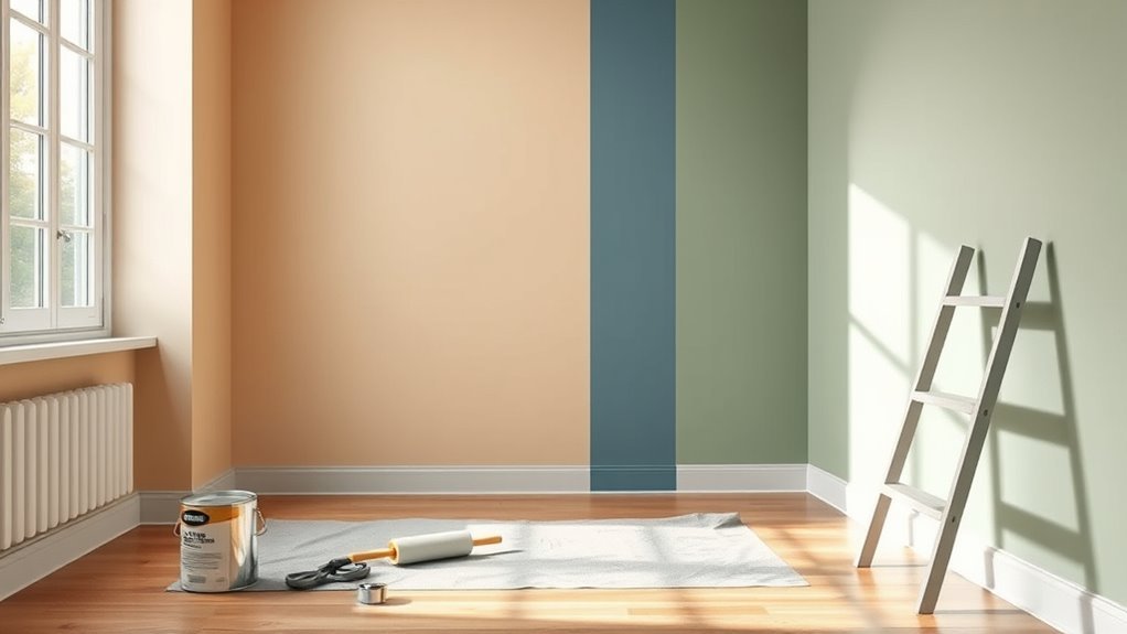
How to Paint Walls Different Colours the Right Way
You can paint walls different colours cleanly by planning zones, testing swatches in real light, and prepping surfaces—fill holes, sand, clean, and prime as needed. Tape crisp dividing lines, seal tape edges with the base coat, then paint each hue in thin, even layers using appropriate brushes and rollers. Remove tape at the right tack stage for sharp edges, touch up seams, and keep tools separate per colour; follow these steps and you’ll pick up extra tips as you go.
Quick Step-by-Step: Paint a Room With Multiple Colours
When you’re ready to paint a room with multiple colours, start by planning your layout, gathering supplies, and protecting surfaces so the actual painting goes smoothly.
Sketch zones, pick hues that work for light and scale, and test swatches on different wall textures to see finish effects.
Map your zones, choose colors suited to light and scale, and test swatches on various textures to judge finishes.
Tape crisp edges, prime where needed, and apply base coats systematically.
Use brushes for corners, rollers for flats, and a steady hand for blending lines—consider a soft sponge or dry brush for subtle color merging.
Remove tape at the right moment, touch up seams, clean tools, and let layers cure before rearranging furniture.
Who Should Paint Multiple Wall Colours
If you want flawless color shifts and help choosing palettes, hire professional designers or painters who’ve got the skills and tools.
If you’re patient, enjoy hands-on projects, and have time to practice taping and cutting in, you can tackle multi-colour walls yourself.
Consider your comfort with prep, precision, and cleanup before you decide.
Professional Designers And Painters
Although tackling multiple wall colours can feel intimidating, hiring a professional designer or painter makes the process smoother and guarantees crisp results. You’ll get expert color blending advice and careful handling of wall textures, so progression looks intentional. Pros evaluate lighting, choose durable finishes, and use proper masking for sharp lines. They save time and reduce mistakes, especially on complex rooms. Expect clear quotes, timelines, and cleanup.
| Benefit | What it means |
|---|---|
| Precision | Sharp edges, consistent coats |
| Expertise | Color theory, texture management |
| Efficiency | Faster completion, less rework |
DIY Enthusiasts With Time
Because you’ve got time and patience, tackling multiple wall colours yourself is totally doable and rewarding—you’ll save money and gain control over every detail.
You’ll plan colours, test swatches, and prep surfaces thoroughly so wall texture won’t sabotage clean lines.
Masking tape, quality brushes, and angled edgers pay off when switching hues midroom.
Work in stages: cut in edges, roll large areas, let coats dry fully before taping removal.
Ventilate well and wear a mask to limit paint fumes.
If you accept a slower pace, you’ll achieve precise *gradations* and a custom look without hiring pros.
What You’ll Achieve With Multi‑Colour Paint
When you use multiple paint colours, you can define zones, highlight architectural details, and change a room’s perceived size and mood with surprising speed. Strategic colour choices make each effect feel intentional rather than haphazard.
Using multiple paint colors defines zones, highlights details, and quickly alters a room’s size and mood with intentional flair.
You’ll create focal points by painting one wall, trim, or niche differently, and use color blending to ease gradations between areas. Contrasting hues add energy; muted pairs calm a space.
You’ll direct sightlines, mask imperfections, and emphasize scale. Mood setting becomes practical: warm tones cozy up large rooms, cool tones open tight ones.
With thoughtful execution, multi‑colour paint turns plain rooms into purposeful spaces.
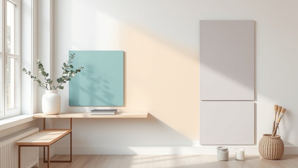
Choose a Colour Scheme That Works Together
How do you pick colours that look intentional together? You’ll focus on color harmony and practical contrasts. Start with a dominant shade, add a secondary that complements it, and pick an accent for energy. Test swatches under real light. Consider finishes and proportion: larger areas use muted tones; small walls handle bold hues. Keep connections smooth between rooms for cohesive flow without repeating everything.
| Role | Example choice |
|---|---|
| Dominant | Soft gray |
| Secondary | Warm beige |
| Accent | Deep teal |
| Trim | Crisp white |
| Finish | Matte main, satin trim |
Use Colour Psychology to Set the Mood
Now that you’ve picked a harmonious palette, think about what each colour will make people feel in a room. Use color harmony to balance tones and guide the emotional impact so every space serves its purpose.
Choose hues that support activity: calming for bedrooms, energizing for kitchens, focused for work nooks. Consider intensity and temperature; saturated brights excite, muted tones soothe.
Match colors to purpose: calming for bedrooms, vibrant for kitchens, focused hues for workspaces—balance intensity and temperature.
- Soft blues and greens for relaxation
- Warm yellows and oranges for energy and sociability
- Neutral greys and beiges to promote focus and versatility
Trust your instincts, but prioritize mood over trends when assigning colours.
Test Paint Colours Before You Commit
Before you commit, try paint samples on the actual walls so you see the true colour in your room’s light and alongside your furniture. Apply several swatches at different heights and observe them at morning, afternoon, and artificial-light hours.
Note how color psychology shifts perception: calming blues may read cooler at dusk, while warm hues energize in bright sun.
Scrape a corner to feel paint texture and check for roller or brush marks that affect finish.
Live with samples for a week, move furniture near them, and take photos. That hands-on testing prevents costly mistakes once you paint the whole wall.
Picking Paint Sheen for Multi‑Colour Walls
Once your samples have lived on the wall and you’ve seen them in different light, pick a sheen that complements each colour and the room’s function. You want practicality and visual harmony: use higher sheen where durability matters and lower sheen where you want depth.
Balance Sheen consistency across large areas, while using sheen contrast to highlight features without overpowering colours. Consider reflections, cleaning needs, and how sheens alter perceived tone.
- Low sheen for muted, cozy expanses
- Satin for easy-clean, subtle sheen
- Gloss or semi-gloss for trim, accents, and focal elements
Best Paint Types for Walls and Trim

You’ll want to choose wall paints that offer good coverage and easy touch-ups, like quality acrylic latex for most rooms.
For trim, opt for a durable, washable option—often a semi-gloss or satin enamel—to stand up to scuffs and cleaning.
Consider finish and durability for each surface so your colours stay crisp and maintenance stays simple.
Best Wall Paints
Choosing the right paint makes a bigger difference than you might expect. You’ll pick paints based on room use, light, and wall texture — flatter hides imperfections, eggshell balances durability, satin cleans easily. Consider VOC levels and coverage to minimize paint removal later.
- Flat/Matte: hides flaws, low sheen
- Eggshell: subtle sheen, good for living areas
- Satin/Semi-gloss: durable, easy to clean
You’ll prep properly: clean, sand, and prime patched areas. Match finish to function—don’t use flat where scrubbing’s needed.
Test samples on walls to confirm color and sheen before committing.
Trim Paint Options
After you’ve picked the right wall paint, it’s time to contemplate trim—baseboards, door and window casings, and crown molding call for different paint properties than walls.
You’ll choose trim options that highlight edges: traditionally semi-gloss or gloss for easy cleaning and sharp reflection, but modern matte enamels can work if you want subtler sheen.
Use a paint formulated for trim adhesion to resist scuffs.
When coordinating, consider colour blending—either match trim to walls for continuity or pick a contrasting tone to frame colour changes.
Test samples on-site and inspect under real light before committing.
Finish And Durability
While paint colour sets the mood, finish and durability determine how long that look lasts and how well it stands up to wear; you’ll want to match sheen and formulation to each room’s traffic and function.
Choose Finish options based on use: matte hides flaws, eggshell balances washability, and semi-gloss resists scuffs on trim.
For durability, pick quality acrylics for walls and tougher alkyd or enamel for trim where bumps happen.
Follow Durability tips: prep surfaces, use primer, and apply recommended coats.
Test sheens in your light, and prioritize cleanability in kitchens, bathrooms, and entryways.
- Matte: hides imperfections
- Eggshell: balanced washability
- Semi-gloss: durable trim choice
Tools You Need for Clean Multi‑Colour Painting
Before you start cutting in or rolling, gather the right tools so your lines stay sharp and your colours don’t bleed into each other. You’ll need angled sash brushes for crisp edges, a good roller and tray for even coverage, and varied nap rollers to match texture and aid color blending without overworking paint.
Keep clean cloths, small detail brushes, and a sharp utility knife for trimming. Use a quality primer and compatible paints to protect paint durability.
A steady ladder, clamp-on lights, and a foam edger help maintain control so progressions look professional and last longer.
When and Which Painter’s Tape to Buy
If you’re working on crisp lines between colors, pick painter’s tape that matches the surface and timing of your job — use delicate-surface tape for freshly painted drywall, medium-duty for trim and baseboards, and high-adhesion tape for textured or exterior surfaces.
Choose width to suit lines and remove tape within recommended time to prevent residue or peeling. Consider tape edge quality and UV-resistance when planning complex colour schemes.
Key choices:
- delicate-surface: low tack, for fresh paint and fragile finishes
- medium-duty: general interior, good for trim and straight lines
- high-adhesion: sticks to textured or outdoor surfaces, resists sun
Prepare and Repair Walls Before Painting
Once you’ve chosen your colors and tape, get the walls sound and clean so paint will adhere and look even. Remove loose wallpaper patterns and strip any remaining adhesive; sand glossy spots and degloss where needed.
Choose colors and prep walls: remove loose wallpaper, strip adhesive, sand glossy spots, and degloss where needed.
Fill holes and cracks with spackling, let dry, then sand smooth. Clean surfaces with mild detergent, rinse, and let fully dry.
Move furniture placement away from walls, cover large items with drop cloths, and protect floors and trims with tape. Check for mold or water stains and treat appropriately.
Inspect final surfaces under good light so your paint job starts on a solid base.
Priming for Drastic and Similar Colour Changes
Wondering whether you need primer for a dramatic color switch or a subtle shift? You do if coverage, adhesion, or colour saturation are concerns. Use priming techniques tailored to the change: stain-blocking primer for marks, high-hide primer for dark-to-light transitions, and tinted primer to boost colour depth.
Prep surfaces, sand glossy spots, and confirm dryness before priming. Choose a primer that matches your finish and drywall or plaster substrate to improve topcoat performance.
Consider these quick guidelines:
- Dark to light: high-hide or multiple tinted coats
- Light to dark: spot-prime problem areas
- Similar shades: light, fast-acting primer
Plan Your Painting Sequence to Avoid Mistakes
Plan your work so you paint rooms in a logical order, finishing less-used spaces before moving to main areas to prevent tracking wet paint.
Start with ceiling edges and trim so you can cut in cleanly before rolling walls.
Use drop cloths and tape to protect freshly painted sections as you move through the house.
Sequence Rooms Strategically
Which room should you tackle first to keep paint colors consistent and mistakes minimal? You’ll start with the most visible room and work outward, so color blending stays seamless and you can account for varying wall texture.
Progression rooms by traffic flow, natural light, and drying access to avoid overlap.
- Begin at main living areas to establish color shift.
- Move to adjoining rooms, matching tones where sightlines meet.
- Finish isolated or low-traffic rooms last to limit accidental scuffs.
Plan breaks between rooms for touch-ups, keep tools ready, and check color in different light before moving on.
Start With Ceiling Edges
Because the ceiling edge determines how tidy your walls will look, start by cutting in there first and work downward so any drips or overlap get handled before you paint large wall areas. You’ll steady your hand along ceiling edges, using a sharp angled brush to create a crisp line where ceiling meets wall.
When you plan for bold colour contrast, precise cutting prevents bleed and reduces touchups. Move methodically around the room, completing all ceilings and edges before rolling broad sections. That sequence keeps edges protected by fresh paint and ensures your contrasting wall colours read clean and intentional.
Protect Previously Painted Areas
Before you move on to the next colour, cover and mask any freshly painted areas so they won’t get smeared or splattered when you work nearby. You’ll plan sequence to protect edges, corners, and trim, accounting for wall texture that can trap stray droplets. Use low-tack tape and breathable paper to avoid lifting paint during paint removal later.
Move cautiously around drying zones and let each area cure before taping off adjacent sections.
- Protect trim and baseboards with tape
- Shield textured walls with paper or drop cloths
- Label dried sections to prevent accidental repainting
Measure and Mark Boundaries for Two‑Tone Walls
When you’re ready to lay out a two‑tone wall, measure carefully and mark a precise, level boundary so the colour change looks intentional and clean. Start by choosing the height and locate studs or visual references, then use a laser level or long spirit level for accurate boundary measurement.
Marking techniques should include pencil lines at intervals and light chalk or low‑tack painter’s tape aligned to the level line. Double‑check measurements from corners and adjacent walls to keep symmetry.
Keep marks minimal and removable; they guide paint placement without damaging surfaces, ensuring a neat shift between colours.
Cutting In by Hand: Step‑By‑Step for Crisp Edges
Grab the right brush, a small angled sash, and tape off trim or the adjoining colour so paint stays where it should.
Load the brush lightly and use steady, controlled strokes—wrist steady, elbow moving—to paint a clean line.
Work slowly in manageable sections and remove the tape before the paint fully cures for the sharpest edge.
Prep Tools And Tape
Although the right tools won’t replace steady hands, they’ll make cutting in by hand far easier and give you crisp, professional edges. Gather quality angled brushes, a steady-edged trim brush, and painter’s tape suited for your surface. Consider how painting textures and wall patterns affect tape choice and brush size so paint won’t seep into grooves.
- Use 2–2.5″ angled brush for control.
- Choose medium-adhesion tape for painted surfaces; low-adhesion for delicate finishes.
- Keep a damp cloth, a putty knife, and a small roller for touch-ups.
Apply tape straight, press edges firmly, and remove while paint’s tacky, not fully dry.
Steady Brush Technique
If you want razor-sharp edges, start by loading just the tip of your angled brush and keeping your wrist steady as you paint a thin guideline along trim and corners. Work in short, controlled strokes, anchoring your pinky on the wall to steady movement.
Feather outward away from the trim to reduce ridges, then fill toward the room with light passes. Maintain Brush mastery by cleaning excess paint and reloading frequently to avoid blobs.
For smooth gradations, practice subtle colour blending at junctions, wiping overlap with a damp brush. Pause to inspect edges in different light and touch up as needed.
Use Painter’s Tape Without Peeling Fresh Paint
When you tape off edges, do it right so the tape comes off clean without pulling fresh paint, which means choosing the proper tape, pressing its edge firmly, and timing the removal correctly.
You’ll pick Painter’s tape suited for your surface—low tack for delicate trim, medium for painted walls. Apply smooth pressure along the edge so paint can’t seep.
Wait until paint’s dry-to-touch but not fully cured; that balance prevents peeling. Remove tape slowly at a 45° angle back against the painted surface.
- Choose tape by surface type
- Press edge with a flat tool
- Remove at 45° when tacky-dry
Paint a Sharp Horizontal Colour Split
Now that you know how to tape cleanly, you can move on to creating a crisp horizontal colour split that looks professional. Choose a clear dividing height, mark it level, and apply high-quality tape over a sealed edge to prevent bleed.
Paint the top colour first, then remove tape while the paint is still wet. Afterward, re-tape along the dry edge before painting the lower band.
Use back-rolling where wall texture is pronounced to reduce colour blending and guarantee uniform coverage. Smooth strokes and consistent pressure keep the line sharp.
Finish by gently lifting the tape away from the painted surface to reveal a clean, straight split.
Paint a Vertical Two‑Colour Wall Neatly
Start by choosing high-quality painter’s tape so your vertical seam stays straight and the adhesive won’t lift the first coat.
Mask the line firmly and paint each side carefully, keeping brush strokes away from the tape edge.
After the paint’s tacky but not fully dry, remove the tape to reveal clean, crisp edges.
Choose High-Quality Tape
Why skimp on tape when a crisp, straight line between two colors depends on it? You’ll want painter’s tape designed for vertical edges and clean removal; cheap tape bleeds or rips. Choose tape with the right adhesion for your wall surface and paint type. Apply firmly, then perform edge sealing to prevent seepage. Test a small strip first.
- Medium-adhesion tape for painted drywall
- Low-adhesion tape for delicate or fresh paint
- Weather- or UV-resistant tape for sunlit walls
Buy reputable brands, replace old rolls, and store tape properly so your two-color wall looks professional and stays neat.
Paint Clean, Crisp Edges
When you want a sharp, professional-looking divide between two colors, take your time and follow a clear sequence: prep the tape line, seal the edge, and paint with controlled strokes.
You’ll press painter’s tape firmly along the guideline, smoothing out bubbles for edge perfection. Run a thin coat of the base color over the tape to close pores, then peel after it’s tacky.
Paint the second color with a small roller, using light, controlled strokes to avoid seepage and guarantee clean paint blending. Remove tape at a 45° angle while paint’s semi-wet for the crispest result.
Paint an Accent Wall That Truly Stands Out
If you want a room to grab attention without overpowering it, paint one wall a bold color while keeping the others neutral. An accent wall frames furniture, highlights architectural features, and sets the room’s mood with minimal effort.
Choose a focal wall, test samples, and view them at different times. Use Color blending for soft progressions or contrast for drama. Apply Texture effects like matte, eggshell, or subtle glaze to add depth.
Balance scale and furnishings so the wall complements, not competes.
- Frame with artwork or shelving
- Tie colors through textiles
- Keep trim and ceiling neutral
Painting Behind Radiators, Vents, and Fixtures
While you’re painting the room, don’t skip the areas behind radiators, vents, and fixed fixtures—those small gaps show and can make fresh paint look unfinished. You’ll move radiators slightly if possible, mask vents, and use a slim brush or extension to reach tight spots. For radiator concealment, paint behind after loosening brackets; for vent painting, remove covers and paint separately to avoid clogging. Work safely, disconnect heating first. Clean dust, use primer on metal, and touch up after reinstallation. Plan order: paint behind fixtures before main walls for seamless edges and consistent coverage.
| Task | Tool | Tip |
|---|---|---|
| Radiator access | Slim brush | Loosen brackets |
| Vent painting | Remove cover | Paint off-unit |
| Tight gaps | Extension | Primer metal |
Paint and Trim: Blend, Mask, or Omit Trim
Although trim can make a room feel finished, you can choose to blend it into the wall, mask it off for a crisp contrast, or omit it entirely for a modern, seamless look. You’ll decide based on style, maintenance, and the colours you’re pairing.
Trim blending creates continuity when you paint trim the same shade as the wall.
Painting trim the same color as the wall creates a seamless, continuous look that visually expands the space.
Masking techniques protect edges for sharp two-tone separation.
Omitting trim simplifies cleaning and highlights architecture.
Consider doors and baseboards before committing.
- Blend trim: same paint, continuous feel
- Mask: tape, careful edging for contrast
- Omit: seamless, minimalist result
Handle Corners and Inside Angles Between Colours
Start by applying clear painter’s tape along the edge where the two colours meet so you get a crisp line.
Use a brush to cut in the corner and paint the inside angle carefully, feathering the bristles for control.
Pull the tape off at a 45-degree angle while the paint is still tacky to avoid peeling.
Prepare Clear Painter’s Tape
Before you apply clear painter’s tape, make sure the surface is clean, dry, and free of dust or grease so the tape will seal tightly along corners and inside angles between colors.
You’ll align tape to protect adjacent hues, keeping Painter’s tape edges straight for crisp lines and proper Color coordination.
Press tape firmly into corners and along the angle; use a plastic card to burnish.
Overlap tape slightly at intersections, then trim excess for neat joins.
- Choose high-quality clear tape for visibility.
- Mask both sides of the angle before painting.
- Remove tape slowly after paint skins over.
Paint Corners With Brush
How will you get crisp, even corners between two colors? Use precise corner detailing: load a slim angled brush with moderate paint, cut into the junction, and paint a straight vertical or horizontal line along the corner.
Work from the dominant color toward the new hue to avoid bleeding. For inside angles, rest the brush heel on one wall and pivot the tip to follow the seam. Maintain light pressure and short, controlled strokes.
Feather the paint slightly away from the edge to blend with rolled areas. Clean the brush often to preserve sharp edges and repeat until coverage is uniform and neat.
Remove Tape At Angle
Wondering how to peel painter’s tape without wrecking your crisp corners? You’ll use a steady angle technique to protect paint edges. Peel slowly, pulling tape back on itself at about 45 degrees; this minimizes lift and gives clean lines.
For inside corners, score the tape with a utility knife before lifting to avoid tearing. Keep tension steady and work in short sections.
- Pull tape back at a low angle for delicate edges
- Score inside corners to separate layers
- Remove tape while paint is dry to the touch
Good tape removal preserves your sharp, professional-looking colour progressions.
Feather or Soften Transitions Between Shades
When you want two colors to flow together without a harsh line, feathering the edge with a dry brush or soft sponge is the easiest way to blend them seamlessly. You’ll work wet edges, use light strokes, and step back to check progress. Feathering techniques rely on short, overlapping passes; soft edge blending removes ridges and visible overlap. Practice on cardboard first, then apply thin layers, letting paint thin slightly for smoother gradation. Clean tools prevent clumps. Keep edges slightly damp for easier blending, and avoid heavy pressure that creates streaks.
| Tool | Stroke | Tip |
|---|---|---|
| Dry brush | Short | Light pressure |
| Sponge | Dab/drag | Blend circles |
| Rag | Feather | Remove excess |
Repair and Touch Up Multi‑Colour Seams
Start by evaluating the seam for cracks, gaps, or flaking paint so you know what needs fixing.
Clean and prep the area—sand rough edges, wipe away dust, and fill any gaps with caulk or spackling.
Match your paint, feather the edges into the surrounding colours, and blend until the seam disappears.
Assess Seam Damage
Noticing gaps or fraying at a colour shift? You’ll inspect seams to judge if seam repair or joint sealing is needed. Run fingers along the changeover, look for lifting, cracks, or missing tape, and press gently to reveal voids. Note movement from settling or poor adhesion.
- Small gaps: fill with flexible compound and smooth flush.
- Frayed edges: trim loose material before sealing.
- Separation over joints: apply joint sealing tape then compound.
Document damage extent and take photos. That lets you choose materials and prevents colour bleed when you later prep and clean the surface.
Prep And Clean Surface
After you’ve documented seam damage and decided on repairs, clean and prep the area so touch-ups bond properly. Remove loose paper, dust, and any flaking compound with a stiff brush. Scrape away paint drips and sand glossy spots until the surface texture matches the surrounding wall.
Wipe the area with a damp cloth and mild detergent, then rinse and let dry completely.
Apply a thin layer of joint compound where needed, feathering edges to reduce ridges that catch light. Once cured, sand lightly and vacuum.
Prime repaired seams with a compatible primer to seal porous areas before you paint.
Blend Paint And Feather
When you’re repairing seams between different wall colours, blend paint and feather your edges so the touch-up disappears into the surrounding finish. You’ll match tones, thin edges, and work outward from the seam.
Use small brushes and light pressure, and keep strokes parallel to the seam. Employ these blend techniques and feathering tips to avoid hard lines and visible overlaps.
- Thin paint slightly for smoother spreading.
- Work wet edges into the existing finish.
- Use a dry brush to soften the border.
Check in good light, let layers dry, and repeat subtly until seamless.
Prevent Lap Marks: Rolling Technique & Wet Edges
How do you keep your paint job looking seamless? Use a proper rolling technique and maintain a wet edge. Load your roller evenly, roll in a “W” pattern, then fill without pressing hard.
Work in manageable sections so paint stays wet between passes; overlapping into a wet edge prevents lap marks. Keep a consistent pressure, nap length, and paint amount on the roller. Feather each pass by lightening pressure at the end to blend.
If edges start drying, re-roll across the boundary while wet. Clean, steady motions and attention to the wet edge give you smooth, uniform coverage.
Timing & Recoat Windows When Switching Colours
Wondering when to switch colours without ruining the finish? You’ll rely on proper paint timing and knowing recoat windows for a clean shift. Check the new paint’s label for recoat windows, test a small seam, and only proceed when the surface is dry but tack-free.
Work methodically from trim to field to avoid overlaps.
- Note manufacturer recoat windows and ambient conditions.
- Wait longer in high humidity or low temps; don’t rush.
- Use a light touch where colours meet; blend only within the recoat window.
Follow those cues and you’ll switch colours with crisp, durable edges.
Avoid Colour Contamination and Brush Bleed
If you want crisp lines and pure colours, prevent contamination by dedicating brushes and rollers to each hue and cleaning tools thoroughly between uses. Don’t let a bristle or roller nap carry old pigment into a fresh coat.
You’ll tape edges, use shields, and work from the lightest to darkest tones to avoid unintended colour blending on edges.
Rinse brushes well, wrap damp ones to reuse a single colour, and label containers.
Watch for brush contamination when loading paint—wipe excess on a tray, change liners, and inspect for stray streaks.
Small precautions keep progressions sharp and finishes consistent.
Coordinate Ceilings and Floors With Wall Colours
Think about how your ceiling and walls can work together to create a cohesive room. Match floor tones to your wall colour—warm floors suit warm walls, cool floors suit cool walls—to keep the palette balanced.
Small contrasts, like a slightly lighter ceiling, can lift the space without overwhelming it.
Ceiling And Wall Harmony
When you coordinate ceiling and floor tones with your wall colours, you create a cohesive room that feels deliberate rather than accidental. You’ll balance ceiling contrast against wall texture to guide sightlines and mood.
Keep ceilings lighter to open space or deepen them for intimacy, and let textured walls catch light for subtle variation. Consider trim as a bridging element and pick finishes that reflect your intent.
Use simple tests—sample swatches and photos—to confirm choices before committing.
- Light ceiling, textured wall for airiness
- Deeper ceiling, smooth wall for coziness
- Trim as subtle connector between planes
Floor Tone Matching
Pairing floor tones with your wall colours anchors the room and keeps the overall palette intentional. You’ll assess undertones in flooring—warm woods, cool tiles, or neutral carpets—and choose wall colours that echo or contrast those undertones without competing.
For subtle cohesion, pick walls a shade lighter or deeper than the floor tone; for drama, introduce a complementary hue. Test samples near baseboards and observe them at different times of day.
Consider rugs as flexible mediators when permanent floors clash. Good colour matching balances mood and function, making changeover feel deliberate and helping furnishings sit naturally within the space.
How Lighting Changes Colour : What to Test
Because light shifts colour more than paint names do, you should test each shade under every lighting condition you’ll actually use.
Because light changes colour more than names do, test each shade under the real lighting you’ll use.
Pay attention to lighting effects and do systematic colour testing so you know how tones read morning, afternoon, and evening.
Apply large swatches and live with them for a day or two before deciding.
- Test natural light at peak sun and overcast conditions.
- Check artificial lights: warm, cool, and dimmed settings.
- View swatches from typical standing and seated positions.
Record observations and photos. That way you’ll avoid surprises and choose a hue that behaves as you expect.
Use Accent Colours in Alcoves, Niches, and Trims
If you want to add depth without overwhelming a room, use accent colours in alcoves, niches, and trims to create intentional focal points that guide the eye and highlight architectural details.
Choose Alcove accents that contrast or complement the main wall to showcase shelves, sculptures, or seating. A bold hue creates drama while a muted shade adds subtlety.
For niche highlighting, paint inside recesses to make objects pop and draw attention to texture.
Use trims in a coordinating or slightly darker tone to frame spaces cleanly.
Test samples under different lighting and finish levels before committing.
Create Visual Height With Darker Lower Walls
Use a darker shade on the lower portion of your walls and a lighter colour above to make ceilings feel higher.
Pay attention to proportions and balance so the split height flatters the room rather than cutting it in half.
Finish with thoughtful trim and a clean shift line to keep the effect crisp and intentional.
Dark Lower, Light Upper
When you paint the lower portion of a room in a darker shade and keep the upper walls light, you’ll visually raise the ceiling and anchor the space—especially effective in rooms with low ceilings or lots of tall furniture.
Use color harmony to link lower and upper tones so blends feel intentional. Choose a richer paint texture below—eggshell or satin—for durability, and a matte light above to reflect more light.
Consider a crisp dividing line or a subtle gradient for softness.
- Dark base, light top for height
- Durable lower finish for scuffs
- Harmonized palette for cohesion
Proportion And Balance
Although lowering the visual weight of a room by painting the base darker, you’ll need to balance proportions so the effect feels intentional rather than heavy-handed. You’ll decide how high the dark band should be: lower for subtle grounding, higher for drama. Use color contrast wisely so transitions read crisp; a thin rail or a shadow line can soften the join without shifting focus.
Consider furniture scale and ceiling height to maintain visual hierarchy—larger pieces can sit against darker paint, drawing the eye down. Test samples at different heights, view them at several times of day, and adjust until balance feels right.
Trim And Transition Details
Because a clean shift keeps the room reading taller, pay close attention to trim and joinery when you paint lower walls darker. You’ll use trim accents to define edges and guide the eye upward. Choose baseboard height, chair rails, or thin molding to balance proportions, and test contrast before committing.
Use crisp *transition* techniques: tape carefully, paint cut-ins, and feather edges where needed. Keep hardware and door frames consistent so the scheme feels intentional. Consider gloss level to reflect light subtly.
Try these simple options:
- High baseboard with dark lower paint
- Thin chair rail and lighter upper wall
- Painted doors matching trim accents
Paint Stripes, Panels, and Geometric Patterns
If you want to add bold visual interest without changing furniture or decor, painting stripes, panels, or geometric patterns is one of the fastest ways to transform a room. You’ll plan layout with painter’s tape and a level, choosing proportions that suit ceiling height and furniture lines.
Use texture techniques—sponges, brushes, or glaze—to add depth, and practice paint blending at edges for smooth progressions. Stick to two or three coordinating hues to avoid chaos, and test patterns on posterboard first.
Work from ceiling downward, remove tape carefully, and adjust contrasts until the design feels balanced.
Tackle a Four‑Wall Palette Without Overwhelm
When you want each wall to play its own part without the room feeling chaotic, start by anchoring the scheme with one dominant color, then use three supporting tones for accents and depth. You’ll focus on Color blending and Palette coordination to keep shift smooth.
Choose a dominant wall, two complementary walls, and one subtle contrast; test samples together. Balance saturation and finish so light reads consistently. Use trim or a narrow molding to separate hues if needed.
- dominant anchor wall
- two complementary supporting walls
- one subtle contrast for interest
Trust your samples before committing.
Painting Small Rooms With Multiple Colours
While small rooms can feel cramped with multiple colours, you can use paint to make the space feel intentional and larger. Pick a dominant light hue for most walls to reflect light, then add one or two accent walls in deeper tones to create depth.
Use color blending at edges—soft gradations or a narrow band—to avoid harsh breaks that shrink the room. Consider wall texture: smooth surfaces show crisp lines, textured ones soften colours and hide imperfections.
Keep trim and ceiling pale to lift sightlines. Test swatches in real light, then paint mindful, measured sections for balance.
Update a Scheme Without Repainting Everything
You don’t have to repaint every wall to change a room’s feel. Swap pillows, rugs, and curtains and add a few accent pieces to shift the color story instantly.
For a bolder tweak, repaint small impact zones like trim, a door, or a single feature wall.
Refresh Accessories And Textiles
Although you’re keeping the wall colour, swapping accessories and textiles can instantly shift a room’s mood and pull a new palette together. Focus on an accessory refresh and targeted textile updates to revitalize without repainting.
Swap cushion covers, throws, and rugs for contrast or harmony with existing walls. Change lampshades, artwork frames, and planter pots to echo new accents. Choose one dominant new colour and two supporting tones for cohesion.
Update window treatments for texture and light control. Small, deliberate changes save time and money while making the space feel intentionally refreshed.
- cushions, throws, rugs
- lampshades, frames, pots
- curtains, blinds, runners
Layer With Accent Pieces
When you want a fresh look without repainting every wall, layer bold accent pieces to redefine the room’s personality quickly and affordably. You can swap cushions, rugs, lamps, and artwork to practice accent layering that shifts focus and mood.
Pick one or two contrasting hues and repeat them across objects for cohesive colour layering without commitment. Use textures and metallics to add depth while keeping paint intact.
Place a large statement piece—chair or framed print—where it anchors sightlines. Rotate items seasonally or by trend; you’ll refresh the scheme instantly, avoid disruption, and control cost and effort.
Repaint Small Impact Zones
Looking to refresh a room without repainting every wall? You can repaint small impact zones to update a scheme efficiently. Focus on areas that draw the eye—around a fireplace, a feature stripe, or a doorway—so color blending feels intentional. Match sheen and account for wall texture to avoid visible patches. Prep edges, feather strokes, and step back often to check progression.
Consider using the following quick approaches:
- Paint a vertical accent panel to frame furniture
- Add a chair rail or short wainscot for contrast
- Touch up trim and corners to unify tones
These moves refresh mood with minimal effort.
Estimate Time and Budget for a Multi‑Colour Job
Because multi‑colour painting involves more steps than a single hue, you should break the job into tasks and assign time and cost to each: preparation (patching, priming, taping), cutting and rolling per colour, drying times between coats, and cleanup.
For accurate Budget planning and Time estimation, list materials (paint, tape, brushes, rollers, primer) and estimate hours per task.
Add buffer for unexpected repairs and extra coats.
Price materials and multiply labor hours by your rate or rental costs.
Track progress against the schedule, adjust quantities if coverage differs, and record actuals to refine future estimates.
When to Hire a Pro vs DIY for Complex Schemes
Wondering whether you should tackle a complex colour scheme yourself or call in a pro? You’ll weigh skill, time, and desired finish.
Should you DIY a complex color scheme or hire a pro? Balance skill, time, and the finish you want.
If you want precise color blending or nuanced mood setting, pros bring experience and tools; DIY suits simpler layering and bold blocks. Consider your confidence with edges, gradations, and texture.
- Hire a pro: delicate gradients, tricky surfaces, tight timelines.
- DIY: straightforward two‑tone walls, accent stripes, budget constraints.
- Hybrid: hire for prep or blending, do touchups and simple sections yourself.
Choose based on skill, patience, and how critical flawless results are to you.
Common Mistakes That Ruin Multi‑Colour Paint Jobs
If you rush prep or skip test patches, you’re setting yourself up for visible seams, bleeding edges, and colours that clash once they dry. Don’t assume colours translate from swatches; test lighting and finish.
Avoid poor tape technique and uneven paint layering—both cause ragged lines and texture differences. Neglecting proper drying time invites smudges and lifting when you overlap hues.
Overworking edges while wet creates muddied color blending instead of crisp progressions. Using mismatched sheens or cheap tools shows brush marks and inconsistent coverage.
Plan sequence, allow full cure between coats, and keep edges clean to protect your multi‑colour result.
Clean and Store Brushes and Rollers Between Colours
After you’ve finished a section and before switching to a new colour, clean brushes and rollers promptly to prevent dried paint from ruining the next hue. You’ll rinse oil or water-based paint according to label instructions, comb bristles with a brush comb, and spin rollers to remove excess. Proper Brush maintenance preserves shape and performance.
Clean brushes and rollers promptly between colors—rinse per labels, comb bristles, spin rollers, and store dry to preserve performance.
- Rinse thoroughly until water runs clear or solvent evaporates safely.
- Wrap brushes in plastic for short breaks; hang rollers to air-dry.
- Use labeled Storage solutions: airtight containers for brushes, pegboards or racks for rollers.
Store dry tools in a cool, dust-free spot until reuse.
Maintain and Care for Multi‑Colour Painted Walls
Because multi-colour walls show wear and scuffs more readily, you’ll keep them looking fresh by adopting a simple routine: dust and spot-clean regularly, touch up chips with matched paint, and protect high-traffic areas with washable finishes or clear guards. Check wall texture before cleaning—smooth surfaces wipe easily; textured areas need gentle brushing. Label touch-up pots; rotate paint storage containers to avoid skinning. Use mild detergents and test hidden spots first. For quick reference, follow this care guide:
| Area | Action |
|---|---|
| Smooth wall | Wipe damp cloth |
| Textured wall | Soft brush |
| Trim | Gentle cleaner |
| Corners | Touch-up paint |
| High-traffic | Protective coat |
Troubleshooting: Quick Checklist for Paint Issues
When a color looks off or the finish isn’t right, use this quick checklist to identify and fix common paint problems so you can get back to a clean, even result. Check lighting and primer first; uneven sheen often comes from missed primer spots or wrong sheen choice. Smell and texture can reveal contamination or old paint.
When color or finish looks off, run this quick checklist—lighting, primer, smell, texture—then sand, thin, or recoat.
- Confirm color mixing ratios and stir thoroughly to avoid tint variations.
- Inspect brushes, rollers, and surface prep for debris or poor adhesion.
- Review paint storage conditions; temperature swings or long storage can separate or spoil paint.
Follow fixes: thin coats, sand, recoat, or replace compromised paint.
Frequently Asked Questions
Can I Use Leftover Paint From Different Brands Together?
Yes — you can sometimes mix leftover paint from different brands, but you’ll test compatibility first. You’ll do a small Color mixing trial, stir thoroughly, and use proper Paint storage to keep mixtures stable.
How Do Pets Affect Paint Drying and Finish?
Pets can slow drying and mar finishes: their fur imprints like windblown leaves, and they’ll cause odor absorption in fresh paint. You should keep pets away, ventilate well, and use pet-safe, low-odor paints.
Are There Eco‑Friendly Low‑Voc Options for Multiple Colours?
Yes — you can choose eco friendly paints and Low VOC options for multiple colours; pick certified water‑based acrylics, sample small swatches, use proper ventilation, and mix tints sparingly to maintain low emissions and consistent finish.
Can Wallpaper Be Combined With Multi‑Colour Painted Walls?
Absolutely — you can combine wallpaper with multi‑colour painted walls and create jaw‑dropping results! You’ll use wallpaper coordination and colour blending techniques, aligning patterns, trims, and shift lines so everything reads cohesive and intentionally designed.
Should Baseboards Be Painted Before or After Carpeting Installation?
You should paint baseboards before carpeting so Baseboard installation finishes look neat and you avoid Carpet painting mishaps; you’ll protect new carpet with drop cloths, touch up after install, and guarantee clean edges without stains or scuffs.
Conclusion
You’ve got this—painting with multiple colours turns a room into a story. I once painted a striped accent wall and my curious cat tracked three different hues across the floor, reminding me every edge matters. Studies show properly planned colour schemes can boost mood by up to 20%, so take time choosing combos and taping clean lines. With patience, good prep, and neat tools, your room will read as intentional, not chaotic.