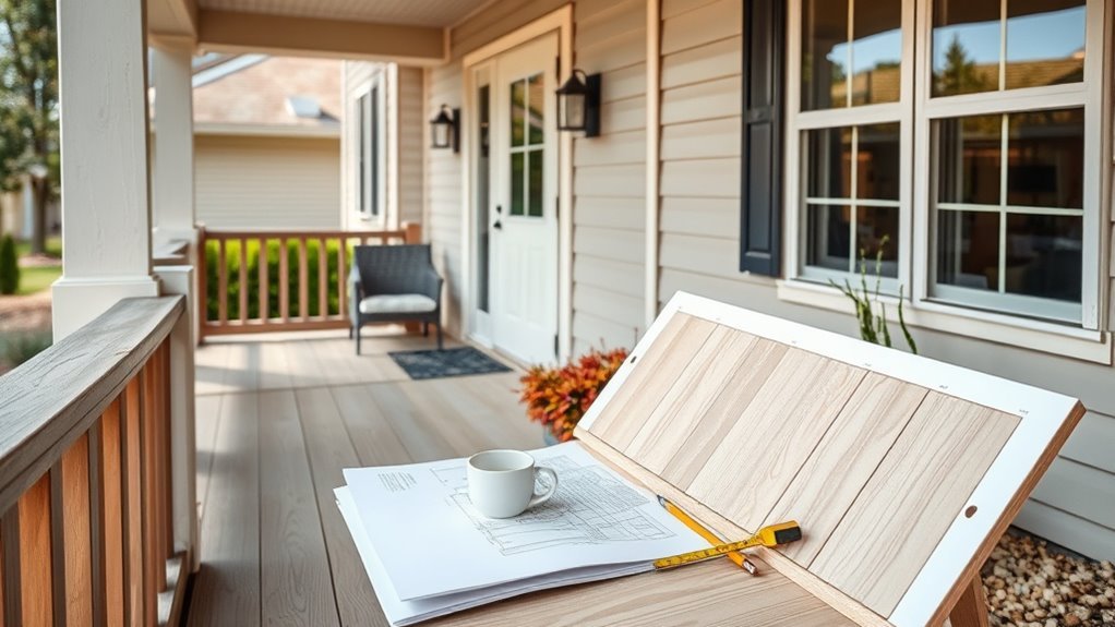
How to Pick Paint Colors for Your House Exterior
Decide what you want—curb appeal, durability, or a bold update—and narrow choices to a three-color scheme: body, trim, accent. Match colors to your architecture, fixed materials (roof, brick, stone) and landscape, then test large swatches on each elevation at different times and in varied light. Favor neutrals to anchor bold hues and use tinted primer for big shifts. Follow HOA rules, document options, and you’ll be ready to proceed with confidence if you want step-by-step guidance.
Define Your Exterior Paint Project Goal
Before you pick colors, decide what you want the paint job to accomplish: refresh faded siding, increase curb appeal for a sale, protect and update trim, or make a bold style statement. You’ll clarify priorities—durability, resale, or aesthetic risk—so choices align with purpose.
Consider color psychology to evoke calm, energy, or tradition; lean on paint symbolism to reinforce historic charm or modern minimalism. List must-haves and deal-breakers, note architectural features, and budget for quality primers and finishes.
With goals set, you’ll evaluate palettes purposefully instead of chasing trends that don’t serve your project.
Quick Framework to Pick Colors Fast
When you need color decisions fast, use a three-step framework—assess, narrow, test—to move from overwhelm to confidence without second-guessing.
First, assess your site: note light, landscape, roof, and neighborhood tones; consider color psychology to set mood—calming blues, energetic yellows, or grounded neutrals.
Second, narrow to a palette of three: primary body, trim, accent. Choose samples considering paint texture—matte hides flaws, satin highlights details.
Third, test large swatches on different walls and view them at various times. Live with samples for a week, then decide based on real light and how the colors feel.
Match Paint to Your Home’s Architectural Style
Because your home’s style defines its lines and details, match colors that highlight those features rather than hide them. Identify the architectural period—Victorian, Craftsman, Colonial, Modern—and pick palettes that respect its proportions.
Match colors to your home’s architectural period—highlight its lines and details rather than conceal them.
Use color psychology to set mood: muted neutrals for historic restraint, bold contrasts for Craftsman trim, cool tones for modern minimalism.
Consider paint symbolism—white for purity on Colonial, deep greens for rustic cabins—to reinforce character.
Test 2–3 combinations on small areas in different light.
Stick to one dominant hue, an accent, and a trim color so your choices emphasize form, not overwhelm it.
Check HOA and Neighborhood Color Rules
If you belong to a homeowners association or live in a neighborhood with design guidelines, check their color rules early so you don’t waste time on choices that won’t be approved. You should request current palettes, understand allowed contrasts, and note submission processes.
Following rules saves revisions and preserves neighborhood harmony. Prioritize HOA compliance to avoid fines or repaint orders.
- Get written guidelines and approved color lists.
- Ask about trim, accent, and roof restrictions.
- Submit samples or mockups per the process.
- Keep records of approvals and communication for future reference.
Assess Neighborhood Context and Curb Lines
Look at your street’s style and scale to make sure your color choices feel proportional to nearby homes and landscaping.
Note the neighboring color palette so your house complements rather than clashes with the block.
Also follow curb appeal lines — trim, roof, and walkway accents — to create a cohesive, eye-catching frontage.
Street Style And Scale
Wondering how your house will read from the street? You’ll want to tune into street style and scale balance so the facade feels intentional. Consider how massing, rooflines, and porches read at curbside before choosing hues.
- Note dominant proportions: tall versus squat shapes change color emphasis.
- Match trim widths to architectural scale so accents don’t overpower.
- Use darker bases to ground large facades and lighter highlights for details.
- Test paint samples viewed from the sidewalk at different times to confirm harmony.
These steps help you pick colors that respect context and strengthen curb appeal.
Neighboring Color Palette
After checking how your house reads from the street, turn your attention to the neighboring color palette and curb lines to make sure your choice fits the block.
Walk the block and note dominant hues, materials, and rooflines; photograph groupings at different times of day.
Choose tones that respect nearby homes while asserting your style—use one or two contrasting accents rather than clashing across facades.
Aim for color harmony by repeating a subtle undertone found in neighboring trims or landscaping.
Test samples on the facade and view them from the sidewalk; if they compete, simplify until the palette complements the street.
Curb Appeal Lines
Because curb lines and roof silhouettes set the visual rhythm of a street, you should assess how your home’s profiles read against neighboring ridgelines, eaves, and lot setbacks before picking colors. Consider how horizontal or vertical lines guide the eye, then choose hues that complement those shapes. Use garden accents and trim to highlight entry points, and pick paint texture to reflect light similarly to nearby facades so nothing feels out of place.
- Match major rooflines with a compatible main color.
- Use trim to emphasize pleasing angles.
- Coordinate garden accents to support color choices.
- Test paint texture in sunlight before deciding.
Inventory Fixed Materials and Color Limits
Before you pick any paint, take stock of the fixed materials—brick, stone, roof shingles, and existing trim—that won’t change, because they set hard color limits you’ll need to work within. You’ll inventory limitations and note color restrictions so selections harmonize. Photograph each surface, list dominant tones, and test small swatches in sunlight. Use a simple visual chart to imagine combinations:
| Material | Dominant Tone | Notes |
|---|---|---|
| Brick | Warm red | Undertones guide accents |
| Stone | Gray-beige | Neutral anchor |
| Trim | White | Contrast potential |
| Accents | Wood | Warm natural textures |
Make choices that respect these anchors.
Account for Roof Color in Your Scheme
Now look up—your roof color will strongly influence which exterior paints will harmonize or clash. You’ll use roof harmony and color coordination to guide choices, balancing warm or cool shingles with siding, trim, and accents.
Consider contrast, undertones, and longevity when sampling.
- Match undertones: pick paints that echo warm or cool hints in shingles.
- Contrast level: decide subtle harmony or bold contrast for visual impact.
- Test samples: view paint chips near roof at different times of day.
- Durability: choose finishes and colors that age well with roof weathering.
Let the roof anchor your palette for cohesive curb appeal.
Coordinate Paint With Landscaping Colors
When you align your paint choices with the colors and textures in your landscaping, your home will read as a cohesive, intentional composition rather than separate parts. Look at dominant foliage hues, seasonal blooms, mulch and stone to pick a palette that supports landscape harmony.
Use color psychology to decide mood—soft greens and neutrals calm, warm terracottas energize. Test siding and trim against shrubbery and hardscape at different times of day.
Accent colors should echo flower or leaf tones for subtle ties. Keep contrast balanced so plants and paint enhance each other without competing for attention.
Consider Climate and Sun Exposure
Because sun, humidity, and temperature affect how paint looks and performs, consider your local climate and sun exposure before choosing colors and finishes. You’ll pick finishes and hues that resist fading, mildew, and peeling by matching materials to conditions.
Consider local sun, humidity, and temperature when choosing paint—match finishes and hues to resist fading, mildew, and peeling.
Use these quick tips:
- In hot, sunny areas, choose lighter colors and UV-resistant finishes to reduce fading from strong sun exposure.
- In humid climates, pick mildew-resistant formulas and semi-gloss or satin finishes for easier cleaning.
- In cold regions, select flexible paints that tolerate freeze-thaw cycles.
- For mixed conditions, prioritize high-quality exterior primers and paints for durability.
How Light Changes Exterior Paint Color
As sunlight shifts through the day and seasons, it alters how your house’s paint reads—making colors warm and saturated in direct morning or evening light and cooler or muted in overcast or north-facing spots.
You’ll notice light reflection changes hue and intensity: smooth, glossy finishes bounce more light and can appear brighter, while matte surfaces absorb light and look softer.
Color perception also depends on surrounding materials and landscaping that reflect their own tones onto walls.
Walk around at different times, observe shadows and highlights, and imagine how changing light will alter contrast with trim and architectural details.
Test Colors at Full Scale on Each Elevation
Before you commit, paint full-size test panels on each elevation so you can judge how a color truly reads on the house. You’ll see shifts from morning to evening, and get a feel for color psychology in context. Note how paint texture affects sheen and depth. Assess panels from the street, the porch, and up close.
- Place panels on north, south, east, and west faces to compare light angles.
- Use your chosen finish and note texture differences in shadows.
- Observe over several days to account for changing light.
- Photograph panels for later, objective comparison.
How to Evaluate Full-Scale Samples
When you step back to evaluate full-scale samples, look for how color, sheen, and texture interact across distances and light conditions so you can make a confident decision. Walk the perimeter at different times—morning, noon, dusk—and note shifting tones and how shadows alter hues.
Consider color psychology: does the shade convey warmth, calm, or energy from the curb? Inspect paint texture up close and at distance; rougher texture can mute saturation, while glossy sheen boosts contrast.
Photograph samples against landscaping and neighboring homes for comparison. Rank options by consistency, mood, and harmony with architectural details before deciding.
Make Physical Sample Boards
If you want to see how colors truly read on your house, make sturdy physical sample boards you can move around the yard and view in different light. Cut plywood or foam board, prime it, and paint full-size swatches showing trim, body, and accent combos. That lets you judge Color psychology in context and compare Paint texture effects up close.
- Label each board with brand, tint, and finish.
- Mount boards at eye height near different facades.
- Photograph boards at sunrise, midday, and dusk.
- Live with them for a few days before deciding.
Use Digital Mockups to Preview Paint Colors
Use digital mockups to test colors on photos of your house so you can see how they look in different lighting. Shift between morning, midday, and dusk settings to catch color shifts and glare.
Rotate viewpoints or try multiple angles so you don’t miss how hues read from the street or driveway.
Try Different Lighting
Because natural and artificial light can change a color’s appearance dramatically, you’ll want to preview paint choices under different lighting conditions before committing.
Use digital mockups to test Lighting variations and notice how Color perception shifts from morning glow to evening bulbs. Try these simple checks:
- Upload a daylight photo to see colors under bright sun.
- Swap to overcast settings to catch muted tones.
- Preview warm evening light or porch bulbs for cozy hues.
- Simulate fluorescent or LED fixtures to spot cool casts.
These quick tests help you pick a color that reads right any time of day.
Compare Multiple Angles
When you preview paint from multiple angles with digital mockups, you’ll catch how shadows, reflections, and surface texture change a color’s look across the facade. Use mockups to rotate viewpoints, compare morning and evening light, and test trim contrasts. Pay attention to color psychology and paint symbolism so chosen hues support mood and curb appeal. Export screenshots, annotate favorites, and get feedback before buying samples.
| Viewpoint | Purpose |
|---|---|
| Front | Primary curb impression |
| Side | Light shift |
| Close-up | Texture & finish |
| Distant | Overall balance |
| Evening | Nighttime tone |
Pick a Dominant Exterior Paint Color
Although it sets the tone for your whole home, choosing a dominant exterior color is simpler than it seems: pick the shade that will cover the largest surfaces—siding, stucco, or brick—and let trim and accents support it.
Consider color psychology to match mood and neighborhood, and prioritize paint durability for weather resistance.
Test samples on different walls and view them at various times of day.
Think about how roofing and landscape interact.
- Pick a timeless base that complements architectural style.
- Test large swatches outdoors.
- Choose finishes that resist fading.
- Factor long-term maintenance needs.
Choose Trim Colors to Contrast or Blend
If you want your home’s details to pop or blend seamlessly, pick trim colors that either contrast with the dominant hue to highlight architectural lines or harmonize for a subtle, cohesive look.
You’ll use trim contrast when you want windows, eaves, and moldings to read as crisp, defined features—choose lighter or darker values than the main siding.
For a unified appearance, prioritize color harmony by selecting trims from the same family or complementary neutrals.
Test samples in different lights, view from the street, and consider material finishes.
Keep proportions balanced so trim enhances rather than competes with the facade.
Select an Accent Color for Doors and Shutters
Because accents draw the eye, pick a door and shutter color that gives your facade a clear focal point without overpowering it. You want a door color that complements the main body and trim, or provides a crisp contrast. Match intensity rather than exact shades so the shutter hue reads cohesive.
Test samples at different times of day, and consider neighborhood style and architectural details. Keep finishes durable for high-touch areas. Balance bold choices with subtle surroundings so accents feel intentional.
- Try one bold door color.
- Coordinate shutter hue with trim undertones.
- Sample large swatches.
- Consider finish and maintenance.
Use a Three-Color Exterior Palette
When you pick a three-color exterior palette, aim for a clear hierarchy: a dominant body color, a complementary trim, and an accent that punctuates doors, shutters, or architectural details.
You’ll choose the body to set mood via color psychology—calming neutrals or energetic hues—while trim defines lines and windows. Use the accent sparingly to draw the eye.
Pick a body color to set the mood—calming neutrals or lively hues—let trim define lines, and use accents sparingly.
Consider paint durability for high-wear areas and sunlight exposure; tougher formulas on trim and entry keep colors crisp.
Test combinations on large swatches, view them at different times, and keep the overall scheme cohesive so architectural features read clearly.
Balance Warm and Cool Tones for Harmony
Check how natural light hits your home at different times of day, since sunlight can warm or cool how colors read.
Pair warm and cool undertones thoughtfully—use complementary hues to keep the look cohesive rather than competing.
Anchor the scheme with neutral trims or accents to stabilize the palette and tie everything together.
Assess Natural Lighting
If your home faces north, south, east, or west, the direction and intensity of light will change how colors read, so take time to observe at different hours and under varying weather.
You’ll notice natural shadows deepen tones and skylight effects soften them. Walk around the exterior morning, noon, and evening. Photograph the siding in sunlight and shade. Note reflections from nearby surfaces.
- Record hue shifts by hour.
- Compare samples in bright sun vs overcast.
- Check how landscaping casts natural shadows.
- Test trim and accent pieces under skylight effects indoors.
Pair Complementary Undertones
After you’ve observed how light shifts your siding through the day, look next at undertones to make sure your colors play well together. You’ll balance warm and cool hints so your home feels intentional. Use paint psychology to pair a warm beige with a cool gray trim, or a soft blue with creamy accents. Think about color psychology: warm undertones feel welcoming, cool ones feel calm. Test swatches together in different light before committing. Let harmony guide choices so curb appeal and mood match.
| Emotion | Warm Undertone | Cool Undertone |
|---|---|---|
| Welcoming | Honey | Dove |
| Calm | Taupe | Slate |
| Energetic | Coral | Teal |
| Serene | Sand | Mist |
Use Neutral Anchors
While you balance warm and cool hues, anchor them with true neutrals to keep the overall look cohesive and calm. You’ll rely on neutral anchors to ground bold choices and let subtle undertones breathe without clashing.
Pick trims, soffits, or a front door color in a genuine neutral—greige, warm white, or stone—that reads steady in different light. Test samples at various times, and note how undertones shift.
- Use a warm greige for soft contrast.
- Choose a cool stone for modern balance.
- Paint trim in warm white to unify.
- Let the door carry subtle undertones.
Read Paint Chips and Spot Undertones
When you hold a paint chip up to your house, don’t trust the tiny printed square—look for undertones by comparing chips against the actual siding, trim, and roofing in both sun and shade.
Move chips around, view at different times, and squint to reveal blue, yellow, or gray hints that shift perception.
Move paint chips, check them in sun and shade, and squint—those subtle blue, yellow, or gray undertones will show.
Think about color psychology: warm undertones feel welcoming, cool ones feel crisp.
Note how undertones affect contrast with trim and whether they might highlight flaws or aid paint preservation by masking dirt.
Mark favorites on larger swatches and test a small painted patch before committing.
Use Undertones to Predict Color Shifts
Now that you’re spotting undertones on chips and swatches, use those hints to predict how color will shift across surfaces and lighting. You’ll use undertone prediction to anticipate warm or cool nudges on brick, trim, and siding so you aren’t surprised after painting.
Develop color shift awareness by testing samples at different times and on large boards. Consider texture and sheen too — rough surfaces scatter light differently.
Use these quick checks:
- View samples in morning, noon, and evening.
- Tape large boards to each facade.
- Note differences on sunny vs. shaded areas.
- Photograph samples for comparison.
Pick Colors That Hide Dirt and Wear
Because exterior paint also has to stand up to grime and foot traffic, pick colors that mask dirt and wear without looking dull. You’ll want mid-tones and muted shades that provide dirt concealment on high-contact areas like entryways, trim near walkways, and lower siding.
Avoid pristine whites and very dark blacks where soil or scuffs show quickly. Test samples at different distances and in varied light to judge how stains blend.
Consider patterning—slightly varied hues or subtle texture paints—to enhance wear camouflage. Regular maintenance still helps, but smart color choices will keep your exterior looking cleaner longer.
Match Paint Finishes to Surfaces and Exposure
Picking colors that hide dirt is smart, but finish choice affects durability and appearance just as much, so match the paint sheen to each surface and its exposure. You’ll use finish to balance color psychology and practical needs: matte softens hues but shows marks, satin resists dirt and highlights form, and gloss boosts accents.
Match sheen to traffic, sun, and moisture to maximize paint durability without sacrificing mood. Consider:
- Matte on low-traffic, shaded walls for warm, cozy tones.
- Satin on siding facing sun or rain for easy cleaning.
- Semi-gloss on trim for crisp contrast.
- Gloss on doors for striking focal points.
Choose Durable Paint Types for Exteriors
When you want a finish that lasts through sun, rain, and temperature swings, pick the right type of exterior paint for each material and climate. You’ll prioritize paint durability, substrate adhesion, and resistance to mildew. Consider acrylic latex for siding, oil-based for trim that needs tough wear, and elastomeric for masonry. Think about color psychology—lighter hues reflect heat, darker tones absorb warmth and change perceived scale. Match sheen to exposure and maintainability. Use the table to compare typical choices and benefits.
| Material | Common Type | Benefit |
|---|---|---|
| Siding | Acrylic latex | Flexibility, UV resistance |
| Trim | Oil-based | Tough finish, smooth leveling |
| Masonry | Elastomeric | Crack bridging, waterproofing |
Sustainable, Low‑VOC Exterior Paint Options
After selecting durable paints for each surface, you’ll want to think about sustainability and indoor/outdoor air quality—low‑VOC and eco‑friendly exterior options now match traditional products on performance.
You can choose formulas with eco friendly pigments and VOC free finishes without sacrificing durability or color retention. Consider these practical choices:
- High-quality acrylic latex with low-VOC binders for siding.
- Silicone‑enhanced breathable coatings for masonry.
- Plant‑based primers that boost adhesion and reduce odor.
- Zero‑VOC topcoats tested for UV stability and mildew resistance.
Test samples outdoors, read labels for certifications, and ventilate during application.
Budgeting: Cost Differences by Color and Finish
Because color and finish affect both material needs and labor, you’ll want to factor them into your budget early on.
Dark, saturated hues often need more coats or a tinted primer, raising paint quantity and labor costs. Lighter shades can cover more easily, reducing trips.
Glossy or specialty finishes cost more per gallon and may demand finer prep and skilled application.
For a clear cost comparison, list paint price, primer, labor hours, and any specialty tools per finish selection.
Get multiple quotes and sample small areas to confirm coverage before committing so your budget matches real-world needs.
Plan Maintenance by Color and Surface
Think about how different surfaces and colors affect upkeep: darker colors can show dirt less but may absorb heat.
Wood, stucco, and metal each need specific cleaning methods.
You should expect different paint lifespans based on color, finish, and exposure, so plan repainting timelines accordingly.
Create a simple seasonal maintenance schedule—cleaning, touch-ups, and inspections—to keep every surface looking its best.
Surface-Specific Cleaning Needs
When you’re choosing exterior paint, plan maintenance by matching cleaning needs to each surface and color—lighter colors show dirt sooner, textured surfaces trap grime, and darker shades can hide streaks but fade faster in sun-exposed spots.
- Vinyl siding: use surface specific cleaning with mild detergent and soft brush; avoid harsh scrubbing that prompts premature paint removal.
- Wood trim: wash gently, check for peeling; sanding and spot paint removal might be needed before repainting.
- Brick and masonry: pressure-wash cautiously to clear moss without stripping mortar or paint.
- Metal and gutters: clean regularly to prevent corrosion and staining; touch up scratches promptly to stop rust.
Paint Lifespan Expectations
If you want your exterior paint to last, plan for realistic lifespans based on both color and surface. Darker hues absorb more heat and may fade faster on sun-exposed siding, so expect shorter intervals between repainting than with lighter tones.
Smooth, primed surfaces extend paint durability, while textured or untreated wood needs more frequent attention. Coastal or shaded areas demand coatings with higher weather resistance.
When choosing colors, balance aesthetics with the maintenance you’re willing to do: pick finishes and formulations rated for durability in your climate, and factor realistic repainting timelines into your long-term plan.
Seasonal Maintenance Schedule
Because paint performance changes with both color and substrate, plan a seasonal maintenance schedule that corresponds with what you actually have on your house. Match inspections to seasons so you spot fading, mildew, and trim wear before problems spread. Note darker colors absorb heat; lighter colors hide dirt but show pollen during seasonal foliage drop. Factor seasonal humidity into touch-up timing to ensure proper curing.
- Spring: wash siding, remove pollen, check for mildew where seasonal humidity lingers.
- Summer: inspect sun-facing walls for blistering on dark colors.
- Fall: clear debris, touch up before wet weather.
- Winter: document issues for spring repairs.
Repair, Prep, and Priming Tips That Affect Color
Before you paint, fix damaged siding, caulk gaps, and smooth surfaces so the color lays down evenly and looks true to the swatch.
Repair siding, caulk gaps, and smooth surfaces first so paint lays evenly and matches the swatch.
You’ll remove loose old coatings with careful paint removal, then use surface sanding to feather edges and create a uniform profile.
Clean thoroughly to eliminate dirt and mildew that alter sheen.
Prime bare wood, patched fiber cement, and metal to guarantee adhesion and consistent absorption; choose tinted primer for strong colors or high-contrast changes.
Let primers cure fully, follow manufacturer instructions, and inspect for imperfections before topcoating so your chosen color appears as planned.
Troubleshoot Fading, Chalking, and Mismatch
When your exterior paint starts fading, chalking, or looking off compared with the swatch, start by identifying the symptom and its likely cause so you can choose the right fix. You’ll check surface prep, exposure, and product age to judge paint durability and color fading.
Then take targeted action:
- Scrape and wash chalking; use alkali-resistant primer before repainting.
- Match batches for mismatched panels; test small swatches in sunlight.
- Replace low-quality paint with higher durability, UV-resistant formulas.
- Address substrate issues (moisture, mildew) before coating to prevent repeat fading and failure.
How to Phase a Repaint Over Multiple Seasons
Start by prioritizing high-visibility areas like the front facade and entry so your home gets the biggest impact first.
Then plan work by architectural sections—roofline, siding, and porches—so each season focuses on a manageable zone.
Coordinate paint and trim choices as you go to guarantee each phase blends seamlessly with the next.
Prioritize High-Visibility Areas
If you can’t repaint the whole exterior at once, focus on the areas that everyone sees first and most often—entryways, front-facing siding, prominent trim, and the garage door—so each phase delivers maximum curb appeal and impact.
Consider color psychology to set mood and coordinate focal elements first; choose high-traffic materials with proven paint durability.
Prioritize actions that change perceived style quickly and protect vulnerable surfaces.
Plan phases so adjacent work complements earlier choices and avoids clashing palettes.
- Entryway: focal color, durable finish
- Front siding: primary hue, weather-resistant coat
- Trim: contrasting accent, hardy formula
- Garage door: statement piece, long-lasting paint
Plan By Architectural Sections
After you’ve prioritized high-visibility areas, map out your repaint by architectural sections so each season’s work appears intentional and cohesive. Start with focal zones—entry, facade, prominent gables—then schedule secondary walls, porches, and trim in later phases.
Group similar exposures to match curing windows and maximize paint durability; work in dry, moderate months for best adhesion. Use color psychology to plan progression: begin with welcoming neutrals, introduce accent hues later to build contrast without overwhelming.
Keep samples and notes so each season aligns. This phased approach saves budget, reduces disruption, and ensures a unified final appearance.
Coordinate Paint And Trim
When you phase a repaint over multiple seasons, coordinate paint and trim so each stage reads as a deliberate step toward the finished look; plan which surfaces get full-color coats now and which receive primer or a neutral base to tie later work together. You’ll manage expectations, preserve curb appeal, and test color psychology in small areas before committing.
Consider paint texture differences between trim and body so progression read intentional. Prioritize weather-exposed elements first, then decorative trim. Keep samples and notes to maintain consistency across seasons.
- Paint body sections in durable base coats
- Finish trim with contrasting texture
- Use primer to harmonize hues
- Test color psychology on accents
Coordinate Paint With Exterior Lighting Plans
Because light changes how color reads, plan your exterior paint with your lighting layout in mind so fixtures highlight the tones you want and hide the ones you don’t.
When you map exterior lighting, note warm vs cool bulbs and fixture placement; warm lights deepen earth tones while cool lights brighten neutrals.
Test paint swatches at night under actual fixtures to see shifts.
Use color coordination to guarantee shadowed areas don’t look muddy—adjust trim or accent shades accordingly.
Aim for balance: let lights enhance focal points and maintain consistent moods across facades for a cohesive, intentional exterior presentation.
Choose Entryway and Front-Door Paint for Curb Appeal
Now that you’ve considered how exterior lighting changes color, focus on the entryway and front door—they’re the focal point that shapes curb appeal and first impressions. Choose a door color that communicates your home’s personality; entryway symbolism matters. Contrast or complement the facade, but keep scale and neighborhood context in mind. Front door symbolism—welcoming, bold, or understated—guides your choice.
- Pick a hue that reads well in daylight and at night.
- Test swatches on the actual door and surrounding trim.
- Consider finish: satin hides flaws, gloss pops.
- Use durable, exterior-grade paint for weather resistance.
Use Color to Emphasize Architectural Features
Use contrasting trim to call attention to windows, eaves, and other architectural details so they read clearly from the street.
Pick an accent color for shutters, doors, or columns to add depth and make features pop without overpowering the main color.
Keep contrasts balanced so the overall look stays cohesive and intentional.
Highlight With Contrasting Trim
Want to make your home’s best features pop? Use contrasting trim to highlight architectural features and guide the eye. Choose a trim color that complements the main siding without matching it exactly—darker trims frame windows, lighter trims open facades. Balance boldness with restraint so details read clearly from the street.
Try these approaches:
- Frame windows and doors with a clean, contrasting trim.
- Paint cornices and eaves slightly lighter to lift the roofline.
- Use a darker trim on shutters and porch posts for definition.
- Keep fascia and gutters consistent to avoid visual clutter.
Test samples in different light before committing.
Use Accent For Depth
After framing windows and doors with contrasting trim, introduce accent colors to add depth and draw attention to key architectural elements. You’ll use accent layering to guide the eye: pick a bold hue for shutters, a subtler tone for the door, and a third, restrained shade for eaves or columns.
Keep roof and siding undertones consistent so color depth feels intentional, not chaotic. Test accents against natural light and adjacent materials, then adjust saturation rather than hue for balance. Use small swatches first; accents can be reversed or muted easily, but wrong large-area choices are harder to fix.
Handle Trim and Details on Ornate Homes
When you’re working with an ornate home, trim and decorative details become the focal points that tie the whole exterior together. So choose colors that highlight craftsmanship without overwhelming it.
You want ornate trim and decorative accents to pop subtly: pick a primary body color, then select a trim hue two to three shades darker or lighter for contrast.
Use a third, sparing accent for focal features like brackets or window crowns.
- Test swatches on multiple elevations.
- Consider historical palettes for authenticity.
- Keep high-contrast for key details only.
- Match sheen to material and wear.
Update Siding Color Without Replacing Materials
You can give worn siding a fresh look just by repainting it, saving time and money compared with replacing materials. Pick a durable exterior paint and prep the surface properly so the new color lasts.
Then use a contrasting accent trim to highlight architectural lines and make the update feel intentional.
Refresh With Paint
If your siding looks tired but is still structurally sound, a fresh coat of paint can completely transform your home’s curb appeal without the time and expense of replacement. You’ll rethink color psychology to set mood and resale appeal, and choose formulations that maximize paint durability for your climate.
Prep matters: clean, sand, prime. Pick finishes that resist fading and mildew. Consider these quick steps:
- Inspect and repair damaged areas before painting.
- Test swatches in sunlight and shade.
- Use high-quality primer and weather-resistant topcoat.
- Plan application timing for dry, mild weather conditions.
Use Accent Trim
While swapping out siding can be costly, changing accent trim gives your home a fresh, intentional look without replacing materials. You can redefine style by painting window casings, doors, and fascia to create deliberate color contrast with existing siding.
Pick one strong accent trim hue that complements roof and landscape, then test small areas in different light. Use matte or satin finishes for durability and easy touch-ups.
Keep trim lines crisp—use proper tape and primer for clean edges. Accent trim updates are affordable, reversible, and impactful, letting you modernize curb appeal without structural work or major expense.
Choosing Colors for Multi‑Material Facades
Because different materials reflect color and age differently, choosing hues for a multi‑material facade means thinking about how those surfaces interact rather than treating them separately.
Consider how different materials age and reflect light—choose hues that interact across surfaces, not in isolation.
You’ll want to balance texture contrast and plan for thoughtful material blending so the whole exterior reads as intentional.
- Pick a dominant color for the largest surface to unify the look.
- Use a secondary hue on contrasting textures to highlight depth.
- Reserve trim or accents for a third, coordinating color to link elements.
- Test samples outdoors at different times to confirm harmony and aging behavior.
Historic Homes: How to Choose Period-Appropriate Colors
If you own a historic house, start by researching period color palettes used when your home was built so your choices feel authentic.
Match paint to original architectural details—trim, cornices, and shutters often had specific contrasting colors.
When possible, test low‑impact paint analysis or compare old photos to confirm your selections.
Research Period Color Palettes
When you’re restoring a historic home, researching period color palettes lets you match the house’s original character and avoid anachronisms that dilute its architectural integrity. You’ll begin with color research to learn common hues from the era, then use palette selection to narrow choices that respect historic context and local materials. Check archives, paint scrapes, and preservation guides. Consider how weather and fading alter tones.
- Review historical photos and local records.
- Inspect underlying paint layers.
- Consult preservation specialists or guidelines.
- Test small samples on different facades and in varied light.
Match Original Architectural Details
As you match original architectural details, focus on how trim profiles, window surrounds, cornices, and decorative elements were originally distinguished—these features often carried the contrasting or accent colors that define a period look.
You’ll inspect surviving paint layers, photos, and moldings to identify original palettes. Prioritize architectural detail placement when choosing hues so accents, siding, and trim read correctly from the street.
For historical accuracy, consult preservation guides or local historic commissions before deviating. Test small areas with sample paints in different lights, then step back.
That disciplined approach preserves character and guarantees your color choices honor the home’s era.
Modern Homes: Minimalist Color Strategies
Because minimalist modern homes rely on clean lines and pared-back details, your color choices should reinforce that simplicity rather than compete with it. You’ll use restrained palettes, considering color psychology to set mood while prioritizing paint durability for low-maintenance exteriors.
Balance neutrals with subtle contrasts and durable finishes that age gracefully.
- Choose a dominant neutral (white, gray, taupe) for cohesion.
- Add one accent in a muted tone to highlight geometry.
- Pick finishes rated for weather and UV resistance for longevity.
- Test swatches on different facades and view them at various times.
When to Go Bold Versus Staying Neutral
Moving from a minimalist palette, you’ll sometimes want to make a stronger statement—knowing when to do that preserves the home’s clean lines while adding personality.
You choose bold accents when architectural details can carry contrast without overwhelming proportions, or when neighborhood context invites energy.
Stay neutral if resale, harmony with surroundings, or aging materials matter.
Let color psychology guide mood: warm hues energize, cool tones calm.
Consider cultural influences—local traditions or historic palettes may favor certain choices.
Balance scale, trim, and entryway; use bold sparingly as focal points.
That way you’ll keep coherence while expressing intent.
How to Test Color Under Seasonal Light Changes
Put several paint samples on different sides of your house and check them at morning, noon, and evening to see how light changes the color.
Take notes or photos across seasons so you can compare how hues warm, cool, or fade from spring to winter.
That way you’ll avoid surprises when the light shifts with the weather.
Observe Samples At Different Times
When you test paint samples, check them at sunrise, midday, dusk and on overcast days so you’ll see how seasonal light shifts the color and tone. Colors that look crisp in summer sun can wash out in winter’s low light or read warmer under autumn haze.
Observe samples on different siding panels and near trim to compare contrast. Consider color psychology—how mood changes with hue under varied light—and factor paint brand selection since formulations reflect differently. Make notes and photos with timestamps.
- Pick three sample sizes.
- Photograph in consistent spots.
- Record temperature and cloud cover.
- Compare over weeks.
Note Seasonal Color Shifts
Ever wondered how your chosen exterior hue will look through snow, spring bloom, summer glare and autumn haze? You should test samples across seasons to note seasonal color shifts and paint temperature effects. Tape swatches on different walls, photograph them at dawn, noon, and dusk across months, and compare warm vs. cool daylight. Pay attention to reflections from foliage, snow, and pavement; they’ll change perceived warmth. Record observations and pick the tone that stays true in most conditions. Use the table below to track results.
| Season | Light | Perceived Warmth |
|---|---|---|
| Winter | Low/reflective | |
| Spring | Soft |
Ask the Right Questions When Hiring a Color Consultant
Before you hire someone to pick your exterior palette, make a short list of questions that reveal their process, experience, and how they’ll work with you. Ask about their familiarity with color psychology and how they factor surroundings, light, and neighborhood context. Confirm whether they provide mockups and on-site samples and who handles paint application details. Clarify timelines, fees, and revision limits so expectations match.
Before hiring for an exterior palette, ask about process, color sense, mockups, on-site tests, application, timelines, and fees.
- What’s your experience with exterior projects?
- How do you test colors on-site?
- Who manages paint application and quality control?
- Can you explain your revision and fee structure?
Work With a Brand Palette: Tips and Pitfalls
If your home doubles as a business or you want cohesive curb appeal, match the exterior with your existing brand colors while staying flexible for architectural limitations.
Use your accent color sparingly—on the door, trim, or a focal element—to prevent it from overpowering the facade.
Always check contrast and legibility from the street so signage and details remain clear at a distance.
Match With Existing Branding
When your business has an established palette, use it as the starting point for exterior paint decisions so your building reads like a coherent extension of the brand; match tones, not exact pixels. You’ll keep brand consistency and make Logo integration feel natural without overbranding.
Consider these practical steps:
- Map primary and secondary brand colors to large surfaces and trim.
- Test samples at different times of day to confirm undertones.
- Prioritize durable, weather-resistant finishes that preserve color fidelity.
- Coordinate signage and awnings so they complement, not compete, with the chosen exterior palette.
Use Accent Color Sparingly
You’ve anchored your exterior in brand colors, so now think about restraint: use an accent color sparingly to draw attention without overpowering the whole façade. Choose one focal element—door, trim, or a small architectural detail—and apply a bold hue that aligns with color psychology to evoke the mood you want.
Keep the rest neutral to preserve cohesion and let the accent pop. Test samples in different light and opt for high-quality paint for longevity; consider paint durability against sun and weather so your accent stays true.
Less is more: strategic, limited use creates impact without visual clutter.
Watch For Color Contrast
Although brand palettes give you a clear starting point, you’ll need to check contrasts carefully so elements read distinctly from a distance and across lighting conditions. You want color harmony without losing visual contrast that defines trim, doors, and accents. Test swatches at different times of day, and view photos from the street.
- Compare light and dark tones to guarantee readability.
- Use a strong accent for focal points, keeping harmony in mind.
- Sample large areas—small chips deceive.
- Beware near-identical hues; they flatten architectural detail.
Trust your eye, but verify with real-world tests.
Final Checklist to Lock in Your Exterior Paint Colors
Before the paint goes on, run through a short, focused checklist to make sure your choices will hold up in real life. Check how color psychology fits your curb appeal goals, test samples in sun and shade, and verify paint technology for durability. Confirm trim, accent, and roof contrasts, and review HOA rules. Get final swatches and order extra for touch-ups.
| Item | Action |
|---|---|
| Samples | Observe at different times |
| Durability | Confirm paint technology specs |
| Contrast | Check trim and accents |
| Rules | Review HOA/local codes |
| Quantity | Order extra for repairs |
Lock in decisions, then schedule painting.
Frequently Asked Questions
Can Paint Color Affect My Home’s Resale Value Regionally?
Yes — your paint choices can influence regional resale value. You’ll use color psychology to appeal to buyers and prioritize exterior durability for lasting curb appeal; matching local trends and climate boosts perceived worth and buyer interest.
How Do I Pick Colors for Unusual Roof Materials Like Metal or Slate?
About 60% of buyers notice roofing color first; you’ll want a metal roof complement with cool neutrals and crisp trim, while a slate roof palette favors muted blues, deep charcoal, and warm stone accents to balance texture.
Will Local Wildlife or Insects Be Attracted to Certain Exterior Colors?
Yes — you’ll influence wildlife attraction and insect behavior: bright florals can draw pollinators and birds, while dark, warm tones may attract fewer insects; contrast and nearby habitat matter, so consider surroundings when choosing colors.
How Do I Coordinate Paint Colors With Planned Future Additions?
Plan future additions around a core color palette harmony, so you’ll select base hues that complement expected materials. Test outdoor color schemes together, preview swatches on-site, and choose adaptable accents that tie everything into one cohesive look.
Are There Legal Requirements for Color on Historic District Exteriors?
Yes—you often must follow historic preservation rules: local ordinances impose color restrictions, and you’ll need approval from preservation boards or commissions before repainting, so check guidelines and submit samples to avoid violations or fines.
Conclusion
You’ve got the tools to pick exterior paint like a pro, so trust your eye and follow the checklist to avoid costly second guesses. Start with your project goal, respect architecture and neighborhood rules, test colors in real light and seasons, and ask smart questions when hiring help. Treat your home’s palette like a signature—subtle, deliberate, and distinctly yours—and lock in those choices with confidence before the brush hits the siding.