How to Transition Two Paint Colors on One Wall
You can create a clean two‑tone wall by choosing compatible hues (same undertone, one lighter), planning the split (horizontal, diagonal, ombré), and prepping the surface well. Tape straight lines or mark curves, seal tape with base color, then paint wet‑on‑wet for smooth blends or feather edges for gradients. Use quality brushes, rollers, and touch‑up tools; remove tape at the right moment for crisp edges. Keep going to learn techniques for complex shapes and finishes.
Quick Start: Pick Your Two‑Tone Approach
Before you pick up a brush, decide which two‑tone approach fits the room’s scale and purpose: a sharp horizontal split creates a modern, structured feel; a soft ombré adds warmth and depth; and a diagonal or curved shift brings energy and movement.
You’ll consider color psychology to set mood—calming blues low, vibrant hues high—and match paint formulation to finish needs: washable satin for traffic areas, matte for cozy zones.
Sketch placements, test swatches at different light times, and plan progressions—tape for crisp lines, feathered blending for gradients. This quick start keeps choices intentional and results predictable.
When to Choose Two Colors on One Wall
When does it make sense to paint two colors on one wall? You’ll choose two tones when you want impact without remodeling: to define zones, boost mood, hide wear, or refresh a focal point. Consider color psychology to set energy, and check paint durability where traffic or stains occur.
- Joyful contrast that energizes your mornings
- Soothing gradient for relaxed evenings
- Practical split where durability matters
- Dramatic statement that sparks pride
- Subtle balance that calms and centers
You’ll decide based on function, emotion, and maintenance, not just aesthetics.
Pick a Transition Style for Your Room
As you decide how to split the wall, pick a changeover style that matches the room’s function and your personal taste—hard-edged lines for crisp definition, soft gradients for a relaxed vibe, or geometric shapes for a modern punch. Consider color psychology to set mood and paint durability for high-traffic areas. Hard edges suit workspaces; gradients calm bedrooms; shapes add energy to social rooms. Use stencils or tape for precision and choose finishes that withstand wear. Below, quick comparison:
| Style | Mood | Durability |
|---|---|---|
| Hard-edged | Focused | High with satin |
| Gradient | Calm | Medium |
| Geometric | Energetic | High with semi-gloss |
How to Pick Two Compatible Paint Colors
Now that you’ve chosen a style, pick two colors that work together and suit the room’s purpose. Use color psychology to match mood—calming blues for rest, energizing yellows for activity—and consider paint formulation for finish and durability.
Test swatches on the wall at different times of day. Stand back and imagine the room’s light, furniture, and traffic. Trust your instincts, but verify with samples.
- Imagine waking into the space
- Feel the calm or energy the colors create
- Picture guests’ reactions
- Sense how texture and sheen affect mood
- Confirm the colors feel right over time
Use Undertones and Value So Colors Don’t Fight
Start by matching undertone families so the colors feel related rather than clashing.
Then balance their value—one should be noticeably lighter or darker so the shift reads intentional.
Together, undertone and value keep the wall harmonious and easy on the eyes.
Match Undertone Families
If you want two colors on one wall to sit comfortably together, pick paints from the same undertone family—warm with warm, cool with cool—so they read as related rather than competing. You’ll use color psychology to set mood and consider paint durability for long-lasting harmony. Match undertones so transitions feel intentional.
- Calm confidence when blues share cool undertones
- Cozy warmth when beiges and terracottas echo yellow-red
- Sophistication when gray undertones align
- Playfulness when pastels carry the same base
- Restfulness when muted tones whisper together
Trust your eye; subtle sameness prevents visual fighting.
Balance Lightness Levels
Because your eye notices contrast first, balance the lightness (value) of two paints so neither overpowers the other; pick one lighter and one darker within the same undertone family to keep shifts calm.
You’ll test samples on the wall at different times of day, observing how color psychology shifts mood with changing light.
Use mid-values for shared space and reserve high contrast for accents.
Feather edges or add a narrow neutral band to ease the shift.
Also consider paint durability where traffic or cleaning affects finish choice—cleanable sheens in mid-tones last better and preserve the desired balance.
Sheen Guide: Which Finish for Seamless Blending
When you’re blending two colors on the same wall, choosing the right sheen matters as much as the hues themselves. You’ll want sheen consistency across both paints so the shift reads as one thoughtful sweep, not two competing surfaces. Pick a finish that balances appearance with finish durability for the room’s use—eggshell for cozy living spaces, satin where you need wipeability.
Test samples side by side under your light. Trust your eye.
- Relief when seams disappear
- Confidence in even reflection
- Pride in a polished look
- Comfort from subtle cohesion
- Calm from thoughtful choice
Contrast Guide: Low vs High Contrast for Mood
Sheen sets the surface; contrast sets the mood, so decide how bold you want the wall to feel before choosing colors.
Low contrast creates calm, blending hues so gradation feel subtle and restful; you’ll rely on color psychology to pick soothing tones like muted blues or warm grays.
High contrast delivers energy and focus, using stark pairings to define zones or draw attention.
Consider lighting effects: bright, directional light ramps up drama in high contrast, while soft, diffuse light smooths low-contrast boundaries.
Test samples in the room at different times to see how mood shifts with both contrast and light.
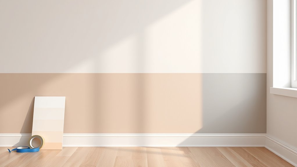
Tools for Two‑Tone Wall Transitions
To get a clean, professional-looking two‑tone shift you’ll need a handful of reliable tools: quality painter’s tape, a good‑edge cutting brush or angled sash brush, a mini roller for the field, a straightedge or level for marking the break line, a putty knife for smoothing imperfections, and a drop cloth to protect floors.
For a sharp two-tone finish, assemble quality tape, a good cutting brush, mini roller, level, putty knife, and drop cloth.
Gather tools that feel sturdy and comfortable; they’ll influence finish and speed. Consider color psychology when choosing tones, and label cans clearly for paint storage.
Use:
- a steady hand to calm nerves
- crisp tape for satisfaction
- a smooth roller for confidence
- a sharp line for pride
- neat cleanup for relief
Surface Prep: Clean, Patch, and Prime
After you’ve gathered your tools and marked the break line, get the wall ready: wipe down surfaces with a mild detergent solution to remove dust, grease, and fingerprints, then rinse and let dry.
For effective surface cleaning, work from top to bottom, use a soft sponge, and change water often.
Inspect for holes, cracks, or nail pops; perform Patch repair with a suitable spackling compound, smooth with a putty knife, and sand once dry.
Remove dust with a tack cloth.
If the wall has stains or bare drywall, apply a primer designed for stain blocking and adhesion.
Let primer cure before painting.
Measure and Mark Your Transition Layout
Once you’ve cleaned and primed the surface, measure the wall and mark the changeover line precisely so both colors meet cleanly. You’ll plan placement to balance Color psychology and visual flow while considering paint durability where traffic or sunlight hits. Use a steady level and pencil, then double-check measurements from each end.
Walk the room and imagine the split emotionally—calm, energetic, cozy—and adjust height accordingly.
- Anticipation of the reveal
- Relief at clear guidelines
- Confidence in balanced contrast
- Satisfaction from thoughtful placement
- Pride in durable, lasting finish
Mark lightly; avoid permanent mistakes.
Create a Crisp Straight Split With Tape and Guides
Start by planning exactly where your split line will sit and mark it clearly so you know what you’re aiming for.
Run a level or laser guide along that line to keep the edge perfectly straight as you work.
Apply painter’s tape along the mark and firmly seal the tape edge so no paint bleeds under it.
Plan Your Split Line
Before you tape, decide exactly where the two colors will meet and how sharp you want the shift to be, then mark that line with a light pencil or chalk so you have a visible guide. Consider color psychology to choose placement that influences mood; factor paint technology for edge definition and finish compatibility. Walk the room, view the line from different angles, and adjust until it feels right. Then tape confidently.
- Anticipation: the split excites the space
- Calm: a soft junction soothes
- Drama: a bold line demands attention
- Balance: symmetry comforts
- Surprise: unexpected placement delights
Use Leveling Guides
Although tape can do a decent job on its own, you’ll get a far crisper, perfectly straight split if you set up leveling guides first—use a laser level or chalk line to mark the exact junction. Clamp a straightedge or a strip of wood where the paint will end, and run quality painter’s tape along that guide so the edge stays true while you roll or brush.
Align guides so your chosen colors respect room mood and color psychology, keeping boundary placement intentional. Secure guides tightly to prevent bleed.
Properly installed guides also help control paint durability by avoiding uneven layers and ensuring clean, long-lasting edges.
Tape And Seal Edges
When you’ve marked your split with guides, run high-quality painter’s tape along the line and press it down firmly so paint can’t seep under the edge; seal the tape edge with a thin swipe of the base color to lock it. You’ll control the shift and protect paint durability while honoring color psychology in your room’s mood. Take your time; crispness matters.
- Relief knowing the line won’t bleed
- Pride at a professional finish
- Calm from orderly preparation
- Excitement seeing contrasting hues meet
- Confidence in lasting results
Remove tape at a slight angle while paint’s tacky for best release.
Paint a Diagonal or Geometric Split Correctly
If you want a crisp diagonal or geometric color split, plan and tape carefully so your lines stay sharp and the paint doesn’t bleed. Measure and mark your design with a level and straightedge so angles read cleanly.
Apply high-quality painter’s tape, press the edges firmly, and seal the tape line with a thin coat of the base color to prevent bleed-through.
Use premium painter’s tape, press edges firmly, then seal the line with a thin base coat to block bleed.
Consider color psychology when choosing contrasting hues—bold diagonals energize, soft geometrics calm.
Use paints known for good paint durability and work in thin, even coats.
Remove tape slowly at a 45° angle once paint is tacky, not fully dry.
Step‑by‑Step: Paint an Ombré Fade
Because an ombré relies on smooth shifts, you’ll want to prep, mix, and blend intentionally before you touch the wall. Start by choosing two colors with compatible color psychology, test swatches, and tape guides. Mix incremental intermediate tones in equal steps, label each can, and work from darkest to lightest.
- Breathe—this will calm your nerves.
- Watch how tones influence mood.
- Trust gradual layering, not heavy strokes.
- Keep edges soft for a natural flow.
- Step back often to judge balance.
Use high-quality brushes and rollers for paint durability, feather gradation while paint is wet, and finish with a protective coat.
Blend Colors With the Dry‑Brush Technique
Start by prepping the paint edges so each color meets cleanly without heavy buildup.
Use a dry brush with very little paint on the bristles to lightly drag color between the bands.
Feather and soften the lines with short, gentle strokes until the shift looks seamless.
Prep The Paint Edges
When you’re ready to blend the two colors, tape a clean, straight guideline where they’ll meet and remove excess paint from your brush so it’s nearly dry; this dry‑brush method softens the edge without leaving streaks.
Prep the paint edges by sanding rough spots, cleaning dust, and checking for sheen differences—color psychology affects mood, so aim for seamless progression; test swatches for paint durability.
Lightly feather the edge with short, controlled strokes. Then step back to assess balance.
- Anticipation of the final look
- Calm from a smooth gradient
- Pride in a flawless seam
- Relief when textures match
- Joy at lasting results
Use A Dry Brush
Although the guideline is taped, you’ll want to remove most paint from your brush until it’s almost dry; this lets you feather the two colors together without harsh lines. Work in short, light strokes across the taped edge, alternating between both hues to create a subtle shift.
You’ll see how color psychology changes mood where tones meet, so test combinations first. Keep brushes clean and pressure gentle to avoid lifting underlying paint.
Dry‑brushing conserves paint and improves paint durability by minimizing buildup. Step back frequently to check balance, adjusting stroke length and paint load for a seamless, controlled blend.
Feather And Soften Lines
If you want a seamless progression, load very little paint on your brush and use light, quick strokes that skim the wall’s surface; this lets you feather the pigments together without leaving hard edges. You’ll blend two hues so the shift feels intentional, tapping into color psychology to guide mood while preserving paint durability by avoiding heavy buildup.
Work from both colors toward the center, soften overlaps, and step back often. Feel the calm as tones mingle.
- Anticipation
- Harmony
- Relief
- Confidence
- Calm
Keep strokes random, brief, and overlapping until the seam disappears.
Use a Sponge or Rag for Textured Gradients
Because a sponge or rag presses paint into the wall’s texture, you’ll get a soft, organic gradient that’s hard to achieve with a brush alone.
Using a sponge or rag presses paint into the wall’s texture, creating a soft, organic gradient brushes can’t easily replicate.
You’ll dab two paints where they meet, working in small sections to create textured gradients that read natural and intentional. Use a sea sponge for mottled effects or a lint-free rag for subtle Rag blending; both let you control density by varying pressure and paint load.
Step back often to check blend uniformity, feather edges with light, dry dabs, and clean tools between colors.
Finish with a light seal if desired to protect the blended surface.
Roller Cross‑Hatch Technique for Even Blends
When you want a smooth, consistent shift between two colors, try the roller cross‑hatch technique to blend them evenly across the wall. You’ll load a roller with both hues, apply crisscross strokes, then soften overlaps while paint’s wet so progression reads seamless.
This method respects color psychology by letting tones mingle gradually, creating mood without harsh lines. It also preserves paint durability because you avoid heavy buildup and patchy touchups.
Practice on a board first, work section by section, and keep a clean roller.
- Calm anticipation
- Confident control
- Subtle warmth
- Quiet satisfaction
- Lasting pride
Tape and Feather for a Seamless Edge
Before you tape, make sure the surface is clean, dry, and sanded smooth so the edge will sit flat.
Apply painter’s tape firmly along your guideline, pressing the edge down to prevent bleed-through and removing any loose bits.
When you paint, feather the new color outward with a lightly loaded brush or roller to blend it into the existing paint for a seamless shift.
Surface Preparation Steps
To get a crisp changeover line, start by taping a straight edge where the two colors will meet, then feather the paint beyond the tape so the overlap blends smoothly.
Now prep the surface: clean, sand lightly, and repair imperfections so your colors read true and color psychology works as designed while paint durability lasts. Prime if needed and let dry.
- Relief: seeing a smooth wall calms you.
- Pride: clean prep shows craftsmanship.
- Confidence: proper steps prevent peeling.
- Joy: the transition looks deliberate.
- Satisfaction: long-lasting finish rewards effort.
Proper Tape Application
Now that the surface is prepped and primed, set your tape carefully where the colors will meet: press it down firmly along a straight edge, then run a putty knife or your fingernail over the seam to seal it so paint won’t bleed. Choose high-quality tape to protect color psychology intentions and guarantee clean shifts. Remove dust, align tape for level lines, and avoid stretching. After painting, pull tape back slowly at 45 degrees while paint is tacky, not wet or fully dry, to preserve paint durability.
| Step | Action |
|---|---|
| 1 | Clean edge |
| 2 | Apply tape |
| 3 | Seal seam |
| 4 | Paint |
| 5 | Remove tape |
Feathering Paint Technique
When you remove the tape and feather the paint, work while the edge is still tacky so you can blend without dragging a hard line. You’ll lightly drag a dry brush from the new color into the old, softening the boundary. This preserves paint durability while honoring color psychology—subtle blends feel calm and intentional.
Trust your wrist, use small strokes, and check from different angles. If needed, re-tack with minimal paint.
- relief at a smooth shift
- pride in a professional finish
- calm from balanced hues
- confidence in lasting results
- delight in subtle craftsmanship
Mix Intermediate Tones On‑Site
Wondering how to get a seamless shift between two paints? Mix intermediate tones on-site to bridge hues smoothly. You’ll sample small batches between the two endpoint colors, adjusting tint by tiny increments until progression read natural.
Consider color psychology when choosing middle values—midtones set mood and guide the eye—while keeping paint durability in mind; don’t over‑thin batches or you’ll compromise finish longevity.
Label each mix and test swatches directly on the wall, viewing from different angles and light. Work deliberately: record proportions, remix as needed, and blend those calibrated midtones across the transition for a cohesive result.
Work Wet‑On‑Wet to Avoid Lap Marks
Start rolling the shift while the paint is still wet so you can blend the seam seamlessly.
Move steadily across the joint and keep your edges perfectly wet to prevent lap marks.
If you pause, feather the edge immediately and rework it before it skins over.
Work Quickly Across Seam
Because paint dries quickly at the seam, work steadily and finish each wet edge as you move along so the two colors blend without lap marks. You’ll keep momentum: load your brush or roller, feather the seam, then move on before drying interrupts the join.
Think about color psychology when placing hues—warm tones feel inviting; cool tones recede—and choose finishes that boost paint durability where traffic hits.
Stay calm, deliberate, and swift so the shift reads intentional.
- Relief as colors meet smoothly
- Confidence in your technique
- Pride in a seamless finish
- Joy at a room transformed
- Satisfaction in lasting results
Keep Edges Perfectly Wet
Maintaining a perfectly wet edge is the single best way to prevent lap marks when two colors meet, so as you feather and move along, keep working ahead with a loaded brush or roller. You’ll keep paint edges wet so new strokes blend seamlessly, avoiding visible overlaps that break the progression.
Watch drying times in different light; temperature and humidity change how long you’ve got. If you’re referencing color psychology or historical trends in room design, flawless blends let subtle contrasts read correctly.
Work methodically, reload regularly, and step back often to confirm the wet edge remains continuous until the area’s complete.
Timing Tips: Drying Times and When to Blend
When you plan the timing for blending two paint colors, factor in the paint type, temperature, and humidity so you know when the first coat has cured enough to resist lifting but is still tacky enough for a seamless shift. Check the paint manufacturer’s recommended recoat window, and consider color psychology—darker shades may show seams sooner.
Test a small area to judge tackiness. Work steadily; don’t wait until fully dry. Use these cues to guide your timing:
- Anticipation: you’ll feel eager when it’s right.
- Relief: smooth transitions calm you.
- Pride: a flawless blend delights.
- Urgency: don’t over-wait.
- Confidence: trust your touch.
Fix Banding, Brush Marks, and Streaks
If you spot banding, brush marks, or streaks while your blend is still tacky, act quickly to smooth them before the paint skins over. Gently feather with a damp brush or roller, working small areas and keeping edges soft. Lightly mist if needed to rehydrate paint. Step back often to assess how light and texture affect perception—color psychology and historical trends show finish and sheen change how a gradient reads. Use this quick checklist:
| Problem | Fix | Tip |
|---|---|---|
| Banding | Feather with roller | Light strokes |
| Streaks | Cross-roll | Blend edges |
| Marks | Damp brush | Rewet sparingly |
| Gloss uneven | Satin coat | Test patch |
Touch Up Edges Without Ruining the Transition
Because touch-ups happen after the main blend, you’ll want to work deliberately to preserve the soft edge: load a small, soft brush or mini-roller with a thin amount of paint, tap excess off, and dab tiny amounts along the seam rather than dragging. You’ll protect the relief by matching paint texture and pressure, and by using the same sheen to honor color psychology and harmony.
Move slowly, step back often, and feather each dot into the surrounding area. Keep tools clean and test on scrap. Embrace calm — touch-ups are subtle wins.
- Relief
- Satisfaction
- Confidence
- Calm
- Pride
Adapt Techniques for High Ceilings and Trim
You’ve practiced careful touch-ups along the seam; now scale those same patient techniques to high ceilings and trim where reach and precision change the game. Use extension poles, angled brushes, and steady scaffolding so your line stays crisp even overhead.
Consider color psychology when deciding whether the ceiling draws attention or recedes; lighter tones lift, darker trims ground. Protect trim with low-tack tape, then feather edges to avoid ridges.
Choose high-quality paints for improved paint durability where wear and cleaning occur. Work in manageable sections, maintain consistent pressure, and step back frequently to confirm a seamless, intentional shift.
Transition Around Windows, Doors, and Outlets
When painting around windows, doors, and outlets, plan each edge like a miniature seam—measure the gap, protect hardware, and pick tools that match the scale so you can keep your color shift crisp without smudging trim or electro fixtures. You’ll work slowly near window framing and door jambs, peel back tape from wet edges, and remove outlet covers to paint cleanly.
Use a sash brush for tight spots and a foam brush for smooth transitions. Breathe steady; precision matters.
Use a sash brush for crisp edges and a foam brush for silky transitions—breathe steady; precision matters.
- Relief when a corner aligns
- Pride in sharp lines
- Calm as you steady your hand
- Joy at uncovered outlets
- Confidence in the finish
Plan Transitions for Multiple Walls and Rooms
If your color shift runs across multiple walls or spills into adjoining rooms, map the flow before you pick up a brush so the change reads intentional rather than accidental. Sketch sightlines, note natural light, and use color psychology to guide warmth or calm between spaces. Label each wall, plan gradual blends at corners, and keep paint storage organized for touchups. Communicate with household members about timing and access.
| Area | Transition Tip |
|---|---|
| Living→Hall | Use graded hue steps |
| Hall→Kitchen | Match undertones |
| Bedroom→Bath | Soften at doorway |
| Open Plan | Anchor with trim |
| Staircase | Follow sightline |
Budget Tools and DIY Alternatives
Although professional tools can speed things up, you don’t need a full contractor’s kit to get a clean, convincing color shift—smart budget choices and a few DIY tricks will do most of the work. You’ll save money while honoring color psychology and even nodding to historical trends in your palette.
Use affordable substitutes and simple techniques to control edges, texture, and fade.
- Rubber squeegee for blended edges — surprise delight
- Foam brushes for soft gradients — intimate calm
- Sample jars for trial runs — confident play
- Sandpaper for feathering — tactile satisfaction
- Painter’s tape hacks — small triumph
When to Hire a Pro for Complex Projects
If your shift involves structural or complex repairs, you should call a pro to guarantee the wall’s integrity and code compliance.
You’ll also want an expert for precision color matching when subtle undertones or custom blends are involved. A contractor or experienced painter can assess risks, match the finish, and save you time and costly mistakes.
Structural Or Complex Repairs
When a wall needs more than a skim coat—say there’s significant drywall damage, bowed studs, or wiring and plumbing exposed—you should strongly consider hiring a pro. You want safe, lasting results; structural reinforcement and complex repairs aren’t DIY thrills. A contractor will assess framing, load, and utilities before you paint.
- Frustration when fixes keep failing
- Anxiety about hidden damage
- Relief when pros guarantee work
- Pride in a solid, safe wall
- Confidence to finish with color
Hire for safety, building-code compliance, and to protect your paint investment.
Precision Color Matching
After structural fixes are handled, you’ll face a different challenge: matching paint colors so seams and repairs disappear. You need precise sampling, attention to Color psychology, and understanding of paint durability. If light, texture, or blended progressions matter, hire a pro. They’ll spectrally match chips, adjust sheen, and recommend durable coatings.
| When to Hire | What they do | Result |
|---|---|---|
| Complex blends | Spectral matching | Seamless finish |
| Large repairs | Texture matching | Invisible joins |
| High-traffic areas | Recommend durable paint | Longer wear |
| Mood impact | Color psychology advice | Cohesive feel |
Maintain and Clean a Blended Two‑Tone Wall
Because a blended two-tone wall draws the eye, you’ll want a simple maintenance routine to keep the shift crisp and colors vibrant. You’ll preserve color psychology and maximize paint durability by cleaning gently, spot-treating marks, and addressing scuffs fast. Test cleaners on a hidden section first, and use a soft cloth with mild soap. Repaint trim or the boundary line with a steady hand when needed.
- Feel proud when the gradient stays true.
- Feel calm knowing stains won’t linger.
- Feel satisfied after a quick touch-up.
- Feel confident in longer-lasting finish.
- Feel delighted by consistent color.
Styling Ideas to Showcase Your Two‑Tone Wall
To showcase your two‑tone wall, balance the room by placing furniture that echoes or contrasts the two colors so the wall feels intentional.
Layer in textiles—rugs, throw pillows, and curtains—to soften the shift and tie the palette together.
Finish with artwork and accents that pick up key hues to create focal points and cohesion.
Balance With Furniture
Wondering how to make your two-tone wall feel intentional rather than accidental? Use color psychology and smart furniture placement to create harmony: let the warmer tone anchor seating, the cooler tone open circulation.
Position a sofa so its back aligns with the dividing line, or float a console to bridge both hues. Keep scale balanced and add one statement piece that reads against both colors.
- Anchor the warmer side with a cozy armchair
- Float furniture to soften the shift
- Use a single wood tone to unify
- Choose art that complements both hues
- Keep negative space around the divide
Layer With Textiles
Looking to make your two-tone wall feel cozy and cohesive? You can use textile layering to bridge the colors: toss cushions, a throw, and a rug that pick up both shades. Choose fabric accents with varied textures—velvet, linen, knit—to add depth without competing with the paint. Keep patterns minimal so the wall remains the focal point, and repeat one accent color in small doses across the room to unify the palette. Below are quick pairing ideas to try.
| Item | Suggestion |
|---|---|
| Cushions | Mix solid & subtle pattern |
| Throw | Chunky knit in neutral |
| Rug | Low-pile with one wall hue |
| Curtains | Sheer layered with blackout |
| Chair | Upholstered in complementary fabric |
Accent With Artwork
A few well-chosen pieces of art will highlight your two-tone wall and make the shift feel intentional rather than accidental. You’ll use art to bridge hues, respecting color psychology and trusting your paint brand selection choices.
Place a focal piece where tones meet, hang a gallery that echoes both colors, or lean sculptural works for depth. Let pieces breathe; avoid clutter so contrast reads clearly.
- Choose art that balances warmth and coolness.
- Use scale to amplify the progression.
- Add texture for tactile contrast.
- Pick frames that tie both tones.
- Rotate pieces to refresh mood.
Frequently Asked Questions
Can Two-Tone Transitions Affect Room Resale Value?
Yes — you can boost or hurt resale value depending on color contrast and wall texture. If you choose subtle contrast and smooth texture, buyers’ll see polished craftsmanship; bold contrasts or uneven texture may narrow appeal and lower offers.
Are There Paint Brands Best Suited for Color Blending?
Yes — you’ll find certain brands excel: Benjamin Moore, Farrow & Ball, Sherwin-Williams, and Behr offer paints that promote paint color harmony and blend smoothly. Use recommended blending techniques for seamless, professional results.
How to Match New Paint Batches Months Later?
About 70% of paint color shifts come from batch inconsistency, so you’ll always request a color matching tint chip, keep original cans for reference, note formula numbers, and buy extra same-batch paint to guarantee batch consistency.
Can Wallpaper Be Combined With a Painted Transition?
Yes—you can combine wallpaper with paint by aligning wallpaper patterns and using texture blending where the paper meets painted sections; you’ll seal edges, sand shifts lightly, and use trim or a painted border to keep the junction crisp.
Are Low-Voc Paints Compatible With Blending Techniques?
Need eco-friendly formulations to blend effectively; can low-VOC paints match performance? Yes—you’ll find many low-VOC products work with brush blending techniques, though you’ll want slightly longer open time and careful layering for seamless shifts.
Conclusion
You’ve learned practical ways to blend two colors, but consider this: when you deliberately shift hues on one wall, you’re testing how small shifts change perception. That’s true—color relationships alter mood, space, and focus. Use that insight: pick styles that reflect how you want to feel, then tweak undertones and value until the wall performs. Treat the wall as an experiment in atmosphere, and you’ll create more than decoration—you’ll shape experience.