Should I Paint Doors Same Color as Walls? Guide
You can paint doors the same color as walls when you want a seamless, spacious look that minimizes visual clutter and makes small rooms feel larger. Matching works well with muted, cohesive palettes and minimalist or period-accurate styles, and it can hide scuffs while creating flow. Contrast is better for focal points, personality, and highlighting architecture, especially in larger spaces. Test swatches in different light and finishes before committing, and keep going to explore practical tips and examples.
Quick Answer: Should Doors Match Walls?
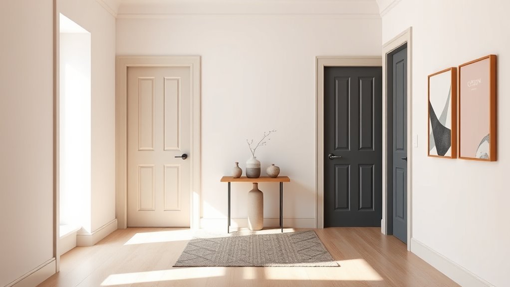
Wondering whether your doors should match the walls? You don’t have to. Matching creates a seamless, spacious feel and suits minimalist, modern door style choices.
Contrasting doors add focal points, define rooms, and express personality. Use color psychology: pale tones calm and recede, bold hues energize and draw attention.
Contrasting doors create focal points, define spaces, and showcase personality—pale tones soothe, bold hues energize and command attention.
Consider scale, light, and trim—small, dark rooms benefit from matching to avoid visual clutter; large, well-lit spaces can handle striking contrasts.
Pick the approach that supports flow and function. Ultimately, you’ll choose what aligns with your aesthetic goals and the mood you want to create.
Decision Framework: When to Match vs Contrast
Think about how room size, architectural features, and maintenance needs should shape your choice to match or contrast doors with walls.
In small rooms you’ll usually want doors that blend to keep the space feeling larger, while bold contrasts can highlight trim, panels, or other design details.
Also weigh practical concerns—darker or more durable finishes hide scuffs better and can cut down on upkeep.
Room Size Impact
When a room feels tight, matching your door to the wall color helps the space read as larger and less cluttered; in contrast, a darker or complementary door creates depth and visual interest in roomy areas.
You should use door color psychology and spatial perception to guide choices: muted matches expand, contrasts anchor. Consider scale, light, and function when deciding.
- Match in small rooms to blur edges and increase flow.
- Contrast in large rooms to create focal points and hierarchy.
- Use mid-tones in medium spaces for balance.
- Test paint swatches in varied light before committing.
Architectural Emphasis
If you want your door to act like a seamless part of the room, match it to the wall so architectural details recede; if you’d rather highlight trim, panels, or an entry’s role, choose a contrasting color to make those features pop. You’ll shape architectural balance and support design harmony by deciding whether to hide or emphasize elements. Match for unified, calm spaces; contrast to define focal points and circulation. Use contrast on a centerpiece door or historic molding. Use match when you want subtlety and flow. Consider proportions, natural light, and style to guide the final call.
| When to Match | When to Contrast |
|---|---|
| Creates flow | Creates focus |
| Softens details | Highlights trim |
| Expands space visually | Defines entryway |
Practical Maintenance Considerations
Alongside deciding whether a door should blend or stand out, you’ll want to weigh upkeep realities that affect that choice: matching paint can hide scuffs and reduce visual maintenance, while contrasting finishes often demand more frequent touch-ups to keep edges crisp.
- Choose high paint durability for high-traffic doors to minimize door upkeep.
- Matte wall paint hides imperfections; semi-gloss on doors cleans easily and resists abrasion.
- If you match colors, expect fewer visible chips but watch for uniform fading across surfaces.
- With contrast, plan periodic edge retouching and protect hardware to preserve the crisp visual separation.
Matching Doors and Perceived Room Size
Because your eyes read continuous planes as larger, painting doors the same color as walls can make a room feel more spacious and unified. When you minimize contrast, the boundary between wall and door recedes, enhancing perceived spaciousness through uninterrupted surfaces.
Color psychology supports this: muted, light hues amplify openness, while deeper tones can cozy without breaking continuity if matched. You’ll also simplify sightlines, letting furniture and architectural features define scale rather than door frames.
Choose finishes that balance durability with subtle sheen so doors survive use without becoming visual interruptions. Match trim thoughtfully to keep proportions consistent and intentional.
How Contrasting Doors Change Visual Focal Points
When you paint a door in a contrasting color, it immediately becomes a visual anchor that redirects attention and sets the room’s hierarchy.
You’ll use focal point techniques to control where eyes land, emphasizing or downplaying architectural features. A contrasting door shifts the visual hierarchy, guiding movement and mood without extra decor.
Consider these simple approaches:
- Use contrast to highlight an entry or feature wall.
- Balance bold doors with neutral surrounds to avoid clutter.
- Coordinate hardware and trim to reinforce the focal point.
- Test small swatches to guarantee the door reads as planned in light.
Tone‑On‑Tone Doors: When to Use Them
If you want a calm, cohesive look that makes architecture feel intentional rather than attention-seeking, choose tone-on-tone doors—painted a shade or two darker or lighter than the walls—to subtly define planes without creating a loud focal point.
You’ll use tone on tone benefits when you want continuity: rooms feel larger, changes are smoother, and trim reads as part of the whole.
Pick hues that maintain color harmony with existing finishes and lighting. Use matte or eggshell for understated texture, and test swatches at different times of day.
Choose tone-on-tone when you want unity and refined restraint rather than contrast.
Contrasting Doors for Personality and Detail
Want to make a room pop? You can use contrasting doors to inject personality and detail without remodeling. Choose bold color choices to define focal points and create balance against neutral walls.
Consider these simple approaches:
- Pick a saturated hue opposite wall tones to draw the eye.
- Use a deep, moody shade for drama in small spaces.
- Add a bright accent door for playful contrast in hallways.
- Match hardware and trim to unify the look while keeping the door distinct.
Contrasting doors add visual interest, guide movement, and let your style speak without overwhelming the room.
Architectural Style and Door Color Choices
Consider how your home’s architectural period guides door color—historic details often call for traditional hues that reinforce the style.
You can use a contrasting door as an intentional accent to highlight moldings or entryways.
Also factor in regional vernacular, since local climates and traditions can influence what colors feel authentic.
Match Period Details
When you’re matching a door color to a home’s architectural period, let the style guide your choice—Victorian houses can handle richer, contrasting hues while Colonial and Craftsman homes often suit restrained, historically accurate shades that blend with trim and siding.
You should research period accuracy and historical context to pick colors that feel authentic.
Consider these practical steps:
- Check old photos or paint analysis for original palettes.
- Choose finishes typical of the era (gloss for trim, eggshell for walls).
- Match wood tones or stonework to unify the facade.
- Test small swatches in different light before committing.
Contrast For Accent
If you want the front door to act as an intentional focal point, use contrast to make it pop against the surrounding facade—bright or deep hues draw the eye and emphasize entry, while subtle contrasts add depth without shouting.
You’ll use accent colors to create bold statements or restrained highlights, guided by color psychology to influence spatial perception.
Balance texture contrast and color harmony so the door reads intentional, not accidental.
Prioritize visual balance, design cohesion, and style consistency so the door complements architectural lines.
Aim for theme integration across trim, hardware, and landscaping to reinforce one clear, confident choice.
Regional Vernacular Considerations
Contrast helps your door stand out, but local architectural traditions will shape what feels right in a neighborhood. You should consider regional styles and cultural preferences so your choice respects community aesthetics and historical influences.
Match design norms or intentionally diverge with modern interpretations.
- Study regional styles to align with traditional choices.
- Note cultural preferences that dictate color symbolism.
- Watch local trends without abandoning respectful context.
- Balance historical influences and contemporary design norms.
You’ll create cohesion when you blend community aesthetics with thoughtful contrast, avoiding clashes while expressing personality through your door color.
Room Function: Pick Door Color by Use
Because doors often signal how a space is used, you’ll want their color to support the room’s function—quiet and cohesive for bedrooms, durable and low-maintenance for mudrooms, and bold or welcoming for entryways.
Think about door symbolism and color psychology: a muted door calms a study, a dark, scuff-resistant finish suits a busy laundry area, and a bright front-door hue invites guests.
For bathrooms, choose moisture-tolerant paints and subtle tones to soothe. In kitchens, pick washable finishes and colors that complement cabinetry.
Match function to finish and hue so each door performs and communicates its purpose clearly.
How Natural Light Affects Door and Wall Color
Natural light reshapes how both wall and door colors read, so you’ll want to contemplate the room’s exposures when choosing hues. Sunlight shifts warmth, intensity, and color perception throughout the day, so pick tones that stay pleasing from morning to evening.
Consider these effects:
- North-facing rooms get cool, muted light—colors look bluer and less saturated.
- South-facing spaces receive warm, strong light—tones appear brighter and warmer.
- East-facing light emphasizes morning warmth, cooling by afternoon.
- West-facing rooms glow late day, enriching warm hues and deepening contrasts.
Use this awareness to decide whether matching doors to walls will feel consistent.
How to Test Colors Under Your Light
How will the paint actually look in your room? Test swatches across different walls and at door height to see real effects. Use peeled samples or small painted boards; move them through morning, midday, and evening light.
Note how color psychology shifts—warm tones feel cozier in low light, cool tones crisper in bright light. Watch light reflection on glossy versus matte finishes; sheen alters perceived hue.
Photograph samples with and without flash for reference. Live with samples for a few days before deciding. This simple routine prevents surprises and helps you choose a door-and-wall combo that truly works.
How Ceilings and Trim Change Door Impact
When you change the color of your ceiling or trim, the perceived size, height, and contrast of a door shifts immediately. So think of these elements as partners rather than afterthoughts.
Ceiling and trim choices instantly reshape how a door reads—treat them as design partners, not afterthoughts.
You’ll use ceiling colors and trim styles to tweak door height and door width perception, leaning on color psychology and color saturation. Consider architectural features and design cohesion to guide choices so doors either blend or pop. Aim for visual harmony and style continuity across the room.
Tips:
- Light ceilings raise perceived height.
- Dark trim frames and emphasizes doors.
- Muted saturation blends doors.
- High contrast spotlights features.
Open‑Plan Layouts: Matching Rules to Keep Flow
Because open plans let rooms flow into one another, you’ll want door colors that help unify sightlines and maintain rhythm across spaces.
In open layouts, pick a limited palette so door color psychology supports changes instead of disrupting them. Use consistent hues or deliberate contrasts at key thresholds to guide movement and mark zones without breaking visual harmony.
Repeat a neutral or accent across multiple doors to create cadence, or reserve one standout door to anchor a sequence. Keep finishes and trim treatments aligned so light reflects similarly.
These matching rules keep the space feeling connected, intentional, and easy to navigate.
Choosing Door Color to Support Room‑to‑Room Flow
When you pick door colors, think about seamless visual continuity to help rooms feel connected as you move through the house.
You can keep doors the same hue as adjacent walls for a calm, unobtrusive flow.
Or make an intentional contrast with a bold or darker door to create focal points and guide sightlines between spaces.
Seamless Visual Continuity
If you want rooms to read as one cohesive space, painting doors the same color as the walls lets sights flow uninterrupted from room to room.
You’ll use color psychology and visual harmony to make connections feel natural, calm, and intentional.
Consider scale, light, trim, and function when matching doors to walls so the continuity supports, not overwhelms, your design.
- Match undertones to avoid clashes.
- Test paint in different light at multiple times.
- Keep hardware minimal to reduce visual breaks.
- Use consistent trim treatment to reinforce unity.
These steps help you create seamless visual continuity between rooms.
Intentional Contrast Choices
Seamless color matching isn’t your only option—intentional contrast can guide movement between spaces and give each room its own identity while still feeling connected.
You can use intentional color on doors to create visual impact and define room identity without breaking design cohesion. Think about color psychology: warmer door hues invite, cooler tones recede.
Balance bold doors with neutral walls for aesthetic balance, or echo a trim color for subtle ties. Treat doors as artistic expression and make creative choices that reinforce function—entryways brighter, private rooms calmer.
Purposeful contrasts steer circulation and elevate your home’s layered, cohesive look.
Paint Sheens: Visual Rules of Thumb for Doors
Because doors sit at the threshold between rooms, their sheen affects how you perceive the whole space, so choosing the right finish matters as much as color.
Because doors sit at thresholds, their sheen shapes how you perceive a space—finish matters as much as color
Consider sheen types and finish durability when picking a door sheen; they’ll influence light reflection and wear resistance. Use this quick guide to decide:
- Flat: minimizes glare, hides imperfections, low finish durability.
- Eggshell/Satin: soft sheen, balances subtle reflection with better durability.
- Semi-gloss: highlights trim, easy to clean, high durability.
- Gloss: dramatic reflection, shows flaws, highest durability but best for accents.
Match function to sheen and you’ll get consistent impact.
Matching Door Paint to Existing Wall Paint
Wondering whether your doors should match the walls? You’ll weigh door color, wall harmony, and design cohesion to decide. Matching can simplify rooms and boost a calm aesthetic impact; contrasting can add focus. Consider light, trim, and hardware before committing.
| Option | Benefit | When to Choose |
|---|---|---|
| Match walls | Seamless flow | Small spaces, minimalist style |
| Slight contrast | Subtle definition | Open plans, layered palettes |
| Bold contrast | Focal point | Accent rooms, statement pieces |
Test swatches under real light. You’ll confirm the best balance between unity and interest.
Repainting Just Doors: Picking a Matching Color
If you’re repainting only the doors, pick a color that ties into the existing wall palette so the update feels intentional rather than patchy.
You’ll want door color psychology to support mood and entry emphasis while maintaining design cohesion with surrounding finishes.
Follow these steps to choose confidently:
- Sample swatches against the wall at different times of day.
- Consider finish contrast—matte for subtlety, satin for durability.
- Use trim or hardware tones to bridge color choices.
- Test a small painted panel to confirm light, wear, and how the hue reads in the room.
Make choices that feel deliberate and well integrated.
When to Choose Slightly Lighter or Darker Doors
When you’re deciding whether to go slightly lighter or darker than the walls, think about the visual weight and the role the door plays in the room: choose a darker shade to anchor a space or add drama, and a lighter one to make the doorway recede and keep the room airy.
Pick darker doors where you want focus—entryways, feature rooms, or where furniture is light. Opt for lighter doors in tight, window-poor spaces to boost perceived size.
Match undertones for color harmony, and factor in door texture; glossy panels read stronger than matte, affecting how much contrast you should use.
Warm vs Cool: Color Temperature Pairing Tips
Because color temperature changes how you perceive space, choose warm or cool door-and-wall pairings to reinforce the room’s mood: warm tones (yellows, terracottas, warm greys) cozy up a space and pair best with doors that carry a hint of the same warmth, while cool tones (blues, greens, cool greys) calm and recede and work well with doors that echo their cooler undertone.
Use temperature balance and color psychology to decide whether to match or contrast.
Consider these tips:
- Match warm undertones for subtle color harmonies and soft mood effects.
- Match cool undertones for serenity and depth.
- Add slight contrast effects for interest.
- Use seasonal colors to refresh mood.
Handling Bold or Saturated Wall Colors With Doors
When your walls are bold or highly saturated, you can balance the intensity by matching or coordinating the door with surrounding trim to create cohesion.
You might choose a contrasting finish—like a matte wall with a glossy door—to add interest without changing color.
If you want to tone things down, introduce neutral doors or hardware to soften the overall look.
Balance With Trim
If your walls are a bold or saturated hue, balance matters: pair doors with trim that either grounds the color or eases the contrast so the room feels intentional rather than overwhelming.
You’ll use door trim and color harmony to control visual weight and flow. Consider these practical approaches:
- Paint trim neutral to anchor bright walls and let doors subtly recede.
- Match door and trim for a unified, calming field against vivid walls.
- Use a slightly lighter or darker trim tone to create depth without competing.
- Choose a complementary trim hue to tie accents and furnishings into a cohesive scheme.
Contrast Through Finish
Consider using finish—not just color—to help bold walls and doors play well together: matte surfaces will soften vivid paint and let the wall read as the star, while gloss or semi-gloss on doors adds a crisp, reflective contrast that defines edges and draws the eye.
You can use targeted door finish techniques to control attention: choose higher sheen on doors for durability and visual pop, or low sheen on doors to recede.
Think about color sheen effects to balance saturation without changing hue. Test samples in room light, and pick a finish combo that preserves drama while keeping shifts intentional.
Soften With Neutrals
Finish choices help define how boldly doors read against walls, but you can also tame saturated paint with neutral doors and trim.
You’ll balance intensity by introducing neutral tones that ground the space while letting bold walls shine. Use soft color palettes to calm shifts and maintain cohesion.
Consider these strategies:
- Paint doors a warm beige or greige to soften contrast.
- Use crisp white trim sparingly to frame without competing.
- Match door hardware to muted metals for subtle continuity.
- Introduce textiles and rugs in complementary neutral tones to blend edges and mellow saturation.
Neutral Doors to Anchor Eclectic Rooms
When your room mixes patterns, colors, and eras, painting the doors in a neutral tone can calm the visual noise and give your eye a place to rest.
You’ll use neutral door designs to anchor eclectic room styles without erasing personality. Choose warm greige, soft taupe, or muted charcoal to complement varied textiles, vintage furniture, and bold artwork.
Use neutral doors—warm greige, soft taupe, or muted charcoal—to anchor eclectic rooms without dulling their personality.
Keep trim and hardware simple so doors read as steady backdrops. Neutral doors let you mix statement pieces confidently because they provide continuity between zones.
If you later change accessories, the doors still work, keeping the space cohesive and adaptable.
Highlighting Architectural Details With Contrasting Doors
How do you make a door announce the room’s architecture instead of fading into it? Use door contrasts to spotlight moldings, transoms, and built-in frames so architectural accents read clearly. Pick a hue that complements trim and wall tones, then balance boldness with scale.
- Choose a contrasting shade that highlights trim profiles.
- Paint only doors to create focused focal points.
- Match contrast intensity to room size and light.
- Repeat the chosen contrast on nearby elements for cohesion.
You’ll create intentional sight lines, emphasize craftsmanship, and let each doorway become a curated part of the room’s story.
How Hardware Finish Should Influence Door Color
Think about your hardware finish when choosing a door color, because matching metal tones creates a unified, intentional look.
You can also pick a contrasting door color to make polished or matte hardware pop against the surface.
Small choices in finish and color will tie the room’s details together.
Match Metal Tones
1 key rule to remember is that your door color should coordinate with the metal finishes in the room—locks, hinges, knobs, and nearby fixtures—so everything reads as a deliberate choice rather than a mismatch.
You’ll create color harmony by considering the predominant metal finishes and tying door tones to them. Match warm metals with warm paint undertones, cool metals with cooler shades, and matte finishes with muted colors.
Practical steps:
- Inventory visible metal finishes.
- Choose a door shade that complements the dominant finish.
- Test samples next to hardware in natural light.
- Adjust undertone for seamless integration.
Contrast With Finish
A simple rule: let the hardware’s finish guide how much your door should contrast with the wall. If you’ve chosen polished or mirrored finishes, pick a door color that contrasts moderately so the hardware reads as intentional, not lost.
Brushed, aged, or matte metals pair well with subtle contrasts that highlight finish textures without fighting them. Consider sheen differences too: a high-gloss door beside matte hardware will make the metal pop; a matte door will mute a glossy knob.
Trust visual balance—match the door’s contrast to the hardware’s character for cohesive, deliberate rooms.
How Trim and Casing Colors Affect Door Choices
When your trim and casing contrast with the walls, they change how a door reads in the room, either making it stand out as an architectural feature or blending it into the overall scheme.
You’ll notice the trim influence immediately: bold white trim lifts a dark door, while matching trim softens its edge. Casing contrast determines whether the door reads as frame or focal point, so pick colors that support your intent.
Consider these practical approaches:
Consider these practical approaches to door and trim color: match, blend, contrast, or choose a balancing mid-tone.
- Match door to trim for uniformity.
- Match door to wall for subtlety.
- Contrast door and trim for drama.
- Use mid-tones to balance both.
Door Colors for Small Rooms and Narrow Halls
If your trim and casing have already set a clear tone, think about how door color can help small rooms and narrow halls feel larger or cozier. You’ll use color psychology to influence spatial perception: lighter hues and low color saturation increase light reflection and openness; deeper tones add intimacy. Consider door placement—recessed doors can disappear with matching walls, while contrasting doors create focal points. Balance visual harmony and design balance with texture play: matte finishes recede, gloss reflects. Use the table below to compare quick strategies.
| Strategy | Effect |
|---|---|
| Match wall | Expands space |
| Contrast | Defines zones |
| Gloss vs matte | Reflects vs absorbs |
Door Colors for Large Rooms and Great Rooms
In large rooms and great rooms you can use door color to emphasize scale, create cohesion, or introduce bold contrast depending on the mood you want.
You’ll choose based on room ambiance and door color trends, balancing openness with focal points.
Consider these approaches:
Consider these approaches: match, deepen, contrast, or coordinate—use door color to shape scale and connect spaces.
- Match walls for seamless, airy continuity.
- Use a deeper shade for subtle framing without shrinking space.
- Pick a bold, contrasting hue to create a dramatic focal point.
- Coordinate with trim or furnishings to tie zones together in expansive layouts.
Trust your lighting and traffic flow to refine the final door decision.
Interior Doors That Face Outside: Coordination Tips
Because these doors act as a bridge between your interior and the outdoors, you’ll want their color to read well from both sides and in varying light.
Choose an interior finish that complements the exterior door while considering color psychology—warm hues feel inviting, cool tones feel calm. Match or contrast intentionally to maintain architectural harmony and boost curb appeal.
Account for seasonal adjustments: sunlight and foliage change perception. Check local trends so your choice fits neighborhood context without copying it.
Prioritize durable paint and hardware that withstands traffic and weather, ensuring a cohesive connection between inside and out.
Testing Paint Samples on Doors and Walls
Ready to see how colors will actually look in your space? Test samples on both doors and adjacent walls to compare finish and sheen.
Use consistent paint application techniques—brush for trim, roller for walls—to mirror the final look. Consider these steps:
- Apply small swatches on the wall and a door section.
- Label each swatch with brand, formula, and sheen.
- Step back, inspect from different angles, and note how texture affects color.
- Try color sample placement near hardware and molding to see interaction.
You’ll make a confident decision when samples reflect the real finish and placement.
Evaluate Color at Morning, Midday, and Evening Light
While natural light shifts throughout the day, you should inspect your paint samples in morning, midday, and evening light to see how hue, warmth, and contrast change. You’ll notice color variations: morning light can cool hues, midday light shows true tones, and evening light brings warming tones and richer shadows. Keep testing colors on both doors and walls, observe lighting effects and light changes, and note how shadow play alters color perception. Use this quick checklist:
| Time of Day | What to Observe |
|---|---|
| Morning | Cool cast, subtle contrast |
| Midday | True hue, flat shadows |
| Evening | Warmth, deep contrast |
| Notes | Record observations for final choice |
Best Paint Types and Sheen for Doors vs Walls
When you pick paint for doors versus walls, choose formulas that match use: durable satin or semi-gloss for doors and washable matte or eggshell for walls.
Sheen affects both look and maintenance—higher sheen shows imperfections but wipes clean, while lower sheen hides texture but needs gentler care.
Consider durability and upkeep in high-traffic areas so your finish stays attractive longer.
Best Paint Types
Because doors get more knocks, fingerprints, and everyday wear than most walls, you’ll want paint that’s tougher and easier to clean; semi-gloss or satin acrylic latex is usually the best choice for doors, while walls can handle a lower-sheen eggshell or matte finish for a softer, more forgiving look.
Choose durable, low-VOC formulas and consider eco friendly options when possible. Think about color psychology to match mood and function.
Practical picks:
- Semi-gloss acrylic latex — durable, wipeable.
- Satin acrylic — slightly softer sheen.
- Eggshell — good for living spaces.
- Matte — hides imperfections on walls.
Sheen Choices Explained
You’ve picked the right paint type for durability; next consider sheen, since it affects both appearance and performance.
Choose satin or semi-gloss for doors if you want a subtle shine that highlights trim and resists scuffs; eggshell suits walls for a softer look.
Flat or matte hides imperfections but isn’t ideal for high-touch doors.
Know common sheen types—flat, eggshell, satin, semi-gloss, gloss—and match finish to traffic and style.
Higher sheens bring more sheen durability and are easier to wipe, while lower sheens read more muted.
Balance aesthetics with practical needs when pairing door and wall finishes.
Durability And Maintenance
If you want doors that stand up to daily use, choose paints and sheens built for wear: high-quality acrylic latex or enamel formulas in satin or semi-gloss resist scuffs and wipe clean easily, while eggshell or matte on walls hides imperfections but won’t hold up to repeated contact.
You’ll boost color durability and simplify maintenance with the right combo. Consider these maintenance tips and choices:
- Pick semi-gloss for high-touch doors to resist marks.
- Use satin for interior doors that need softer sheen but decent cleaning.
- Choose eggshell or matte on walls to conceal flaws.
- Prep and prime for longest-lasting finish.
Prep and Paint Tips for a Professional Door Finish
Start by removing hardware and giving the door a thorough cleaning and light sanding so paint will adhere smoothly.
Remove hardware, clean thoroughly, then lightly sand so paint will grip and the finish lays on smoothly
For solid door prep, choose sanding techniques that smooth flaws without overworking edges.
Pick paint types suited to traffic—waterborne enamels or alkyds—and prioritize primer selection for adhesion and stain blocking.
Do color testing on a scrap to judge appearance under room light.
Use application methods that match the finish quality you want: brush techniques for panels and foam or roller for flats.
Respect drying times between coats, and finish with protective coatings for durability and easy maintenance.
Matching Multi‑Panel and Glass Doors to Walls
When you’re matching multi‑panel or glass doors to walls, think about coordinating panel colors so raised or recessed sections don’t disappear or fight the room.
You’ll also want to balance glass visibility—darker frames can highlight panes while lighter finishes keep them subtle.
Finally, use trim and frame contrast to define edges without clashing with your wall color.
Coordinating Panel Colors
Multi-panel and glass doors add visual rhythm, so you’ll want the paint on their stiles and muntins to either recede with the wall or stand out as intentional trim.
Consider how color harmony and color psychology affect spatial perception and aesthetic appeal. Choose panel styles that respect architectural integrity while following design trends you like.
- Recede: match wall hue for seamless visual balance.
- Contrast: pick a trim color for texture contrast and emphasis.
- Two-tone: use related shades to highlight panels without overpowering.
- Finish: select paint finishes that suit wear, light reflection, and overall cohesion.
Balancing Glass Visibility
If you want glass panels to read as airy openings rather than dark voids, match or slightly lighten the frame color relative to the wall so reflections and sightlines stay legible without drawing undue attention.
You’ll preserve door visibility by keeping muntins and glass framing subtle; pick a tone that reduces contrast with surrounding paint.
For multi‑panel doors, maintain consistent hue across frames so individual lites read as part of the wall plane.
When privacy or glare matters, use translucent glass or low‑contrast frames instead of stark colors.
This approach keeps circulation visually open while respecting overall color unity.
Trim And Frame Contrast
Because trim and frames define both edge and emphasis, deciding whether to match them to the wall or contrast them shapes how doors read in the room.
You’ll weigh trim styles and frame materials against door panels and glass to guide attention.
Consider these practical options:
- Match trim and wall for seamless multi-panel doors that recede visually.
- Contrast frames to highlight glass panes and architectural detail.
- Use subtle sheen shifts when you want cohesion without monotony.
- Pick durable frame materials in high-traffic areas and paint them a complementary accent.
These choices help you control rhythm, sightlines, and the perceived scale of doors.
Tasteful Color Blocking and Two‑Tone Door Ideas
When you split a door into two complementary hues, you’ll get a modern, intentional look that balances boldness with restraint; tasteful color blocking can highlight architectural details, conceal wear, or create a striking focal point without overwhelming the room.
You can use color blocking to create door accents that play with bold contrasts while maintaining design harmony across adjacent surfaces. Choose proportions and a neutral anchor to guarantee visual impact without chaos.
Think about color dynamics—light above, dark below or vice versa—for aesthetic balance. Two-tone doors offer subtle style integration, letting you experiment without repainting entire rooms.
Integrating Wallpapered Walls With Door Color
After exploring two‑tone doors, you can apply the same compositional thinking to rooms with wallpaper. You’ll balance texture and hue by considering door color psychology alongside wallpaper patterns.
Think about contrast, scale, and mood so doors either disappear or pop.
- Match a subdued door to busy wallpaper to calm the space.
- Choose a bold door hue when wallpaper patterns are large and sparse.
- Pick a midtone door drawn from a wallpaper accent color for cohesion.
- Test finishes—matte absorbs, satin reflects—and observe the room at different light levels.
Using Doors as Accents in Minimalist Rooms
Want a focal point that stays true to minimalism? You can use a single door as an accent by choosing restrained accent colors that respect minimalist design.
Pick door styles with clean lines so minimalist accents read intentional, not cluttered. Consider color psychology to set mood—muted blues calm, warm ochres invite—while keeping visual harmony with surrounding walls.
A well-chosen hue subtly alters spatial perception, making a corridor feel longer or a room cozier. Focus on accentuating features like hardware and trim rather than busy patterns.
This keeps the look simple, purposeful, and aligned with minimal principles.
Coordinating Door Color With Flooring and Rugs
If you’ve chosen a restrained accent door in a minimalist room, think about how that color will sit against your flooring and any rugs—those surfaces ground a space and can make a door read warm, cool, bold, or washed out.
You’ll balance door rug harmony and flooring compatibility by testing contrast, texture, and undertone.
Try these steps:
- Match undertones: warm wood with warm paint.
- Test contrast: light door on dark floor for pop.
- Use rug as bridge: pull paint accents into pattern.
- Consider scale: large rugs soften bold doors; small rugs amplify contrast.
Trust visual tests before committing.
Creating a Cohesive Palette Across Multiple Rooms
How do you make separate rooms feel like parts of a single story? You pick a restrained palette and let accents travel from room to room. Use a dominant neutral on walls and repeat one or two accent hues—on doors, trim, or furnishings—to guide sightlines.
Consider color psychology: warm accents create energy, cool tones soothe. Vary saturation and texture to avoid monotony while keeping hue relationships consistent for design harmony.
Tie connecting spaces, like hallways, to both adjoining rooms with a midpoint shade. That way each room reads individually but contributes to a coherent whole.
Budget‑Friendly Ways to Try Different Door Colors
Curious how you can test bold door colors without committing a fortune? You’ll explore door color psychology on a small scale and use budget friendly techniques to decide what feels right.
- Buy tester pots and paint a corner or a primed sample board to observe light at different times.
- Use removable vinyl wrap or peel-and-stick film for a temporary, zero-damage trial.
- Swap doors between rooms (if possible) to see how a hue reads in various spaces.
- Apply poster-board swatches with clips to the door for quick, low-cost comparisons before buying paint.
Common Mistakes When Painting Doors the Same Color
When you paint a door the same color as the wall, don’t skip proper surface prep or you’ll end up with drips, uneven coverage, and premature wear.
Also pay attention to trim contrast—matching everything can make details disappear, while a subtle contrast keeps lines crisp.
Before you start, sand, clean, and prime the door and decide how much trim contrast you want.
Poor Finish Prep
Although painting doors the same color as walls can create a seamless look, poor finish prep will make that effort look sloppy fast. You’ll notice flaws if you skip cleaning, sanding, or priming—poor surface preparation leads to uneven paint application and visible defects.
To avoid that, do these steps:
- Clean thoroughly: remove grease, dust, and fingerprints.
- Sand lightly: smooth bumps and old gloss for adhesion.
- Prime if needed: block stains and promote even coverage.
- Use proper tools: quality brushes/rollers for uniform strokes.
Prep prevents a patchy result and keeps that seamless intention looking intentional.
Ignoring Trim Contrast
Good prep won’t fix every misstep: if you paint doors the same color as walls but ignore trim contrast, the whole room can read flat and unfinished.
You’ll lose visual edges that define architecture and diminish door aesthetics, making shifts seem accidental. Consider trim as a framing device—contrast can highlight doors, guide movement, and balance proportions.
Color psychology plays a role: subtle trim contrast can calm, bold contrast can energize, and matching trim might mask focal points.
Think hierarchy before rolling paint: decide whether doors should blend or stand out, then choose trim tones that intentionally support that choice.
Troubleshooting Door‑Specific Paint Problems
Painting doors brings its own set of challenges, and troubleshooting them quickly saves time and frustration. You’ll want to assess the door finish, test adhesion, and consider color psychology so the result fits the room’s mood.
Follow these clear steps:
- Sand glossy surfaces lightly to improve adhesion and wipe dust thoroughly.
- Prime stained spots or knots to prevent bleed-through and uneven sheen.
- Address drips or brush marks by sanding once dry and re-coating with thin layers.
- Match sheen across trim and hardware; replace or tape hardware if paint buildup causes sticking.
These fixes keep doors functional and visually consistent.
Case Studies: Matching vs Contrasting Door Examples
You’ll see how matching and contrasting doors change a room’s feel through three real-life examples: a monochrome urban loft where same-color doors make spaces read larger and calmer; a cottage renovation that used bold contrasting doors to add personality and wayfinding; and a small duplex where selective contrast highlighted circulation without overpowering finishes.
In the loft, you’ll notice door color theory at work — seamless hues extend sightlines and reinforce visual harmony.
The cottage shows how contrast creates focal points and aids navigation.
In the duplex, targeted accents balance cohesion and clarity, proving both approaches work when guided by intent.
Decision Checklist: Paint Doors Same Color or Not
Decide whether you want doors to blend for a seamless visual flow or stand out as focal points.
Consider how often doors get scuffed or need touch-ups, since matching colors can make maintenance easier or harder depending on finish.
Use this checklist to weigh aesthetics against practical upkeep before you commit.
Seamless Visual Flow
If you want a room to feel larger and calmer, matching doors to the wall color creates a seamless visual flow that minimizes interruptions and keeps attention on the space rather than the openings.
You’ll use color psychology to reduce contrast, promoting visual harmony and a unified backdrop. That choice makes rooms feel cohesive and less busy, especially in tight plans or open-concept homes.
Consider these quick points to decide:
- Match for continuity in small spaces.
- Blend tones to soften shifts.
- Use exact paint finish for consistency.
- Keep trims subtle to preserve the flow.
Practical Maintenance Needs
1 practical factor to weigh is how often your doors get touched, bumped, or scuffed—high-traffic doors need tougher finishes and more frequent touch-ups, so matching them to the wall might mean extra maintenance if the wall paint is a softer sheen.
Consider door durability and finish longevity when choosing color alignment. Use proper surface preparation to boost wear resistance and reduce repaint frequency.
Follow maintenance tips and cleaning techniques to limit color fading. Plan repair strategies for chips and scratches, and schedule seasonal upkeep to inspect hardware and seals.
Balancing aesthetics with practicality will guide your decision.
Next Steps: Test, Schedule, or Hire a Pro
Before you commit, run a small test patch on a door and a nearby wall so you can see how light and wear affect the colors over time.
Try paint samples in different spots to evaluate lighting effects and finish types. Note color preferences and door styles, plus maintenance tips and budget considerations before deciding.
Test paint samples in varied spots to judge lighting, finish, maintenance, and budget before deciding.
Then:
- Test colors on multiple walls and doors.
- Schedule consultation with a designer if unsure.
- Hire professionals for complex prep or high-end finishes.
- Compare quotes, timelines, and warranty terms.
You’ll finish with confident choices, realistic schedule expectations, and a clearer plan to proceed.
Frequently Asked Questions
Can Door Hardware Visibility Require a Different Paint Approach Than Walls?
Yes — you should adjust paint choices when hardware’s visible because door color psychology affects mood and perception, and you’ll want hardware contrast options that either complement or deliberately pop, so doors read as intentional features.
Will Painting Closet Doors the Same Affect Resale Value?
Want a quick win for buyers? You’ll boost closet aesthetics and often see resale benefits by matching closet doors to walls, creating seamless, modern rooms that feel larger and more updated—though unique accents can still attract specific buyers.
Can Fire‑Rated or Hollow Doors Accept the Same Paint as Walls?
Yes — you can paint fire rated doors and hollow doors, but you’ll check paint compatibility, follow surface preparation, use approved fire‑rated finishes, and avoid heavy coatings that could affect certification or function.
Should Soundproofing Concerns Change Door Paint Decisions?
Yes — soundproofing can change door paint choices: you’ll prioritize acoustic materials and sealants over glossy finishes, and you’ll balance door aesthetics with performance, choosing specialized coatings that won’t compromise seals or add vibration.
Do Rental Rules or HOA Guidelines Restrict Door Color Choices?
Yes — rental rules or HOA guidelines can restrict door color choices; they act like gatekeepers, enforcing color harmony and preserving aesthetic balance, so you’ll need approval or stick to approved palettes to avoid fines or repainting.
Conclusion
You’ll know which route to take by picturing the room as a stage: matching doors fade into the set, while contrasting ones become the lead actor. If you want calm and continuity, paint doors your wall color; if you want punch and direction, pick a contrast. Tone‑on‑tone gives subtle depth. Test samples, consider hardware and trim, and follow the checklist. When in doubt, try temporary swatches before committing.