What Color to Paint Baseboards With White Walls?
With white walls, you’ll usually get the cleanest, most versatile look by painting baseboards a crisp pure white or a slightly warmer off-white to coordinate with flooring and warm tones; choose satin or semi-gloss for durability and easy cleaning in high-traffic areas. If you want contrast, try charcoal or black to frame the room and highlight architectural details. Check undertones so whites don’t clash, and keep going to learn practical tips and steps.
What This Guide Covers and Who It’s For
If you’re wondering how to pick a baseboard color that suits your home and painting skill level, this guide breaks down the practical choices, design rules, and common mistakes to avoid.
You’ll get clear explanations of common baseboard styles, finishes, and how they interact with white walls. You’ll learn basic color psychology to choose tones that support mood and flow.
This guide’s for DIYers, renters, and designers who want efficient, tasteful results without overcomplicating decisions.
You’ll see when to match trim to walls, when contrast works, and what tools and prep steps keep results professional and lasting.
Quick Recommendations: Best Baseboard Colors for White Walls
Three smart options work best for baseboards against white walls: crisp white for a clean, seamless look; soft gray for subtle contrast and durability; or a warm off-white/cream to add softness without starkness. You’ll choose based on room vibe, furniture, and color psychology—white reads modern, gray feels grounded, cream warms. Follow baseboard trends for sleek profiles or painted trims that blend. Use the chart below to compare at a glance.
| Option | Effect | Best For |
|---|---|---|
| Crisp White | Clean, modern | Minimalist spaces |
| Soft Gray | Subtle contrast | High-traffic rooms |
| Off-white/Cream | Warmth | Traditional/cozy rooms |
How to Choose Baseboard Color: A Simple Decision Checklist
Wondering which baseboard color will tie your room together? Use this quick checklist to decide confidently, blending color psychology with current design trends. Consider scale, contrast, and function before picking paint.
- Assess contrast: Choose high-contrast for definition, low-contrast for a seamless look; think about light levels and furniture.
- Match purpose: Pick durable finishes in high-traffic areas; coordinate with trim or accent colors to support mood via color psychology.
- Follow trends sparingly: Use design trends as inspiration, but prioritize timeless choices that suit your home’s architecture and resale value.
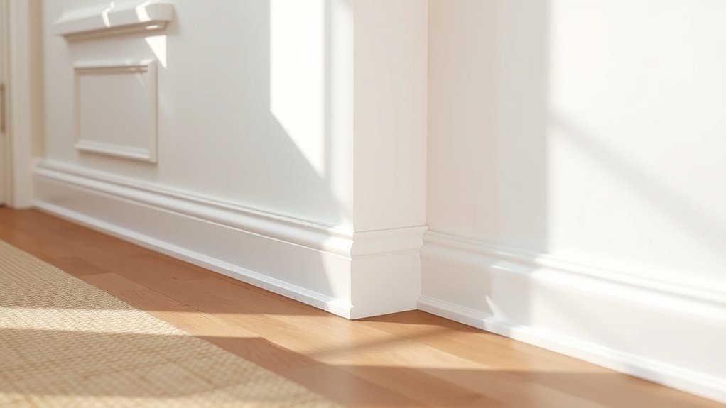
Paint Baseboards Pure White: When It Works Best
When you want a crisp, timeless backdrop that brightens and visually lifts a room, painting baseboards pure white is a smart choice. It creates clean lines that read as intentional, reflects light in darker spaces, and pairs easily with any wall color or style.
You’ll choose pure white when you want continuity, a neutral canvas, or to showcase flooring and furnishings without visual competition. It suits minimalist interiors, adaptable schemes, and evolving design trends because it stays relevant.
Use durable, semi-gloss finishes for easy cleaning and sharp contrast against textured walls, ensuring the look feels fresh and intentional.
Use Dark Baseboards to Frame White Walls
If you want to make white walls pop, try painting the baseboards a dark color to create bold contrast effects that visually anchor the room.
Pick a complementary shade—like charcoal for cool palettes or deep walnut for warm tones—to keep the look cohesive.
You’ll see how the darker trim frames the space and highlights architectural details.
Bold Contrast Effects
By painting baseboards a deep charcoal or black, you create a crisp frame that makes white walls pop and anchors the room visually.
You’ll use bold color combinations for drama and achieve a striking visual impact that guides the eye and defines proportions.
Consider how contrast changes perceived ceiling height and floor scale. Choose finishes that suit traffic and lighting.
Think about furniture silhouette and decor rhythm so the dark trim complements rather than competes.
- Emphasize edges to sharpen architectural lines.
- Balance darkness with light textiles and metallic accents.
- Test swatches under real light before committing.
Choosing Complementary Shades
Taking that bold contrast and directing it toward harmonious color relationships will help you make dark baseboards feel intentional rather than jarring. You’ll use color psychology to choose tones that ground the room while keeping design harmony with white walls. Pick deep charcoal for modern calm, navy for warmth, or espresso for cozy depth. Test samples beside your floor and trim in different lights. Trust contrasts that echo other accents so the border reads like a deliberate frame rather than an afterthought.
| Emotion | Shade |
|---|---|
| Calm | Charcoal |
| Warmth | Navy |
| Comfort | Espresso |
| Drama | Black |
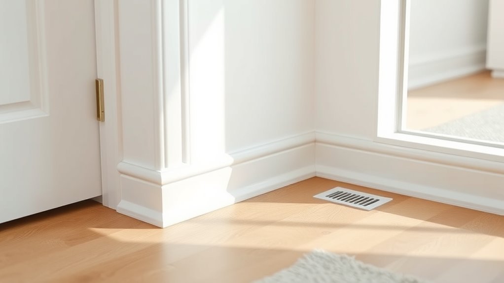
Warm Neutrals: Beige and Greige Options That Feel Cozy
When you want a cozy, timeless look, warm neutrals like beige and greige make baseboards blend with walls while still defining the room’s edges.
You’ll create a cozy ambiance and subtle color warmth without high contrast, which keeps focus on furnishings and texture.
Consider these approaches:
Consider these approaches: warm beige, greige, or slightly darker trim to softly define and connect your room’s tones.
- Choose a warm beige for soft shift and traditional appeal.
- Use greige to connect modern cool tones and classic neutrals.
- Pick slightly darker trim than the wall to outline architecture without stark lines.
Test samples in different light, and pick the tone that complements sunlight and artificial lighting.
Match Baseboards to Floors: Wood and Tile Strategies
Match your baseboards to the floor’s tone and texture to create a cohesive look that feels intentional rather than tacked-on.
When you have wood floors, pick baseboard styles that echo grain direction and warmth—stained or painted trim in a complementary hue softens transitions and reduces floor contrast.
For cool-toned tile, choose sleeker, painted baseboards to mirror the tile’s finish and keep lines clean. Thicker, more detailed profiles suit rustic planks; minimal profiles work with large-format tile.
Test samples near the floor in different lights, and prioritize balance so baseboards support the room’s overall harmony without dominating.
Coordinate Trim and Doors: Keep Trim Consistent or Mix Colors
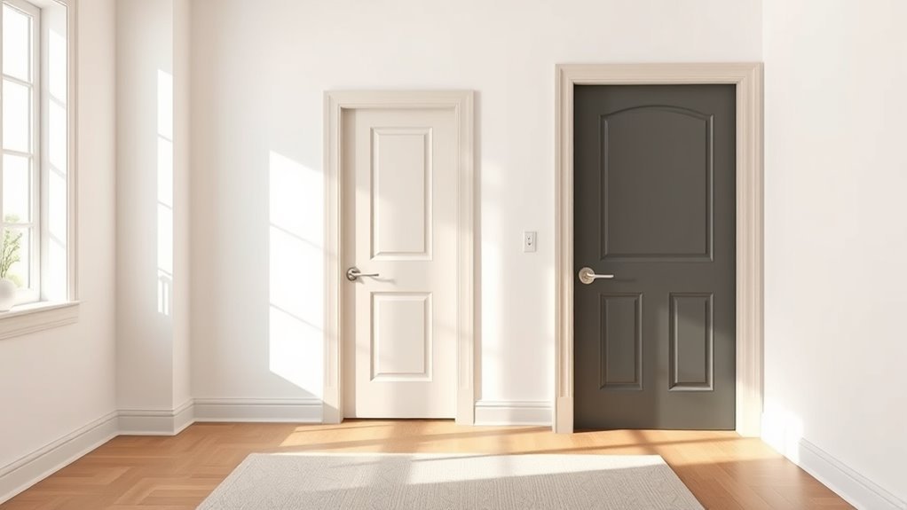
After you’ve settled on baseboard-to-floor relationships, decide whether your trim and doors should read as one continuous element or play off each other.
You’ll want consistent styles across rooms for cohesion, but mixing colors can create focal points. Consider these approaches:
- Match trim and doors for seamless flow and subtlety.
- Paint doors darker for contrast while keeping trim neutral for balance.
- Use the same trim color throughout and vary door hues to define zones.
Assess color harmony with your walls and hardware, and test samples.
Check how trim and doors relate to walls and hardware, and always test paint samples first.
Pick the option that supports circulation and highlights architectural features without competing with the room.
Best Paint Sheens for Baseboards (Durability + Appearance)
You’ll want to pick a sheen that balances looks and toughness.
High-gloss gives you the hardest, easiest-to-clean surface for areas that take abuse.
Satin offers a softer sheen while still standing up well to scuffs and touch-ups.
High-Gloss For Durability
When durability matters most, high-gloss paint is the go-to choice for baseboards because it stands up to scuffs, cleaning, and everyday wear better than flatter sheens.
You get clear high gloss benefits: it resists marks, repels stains, and wipes clean without dulling. That long-lasting finish also highlights trim lines, so you’ll want precise application.
- Prep: sand and prime for adhesion and smoothness.
- Application: use a quality brush or small roller for even coverage.
- Maintenance: clean gently with mild soap; touch up chips to preserve sheen and protection.
Satin For Balanced Look
If you want a middle ground between shine and practicality, satin offers a soft luster that hides imperfections better than high gloss while still standing up to light scrubbing.
You’ll get enough sheen to catch light subtly without shouting attention, so baseboards feel finished but not flashy. A satin finish cleans easier than eggshell and resists scuffs better, making it ideal for hallways and family rooms.
Use the same white hue as walls for seamless visual harmony, or choose a slightly brighter white to define edges gently.
Satin balances durability and appearance for everyday use.
Check Undertones So Whites Don’t Clash
Because whites carry subtle undertones—cool blue, warm yellow, or creamy pink—they can look mismatched next to each other, so check undertones before you commit.
You’ll want color harmony between walls and baseboards, so practice undertone matching with small samples. Test strips in different light at morning and evening; they’ll reveal shifts.
- Compare swatches against wall at different angles.
- Note warm vs cool casts under natural and artificial light.
- Choose baseboard white that reads the same distance away.
Trust your eye; small undertone differences can read as dirty or stark, so adjust accordingly.
Budget-Friendly Ways to Update Baseboards
Matching undertones takes care of the biggest color clash, but you don’t need a full remodel to refresh baseboards. You can swap scuffed trim for pre-primed lengths, use affordable materials like MDF or vinyl, and save on labor by replacing sections rather than all trim.
Consider painting just the top edge or adding thin chair rail molding for subtle contrast. Try creative finishes—satin paint for durability, metallic wax for accents, or stain-look paint for woodgrain without new lumber.
Small changes, smart material choices, and selective updates keep costs down while boosting your room’s polish.
DIY Steps: Prep, Prime, Paint, and Touch-Up
Start by prepping the surface—clean, sand, and fill gaps so paint sticks and edges look sharp.
Prime for even coverage, especially on raw wood or repaired spots, to prevent stains and guarantee true color.
Finish with two thin coats of paint and quick touch-ups along the seams for a professional result.
Prep The Surface
Prepare the surface thoroughly before you paint—this step determines how smooth and durable your baseboard finish will be. You’ll remove dust, grease, and loose paint, then repair dents so the topcoat adheres and looks professional.
Use surface cleaning with a mild degreaser, rinse, and dry completely. Lightly scuff glossy areas and employ proper sanding techniques to feather edges and smooth filler.
- Wash and dry, removing contaminants.
- Fill gaps or holes; sand when dry.
- Wipe with a tack cloth to remove particles.
Work patiently; good prep saves time and prevents peeling.
Prime For Coverage
Seal the deal with a quality primer so your baseboards get full, even coverage and the paint lasts. You’ll see prime benefits immediately: improved adhesion, stain blocking, and a uniform surface that reduces topcoat coats.
Lightly sand any rough spots, clean dust, and apply primer in thin, consistent strokes. Use angled brushes for edges and a small roller for flat faces; those coverage techniques prevent drips and lap marks.
Allow proper dry time per label, then inspect for missed areas or knots that need a second coat. Once cured, you’ll have a ready, stable surface for painting.
Paint And Touch-Up
Once your primer’s cured, you’ll paint the baseboards with steady, controlled strokes to build smooth, even coverage and minimize drips.
Work in small sections, keeping a wet edge and choosing paint finishes that resist scuffs—semi-gloss or satin work well. Let coats dry fully before evaluating.
- Sand light imperfections between coats for adhesion.
- Apply a thin final coat and inspect under good light.
- Use precise touch up techniques: small brushes, feathering, and matching sheen.
Clean edges with a damp cloth, remove tape carefully, and store leftover paint for future repairs.
When to Hire a Pro for Complex Trim or Historic Homes
If your home has intricate mouldings, layered trim, or historic millwork with delicate profiles, you should hire a pro rather than tackle it yourself—these jobs demand specialized tools, steady hands, and experience matching paint finishes to preserve original character.
For intricate mouldings or historic millwork, hire a pro—preserving delicate profiles needs skill, tools, and matched finishes
You’ll want someone versed in historic preservation who understands varied trim styles and can assess underlying damage, lead paint risks, and appropriate primers.
A pro will match sheen and color, feather connections, and reinstall moulding correctly after repair.
Hire them when trim complexity, age, or structural concerns exceed your skill, or when you simply value accuracy and long-term protection.
Frequently Asked Questions
Can I Paint Baseboards a Bold Color in a Rental Without Losing My Deposit?
You can—if your rental agreement considerations allow it and you pick reversible bold color options. Get written permission, use removable paint or primer, document condition, and repaint to original before moving out to protect your deposit.
How Often Should I Repaint Baseboards in High-Traffic Areas?
About 30–60 months is typical; studies show surfaces in high-traffic zones wear 3× faster. You’ll monitor baseboard maintenance, address traffic wear sooner, clean regularly, touch up scuffs, and fully repaint every 2–5 years.
Are There Eco-Friendly Paints Suitable for Baseboards?
Yes — you can choose eco friendly options for baseboards: low-VOC or zero-VOC paints with durable paint finishes like semi-gloss or satin. They’ll resist scuffs, clean easily, and reduce indoor toxins while looking great.
Will Painting Baseboards Darker Affect Room Perceived Ceiling Height?
Yes — darker baseboards can make your ceiling feel lower because baseboard color psychology and light reflection effects reduce perceived vertical space; you’ll create a grounded, cozy feel, so choose contrast deliberately to control room height perception.
How Do I Prevent Paint Drips and Streaks on Glossy Baseboards?
Use proper paint application and slow brush technique: load less paint, drag light even strokes, wipe excess on tray, keep a wet edge, sand and prime first, and use a small angled brush so you won’t get drips or streaks.
Conclusion
You’ve got choices that can calmly complement or confidently contrast your crisp white walls. Pick pure white for seamless simplicity, dark hues to frame and focus, or a warm neutral to harmonize undertones—whatever fits your flavor and budget. Prep properly, paint precisely, and touch up to keep trim timeless. If trim’s tricky or historic, bring in a pro. Bright, balanced baseboards bring bold beauty and boost your room’s refined, restful rhythm.