What Color to Paint Cinder Block Wall? Ideas
Pick a color based on light, location, and moisture: go with warm whites or greiges to brighten dim basements, muted blues or sage greens for a calming patio, and charcoal or deep navy for an industrial, dramatic look. Use satin or semi-gloss for durability where moisture or wear is likely, and matte to hide surface flaws. Test swatches in different light and prime or seal blocks first—keep going and you’ll find practical tips for finishes, prep, and accents.
Quick Answer: Best Colors for Cinder Block Walls
Start with neutral tones like warm gray, soft beige, or classic white—you’ll get a clean, versatile backdrop that hides imperfections and brightens the space.
From there, choose cool blues or muted greens to calm basements and patios; they use color psychology to soothe and expand.
Choose cool blues or muted greens to calm basements and patios; their soothing tones visually expand the space.
For industrial looks, charcoal or deep navy add drama without clutter. Accent with terracotta or mustard for warmth in living areas.
Match finish types to function: matte hides texture, satin balances sheen and durability, semi-gloss resists moisture and cleans easily.
Test samples on the actual wall to confirm how light and texture affect each option.
How to Choose a Color: 3 Key Criteria (Light, Location, Moisture)
When you pick a color for a cinder block wall, think about the type of light it gets—natural versus artificial—because that changes how hues read.
You’ll also consider the wall’s location and purpose to match style and durability.
Finally, check for moisture and do proper surface prep, since damp or rough blocks need specific paints and treatment.
Natural Vs. Artificial Light
Because light changes how color reads, you’ll want to evaluate natural versus artificial sources before you pick a paint, since the same shade can look warm and inviting in daylight but flat or harsh under bulbs.
You should test swatches at different times: morning and late afternoon for natural light, and with the fixtures you’ll use for artificial light.
Note bulb color temperature—warm LEDs soften neutrals, cool fluorescents sharpen blues—and the wall’s orientation affects intensity.
Tape several samples, observe for at least a day, and choose the hue that stays true to your intent under both lighting conditions.
Moisture And Surface Prep
If your cinder block wall holds moisture or has efflorescence, pick a paint and finish that tackle dampness first—water stains, rising damp, and salt deposits can ruin even the nicest color.
You should diagnose leaks, dry the wall, and remove salts before you paint. Apply appropriate moisture barriers where needed and choose breathable masonry primers so trapped vapor can escape.
Use rigid surface treatments—acid wash for efflorescence, patching compound for spalls—and follow with a masonry sealer or elastomeric coating if conditions demand.
Proper prep protects color longevity and prevents peeling, blistering, or discoloration.
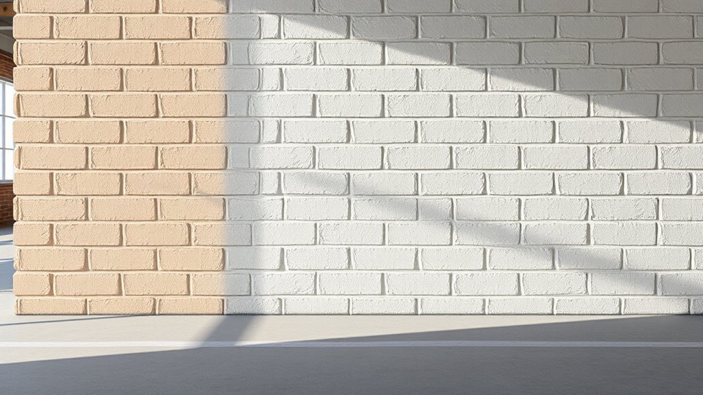
Natural Light Effects on Cinder Block Color
Pay attention to how natural light changes the way a cinder block color reads: brighter, more intense light will make colors pop while dim light mutes them.
Notice the effect of directional sunlight—east and west exposures cast warm, angled light that can shift hues and reveal texture.
Also watch colors across the day, since morning, midday, and evening light each change tone and contrast.
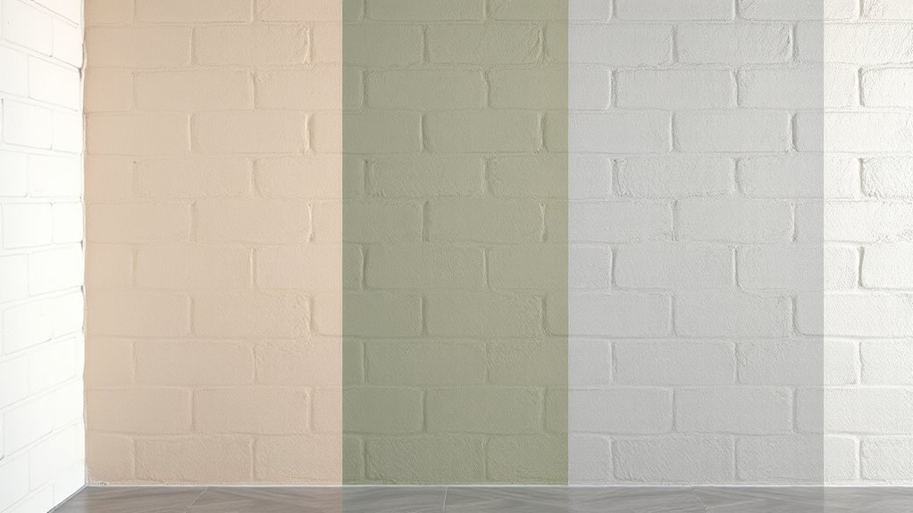
Light Intensity Effects
When natural light hits a cinder block wall, it changes how the paint color reads throughout the day, so you’ll want to take into account both the intensity and direction of that light when choosing a shade. Higher intensity washes out saturated hues, while low intensity deepens tones; consider light temperature effects to maintain visual comfort. Test swatches at different times; note glare and shadow contrast. Use finishes wisely—matte hides texture, satin reflects more. Below is a quick comparison table to guide choices.
| Intensity | Effect | Tip |
|---|---|---|
| High | Fades color | Use richer pigments |
| Medium | True color | Sample midday |
| Low | Deepens | Use lighter shades |
Directional Sunlight Impact
How will shifting sunlight change your cinder block wall’s color and texture over the day?
You’ll notice sunlight direction and wall orientation shape color perception; environmental factors and light diffusion alter whether warm tones or cool tones dominate.
Consider shadow effects and seasonal changes when selecting paint; color psychology also guides mood.
- Morning sun favors warm tones, lifting texture and hue.
- Midday light flattens contrasts, testing true color under strong light diffusion.
- Evening angling deepens shadow effects, enriching cool tones.
- Overcast skies and seasonal changes mute saturation, revealing undertones.
Time-Of-Day Shifts
Across and through the day, shifting sunlight will change how your cinder block wall reads—its color, depth, and texture will look different at each hour.
You’ll notice warm morning light brings out pigments and surface warmth, while harsh midday light flattens texture and mutes subtle tones. Late afternoon and golden hour enhance shadows, revealing relief and contrast.
Consider time of day lighting when choosing paint—test samples at dawn, noon, and dusk to gauge true color perception.
Inside or under awnings, artificial light shifts tones differently, so evaluate in the actual setting before committing to a final hue.
Interior vs. Exterior: How Location Changes Your Choice
Because indoor and outdoor environments affect both appearance and performance, you’ll choose colors differently depending on whether the cinder block wall sits inside or outside.
Consider location impact: interior styles rely on color psychology and design trends, while exterior themes demand paint durability against weather. You’ll match tones to room function and curb appeal, balancing maintenance and mood.
- Indoor: warm or muted hues for cohesion with interior styles
- Outdoor: fade-resistant pigments and protective finishes for longevity
- Intermediary spaces: coordinate exterior themes with indoor palettes
- Practical choices: prioritize color psychology for interiors, durability for exteriors
Best Colors for Basements and Low‑Light Spaces
In basements and other low-light spaces you’ll want light-reflective neutrals like soft whites, warm greiges, or pale taupes to bounce whatever light you have around the room.
Add a few warm accent tones—muted terracotta, mustard, or rich ochre—to prevent the space from feeling flat without overwhelming it.
Finish with a moisture-resistant paint or sealer so your color choice stays looking fresh despite damp conditions.
Light Reflective Neutrals
Looking for a way to brighten a basement or other low-light room? Choose light neutral palettes to maximize brightness and keep cinder block walls feeling airy.
You’ll want colors that bounce light without feeling cold; subtle warm-beige, soft greige, pale taupe, and off-white work well. Pair them with reflective finishes to amplify available light—satin or eggshell over raw block gives a slight sheen without highlighting imperfections.
Consider these quick picks:
- Soft greige for modern calm
- Warm beige to avoid sterility
- Pale taupe for depth without heaviness
- Creamy off-white to open space
These options create a brighter, more inviting basement.
Warm Accent Tones
A few well-chosen warm accents can turn a dim basement from drab to cozy without overwhelming the space; pick muted, sun-kissed hues—like terracotta, burnt sienna, warm amber, or deep mustard—to add inviting depth while keeping contrast controlled. You’ll use warm color palettes sparingly on a cinder block wall to lift mood and avoid heaviness. Try accent color combinations that pair a deep accent with soft neutrals and layered textiles. The table below helps visualize simple pairings and feelings so you can choose confidently.
| Accent | Mood |
|---|---|
| Terracotta | Earthy warmth |
| Deep mustard | Vintage glow |
| Burnt sienna | Cozy richness |
Moisture-Resistant Finishes
Because basements and low-light spaces often trap dampness, you should choose finishes that resist moisture and reflect light without glossing over texture.
Pick light, warm neutrals or soft greys to brighten corners while hiding imperfections. Seal first, since proper moisture barriers boost paint longevity and prevent peeling.
Consider semi-gloss sparingly for trim; flat finishes mask blocks but need breathable masonry formulas.
- Use a masonry primer with damp-proofing qualities.
- Choose light-reflective, mildew-resistant paints.
- Test a small patch to check sheen and coverage.
- Maintain ventilation to protect the finish and structure.
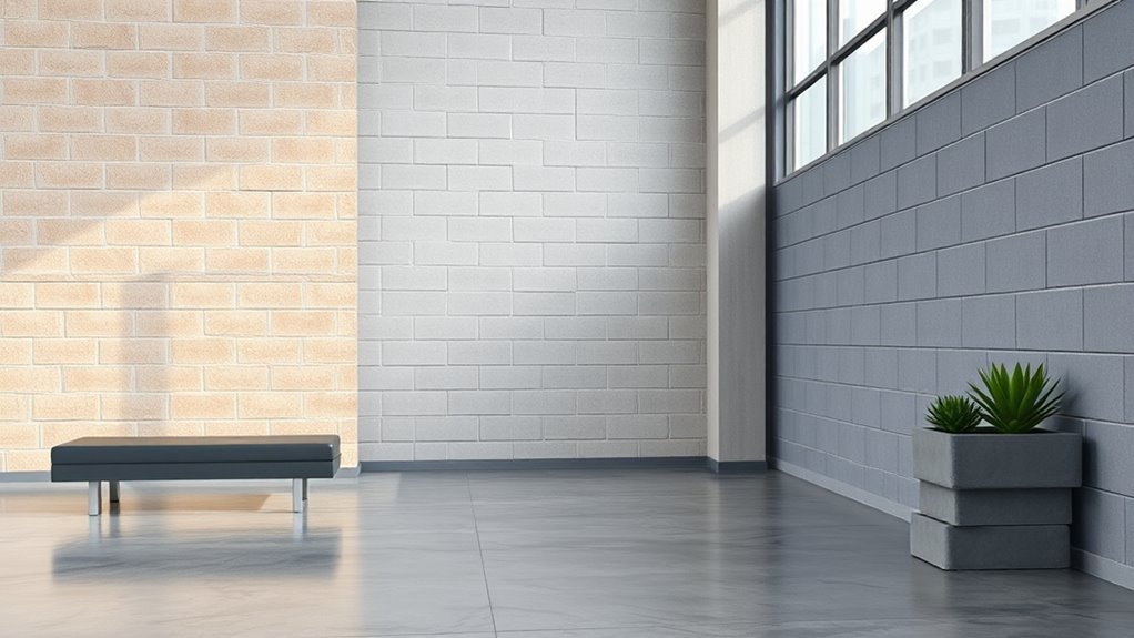
Best Colors for Garages, Workshops, and Utility Rooms
When you’re painting a garage, workshop, or utility room, choose colors that hide dirt, boost visibility, and stand up to wear; neutral grays, muted blues, and sage greens are popular because they mask grime while keeping the space calm and functional. You’ll pick garage color schemes that balance utility and style, and apply workshop color psychology to improve focus and safety. Use durable enamel or semi-gloss finishes on lower walls, lighter tones overhead, and accent trim for contrast. Consider antislip floor paints and high-visibility zones near workbenches.
| Area | Color | Finish |
|---|---|---|
| Walls | Gray | Semi-gloss |
| Floor | Concrete gray | Epoxy |
| Trim | White | Gloss |
| Accent | Safety yellow | Satin |
Colors for Patios, Courtyards, and Outdoor Facades
Start with three goals: make the space feel open, withstand weather, and tie the outdoor area to your home’s style—then pick colors that do all three.
You’ll want durable, fade-resistant paints and palettes that enhance patio color schemes and courtyard aesthetics. Balance neutrals with accents, and think about surrounding plants, paving, and light.
Consider these options:
- Soft warm neutrals to reflect light and enlarge the space
- Muted Mediterranean blues or terracottas for regional character
- Deep charcoal or green for contrast and modernity
- Crisp white trim to brighten edges and tie to the main facade
Test swatches in sun and shade before committing.
Color Choices for Commercial Cinder Block Spaces
When you’re painting commercial cinder block, start with durable neutral tones that hide wear and cut maintenance costs.
Then use brand-aligned colors to reinforce identity across façades and interiors.
Finally, add high-visibility accents for wayfinding and safety where needed.
Durable Neutral Tones
Because commercial cinder block spaces need finishes that hold up to traffic and look professional, choose durable neutral tones like warm greige, soft taupe, or charcoal to balance longevity with a clean aesthetic.
You’ll want durable finishes and neutral palettes that hide scuffs and simplify maintenance while keeping a polished look. Stick to matte or eggshell sheens for durability and reduced glare.
Consider these options:
- Warm greige for warmth without overwhelming color
- Soft taupe to soften industrial edges
- Charcoal for contrast and concealment of marks
- Off-white for brightness with forgiving undertones
These choices keep spaces functional and refined.
Brand-Aligned Colors
If you want your commercial cinder block space to feel cohesive with your brand, pick paint colors that echo your logo, marketing materials, and overall identity—muted brand hues or complementary neutrals will reinforce recognition without overwhelming the space.
You’ll use brand identity to guide choices: dominant tones for large walls, accents in secondary colors for focal areas.
Consider color psychology to set mood—calming blues for trust, greens for sustainability, warm neutrals for approachability.
Test swatches under your lighting, factor maintenance and wear, and keep finishes durable.
That way your walls support marketing goals without distracting from operations.
High-Visibility Accents
Although bold accent colors draw the eye, choose them strategically so they guide movement, highlight safety zones, and reinforce wayfinding without creating visual clutter.
You’ll use color psychology to prioritize visibility and mood: warm hues like high-visibility orange or yellow signal caution, while cool greens mark safe routes.
Keep base walls neutral and add accent highlights sparingly to avoid overstimulation. Consider durability and reflectivity for industrial lighting.
Use this simple approach:
- Mark exits and stairwells with high-contrast bands
- Paint safety zones in standardized, reflective colors
- Use colored strips to direct pedestrian flow
- Reserve brand tones for focal signage
Clean Whites That Brighten Textured Cinder Block
Clean white paints are a quick way to lift the heavy look of textured cinder block and reflect more light into dim spaces. You’ll find clean white options that suit industrial, modern, or minimalist tastes; choose a bright pure white for maximum reflectivity or a soft cool white to maintain crispness without glare.
Use paint formulated for masonry and apply with a roller or sprayer to get into pores of textured finishes. Two coats usually suffice.
Maintain contrast with trim or fixtures to avoid a hospital feel, and seal if moisture is a concern to keep the white fresh longer.
Soft Neutrals That Hide Imperfections and Read Warm
When you want to soften a cinder block wall and disguise pits or uneven texture, choose warm neutrals like greige, taupe, or soft beige—they mask imperfections while adding cozy depth.
You’ll find soft neutrals with warm undertones smooth the eye, making surfaces read more refined. Pick a finish that minimizes shine to hide irregularities. Test swatches in different light before committing.
- Use greige for modern warmth
- Choose taupe for subtle richness
- Try soft beige for airy comfort
- Pair with wood accents to enhance warmth
These choices keep the wall inviting without calling attention to flaws.
Earthy Tones That Blend With Landscaping and Brick
If you want your cinder block wall to feel like an extension of the garden, reach for earthy tones—terracotta, warm olive, clay brown, or muted stone—that echo surrounding plantings and brickwork. You’ll create cohesive landscaping harmony by choosing colors that pick up soil, foliage, and brick highlights. Earthy palettes weather well, hide dirt, and make shifts between hardscape and plants seamless. Use texture and matte finishes to keep the look natural.
| Tone | Effect |
|---|---|
| Terracotta | Warmth |
| Warm olive | Subtle depth |
| Clay brown | Grounding |
| Muted stone | Soft backdrop |
Bold Dark Hues for a Modern, Dramatic Look
If you want a striking, modern wall, consider a deep charcoal to make the cinder block feel sleek and architectural.
Use navy as an accent to create a crisp statement without overwhelming the space.
You’ll get drama and depth while keeping the palette sophisticated and intentional.
Deep Charcoal Walls
One deep charcoal wall can instantly anchor a room, giving it a sleek, modern edge without overwhelming the space. You’ll appreciate deep charcoal aesthetics that add depth and contrast to exposed block, while maintaining subtlety.
Use finishes and lighting to balance the tone and introduce deep charcoal warmth that keeps the room inviting rather than cold.
- Pair with warm wood to soften the scale
- Add textured textiles for tactile contrast
- Use adjustable lighting to highlight masonry detail
- Keep surrounding walls lighter to preserve brightness
Apply durable, matte paint for a refined, low-glare finish that hides imperfections.
Navy Accent Statement
When you paint a cinder block wall in a deep navy, the result is an instant, sophisticated focal point that balances drama with warmth. You’ll use navy psychology to anchor a room, pairing bold blue with light furnishings to heighten depth. Keep lines clean and textures simple so the wall reads intentional, not heavy. Use accent contrast—brass, warm wood, or crisp white—to lift the palette and guide sightlines. A navy accent works in living rooms, entryways, or exteriors when balanced. Below is a quick reference to plan your installation and styling.
| Area | Recommended Pairing |
|---|---|
| Living room | White trim |
| Entryway | Brass hardware |
| Exterior | Matte finish |
| Bedroom | Soft linens |
Accent Colors and Mural Ideas for Feature Walls
Looking to make your cinder block wall pop? You can use bold accent colors and mural techniques to transform a plain surface into a feature wall that suits your style.
Pick a focal hue, then layer accent patterns to guide the eye and break up blocks. Consider scale, contrast, and weather-resistant paint for longevity.
Choose a focal hue, layer accent patterns to break up blocks, and use scale, contrast, and weatherproof paint for lasting impact
Ideas to try:
- Geometric repeats with a contrasting stripe to emphasize lines
- Botanical mural fading from vivid base to soft edges
- Local motif or skyline silhouette in a single strong color
- Ombre wash with painted block highlights for subtle depth
Plan, test swatches, then commit.
How Texture and Mortar Lines Change Perceived Color
Because texture and mortar lines interrupt how light hits the surface, they’ll change the color you actually see, not just the paint you pick.
When you paint cinder block, rough faces scatter light, altering texture perception and making colors look softer or more muted than on smooth walls.
Deep pores and uneven mortar joints create shadowed bands; mortar contrast against block can read as stripes or gridlines from a distance.
To predict outcome, test large swatches under the room’s light at different times.
Consider thin washes or color-matched mortar to reduce contrast, or embrace it for graphic depth.
Best Paint Sheens for Cinder Block: Matte to Satin
One key decision for painting cinder block is sheen: it affects durability, texture reveal, and how color reads on rough masonry. You’ll choose between matte and satin based on look and maintenance, balancing the best paint finishes with the block’s roughness and your ideal surface preparation.
Consider pros and cons:
- Matte hides imperfections and keeps color flat, good for rustic looks.
- Eggshell softens texture while offering slight washability.
- Satin boosts durability and is easier to clean on exterior or high-traffic walls.
Test small areas after priming to confirm appearance and adhesion.
Moisture, Efflorescence, and Color Longevity
Before you pick a color, make sure water can’t penetrate the block by sealing cracks and using a proper masonry waterproofing primer.
You’ll also want to address efflorescence stains with a stiff brush and a salt-neutralizing cleaner so they don’t ghost through the paint.
Finally, choose durable, breathable finishes designed for masonry to keep color vibrant and prevent moisture-related failure.
Preventing Water Penetration
If you want your paint job to last and keep the wall healthy, you’ll need to block water at every stage—from surface moisture to salt-laden efflorescence—because trapped water ruins adhesion and fades color.
Use waterproofing techniques and moisture barriers before painting, choose sealing products and durable surface coatings, and apply exterior treatments to shed rain. Improve drainage solutions and implement ventilation strategies to reduce trapped humidity. Monitor humidity control during and after application.
- Inspect and repair cracks, then apply sealant.
- Add gutters, grading, or French drains.
- Use breathable masonry coatings.
- Guarantee airflow behind walls with vents.
Managing Efflorescence Stains
Moisture control helps, but you’ll still face efflorescence—the white, powdery salt deposits that leach from masonry and can streak or blister paint.
You should first identify active moisture sources and fix them; without that, stains return.
For cleaning cinder blocks, dry-brush loose salts, then rinse and use a mild acid wash (vinegar or diluted muriatic following safety guidance) to dissolve residues.
Rinse thoroughly and let the wall fully dry before any coating.
Consider applying breathable sealers and follow efflorescence prevention techniques like improving drainage and ventilation.
Regular inspection and prompt cleaning keep your painted cinder block walls looking consistent.
Choosing Long-Lasting Finishes
When you want paint that endures, pick finishes and application methods that handle water movement, salt migration, and UV exposure. The right system combines breathable masonry primers, alkali- and salt-tolerant topcoats, and proper surface prep so color and adhesion last.
You’ll guarantee long lasting durability by sealing cracks, using vapor-permeable products, and addressing drainage. Expect routine finish maintenance to preserve appearance and stop efflorescence recurrence.
Consider:
- Breathable masonry primer to resist salt migration
- Alkali-resistant, exterior-grade acrylic or elastomeric topcoat
- Proper curing times and recommended film thickness
- Annual inspections and targeted touch-ups to prevent failure
Masonry Paint vs. Latex: Color and Durability Differences
While both masonry paint and interior/exterior latex can cover cinder block, they differ in pigment saturation, breathability, and wear resistance in ways that affect your color choice and how long that color lasts.
You’ll find masonry paint benefits include deeper pigmentation, water resistance, and formulations that tolerate block movement, so colors stay truer outdoors.
Conversely, latex paint drawbacks often involve lower permeability and faster fading under harsh conditions, though it’s easier to apply and clean.
Choose masonry paint for durability and color retention on exterior or damp walls; pick quality latex only for protected interiors or mild climates.
Primers for Cinder Block: When and Which to Use
Before you paint, you’ll want to know when priming is necessary—if the block is new, porous, stained, or unevenly patched, prime it.
Use a masonry-specific primer or a high-adhesion acrylic primer for best results, and choose a stain-blocking primer if efflorescence or tannin bleed is present.
Apply with a brush or roller into all pores, work in small sections, and let the primer fully dry before topcoating.
When To Prime
If your cinder block wall shows large pores, efflorescence, stains, or uneven absorption, you’ll want to prime it before painting to guarantee proper adhesion and an even finish.
You should prime when blocks are new, patched, or previously painted and show wear. Use appropriate priming techniques and select primer types suited to moisture and substrate.
Prep by cleaning, drying, and repairing cracks first.
- Prime after efflorescence removal and full drying
- Prime patched or skim-coated areas to equalize suction
- Prime before using color-changing or tinted topcoats
- Skip primer only on uniformly sealed, compatible surfaces
Best Primer Types
Now that you’ve prepped and primed where needed, pick a primer that matches the block’s condition and the environment it faces. Choose masonry primers for porous, new cinder block; stain-blocking primers for efflorescence or water stains; and oil-based or shellac primers for stubborn stains. For exterior walls, use breathable, mildew-resistant primers. Consider primer types and application methods suited to surface texture and exposure.
| Primer Type | Best Use |
|---|---|
| Masonry | New/porous block |
| Stain-blocking | Efflorescence/water stains |
| Oil-based | Tough stains |
| Acrylic | Exterior breathable |
| Shellac | Severe stains |
Application Tips
When you’re ready to prime, match the primer to the block’s condition and the wall’s exposure: use masonry primers on clean, porous units, stain-blockers or shellac for efflorescence or tannin bleed, and oil-based primers for greasy or stubborn stains.
You’ll follow clear preparation strategies, choose paint types and sealing options, and consider texture considerations before you apply. Use proper application techniques to control color application and finish selection, and employ weatherproofing methods on exterior walls.
- Rollers for porous faces, brushes for crevices
- Thin coats, allow full cure between layers
- Test adhesion and color on an inconspicuous area
- Seal joints and edges thoroughly
How to Test Paint Samples on Cinder Block
Before committing to a color, test paint samples directly on several areas of the cinder block to see how texture, lighting, and absorption affect the finish.
Before choosing a color, test paint samples on multiple cinder block areas to gauge texture, light, and absorption.
For accurate paint sample testing, clean and prime spots first as part of cinder block preparation so results reflect true color, not dirt or variable porosity.
Apply quarter-sized swatches of each hue, using both brush and roller to note texture differences. Let samples cure fully and observe at different times of day.
Photograph results and label swatches. Choose the tone that reads best in the room’s light and aligns with your maintenance and durability needs.
Coordinating Cinder Block Color With Trim and Floors
Although cinder block color sets the room’s tone, your trim and floors complete the look, so pick combinations that balance contrast and flow. You’ll use color harmonization to tie elements together, and trim contrast to define edges without overwhelming texture.
Consider scale, light, and function as you choose.
- Use warm floors with cool block for balanced depth.
- Match trim to the lightest or darkest tone for clean lines.
- Pick neutral flooring to let a bold block color sing.
- Try mid-tone trims to bridge stark contrasts and soften transitions.
Test samples in different light before committing to any scheme.
Matching Landscaping and Exterior Materials to Color
If you want your cinder block wall to feel like part of the whole property, tie its color into the landscaping and exterior materials so paths, plantings, and siding read as a cohesive composition. You’ll achieve landscape harmony by echoing tones from stone, mulch, or foliage; choose warm grays for flagstone, olive greens for shrubs, or deep charcoal to recede. Material synergy comes from matching undertones—cool blues with metal accents, warm tans with wood. Use the table below to coordinate quickly:
| Element | Color Cue | Effect |
|---|---|---|
| Stone | Warm gray | Anchors |
| Wood | Honey tan | Warms |
| Planting | Olive | Softens |
Use Color to Change Perceived Room Size and Height
If you want a cinder block room to feel larger, stick with light, reflective colors that open up the space.
Use dark accents on recesses or trim to add depth and avoid a flat look.
Painting horizontal stripes or bands can make walls read wider, while vertical lines help emphasize height.
Light Colors Expand Space
1 way to make a basement or compact room feel larger is to paint your cinder block walls in light, reflective hues; they bounce daylight and artificial light around the space, softening shadows and erasing visual heaviness.
You’ll tap into space perception and color psychology to create openness without structural changes. Choose cool whites, pale grays, soft blues, or warm creams to suit mood and lighting.
Tips to apply effectively:
- Match trim and ceiling to walls for seamless edges
- Use satin or eggshell finish to reflect light subtly
- Keep contrast low between floor and walls
- Add minimal, bright furnishings to maintain airy feel
Dark Accents Add Depth
When you introduce dark accents on a cinder block wall, they anchor the room and make other surfaces feel more spacious by contrast.
You’ll use dark color psychology to add gravity without shrinking the space—think deep charcoal or navy at focal points like a fireplace wall or recessed niche.
Pair those anchors with lighter surrounding tones so the room breathes, and choose accent color combinations that balance warmth and coolness.
Apply paint selectively to vertical elements to suggest height, or concentrate darkness low to ground the room.
You’ll create depth and drama while preserving an open, airy feel.
Horizontal Stripes Widen Walls
Although your room’s footprint stays the same, painting horizontal stripes on a cinder block wall will visually widen the space by drawing the eye along the wall’s length.
You can use horizontal color schemes to stretch proportions and add visual depth without major renovations. Keep stripes proportionate to the room: thin bands in busy rooms, broader bands in simple spaces.
Consider finish and contrast to control mood.
- Pair soft neutrals for subtle widening
- Use high contrast for bold, dramatic extension
- Match stripe width to furniture scale
- Test samples on blocks to judge visual depth
Painting Techniques to Hide Joints and Uneven Texture
Smooth out the look of your cinder block wall by choosing techniques that minimize visible joints and mask uneven texture.
Use joint camouflage techniques like filling mortar gaps with a tinted patching compound that matches your paint base, then sand lightly.
Apply a thin skim coat or microcement to blend surface highs and lows.
Roll on paint with a nap designed for rough masonry to push pigment into pores.
Consider a stippling brush or textured roller for texture blending methods that break up shadow lines.
Finish with a matte or eggshell finish to reduce glare and further hide imperfections.
Stain and Limewash Alternatives to Opaque Paint
If you want a more natural, breathable finish than opaque paint, consider mineral stains or limewash.
You’ll get subtle color that soaks into the block rather than sitting on top, and limewash lets the wall release moisture.
Try thin, multiple coats and test on a scrap area to find the right absorption and hue.
Natural Mineral Stains
When you want color that soaks into cinder block rather than sitting on top, natural mineral stains and limewash give a breathable, textured finish that highlights the masonry.
You’ll appreciate natural aesthetics and subtle variation that opaque paint can’t mimic. Stains penetrate, enhancing texture and offering good color longevity without hiding block character.
Consider surface prep and compatibility, then choose mineral pigments for permanence.
Benefits include:
- Breathable finish that resists peeling
- Soft, earthy tones that age gracefully
- Low sheen that conceals imperfections
- Minimal maintenance compared to repainting
Use stains when you want enduring, authentic color rather than a painted look.
Limewash Application Tips
Natural mineral stains give you a subtle, breathable color, but limewash offers a different look and application method that still preserves masonry texture. You’ll learn limewash techniques quickly: mix thin, test batches, apply in layers, and distress for patina. Work damp surfaces, brush with a saltwater-resistant brush, and avoid heavy buildup to maintain finish durability. Expect chalking initially that settles; seal only if necessary. Use the table below to pace coats, drying, and style choices.
| Step | Coat | Dry Time |
|---|---|---|
| Mix | Thin | 1–2 hrs |
| Test | Small | 24 hrs |
| Apply | Layered | 2–6 hrs |
| Distress | Optional | Immediate |
| Seal | Rare | 48+ hrs |
Breathable Finishing Options
Choose breathable finishes like stains, limewash, and mineral washes when you want color without sealing moisture in; they let vapor pass while highlighting the block’s texture.
You’ll preserve durability, use sustainable materials, and pick from varied texture options to suit rustic or modern looks.
Consider these alternatives to opaque paint:
- Masonry stains for translucent, long-lasting color and easy maintenance
- Traditional limewash for a matte, mineral-rich finish that ages gracefully
- Mineral washes for subtle tonality while retaining block detail
- Natural pigments mixed with breathable binders to customize hue and coverage
Test small areas to confirm adhesion and shade.
Low‑Budget Color Options That Still Look High‑End
If you want a high-end look without spending much, stick to a tight palette of muted, versatile hues that read as intentional rather than cheap.
You can choose budget friendly palettes like warm greige, soft charcoal, or dusty sage and pair them with crisp white trim to lift the space.
Use satin or eggshell sheens to mimic upscale finishes; they reflect light subtly and hide imperfections.
Focus on clean edges and consistent coverage—one good coat with primer beats sloppy multiple coats.
Accessorize with natural textures: wood, wicker, or matte metal for a composed, expensive-looking result.
Touch‑Ups and Repaint Schedules for Cinder Block
1 smart touch-up every few years will keep a cinder block wall looking cared-for without a full repaint.
You’ll inspect annually and use simple touch up techniques—clean, prime, and feather new paint into old—to extend life. Repaint frequency depends on exposure: sheltered walls last longer, sun‑baked ones need attention sooner.
Keep a small kit and note dates so you’ll act before damage spreads.
- Clean stains with mild detergent before touching up
- Use masonry primer for porous patches
- Match texture with a stipple or roller
- Record repaint frequency and touch-up dates for reference
Weatherproof Color Choices for Freeze‑Thaw Climates
Because freeze‑thaw cycles stress both paint and block, pick colors that help hide wear and reduce maintenance without sacrificing protection. You’ll want mid‑tone neutrals or deep earth hues paired with weatherproof coatings to improve freeze thaw durability. Choose shades that mask micro‑cracking and salt stains, and use breathable, elastic primers and topcoats. Inspect annually and touch up hairline damage before winter.
| Color Family | Benefit |
|---|---|
| Greige | Masks dirt, reflects some heat |
| Slate Blue | Hides efflorescence, looks cool |
| Charcoal | Conceals stains, low maintenance |
| Terra Cotta | Warmer, camouflages spalls |
Color Choices for Mold‑Prone or High‑Humidity Areas
While freeze‑thaw climates call for colors that hide physical wear, humid or mold‑prone environments demand choices that help hide and resist biological staining while supporting ventilation strategies.
You’ll pick colors and finishes that minimize visible mold, complement moisture control, and work with mold resistant paints.
Consider humidity considerations when choosing mid‑tones or warm neutrals; they disguise spotting without showing dirt like pure white or deep black.
- Choose warm greiges and soft olives to mask staining.
- Opt for satin or semi‑gloss for easier cleaning.
- Use mold resistant paints with biocide additives.
- Pair color with ventilation and dehumidification.
Safety, Reflectivity, and Exterior Color Considerations
When you’re choosing exterior colors for a cinder block wall, think about how reflectivity and safety interact with aesthetics. You’ll need to follow safety standards for visibility, especially near driveways or walkways, and weigh reflectivity effects: bright hues increase night visibility but may glare.
Prioritize exterior durability against weather and fading, and consider color psychology to influence perception of size and warmth. Check maintenance considerations—dirt shows differently on light versus dark color schemes.
Review environmental impact of finishes and align choices with current design trends. Balance practical needs with cohesive color schemes for long‑term success.
Eco‑Friendly and Low‑VOC Color Options for Cinder Block
If you want a durable, low‑impact finish for your cinder block wall, choose paints and finishes labeled low‑VOC or zero‑VOC and look for third‑party certifications like GreenGuard or EcoLogo.
You’ll reduce odors and indoor pollutants while keeping longevity.
Consider these eco friendly paints and low VOC options:
- Mineral limewash: breathable, natural, resists mildew.
- Zero‑VOC acrylic masonry paint: durable, easy to clean.
- Clay‑based paint: matte, non‑toxic, good for interior block.
- Natural pigment stains: subtle color, minimal additives.
Prep and seal cracks before painting, and ventilate as you work to maximize health benefits and adhesion.
Creating a Palette for Multi‑Wall Cinder Block Rooms
Because cinder block rooms often span multiple walls and sightlines, plan a cohesive palette that balances continuity with focal variation. You’ll pick a primary neutral to unify expanses, then add one or two accent hues for interest.
Use color harmony by choosing related warm or cool tones so shifts feel intentional. Reserve a stronger shade for a feature wall or niche to create hierarchy without chaos.
Introduce texture contrast—matte paint on broad walls, satin or glossy trims, or textured finishes—to catch light and break monotony.
Test swatches across different walls and lighting before committing to the full room.
Specifying Color, Finish, and Tolerances With Contractors
Start by documenting exact color codes, finishes, and acceptable variances so you and your contractor share a clear standard to meet.
You’ll use precise color specifications and clear contractor communication to avoid guesswork. Include measurable tolerances, approved sample locations, and approval steps before full application.
A short, written scope keeps everyone accountable.
- Provide Pantone or RAL codes and sheen level.
- Define acceptable variance (Delta E or percentage).
- Specify primer, paint system, and surface prep.
- Require mock-up panel approval and sign-off.
Keep the document with the contract and review it during walkthroughs.
Common Cinder Block Color Mistakes to Avoid
When choosing a color for cinder block walls, don’t underestimate how texture, lighting, and scale change perception—what looks good on a swatch can read entirely different on masonry.
Avoid picking trendy hues without considering color psychology; a bold shade can overwhelm a raw, porous surface and alter mood.
Don’t ignore surrounding materials—trim, concrete, landscaping—or expect one coat to hide flaws.
Steer clear of high-gloss where moisture or salts show; matte or breathable masonry paints work better.
Finally, resist mismatched undertones that disrupt aesthetic harmony; test full-size patches in relevant light before committing.
Five‑Step Checklist to Pick the Right Cinder Block Color
Ready to choose a color that actually flatters your cinder block wall? Follow this five-step checklist so you pick confidently, not by chance.
Consider function, light, and texture first. Use color psychology to set mood—calming neutrals or energizing accents. Test samples, view them at different times, and inspect how mortar lines read. Seal choices against moisture and wear.
- Evaluate room purpose and desired mood
- Sample paint on several blocks, check at day/night
- Match finish and primer to block porosity
- Confirm maintenance needs and durability
Stick to these steps and your cinder block will look intentional.
Where to Find Inspiration and Tools for Color Selection
Looking for inspiration and the right tools? You can scan color inspiration sources like design blogs, Pinterest boards, and neighborhood photos to see how hues read on textured cinder block.
Visit paint stores to view swatches under different lights and borrow sample pots to test on a small section.
Stop by paint stores to see swatches in varied light and grab sample pots to try on-site.
Use color selection tools—apps with AR previews, online palettes, and manufacturer visualizers—to compare tones against existing landscaping and fixtures.
Note undertones, maintenance, and finish compatibility with masonry.
Collect your favorites, test them on-site at different times of day, then choose the option that balances aesthetics and durability.
Frequently Asked Questions
Can I Use Spray Paint Specifically Formulated for Masonry on Cinder Block?
Yes — you can use spray paint specifically formulated for masonry on cinder block. You’ll explore spray paint options that adhere well; masonry paint benefits include durability, moisture resistance, and even coverage for rough, porous surfaces when prepped properly.
How Does Painting Affect the Block’s R-Value or Insulation Performance?
Painting has minimal insulation impact; it won’t noticeably change R-value. You’ll still want to prioritize color choices for solar gain and moisture control, and consider adding dedicated insulation or insulated finishes if you need real performance gains.
Will Building Codes or HOA Rules Restrict Cinder Block Exterior Colors?
Yes, you’ll often face restrictions: building codes and HOA rules can limit exterior aesthetics, so check neighborhood guidelines and permit requirements first; you’ll need approval for certain colors, finishes, or alterations to cinder block exteriors.
How Long Should I Wait After New Block Installation Before Painting?
Think of patience like a bricklayer’s promise: you should wait about 28 days for proper cure time before painting. Do surface preparation afterward—cleaning, drying, and priming—so paint adheres and lasts.
Can Colored Sealers Replace Paint for Durable, Breathable Protection?
Yes — colored sealers can replace paint for durable, breathable protection. You’ll get UV-stable color, moisture vapor transmission, and easier maintenance, though color options and opacity may be more limited than with paint finishes.
Conclusion
You’ll want a color that’s practical yet personal — neutral grays and whites that hide flaws, or a bold navy that enlivens a dim basement. Don’t pick a shade for style alone; weigh light, moisture, and finish. Contrast matters: a matte, moisture‑resistant paint on rough block reads calm, while a glossy accent creates drama. Balance function with flair, and you’ll transform cold, utilitarian masonry into a confident, livable surface you’ll actually enjoy.