What Color to Paint Office Walls? Best Choices
Pick cool, calming blues or muted greens for focused work, and use warm yellows or soft corals in collaboration zones to spark creativity. Tie areas together with versatile neutrals like warm gray, beige, or soft white to mask wear and support branding. Consider natural light—north light cools tones, south/west warms them—and test swatches at different times. Choose durable, scrubbable finishes in high-traffic spots, and keep going to find tailored palettes and placement tips.
Top 5 Office Wall Colors and When to Use Them
Pick the right color and you’ll shape how people feel and work in your office. You’ll choose calming blue for focus-heavy zones, energetic yellow for creative hubs, and neutral gray to support brand-forward spaces.
Soft green reduces stress near plants, while warm beige encourages collaboration in client areas. Match choices to function, brand, and office color trends without overpainting every room.
Soft green soothes around plants; warm beige invites collaboration in client spaces—choose function and brand without repainting everything.
Balance bold accents with muted fields to maintain professional workspace aesthetics. Test swatches at different times, then commit to finishes that resist scuffs.
Use color strategically to boost mood, productivity, and a cohesive visual identity.
How Natural Light Affects Color Choice
Because light changes color and intensity throughout the day, natural light has a huge impact on how paint looks in your office—cool north light makes colors read bluer and darker, while warm south or west light can make the same paint appear brighter and more yellow.
You should test swatches at different times to observe natural light impact and note color perception shifts. Place samples on multiple walls and view them morning, noon, and late afternoon.
Also factor window size, nearby buildings, and landscaping. That way you’ll pick a paint that stays consistent and supports your desired atmosphere.
Office Color Psychology: Cool Tones for Focus
You’ll find cool tones help sharpen focus without overwhelming the room.
Calming blues set a serene backdrop, muted greens bring a touch of nature, and soft gray neutrals keep the palette balanced.
Try combining them in accents and large surfaces to see what helps you concentrate best.
Calming Blue Shades
When you paint your office in calming blue shades, you tap into a color that lowers stress and sharpens focus without feeling cold or sterile.
You’ll create a serene atmosphere that supports clear thinking and a measurable productivity boost. Choose shades from pale sky to soft slate to match light and task needs.
Use:
- Pale blue for airy openness.
- Dusty blue for reduced glare.
- Slate blue for grounded focus.
- Accent navy for depth without distraction.
You’ll balance cool tones with warm wood or soft textiles to keep the space inviting while maintaining concentration and calm.
Muted Green Accents
If you want a focused, restorative workspace without the intensity of brighter hues, muted green accents bring calm energy that keeps you grounded and alert.
You’ll use muted green to echo nature inspiration, softening walls or trim so light feels gentle. Place plants, textiles, or a painted feature to create accent harmony and avoid overwhelming the room.
Those touches deliver tranquility effects that reduce stress and sharpen concentration, offering a measurable productivity boost when paired with clear layouts.
Keep palettes restrained for design balance, mixing warm woods or matte metals to complete a composed, focused office environment.
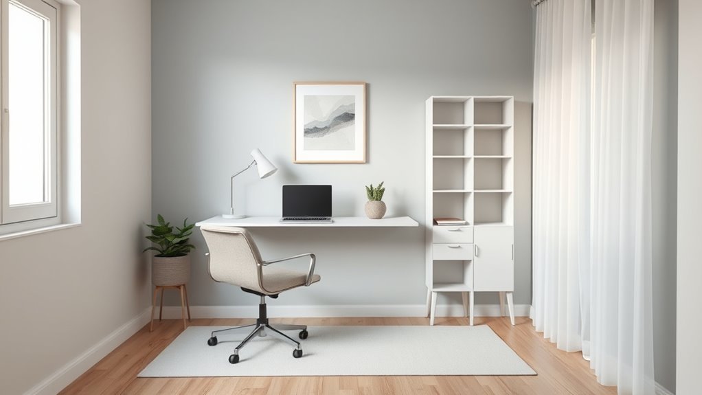
Soft Gray Neutrals
Moving from muted green’s restorative touch, soft gray neutrals keep the calm but sharpen focus with cool, unobtrusive tones.
You’ll choose soft gray textures and soft gray finishes to reduce visual noise and support concentration.
Consider these practical benefits:
- Clarifies visual hierarchy—walls recede, content stands out.
- Stabilizes mood—cool tones lower overstimulation and speed decision-making.
- Pairs with accents—use vibrant art or warm wood for balance.
- Adapts lighting—reflects daylight evenly without glare.
You’ll find gray versatile: pick slightly warm or blue-leaning variants to match your team’s temperament and the office’s natural light.
When Warm Tones Boost Creativity and Teamwork
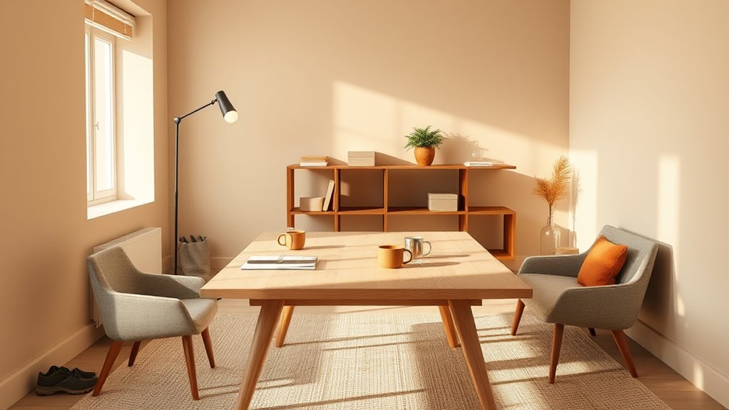
Because warm hues naturally mimic sunlight, they energize spaces and encourage collaboration, so you’ll often find teams brainstorming more freely in rooms painted with soft oranges, terracottas, or muted yellows.
You’ll notice creative energy rising as people feel more open and alert; those tones reduce formality without sacrificing focus. Use accent walls or breakout zones in warm shades to nudge team dynamics toward friendly debate and quick ideation sessions.
Keep saturation moderate so the color supports concentration rather than distracting. Pair warm walls with balanced lighting and calming furniture to sustain momentum and maintain a productive, cooperative atmosphere.
Best Neutral Paint Shades for Any Office
You’ll find that calm greige tones create a soft, modern backdrop that keeps focus without feeling cold.
Warm taupe selections add subtle richness and can make a space feel more inviting for meetings and solo work.
Try samples on different walls to see how each shifts with your office’s light.
Calm Greige Options
If you’re after a neutral that feels both warm and modern, greige delivers a calm, versatile backdrop for any office.
You’ll find calm greige tones balance beige’s warmth with gray’s coolness, keeping focus without feeling cold.
Pairing matters: greige color combinations with navy, soft white, muted green, or warm wood bring depth and personality.
Consider these uses to guide choices:
- Feature wall in deeper greige for subtle contrast.
- Trim and ceiling in crisp white to sharpen edges.
- Accent with navy for professional authority.
- Natural wood furniture to introduce warmth and texture.
These moves keep your office serene and adaptable.
Warm Taupe Selections
When you want a neutral that feels cozy without looking dated, warm taupe is a smart choice for offices—its brown undertones add softness while subtle gray keeps it professional. You’ll find taupe variations that suit focus rooms, client spaces, and shared desks. Pair warm undertones with crisp white trim, matte black accents, or wood furniture to balance warmth and formality. Test samples at different times of day to see undertone shifts. Use this quick guide to imagine options:
| Space Type | Suggested Feel |
|---|---|
| Private office | Inviting, focused |
| Conference room | Calm, authoritative |
| Lobby | Welcoming, modern |
| Open plan | Cohesive, soft |
| Accent wall | Subtle drama |
Accent Wall Colors and Where to Place Them
Although a single bold wall can change the room’s energy, choose its color and placement to support how you work and move through the space.
Use an accent wall to create focal points, space definition, and mood enhancement while keeping design balance and visual interest through thoughtful color contrast.
Use an accent wall to define space, set mood, and maintain balance through smart color contrast.
Consider placement ideas that align with seating, natural light, and traffic flow.
- Behind the desk: anchors focus and reduces distractions.
- Opposite windows: boosts perceived brightness and depth.
- Entry wall: greets visitors and defines circulation.
- Short wall in a long room: restores proportion without overwhelm.
Use Brand Colors Without Overwhelming the Space
Because your brand colors carry meaning, you can use them to reinforce identity without letting them dominate the room—pick one or two hues as accents, dilute them with neutrals, and repeat them in small doses like trim, artwork, or accessories so the space feels cohesive rather than saturated.
You’ll choose placements that support workflow—doors, shelving backs, a single wall—but avoid full-room coverage. Test scaled swatches under your office lighting and pair warm or cool tints with complementary neutrals to maintain color harmony.
Small, consistent applications boost brand identity while keeping the environment calm, professional, and adaptable.
Make a Small Home Office Feel Larger With Paint
If you want a small home office to feel bigger, choose paint strategically: light, cool hues and high-reflectance neutrals open up the space, while well-placed accent tones add depth without shrinking the room.
Use these tips to create space illusions and a breathable work area.
- Paint trim and ceiling a lighter shade to raise perceived height.
- Apply vertical stripes subtly on one wall to elongate the room.
- Pick cool blues or pale greens to recede visually.
- Use satin finishes sparingly for reflections that amplify light.
You’ll feel more room and clarity with intentional color choices.
Choosing Paint for Windowless Conference Rooms
When you’re choosing paint for a windowless conference room, prioritize colors and finishes that boost light, focus, and comfort so meetings feel less claustrophobic and more productive.
Pick light, warm neutrals or soft greens to counter dim windowless lighting and support conference ambiance. Moderate color saturation avoids glare while providing visual stimulation without distraction.
Choose light warm neutrals or soft greens—muted saturation to brighten windowless rooms without glare or distraction
Matte or low-sheen finishes reduce reflections; textured walls or acoustic panels improve sound absorption and add subtle wall texture.
Aim for hues that promote productivity enhancement and a collaborative atmosphere—calming yet engaging tones that help teams focus, communicate, and stay energized during long sessions.
Best Colors for High-Traffic Reception Areas
For high-traffic reception areas, you’ll want durable neutral tones as a base to hide wear and keep the space looking professional.
Add a welcoming accent color to create warmth and reinforce your brand without overwhelming visitors.
Choose easy-to-clean finishes so scuffs and fingerprints are simple to wipe away.
Durable Neutral Tones
Because reception areas get constant use, choosing durable neutral tones helps keep your space looking fresh longer while staying professionally inviting.
You’ll want colors that hide wear, pair well with furnishings, and work with durable materials and varied wall textures.
Consider these practical neutral choices:
- Warm greige — masks scuffs, complements wood.
- Soft taupe — forgiving, pairs with metal accents.
- Slate gray — hides marks, modern without feeling cold.
- Pale warm white — brightens, hides minor imperfections.
Choose low-sheen finishes and scuff-resistant paints, and test samples in natural and artificial light before committing.
Welcoming Accent Colors
Neutral bases keep reception areas practical, but a thoughtful accent color will make the space feel inviting without sacrificing durability.
You’ll pick welcoming hues that complement neutrals—muted teal, warm terracotta, or soft sage—to add character without overwhelming visitors. Use inviting tones on a single feature wall, behind the reception desk, or within alcoves to guide sightlines and create focal points.
Balance brightness so the color reads professional under various lighting. Test samples at different times of day and view them with your furnishings.
Keep accents restrained; they should enhance comfort and brand identity while remaining timeless and approachable.
Easy-To-Clean Finishes
1 practical choice for busy reception areas is a finish that hides wear and cleans easily, so you’ll want colors and coatings that stand up to scuffs, fingerprints, and frequent wiping.
You’ll prefer neutral tones with satin or semi-gloss sheens for durability and appearance. Consider these easy care options and washable finishes to keep your space welcoming without constant repainting:
- Satin beige — forgiving, hides marks.
- Semi-gloss warm gray — durable, wipes clean.
- Deep navy accent — hides dirt on lower walls.
- Two-tone with washable trim — stylish, practical.
Choose finishes that balance aesthetics and maintenance.
Calming Paint Choices for Private Focus Rooms
For private focus rooms, choose calming paints that help you settle into concentrated work without feeling sleepy or pinned down. You’ll use mindful color selection to balance focus and calm, favoring muted blues, soft greens, warm greiges, and gentle lavenders. These hues create a tranquil workspace ambiance that steadies attention and reduces visual clutter. Pair wall color with matte finishes and minimal contrast to keep distractions low. Test samples at different times of day. Below is a quick comparison to guide choices:
| Hue | Effect |
|---|---|
| Muted blue | Calming, aids concentration |
| Soft green | Restful, grounding |
| Warm greige | Neutral, cozy |
| Gentle lavender | Subtle uplift, serene |
Colors That Reduce Eye Strain Under Fluorescents
Alongside choosing calming hues for private focus rooms, you’ll also want to contemplate how paint interacts with common office lighting—especially fluorescent fixtures that can amplify glare and color shifts.
Choose tones that neutralize contrast and reduce eye strain under fluorescent lighting. Consider:
Choose tones that soften contrast and ease eye strain under fluorescent lighting—opt for calming, low-chroma hues.
- Soft warm grays — minimize stark contrast, keep whites from looking clinical.
- Muted sage greens — provide restful, low-contrast backgrounds.
- Dusty blues — cooler without causing glare or flicker sensitivity.
- Warm beige with low chroma — balances brightness and reduces visual fatigue.
These colors help stabilize perceived color and brightness, making tasks easier on your eyes.
How to Test Paint Samples in Your Actual Workspace
Start by taping up several paint swatches and checking them in daylight near a window so you can see their true undertones.
Then observe those same samples with your office lamps and fluorescents to note shifts in warmth or coolness.
Compare the differences and pick the shade that stays comfortable under both lighting conditions.
Test Samples In Daylight
When you bring paint samples into your office, hang several large swatches on different walls and observe them through a full workday of natural light.
You’ll notice daylight impact on hue, saturation, and overall color perception as sun angle shifts. Check each swatch at morning, midday, and late afternoon to see true behavior.
- Note hue shifts over time.
- Compare swatches on north vs. south walls.
- Photograph samples at fixed times for reference.
- Walk the space while focusing on mood and glare.
Trust your eyes; daylight reveals what chips and catalogs hide.
Observe Colors Under Lamps
How does paint look under the office’s actual lamps? You’ll place samples on walls and observe color temperature shifts from different lamp types and bulb brightness settings.
Note lighting effects on reflective qualities and shade variations across the day, since fixtures alter color contrast and perceived hue.
Walk the space, view from workstations, and test task lights plus overheads to gauge mood influence and workspace ambiance.
Record which combos create color harmony or clash with furnishings.
Use small swatches, snap photos under each lamp type, and compare notes so your final choice performs well in real office lighting.
Combining Two or Three Wall Colors Without Clashing
Although mixing two or three wall colors can feel risky, you can create a cohesive, professional office by choosing a dominant hue, a secondary complementary shade, and a restrained accent color that ties the scheme together.
Although mixing two or three wall colors feels risky, a dominant hue, complementary secondary, and subtle accent create cohesive professionalism.
Use color harmony techniques to keep wall color combinations balanced and intentional. Consider contrast, proportion, and lighting so spaces read as unified rather than busy.
- Pick a dominant color for most walls.
- Select a complementary secondary for one focal wall.
- Add a small, restrained accent for trim-like features.
- Test swatches under office lamps and daylight before committing.
Trim, Ceiling, and Accent Finishes That Enhance Walls
Think about how trim color contrasts can frame your walls and make hues pop or soften.
Choose a ceiling finish—matte for concealment, semi-gloss for durability—to affect light and perception.
Add accent materials like wood, metal, or textured plaster to introduce warmth, contrast, or visual interest.
Trim Color Contrasts
When you choose trim, ceiling, and accent finishes, aim for contrasts that frame and lift your wall color instead of competing with it. You’ll pick trim color ideas that define edges, add polish, and support mood.
Use contrasting hues thoughtfully: stronger contrast for modern focus, softer contrast for calm. Consider these tactics:
- Crisp white trim to brighten and outline muted walls.
- Deep charcoal trim for dramatic, professional framing.
- Muted wood tones to warm neutral palettes without overpowering.
- Accent-color trim sparingly to tie furniture or art into the scheme.
Test samples under your light before committing.
Ceiling Finish Choices
A well-chosen ceiling finish can lift your room and make wall colors read truer, so don’t treat the ceiling as an afterthought—pick a surface that supports the mood you want.
You’ll choose finishes based on function and style: smooth matte for a clean, expansive feel; subtle eggshell for warmth; satin or slight gloss to bounce light in low ceiling heights.
Consider plaster, beadboard, or tongue-and-groove for texture without competing with walls. Light-reflective paints brighten, while darker ceilings cozy large rooms.
Coordinate trim and ceiling finishes so they enhance, not overpower, your chosen wall color and office atmosphere.
Accent Material Options
While trim, ceiling, and accent finishes often seem secondary, they frame your walls and can shift how colors read, so pick materials that reinforce your office’s mood and function.
Choose Accent material types that match your program: wood trim for warmth, metal for modernity.
Consider Texture design choices and Finish combinations to add depth. Use Fabric accents or Creative overlays for acoustic benefits.
Balance Color pairing ideas with Lighting considerations to highlight Wall art options and Decorative elements.
Favor Sustainable materials where possible to reduce impact.
Practical selections make the palette sing and guarantee your space feels intentional and efficient.
Choosing Finishes: Matte, Eggshell, or Satin
Because finish choice affects both look and durability, you’ll want to pick matte, eggshell, or satin based on traffic, light, and maintenance needs. You’ll weigh finish durability and sheen impact: matte hides imperfections but’s less washable, eggshell balances concealment and cleanability, satin reflects more light and wipes clean easily. Match finish to room use and lighting. Use the table below to compare at a glance.
| Finish | Best For | Maintenance |
|---|---|---|
| Matte | Low-traffic, soft look | Low washability |
| Eggshell | General offices | Moderate cleaning |
| Satin | High-traffic, bright areas | Easy to clean |
Durable Paint Options for Busy Office Walls
Durability matters when your office sees constant foot traffic, scuffs, and frequent cleaning, so you’ll want paints that stand up to wear without sacrificing appearance.
Choose a durable paint with scrubbable, stain-resistant formulas for high traffic areas to keep walls looking sharp.
Consider professional-grade options and consult product specs for abrasion and washability ratings.
Think about sheen: eggshell to satin often balances durability and reduced glare.
Select colors that hide marks while matching your brand.
Prioritize proper surface prep and quality primer to extend lifespan.
- Acrylic latex for resilience
- Washable enamel for scrubbability
- Anti-microbial for hygiene
- Commercial-grade for longevity
Budget-Friendly Color Strategies That Still Look Professional
Start with a neutral base like warm greige or soft white so your space stays flexible and professional.
Add a budget-friendly accent—think a single feature wall or colorful accessories—to bring personality without repainting the whole office.
Choose durable, low-cost finishes (eggshell or satin) to keep upkeep easy and look sharp longer.
Neutral Bases For Flexibility
A neutral base—think soft greys, warm beiges, or muted greiges—gives you a professional backdrop that’s easy on the eye and lets you change accents without repainting every few years.
You’ll follow neutral color trends and choose versatile paint selections to suit lighting and furniture.
Consider these practical steps:
- Test samples in different light to confirm undertones.
- Pick mid-tone neutrals to hide scuffs and reduce maintenance.
- Coordinate textiles and plants to add texture without color overload.
- Use semi-gloss on trim for durability while keeping walls matte.
These choices keep your space flexible, budget-friendly, and business-ready.
Accent Color On Budget
Once you’ve settled on a neutral base, you can introduce accent color without spending much—small touches go a long way.
Use budget friendly accents like cushions, desk accessories, or a single painted door to create impact. Pick two-tone schemes and creative color combinations—muted teal with warm gray, or mustard with soft navy—for a polished look.
Apply color in predictable spots: trim, shelving backs, or an art gallery wall.
Swap textiles seasonally to refresh the palette without repainting. Keep saturation moderate so accents read professional.
Plan placements so cost stays low but visual cohesion remains high.
Durable Low-Cost Finishes
When you need a professional-looking finish without blowing your budget, choose paints and techniques that stand up to wear and hide imperfections—high-traffic rooms benefit from washable eggshell or satin sheens, while semi-gloss on trim resists scuffs and cleans easily.
Use durable finishes and low cost options by prioritizing smart prep and targeted upgrades. Consider:
- Patch and sand to avoid costly repaints.
- Buy contractor-grade paint for balance of price and performance.
- Paint trim in semi-gloss to protect edges.
- Use accent walls sparingly to limit paint volume.
You’ll get lasting, professional results without overspending.
Use Color to Delineate Zones in an Open Office
Although open offices emphasize collaboration, you can use color to clearly define work zones so people know where to focus, meet, or relax.
Use muted tones for focused desks, vibrant accents for collaboration hubs, and calming hues in break areas to cue behavior.
Muted tones at desks, vibrant accents for collaboration, and calming hues in break areas cue behavior.
Implement color zoning with painted walls, ceiling accents, or rugs to mark boundaries without barriers.
Keep a consistent palette so shifts feel intentional.
Test small swatches and gather feedback to verify colors support tasks.
Thoughtful contrasts aid wayfinding and productivity enhancement by signaling purpose and reducing visual confusion in shared spaces.
Avoid Common Color Mistakes That Harm Productivity
If you want your office colors to help, not hinder, pay attention to a few common mistakes: overly saturated walls that cause eye strain, too many competing accents that create visual clutter, and poor contrast that makes signage and screens hard to read.
You’ll avoid pitfalls by applying clear color selection strategies and choosing productivity enhancing hues. Follow practical fixes:
- Swap neon for muted tones to reduce fatigue.
- Limit accent colors to two to prevent distraction.
- Test contrast with real signage and monitors.
- Use samples under different lighting before committing.
These steps keep focus high and reduce visual stress.
Quick Decision Checklist for Choosing Wall Color
Because you’ll finalize a color faster with a clear checklist, start by confirming these essentials: measure natural and artificial light, note primary work tasks and screen use, pick a base hue plus up to two accents, sample paint in multiple spots and times of day, and check contrast with actual signage and monitors.
Next, list goals (focus, creativity, calm), review current furniture and flooring, and verify maintenance needs and sheen.
Compare selected options to short-term color trends but prioritize long-term mood impact and functionality.
Finally, get feedback from a small team, confirm budget, and schedule a trial patch.
Sample Palettes: Proven Color Sets for Different Office Types
With your checklist complete, you can move on to concrete palettes that match specific office functions and moods. You’ll pick palettes that reflect color trends while supporting productivity and brand identity.
With your checklist done, choose palettes that suit each office function—balancing trend, productivity, and brand identity.
Consider these proven sets:
- Reception: soft teal, warm white, light oak — welcoming, modern office aesthetics.
- Focus rooms: muted navy, dove gray, matte black — calm, minimal distractions.
- Creative studio: sunflower yellow, slate blue, bright coral — energetic, inspiring.
- Executive suite: charcoal, cream, brass accents — authoritative, refined.
Use sample swatches, test under your lighting, and adjust saturation so each palette serves function and mood.
Frequently Asked Questions
How Often Should Office Walls Be Repainted for Maintenance and Brand Freshness?
You should repaint office walls every 3–7 years to maintain color longevity and support aesthetic updates; you’ll refresh high-traffic areas more often, align with branding shifts, and schedule touch-ups annually to keep spaces vibrant and professional.
Can Wall Color Influence Indoor Air Quality or VOC Exposure?
Like a cautious gardener tending blooms, you choose paints that won’t sicken the soil; yes, wall color can affect VOC emissions and color psychology, so you’ll pick low‑VOC finishes and hues that support wellbeing and productivity.
What Paint Considerations Apply for Rentable/Co-Working Office Spaces?
You should choose neutral, low-VOC finishes that balance color psychology and tenant preferences, offer accent options, use durable washable paint, provide easy repaint clauses, and sample swatches so tenants can personalize without costly maintenance or air-quality issues.
How Do Seasonal Lighting Changes Affect Perceived Wall Color Year-Round?
About 60% of people report mood shifts with seasonal light changes, so you’ll notice lighting effects shift hues and warmth; you’ll adjust tones seasonally, and color psychology means cooler winter light feels bluer while warmer summer light feels brighter.
Are There Paint Options That Improve Acoustics in Open Offices?
Yes—you can improve acoustics: combine acoustic paneling with sound absorbing paint to cut reverberation; you’ll strategically place panels for low frequencies and use specialty paint to reduce mid-to-high reflections, blending function with aesthetics throughout the space.
Conclusion
You’re about to pick a wall color that’ll make your office feel like a genius factory, a zen spa, or a buzzing brainstorm hub — no pressure, right? Trust the light, pick a tone that fits the task, and use neutrals to keep sanity intact. Don’t dunk the whole place in neon. With the right palette, your workspace will practically hum productivity and creativity so loudly your plants will start asking for paychecks.