What Color to Paint Walls With Grey Floor? Design Guide
Pick a wall color by matching your grey floor’s undertone (warm or cool), then factor in the room’s light and its purpose. Warm greys suit creamy beiges and soft yellows for cozy spaces; cool greys pair with blues, greens, or crisp whites for a calm, modern vibe. Test two to three swatches on the wall and view them at different times of day. Keep accents and textiles aligned with the undertone for harmony—and keep going to get specific combos and tips.
What You’ll Learn
You’ll get clear, practical guidance on choosing wall colors that pair well with grey floors, including how undertones, light, and room function affect your choice, plus quick palettes and tips for bold or safe looks.
You’ll learn to read grey’s undertones and match warm or cool paints so rooms feel balanced.
You’ll consider natural and artificial light, scale, and furniture to pick hues that enhance space.
You’ll use color psychology to set mood—calming blues, energizing yellows, or neutral greiges—and follow current design trends to keep choices fresh yet timeless.
You’ll leave ready to test samples confidently.
Quick Answer: Best Wall Colors for Grey Floors – Pick in 3 Steps
Now that you know what influences a good match, pick a wall color in three simple steps: identify your grey’s undertone (warm or cool), decide the mood or function you want for the room, and test two to three paint swatches in the actual light before committing.
Use color psychology to guide mood—soft blues soothe, warm beiges comfort, and muted greens refresh. Balance current design trends with timeless neutrals so your space stays relevant without feeling trendy-only.
Let color psychology guide you: blues soothe, beiges comfort, greens refresh—pair trends with timeless neutrals for lasting style.
Try these quick options:
- Warm grey + creamy beige for cozy living rooms
- Cool grey + soft blue for calm bedrooms
- Mid-grey + sage green for modern freshness
Decide in 3 Steps: Undertone, Light, Use
Because the right wall color depends on three simple factors—undertone, light, and use, you can narrow options quickly and confidently.
First, identify the grey floor’s undertone so choices won’t clash; you’ll avoid cold-versus-warm fights.
Next, evaluate natural and artificial light: bright rooms handle richer hues, dim ones benefit from pale, reflective tones.
Finally, match function and color psychology—calm blues for bedrooms, energetic yellows for kitchens, neutral greiges for multipurpose areas.
Combine those steps, then apply accent techniques like trim contrasts or a single feature wall to tie the palette together and finish decisively.
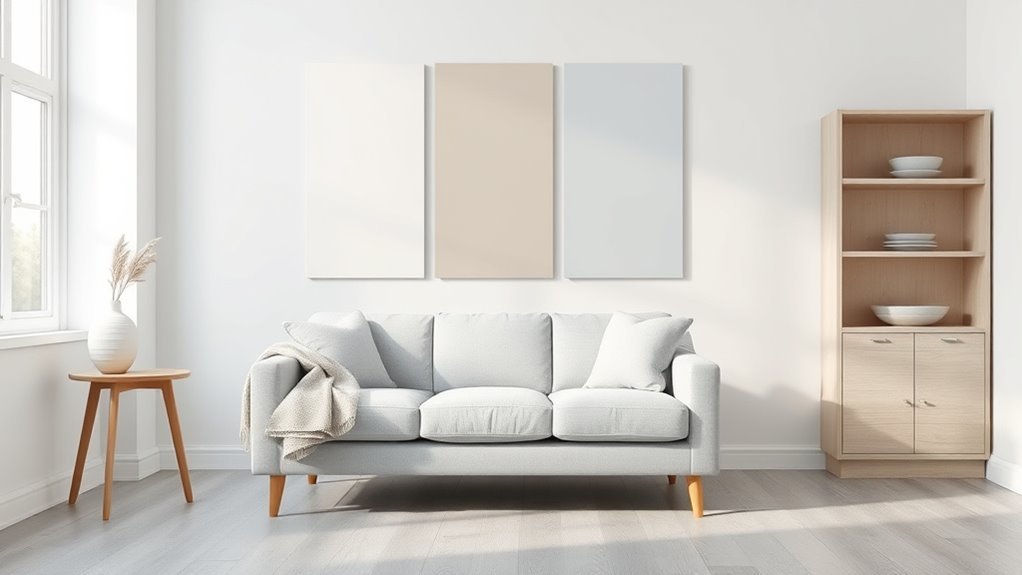
Match Wall Color to Grey Floor Undertone: 3-Step Guide
With those three factors in mind, match wall color to your grey floor’s undertone in three clear steps so colors harmonize instead of fighting.
Start by identifying undertone importance: test swatches against the floor in natural light.
Use color psychology to pick a mood—warm beiges for cozy, cool blues for calm.
Finally, commit to a sample wall and observe throughout the day before buying paint.
- Compare swatches near baseboard to reveal true undertone.
- Choose wall hue that supports your desired mood and function.
- Test large samples at different times to confirm harmony.
Cool Grey Floors: Colors for a Crisp Look
With cool grey floors, you’ll get a crisp look by pairing them with bright, true whites that make the space feel clean and modern.
Add icy blue accents to reinforce the cool palette and introduce a subtle, invigorating color note.
Together they create a sharp, cohesive scheme that keeps the room feeling airy and contemporary.
Crisp White Contrast
When you pair cool grey floors with crisp white walls, the result feels fresh and sharply modern rather than cold; the high-contrast combo brightens the room and highlights architectural lines.
You’ll enjoy a clean backdrop that lets furniture and art stand out. Use finishes and accessories to tune warmth.
- Choose matte walls for subtlety and semi-gloss trim for definition.
- Add black or brass hardware to emphasize the striking contrast.
- Layer textures—wool rugs, linen curtains, wooden accents—to avoid sterility.
This approach feels deliberate and easy to maintain, giving you a timeless, adaptable space that reads crisp and intentional.
Icy Blue Accents
Pair cool grey floors with icy blue accents and you’ll create a crisp, calming palette that reads modern without feeling sterile.
Use icy blue palettes to layer soft walls, trim, and feature pieces—think pale glacier, muted aqua, and silver-blue tones that enhance grey’s cool undertone.
Add depth with icy blue textiles: throw pillows, curtains, and rugs in varied textures to prevent flatness.
Balance with warm woods or brass fixtures so the scheme stays inviting.
Keep patterns minimal and finishes matte to maintain the serene vibe.
You’ll end up with a refined, airy space that feels both fresh and restful.
Warm Grey Floors: Colors for a Cozy Feel
If you want a cozy, inviting room around warm grey floors, lean into colors that add softness and depth—think muted terra cotta, creamy beige, and warm olive.
You’ll create balance by pairing those walls with cozy textures and warm accents in throws, rugs, and lighting to soften the grey. Choose paint with subtle warmth to avoid looking washed out, and use layered neutrals to add complexity.
Pair warm, textured layers—throws, rugs, and soft lighting—with subtly warm paint to prevent grey from feeling flat.
Consider these focused approaches:
- Soft beige walls for a timeless, calming backdrop
- Muted terra cotta for depth and a gentle focal color
- Warm olive for an earthy, enveloping feel
Mid-Tone Grey Floors: Flexible Neutral Choices
Mid-tone grey floors give you a versatile base that works with a wide range of neutral wall colors, so you can shift the room’s mood simply by changing undertones.
Choose a warm beige or greige to add softness, or opt for cool taupe and pale slate to emphasize modern crispness.
Stick to a neutral palette for furniture and textiles to maintain color harmony, then introduce one accent hue through art or cushions for personality.
Balance gloss and texture—matte walls with subtle sheen trim—to keep depth without competing with the floor.
Test samples under actual light before committing.
When Pure White Walls Work Best With Grey Floors
If your room is small, pure white walls will bounce light and make the space feel larger against grey floors.
They also sharpen a modern minimalist look by keeping lines clean and uncluttered.
And when your floor has cool undertones, white walls reinforce that crisp, cohesive palette.
Brightening Small Spaces
Want the room to feel larger and airier? You’ll find pure white walls with grey floors can open a small space, reflecting light and simplifying sightlines.
Use color psychology to keep things calm and uncluttered, then add texture instead of heavy hues. Consider:
- High-gloss or satin white to bounce natural light
- Minimal, pale accent textiles to maintain openness
- Mirrors and sheer curtains to amplify brightness
Keep trim subtle and avoid dark bands that cut the room.
White lets your grey floor anchor the palette without making the space feel boxed in, so prioritize light, contrast, and breathable layouts.
Highlighting Modern Minimalism
Often you’ll find pure white walls with grey floors give a room a crisp, modern-minimalist edge, letting clean lines and negative space take center stage.
You’ll want this pairing when you favor minimalist decor and need interiors that feel airy yet intentional. Keep furnishings low-profile, textures subtle, and color accents to a minimum so the white amplifies light and the grey anchors the scheme.
This combo suits functional spaces—home offices, kitchens, and galleries—where clarity and usability matter.
Resist clutter, choose quality finishes, and let the contrast between white walls and grey floors define the room’s purposeful calm.
Complementing Cool Tones
Because grey floors already lean cool, pure white walls work best when you want to enhance that crisp, airy feel without introducing competing hues.
You’ll lean into cool color combinations that amplify natural light and make spaces feel larger. Pure white provides a neutral backdrop that highlights grey floor contrasts and keeps attention on texture, furnishings, and architectural lines.
Use white when you want a gallery-like simplicity or to balance reflective surfaces.
Consider these refinements:
- Add matte or satin white finishes to control glare.
- Layer cool textiles and metallic accents for depth.
- Introduce plants or wood to soften starkness.
Off-White and Cream Walls to Soften Grey Floors
When you pair grey floors with off-white or cream walls, the result feels warmer and more inviting without sacrificing modern calm.
You’ll notice off-whites soften contrast, lifting the room’s mood while preserving the floor’s sleekness. Cream tones add subtle warmth, helping establish color harmony between cool greys and warmer furnishings.
Choose finishes thoughtfully—matte hides imperfections, eggshell reflects gentle light. Accents in wood, muted metals, or soft textiles will read richer against this backdrop.
You can switch between crisp off-white for an airy vibe or deeper cream for coziness, both keeping spaces bright and timeless.
Greige and Taupe Walls for Layered Neutral Palettes
If off-white or cream feels too pale but you still want a neutral backdrop, greige and taupe give you depth without overpowering the room.
You’ll find greige tones and taupe shades adapt to light, anchoring grey floors while keeping layers subtle. Choose warmer taupes for coziness or cooler greiges to read modern. Balance with textures and trim contrast so the palette feels intentional.
- Use matte paint to hide imperfections and enhance warmth.
- Add natural wood or rattan accents for depth.
- Layer textiles in similar undertones to unify the scheme.
These choices let you craft a refined, flexible neutral room.
Pale Blue Walls for a Calm, Coastal Vibe
While pale blue brings a cool, airy feel that instantly soothes, it also creates a clear coastal reference that pairs beautifully with grey floors. You’ll get a serene atmosphere ideal for relaxing rooms; coastal decor accents like rattan, white trim, and linen reinforce the vibe. Balance cool tones with warm woods or brass to avoid feeling chilly. Use samples in different lights, then pick a saturation that complements your floor’s undertone.
| Element | Effect | Tip |
|---|---|---|
| Pale blue | Calming | Test near windows |
| Grey floor | Neutral base | Match undertones |
| Rattan | Warmth | Layer textures |
| White trim | Crispness | Brightens space |
| Brass | Accent | Small doses only |
Soft Green Walls to Bring Nature Inside
Pale blue sets a tranquil tone, but soft green brings a more organic, restorative energy that harmonizes beautifully with grey floors.
You’ll lean into nature inspired palettes, pairing muted sage or seafoam with cool-grey planks to create a calming, cohesive backdrop.
Soft green makes rooms feel fresher and supports indoor greenery without overwhelming the space.
- Choose warm or cool green undertones to complement grey.
- Add wood accents and textured fabrics for depth.
- Use plants and ceramic pots to echo tones and boost contrast.
You’ll find the result feels intentional, airy, and quietly revitalizing.
Blush and Muted Pinks for Warmth and Style
When you pair blush or muted pink walls with grey floors, the space instantly feels warmer and more sophisticated without losing its modern edge.
Pair blush or muted pink walls with grey floors to warm and sophisticate a modern space without losing its edge
You’ll find blush tones soften the coolness of concrete or slate, creating a welcoming backdrop for wood furniture and brass accents.
Choose muted palettes to keep the look refined—dusty rose, powder pink, or warm mauve work well.
Use white trim to maintain contrast and consider textured fabrics to add depth.
For open-plan areas, repeat the pink subtly in accessories to unify rooms without overwhelming the neutral foundation set by your grey floor.
Charcoal and Deep Grey Walls for Dramatic Contrast
Because charcoal and deep grey walls absorb light, they give grey floors a bold, cinematic backdrop that emphasizes texture and form.
You’ll use charcoal accents to anchor furniture and create focal points, while deep grey textures on walls add depth without cluttering the palette.
Keep contrasts crisp and intentional so the room reads as sophisticated, not heavy. Balance with reflective surfaces and warm lighting to prevent gloom.
Consider these approaches:
- Matte charcoal feature wall behind a sofa for sculptural impact
- Layered textiles in slate tones to play off deep grey textures
- Metallic or wood highlights to lift the overall scheme
Navy and Deep Blue Walls Paired With Grey Floors
If you want a rich, moody backdrop that still feels composed, navy and deep blue walls pair beautifully with grey floors to create a layered, sophisticated look.
You’ll benefit from contrast: cool grey anchors the space while deep blue adds depth without overpowering.
Use navy accents—trim, shelving, or textiles—to tie the palette together and introduce subtle texture.
Anchor the scheme with navy accents—trim, shelving, or textiles—to unify the palette and add subtle texture.
Balance darkness with lighter furniture, warm metals, or soft lighting to keep the room inviting.
In smaller spaces, choose a lighter shade of deep blue on one wall to avoid swallowing light; in larger rooms, go bold for dramatic calm.
Black Accent Walls: When and How to Use Them
If your room gets good natural or layered lighting, you can choose a black accent wall to add drama without swallowing the space.
Balance light and dark by pairing black with bright trims, mirrors, or reflective surfaces so the room still feels open.
Consider matte for cozy texture or satin/eggshell for subtle sheen that bounces light.
When To Choose Black
When you want a room to feel dramatic, grounded, or sharply modern, a black accent wall can deliver that punch without overwhelming the space.
Choose black when you want depth against grey flooring, to highlight architectural details, or to create a focal backdrop for art. You’ll get subtle black warmth that reads cozy rather than cold when paired with warm metals, wood, or textiles.
Consider these situations:
- A living room needing a bold focal point.
- A bedroom where intimacy and sophistication matter.
- A gallery wall that requires a neutral, absorptive backdrop.
Use matte finishes to soften reflections and keep proportions in mind.
Balancing Light And Dark
A black accent wall can anchor a room, but balancing it against lighter walls and grey floors is what keeps the space from feeling heavy. You’ll want to think about how much darkness to introduce, where to place it, and how surrounding finishes will reflect or absorb light.
Choose a single black wall opposite windows or a focal point to preserve light balance and maintain color harmony with soft neutrals and warm metallics. Use art, mirrors, and strategic lighting to lift the black without breaking the palette.
Keep adjacent walls pale so the floor and room read open, cohesive, and intentional.
Texture And Finish Choices
Choose finishes and textures that let the black wall read as intentional rather than simply dark, and you’ll control mood, depth, and light reflection in a room with grey floors.
When you pick Finish options, consider sheen: matte hides flaws and feels modern, satin adds subtle warmth, and semi-gloss reflects light for contrast.
Use Texture techniques to add dimension—trowel plaster, grasscloth, or a soft suede effect.
Balance the black accent with surrounding lighter walls and metallic or wood accents so it reads deliberate.
Test samples under your room’s light before committing to confirm the effect matches your vision.
- matte for modern depth
- satin for warmth
- textured plaster for interest
Mustard and Ochre for a Modern-Retro Pop
If you’re after a bold throwback with a modern twist, mustard and ochre inject warm, sunny energy against cool grey floors and keep the space feeling fresh rather than dated.
You can use mustard accents on trim, cushions, or a single feature wall to create focal points without overwhelming the room. Ochre patterns in wallpaper or textiles add vintage flair while maintaining sophistication.
Balance is key: pair these hues with crisp whites, deep charcoals, or muted greens to prevent visual fatigue.
Keep finishes matte or soft satin to preserve retro charm and guarantee the grey floor remains your neutral anchor.
Terracotta and Warm Earth Tones With Grey Floors
Terracotta and warm earth tones can add cozy contrast to grey floors, but you’ll want to balance warmth so the room doesn’t feel heavy.
Use lighter plaster-like shades on primary walls and reserve richer terracotta for an accent wall or textiles.
Pair those accents with muted greens or soft ochres to keep the palette grounded and lively.
Warmth Balance Tips
A warm palette can soften grey floors and make a room feel inviting, so try pairing them with terracotta or other warm earth tones like ochre, burnt sienna, and clay to add depth without overpowering the space.
Use color psychology to guide choices: warmer hues create warmth effects that counterbalance grey’s coolness. Balance intensity and saturation to avoid heaviness.
Consider finishes and lighting to amplify warmth.
- Choose one dominant warm tone and two supporting neutrals.
- Use textiles or rugs to introduce terracotta accents without committing to paint.
- Test samples in different light throughout the day before deciding.
Pairing Accent Shades
When you pair warm earth accents like terracotta, ochre, and burnt sienna with grey floors, you create a lively contrast that keeps the space grounded without feeling cold. You’ll use Accent Color Combinations to inject warmth—think cushions, rugs, and art—while Highlighting Textures with clay pots or woven throws. Aim for balance: one dominant accent, one supporting hue, and neutral walls. Use finishes to add depth and avoid clash by sampling swatches. Below is a simple palette map to guide placement.
| Accent | Use |
|---|---|
| Terracotta | Pillows, vases |
| Ochre | Throws, lamps |
| Burnt sienna | Artwork, rugs |
Monochrome Schemes Using Multiple Greys
If you want a calm, sophisticated look, a monochrome scheme using multiple greys lets you layer tones for depth without adding color.
You’ll use monochrome layers and grey tonalities to create subtle contrast—darker trims, mid-tone walls, and pale ceilings guide the eye while keeping serenity.
Balance cool and warm greys to match light and furnishings. Texture becomes essential: matte paint, satin trims, and woven rugs add interest.
Balance cool and warm greys to suit light and furnishings; rely on texture—matte paint, satin trim, woven rugs—for layered interest.
Consider these steps:
- Choose a dominant mid-grey for walls.
- Add a deeper grey for accents and trim.
- Use a very light grey on ceilings and larger textiles for lift.
High-Contrast Schemes: Bold Colors With Grey Floors
You can make a grey floor pop by pairing it with jewel-toned accent walls like emerald or sapphire for rich, dramatic contrast.
For a sleek, modern look, consider a matte black feature wall to anchor the space and highlight metallic or wood accents.
Both approaches give your room a bold, sophisticated edge while keeping the overall palette grounded.
Jewel-Toned Accent Walls
Although grey floors read as neutral, pairing them with jewel-toned accent walls makes a room sing—think emerald, sapphire, or ruby against the cool slate base to create dramatic, modern contrast that still feels grounded.
You’ll want to choose one wall to anchor the space so the jewel tones don’t overwhelm. Balance richness with lighter furnishings and reflective accents to keep depth without heaviness.
- Use textiles to echo the accent wall’s hue.
- Add metallics (brass or chrome) for brightness.
- Keep trim and ceilings neutral to frame color.
These choices let you enjoy bold color with a cohesive, sophisticated result.
Matte Black Feature Walls
Jewel tones set a rich stage, but a single matte black feature wall can bring a room into sharper focus by amplifying contrast against grey floors. You’ll use that deep backdrop to anchor furniture, highlight metallics, and create drama without overwhelming the space.
Position the matte black wall where light and sightlines naturally converge—behind a sofa, bed, or fireplace—to keep balance. Keep surrounding walls lighter to preserve depth and avoid a cave effect.
Pair with warm wood, brass accents, and soft textiles to add warmth. Maintain simple, clean furnishings so the feature wall reads intentional and sophisticated.
How Lighting Changes Wall Color Perception With Grey Floors
When light changes, so does the way paint reads against grey floors, because undertones reveal or hide depending on intensity and direction.
You’ll notice lighting effects shift warmth or coolness, altering how colors interact with neutral flooring. Use color psychology to choose hues that maintain mood under varying conditions.
Test swatches at different times, watching for subtle shifts that affect contrast and depth.
Consider these practical checks:
- View swatches near the floor’s edge to see reflected tint.
- Watch colors at varying angles to catch directional shifts.
- Compare small samples under multiple bulbs to confirm consistent mood.
Natural vs. Artificial Light: What to Test First?
You’ve already seen how daylight and bulbs reveal different undertones next to grey floors, so start by testing natural light first: it’s the broadest influence on how paint will look throughout the day, showing true undertones and how colors shift with sun angle and intensity. Natural light sets baseline color perception; then evaluate artificial sources to understand lighting effects after dark. Note times and note fixtures. Use samples on walls (not just cards) and observe morning, midday, and evening. Compare results to avoid surprises.
| Time | Light Source | Observation |
|---|---|---|
| Morning | Sun | Cooler tones |
| Midday | Sun | True undertones |
| Evening | Lamps | Warmer shift |
| Night | Overhead | Saturation changes |
How to Sample Paint Correctly on Grey Floors
When you sample paint on grey floors, test swatches at different times of day and with artificial lights on so you see how color shifts.
Use large paint samples or poster boards rather than tiny chips to judge undertones against the floor.
Also check the swatches with your furniture in place so the final look feels cohesive.
Test Multiple Lighting Conditions
Because lighting shifts how paint reads against grey floors, you should sample colors in every light the room gets.
Test at different times to understand lighting dimensions and how color intensity changes with daylight, fixtures, and reflections. Place samples where you’ll live and move them through the day. Note undertones that pop or vanish next to the grey.
- Morning: cool daylight reveals true hues.
- Afternoon: warm sun increases color intensity.
- Evening: artificial light alters tone and mood.
Record observations and photos under each condition.
That way you’ll pick a wall color that complements your grey floor in real life.
Use Large Paint Swatches
Although small paint chips can trick you, use large swatches so you can judge how a color reads next to your grey floor from different angles and distances.
Put 18×24-inch or similarly sized samples on multiple walls and move them throughout the day to capture changing light.
These large swatch benefits include seeing undertones, saturation shifts, and how the floor’s cool or warm grey shifts perception.
Hold samples at eye level and step back, then view from close to understand texture interaction.
Take photos under each lighting condition for comparing later.
This method improves visualizing colors and helps you choose with confidence.
Observe With Furniture Present
After you’ve placed large swatches to see how light and undertones play with the grey floor, bring your furniture back into the scene before committing.
You’ll notice how furniture placement shifts perceived color, how shadows fall, and how texture contrast changes the overall tone. Live with the swatches for a day, moving sofas or rugs to test multiple views.
Evaluate paint against upholstery, wood tones, and metal finishes. Consider these checks:
- Observe paint at morning, midday, and evening light
- Swap cushions or throws to test texture contrast
- Step back from key furniture placement angles before deciding
Trim Colors That Complement Grey Floors
When you choose trim colors to pair with grey floors, aim for contrast that frames the room without competing with the flooring. You’ll pick trims that accent moldings, highlight doorways, and balance light. Consider crisp white for freshness, deep charcoal for drama, or warm taupe for softness. Mix trim styles and use accent materials like metal or stained wood to add texture. Coordinate baseboards, casings, and window trims so changes feel intentional and polished.
| Trim Color | Mood | Best With |
|---|---|---|
| Crisp White | Fresh | Cool greys |
| Charcoal | Dramatic | Light greys |
| Warm Taupe | Soft | Warm greys |
Ceiling Color Choices to Change Room Height
If you want the room to feel taller, paint the ceiling a lighter shade than the walls to draw the eye upward; for a cozier, lower feel, use a darker or matched tone to visually shorten the space.
You’ll control ceiling height perception with simple color choices and contrast. Consider how light reflects off grey floors and affects overall visual effects.
- Use high contrast (light ceiling, darker walls) to open the room.
- Match ceiling to walls for an intimate, enveloping feel.
- Try a slightly warmer ceiling tint to balance cool grey floors without shrinking the space.
Paint Sheens and How They Affect Color Over Grey Floors
When you pick a sheen, it can subtly shift how a paint’s hue reads against grey floors, making cooler or warmer undertones pop.
Higher sheens reflect more light and will make colors look brighter and more contrasty, while flatter finishes mute tones and hide imperfections.
Also consider durability and maintenance—glossier paints stand up to scuffs and cleanings better near high-traffic grey floors.
Sheen Impact On Hue
Pick a paint sheen with care, because gloss level changes how a color reads against grey floors. You’ll notice sheen types shift perceived hue: matte softens and mutes, satin offers subtle richness, gloss sharpens and brightens. Choose based on the mood you want and the floor’s undertone.
- Matte: minimizes contrast, hides imperfections, keeps hues restrained.
- Satin: balances depth and practicality, gently lifts color against cool greys.
- Gloss: intensifies pigments, creates crisp edges and stronger color pop.
Consider sheen effects on finish consistency and durability so the wall color complements your grey floor intentionally.
Light Reflection Differences
Because different sheens bounce light differently, you’ll see the same wall color read cooler or warmer against a grey floor depending on gloss level and lighting.
Choose higher-gloss paints where you want increased light reflection; they amplify highlights and can make a neutral appear brighter and slightly cooler.
Matte finishes absorb light, muting hues and enhancing color warmth, which can cozy up a room with cool grey flooring.
Semi-gloss sits between, balancing reflection and depth.
Test samples in your actual space at different times of day to observe how sheen shifts perceived temperature and contrast with the grey floor before you commit.
Durability And Maintenance
While sheen doesn’t change a hue, it does alter how durable and maintainable that color will be over a grey floor. So, you’ll want to match finish to traffic and cleaning needs.
Choose sheens for color durability and easy upkeep: gloss resists scuffs, satin balances washability and subtlety, eggshell hides imperfections.
Consider light on grey floors—shinier finishes reflect more and can shift perceived tone.
- High gloss: best for trims, easy cleaning.
- Satin: good for living areas, moderate maintenance.
- Matte/eggshell: hides flaws, follow gentle maintenance tips to avoid marks.
Texture, Panels, and Accent Walls That Work With Grey Floors
When you pair grey floors with textured walls, panels, or a bold accent, you create depth and personality without overwhelming the space. Use texture contrasts to add warmth: rough plaster, grasscloth, or a plastered lime finish plays nicely. For panel choices, try slim vertical boards or elegant raised panels painted a soft cream or deep charcoal for drama. An accent wall in muted teal or warm terracotta complements cool grey tones. Keep surrounding walls neutral to maintain balance. Change scale selectively: large-format texture reads calm, small repeating textures read busy — choose based on room size.
| Element | Recommendation |
|---|---|
| Texture scale | Match room size |
| Panel style | Vertical or raised |
| Accent hue | Muted teal/terracotta |
| Finish | Matte or eggshell |
| Balance | Neutral surrounding walls |
How Furniture and Textiles Affect Wall Color Choices
Look at your largest furniture pieces and textiles first, because they anchor the palette and determine how bold your walls can be. You’ll choose wall hues that complement furniture styles and balance scale.
Neutral sofas let you try richer wall colors; vintage wood calls for warmer neutrals. Pay attention to textile patterns—they guide accent shades and repeat colors for cohesion. Consider contrasts and repeats so walls support, not fight, upholstery and rugs.
- Match undertones: cool grey floor with warm wood or cool metals.
- Pull a subtle shade from patterned cushions.
- Keep large solids calmer than small prints.
Color Temperature and Mood With Grey Floors
When you choose wall colors for a grey floor, think about warm versus cool tones and how they shift the room’s feel.
Warm tones like creams and soft beiges will cozy up the space, while cool blues and greens keep it crisp and airy.
Since grey itself is neutral, the temperature you pick will strongly shape the mood.
Warm Vs Cool Tones
Although grey floors feel neutral, the wall temperature you choose will steer the room’s mood. Warm tones like cream, terracotta, or soft gold add coziness and intimacy, while cool tones such as icy blues, sage, or crisp white emphasize calmness and modernity.
You’ll use color psychology to guide choices, aware of the emotional impact each hue brings. Consider function and light when picking warm or cool walls so the floor and walls harmonize. Think about accents and textiles to balance temperature.
- Warm: invites comfort and sociability
- Cool: promotes serenity and clarity
- Mixed: offers layered depth
Mood Impact Of Grey
Mood shapes how grey floors read in a room, and the color temperature you choose will steer that mood decisively.
You’ll notice grey’s mood influence immediately: warm wall hues (creams, soft ochres) cozy up the space, inviting relaxation and comfort, while cool blues or pale greens feel crisp and calming.
Consider contrast too—deep, warm accents energize; muted, cool palettes soothe. Your choices guide occupants’ emotional response, so pick tones that match function: bedrooms benefit from calming cools, living areas often flourish with warmer invites.
Test samples at different times to confirm the exact mood you want.
Small-Room Color Strategies to Expand Space Over Grey Floors
If you want a small room to feel larger over grey floors, choose colors that boost light and blur boundaries: pale warm whites, soft greiges, and very light pastels reflect light and create visual continuity from floor to wall.
You’ll use small room illusions and expansive visuals by keeping contrasts low and finishes matte to avoid glare. Pair with simple trim and continuous flooring tones to extend sightlines. Focus on scale, not pattern.
Keep contrasts low and finishes matte to avoid glare; use simple trim and continuous flooring to extend sightlines.
- Paint ceilings slightly lighter than walls to lift space
- Use monochrome accents for depth without clutter
- Add translucent window treatments to maximize daylight
Large-Room Color Strategies to Add Intimacy
In large rooms with a grey floor, you can make the space feel cozier by painting a warm accent wall that pulls the room together.
Pair that color with a layered lighting plan—overhead, task, and ambient sources—to create pockets of comfort.
Choose furnishings scaled to the room so seating groups and rugs break the space into intimate zones.
Warm Accent Walls
Looking to make a large room feel cozier without shrinking it? Use warm accent walls to anchor space against grey floors; you’ll balance scale while keeping openness.
Choose warm color combinations that pair terracotta, deep ochre, or muted rust with soft neutrals. For accent wall inspiration, pick one focal wall—behind a sofa or fireplace—to draw the eye.
- Paint only one wall a rich hue for depth without enclosure.
- Use matte finishes to absorb light and increase warmth.
- Tie the accent to textiles or art to unify the palette and avoid visual disconnect.
Layered Lighting Plan
Warm accent walls give a room visual weight, and layered lighting makes that weight feel intimate rather than heavy.
You’ll balance broad ambient lighting with warmer task and accent fixtures to sculpt mood without dimming the color’s impact.
Position sconces to wash the accent wall gently and add table or floor lamps for reading nooks, creating multiple lighting layers that let you adjust intimacy by zone.
Use dimmers and bulbs with warm color temperatures to harmonize with the paint.
Thoughtful layering prevents glare, highlights texture, and keeps the space cozy while showing off the grey floor and warm wall tones.
Scale-Appropriate Furnishings
Choose furniture that speaks to the room’s scale so you don’t feel swallowed by space or stretched thin across it. You’ll create intimacy by grouping pieces, choosing chunkier silhouettes near seating, and anchoring areas with rugs that echo wall color against grey floors.
Balance furniture scale with ceiling height to maintain design harmony and avoid tiny pieces in vast spaces.
- Use sectional or modular seating to define a lounge.
- Add taller bookcases or floor lamps to reduce cavernous feel.
- Position coffee tables and ottomans to foster conversational clusters and layered warmth.
Unifying Wall Color Across Open-Plan Spaces With Grey Floors
When you’re dealing with open-plan areas with grey floors, aim for a wall color strategy that links zones without making the space feel monotonous; a consistent base hue—tinted warmer or cooler as needed—lets you define areas with accents, textures, and finishes while keeping visual flow intact. You’ll use color harmony and spatial flow to guide sightlines: keep walls unified, vary furniture tones, and add rugs or wall panels to signal purpose. Use accent walls sparingly and repeat trim or ceiling color for cohesion. Visualize options:
| Living | Dining | Workspace |
|---|---|---|
| Soft beige | Muted teal | Warm grey |
| Textured linen | Metal accents | Wood grain |
Kitchen Wall Colors for Grey Tile or Concrete Floors
With grey tile or concrete floors, you can warm up the kitchen by choosing soft neutrals like warm beige, creamy greige, or muted taupe that complement the cool flooring.
If you want more personality, add a bold accent wall or island in deep navy, forest green, or terracotta to create contrast.
Keep finishes durable and easy to clean so the color choices stay practical as well as stylish.
Warm Neutral Walls
A soft warm neutral can instantly soften the coolness of grey tile or concrete floors and make your kitchen feel inviting rather than industrial.
You’ll choose warm neutrals to balance tones, using color psychology to evoke comfort and calm. Pick a shade with enough warmth to contrast the grey without overwhelming light.
- Creamy greige for subtle warmth and easy coordination
- Soft taupe to add depth while keeping a neutral backdrop
- Pale warm white to brighten and preserve a clean look
You’ll layer wood accents and warm metals to complete a cohesive, welcoming kitchen.
Bold Accent Choices
If you’ve warmed the room with soft neutrals but want more personality, bold accents can energize grey floors without clashing. You can pick jewel tones—teal, emerald, or navy—as bold color combinations that pair beautifully with cool concrete or warm grey tile.
Use an accent wall ideas approach: paint the wall behind open shelving, the breakfast nook, or the range wall to create focus. Keep cabinets and countertops neutral so the color reads intentional, not overwhelming.
Add repeat accents—ritzy bar stools, a pendant lamp, or art—to tie the scheme together and keep the kitchen cohesive and lively.
Living Room Palettes That Flatter Grey Floors
When you choose a palette for a living room with grey floors, aim for tones that either warm the space or play up the floor’s cool sophistication.
You’ll balance color with living room textures and smart furniture choices to create calm contrast or cozy warmth. Pick a dominant wall hue, layer neutrals, then add accents.
- Warm neutrals: taupe, creamy beige, soft terracotta
- Cool complements: slate blue, muted teal, soft charcoal
- Accent pops: mustard, rust, or blush for personality
Stick to three main tones so your scheme feels intentional and the grey floor stays flattering.
Bedroom Colors That Pair With Grey Floors for Better Sleep
Move from living room palettes into bedroom choices by focusing on colors that encourage rest and complement grey floors’ cool base.
Choose soft, muted tones—dusty blue, sage green, warm taupe—that foster bedroom serenity and work with grey’s neutrality. Use calming hues on walls, keep trim crisp, and layer textiles in complementary shades to soften the room.
If you want contrast, pick a deeper charcoal accent wall to ground the space without disrupting sleep. Avoid overly bright or saturated colors that energize.
Light control, texture, and consistent temperature complete a restful palette that harmonizes with grey flooring.
Bathroom Wall Ideas for Grey Tile or Concrete Floors
Because grey tile or concrete floors give your bathroom a sleek, neutral foundation, you can pick wall colors and finishes that either highlight that modern vibe or warm the space up for comfort.
Choose a bathroom color that creates intentional tile contrast or blends softly for a spa feel. Consider finishes and accents that resist moisture and add texture.
- Soft warm whites or pale taupes to soften cold floors
- Muted blues or greens for calming contrast with grey
- Charcoal or deep navy for dramatic, modern contrast
Keep grout, trim, and fixtures consistent to maintain a cohesive, durable scheme.
Hallway and Entry Color Treatments to Complement Grey Floors
In your hallway or entry, bright neutral paints like warm whites and soft beiges will keep the space feeling open and let grey floors stand out.
You can also make a statement with a bold accent wall to add personality without overwhelming the corridor.
For texture and depth, consider wainscoting, grasscloth, or plaster finishes that play nicely with grey underfoot.
Bright Neutral Paints
When you want a hallway or entry to feel airy and welcoming against grey floors, pick bright neutrals that balance warmth and clarity—soft whites, pale greiges, and light taupes work especially well.
You’ll use bright neutral palettes to enhance natural light and make narrow spaces feel larger. Choose finishes that resist scuffs and reflect light subtly.
Consider these versatile color combinations to layer interest without clutter:
- Soft white walls with warm wood trim for contrast and cohesion
- Pale greige with matte finishes to hide imperfections
- Light taupe accented by brass or black hardware for depth
Bold Accent Walls
Though bold accent walls grab attention, they can actually anchor a hallway with grey floors without overwhelming the space. You’ll pick one focal wall—behind a console or stairwell—and use saturated hues that complement cool or warm greys.
Try navy with brass fixtures, deep forest green for a moody entry, or terracotta to warm pale concrete tones. Mix in bold color combinations sparingly: doorway trim, a painted bench, or hung art keep balance.
Follow current accent wall trends by limiting scale and pairing with light neutrals so your hallway feels intentional, cohesive, and welcoming rather than cramped.
Textured Wall Treatments
Because texture adds depth without competing with grey floors, you can use wall treatments to create warmth, interest, and tactile contrast in your hallway or entry.
Choose textured finishes that read subtly at a distance but reward closer inspection. Neutral plaster, grasscloth, or low-sheen paint in soft taupe, warm white, or muted sage complements grey tones while keeping the space cohesive.
Try wall patterns sparingly to avoid visual clutter; a single accent wall or paneling works best. Consider lighting to enhance texture and protect finishes in high-traffic areas.
- Plaster or stucco for gentle depth
- Grasscloth for organic warmth
- Textured paint for durability
Choosing Accents and Trim Hues to Reinforce Your Scheme
If you want your grey floors to feel intentional rather than accidental, choose accents and trim that reinforce the palette and define the room’s mood; cool greys pair well with crisp whites and soft blues for a modern calm, while warmer greys welcome cream, taupe, or muted mustard to add coziness. Use accent wall strategies sparingly and align trim color choices with fabrics and fixtures so sightlines feel unified. Balance bold accents with neutral trim, or flip that rule for drama.
| Emotion | Accent hue | Trim tone |
|---|---|---|
| Calm | Soft blue | Bright white |
| Cozy | Muted mustard | Warm cream |
| Bold | Charcoal | Pale grey |
Palettes by Design Style: Modern, Scandinavian, Industrial
For a modern look, you’ll want high-contrast neutrals—think crisp white walls, charcoal accents, and bold black details against your grey floor.
If you prefer Scandinavian, choose soft warm minimalism with pale creams, muted pastels, and light wood tones to keep the space airy.
For industrial vibes, go with raw textures and tones like concrete greys, rusted browns, and matte metals that complement the flooring.
Modern: High-Contrast Neutrals
When you pair a grey floor with high-contrast neutrals in modern, Scandinavian, or industrial schemes, you get a crisp, minimalist look that feels both sleek and grounded.
You’ll favor clean lines, pared-back furniture, and a restrained palette where black, white, and charcoal play off each other. Introduce bold accents sparingly to maintain impact.
Consider these approaches to balance drama and calm:
- Use matte black trim or fixtures to anchor the room.
- Keep walls bright white or warm grey for visual breathing room.
- Add one vivid accessory — a leather chair or sculptural lamp — as a focal point.
Scandinavian: Soft Warm Minimalism
Move from high-contrast minimalism to a softer Nordic approach that keeps clean lines but warms the space around your grey floor.
Choose pale, muted wall tones—cream, warm white, or light sand—to reflect light and soften cool floors.
Layer with Scandinavian textiles in linen and wool for texture without clutter.
Introduce natural wood furniture and trim to bring warmth and tactile contrast, keeping finishes matte and simple.
Stick to uncluttered silhouettes, soft-edged rugs, and minimal art to maintain calm.
This palette feels light yet cozy, letting your grey floor anchor the room while warmth comes from materials, not bold color.
Industrial: Raw Textures & Tones
If you want a gritty, urban edge that complements grey floors, lean into raw materials and restrained, moody tones.
You’ll favor exposed brick, concrete-look paints, and matte charcoal or soot walls that amplify industrial aesthetics without feeling cold.
Pair textures to create depth and keep accents minimal so the floor anchors the room. Use warm metallics sparingly for contrast and practical lighting to highlight surfaces.
- Exposed brick or textured plaster for tactile interest
- Charcoal, slate, and muted olive for layered neutrals
- Aged brass or blackened steel fixtures for subtle warmth
Floor Finish (Matte vs. Glossy) and Wall Color Over Grey Floors
Choose a matte or glossy finish based on how you want light and texture to interact with grey floors.
Matte hides imperfections, so pair it with richer wall texture choices—like eggshell or soft matte paint—to create warm, understated contrast.
Matte hides flaws—pair it with richer textures like eggshell or soft matte paint for a warm, understated contrast
Glossy floors reflect light, making rooms feel brighter; pick smoother wall finishes and cooler hues to balance glare and emphasize sleekness.
For mid-sheen floors, neutral walls in warm taupes or soft blues soften industrial edges.
If you want drama, use deep charcoal or navy walls against glossy grey for shine contrast.
Test samples in different light before committing.
Budget-Friendly Paint and Styling Tricks for Grey-Floor Rooms
Start with two practical priorities: pick a cost-effective neutral paint and focus on high-impact styling that doesn’t break the bank.
You’ll save by sampling affordable neutral shades, using eggshell or satin finishes for durability, and timing sales.
Apply budget friendly techniques while keeping a cohesive palette to complement grey floors.
- Reuse or repaint existing furniture with accent colors to freshen the room.
- Add inexpensive textiles (rugs, cushions, curtains) to introduce warmth and contrast.
- Use strategic lighting and mirrors to amplify space without remodeling.
These styling tips let you transform grey-floor rooms affordably and with professional polish.
Common Mistakes When Painting Walls With Grey Floors (And Fixes)
When grey floors anchor a room, it’s easy to make color and contrast missteps that leave the space feeling cold, flat, or mismatched—so watch for common errors and how to fix them.
You might pick a paint that clashes with undertones; test nearby fabrics and lighting to preserve color harmony.
Test paints with nearby fabrics and lighting—avoid undertone clashes to keep colors harmonious.
Avoid overly pale neutrals that vanish against grey—choose richer warm or cool tones to create balance.
Neglecting wall texture can make painted surfaces look dull; add subtle texture or trim to introduce depth.
Finally, don’t ignore scale: small rooms need lighter, warmer walls to feel inviting.
Color-Testing Checklist Before You Commit
After fixing common mistakes, you’ll want to test paint colors in the actual room before committing. Bring large swatches, prime small panels, and observe at different times.
Note how grey floors shift tones against each sample and how color psychology affects mood—cool hues calm, warm hues energize. Check paint durability on high-traffic zones and against scuffs.
- Place swatches on multiple walls and near windows.
- Live with samples for several days to see light changes.
- Scrub a tiny test area after curing to assess wear.
Record notes and photos so you choose confidently.
Layering Art, Rugs, and Lighting to Support Your Wall Color
Because your wall color sets the stage, layer art, rugs, and lighting to reinforce its undertone and mood: choose artwork that echoes or contrasts the wall hue, using art layering with varied frame finishes and scales to add depth without clutter.
Anchor seating with rugs that pick up subtle undertones from the grey floor and wall, balancing warmth or coolness.
Use lighting techniques—layer ambient, task, and accent lights—to highlight textures, colors, and focal art pieces while controlling glare.
Adjust bulb temperature to match mood: warmer for cozy, cooler for crisp.
This cohesive approach makes walls and floor feel intentionally connected.
When to Hire a Color Consultant vs. DIY Sampling
Layering art, rugs, and lighting can give you a strong sense of how colors will live in your space, but deciding whether to hire a color consultant or tackle sampling yourself comes next.
If you’re confident with basic color psychology and have time to test swatches in varied light, DIY sampling saves money and teaches you nuance.
Hire expert advice when scope, resale value, or architectural complexity raise stakes.
Consider these quick triggers:
- Limited time, high budget, or complex trim work.
- Emotional stakes, unsure about color psychology, or bold choices.
- Need coordinated finishes across rooms or materials.
5-Step Decision Flowchart to Pick Your Wall Color
Where do you start when a hundred paint chips feel overwhelming? Use a simple flowchart: note light levels, pick warm or cool undertones, and test one neutral plus one accent.
Ask if you want calm or energizing rooms—apply color psychology to guide hue choice. Consider current furniture and whether you’ll follow evolving design trends or a timeless palette.
Decide whether you want calm or energizing rooms—use color psychology, assess furniture, and choose trends or timeless palettes.
If natural light is low, favor lighter tones; if high, you can go deeper. Sample large swatches, view at different times, and live with them for a week.
Decide once a clear favorite harmonizes with grey flooring and mood goals.
Next Steps: Finalize Paint, Trim, and Accent Choices
Once you’ve tested swatches and settled on a primary hue, lock in your trim and accent colors so the whole scheme feels intentional.
Now finalize choices with purpose: confirm finish levels, test accents against natural light, and note current color trends that suit your grey floor. Decide whether crisp white or warm cream trim complements the room, and pick complementary accents for cohesion.
- Choose a trim style that matches your home’s character: modern, traditional, or craftsman.
- Test accent pieces (pillows, art, rugs) with paint chips.
- Final walk-through to verify balance and flow.
Frequently Asked Questions
How Do Wall Colors Affect Resale Value With Grey Floors?
Neutral, updated wall colors boost resale value with grey floors because resale trends favor timeless palettes; you’ll leverage color psychology to create calm, spacious rooms buyers want, while avoiding polarizing, overly bold hues that could lower offers.
Can Wall Color Hide Scuffs or Dirt on Grey Flooring?
Like a cloak hiding bruises, you can’t fully conceal scuffs on grey flooring, but you’ll lessen visibility by choosing scuff resistant finishes, using complementary tones and dark accent walls to distract and create intentional focal points.
Which Paint Brands Last Best Near Grey Floors in Humid Rooms?
You’ll want brands like Benjamin Moore, Sherwin-Williams, and Behr; they offer paint durability and moisture resistance in their premium acrylic and mildew-resistant lines, so you’ll get lasting, washable finishes near grey floors in humid rooms.
How Do Area Rugs Change Perceived Wall Color With Grey Floors?
Like a mirror, rugs shift hues: you’ll notice color perception change as rug texture, pattern, and tone reflect onto walls and floor, softening or warming grey floors; choose pile and color to amplify your desired mood.
Are There Voc-Free Paints That Work Well With Grey Floors?
Yes — you can use VOC-free paints that pair well with grey floors; you’ll find eco friendly options from brands like AFM Safecoat and ECOS, and you’ll want to contemplate paint finishes like matte, eggshell, or satin.
Conclusion
You’ve got a clear road map to pair walls with grey floors—check undertone, assess light, and match function. Start small: paint a sample wall, add rug and art, then tweak. For example, a homeowner with cool charcoal vinyl tested warm greige on a sample strip, saw how morning light warmed it, and chose soft greige plus brass accents for a cozy, modern feel. Now pick samples and finalize trim and accent colors.