What Color White to Paint Exterior House? Best Picks
You’ll pick a white that flatters your home’s style, light, and surroundings: cool, crisp whites with blue or gray undertones suit modern lines and sunlit sites, while warm, creamy whites lift shaded yards and traditional facades. Consider roof tone, landscaping, and finish—satin for durability, matte to hide texture—and always test swatches in morning, midday, and evening. Keep contrast or an all‑white look based on details and neighborhood; more guidance follows below.
Quick Answer: How to Choose the Right Exterior White Paint

Wondering which white will actually suit your house? You’ll start by noting light direction, surrounding landscape, and roof tone; those change how white reads.
Pick a paint finish that suits trim and exposure—satin for durability, flat for hiding flaws—and test samples at different times of day.
Choose a finish that fits trim and exposure—satin for wear, flat to conceal imperfections; test samples throughout the day.
Consider color pairing: warm whites go with earthy accents, cool whites suit slate or black details.
Hold off on trends; choose the white that balances contrast without washing features out.
Apply large swatches, live with them for a week, then decide based on harmony and maintenance needs.
Best Exterior Whites by Architectural Style
When you match white paint to your home’s architectural style, you highlight its character and avoid a one-size-fits-all look.
For Colonial or Georgian homes, choose warm, creamy whites to emphasize traditional trim and create architectural harmony.
Craftsman and cottage styles benefit from softer off-whites that complement natural wood and stone.
For Mediterranean or Spanish Revival, pick whites with subtle golden undertones to pair with terracotta.
When following exterior white trends, balance roof, masonry, and landscaping tones so the white reads intentional, not flat.
Test samples at different times of day to guarantee the chosen white preserves style and proportions.
Best Whites for Modern, Minimalist Homes?
For a modern, minimalist home you’ll want whites that reinforce clean lines and calm spaces.
Cool, crisp whites with blue or gray undertones keep the look sharp and airy.
If you prefer a softer feel, warm off-white shades with subtle creamy undertones add warmth without cluttering the aesthetic.
Cool Crisp Whites
Although cool, crisp whites can feel austere at first, they’ll instantly sharpen the clean lines and open feel that define modern, minimalist homes.
You’ll want whites with cool undertones to emphasize geometry and contrast against metal, glass, or dark trim.
Choose matte or low-sheen white finishes to reduce glare and highlight texture on siding or stucco.
Pair these whites with sparse landscaping and simple hardware to keep the aesthetic cohesive.
Test samples at different times of day; natural light can shift perception.
With restraint, cool crisp whites create a calm, precise exterior that reads contemporary and elegantly minimal.
Warm Off-White Shades
1 subtle warm off-white can soften a minimalist exterior without sacrificing clean lines, and it’ll bring a welcoming glow that cooler whites sometimes lack.
You’ll choose shades with gentle off white undertones—creamy, slightly beige, or faintly warm gray—to keep the look modern yet inviting.
Pair these tones with natural wood, matte black trim, or muted metals to accentuate form and shadow.
Warm white palettes work especially well on sunlit facades, where they read richer without appearing yellow.
Test samples at different times of day, and pick the warm off-white that complements your home’s materials and surrounding light.
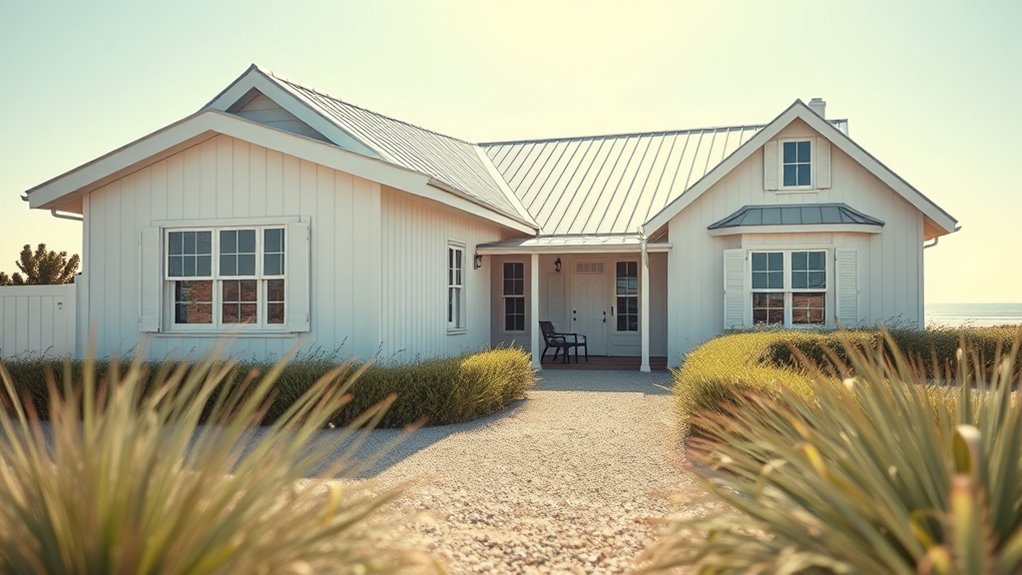
Warm Exterior Whites for Traditional and Cottage Exteriors
Warm exterior whites bring a cozy, lived-in feel to traditional and cottage homes, softening harsh lines and complementing natural materials like wood and stone.
Warm exterior whites create a cozy, lived-in feel, softening lines and pairing beautifully with wood and stone.
You’ll find these tones enhance cottage charm and uphold traditional elegance without feeling fussy. Choose creams with subtle yellow or warm gray undertones to blend with landscaping and vintage trim.
Consider contrast for shutters and doors to keep profiles clear.
- Soft cream: invites warmth, pairs with wood.
- Warm greige: neutral backbone for evolving accents.
- Antique white: aged look that flatters stone and brick.
Test samples in morning and evening light.
Bright Exterior Whites for Coastal and High‑Sun Climates
For coastal or sunny sites, you’ll want cool, reflective whites that bounce heat and keep your walls cooler.
Look for UV‑resistant paint formulas and pigments that resist yellowing and chalking in intense sunlight.
I’ll cover how these coatings perform and which formulations hold up best.
Cool Reflective Whites
If you live near the coast or under intense sun, cool reflective whites will keep your home brighter and cooler by bouncing heat away instead of absorbing it.
You’ll choose tones with cool undertones to reduce glare and keep facades feeling crisp. Pair those tones with reflective finishes to enhance light dispersion and lower surface temperatures.
Consider texture, trim contrast, and local style so the white complements rather than overwhelms.
- Pick a cool white with slight blue or green hints for coastal clarity.
- Use satin or semi-gloss reflective finishes for easy cleaning.
- Test samples in full sun before committing.
UV‑Resistant Paint Options
Because bright whites take the full brunt of sun and salt, you’ll want UV‑stabilized exterior paints that resist yellowing, chalking, and premature breakdown.
Choose acrylic or elastomeric formulas with proven UV protection benefits and fungicide additives for coastal exposure.
Look for high-quality pigments and binders—they’re paint longevity factors that curb fade and flake.
Light-reflective sheens reduce heat absorption, but prioritize UV inhibitors over gloss.
Prep and primer matter: a UV-resistant primer enhances adhesion and seals substrate.
Follow manufacturer recoat intervals and inspect annually.
With the right product and maintenance, your bright white stays crisp longer in harsh sun.
Soft, Creamy Exterior Whites for Shaded Yards and Wooded Lots

When your house sits under trees or in a north-facing yard, soft, creamy exterior whites warm shadowed siding without looking stark; they bounce limited light and bring out natural wood tones so your home feels inviting rather than washed out.
Soft, creamy exterior whites warm shaded siding, bouncing limited light and highlighting natural wood tones for an inviting, never-washed-out home.
You’ll pick soft whites and creamy finishes to prevent dullness and add subtle glow. Consider contrast, durability, and surrounding foliage when choosing shade and sheen.
- Choose a warm-leaning cream to lift dark corners without clashing with leaves.
- Test samples at different times; shadows shift color perception.
- Pair with natural trim and durable, low-VOC paint for longevity.
How Yellow, Blue, and Gray Undertones Change Exterior Whites
Although white looks simple at first glance, subtle yellow, blue, or gray undertones shift how it reads on your house, so you’ll want to choose deliberately.
Yellow warms facades, making homes feel friendly and approachable; color psychology shows it invites sunlight and pairs well with natural trim.
Blue cools and modernizes, creating crisp contrast against greenery and signaling calm restraint.
Gray tames brightness, offering sophistication and hiding imperfections without heavy contrast.
For reliable results, perform an undertone evaluation outdoors at different times of day, compare samples against landscaping, and consider the mood you want to project before committing.
Choosing White Based on Siding Material and Texture
If your house wears clapboard, brick, stucco, or vinyl, you’ll want to match the white to the material’s texture and light behavior rather than treating all surfaces the same.
You’ll consider siding compatibility and how rough or smooth faces alter perceived warmth. Pick whites that complement, not fight, the substrate.
- Clapboard: choose a crisp white with slight warmth to emphasize lines and resist shadowing.
- Brick: pick a softer, muted white to bridge mortar tones and respect texture influence.
- Stucco/vinyl: go for flexible neutrals—clean on smooth vinyl, warmer on textured stucco.
How Light and Time of Day Change Exterior White Paint
In the morning you’ll see whites take on a cool, bluish cast that can make a house feel crisp.
By midday the sun bounces off surfaces and whites look brightest and truest.
As evening approaches warm light shifts whites toward creamier, golden tones you’ll want to preview before committing.
Morning Cool Casts
Morning light often gives exterior white paint a cool, bluish cast that can make warm undertones disappear; you’ll notice this most on north-facing walls and during clear early hours when the sky’s color temperature is highest.
You’ll see how morning light and cool shadows lengthen detail, muting creams and beiges. Choose whites with slight blue or neutral bases if you prefer that crisp morning look, or test swatches at dawn.
Consider these quick checks:
- Observe swatches at first light for at least 30 minutes.
- Note how trim contrasts in cool shadows.
- Photograph samples to compare tones across mornings.
Midday Bright Bounce
Midday light hits your house with a high, direct intensity that bounces off white paint and exaggerates texture, revealing brush marks, grain, and subtle undertones that were hidden at dawn. You’ll notice sunlight reflection sharpening contrasts; flat whites look stark while warm whites reveal depth. For midday aesthetics, inspect samples outside at noon, step back to judge glare, and consider sheens that tame bounce. A focused midday check helps pick whites that read balanced against landscaping and hardscape without waiting for sunset.
| Time | Effect | Tip |
|---|---|---|
| Morning | Cool cast | Test early |
| Midday | High glare | Check samples |
| Afternoon | Softer | Compare |
Evening Warm Shift
As daylight softens toward evening, white paint warms and the house takes on richer, golden tones that smooth texture and hide minor flaws; check samples at dusk to see how undertones deepen and how warm whites pair with landscape lighting.
You’ll notice evening light pulls cool whites toward beige and enhances warm undertones, altering curb appeal. Test paint on multiple walls and view after sunset to confirm intent.
Consider how fixtures, plantings, and neighboring colors interact as tones shift.
- Observe: place large swatches and photograph at golden hour.
- Compare: note how trim and siding read together.
- Decide: pick the white that feels intentional.
Pairing Trim, Shutters, and Doors With Exterior White
Looking for a clean, cohesive look when your house is painted white? You’ll balance trim combinations to define edges—bright white for crisp lines or soft cream for subtle warmth.
Match shutter styles to your home’s period: louvered for coastal, raised-panel for traditional, board-and-batten for farmhouse.
Choose shutters to suit your home’s era: louvered for coastal, raised-panel for traditional, board-and-batten for farmhouse.
Use door accents to introduce personality—deep navy, black, or natural wood—keeping finish durable for weather.
Aim for architectural harmony: repeat a hue in small details like gutters or porch posts to unify the palette.
Test samples at different times of day, then lock in choices that reinforce your home’s style and proportions.
When to Choose Contrast Versus All‑White Exteriors?
Think about how your house’s architectural details will read—strong moldings and trim can handle bold contrast, while simple facades often benefit from an all-white approach.
Consider the neighborhood and streetscape so your choice fits the local rhythm rather than sticks out.
Also factor in climate and light, since bright sun or soft northern light will change how contrasts or pure whites look day to day.
Balance With Architectural Details
When deciding between a stark all‑white facade and one that uses darker trims and accents, consider how your home’s architectural details will read from the street: contrast highlights cornices, window frames, and moldings, while an all‑white approach mutes ornament for a cleaner, more minimalist look.
You’ll weigh architectural harmony and detailing contrast to decide whether to emphasize or simplify features.
Use these quick cues:
- Highlight: choose darker trims to showcase intricate moldings and cornices.
- Simplify: pick uniform white to hide busy ornamentation for modern appeal.
- Balance: mix subtle off‑whites with soft contrast to preserve detail without loud statements.
Neighborhood And Streetscape Context
Your choice between contrast and an all‑white facade should respond to the street as much as your house.
Look at community aesthetics: if neighboring homes lean traditional with varied trim, contrast will help your details read clearly.
In areas where neighborhood trends favor cohesive light palettes, an all‑white exterior can strengthen curb appeal and resale value.
Walk the block, note rooflines, porches, and material palettes, and consider whether you want to blend or stand out.
Use contrast selectively—doors, shutters, or trim—so you respect streetscape rhythm while expressing your home’s character.
Climate And Light Considerations
Because light and climate shape how paint actually looks and performs, consider local conditions before choosing all-white or a high-contrast palette.
You’ll want to weigh climate impact and light reflection to get the look and durability you expect. Think about heat, humidity, and seasonal light angles when picking undertones and trims.
- In hot, sunny climates, prefer whites with subtle warm undertones to minimize glare and reduce visible dirt from strong light reflection.
- In cloudy, cool regions, crisper whites or contrast accents add definition lost in diffuse light.
- In humid areas, choose paints with mildew resistance to offset climate impact.
Testing White Swatches on Your House Correctly
Start by painting several 12-inch swatches of your top white contenders on different sides of the house so you can see how each one reads in morning, midday, and evening light. For accurate swatch application, label each swatch and note the facing (north, south, etc.). Observe how nearby materials and shadows shift warmth or coolness during your color testing. Record impressions and photos at set times. Use this quick comparison table to track results:
| Swatch ID | Time Observed | Impression |
|---|---|---|
| A | Morning | Cooler, crisp |
| B | Midday | Neutral, reflective |
| C | Evening | Warmed, soft |
Exterior Sheens: Durability, Maintenance, and Where to Use Them
When you’re choosing an exterior sheen, think about the trade-offs between durability and appearance: high-gloss finishes stand up to scrubbing and moisture but highlight surface imperfections, while flat or matte sheens hide flaws and resist showing dirt but don’t clean as easily.
For a clear sheen comparison and practical maintenance tips, match sheen to surface and exposure. Use satin or eggshell on trim and siding for balance; semi-gloss on doors and high-contact areas for durability; flat on large walls with few blemishes.
Consider climate, cleaning frequency, and repair needs when selecting sheens.
- Satin: versatile
- Semi-gloss: durable
- Flat: forgiving
Budget Picks vs. Premium Exterior Whites + Quick Decision Checklist
After you’ve matched sheen to surface and exposure, the next decision is how much to spend on the white itself—budget formulas can save money now but may need repainting sooner, while premium whites offer better coverage, UV resistance, and mildewcide for longer life.
Match sheen, then decide budget vs. premium whites—spend more for coverage, UV resistance, and longer lifespan.
You’ll choose based on lifespan, substrate, and appearance goals. Consider budget friendly options for rental properties or short-term fixes; pick premium selections for high-visibility facades and resale value.
Quick decision checklist: assess substrate condition, expected years before repaint, local climate, desired opacity, and warranty.
Prioritize coverage and resistance if you want fewer touch-ups.
Frequently Asked Questions
How Do White Paints Affect a Home’s Resale Value?
White exteriors can boost resale value because resale trends favor clean, neutral looks; you’ll attract broader buyer preferences, increase curb appeal, and often sell faster—just guarantee quality finishes, appropriate undertones, and cohesive trim contrasts to maximize return.
Can White Exterior Paint Hide Surface Imperfections?
Yes — but only to a degree. If you want to mask surface texture flaws, choose a flatter paint finish and prep carefully; glossy finishes highlight imperfections, while matte or eggshell obscure minor irregularities more effectively.
Are There Eco-Friendly White Exterior Paint Options?
Yes—you can choose eco-friendly white exterior paints that use sustainable materials and still offer excellent paint durability; you’ll find low-VOC, plant-based or mineral formulations that resist weathering, fade, and mildew while reducing environmental impact.
How Long Does White Exterior Paint Typically Last Outdoors?
You’ll typically get 5–10 years from white exterior paint, depending on paint durability and weather resistance; high-quality, eco-friendly formulations and proper prep extend life, while harsh sun, moisture, and poor maintenance shorten it.
Will White Paint Increase My Home’s Cooling Costs?
No — white paint rarely boosts your cooling bills; it actually reflects heat so strongly you’ll swear it’s a mini arctic shield. You’ll improve energy efficiency and heat reflection, lowering solar gain and easing air-conditioning demand.
Conclusion
You’ll pick a warm white for charm, a crisp white for contrast, a soft white for calm. You’ll test swatches in sun, shade, and evening light. You’ll match trim and accent colors, or you’ll let them disappear. You’ll choose durable sheens for high-traffic areas, budget-friendly options for whole-house projects, and premium paints for focal façades. You’ll step back, observe, and decide — confident, deliberate, and ready to paint.