
35 Modern Wall Color Ideas for a Stylish Home Makeover
You’ll find 35 modern wall color ideas that help you refresh any room, from warm greige and crisp whites with warm undertones to cool dove gray and soft mushroom neutrals. Use deep charcoal or inky blues for dramatic accents, terracotta or mustard for sunny warmth, and aqua or pale blue for coastal freshness. Match tones to your wood and pick accents from artwork. Try large samples in different light—keep going to see practical tips and combos.
Warm Greige for a Cozy Modern Base
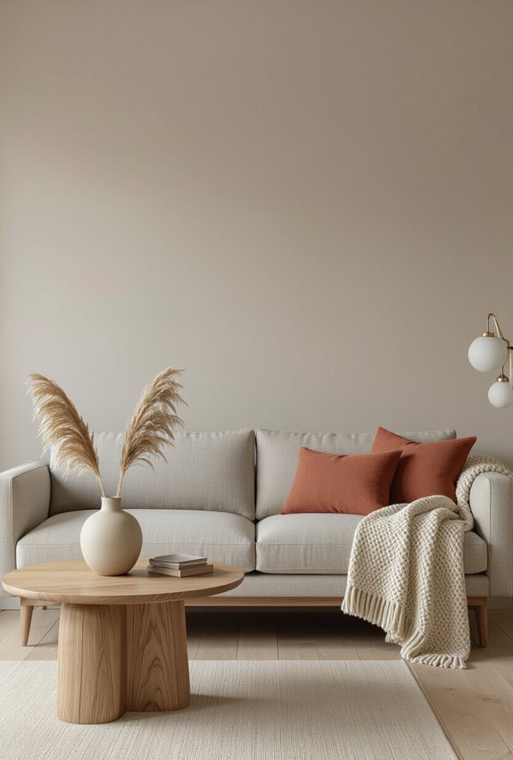
When you want a modern look that still feels inviting, choose warm greige as your base—it’s a balanced blend of gray’s calm and beige’s warmth that anchors a room without dominating it.
You’ll use warm greige as a cozy base, pairing muted taupe accents and natural textures to create modern warmth.
Keep trim simple and add layered lighting for depth.
Crisp White With Warm Undertones
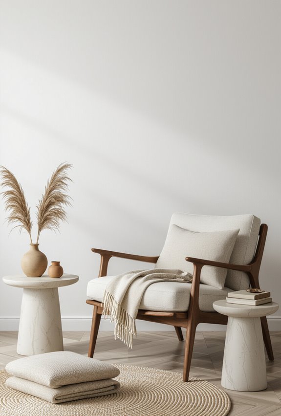
If warm greige gives your room a soft, grounded feel, crisp white with warm undertones lifts the space while keeping it cozy—think clean walls that still read inviting under natural and artificial light.
Choose a warm white with subtle buttery undertones to reflect light without feeling sterile. You’ll create a bright, welcoming backdrop that complements wood tones, brass accents, and layered textiles.
Olive Green for Warm, Earthy Vibes
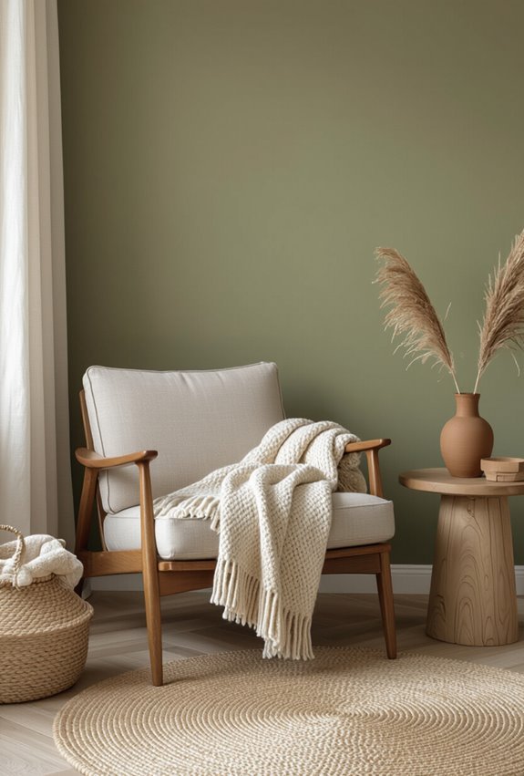
Comfort anchors a room painted in olive green, giving spaces a cozy, earthy warmth that feels lived-in without being heavy.
You’ll pair olive farmhouse cabinets or shiplap with warm wood and brass accents. Choose rustic velvet cushions and curtains to add soft texture, and keep contrasts muted so the palette reads cohesive. Use natural fibers and simple lighting for an inviting, grounded look.
Mustard Yellow for Retro-Modern Pop
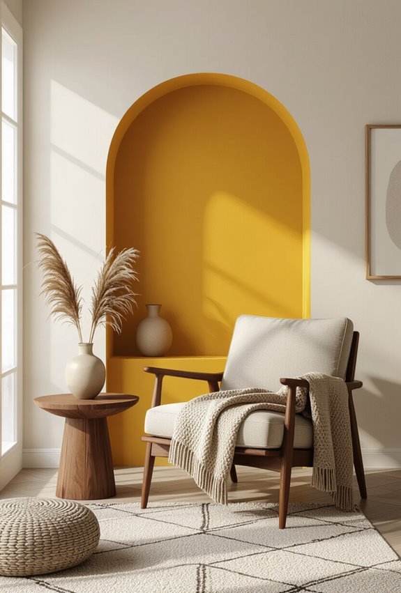
If you loved the warmth of burnt orange, mustard yellow offers a similar mid-century energy but with a sharper, retro-modern edge.
You’ll use retro mustard for accent walls, pairing 60s revival furnishings with clean lines. Choose modern ochre finishes to create sleek contrast against matte neutrals. Keep accessories minimal so the color reads bold, intentional, and unmistakably contemporary.
Soft Butter Yellow for Sunny Kitchens
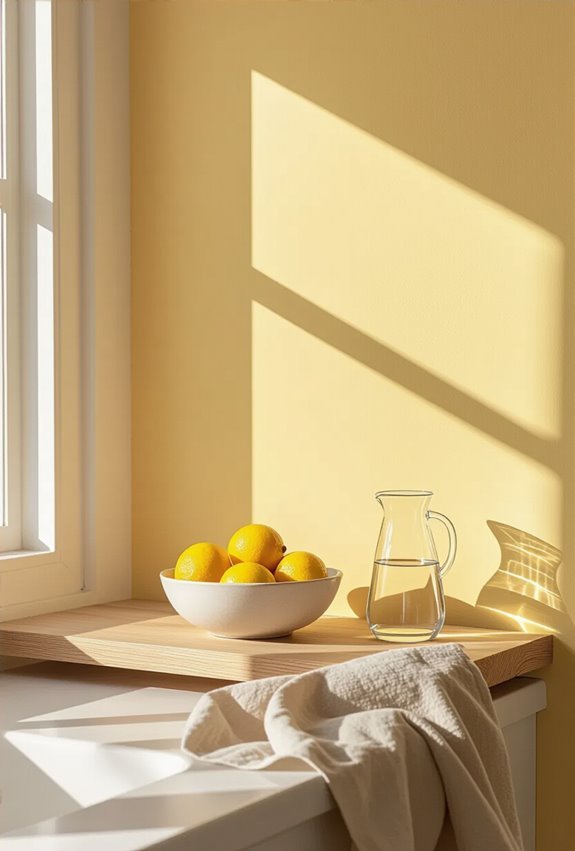
Often you’ll find that soft butter yellow instantly brightens a kitchen without overwhelming it; use it on walls or upper cabinets to reflect light and make the space feel sunnier and more inviting.
You’ll love how soft butteryellow pairs with natural wood or crisp white for sunny cabinetry contrast.
Opt for matte finishes to hide imperfections and warm metallic accents for subtle depth.
Aqua for Bright Bathrooms
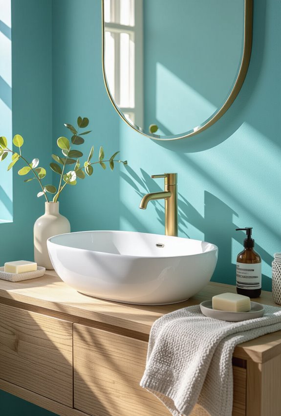
Think of aqua as instant daylight for your bathroom—its cool, watery hue brightens small spaces and reflects natural light so fixtures and tiles pop.
You can pair aqua walls with turquoise tiles for depth and glossy contrast, then add coral accents sparingly to warm the palette.
Choose white trim and chrome hardware to keep the look fresh, airy, and effortlessly modern.
Plum for Luxurious Bedrooms
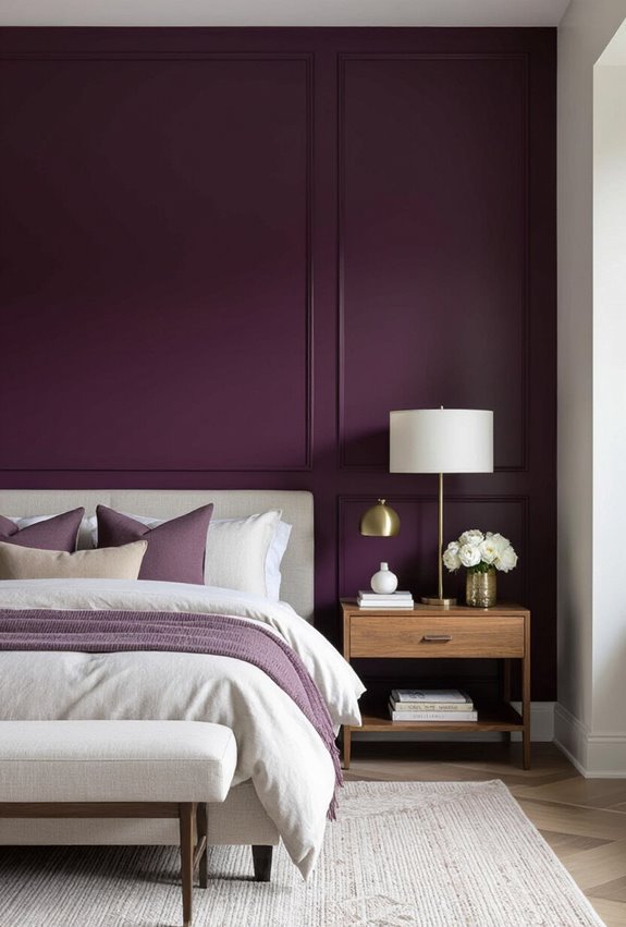
Opulence arrives when you paint your bedroom in deep plum—you’ll get a rich, enveloping backdrop that makes everything from brass fixtures to cream linens pop.
Pair a plum headboard with velvet drapery to enhance texture and depth. Keep bedding neutral, add mirrored accents, and balance mood lighting to prevent heaviness. This approach feels sumptuous without overwhelming the space.
Metallic Accent Wall for Subtle Shine
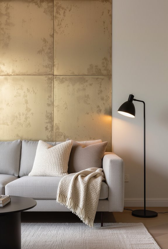
Introduce a metallic accent wall to add subtle shimmer and depth without shouting for attention. You’ll use metallic plaster to create texture, then highlight pearl veining for gentle contrast.
Choose paints that offer a subtle sheen and soft luster so light shifts subtly across the surface. Place it behind a bed or console to anchor the room without overpowering other finishes.
Two-Tone Walls With a Chair Rail
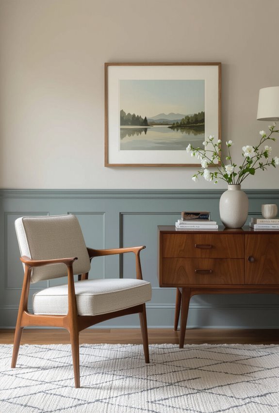
When you split a wall with a chair rail, you get a clean, classic way to layer color and define a room’s proportions. Use a low chairrail to make ceilings feel taller or anchor wainscoting.
Pick a bold color below and a lighter shade above, then finish with contrasting trim to sharpen edges. This approach balances visual interest and timeless structure.
Ombre Walls for Smooth Color Transitions
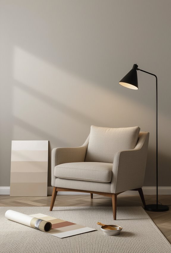
With a gentle gradient, omre walls help you blend two or more hues so shifts feel deliberate and soothing rather than abrupt.
You’ll use a gradient technique to layer pigments from deep to light, working wet-on-wet for seamless blending.
Position the fade to suit natural light, practice on a sample panel, and seal with subtle sheen to protect the changeover without overpowering room elements.
Matte Finish for Contemporary Sophistication
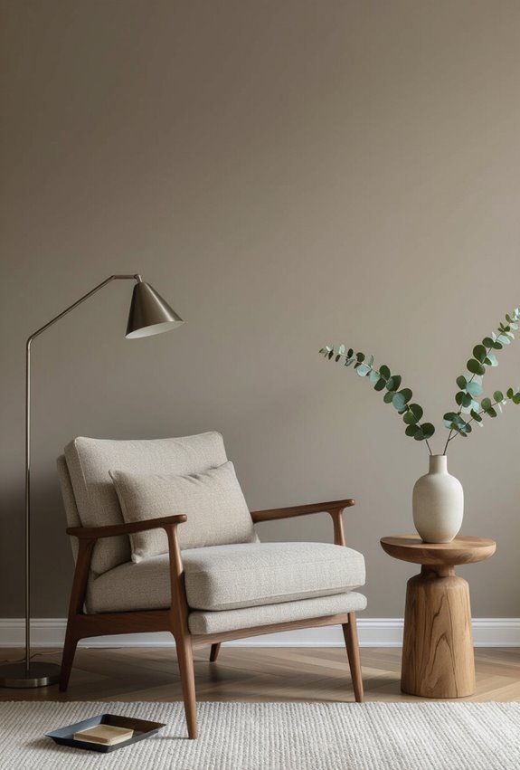
After exploring gentle gradients, consider how a matte finish can ground those soft shifts while giving your space a modern, refined feel. You’ll love matte velvet textures that absorb light, reducing glare and highlighting form.
Embrace urban minimalism with deep, muted hues on accent walls to create calm, sophisticated rooms. Pair with tactile fabrics and simple lines for an understated, contemporary statement.
High-Gloss Trim for Modern Contrast
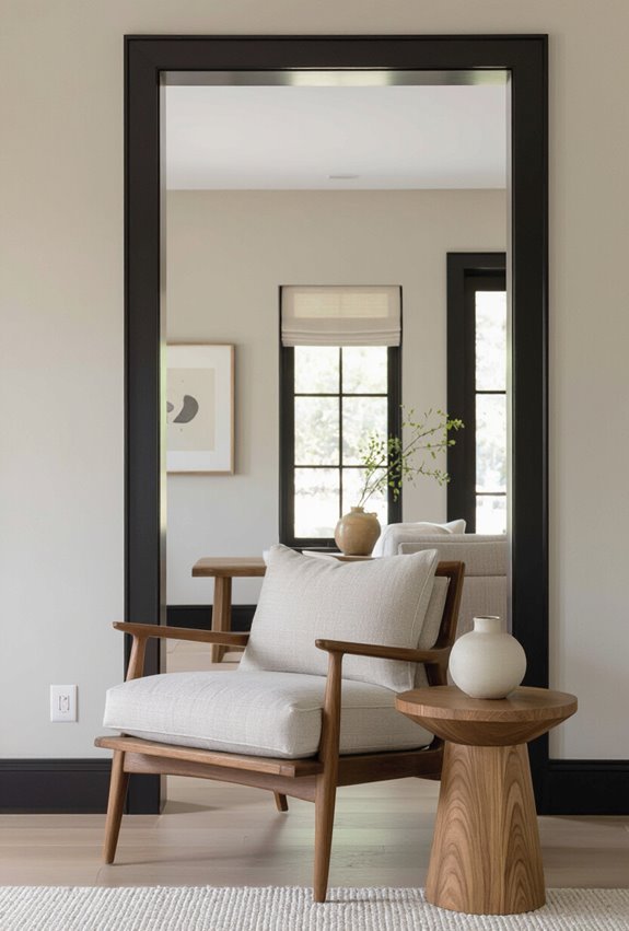
If you like the soft, low-sheen look of eggshell walls, pairing them with high-gloss trim will sharpen the room’s edges and add modern contrast.
You’ll see how high gloss trim creates reflective molding that bounces light, defines sleek edges, and elevates simplicity.
Use it on baseboards, door frames, and window casings to contrast matte surfaces and emphasize architectural lines without overwhelming the space.
Monochrome Palette With Texture Layering
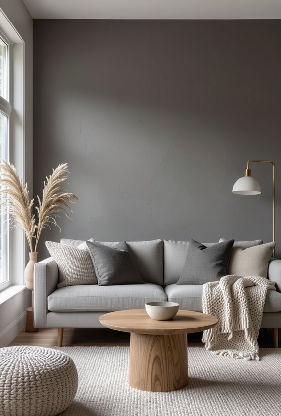
When you choose a monochrome palette, texture becomes the tool that keeps a single hue from feeling flat—layer matte paint, glossy trim, woven textiles, and sculptural wall finishes to create depth and interest.
You’ll add tactile plastering on an accent wall, pair velvet draping for contrast, and mix sisal rugs, ribbed wood, and metallic accents so the room reads as intentional, rich, and cohesive.
Best Wall Colors for Open-Plan Living
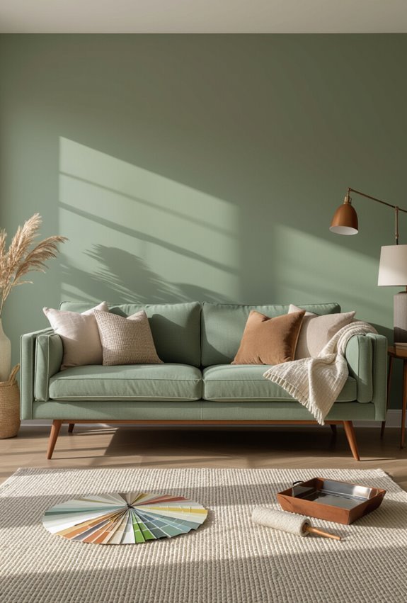
Because open-plan living blends zones, your wall colors should both unify the space and let each area read clearly; pick a cohesive palette with subtle shifts—like a warm neutral base plus deeper accents—to guide sightlines and define function without breaking flow.
Use airy neutrals as anchors, then employ zoned palettes—soft taupes, muted greens, or charcoal accents—to create shifts and clarify living, dining, and work areas.
Choosing Wall Colors That Match Wood Tones
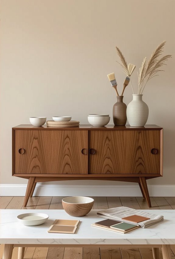
If you want your walls to make wood tones sing, start by identifying the undertones—warm woods like honey oak pair best with soft creams and warm greiges, while cool woods like ash and gray-washed pine call for muted blues, greys, or soft greens.
Match Warm walnut with deep taupes or olive; balance Cool oak using pale blue-greys to keep spaces calm and cohesive.
How to Pick an Accent Color From Artwork?
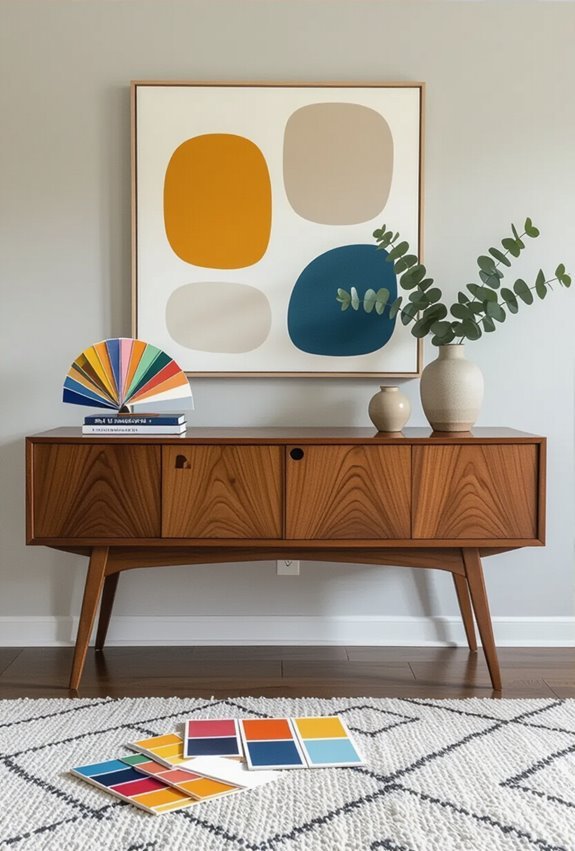
Start by standing in front of the artwork and choosing the most compelling color that already appears there—pick a hue that draws your eye, then use its saturation and value to guide the rest of the room; a vivid jewel tone can become a bold accent, while a muted tint will read softer when repeated in pillows, trim, or a single painted wall.
Use focal extraction and palette psychology to balance contrast, temperature, and proportion so the accent feels intentional, not accidental.
Striped Walls

If you want to make a bold statement with your accent wall, striped walls offer a playful and dynamic option.
You can choose contrasting colors for a striking effect or soft hues for a more subtle look.
Experiment with different widths and orientations—horizontal stripes can widen a space, while vertical stripes can create the illusion of height.
Get creative and have fun with it!
Two-Tone Split

After exploring the vibrant possibilities of a mosaic tile look, consider the striking simplicity of a two-tone split accent wall.
This technique divides your wall horizontally or vertically, using two complementary colors. It creates a bold statement while maintaining elegance.
You can experiment with different shades to match your decor, making it an easy yet impactful choice for any room.
Conclusion
With these 13 fun techniques, you can transform your space into a vibrant haven. You’ll create geometric shapes that spark joy, embrace ombre effects that soothe the soul, and enjoy color blocking that energizes the mind. You’ll add playful polka dots that bring smiles, explore abstract art that ignites creativity, and celebrate colorful murals that tell your story. So go ahead, release your imagination, and let your walls reflect the lively spirit within you!
