
Should You Paint Wainscoting the Same Color as the Wall?
You can — and often should — paint wainscoting the same color as the wall if you want a calmer, larger-feeling room; matching removes visual breaks, softens sightlines, and makes small or light-filled spaces feel more cohesive. Use matching for bedrooms, hallways, and modern schemes, choose contrast to highlight trim or create drama, and always test samples and sheens under real light. Keep going to see rules, tests, and style swaps that make the choice easy.
Quick Decision: Match or Contrast Wainscoting?
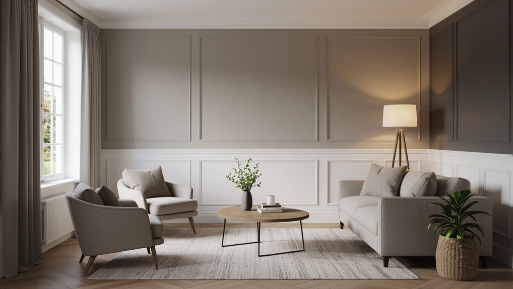
Wondering whether to match or contrast your wainscoting? You’ll weigh practical style: matching simplifies visual flow and highlights texture, while contrasting adds punch and frames panels.
Consider color psychology—soft tones calm, bold hues energize—and practical upkeep. Inspect edge detailing; crisp edges favor contrast, subtle profiles suit match. Decide based on desired mood, maintenance, and existing trim.
Why Matching vs Contrasting Changes Room Scale and Mood
When you match the wainscoting to the wall, you create visual continuity that makes the room feel larger and more cohesive.
Contrasting colors break that flow and can make the lower portion read as a distinct element, which often shortens perceived height or adds intimacy.
Think about whether you want an open, airy vibe or a cozy, grounded one before choosing.
Visual Continuity Effects
Visual continuity plays a big role in how a room feels: matching your wainscoting to the wall creates a seamless plane that makes ceilings seem higher and spaces feel larger.
You’ll get color continuity that calms sightlines and a seamless shift between trim and wall. Contrasting trim, by contrast, adds rhythm and focus, defining architectural detail and boosting personality without overwhelming the room.
Perceived Room Size
Matching your wainscoting to the wall doesn’t just smooth sightlines—it changes how you perceive the room’s scale.
You’ll notice a subtle perceived scale shift that makes spaces feel larger and calmer; contrasting trim creates a defined boundary and cozier mood via spatial illusion.
- Seamless: expands perceived scale
- Contrasting: encloses, adds focus
- Hybrid: balances openness and warmth
What “Same Color as the Wall” Really Means in Practice
When you say the wainscoting is the “same color” as the wall, you’re really balancing tone and finish—matching the hue but deciding whether sheen should match or contrast.
That choice affects whether the trim visually recedes for unified depth or reads as a subtle band. Think about how a matte wall with a satin trim will change perceived depth compared with a full blend.
Tone And Finish Match
Often you’ll find that “same color” isn’t just about the hue but about tone and sheen too, and those details determine whether the trim blends in or subtly stands out.
You’ll want tone matching and finish uniformity so light reads consistently. Consider:
- Sheen level (matte vs gloss)
- Undertone coordination
- Light test in situ before committing
Visual Depth Versus Blend
Depth matters as much as hue: choosing the same color for both wall and wainscoting can either make the room feel unified and airy or create subtle layers depending on how you handle value, shadow, and finish.
You can emphasize perceptual layering by varying sheen or slight value shifts, and use edge softening to blur changes so the trim reads as part of the wall while keeping architectural interest.
Simple Decision Matrix: When to Match and When to Contrast
If you’re weighing whether to match your wainscoting to the wall or make it stand out, use a simple decision matrix based on room size, light, and your style goals: match for a calm, spacious feel in small or low-light rooms, contrast to add definition in bright, airy spaces or when you want architectural emphasis, and mix approaches—subtle tonal contrasts—for balanced, contemporary looks.
- Match: favors color psychology for serenity.
- Contrast: highlights material contrast and trim.
- Mix: tonal variations for modern cohesion.
Key Visual Factors: Room Size and Perceived Scale
Because wainscoting sits at eye level, it can make a room feel taller or shorter depending on whether you match it to the wall or contrast it—so think about the scale you want. You’ll use contrast for bold scale illusions; matching improves cohesive spatial perception. Consider this quick guide:
| Effect | When to Match | When to Contrast |
|---|---|---|
| Perceived height | subtle | dramatic |
| Visual flow | continuous | segmented |
| Room size | unified | expanded |
Light Matters: How Natural Light Affects Color Choice
Natural light can make the same paint read brighter or more muted throughout the day, so you’ll want to test samples at different times.
Pay attention to how shadows deepen color on the wainscoting versus the flat wall, since texture and trim catch light differently.
That contrast can change whether the unified color feels seamless or subtly sculpted.
Brightness Changes Perception
Often the way a room is lit will completely change how a paint looks, so you’ll want to evaluate colors at different times of day.
You’ll notice light perception shifts across surfaces, altering brightness contrast between wainscoting and wall.
Check these factors before deciding:
- Morning vs. afternoon light
- Direct sunlight intensity
- Artificial lighting color temperature
Shadow Depth And Tone
Light plays a big role in how shadows define the depth and tone of wainscoting, so notice how sunlight shapes every groove and panel before you commit to a single color. You’ll see shadow contrast shift throughout the day; use tone layering to choose a finish that balances depth and cohesion.
| Morning | Midday | Evening |
|---|---|---|
| Soft | Bright | Warm |
| Gentle shadows | Minimal | Long shadows |
| Subtle depth | Flat tone | Rich depth |
Ceiling Height: How It Alters Matched Trim Impact
Ceiling height dramatically changes how matched trim reads in a room, so you’ll want to take into account it before committing to a single color scheme.
- In low ceilings, matching wainscoting to walls with horizontal trim can lower perceived height, so use contrast or lighter ceilings.
- Vertical stripes or tall moldings can counteract squat spaces.
- In lofty rooms, matched trim feels seamless, enhancing scale and cohesion.
Architectural Style: Guide to Paint Harmony by Style
If your home leans traditional, you’ll usually want contrast between wainscoting and wall to highlight the moldings.
In modern or minimalist spaces, matching the trim creates a seamless, monochrome look that feels cleaner.
Consider your style first, then choose contrast or continuity to support it.
Traditional Homes: Contrast Preferred
When you’re working with a traditional home, contrast between wainscoting and walls usually feels right—these houses were built to show off trim, so darker or complementary tones on the lower panels emphasize architectural detail and period character.
You’ll honor heritage detailing and period authenticity by choosing trim hues that frame moldings and shadows.
- Pick complementary contrasts.
- Highlight moldings.
- Respect historical palettes.
Modern Spaces: Seamless Monochrome
Because modern design favors clean, uninterrupted planes, painting wainscoting the same color as the wall creates a seamless, monochrome look that visually expands the room and keeps attention on form and texture rather than trim.
You’ll embrace monochrome minimalism, letting subtle tonal layering define depth. Choose matte finishes and crisp lines so surfaces read as one cohesive plane, enhancing calm and architectural clarity.
Wainscoting Profile and Texture: How They Change Color Perception
With different profiles and textures, wainscoting can make the exact same paint look like a different shade; deep grooves, beadboard ridges, or smooth flat panels catch and reflect light uniquely, so you’ll see contrast and tonal shifts even when color is identical.
- Profile perception: shapes create shadow lines.
- Texture interplay alters apparent depth.
- Pairing simple profiles keeps harmony.
Paint Sheen and Gloss: Influence on a Matched Look
Don’t assume matching paint color alone creates a seamless look—sheen contrast can make the same hue read as two different finishes.
You’ll notice gloss reflectivity highlights edges and details while matte surfaces absorb light, changing perceived depth.
Choosing matte vs. gloss thoughtfully helps you control harmony between wall and wainscoting.
Sheen Contrast Effects
Think about sheen like the finish’s fingerprint: even when the wall and wainscoting share the same paint color, a higher or lower gloss will catch light differently and make the trim stand out.
You’ll notice sheen interplay and finish layering affect depth. Consider these choices:
- Subtle satin on trim for soft definition.
- Matte walls to recede.
- Eggshell for balanced contrast.
Gloss Reflectivity Differences
Light behaves differently on each sheen, and that behavior is what determines whether your wainscoting reads as a distinct element or melts into the wall.
You’ll notice gloss level changes Light bounce and alters perceived depth. Use reflective mapping to predict highlights; subtle sheen layering can unify color while preserving trim definition. Adjust finishes intentionally to control contrast.
Matte Vs. Gloss Harmony
Often you’ll find that choosing between matte and gloss determines whether your wainscoting disappears or stands out; matte absorbs light and minimizes edge definition, while gloss reflects it and sharpens contrast, so match your sheen intentionally to the visual effect you want.
You’ll weigh matte harmony against gloss interplay to control depth, focus, and maintenance.
- Matte: soft, forgiving
- Satin: subtle sheen
- Gloss: crisp, highlight-preserving
Pick Paint Type & Sheen for Matched Wainscoting (Durability + Look)
Choose a paint type and sheen that balance durability with the seamless look you want—semi-gloss or satin on wainscoting gives you scrubbable, impact-resistant surfaces while a matte or eggshell on the upper wall keeps glare low; using the same finish everywhere will maximize the “built-in” effect, but you can mix a tougher sheen on trim if the area gets heavy use.
Consider Durability layers and Sheen pairing to protect high-contact zones while preserving a unified appearance.
Test Paint Samples: Matched vs Contrast in Real Light
Grab matched and contrasting paint samples and apply them to the wainscoting and wall so you can compare them side by side.
Stand in the room at different times of day and under artificial light to see how each finish reads. You’ll quickly notice which option keeps the space cohesive and which creates the visual pop you want.
Matched Vs. Contrasting Samples
Want to see how matched and contrasting samples behave in your room’s real light? Try paired swatches to judge material contrasts and respect historical context. Evaluate how each option changes perceived height and mood.
- Matched: seamless, modern, elongates.
- Contrasting: defines trim, adds depth.
- Hybrid: subtle contrast, balanced character.
Observe Paints In Light
Now that you’ve compared matched, contrasting, and hybrid samples on paper, bring those swatches into your room and watch how real light alters their appearance. Hold matched and contrasting chips at different angles and times to catch color metamerism.
Note how light directionality—morning sun, side lamps, overhead fixtures—changes depth and warmth. Choose the finish that stays true across conditions.
Use Sample Boards to Evaluate Wainscoting Color
Testing with sample boards gives you a clear, realistic view of how your chosen paint will read on both the wainscoting and the wall under different lighting.
You’ll run lighting tests, compare material swatches, and evaluate edge treatments to see seams and sheen. Try these steps:
- Paint matched boards for direct comparison.
- Move boards at day/night.
- Inspect edges for contrast.
Small Rooms & Hallways: Choosing a Matched Look
After you’ve evaluated samples, consider how a matched wainscoting-and-wall scheme will affect tight spaces like small rooms and hallways.
Painting them the same color creates a space illusion that visually removes the trim, expanding perceived volume. In narrow flow areas, this unified treatment simplifies sightlines and reduces visual clutter, so you’ll feel movement is smoother and the corridor more cohesive.
Living Rooms and Open Plans: When to Blend Trim
In open living areas, blending your wainscoting with the wall color can knit multiple zones together and keep sightlines calm, so your eye can travel uninterrupted across sofas, dining areas, and entryways.
You’ll make an open plan feel cohesive when you consider sofa alignment and furniture placement.
- Match trim to walls for unity.
- Use contrast for focal points.
- Align sofas to preserve sightline.
Bedrooms and Nurseries: Cozy Matched Palettes
Create a cozy, enveloping feel by painting wainscoting the same color as the walls in bedrooms and nurseries—this simple choice softens edges, reduces visual clutter, and makes small rooms feel larger and more restful.
You’ll enhance calm with a soft texture underfoot or on textiles, letting muted patterns on bedding or curtains provide subtle interest without breaking the tranquil, unified backdrop.
Bathrooms and Laundry Rooms: Moisture-Proof Matched Finishes
Bedrooms and nurseries benefit from that soft, unified look, and you can get the same serene effect in bathrooms and laundry rooms—just pay closer attention to moisture and finish.
You’ll choose moisture resistant finishes and prioritize ventilation strategies. Consider:
- Semi-gloss or satin for wainscoting durability.
- Mold-resistant primers.
- Exhaust fans and regular airing to protect paint.
Dining Rooms and Entryways: Creating Formality or Flow
In dining rooms you can boost formality by painting the wainscoting a contrasting shade to frame the space and highlight architectural details.
In entryways, matching the wainscoting to the wall creates a seamless flow that makes passages feel calm and intentional. Think about the mood you want at the threshold—sharp and defined, or continuous and welcoming—and pick your finish accordingly.
Enhance Formality With Contrast
A bold contrast between wainscoting and wall paint instantly heightens formality, so choose a trim color that anchors dining rooms and entryways without overpowering them.
You’ll create a formal contrast or regal pairing that underscores architectural details and guides guests. Consider these refined options:
- Deep charcoal for dramatic depth
- Navy for classic elegance
- Ivory for crisp, elevated balance
Seamless Flow With Matching
When you paint the wainscoting the same color as the wall, rooms feel larger and more cohesive, making dining areas and entryways flow naturally from one space to the next. You’ll create a seamless shift that emphasizes architectural lines and lets matching accents shine without competing. Use uniform tones for formality or subtle contrast for interest.
| Area | Effect | Tip |
|---|---|---|
| Dining | Formal | Consistent trim |
| Entry | Flow | Light hue |
| Hall | Continuity | Cohesive décor |
| Sitting | Calm | Minimal trim |
| Gallery | Showcase | Accent pieces |
Pairing Matched Wainscoting With Trim and Moulding
If you want a seamless, cohesive look, pairing matched wainscoting with your trim and moulding keeps the room feeling unified rather than fragmented. You’ll focus on trim pairing and moulding balance to maintain proportions and highlight architectural lines.
Consider these steps:
- Match finish sheen for consistency.
- Use the same color for visual flow.
- Adjust moulding scale to room size.
Combining Matched Wainscoting With an Accent Wall
If you paint wainscoting the same color as the wall, you’ll create a seamless visual flow that makes the room feel larger and more cohesive.
Pairing that unified base with an accent wall gives you a chance to introduce texture contrast—think matte wainscoting against a subtly patterned or tactile accent. Just be sure the trim finish coordinates with both surfaces so the shift reads intentional, not accidental.
Seamless Visual Flow
Although matching your wainscoting to the wall color unifies the room, you can still create a striking accent wall without breaking that seamless flow.
You’ll preserve seamless shifts and uninterrupted surfaces while highlighting one area. Consider these strategies:
- Use a deeper hue on a single wall.
- Add art or lighting to draw focus.
- Frame the accent with subtle trim to keep cohesion.
Accent Texture Contrast
Contrast can be tactile as well as visual, so when your wainscoting matches the wall, introduce texture on the accent wall to create depth without breaking unity.
You can add tactile variation through beadboard, plaster, or grasscloth, letting subtle pattern layering provide interest while the unified color keeps spaces calm. This approach balances cohesion with dimensionality.
Trim Finish Coordination
Coordinate trim finishes to make matched wainscoting and an accent wall read as a single, intentional design choice. You’ll use trim coordination and finish alignment to tie elements together, choosing sheen and color that bridge textures.
Consider practical steps:
- Match sheen across wainscot and trim.
- Use a slightly darker trim hue for depth.
- Keep hardware and profiles consistent for cohesion.
Layering Neutrals When Painting Wainscoting the Same Color
When you paint wainscoting the same color as the wall, layering neutrals becomes your tool for depth and subtle contrast—start with a base tone that matches the wall’s undertone, then add slightly lighter or darker shades on trim, rails, or recessed panels to define architectural lines without breaking the unified look. Use layered neutrals and subtle gradation to whisper dimension.
| Calm | Warmth | Texture |
|---|---|---|
| Soft | Embrace | Smooth |
| Quiet | Cozy | Subtle |
Create Subtle Contrast Using Tones Rather Than Hues
Keep the hue consistent between wall and wainscoting, but tweak the value so the trim reads lighter or darker without shifting color.
You can also use different sheens to catch light differently and layer textured whites for subtle dimension. These small moves let you create contrast that’s quiet yet intentional.
Match Hue, Shift Value
If you want a subtle distinction between wall and wainscoting without switching hues, use the same color family but alter the value—lighter or darker—to create depth. You’ll balance color temperature and a careful value shift to keep cohesion while adding dimension.
Try these approaches:
- Darker base for grounding.
- Lighter cap to lift.
- Mid-tone contrast for unity.
Play With Sheen
Often subtle, sheen can be the easiest way to separate wainscoting from the wall without changing color—by using different finishes you’ll get contrast through light and texture rather than hue.
You’ll want sheen sampling to compare satin, eggshell, and semi-gloss on site. Pick a higher sheen for trim to create finish contrast and durability, keeping overall tone unified and refined.
Layer With Textured Whites
Sheen differences help, but you can also create subtle separation by layering textured whites—mixing slightly warm, cool, or chalky whites so the wainscoting reads distinct without introducing a new color. You’ll use textured neutrals and tactile whites to add depth while keeping cohesion.
Consider:
- Warm off-white base
- Cool white trim
- Chalky accent panels
Cleaning and Maintenance for Matched Wainscoting
Regularly wipe matched wainscoting with a soft, damp cloth to keep dust and fingerprints from settling into the paint finish.
Use mild detergent for tougher spots, then dry immediately.
Schedule Seasonal refreshes—light touch-ups and a thorough clean each season prevent buildup.
Consider Protective coatings like clear enamel in high-traffic areas to ease maintenance, resist scuffs, and extend the painted surface’s lifespan.
How Matched Wainscoting Affects Resale and Buyer Expectations
If you’re planning to sell, matched wainscoting can subtly influence buyer perception by making rooms feel larger and more cohesive, but it may also hide architectural detail that some buyers value.
You should weigh Buyer psychology and Market trends when deciding. Consider:
- Appeal to broad tastes.
- Neutral backdrop for staging.
- Potential loss of character for niche buyers.
When Contrast Improves Resale Appeal Instead
When buyers are drawn to character and craftsmanship, contrasting wainscoting can boost resale appeal by highlighting trim, depth, and historic detail rather than hiding it.
You’ll tap market psychology by signaling quality and intentional design; buyers sensing authenticity often value contrast. Consider buyer demographics—urban professionals or older buyers may prefer visible millwork—so choose finishes that communicate preserved character and clear investment potential.
Budgeting to Repaint Wainscoting and Walls Together
Highlighting trim can help sell a house, but you’ll still want to budget carefully if you plan to repaint both wainscoting and walls together.
You’ll need a clear cost breakdown and realistic timing estimates.
Consider these points:
- Materials and primer: price per gallon and brushes.
- Labor: hourly rates or contractor quotes.
- Prep time: masking, sanding, and cure windows.
DIY Tips: Painting Wainscoting to Match Walls
Get ready to tackle the job like a pro: painting wainscoting to match the walls is mostly about careful prep and the right tools. You’ll sand lightly, clean surfaces, and prime spots for adhesion.
Use sample swatches for color matching, a quality brush for panels, and low-nap rollers for flats. Finish with precise edge sealing to prevent bleed and guarantee a seamless look.
How Pros Prep and Paint Matched Wainscoting Fast
Start by setting up a tight workspace: pros lay down drop cloths, tape edges, and remove hardware so you can move quickly without worrying about drips or damage.
Set up a tight workspace: lay drop cloths, tape edges, remove hardware to avoid drips and damage
You’ll follow professional prep steps, sand lightly, clean, and prime. For speed, consider spray application for smooth coverage.
- Sand and clean
- Prime seams
- Spray and backroll
Common Mistakes When Blending Wainscoting and Walls
When you try to make wainscoting disappear into the wall, a few predictable mistakes will betray the effort: using the wrong sheen, skimping on priming, or mismatching the exact paint tint.
You’ll notice uneven blending if coats aren’t consistent, or trim bleeding when tape fails.
Don’t rush sanding, ignore edge sealing, or skip test patches; small errors ruin the matched look.
Best Paint Brands and Products for Matched Finishes
Choose paints and primers that promise consistent tinting, durable sheen control, and smooth application—these traits matter most when you want wainscoting to visually vanish into the wall. You’ll favor brands offering premium finishes and eco friendly paints for indoor air quality and color fidelity.
Pick paints and primers with true tinting, reliable sheen control, and smooth application for seamless, healthy finishes.
- Benjamin Moore Aura
- Sherwin-Williams Emerald
- Farrow & Ball Modern Emulsion
Quick Decision Checklist: Match vs Contrast Recap
After picking a high-quality paint that guarantees consistent tint and finish, you’ll want a quick checklist to decide whether to match your wainscoting to the wall or make it stand out.
Consider room size, light, and desired mood.
Favor color continuity to enlarge small spaces; use contrast psychology to add drama or highlight trim.
Choose match for calm, contrast for statement, then test samples.
Visual Inspiration: Matched Wainscoting Examples to Copy
If you want a calm, cohesive look that visually expands a room, matched wainscoting delivers—paint the panels and wall the same hue so trim melts into the surface and the space reads as one continuous plane.
For a calm, cohesive feel, paint wainscoting and wall the same hue so trim visually disappears.
You’ll love these matched panels ideas and subtle tonal accents to copy:
- Soft gray whole-wall wash
- Deep navy enveloping lower boards
- Warm beige seamless trim
How to Test Sample Shots for Photos and Listings
Before you commit to a matched wainscoting finish for photos and listings, shoot small sample panels in the actual room lighting so you can see how the color reads on camera and in different exposures.
Photograph each panel with varied lighting setup and camera angles, note reflections, white balance, and shadow detail.
Review images on multiple devices to confirm consistency before advertising.
Final Next Steps: Test, Hire, and Finalize Your Paint Plan
Once you’ve confirmed how the matched wainscoting photographs and looks in the room, it’s time to run a final round of tests, get bids from painters, and lock in your paint plan so nothing surprises you during execution. Test finishes under real light, weigh color psychology, and collect contractor quotes before committing.
- Final test
- Compare quotes
- Schedule paint
Frequently Asked Questions
Can Matched Wainscoting Hide Wall Imperfections Better Than Contrasting Trim?
Yes—you’ll find matched wainscoting offers optical smoothing, creating a seamless backdrop that masks minor flaws; contrasting trim highlights edges and imperfections, while matching tones visually blend surfaces for a cleaner, unified look.
Will Heating or Humidity Cause Matched Paint to Yellow Differently Than Trim?
About 60% of yellowing comes from UV and heat exposure, so yes, you’ll see different yellowing: paint degradation depends on surface porosity and material differences, and matched paint can yellow unevenly with varying humidity and heat.
Should Door and Window Trim Match the Matched Wainscoting Color?
You should, if you want match continuity and trim harmony throughout the space; matching door and window trim to matched wainscoting creates a cohesive look, though contrasting trim can highlight architectural details if you prefer bold accents.
How Does Matched Wainscoting Affect Artwork Placement and Framing Choices?
Studies show 68% of homeowners prefer cohesive trim; you’ll place art higher on matched wainscoting, using Scale considerations to balance proportions, and you’ll adjust frames and Lighting impact to guarantee contrast and visual focus.
Can Floor Color or Stain Clash With a Matched Wainscoting Scheme?
Yes — your floor color or stain can clash with matched wainscoting. You’ll avoid discord by prioritizing floor contrast and thoughtful stain coordination, ensuring undertones and warmth align so trim, walls, and flooring feel cohesive.
