What Is the Best Exterior Paint Color
The best exterior paint color is a high-quality neutral—think soft gray, warm greige, or muted beige—paired with contrasting trim and a bold front-door accent to boost curb appeal and resale. Pick a shade that complements your roof, stone, and landscape, test swatches in different light, and follow HOA rules. Prioritize UV-resistant, durable paint and consider a pro for tricky surfaces. Keep exploring for practical examples and step-by-step selection tips.
Quick Framework: Pick an Exterior Paint Color in 3 Steps
When you’re choosing an exterior paint color, start with three simple steps: assess your home’s architecture and surroundings, pick a primary color that complements those elements, and choose trim and accent shades to balance contrast and cohesion.
Next, evaluate light and landscape so your choice reads well at different times. Use color psychology to set mood—calming neutrals, energetic warm tones, or stately deep hues—and test swatches on multiple walls.
Finally, factor in paint durability: pick finishes and formulations rated for your climate to protect siding and reduce maintenance, then review samples before committing.
Set Your Goal: Curb Appeal, Resale, or Personality
Now that you’ve narrowed options by architecture, light, and durability, decide what you want the color to do: boost curb appeal, maximize resale value, or express your personality.
If curb appeal is priority, pick a universally appealing palette that’s clean and readable from the street; use color psychology to favor welcoming tones like soft blues, greys, or muted greens.
For resale, stay neutral and proven—buyers prefer familiar shades that highlight features without distracting.
If personality wins, choose a bold accent or unexpected trim but guarantee paint durability for longevity and low maintenance. Balance impact with practical resilience.
Match Color to Your Home’s Style
Because your home’s architectural style sets expectations, match colors that reinforce its period and proportions so the paint feels intentional rather than pasted on. You’ll honor original details, boost curb appeal, and use color psychology to support mood—calmer neutrals for Craftsman, bold contrasts for Victorian.
Match your home’s style with period-appropriate colors—subtle neutrals for Craftsman, bold contrasts for Victorian—to honor details and boost curb appeal.
Consider materials and paint durability when choosing sheen and formula.
- Pick base hues that echo original trim and masonry.
- Use accent colors to highlight doors, shutters, and porches.
- Test swatches at different times of day.
- Choose high-quality, durable finishes suited to your climate.
Follow the style, not trends, for a coherent exterior.
Check Neighborhood and HOA Rules
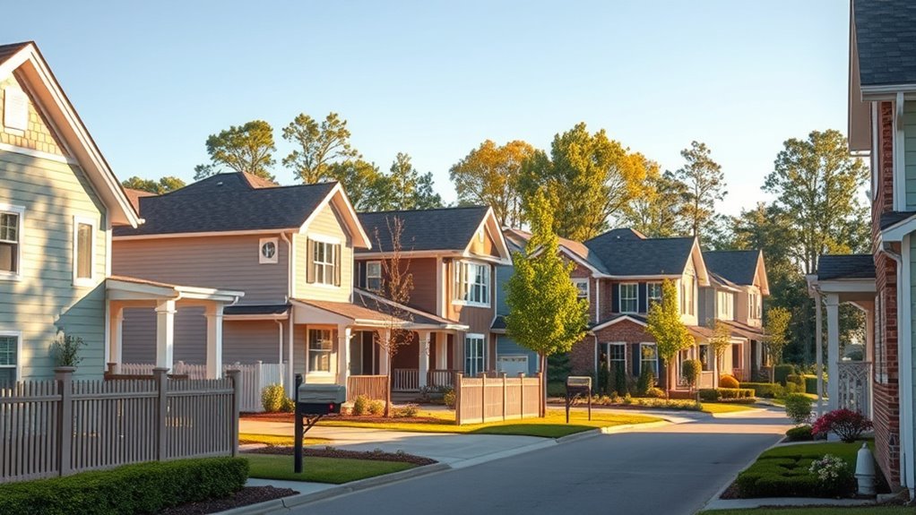
Before you pick swatches, check your HOA’s color guidelines so you don’t waste time on options that won’t be approved.
You’ll also want to contemplate the neighborhood’s overall aesthetic to make sure your choice fits the street and keeps resale value strong.
If rules or trends limit your options, focus on complementary accents that satisfy both requirements.
HOA Color Guidelines
Wondering whether your dream color will pass muster with your HOA? You should verify approved palettes, note finish restrictions, and confirm submission procedures; HOA rules often balance color psychology with community cohesion and practical paint durability concerns.
Before you start, check those specifics so you won’t waste time or money.
- Review the official palette and sample swatches.
- Ask about contrast limits, trim, and accent rules.
- Confirm required documentation and approval timelines.
- Learn penalties and repainting obligations.
Follow rules, document approvals, and choose colors that meet both your taste and the HOA’s standards to avoid future conflicts.
Neighborhood Aesthetic Consistency
When you’re choosing exterior paint, check both HOA rules and any neighborhood covenants to make sure your palette fits the established look—these guidelines often cover approved colors, trim contrasts, and placement of accents to preserve a cohesive streetscape. You’ll respect community character while applying color psychology to evoke calm, warmth, or modernity. Match approved hues to materials, and consider paint durability for longevity. If you want a bolder accent, submit samples to the board first. Use the table below to summarize steps and reminders.
| Step | Reminder |
|---|---|
| Review rules | Note approved swatches |
| Test samples | Check durability |
| Submit request | Include photos and specs |
Consider Roof, Brick, Stone, and Trim
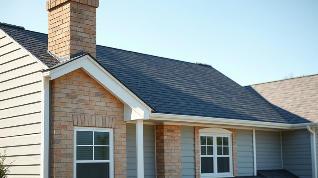
Because your roof, brick, stone, and trim anchor the whole look, you’ll want to choose paint that complements their tones and textures rather than competes with them. You’ll aim for Roof harmony with shingles and gutters while using Brick contrast to highlight masonry without overpowering it.
Consider undertones and material finishes, then test swatches near trim.
- Match trim undertones to avoid clashing edges.
- Use a muted main color if stone has bold veining.
- Pick accent colors from roof or brick for cohesion.
- Sample at different times to confirm true color.
Make choices that balance materials and streamline curb appeal.
How Sunlight and Climate Affect Color
Where you place your home and how much sun it gets will change how colors look and age. In bright, intense sunlight you’ll want colors that won’t wash out or show fading quickly.
While shaded or cloudy climates let you use richer, darker tones. Consider local climate — humidity, heat, and UV levels — when choosing pigments and finishes to guarantee long-lasting, true color.
Sunlight Intensity Effects
Although bright sunlight can make colors pop, intense UV exposure and heat will fade pigments faster than you might expect. You’ll notice Sunlight reflection raises surface temperature, accelerating Color fading and altering perceived hue.
Choose finishes and pigments that resist UV and hold up under heat, and plan for maintenance.
- Pick lighter shades where reflection reduces heat buildup.
- Use high-quality UV-resistant paint to minimize fading.
- Test swatches in direct sun at different times of day.
- Consider finish: satin and semi-gloss shed dirt and reflect light differently.
Monitor surfaces annually so you can refresh before damage worsens.
Climate-Driven Color Choices
When sunlight, humidity, temperature swings and local weather patterns interact, they shape not only how a color looks but how long it lasts on your exterior surfaces.
You should choose hues that suit your climate: lighter shades reflect heat in hot, sunny areas to protect finishes, while darker tones can absorb warmth in cooler zones.
Consider color psychology—cool blues calm coastal homes; warm earth tones feel inviting in arid regions.
Factor paint durability: high-UV formulas and moisture-resistant coatings extend life in extreme conditions.
Match finish and maintenance plans to weather realities so your exterior stays attractive and resilient.
How Landscape and Surroundings Change Perception
Because your home sits within a specific setting—urban, suburban, rural, coastal, or wooded—the same paint color can look entirely different depending on what’s around it. You’ll weigh Landscape harmony against Surrounding contrast as you pick tones that either blend with greenery, stone, or sand or deliberately stand out.
Consider sightlines, nearby materials, and seasonal shifts. Pick colors that respect scale and context so your house feels intentional.
- Match warm wood and brick for cozy cohesion
- Contrast cool coastal grays with pale sands
- Blend muted greens in forested lots
- Use bold accents where architecture demands attention
How Paint Undertones Alter Appearance
Landscape and surroundings change how a color reads, but undertones are the subtler cue that can make a shade feel warm, cool, or flat on your home. You’ll notice undertones shift with light and nearby materials; a beige with pink undertones warms brick, while greenish hints cool siding.
Consider color psychology—undertones influence mood and curb appeal, so pick ones that match the feeling you want. Test samples on different walls and at various times of day.
Also factor in paint durability: certain pigments resist fading differently, so choose undertones found in more UV-stable formulations to keep appearance consistent.
Palette Types: Neutral, Classic, or Bold
If you want a reliable starting point, choose a palette type that matches your home’s architecture and your risk tolerance: neutrals keep things calm and flexible, classic palettes lean on timeless combos that enhance form, and bold choices make a statement and draw attention to details.
You’ll consider color psychology and paint durability alongside curb appeal. Pick a palette that respects scale and surroundings, then test samples in different light.
Suggestions:
- Neutral: subtle contrasts, easy resale appeal.
- Classic: balanced accents, emphasizes trim and rooflines.
- Bold: focal points, adventurous shutters or doors.
- Mixed: combine restraint with a single pop.
Best Neutral Exterior Paint Colors
When choosing neutral exterior paint, you’ll want to weigh timeless warm neutrals that add cozy curb appeal.
You can also consider cool gray tones for a modern, refined look.
Soft greige options strike a balance between warm and cool if you’re unsure which direction to take.
Timeless Warm Neutrals
Though trends shift, warm neutrals remain a reliable choice for exterior paint because they create an inviting, versatile backdrop that complements varied architectural styles and landscaping. You’ll find they balance color psychology—evoking comfort and approachability—with practical paint durability for long-lasting curb appeal.
Consider finishes and contrast for trim and accents to keep the look fresh.
- Soft beige anchors traditional homes while brightening shady facades.
- Warm greige blends modern and classic elements without starkness.
- Creamy off-white highlights texture and architectural details subtly.
- Taupe with brown undertones pairs well with natural stone and wood.
Cool Gray Tones
Warm neutrals make a home feel welcoming, but cool gray tones give exteriors a crisp, contemporary edge while staying neutral enough to suit many styles. You’ll appreciate how cool grays highlight architectural lines, pair with Vintage accents, and adapt to Seasonal palettes. Choose undertones—blue, green, or purple—to match mood and light. Balance trim and doors for contrast or softness. Test samples at different times of day. Consider materials: siding, stone, and metal reflect gray differently. Use the table to compare options and decide confidently.
| Undertone | Best Pairing | Mood |
|---|---|---|
| Blue | White trim | Fresh |
| Green | Wood | Calm |
| Purple | Black door | Sophisticated |
| Neutral | Stone | Versatile |
Soft Greige Options
If you want a neutral that feels both cozy and contemporary, soft greige is a smart choice—mixing gray’s coolness with beige’s warmth to flatter varied lighting and materials. You’ll enjoy a versatile backdrop that balances curb appeal with subtlety. Consider finishes and primers that boost paint durability and select tones that reflect the mood you want via color psychology.
- Choose warmer greiges for inviting facades.
- Pick cooler greiges for modern, crisp exteriors.
- Test samples at different times for true color.
- Use high-quality coatings to protect against weather.
This approach keeps your exterior timeless and resilient.
Warm Exterior Paint Colors for Traditional Homes
When you choose warm exterior paint for a traditional home, you bring out its classic lines and create an inviting curb appeal that feels timeless. You’ll select hues like buttery cream, ochre, brick red, or deep taupe to emphasize trim, shutters, and porches.
Consider color psychology: warm tones convey comfort, stability, and hospitality, guiding choices for entryways and accents. Balance richer shades with lighter trims to avoid heaviness.
Prioritize paint durability—choose high-quality, weather-resistant formulas and proper priming to keep colors vibrant. With thoughtful contrasts and maintenance, warm palettes reinforce a traditional home’s character and welcoming presence.
Cool Exterior Paint Colors for Modern and Coastal Homes
Switching to cool exterior colors will give your home a fresh, contemporary feel using a cool neutrals palette of soft grays, muted greens, and pale taupes.
You can anchor that calm base with coastal blue accents on shutters, doors, or trim to evoke seaside charm without overwhelming the design.
Try a few small samples in different light to see how the blues and neutrals read on your specific facade.
Cool Neutrals Palette
Looking for a fresh, understated look for your home? You’ll love cool neutrals: soft greys, greiges, muted taupes, and pale greens that read modern yet timeless. Use color psychology to create calm curb appeal, pairing neutrals with crisp trim for contrast.
Prioritize paint durability for exterior exposure—choose high-quality finishes resistant to fading and mildew. Consider these combinations:
- Soft dove grey walls with bright white trim
- Greige siding and charcoal accents
- Pale sage with natural wood doors
- Muted taupe paired with black metal fixtures
These choices anchor modern and coastal homes without relying on loud hues.
Coastal Blue Accents
If you like the calm clarity of cool neutrals, coastal blue accents will give your home’s exterior a fresh, seaside-infused lift without overpowering the palette. You can use coastal blue on shutters, front doors, or trim to introduce color while keeping walls neutral.
Pair it with crisp whites and soft grays to maintain a modern look, or add subtle nautical accents like rope-wrapped planters, brass lanterns, or striped textiles for a coastal vibe.
Keep contrast balanced: too much blue reads themed, too little gets lost. Test samples in different light and choose a shade that complements your home’s architectural lines.
Accent and Trim Color Rules That Always Work
When you pick accent and trim colors, aim for contrast that highlights architectural details without overpowering the main color. Choose one bold accent for doors or shutters and a complementary neutral for trim so the house reads as a cohesive whole.
You’ll use color psychology to set mood and consider paint durability for long-term looks. Keep palettes simple: one main, one accent, one trim. Use these rules to guide choices:
- Match trim to architectural lines for clarity
- Let the accent pop but stay limited
- Pick neutrals that age well
- Test samples in different light before committing
Front Door Color Ideas That Complement the Exterior
Because the front door is a focal point, choose a color that complements your main siding and accent tones while reflecting the mood you want to set. Pick bold reds for energy, deep blues for calm, or cheerful yellows for warmth. Match hardware and front porch accessories; coordinate mailbox colors for cohesion. Consider neighborhood context and seasonal plants when selecting contrast or harmony.
| Color Mood | Example Shade | Pairing Tip |
|---|---|---|
| Energetic | Cherry Red | White trim, brass hardware |
| Calm | Navy Blue | Stone accents, matte black |
| Warm | Mustard Yellow | Dark green pots, copper mailbox colors |
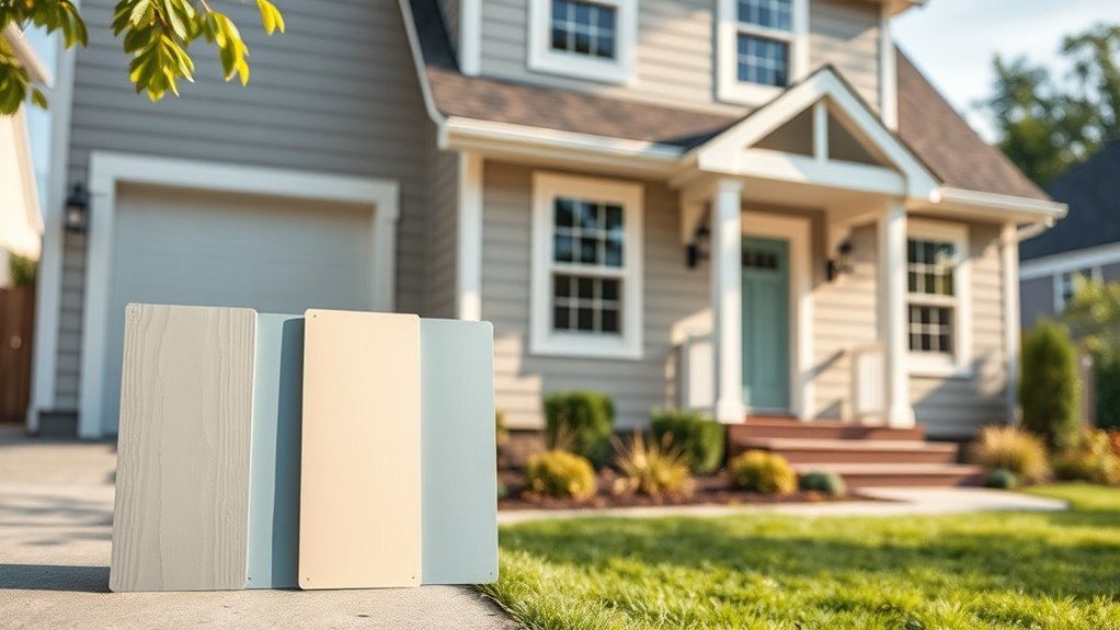
How to Sample and Test Colors on Your House
Although choosing colors online gives you ideas, you’ll need real samples to see how paint looks on your house in different light. Test large swatches on varied exposures, observe morning-to-evening shifts, and note how Color psychology affects mood in each spot. Include substrate prep to gauge paint durability and adhesion. Wear a neutral outfit so colors read true.
- Paint three-foot squares on siding and trim
- View samples from the street and up close
- Test after rain and on sunny days
- Keep swatches for a week before deciding
Trust what you see, not just swatches in a store.
How Finish (Sheen) Changes Color Appearance
When you pick a sheen, it changes how the color looks because glossier finishes reflect more light and can make hues appear brighter.
Lower-sheen paints absorb light and often read richer or deeper on siding and trim.
Also remember that surface texture interacts with finish—rough surfaces break up reflectance while smooth ones amplify it.
Sheen Affects Perceived Color
If you’ve ever compared the same paint color in flat and semi-gloss, you’ve seen how sheen changes perception. You’ll notice finish shifts depth, vibrancy, and mood, so choose based on exposure and color psychology as well as paint durability. Consider these effects before committing:
- Flat hides imperfections and mutes brightness, softening emotional impact.
- Eggshell warms colors subtly, balancing sheen and subtle reflection.
- Satin adds slight glow, making hues feel livelier without harsh shine.
- Semi-gloss amps contrast and highlights details, increasing perceived saturation and crispness.
Test samples on your exterior to confirm the effect in varied viewing conditions.
Light Reflectance Changes Tone
Sheen doesn’t just change shine—it alters how much light a surface reflects, and that shifts perceived tone. You’ll notice high-sheen finishes bounce more light, making colors read brighter and cooler, while matte sheens absorb light, deepening warmth and subtle undertones.
When you pick a finish, consider color psychology: glossy surfaces feel energetic and modern; flatter sheens feel calm and grounded. You’ll also weigh practical concerns—higher sheen usually boosts paint durability and cleans easier, which matters for trim and high-traffic areas.
Test samples in real light at different times to confirm how sheen changes the color you’ll live with.
Texture Interaction With Finish
Because surface texture scatters and catches light differently, the same finish can make a color read as warmer, cooler, lighter, or deeper depending on whether the wall is smooth, rough, or textured.
You’ll notice satin sheens smooth light, making colors feel richer on flat surfaces, while matte hides imperfections and softens hue.
Consider texture contrast between trim and siding to control perception, and balance desired look with finish durability for exterior wear.
Test swatches on actual surfaces.
Tips:
- Use gloss on trim for crisp lines
- Choose matte for stucco to soften color
- Satin for longevity on wood
- Sample in varied light
Balance Trends vs Timeless Color Choices
When you’re choosing exterior paint, weigh current trends against timeless palettes so your home looks fresh now and still feels right years from now. You’ll want to contemplate color psychology—how hues affect mood and perceived size—while balancing that with practical paint durability for weather and maintenance.
Use trends as accents: swap a bold door or trim more often than siding. Pick a classic main color that complements your architecture and neighborhood, then add trendy touches that are easy to repaint.
That approach protects resale, simplifies upkeep, and keeps your home feeling both current and enduring.
Color Combinations That Boost Curb Appeal and Value
If you want your home to stand out for the right reasons, choose color combinations that highlight architectural features, harmonize with the streetscape, and appeal to buyers. Pick a dominant neutral, an accent trim, and a front-door pop that uses color psychology to evoke warmth or sophistication. Prioritize paint durability for long-term value.
Consider these combos and tips:
- Soft gray body, crisp white trim, navy door — classic contrast.
- Warm beige, deep brown trim, teal door — cozy, grounded.
- Pale blue, cream trim, red door — coastal charm.
- Charcoal, black trim, bright yellow door — modern, high-impact.
Common Color Mistakes and How to Avoid Them
Those color combos and guidelines will get you far, but even good palettes can falter if you make common mistakes. You’ll want to test swatches in different light and seasons so color psychology works as intended—what felt calm indoors might read cold outside.
Avoid tiny sample patches; paint larger boards and view them from the street. Don’t ignore trim contrast: too little flattens details, too much overwhelms.
Consider climate and material to protect paint durability—bright whites can show dirt, darks absorb heat.
Finally, get feedback from neighbors or a pro to catch issues before you commit.
Budgeting for Color: Paint Quality, Labor, Longevity
Because color choices affect more than aesthetics, you should factor paint quality, labor, and longevity into your budget from the start. You’ll balance initial cost against long-term value: premium paint boosts paint durability and resists fading, while correct prep and skilled labor extend life.
Factor cost, quality, and skilled prep upfront—premium paint and proper labor extend lifespan and value.
Consider color psychology only for choices that fit maintenance realities; darker colors may retain heat, lighter shades hide dirt differently.
Budget line items:
- Quality paint: lifespan and coverage
- Surface preparation: repairs and primer
- Labor: hourly rates and efficiency
- Maintenance: touch-ups and repaint cycle
Plan for decades, not just the season.
Hire a Pro or DIY? Color-Selection and Painter Tips
Decide whether to hire a pro based on your project’s size, safety needs, and how much time you have—larger jobs or high work on ladders usually mean call a pro.
If you’re doing it yourself, test swatches on different walls and view them at various times of day to see true color and undertones.
Also, pick quality primer and paint that suit your siding and climate so your colors look right and last longer.
When To Hire
If you’re weighing whether to hire a pro or tackle exterior painting yourself, consider the scope, your time, and your comfort with ladders and prep work.
You should hire a pro when projects involve complex trim, multiple stories, or historic homes where historical significance and cultural influences demand accuracy. Pros handle permits, lead-safe practices, and color-matching for preservation.
Hire if you lack time, proper tools, or patience for prep and cleanup.
Consider DIY for small, single-story, low-risk jobs.
- Multi-story or tall work
- Historic or preservation projects
- Tight deadlines or limited time
- Lack of proper equipment
DIY Color Tips
When you’re choosing exterior paint, balance personal taste with practical factors like climate, neighborhood context, and maintenance needs; that way your color looks great and holds up over time.
If you DIY, test swatches in sunlight and twilight to see true tones and consider color psychology—warm hues feel welcoming, cool tones read modern.
Pick quality primers and topcoats for paint durability, and prep thoroughly: scrape, sand, caulk, wash.
Work in manageable sections, use proper brushes and rollers, and follow manufacturer dry times.
If the job feels overwhelming or complex, hire a pro to guarantee even coverage and longevity.
Final Checklist Before You Commit to a Color
Before you commit to a color, run a quick final checklist: view samples on different walls and in various light, check trim and roof compatibility, test a full-size swatch on the exterior, consider neighborhood context and resale impact, and confirm the finish and product specs match your climate and maintenance plans.
You’ll want to balance color psychology and paint durability so your choice feels right and lasts. Check these points before buying:
- Observe swatch at morning, noon, and dusk.
- Confirm trim, roof, and accent colors coordinate.
- Review product specs for UV and moisture resistance.
- Imagine curb appeal for resale.
Real-World Examples: Color Picks by House Type
Because each house style has distinct lines, materials, and neighborhood expectations, you’ll get the best results by matching color strategies to those characteristics.
For Victorian homes, use historical palettes—muted jewel tones with contrasting trim—to highlight ornamentation.
Craftsman bungalows benefit from earthy greens, warm browns, and natural wood stains that honor artisanal details.
Colonial and Georgian styles suit classic neutrals and deep blues that respect symmetry.
Modern homes take monochromatic schemes or bold accents to emphasize geometry.
In regions with strong cultural influences, adapt local hues and textures so your choice feels authentic and cohesive within the streetscape.
Frequently Asked Questions
Will Exterior Paint Color Affect My Home’s Energy Efficiency?
Yes — your exterior paint affects energy efficiency: lighter colors boost sun reflection, reducing cooling loads, while darker hues absorb heat. Color psychology also matters for perceived comfort, so choose shades that balance thermal performance and visual appeal.
Can I Use the Same Color for Siding and Detached Garage?
Yes — you can use the same color for siding and a detached garage; coincidence often makes unified palettes feel intentional, and by prioritizing color coordination and design consistency you’ll create a cohesive, polished exterior that ties structures together.
How Long Does Exterior Paint Color Stay True Before Fading?
Expect exterior paint color fading to become noticeable in about 5–10 years; how fast depends on paint durability, UV exposure, climate, and maintenance. You’ll prolong true color with high-quality pigments, proper prep, and regular cleaning.
Are There Eco-Friendly Exterior Paint Options With Vibrant Colors?
Yes, you can choose bold hues, you can choose gentle tones: you’ll find vibrant eco-friendly options using natural pigments and eco friendly finishes that perform well, reduce VOCs, and hold color while protecting your siding.
Can I Change Exterior Color While Renting or Under a Lease?
Yes — you can, but you’ll need landlord permission and to follow lease restrictions; you’ll want to guarantee color compatibility with neighborhood or building rules. You’ll also agree on restoration terms and document approvals in writing.
Conclusion
You’re about to transform your home — and studies show exterior color can boost perceived value by up to 7%, so your choice really matters. Start with your goal, respect your home’s style and neighborhood, and consider roof, brick, and trim before committing. Test samples in different light, factor in quality paint and labor, and decide pro vs. DIY. Do a final checklist, then pick the color that feels right and watch your curb appeal lift.