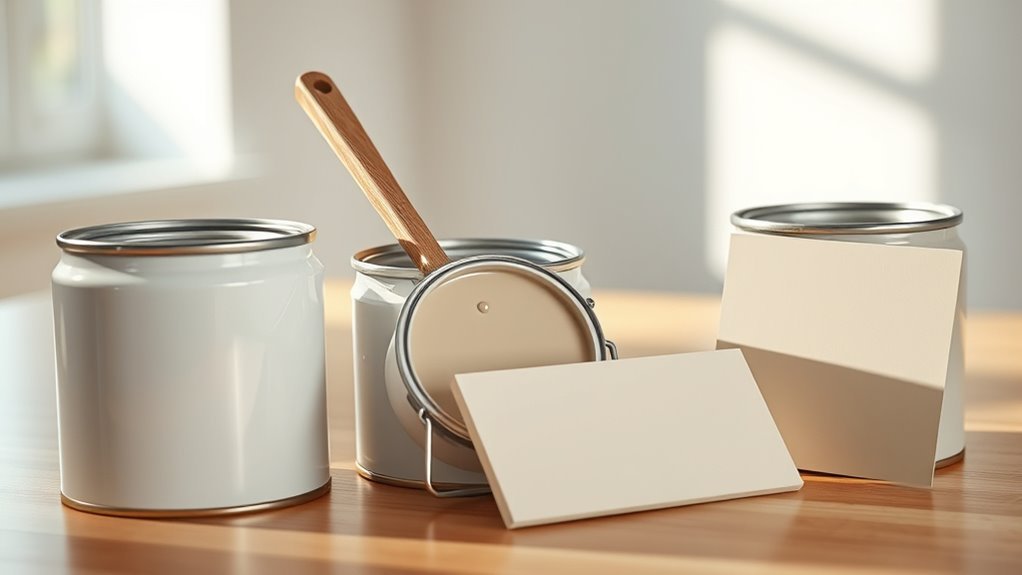
Does Paint Lighten as It Dries
Yes — paint usually lightens as it dries because solvents evaporate and the binder forms a clear film, changing how light scatters and reflects off pigments. You’ll see wet paint look darker and glossier; over days the color settles, sheen drops, and the true hue becomes steadier. Factors like pigment load, texture, primer, humidity, and lighting affect the shift, so test a dry patch for accuracy—keep going to learn what influences the final result.
Short Answer: Does Paint Lighten As It Dries?
Yes—many paints do lighten as they dry, and you’ll usually notice the shift within minutes to a few hours. You’ll see wet gloss soften and pigments settle, affecting color consistency across the surface.
If you’re testing a swatch, wait for full cure before final judgment; wet samples mislead. Oil and latex behave differently, so always check manufacturer notes.
Don’t rely on scent to judge doneness—paint smell fades before full color settles, so odor’s disappearance isn’t a color cue.
For reliable matching, dry samples under normal room conditions and compare in the light where the paint will live.
When and Why Paint Can Look Lighter
After you’ve watched wet paint settle, you’ll notice it often lightens as it dries for a few straightforward reasons. You see moisture evaporate, gloss levels drop, and microscopic surface texture changes scatter light differently, making color appear paler.
Lighting and viewing angle amplify this effect, so check samples in the room at different times. Sheen choice affects perception and long-term paint durability, so pick formulations that resist premature fading.
Also consider color psychology: lighter tones feel airier and can change mood as they settle. Test small areas first to confirm the final look before committing to a full coat.
How Paint Chemistry Changes While Drying
As paint dries you’ll notice chemical shifts that change its appearance: solvent evaporation concentrates pigments and alters light scattering.
The binder particles fuse into a clear film that locks pigment placement and refractive index.
Those combined effects — less solvent, tighter pigment packing, and binder film formation — are what make the color look lighter.
Pigment Concentration Changes
While paint’s surface may look the same, the concentration of pigment changes considerably as it dries, and that alters both color and opacity. You’ll notice color saturation often appears diminished because solvent and water evaporate, leaving pigments more densely packed in thinner visual layers.
Light scattering shifts, so highlights and midtones read differently even when pigment amount is constant. As pigments settle, your perceived gloss level can change too, affecting sheen and depth.
You should expect subtle shifts: lighter-looking areas where pigment thins, and richer pockets where it concentrates. Monitor application thickness to control final appearance precisely.
Binder Film Formation
How does the paint actually hold together once the solvents leave? You’re left with pigment particles embedded in a continuous binder film that forms as polymer particles coalesce and fuse. That film gives mechanical strength, adhesion, and affects color stability by controlling pigment dispersion and light interaction.
Crosslinking and curing reactions lock the matrix, so you’ll see long-term hue shifts tied to binder chemistry.
Primer influence matters: a compatible primer promotes even film formation and consistent drying, while mismatch can cause blush, poor adhesion, or altered sheen that changes perceived color.
Understanding binders helps predict final appearance and durability.
Solvent Evaporation Effects
Because solvents leave the film at different rates and in different micro-environments, the chemistry of paint changes markedly during drying. You’ll notice pigments shift as solvent loss alters refractive index and binder packing, producing the perceived lightening or deepening of color.
Volatile components fleeing early can leave matte patches, while slower solvents let binders coalesce, affecting gloss and hue. These microchemical changes influence color psychology—cooler or warmer tones can emerge as films cure—and they affect paint durability by changing crosslink density and adhesion.
To control outcomes, you should manage solvent blends, evaporation rate, and drying conditions precisely.
Solvent Evaporation vs. Film Formation
As solvents leave the paint, you’ll notice two overlapping but distinct processes: evaporation removes the liquid carrier, and film formation reorganizes the binders into a continuous, durable coating. You’ll see temporary color fading as light scatters from surface wetness, then a stabilized finish sheen as binders cure. Evaporation changes optical path; film formation sets refractive index and clarity. Control humidity and temperature to balance drying speed and film coalescence, avoiding premature dulling or blistering.
| Process | Effect |
|---|---|
| Evaporation | Rapid solvent loss |
| Film formation | Binder coalescence |
| Combined result | Color and sheen shift |
Pigment Concentration and Final Color
When you raise or lower pigment concentration, you directly change the paint’s tint strength, opacity, and how light interacts with the film. Small adjustments can noticeably shift the final color and saturation.
Adjusting pigment concentration alters tint strength, opacity, and light interaction—small changes noticeably shift color and saturation.
You’ll see denser mixes yield richer, more saturated hues and greater hiding power, while diluted blends appear lighter and more translucent once dry.
Consider how color psychology guides choices: stronger pigments can energize a room, paler tones calm it.
Also factor pigment type—natural or synthetic—and opt for eco-friendly pigments when possible to reduce VOCs and environmental impact without sacrificing the desired chroma.
How Binders Affect Wet-to-Dry Shifts
Although binders might seem like the invisible part of paint, they govern a lot of the wet-to-dry changes you’ll notice: they control film formation, gloss, and how pigments settle and refract light as solvent leaves.
You’ll find that heavy binders keep pigments suspended longer, preserving color saturation while the surface evens out. Lighter binders let pigments sink slightly, dulling intensity as drying progresses.
Binders also influence brush texture retention; flexible binders smooth brush marks differently than stiff ones, so the apparent richness and edge definition shift as the film cures. Match binder choice to desired wet-to-dry behavior.
Does Sheen Change Whether Paint Lightens?
Binders shape how pigments sit and reflect light, and sheen adds another layer to that behavior. You’ll notice sheen influence because gloss levels change surface reflectivity: higher sheen bounces more light, which can make a dried color look slightly lighter and boost apparent color saturation.
Matte finishes scatter light, muting highlights and often making the same pigment seem deeper. Sheen won’t alter pigment chemistry, so wet-to-dry shifts stem from binder and solvent behavior.
But your eye interprets sheen-driven reflections as a lightening or darkening effect. Choose sheen deliberately to control perceived color saturation and finish.
Opacity and Hiding Power Explained
How well will a coat of paint cover what’s underneath? You judge opacity by hiding power: pigment volume, particle size, and binder interactions determine whether underlying tones show. Color saturation affects perceived coverage—more saturated pigments can seem denser but may need stronger hiding formulation.
Paint consistency changes application; thicker mixes hide better but may sag or show brush marks. Consider these practical steps:
- Test a sample on the actual surface.
- Note how color saturation changes with additional coats.
- Adjust paint consistency per manufacturer guidance.
- Choose higher hiding formulas for minimal coats.
Measure, test, and adjust to get true opacity.
How Surface Color and Porosity Affect Drying
Because darker or more saturated surfaces absorb and reflect heat and light differently, they can change how paint dries—darker substrates often speed surface drying by warming the paint, while very light or reflective backgrounds can keep the top layer cooler and slow evaporation.
You’ll notice porous materials pull solvent into pores, speeding apparent dryness but risking uneven sheen and color.
Smooth, low-absorption surfaces let the film form more uniformly, while rough surface texture promotes faster surface cure and potential mottling.
Always consider environmental humidity, since high moisture slows drying across substrates and exaggerates differences caused by porosity and color.
Why Primer Matters for Accurate Color
Although you might skip it to save time, primer guarantees the color you expect by creating a uniform base that hides substrate variations and controls absorption. You’ll get truer hues, better coverage, and a consistent paint texture that reflects color psychology more reliably.
Primer ensures true color—creating a uniform base for consistent hues, coverage, and texture you can trust.
Use primer when switching from dark to light or when covering stains. Benefits include:
- Even absorption prevents patchy drying.
- True pigment appearance reduces surprises.
- Improved adhesion extends finish life.
- Smoother texture minimizes sheen inconsistencies.
Skip primer and you risk altered tones, uneven gloss, and a final look that contradicts your design intentions.
How Lighting Alters Wet Paint Appearance
Ever notice your freshly painted wall looking different at dusk than it did under a bright midday lamp? You’ll see wet paint shift as light changes: warm evening bulbs deepen tones, cool daylight reveals undertones.
Gloss and sheen reflect more, making wet areas appear darker or shinier than when dry. Consider color psychology—moods change with intensity and hue, so the same wet stroke can feel cozy or clinical under different fixtures.
If you’re using eco-friendly paints, remember they may have lower VOCs and slightly different sheens that interact with light uniquely. Check samples at various times before committing.
Indoor vs. Outdoor Drying Differences
Want your paint to dry predictably? Indoor and outdoor settings change color saturation and drying speed, so you’ll want to account for visible shifts.
Indoors, light is controlled and films often appear richer. Outdoors, sunlight and airflow can mute or intensify tones as solvents leave. Consider these practical contrasts:
- Indoor: stable light, slower drying speed, deeper apparent saturation.
- Outdoor: variable light, faster drying speed, potential for temporary glare.
- Indoor: reduced dust but limited ventilation—affects finish development.
- Outdoor: higher airflow—can cause uneven sheen or faster visible lightening.
Plan placement and inspection accordingly to judge true dry color.
Humidity and Temperature Effects on Color
When humidity rises or temperature drops, paint holds onto solvents longer and dries slower, which keeps colors looking deeper and slightly darker than they’ll be once fully cured. You’ll notice slower evaporation affects sheen and binder behavior, so finish and gloss evolve over days.
To maintain color consistency, control ventilation and aim for manufacturer-recommended temperature ranges during application and curing. Use consistent ambient conditions between test swatches and the final job to avoid surprises.
Be aware that lighting illusions from cooler, dimmer rooms can exaggerate perceived depth; view samples under the same lights you’ll use in the finished space.
When Paint Darkens Instead of Lightening
Sometimes the color looks darker as it dries, and you’ll want to compare the wet vs. dry appearance to see how much change to expect.
Pay attention to undertones that can emerge once solvents evaporate, shifting the hue toward warmer or cooler notes.
Also consider surface absorption—porous or previously stained substrates can pull in pigments and leave a deeper finish than what you saw when the paint was wet.
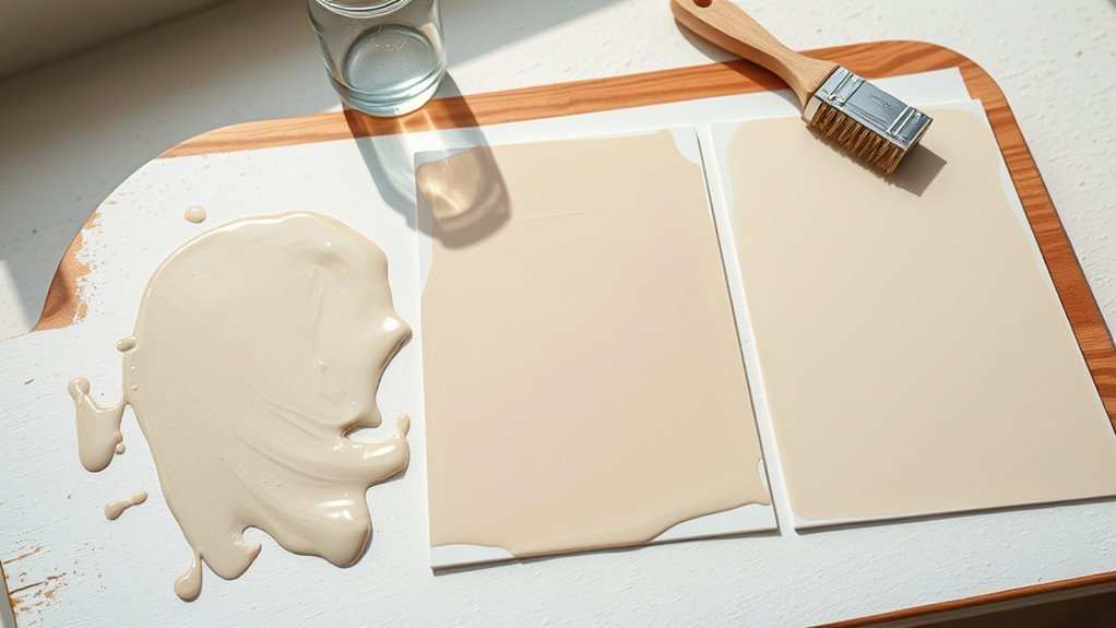
Wet vs. Dry Color
Although you expect paint to dry lighter, some colors actually deepen as the solvent evaporates, and knowing why helps you avoid surprises. You’ll notice differences between wet and dry color because color perception shifts with gloss, thickness, and light.
Wet paint often looks glossier, boosting surface reflection and masking true tone. As it dries, matte finish returns, scattering light and revealing the actual depth.
- Gloss hides depth, so wet looks lighter or richer.
- Pigment concentration appears stronger when solvent leaves.
- Surface texture alters perceived saturation.
- Lighting angle changes apparent value.
Undertone Revelation
Wet-to-dry shifts can reveal hidden undertones that make a color deepen rather than lighten. You’ll notice subtle pigments emerge as solvents evaporate, shifting mood and affecting color psychology—what felt airy wet can feel warmer or muddier dry.
Pay attention to paint texture; thicker brushstrokes can trap deeper pigments, intensifying undertones, while smooth application may mute them. Test swatches, view them at different times of day, and trust your perception rather than a wet sample.
If a drying sample darkens undesirably, try a different sheen, adjust your base, or select a hue with cleaner undertones to match your intent.
Surface Absorption Effects
Why did that fresh, lighter-looking paint turn richer—or even darker—once it dried on your wall? You’re likely facing surface absorption effects: porous substrates suck binder and light-scattering pigments inward, leaving a denser, darker film.
Surface contamination and old finishes can block even absorption, producing uneven tones. Environmental humidity alters drying rate, changing pigment distribution and sheen. Check these factors:
- Substrate porosity drawing binder and pigments inward.
- Residual grease or surface contamination causing uneven absorption.
- High humidity slowing drying, promoting pigment settling.
- Old varnish or chalky layers preventing uniform adhesion.
Prep and priming prevent surprise darkening.
How Multiple Coats Change Appearance
When you add more coats, the paint builds depth and can shift both color and sheen noticeably as it dries. You’ll see increased color saturation because each layer reduces underlying substrate influence and evens pigment distribution during paint drying.
Multiple coats also affect perceived gloss: wet layers reflect differently, and as solvents evaporate you’ll notice sheen stabilizing higher or lower depending on formulation. Thicker film hides imperfections and blends edges, making hue appear richer and more consistent.
To control final appearance, space coats for proper flash time, follow manufacturer recoat intervals, and apply uniform thickness rather than extra heavy single layers.
Brush, Roller, or Spray: Effects on Finish
When you choose a brush, you’ll leave subtle stroke texture that can affect how light and color read as the paint dries.
A roller’s nap changes surface stipple and can trap or reflect highlights differently.
Spraying gives the most uniform pattern, which usually keeps lightening consistent across the finish.
Brush Stroke Texture
Although the application method might seem like a small choice, the tool you pick—brush, roller, or sprayer—shapes the final texture and visual depth of your paint job, so pick deliberately based on the surface and look you want. You’ll notice brush stroke texture creates visible ridges that catch light differently, affecting perceived color and highlighting subtle color fading over time.
Consider how texture links to paint durability and maintenance; rougher strokes can trap dirt, while smoother finishes resist wear. Think about purpose and lighting:
- Thin brush strokes: detailed control
- Thick brush strokes: pronounced texture
- Directional strokes: guided sheen
- Blended strokes: softened appearance
Roller Nap Effects
Curious how the nap on your roller changes the look and behavior of paint? You’ll pick nap length based on surface texture: short naps give smooth, even coverage and reveal true color as it dries, while long naps hold more paint, create subtle texture, and can shift perceived shade slightly.
You should test on a sample area because texture interacts with light, affecting color psychology—soft textures feel cozy, smooth ones feel modern. Also consider paint branding: premium rollers often lay down more uniformly.
Match nap to surface and finish goals to control how drying alters appearance.
Spray Pattern Uniformity
Because how paint is applied controls the final look, you should consider spray pattern uniformity as a core factor when choosing between brush, roller, or sprayer. You’ll notice spray gives even color consistency when the nozzle, pressure, and technique are right.
Poor surface preparation ruins uniformity, causing mottling or streaks. Match method to job size and texture, and test on a scrap.
- Adjust nozzle for fan width.
- Keep consistent distance and speed.
- Overlap passes by 50%.
- Thin coats improve leveling.
Follow these steps and you’ll get a predictable, even finish.
Why Streaks and Lap Marks Form While Drying
When paint dries, you’ll often see streaks and lap marks where wet and partially cured areas overlap, because differing drying rates, uneven thickness, and inconsistent brushing or rolling change how light reflects off the surface.
You’ll notice lap marks where you restart a stroke too late or apply uneven pressure; thicker edges dry slower and trap solvents, even creating lingering paint fumes.
Variations in sheen and micro-texture redirect light, so the same hue looks different across the film.
You can minimize marks by maintaining a wet edge, matching application speed, and using consistent tools—remembering that perceived color links to color psychology.
Predicting Final Color Before Full Cure
When you’re comparing wet vs. dry color, remember the paint usually lightens as solvents evaporate and binders settle.
You can’t rely on the wet sheen to show the final shade, because pigment concentration, film thickness, and lighting will all shift the appearance during curing.
To predict the outcome, test a small patch at the desired thickness and view it under the same light you’ll use once the job is finished.
Wet vs. Dry Color
Even though paint often looks different as it cures, you can learn to predict the final color by understanding how sheen, binder, and solvent interact while the film dries.
You’ll notice wet surfaces show deeper color saturation and higher paint gloss because solvents create a temporary refractive index. As solvents evaporate, binders consolidate and reflect light differently, revealing the dry hue.
To estimate final appearance, consider these quick checks:
- Observe gloss change from wet to tacky.
- Smell intensity hints solvent loss.
- Compare adjacent wet strokes for consistency.
- Test a small, fully dried patch before committing.
Factors Affecting Shade
Beyond the wet-to-dry cues, several concrete factors will determine the final shade before a coating fully cures. You’ll watch solvent release, binder absorption, and pigment settling change tones. Lighting, substrate color, and layers alter perception; color psychology affects how you emotionally read that shift. Paint texture and sheen shift highlights, making surfaces look lighter or deeper. Temperature and humidity speed or stall chemical cure, so plan trials. Use small samples under real light. The table below captures how factors feel as much as they act:
| Factor | Effect | Feeling |
|---|---|---|
| Light | Brightens | Hope |
| Texture | Diffuses | Calm |
| Substrate | Tints | Surprise |
| Cure | Stabilizes | Relief |
Best Ways to Test Color at Home
If you want to know how a paint will actually look in your space, test it under real conditions before committing; small samples and simple techniques will save you time and money. You’ll learn how lighting, adjacent colors, and Color psychology affect perception.
Try these quick checks to be confident, especially with Eco friendly paints:
Try simple, real-world tests—move painted samples around at different times to see true color, especially with eco paints.
- Paint a 12×12″ board and move it around the room at different times.
- Observe samples in morning, midday, and evening light.
- Compare against trim and furnishings to spot undertones.
- View from typical standing and seated positions for final judgment.
Using Sample Pots Effectively
When you use sample pots, check them under the same lighting conditions you’ll have in the room to see how the color shifts.
Don’t trust one thin coat—apply multiple coats and let each dry to observe the true lightening.
That way you’ll know whether the shade works before you commit to a full can.
Test Lighting Conditions
Because paint shifts under different lights, you’ll want to test sample pots in the same conditions where the final project will live. You’ll see how color psychology reacts to morning sun, cool LEDs, or lamplight.
Place samples on the wall, observe at different times, and note how environmental lighting changes perception.
- View samples near primary light sources.
- Compare under natural morning and evening light.
- Check with the room’s artificial bulbs.
- Observe adjacent surfaces and shadows.
Record impressions and photos. That disciplined testing prevents surprises and helps you pick the shade that truly fits the space.
Apply Multiple Coats
Once you’ve settled on a contender, plan to apply at least two coats from your sample pots so you can see the true depth and finish of the color.
Apply the first coat thinly and let it dry fully; you’ll note how paint texture highlights imperfections. Lightly sand between coats if needed, then apply the second coat matching your desired brush strokes to mimic the final technique.
Test in several spots and view from different angles and times of day. Two coats reveal sheen, opacity, and how the color settles into texture, so you’ll avoid surprises when you paint the full room.
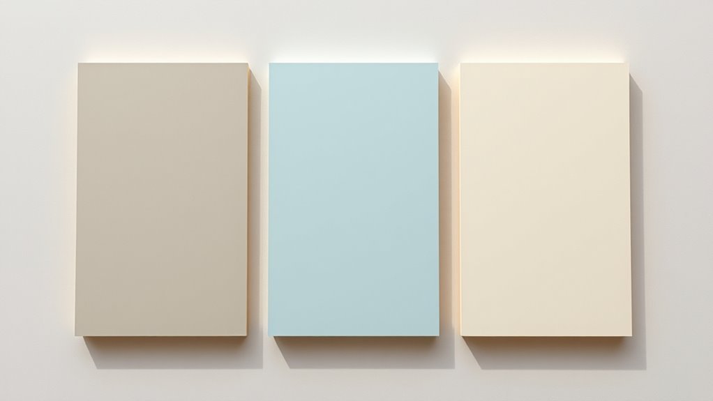
Paint Chips vs. Painted Samples: Which to Trust?
If you want an accurate sense of how a color will look in your room, don’t rely on paint chips alone—painted samples give you the real-world effect of finish, light, and texture. You’ll see true color saturation and how brush techniques or roller marks influence depth. Chips flatten perception; samples show wet-to-dry shifts and interaction with your lighting.
Test larger swatches on different walls and observe at various times. Consider these steps:
- Paint a 12×12″ sample.
- Try both brush and roller.
- Evaluate in morning and evening.
- Note wet vs. dry differences before deciding.
Choosing Sheen for Consistent Color
How will sheen affect the way your color reads across a room? Sheen changes light reflection, altering perceived depth and mood, so pick finishes that support your color psychology goals: matte softens and calms, satin adds warmth, and gloss enlivens.
Use consistent sheen across large surfaces to avoid patchy highlights that confuse the eye. If you’re using eco-friendly paints, verify the manufacturer’s sheen consistency—low-VOC formulas can vary in finish.
Test small panels under the room’s lighting, viewing from different angles and distances. That quick check ensures uniform appearance and preserves the emotional impact you aim.
Compensating for Underlying Wall Colors
If you’re working over a bare wall versus a primed surface, expect different amounts of color shift as the paint dries and plan accordingly.
Consider tinting your primer or topcoat to counteract strong undertones so the final shade reads true.
Always try test swatches in several spots and let them dry fully before committing.
Primer vs Bare Wall
When you’re trying to lighten a paint color over a dark or vivid wall, priming first usually gives you the most predictable result. You’ll see truer hues with primer, avoid extra coats, and control undertones that affect color psychology in a room.
Going bare can work for mild shifts, but risks patchiness and more waste. Consider environmental impact: fewer coats mean less VOCs and less paint discarded. Decide based on surface and contrast.
- Primer: consistent base
- Bare wall: economical if similar tone
- Coverage: primer reduces coats needed
- Waste: primer often lowers overall material use
How Tinting Helps
Rather than relying solely on primer or repainting multiple coats, tinting your paint lets you neutralize stubborn undertones from the existing wall so the new color reads accurately. You’ll add small amounts of pigment to shift base paint toward your target, preventing unexpected warmth, coolness, or greenish casts.
That control helps guarantee color psychology works as designed—calm blues stay calming, energetic yellows don’t muddle. Tinting can also improve coverage, letting you use fewer coats and enhancing paint durability by reducing the need for abrasive recoats.
Choose a professional tint for precise adjustment and match the room’s lighting before committing.
Test Swatches First
Before you commit to a full paint job, apply several test swatches over the existing wall to see how the new color interacts with underlying tones and room light. You’ll notice how color saturation shifts as paint dries and how brush texture affects perceived depth.
Place swatches in sun and shade, near trim, and on both primed and bare sections. Observe over 24–48 hours before deciding.
- Compare wet vs dry saturation.
- Check brush texture visibility.
- Note interactions with underlying pigments.
- Evaluate under different lighting periods.
Test first so your final choice matches real conditions.
Mixing Tints and What to Expect as They Dry
If you mix tints, expect the color to shift as the paint dries because pigments and binders interact differently once solvents evaporate. You’ll notice initial wet tones often appear deeper; as moisture leaves, opacity and sheen change, revealing final hue.
To maintain color consistency, stir thoroughly and test small swatches on the *desired* surface under realistic light. Consider pigment stability: some organic dyes fade or alter more than inorganic pigments, so choose mixes with compatible pigments.
Record ratios and drying times so you can reproduce results. Patience and testing prevent surprises and help you predict the finished appearance reliably.
Additives and Extenders: Color Impacts
When you change pigment concentration you’ll see saturation and value shift as the paint dries, since less pigment means less light absorption.
Adding extenders can alter opacity and cause apparent lightening as the binder film thins and scattering increases.
Certain additives chemically or physically increase scattering or thin the pigment load, so you’ll want to test how they lighten a specific formula.
Pigment Concentration Effects
Because pigment concentration directly controls opacity and hue strength, small changes in pigment load or the addition of extenders and additives can noticeably shift a paint’s apparent color as it dries. You’ll notice that reducing pigment weakens hue, while increasing it deepens tone; maintain color consistency by measuring loads.
Surface absorption matters—porous substrates draw binders, altering perceived saturation. Manage variables to predict drying shifts. Consider these effects:
- Pigment load: stronger color, less light scattering.
- Binder ratio: affects gloss and saturation.
- Extenders: dilute chroma without changing hue.
- Application thickness: changes opacity and drying appearance.
Extender Opacity Shifts
Shifting pigment concentration affects hue and saturation, but additives like extenders change how light interacts with a dried film by altering opacity rather than color chemistry. You’ll notice extenders can mute intensity and improve color consistency across a surface while also affecting paint longevity by changing film thickness and light scattering. Choose extenders to balance coverage and texture without expecting chemical color shifts.
| Extender Type | Effect |
|---|---|
| Whiting | Increases opacity, lowers gloss |
| Silica | Reduces sheen, improves durability |
| Calcium carbonate | Thins color strength |
| Polymer extender | Enhances cohesion, boosts longevity |
Additive Lightening Mechanisms
If you add extenders or other additives to paint, they’ll lighten its appearance not by changing pigments but by altering how light scatters and reflects from the dried film. You’ll notice reduced color saturation as microscopic particles increase diffuse scattering, and changes in surface gloss shift specular highlights.
Consider how specific additives behave:
- Extenders dilute pigment packing, boosting scatter and perceived lightness.
- Matting agents lower surface gloss, softening contrast and brightening tone.
- Fillers with high refractive index can unexpectedly deepen hues.
- Flow modifiers alter film uniformity, subtly affecting saturation and sheen.
Choose additives based on your visual goal.
Manufacturer Notes and Jargon to Watch For
When you check labels and data sheets, manufacturers often slip in terms and caveats that directly affect how a paint will lighten as it dries—so you’ll want to know what to look for. Watch for notes on sheen, pigment volume concentration, and binder type; these influence final tone and gloss.
Look for warnings about flash time, recoat windows, and recommended application techniques—they change film thickness and drying behavior. Claims like “self-leveling” or “high-build” affect paint texture and can mask true color until fully cured.
Also note substrate prep and ambient conditions the manufacturer tested for accurate expectations.
True Color” and “Color Hold”: Labeling Tips
While labels often tout phrases like “True Color” or “Color Hold,” you should read the fine print to know what those claims actually mean in practice. You’ll want to check how manufacturers define those terms, since lighting, sheen, and surface prep affect results. Look for specifics about VOCs, paint odors, and recommended drying time.
Labels like “True Color” or “Color Hold” are marketing — read the fine print and test first for real-world results.
Consider these label cues:
- Definition of “True Color” under laboratory conditions
- “Color Hold” guarantees and surface limitations
- Required drying time before topcoats or evaluation
- Notes on ventilation, odors, and cleanup
Use labels as guides, not promises; test first.
Troubleshooting Uneven Drying or Shifts
Watch for color shifts as paint dries and note any areas where sheen or tone looks uneven.
If you see lighter or duller patches, you’ll want to check drying conditions, application thickness, and substrate differences.
Addressing those factors quickly helps you correct finish inconsistencies before they set.
Color Shifts During Drying
Because paint can change noticeably as it dries, you’ll want to know why colors shift and how to spot uneven drying early. You’ll notice shifts from wet-to-dry due to color perception changes and pigment stability as binders cure. Watch for mottling, flashing, or patchy tone.
- Check lighting — different angles reveal drying differences.
- Monitor humidity and temperature — they affect drying speed.
- Test on a sample board to see final hue before committing.
- Use consistent application and compatible primers to reduce shifts.
Act quickly if you see uneven areas so corrections blend with the final color.
Uneven Sheen And Tone
If your finish looks patchy or some areas have a duller or glossier appearance, it’s usually a sign of uneven sheen or tone caused by inconsistent drying or application. You’ll want to check for improper thinning, roller marks, or varied porosity—these cause light to reflect unevenly and alter perceived color, which ties into color psychology and how a room feels.
Fix by feathering edges, using consistent tools, and applying uniform coats at recommended thickness. Control temperature and humidity for proper cure.
For long-term paint preservation, avoid harsh cleaners and touch up with the original batch to maintain uniform sheen and tone.
Fixing Color Mismatch After Paint Dries
When paint dries and the color doesn’t match, you’ll want to assess the cause before repainting: check sheen differences, underlying stains, and whether the paint actually mixed correctly.
You can fix mismatches by addressing root issues and using proper techniques for color consistency and paint blending.
Steps to follow:
- Clean and primer-seal stained areas.
- Feather edges with the same sheen to avoid hard lines.
- Stir and test the original batch; tint if needed.
- Apply thin, even coats and compare under the desired lighting.
If mismatch persists, repaint the whole surface with a single mixed batch for uniformity.
When Lightening or Fading Signals a Problem
You’ve fixed obvious mismatches, but fading or unexpected lightening is a different warning sign that calls for investigation. If paint fades too quickly or changes unevenly, you should inspect surface prep, exposure to sunlight, and product compatibility.
Look for chalking, solvent evaporation, or poor adhesion—these can signal formula breakdown or contamination. Consider paint safety: strong odors or visible degradation might mean volatile compounds are present, so ventilate and use PPE.
Also assess environmental impact; improper disposal or stripping can harm ecosystems. If problems persist, consult the manufacturer or a professional to identify causes and choose a safer, more durable solution.
How Long Until Paint Reaches Its Final Color?
Although drying times vary with formulation and conditions, paint usually takes several days to reach its true appearance, and you should expect subtle shifts over that period. You’ll notice color saturation deepen as solvents evaporate and binders set, and full paint durability develops more slowly than surface dryness.
Factors that influence timing include humidity, temperature, coat thickness, and pigment load.
Monitor progress like this:
- Thin seals: 24–48 hours for surface dry.
- Normal coats: 3–7 days for stable color.
- Heavy or dark coats: 7–14 days for true hue.
- Full durability: up to 30 days for final cure.
Dry-to-Touch vs. Full Cure: What Changes
When paint is dry to the touch you’ll often think it’s finished, but the surface can still change as solvents evaporate and binders cure.
Expect a subtle color shift and slight lightening during the cure, with the final finish often appearing smoother and less glossy than the wet film.
Keep handling and evaluating the piece until it’s fully cured to judge the true color and sheen.
Dry-To-Touch Appearance
Because the surface feels dry long before the paint has fully cured, it’s important to know what that early appearance really means: dry-to-touch just indicates the top layer no longer transfers to your finger, not that the film has reached full hardness, chemical resistance, or maximum color and sheen.
You’ll notice factors like paint texture and drying temperature affect that feel.
Consider these staged realities:
- Surface feels dry but beneath layers remain soft.
- You can handle gently, but abrasion risk is high.
- Solvent or moisture may still migrate, altering sheen later.
- Full mechanical cure can take days to weeks.
Color Shift During Cure
That dry-to-touch feel can fool you about how the paint will look once it’s fully cured: as solvents evaporate and the film finishes forming, color and sheen often change noticeably.
You’ll see subtler shifts after initial drying as binding agents continue crosslinking; pigments settle and refract light differently, altering perceived hue.
Paint texture plays a role—thicker, uneven layers hold solvents longer, delaying final color.
Drying temperature affects reaction speed and gloss development, so cool or humid conditions prolong shifts.
Expect the cured color to stabilize over days or weeks; test samples and control application thickness to predict the outcome.
Final Finish Vs. Wet
Although the surface may feel dry to the touch, the paint’s appearance and performance keep evolving until it reaches full cure. You’ll notice wet paint often looks glossier and slightly darker; as solvents evaporate and binders crosslink, color consistency stabilizes. Full cure reduces sensitivity to handling, improves hardness, and reveals true sheen.
Surface absorption during application affects final tone—porous areas may lighten more as they draw binder in. Consider these stages:
- Wet: deep, uniform sheen
- Dry-to-touch: surface solvents gone, interior curing continues
- Tack-free: minimal transfer risk
- Full cure: true color consistency and ideal durability
Special Tips for Dark and Deep Hues
When you’re working with dark or deep hues, keep in mind they dry differently than lighter tones and need extra attention to avoid streaks, patchiness, and uneven sheen. You’ll prep thoroughly: clean, sand, prime with tinted primer, and thin only as recommended to maintain coverage.
Apply consistent, full wet edges and use quality brushes or rollers to reduce lap marks. Mind lighting and color psychology—deep tones absorb light and read richer as they cure.
Keep extra paint for touch-ups; label leftovers and consider paint recycling programs for true color matches rather than mixing unknowns that shift when dry.
Special Tips for Pale and Pastel Hues
Because pale and pastel paints show every imperfection and shift in tone as they dry, you’ll need slightly different prep and application techniques than with darker colors. You’ll plan for subtle Color psychology effects and account for environmental factors during drying.
Pale and pastel paints demand meticulous prep and controlled drying to reveal true, subtle hues and psychological effects.
Follow these concise steps to get even, true hues:
- Prime with tinted primer to reduce tint shifts.
- Sand and fill thoroughly; thin layers reveal flaws.
- Apply at consistent temperature and humidity to stabilize tone.
- Use multiple thin coats, let each cure fully before next.
These practices help you achieve clean, predictable pastel results without surprises.
How Exterior Exposure Alters Color Over Time
If you expose painted surfaces to sun, rain, and fluctuating temperatures, pigments will fade, binders will break down, and finishes can chalk or yellow over time. You’ll notice uneven aging where Color consistency suffers: UV hits, moisture cycles, and Surface absorption differences change hue and sheen. You should expect gradual lightening, spotting, or patchy wear depending on exposure and substrate. Regular maintenance, UV-resistant topcoats, and priming porous materials reduce disparity. Track trouble spots and match coatings by testing small areas. Use the table to compare typical outcomes and interventions.
| Exposure | Effect | Fix |
|---|---|---|
| UV | Fading | UV topcoat |
| Rain | Chalk | Recoat |
| Temp swing | Cracking | Flexible paint |
Painters’ Rules for Predicting Final Color
When you watch paint dry, remember wet versus dry can look noticeably different, so don’t judge the final shade too soon.
You’ll also see sheen affect perception—gloss makes colors read darker and more saturated than flat finishes.
Finally, note that tint and base interact: a stronger tint or different base can shift the dried color more than you expect.
Wet Versus Dry
As paint dries it often looks lighter and less glossy than it does wet, so you’ll need to learn a few simple rules to predict the final color accurately. You’ll watch color saturation drop as solvent leaves, and you’ll check texture consistency because surface variations change perceived hue.
Use these practical cues to judge wet samples:
- Compare a small dried swatch to the wet brushstroke.
- View samples under the room’s usual light, not studio lights.
- Note thinner coats will appear lighter than thicker ones.
- Expect pigments to settle slightly during curing, mellowing the wet intensity.
Follow these and you’ll avoid surprises.
Sheen And Perception
Because gloss catches more light and satin hides it, sheen can dramatically shift how a color reads on your walls, so you’ll want to factor finish into every sample test. You’ll notice high gloss amplifies highlights and makes warm Color temperature pop, while matte tames reflections and can mute hues. Consider paint branding—some lines add optical brighteners that change perception. Test the same formula in different sheens under your room’s light.
| Sheen | Effect | Tip |
|---|---|---|
| Gloss | Brighter | Use sparingly |
| Satin | Balanced | Good for trim |
| Matte | Subdued | Hides flaws |
Tint And Base
How will the base and tint recipe change the color you see? You’ll notice that base choice and tint strength shift drying appearance: a deep base holds pigments differently than a light base, and concentrated tint can mute or brighten as it cures. Consider these rules to predict outcome:
- Dark bases deepen wet color; expect subtle lightening.
- Light bases reflect more, yielding apparent brighter dries.
- Strong tint saturation may reveal undertones with time.
- Low-VOC formulations influence both Color psychology and environmental impact, altering perception and performance.
Use sample panels to confirm final hue before committing.
Tools and Apps That Simulate Wet-to-Dry Color
When you want a quick, reliable preview of how a paint will shift as it dries, several apps and digital tools can simulate that wet-to-dry changeover with surprising accuracy. You can test hues, factor in color psychology, and anticipate how finish and paint durability affect appearance. Use swatch comparisons, lighting toggles, and before/after sliders to judge choices before buying.
| Tool | Feature |
|---|---|
| App A | Wet-to-dry slider |
| App B | Lighting presets |
| App C | Finish simulation |
| App D | Palette export |
Compare results to test samples; rely on both app previews and small physical patches.
Cost-Saving Strategies to Avoid Repainting
If you want to skip a full repaint and save money, focus on preventing common causes of failure and revitalizing what’s already there: clean surfaces, spot-prime bare or stained areas, repair small cracks and nail pops, and choose touch-up-ready paint finishes.
You’ll extend life by addressing adhesion, moisture, and UV exposure that cause color fading and reduce pigment stability. Targeted steps let you avoid full coats:
- Clean and degloss trouble spots.
- Spot-prime stains and bare drywall.
- Patch cracks, sand, and smooth edges.
- Use compatible touch-up paint and maintain humidity control.
These actions preserve appearance and defer repainting.
When to Call a Pro for Color Matching
If your room has complex lighting that shifts color throughout the day, you’ll want a pro’s eye to predict how a match will read under those conditions.
For large or highly visible repairs, a professional can blend and feather so the patch disappears rather than stands out.
Call a color-matching specialist when the stakes are high or the lighting is tricky.
Complex Lighting Conditions
Because mixed or unusual lighting can radically change how paint reads on your walls, you should consider calling a pro when natural, artificial, and directional lights combine to create shifting hues that are hard to predict.
You’ll want expertise if variables like paint texture and color fading interact with light to mask undertones. A pro assesses conditions and recommends samples under real lighting.
Consider these focused reasons:
- Identify undertones under multiple light sources.
- Recommend finishes to minimize glare and highlight texture.
- Test swatches at different times of day.
- Match pigments to prevent perceived shifting hues.
Large Or Visible Repairs
When should you call a pro for color matching on large or highly visible repairs? If the area is prominent or spans several feet, hire a professional. You’ll avoid patchy blends, mismatched sheens, and uneven gloss that amateurs often miss.
Pros assess color fading from sunlight and paint oxidation, blend old and new layers, and adjust formulas to compensate for surface aging. They use tools and controlled lighting to match undertones and finish.
Call a pro when repair size, viewer distance, or critical aesthetics demand perfection — especially on exterior walls, trim, or heritage interiors where visible mistakes are costly.
Quick Pre-Paint Checklist to Avoid Surprises
Before you open a can of paint, run a quick checklist to catch hidden issues like peeling, moisture, or uneven patches that will ruin your finish; this saves time and money and keeps the job from turning into a weekend disaster.
You’ll also think about Color psychology and whether Eco friendly pigments match the room’s purpose. Inspect surfaces, test patches, and confirm tools and ventilation.
Follow this checklist:
- Remove loose paint, sand, and fill imperfections.
- Check for moisture, mold, and structural damage.
- Prime where needed and test a small swatch.
- Confirm materials, tools, and safety gear are ready.
Myths About Paint Lightening: Debunked
Although lightening paint can seem as simple as adding white or thinning it out, several persistent myths trip up DIYers and pros alike. You might hear that all paints lighten identically as they dry, that thinning won’t change pigment strength, or that mixing small amounts of white won’t shift undertones.
In reality, formulation, binder type, and pigments matter. Historical paint recipes tell you older formulas behaved differently, and modern additives alter drying appearance.
Don’t assume cultural color symbolism predicts fading. Test samples, note sheen changes, and adjust mixes rather than relying on folklore to reach the color you want.
Key Takeaways: Ensure Accurate Final Color
You’ve seen how myths and formulation quirks can mislead color expectations, so focus on a few practical rules to guarantee the shade you want. You’ll control final color by testing, environmental awareness, and mindful product choices. Consider how color psychology affects mood and light perception in the space. Don’t rely on leftover cans without checking batch codes—paint recycling can introduce unexpected tints. Follow these steps:
- Test large swatches on different walls and observe at various times.
- Use the same batch and finish for consistency.
- Note lighting types and room orientation.
- Allow full cure before final judgment.
Frequently Asked Questions
Will Drying Affect Paint Color on Metal Surfaces Differently?
Yes — you’ll see differences: metal surface oxidation can alter pigment appearance, and paint adhesion issues on corroded areas change sheen and color uniformity, so drying on metal often affects final color and consistency.
Can Paint Sheen Change Due to UV Exposure Over Months?
Yes — you’ll see sheen variation over months: UV degradation breaks binders, fades pigments, and alters surface oils; you’ll notice dulling on exposed areas, gloss loss on sunny faces, and uneven finishes where protection varies.
Do Paint Fumes Make Colors Seem Different Temporarily?
Yes — paint fumes can temporarily alter color perception; you’ll notice paint odor affecting how colors look until it dissipates, since strong smells and solvent vapors can change contrast and hue appearance briefly.
How Do Primer-Paint Compatibility Issues Alter Final Color?
In a kitchen repaint where oil primer met latex paint, you’ll see poor Color consistency and weakened Primer adhesion alter final color. You’ll get uneven sheen, patchy tone, and possible peeling unless you match systems or use a bonding primer.
Can Textured Finishes Hide Wet-To-Dry Color Shifts?
Yes — you can use texture masking to minimize wet-to-dry color shifts; textured finishes hide minor changes while maintaining finish consistency, but heavier textures might alter sheen and make final color appear slightly different across lighting.
Conclusion
Yes, paint often looks lighter as it dries — but not always. You’ll see changes because solvents evaporate, sheen shifts, and pigment concentration or binder clarity alters how light reflects. Want the color you pictured? Test a swatch, wait for full cure, and compare under your room’s lighting before committing. If colors still surprise you, call a pro for matching advice. Stay patient and proactive to get the finish you imagined.