What Color Should I Paint the Exterior of My Home?
Start by deciding if you need a touch-up, refresh, or full repaint based on damage and fading, then match colors to your home’s architectural style and neighborhood rules so your choice feels authentic and sells curb appeal. Consider how sun, climate, and siding undertones shift hues through the day, build a three-color palette (field, trim, accent) for clear contrast, pick a durable sheen for the climate, and weigh pro versus DIY costs — keep going to learn practical next steps.
Decide: Touch-Up, Refresh, or Full Repaint
Wondering whether your house needs a touch-up, a refresh, or a full repaint? You’ll inspect damage, fading, and peeling first: small chips call for touch-ups, widespread chalking suggests a refresh, and extensive blistering or mismatched patches means a full repaint.
Think about how color psychology affects curb appeal—subtle shifts can alter mood without full overhaul. Match effort to goals: preserve, modernize, or transform.
Consider timing with seasonal trends—schedule painting in mild, dry months for best adhesion and color accuracy. Budget, future maintenance, and desired impact will guide the practical choice you make.
Evaluate Your Home’s Architectural Style for Paint Color
When you evaluate your home’s architectural style, you’ll align paint choices with proportions, details, and historical context so the color enhances rather than clashes.
First, identify your style—Victorian, Craftsman, Colonial, Modern—and note defining elements like trim width, roofline, and decorative features.
Begin by pinpointing your home’s style—Victorian, Craftsman, Colonial, Modern—and note key elements like trim, roofline, and ornamentation.
Use architectural harmony to select palettes that respect original materials and emphasize focal points.
Let style influences guide contrasts: high contrast for ornate styles, subtle variations for minimalist designs.
Test samples on different elevations and lighting.
Aim for cohesion between siding, trim, and accents so the finished scheme feels intentional and true to the home’s character.
Use Neighborhood and HOA Rules to Narrow Options
Check your HOA’s paint palette first, since approved color lists can immediately rule out many options.
Also consider the prevailing architectural styles in your neighborhood so your choice complements nearby homes.
Balancing those guidelines will help you narrow colors that both please you and pass muster.
HOA Paint Palette Limits
Because your neighborhood’s homeowner association sets the rules, you should start by reviewing the HOA paint palette and any related guidelines before you pick colors.
Check color restrictions and community guidelines to guarantee your choice meets aesthetic standards and avoids rejected hues.
Focus on paint consistency across trims and accents, understand allowed color variations, and factor in resident preferences that influence approved options.
Submit samples for design approval when required, and document maintenance requirements tied to certain finishes or hues.
Neighborhood Architectural Styles
If your HOA already narrows the palette, let the neighborhood’s architectural style guide how you apply those colors so your home fits rather than clashes. You’ll consider historic influences and cultural trends, balance local preferences with seasonal changes, and respect community standards to achieve architectural harmony. Use design evolution as permission to modernize subtly while preserving neighborhood identity. Compare styles and treatments below to decide texture, trim, and accent placement for coherent curb appeal.
| Style | Recommended Approach |
|---|---|
| Victorian | Layered trims, muted contrasts |
| Craftsman | Natural tones, strong accents |
| Modern | Monochrome palettes, bold focal color |
How Climate and Sunlight Change Paint Color
Where your house sits in relation to the sun will change how colors look over the day and season, so you’ll want to view samples at different times.
Strong sunlight and UV exposure can make bright pigments fade faster, while humid or salty climates speed wear and chalking.
Factor in local climate and sun exposure when choosing finishes and maintenance schedules.
Sun Exposure Effects
When your home bakes in strong sunlight or sits mostly in shade, the same paint can look and wear very differently; sunlight fades pigments, magnifies undertones, and accelerates surface breakdown.
You’ll assess sunlight intensity and UV exposure across seasonal changes to choose hues that keep desired color psychology and mood year-round. Warm color temperature under harsh sun can read brighter, cool tones deepen in shade.
Consider light reflection off nearby surfaces and prevailing weather conditions that affect paint longevity. Pick high-quality, UV-resistant coatings and test samples at different times so your final choice holds true in real light.
Climate-Driven Fading
Sun and climate don’t just alter how a hue looks from hour to hour—they change the pigment itself over seasons and years. You’ll notice faster fading where sun, heat, humidity, or salt combine—this climate impact shortens paint longevity. Choose UV-resistant pigments and lighter tones for intense sun; pick mildew-resistant formulas for humid zones. Regular maintenance restores color and extends life.
| Climate | Risk | Tip |
|---|---|---|
| Sunny | UV fade | UV-resistant |
| Humid | Mildew | Biocide |
| Coastal | Salt corrosion | High-grade |
| Cold | Cracking | Flexible |
| Variable | Uneven fade | Inspect yearly |
Create a Palette That Flatters Your Siding
Because your siding sets the stage for everything else, pick a palette that complements its tone and texture rather than competing with it. Assess undertones—warm brick, cool gray, or natural wood—and choose accents that echo those hues.
Use color psychology to decide mood: calming blues for tranquility, energetic corals for curb appeal. Test samples at different times of day and against trim and roof materials.
Consider seasonal trends, but prioritize timeless contrasts that suit your home’s architecture. Limit your scheme to three harmonious colors: primary field, trim, and a bold accent for doors or shutters to create cohesive curb appeal.
How Neutral Exterior Colors Age Best

Pick neutrals with classic undertones—think warm taupes or soft greiges—so your home stays stylish as trends shift.
You’ll also want to reflect on how finishes show wear and how easy touch-ups will be, since maintenance affects long-term appearance.
With the right hue and upkeep plan, your exterior will look fresh for years.
Timeless Hue Choices
A stone-gray facade or a warm beige can give your home a calm, lasting presence because neutral tones hide wear, coordinate with many accents, and weather more gracefully than trend-driven colors.
You’ll find neutral palettes and classic shades suit varied styles, letting color psychology favor comfort and resale.
Consider seasonal trends only to tweak accents, not your base. Look to historical influences and regional preferences for context, and respect cultural significance when choosing contrasts.
Balance hues for aesthetic harmony that complements landscaping and architecture.
That restrained approach keeps your exterior feeling intentional and timeless across changing fashions.
Maintenance And Wear
Neutral exterior colors tend to mask dirt, fading, and minor imperfections, so you’ll spend less time and money on upkeep than with vivid hues. When you choose neutrals, you boost color longevity because subtle tones hide wear factors; paint durability and weather resistance matter too.
Plan a maintenance schedule that inspects caulking, trim, and siding annually, adjusting for seasonal impact like sun, moisture, or freeze–thaw cycles. Proper surface preparation before painting extends life and reduces repaint frequency.
Exterior upkeep becomes predictable: monitor for chalking, mildew, and flaking, address issues promptly, and pick quality coatings for long-term performance.
When Bold or Dark Exterior Paint Colors Work
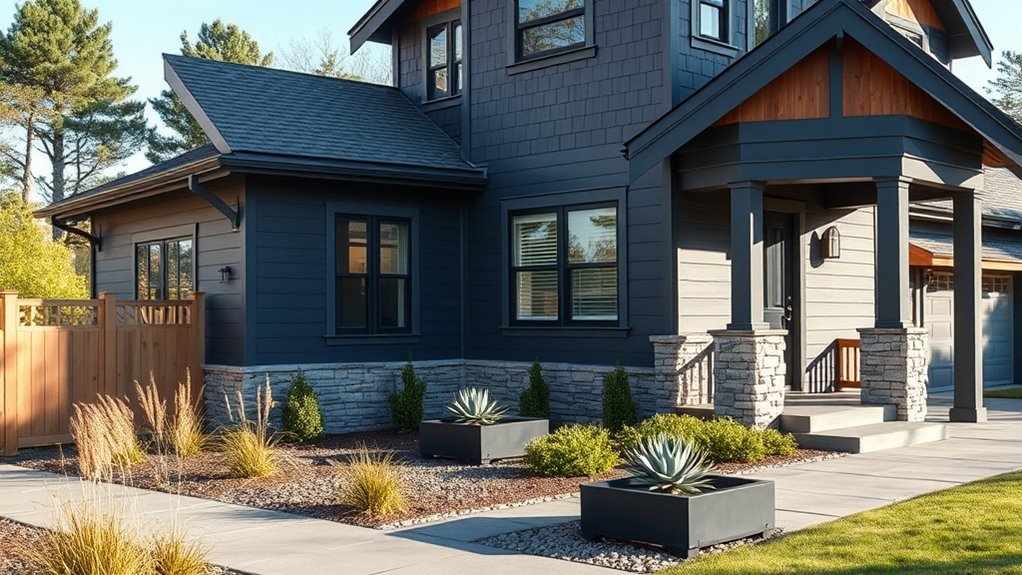
When you choose bold or dark exterior paint, you make a strong design statement that can highlight architectural details and create striking curb appeal.
You’ll want to balance bold color psychology with context and function. Consider scale, exposure, and material to guarantee dark color durability and long-term satisfaction.
Use these guidelines:
- Choose bolds on focal elements (doors, shutters, entryways) to draw the eye without overwhelming.
- Reserve full-dark schemes for homes with ample natural light, generous massing, or dramatic landscaping.
- Test samples in different light, watch for fading, and pick high-quality, weather-resistant finishes for lasting results.
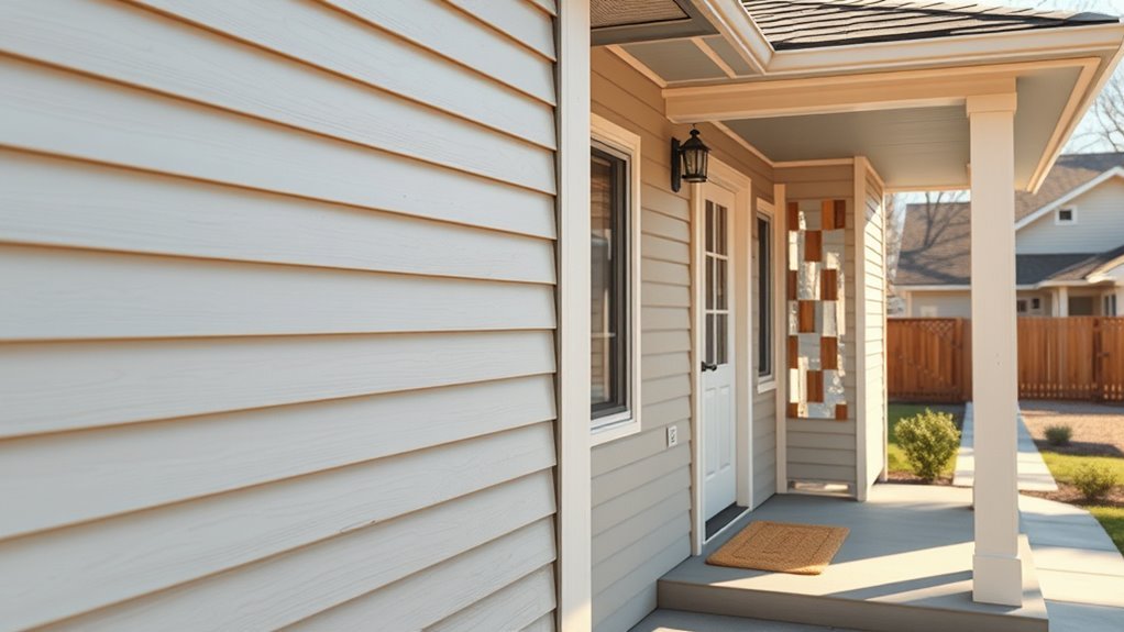
Pick Trim, Fascia, and Soffit Colors That Coordinate
Think of trim, fascia, and soffits as the frame that sharpens your home’s overall look, and pick colors that coordinate without competing. You’ll want neutrals for cohesion, but use color psychology to influence mood—soft whites calm, warm creams welcome. Consider seasonal trends when selecting finishes; matte for understated winter, crisp gloss for sunlit summer. Balance proportions: lighter trim makes facades read larger; darker fascia adds definition.
| Element | Purpose | Typical Choice |
|---|---|---|
| Trim | Defines edges | Soft white |
| Fascia | Caps roofline | Deep neutral |
| Soffit | Under-eave surface | Pale complement |
Choose an Accent Color for Doors and Shutters
Looking for a way to make your entry and shutters pop? Pick an accent that complements siding and trim, using door color psychology to convey warmth, boldness, or calm.
Consider shutter style trends to match historic or modern vibes. Balance contrast so accents attract attention without overpowering.
- Choose a mood: bright for energy, deep for sophistication, muted for subtlety.
- Coordinate with hardware and landscaping for seamless curb appeal.
- Test finishes—gloss for drama, satin for durability, matte for understated chic.
Keep proportions in mind: small accents carry bolder hues, large areas benefit from restraint.
Test Paint Swatches on Your Home in Real Light
Put several paint swatches on different sides of your house so you can see how they look in varying light.
Check them at peak sun to notice true color and any shifts from glare.
Also view the swatches at night under porch and street lighting to make sure the tones work after dark.
Test Swatches In Different Light
Because paint looks different under varying conditions, you should test swatches on your actual siding and watch them through the day.
Place multiple samples where they’ll sit permanently so swatch placement mirrors real exposure. Do a direct color comparison to nearby trim, roof, and landscaping.
- Morning: note cool tones and shadows on north-facing areas.
- Midday: check hue shifts where sunlight hits directly.
- Evening: observe warm glows and muted saturation as light wanes.
Record observations and photos at each time. You’ll spot undertones and contrast that single-swatch viewing misses, helping you choose confidently.
Observe Colors At Peak Sun
After checking swatches through the day, focus on peak sun to see how strong, direct light alters hue and sheen on your siding.
Stand back and up close; sunlight can wash out muted tones or make subtle undertones pop, changing your color perception.
Note glare on glossy finishes and shadow contrast on textured surfaces.
Photograph swatches at midday from different angles to compare with evening views you’ve already taken.
Repeat on several days to account for seasonal changes in sun angle and intensity.
Use these observations to rule out shades that look great in shade but fail under full, bright sun.
Evaluate Swatches At Night
How does your chosen color read under porch lights and streetlamps? You’ll want to do a nighttime evaluation: paint three large swatches on the façade, then check how swatch lighting changes hue and value after sunset.
Move around the yard and view from the street, porch, and driveway. Notice glare, shadowed contrast, and whether the color warms or cools under artificial light.
Use these steps:
- Paint test swatches at least 2×2 feet and let them dry.
- Assess under all exterior fixtures and passing car headlights.
- Record impressions and photos to compare with daytime views.
How Undertones Shift on Wood, Brick, and Siding
When you test paint on different materials, you’ll quickly see the same color read very differently on wood, brick, and siding; each surface has its own texture, porosity, and base tone that pulls undertones forward or mutes them. You should note wood undertones often warm with grain, brick undertones lean earthy and deepen, siding undertones can read cooler or flatter. Consider color perception, temperature effects, natural light, color harmony, and material compatibility when choosing samples. Test in sun and shade.
| Material | Typical Shift | Tip |
|---|---|---|
| Wood | Warmer | Try grain-forward samples |
| Brick | Earthier | Test in direct sun |
| Siding | Cooler | View at different angles |
Use Photos and Apps Smartly: Avoid Color Pitfalls
You’ve tested samples on wood, brick, and siding, but photos and apps can make or break your final choice—so use them with care.
Rely on accurate color visualization tools, but verify on-site. Don’t trust one filtered photo; lighting, time of day, and shadows skew tones. Use photo editing sparingly to compare true hues, not create fantasy results.
Follow these steps:
- Shoot multiple photos at different times (morning, noon, evening).
- Load originals into trusted color visualization tools; match chips to real samples.
- Make minor photo editing only to correct exposure, not hue.
Check samples outdoors before committing.
Balance Curb Appeal and Resale With Color Choices
Think about how your color choices fit the neighborhood—keeping harmony helps your home feel like it belongs and can protect resale value.
Start with a neutral base to appeal to more buyers, then add personality with well-placed accent colors on trim, doors, or shutters.
That balance lets you express style without narrowing future market appeal.
Match Neighborhood Character
Choosing a paint palette that fits your neighborhood helps your home look intentional and protects resale value, so start by noting common tones, roof and trim styles, and the overall architectural era around you.
You’ll also want to study neighborhood trends and basic color psychology to pick hues that feel cohesive.
- Observe nearby homes: record dominant palettes, materials, and era details.
- Respect scale: bold colors can work in eclectic areas but will jar in historic districts.
- Test samples at different times of day, and imagine curb appeal for future buyers.
Blend personal taste with context to maximize appeal and value.
Neutral Bases With Accents
When you want curb appeal that’s broadly appealing, start with a neutral base—soft grays, warm beiges, or muted greiges—and add one or two accent colors to highlight doors, shutters, and trim. You’ll balance resale value and personality by choosing neutral color combinations that read cohesive from the street while picking accent color options that punctuate architectural features. Test samples in different light, limit accents to focal points, and keep contrast moderate for broad appeal. Use this quick guide to decide purposefully.
| Element | Recommendation |
|---|---|
| Base | Soft gray or warm beige |
| Trim | Subtle lighter tone |
| Door | Bold but restrained accent |
| Shutters | Coordinated darker hue |
Match Paint to Your Landscaping and Hardscape
Look at your yard as a whole and let the dominant tones of your landscaping and hardscape guide the house color. You’ll achieve landscape integration and hardscape harmony by choosing hues that echo stone, mulch, and foliage.
Consider contrast and cohesion so plants and paths enhance—not compete with—your siding.
- Match undertones: pick warm or cool shades that mirror paving and plant hues.
- Use accent trims to link garden elements to architectural details.
- Test swatches near beds and patios at different times of day to guarantee consistent, pleasing results.
Plan Color for Mixed-Material Exteriors (Brick, Stone, Wood)
Having matched your siding to the yard, turn attention to homes that mix brick, stone, and wood—each material brings its own color story and texture you’ll want to balance.
You should assess undertones first: warm brick pairs with warm wood stains, cool stone prefers muted, cooler paints. Aim for color harmony by choosing a dominant material tone, then select paints that complement rather than compete.
Test swatches near each material in different light. Prioritize material compatibility to protect finishes—use appropriate primers and breathable paints on masonry and stain or paint formulated for wood.
Small adjustments unify the overall look.
Create Contrast and Hierarchy With Three Colors
Three tones—primary, secondary, and accent—give your exterior a clear visual hierarchy and keep the design from feeling flat.
Use color theory to balance proportions: the primary covers most surfaces, the secondary supports details, and the accent pops on doors or trim.
Think about color psychology—warm primaries feel inviting, cool secondaries calm, bright accents energize.
Follow this simple plan:
- Primary: largest area, neutral or dominant hue.
- Secondary: medium surfaces, complementary or analogous tone.
- Accent: small elements, high-contrast or bold color.
Test samples together on the house at different times of day before committing.
Pick the Right Sheen for Weather and Look
Pick a sheen that matches your climate and the surfaces you’ll paint, because finish affects durability, maintenance, and how color reads in different weather.
You’ll choose based on sheen selection and weather considerations: flat hides imperfections and works on stucco or older wood in dry climates, while satin resists mildew and wipes clean—good for humid areas.
Semi-gloss highlights trim, doors, and railings and stands up to rain and abrasion. High-gloss gives maximum durability but shows flaws.
Balance aesthetics and practicality: test samples on north- and south-facing walls, observe them across days, then pick the sheen that endures and flatters.
Budget and Schedule: Pro vs. DIY Exterior Painting
When you’re weighing cost and timing for an exterior paint job, decide early whether you’ll hire pros or tackle it yourself—each choice changes your budget, timeline, and the scope of prep and cleanup.
You’ll want a clear cost comparison and realistic project timeline before committing. Consider skill, safety, and tools; pros speed things but cost more, DIY saves money but takes longer.
Plan for weather, permits, and drying times.
- Pro: faster project timeline, warranty, higher hourly cost.
- DIY: lower direct costs, longer duration, tool rental.
- Hybrid: hire for prep, DIY painting.
Fixes and Troubleshooting When Color Looks Wrong
If the color isn’t reading the way you expected, don’t panic — you can usually fix it without repainting the whole house. Assess lighting, nearby materials, and color perception tricks. Try small adjustments: swap trim, add shade, or tweak saturation. Remember color psychology—mood changes with hue intensity.
| Problem | Quick Fix | Result |
|---|---|---|
| Too bright | Add matte trim | Tones down impact |
| Too cold | Warm accessories | Coziness restored |
| Washed out | Increase saturation | Stronger presence |
Test changes on sample boards, view at different times, and ask others for honest feedback before committing.
Frequently Asked Questions
How Long Does Exterior Paint Typically Last Before Repainting Is Needed?
You’ll usually need to repaint every 5–15 years; paint lifespan depends on quality and environmental factors like sunlight, moisture, and temperature swings. Regular maintenance and proper surface prep will extend durability and delay repainting.
What Paint Brands Offer the Best Durability for My Climate?
Think of paints as armor: you’ll choose Benjamin Moore, Sherwin-Williams, or PPG for weather resistant options and strong color retention. You’ll get durable acrylic or elastomeric formulas that resist fading, peeling, and harsh seasonal wear.
Can I Paint Over Lead-Based Exterior Paint Safely?
Yes — you can, but you shouldn’t do it yourself; lead paint safety requires a professional assessment first. They’ll test, encapsulate or remove hazardous layers, and recommend containment, PPE, and disposal to protect you and your family.
How Do I Prepare and Protect Landscaping During Exterior Painting?
Picture your hostas wearing tiny hard hats—now act: you’ll use plant protection like stakes and screens, drape landscape covering plastic or breathable fabric, water beforehand, prune, and avoid spraying to keep foliage safe and tidy.
Should Gutters and Downspouts Be Painted the Same Color as Trim?
You don’t have to paint gutters and downspouts the same as trim; match gutter color to trim for cohesion or contrast for emphasis, and consider downspout materials—metal, vinyl—since finish and durability affect paint adhesion and longevity.
Conclusion
Deciding on an exterior paint plan — touch-up, refresh, or full repaint — sets the stage for a home you’re proud of. You’ll weigh style, neighborhood rules, climate, and sunlight to pick flattering hues and contrasts, choose the right sheen, and balance budget with timeline. Want your house to feel welcoming from the curb or stand out with confident contrast? Plan fixes ahead so the color you choose looks great for years.