How to Paint a Two Tone Wall for a Stylish Look
You can give any room instant depth by painting a two-tone wall: pick complementary or high-contrast shades, measure and level a clean dividing line, and use low-tack tape sealed with a thin coat of paint for crisp edges. Prep by cleaning, patching, sanding, and priming; cut in with a quality angled brush and roll thin coats, peeling tape while paint’s tacky. Place the color split where it improves proportion, and keep going for pro tips and advanced looks.
Why a Two-Tone Wall Upgrades Your Room
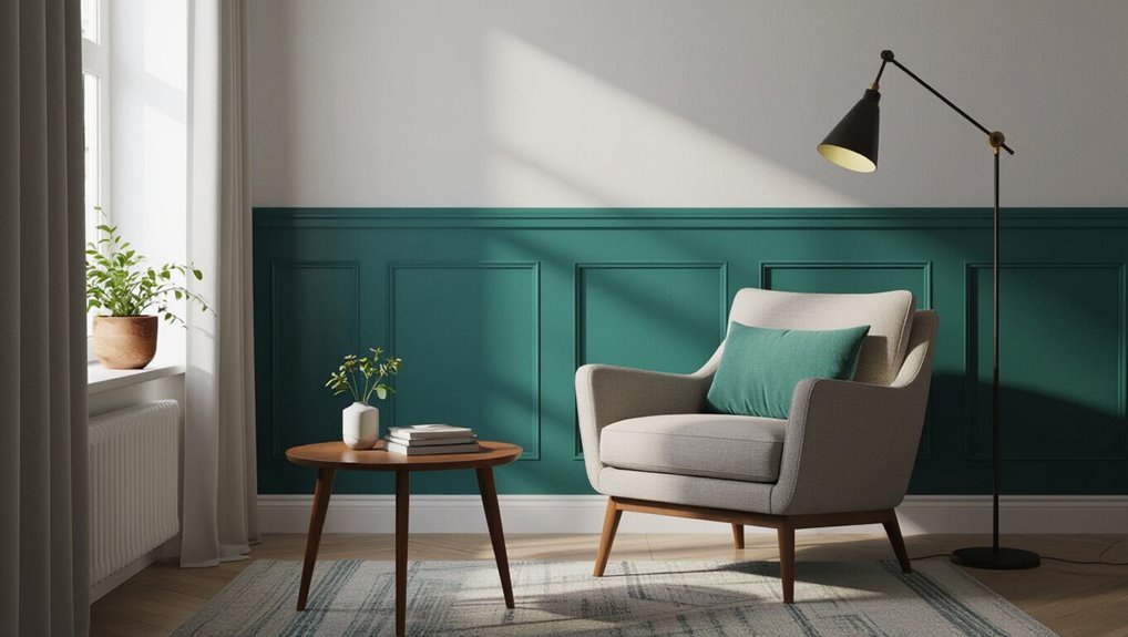
When you split a wall into two colors, you instantly add depth and personality without rearranging furniture or buying new decor.
You’ll harness color psychology to set mood—calming tones below, energizing hues above—and follow current design trends that favor contrast and balance.
A two-tone wall refines proportions, highlights architectural features, and refreshes your space with minimal cost and effort.
Best Rooms for a Two-Tone Wall
You can use a two-tone wall to make your living room feel more dynamic and highlight a focal area like a fireplace or media wall.
In your bedroom, a soft contrasting band or color-blocked lower half can create a calming, intimate ambiance.
Both rooms benefit from scale and finish choices, so pick tones that match the room’s function and light.
Living Room Impact
A two-tone wall can instantly lift your living room’s mood and define its zones, whether you want a cozy conversation nook or a bold focal wall behind the sofa.
You’ll influence living room aesthetics and use color psychology to set energy or calm. Choose complementary shades, balance light and dark, and position the split to highlight seating, artwork, or architectural features for maximum impact.
Bedroom Ambiance
Bedroom walls deserve the same thoughtful treatment as living spaces, so pick two tones that support the mood you want to sleep in.
You’ll create a bedroom retreat by using color psychology to balance calm and warmth. Choose tones that suit your sleep habits and furniture, then test swatches at night.
- soft neutrals + muted blue
- warm beige + dusty rose
- charcoal + cream
- sage + pale gold
Two-Tone Styles: Bold Contrast to Subtle Ombré
Two main approaches dominate two-tone walls: striking contrast and gentle ombré, and each changes a room’s mood instantly. You’ll choose bold combinations for drama or use ombré techniques for softness. Consider placement, sheen, and balance to guide eye flow.
| Style | Effect |
|---|---|
| High contrast | Energetic |
| Ombré | Calm |
| Split | Structured |
| Accent | Focused |
Quick Start: A Simple Step-by-Step Two-Tone Plan
Now that you’ve weighed style and placement choices, let’s get hands-on with a straightforward plan you can follow today.
You’ll prep, choose tones (consider color psychology), test on wall textures, and paint confidently.
Follow this quick checklist:
- Clean and tape edges
- Prime problem spots
- Mark and level the dividing line
- Paint top, then bottom, touching up edges
How to Pick Complementary Two-Tone Color Pairs
Wondering which hues play well together? Use basic color theory and the color wheel to choose pairs: opposites for bold contrast, adjacent shades for harmony, or a muted neutral with a vibrant accent.
Consider undertones, room lighting, and furniture finishes. Test samples on the wall, view them at different times, and commit once the balance feels right for your space.
Choosing Top-and-Bottom Split vs. Vertical or Diagonal
Choosing the split style shapes both the room’s feel and how colors interact, so pick the layout with your space and goals in mind.
You’ll favor top and bottom designs for classic balance, vertical splits to emphasize height, or diagonal for energy.
Consider scale, furniture alignment, focal points, and natural light when choosing.
- Room height
- Furniture layout
- Focal wall
- Light direction
Decide: Bold Contrast or Subtle Tonal Variation
Once you’ve picked a split style, decide whether you want bold contrast or subtle tonal variation—each approach sets a very different mood.
You’ll choose high-contrast pairs for drama and focal impact or close tonal steps for calm cohesion.
Use color psychology to guide emotion, and balance hues for design harmony.
Trust proportions and sampling before committing.
How Lighting Changes How Two Tones Read
Because light can warm, cool, dull, or enliven a color, the same two-tone pair can read dramatically different at various times of day and under different fixtures.
You should test samples and observe lighting effects to judge color perception.
Consider:
- Morning sunlight vs evening glow
- Cool LED vs warm incandescent
- Window placement impact
- Shadows and reflective surfaces
Selecting Paint Finish for a Two-Tone Wall
When you pick finishes for a two-tone wall, think about how sheen affects both color and wear—matte tones hide imperfections and give depth, while satin or eggshell adds subtle sheen and cleans more easily where traffic or fingerprints are a concern.
Choose higher gloss for trim, lower gloss for expanses, and balance paint durability with finish sheen to suit room use and maintenance.
How Much Paint You Need for Each Color
First measure the wall surface for each section so you know the square footage you’ll be painting.
Then calculate how many gallons or liters each color requires based on the paint’s coverage rate and number of coats.
Finally, allocate the paint per color and add a small overage for touch-ups.
Measure Wall Surface
Start by calculating the total square footage of each section you’ll paint so you know how much of each color to buy.
Measure height × width, subtract windows/doors, and note ceilings. Consider paint types and wall textures when estimating coverage. Record results clearly.
- Measure each wall section
- Subtract openings precisely
- Note texture and finish
- Tally totals per section
Allocate Paint Per Color
Now that you’ve got accurate square-footage numbers for each wall section, figure out how much paint you’ll need per color by dividing those totals by the paint’s coverage rate (usually listed on the can). Consider color psychology for focal areas and choose finishes for paint durability. Sketch a quick plan:
| Area | Gallons needed |
|---|---|
| Top | 1.0 |
| Bottom | 1.5 |
Tools and Materials Checklist for a Clean Finish
Gathering the right tools and materials before you tape and paint makes the job cleaner and faster: you’ll need quality painter’s tape, angled brushes for cutting in, a roller and tray with the appropriate nap for your wall texture, drop cloths, a level or laser, a pencil for marking, sandpaper, primer, two coordinated paint colors, and clean rags for touch-ups.
Use this tools checklist and materials checklist to prepare:
- Painter’s tape and angled brush
- Roller, tray, and nap
- Drop cloths and sandpaper
- Primer, paints, rags
Measuring and Marking Your Split Line Like a Pro
With your tools ready and the wall primed, it’s time to mark the split line that will define your two-tone look.
You’ll use simple measuring techniques: measure from a fixed floor or ceiling point, note consistent heights, and transfer marks along the wall.
Choose appropriate marking tools like a pencil or painter’s tape for temporary guides, keeping marks light and easy to correct.
Use a Level, Laser, or Plumb Line for Perfect Alignment
Once you’ve transferred your reference marks, use a level, laser, or plumb line to turn those marks into a perfectly straight guide—each tool gives you a quick, reliable way to check vertical and horizontal alignment so your split line won’t drift as you paint.
You’ll guarantee level alignment and benefit from laser accuracy. Try these quick checks:
- Hold a spirit level along the mark
- Project a laser line across the wall
- Suspend a plumb line from the ceiling
- Recheck at multiple heights before painting
Taping Techniques for Straight, Drip-Free Edges
Painter’s tape is your best friend for crisp, drip-free split lines—apply it firmly along the guide, pressing the edge down with a putty knife or your fingernail to seal it and prevent bleed-through.
Choose tape types for your surface—low-tack for fresh paint, medium for drywall—and use edge techniques like sealing, rolling a thin coat over tape, then peeling while paint’s tacky for clean results.
Preparing the Wall: Cleaning, Patching, Priming
Before you tape and paint, clean the wall thoroughly to remove dust, grease, and cobwebs so paint will adhere evenly.
Patch any holes or cracks with spackle, sand smooth, and wipe away dust for a flawless surface.
Finish by applying primer evenly to seal repairs and create a consistent base for your two-tone colors.
Clean Surface Thoroughly
Start by cleaning the wall thoroughly so paint will adhere evenly and the finish looks professional.
You’ll focus on surface preparation using proper cleaning techniques to remove dust, grease, and mildew before priming. Use a mild detergent or TSP substitute, rinse, and let dry completely.
- Degrease high-traffic areas
- Remove cobwebs and dust
- Treat mildew spots
- Rinse and dry thoroughly
Patch Imperfections Properly
Patch holes and smooth rough spots so your two-tone finish looks crisp and professional. You’ll use proven patching techniques and proper surface preparation: sand edges, apply filler, sand smooth, and dust before painting. Check for adhesive residue or loose texture and remove it.
| Step | Tool | Action |
|---|---|---|
| 1 | Sandpaper | Feather edges |
| 2 | Filler | Fill holes |
| 3 | Brush | Remove dust |
| 4 | Inspect | Confirm smoothness |
Apply Primer Evenly
Once you’ve smoothed and cleaned the wall, apply primer evenly to create a uniform base that helps paint adhere and show true color.
You’ll use proper painting techniques to roll from top to bottom, maintain a wet edge, and respect primer importance for coverage and adhesion.
- Use a nap roller for even texture
- Cut in edges first
- Thin coats prevent drips
- Let primer dry fully
Primer: When to Use It and When to Skip It
Primer matters more often than you might think: use it when you’re covering dark or stained surfaces, switching from oil- to water-based paint, or painting new drywall.
However, you can skip it on clean, lightly tinted walls if you’re applying a high-quality paint with built-in primer.
Choose primer types based on surface and finish, and focus primer application for adhesion and uniform color before your two tone design.
Painting the Base Color Without Ruining the Second
Start by protecting the area for the second color with crisp, high-quality painter’s tape and a continuous drop cloth so you can work confidently on the base without worrying about bleed or splatter.
Use base color techniques that minimize roller splatter and work away from taped edges. Maintain second color protection until fully dry.
Work the base away from taped edges, using thin, controlled roller strokes; keep second-color protection until fully dry.
- Roll toward the tape
- Use thin coats
- Feather edges gently
- Inspect for drips
How to Cut In Crisp Edges Along Taped Lines
How do you get razor-sharp lines without tugging at the tape?
Use steady cutting techniques: load a high-quality angled brush, paint away from the tape with short, controlled strokes, and keep bristles flat for consistent coverage.
Once dry, score the tape edge with a blade for edge precision, then peel slowly at a 45° angle toward the painted area to reveal a crisp line.
Best Rolling Techniques to Avoid Lap Marks
Before you roll, make sure you prep and prime the surface so the paint goes on evenly.
Keep a wet edge as you work and use consistent, light roller pressure to blend each pass without leaving lap marks.
If you notice thicker or thinner areas, rework them immediately while the paint is still wet.
Prep And Prime Surface
1 key to a smooth two-tone finish is proper prep and priming: you’ll clean, sand, and seal the surface so your roller lays down paint evenly and without lap marks.
Focus on surface cleaning and primer application to promote adhesion and uniform coverage.
- Remove dust and grease
- Sand glossy spots
- Patch imperfections
- Apply even primer coat
Maintain A Wet Edge
When you roll, keep a wet edge so each pass blends into the last and you don’t end up with visible lap marks.
Work in manageable sections, overlap strokes while the paint’s still wet, and maintain consistent speed.
Use wet edge techniques to feather joints and guarantee even paint application.
Reload rollers before edges dry so changes stay seamless and uniform.
Use Proper Roller Pressure
Keeping a wet edge helps, but the pressure you apply with the roller determines whether those blended strokes stay smooth or show lap marks. You’ll control roller pressure to spread paint evenly, avoid ridges, and finish with a uniform look.
Use this ideal technique to vary pressure as needed and read the surface to prevent overlap.
- Start light
- Increase slightly on edges
- Maintain steady rhythm
- Feather out shifts
Removing Tape the Right Way for Sharp Lines
Before the paint fully dries, pull the tape off at a 45-degree angle toward the painted area to get the cleanest edge possible.
You’ll keep tape removal steady and slow, preventing paint lift. If paint resists, score the edge with a utility blade.
Work in short sections, maintain edge precision, and inspect for touch-ups immediately so lines stay crisp and professional.
Blending an Ombré or Gradient Two-Tone Wall
Although it takes a bit more patience than a hard line, blending an ombré or gradient two-tone wall lets you create a smooth, professional change between colors that draws the eye and adds depth.
Use ombre techniques and gradient blending to control shifts.
Tips:
- Work wet-to-wet with a wide brush
- Feather edges gently
- Blend in sections
- Step back often to check balance
Painting a Diagonal or Geometric Two-Tone Design
A diagonal or geometric two-tone design gives your room instant energy and crisp visual structure. You can achieve it with careful measuring, sharp lines, and the right tape and tools.
Measure and mark exact angles, use level and pencil guidelines, then apply high-quality painter’s tape for crisp diagonal patterns and clean edges.
Paint geometric shapes in stages, removing tape while paint is tacky.
Creating a Painted Chair-Rail or Faux Molding Split
If you liked the crisp lines of geometric splits, you’ll also appreciate the classic look a painted chair-rail or faux molding provides—it’s a simple way to add architectural interest without installing trim.
You can mimic molding with paint, choose among chair rail styles, and use faux molding techniques for depth.
Consider:
- height placement tips
- paint contrast choices
- edge definitions
- maintenance basics
Trim and Ceiling Choices for a Seamless Two-Tone Look
When you’re planning a two-tone wall, think about how trim and ceiling colors will tie the whole room together so shifts look intentional and clean.
Choose trim styles—simple modern casings or classic crown—to frame the split. Paint trim in crisp white or a coordinating hue.
For ceiling colors, go lighter than the upper wall to open the space or match subtly for cohesion.
Furniture and Decor Tips to Complement a Two-Tone Wall
Place your furniture to highlight the line between the two tones—low pieces can keep the boundary visible while taller items can bridge both colors.
Use pillows, rugs, or art to repeat accents from each tone so the room feels intentional and balanced.
Try keeping larger pieces neutral and use small, coordinated pops of color to tie everything together.
Furniture Placement Strategies
Contrast drives attention, so arrange your furniture to highlight the two-tone split rather than hide it.
You’ll use furniture arrangement to reinforce color balance and create focal points. Place larger pieces against the dominant tone, float seating to showcase the divide, and keep sightlines clear so the split reads intentionally.
- Anchor with a low sofa
- Float a rug at the seam
- Use asymmetrical groupings
- Keep pathways open
Coordinating Color Accents
1 simple rule will help you coordinate accents: pick two to three repeat colors drawn from the wall tones and use them consistently in furniture, rugs, and accessories.
You’ll apply color psychology to set mood—warm for energy, cool for calm—and balance bold pieces with neutrals.
Aim for accent harmony: repeat materials and shapes so the room feels intentional and pulled together.
Quick Fixes for Common Two-Tone Painting Mistakes
Mistakes happen, but you can fix most two-tone painting problems quickly with the right tools and a steady hand; whether you’ve got paint bleed, uneven lines, or stray splatters, this section shows simple, reliable corrections to restore clean, crisp results.
- Use painter’s tape and primer for mistake prevention and crisp edges.
- Scrape and sand dried bleeds gently.
- Recut lines with a cutting tool and small brush.
- Spot-paint stray splatters carefully.
When and How to Touch Up Scuffs and Chips Later
Check your two-tone wall periodically for scuffs and chips so small issues don’t become obvious problems.
Match the original paints exactly and test a swatch before touching up.
When you apply the touch-up, feather the edges into the surrounding finish so the repair blends seamlessly.
Assess Damage Regularly
Because walls get nicked and scuffed over time, you should inspect your two-tone finish every few months and after any rough activity (moving furniture, kids’ play, pets).
Do damage assessment during routine checks to spot chips, peeling, or stains early. Then clean, sand, prime, and touch up small areas promptly.
- Inspect edges and corners
- Note color changes
- Photograph damage
- Schedule quick fixes
Match Paint Precisely
When you’re touching up scuffs or chips, match the original paint exactly so the repair disappears against the two-tone finish; test small areas with leftover paint and compare in natural light.
Use color matching at a store if needed, bring paint samples or a chip from the wall, and apply thin layers.
Let each coat dry fully before deciding if more touch-up is necessary.
Blend And Feather Edges
After you’ve matched the paint and applied thin coats, blend and feather the edges so touch-ups vanish into the two-tone finish.
You’ll use blending techniques and feathering tips to soften shifts; work in small areas, lightly dry-brush, and layer thin glaze to match texture so chips disappear.
- Lightly feather with a dry brush
- Match sheen and texture
- Layer ultra-thin coats
- Inspect in daylight
Cost-Saving Tips Without Sacrificing Finish Quality
Saving money on a two-tone wall doesn’t mean you have to settle for a sloppy finish; by choosing quality mid-priced paint, prepping surfaces properly, and investing in a few reusable tools like a good angled brush and a reliable painter’s tape, you’ll get professional-looking results without overspending.
Use cost effective techniques: patch and sand once, tape carefully, work in sections, and buy budget friendly supplies in bulk.
When to Hire a Pro vs. DIY for Complex Two-Tone Designs
If your two-tone design includes intricate patterns, sharp angles, or specialty finishes, you should hire a pro to guarantee crisp lines and a flawless result.
You can handle simpler stripes or block colors yourself with basic tools and careful taping.
Weigh the time, skill, and potential touch-up costs to decide which route makes sense for you.
When To Hire
When your two-tone design involves intricate patterns, unusual textures, or high ceilings, you’ll likely save time and get cleaner results by hiring a pro.
Weigh cost considerations against design complexity and your skill level, schedule, and risk tolerance before deciding.
- tight timelines
- complex masking
- specialty finishes
- safety concerns
DIY For Simpler Patterns
Even if a pro makes sense for complicated projects, you can handle many two-tone looks yourself—especially simple geometric blocks, horizontal bands, or single accent walls.
Choose simple patterns, quality tape, and proper primer. Use easy techniques: measure, level, and paint in controlled passes.
Tackle straight lines first; practice on scrap board. Hire pros for curves, murals, or large-scale complexity.
Inspiring Two-Tone Examples to Try in Your Home
Try a bold accent wall and a soft neutral above to give your room instant depth and personality without overpowering the space.
Use color psychology and current design trends to choose combos that match mood and function.
Try these ideas to inspire your next project:
- Moody navy lower, pale gray upper
- Warm terracotta base, cream top
- Sage green base, white upper
- Charcoal bottom, blush upper
Frequently Asked Questions
Can I Use Leftover Paint From Different Brands Together Safely?
Yes — you can sometimes mix leftover paints, but you’ll test paint compatibility first. You’ll check brand adhesion, base type (latex vs oil), and do a small patch; if it dries evenly and bonds, it’s safe to use.
How Do Two-Tone Walls Affect Home Resale Value?
A tasteful two-tone can whisper sophistication and boost appeal; you’ll tap color psychology and market trends to attract buyers, but avoid bold contrasts that alienate—neutral, complementary schemes usually help resale across varied tastes.
What Paint VOC Levels Are Best for Indoor Two-Tone Projects?
Choose low-VOC or zero-VOC paints (under 50 g/L, ideally 0 g/L) to prioritize paint safety and indoor air quality; you’ll reduce odors and health risks, and you’ll ventilate well while the finishes cure.
Can Wallpaper Be Combined With a Two-Tone Painted Wall?
Yes — you can combine wallpaper with two-tone paint, but don’t worry about clashing; choose complementary wallpaper patterns and focus on color coordination so the wallpaper becomes a purposeful accent that enhances balance and visual interest in your room.
How Long Should I Wait Between Coats in Humid Climates?
You should wait 24–48 hours between coats in humid climates; humidity effects slow drying time, so you’ll extend intervals, use dehumidifiers or fans, and test touch-dryness before applying the next coat to avoid tackiness and streaks.
Conclusion
You wanted a simple update, and now you’ve voluntarily agreed to debate paint sheen and tape lines like it’s a sport. Good news: your two-tone wall will make that caffeine-fueled effort look intentional. You’ll discover which rooms forgive your rookie brushes and when to call a pro for the optical illusions you can’t unsee. In short, you’ll love the result—until you spot a scuff and feel oddly proud you did it yourself.