Should You Paint Your Walls White or Cream? How to Decide
You should pick white when you want maximum light, a crisp modern neutral, and easy resale appeal; choose cream when you need warmth, a softer traditional feel, and something more forgiving of stains. Check your room’s light, orientation, size, and existing finishes before deciding. Test large paint patches at different times and view them with your furniture. Consider mood, maintenance, and photography effects, and keep testing — below you’ll find practical steps and room-by-room guidance to help finalize your choice.
Quick Answer Should You Paint Your Walls White or Cream?
If you want crisp, modern brightness pick white for kitchens, bathrooms, and compact spaces, and choose cream for cozy living rooms and bedrooms where warmth matters.
Below I’ll give a simple summary table showing when white outperforms cream and vice versa.
Use that quick reference to match color choice to your room type and design goal.
One-sentence recommendation based on common room types and goals
When you want a crisp, modern backdrop that makes small rooms feel brighter, pick white; choose cream when you want a softer, warmer feel for living rooms, bedrooms, or spaces with vintage or wooden furnishings.
If you’re deciding — should I paint my walls white or cream — match white to minimal, high-contrast schemes and cream to cozy, layered decor for immediate, room-appropriate results.
When to choose white vs. when to choose cream (summary table)
Decision-making gets easier with a quick-reference table that shows at a glance whether white or cream suits your room and goals.
| Room/Goal | Choose White | Choose Cream |
|---|---|---|
| Small, bright rooms | Enhances light, crisp look | Warms without darkening |
| Cozy, traditional spaces | Can feel stark | Adds warmth and softness |
| Modern minimalist | Clean, sharp backdrop | Softens texture and tone |
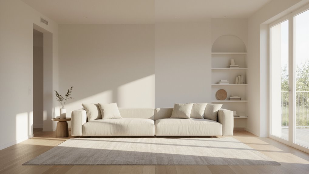
What Are White and Cream Paints? Basic Definitions and Differences
When you talk about “white” paint, you’re looking at high brightness with subtle undertones—cool blue, warm beige, or true neutral—that change how crisp it reads.
“Cream” leans warmer, carrying yellow or ivory undertones that make a space feel softer and more inviting.
Remember that the paint’s formula and sheen (matte vs. satin or gloss) will shift how intense those undertones and the overall color appear on your walls.
What ‘œwhite’ means in paint (undertones, brightness)
If you think white is just one flat, neutral color, you’re not alone—but in paint it’s actually a family of shades defined by undertones and brightness.
You’ll notice cool whites lean blue, green, or gray, while warm whites carry subtle beige or pink hints.
Brightness (value) ranges from crisp, high-reflective whites to softer, muted off‑whites that change with light.
What ‘œcream’ means in paint (warmth, yellow/ivory undertones)
Just as whites carry subtle undertones that shift their feel, creams bring a definite warmth you can see and feel in a room.
When you pick cream, you’re choosing soft yellow or ivory undertones that mellow light, add coziness, and complement wood tones.
Creams read warmer than neutrals, varying from pale buttery to deeper eggshell, so test samples in your actual light.
How paint formulas and sheens affect perceived color
Because paint isn’t just pigment, the formula and sheen you choose will change how a white or cream actually looks on your walls.
Sheen alters light reflection—flat hides imperfections, satin and eggshell boost warmth, gloss intensifies contrast.
Formula matters too: higher binder content deepens tone, pigments and additives shift undertones.
Test samples in your room under real light before committing.
Key Factors to Consider Before Choosing (Quick checklist)
Before you pick white or cream, consider a few quick practical points that affect how the color will read in the room.
Use this checklist to compare light, scale, finishes, and mood:
- Natural light and room orientation
- Room size and ceiling height
- Existing finishes: trim, flooring, cabinetry, furniture and textiles
- Desired mood and function (calming, bright, formal)
Natural light and orientation of the room
If your room gets lots of natural light, white will feel crisp and bright; in dimmer spaces, cream adds warmth and prevents a washed-out look.
Consider orientation: south-facing rooms handle cooler whites, north-facing benefit from warmer creams.
East light suits fresh whites in mornings; west-facing afternoons warm up creams.
Match undertones to daylight to keep color consistent throughout the day.
Room size and ceiling height
When you’re deciding between white and cream, think about how wall color interacts with room size and ceiling height: lighter shades make small rooms feel airier and higher ceilings seem more expansive, while slightly warmer creams can add coziness to large, cavernous spaces without closing them in.
For low ceilings, choose lighter, cool whites; for tall rooms, consider soft creams to warm scale subtly.
Existing finishes: trim, flooring, cabinetry
Think about the finishes already in the room—trim, flooring, and cabinetry—and how they’ll change the way white or cream reads; cool, stark whites can clash with warm wood tones, while creamy hues often blend more naturally with honey or oak finishes.
Match undertones: choose warm creams with yellow or red woods, and cooler whites with gray, bleached, or painted trims for cohesive contrast.
Furniture, textiles, and décor color palette
Consider the colors and textures of your furniture, textiles, and décor before picking white or cream, because they determine whether a wall shade will harmonize or fight with the room.
Match cool, modern fabrics and chrome with crisp white; pair warm woods, brass, or patterned rugs with cream to enhance cohesion.
Test samples near key pieces to confirm undertones.
Mood and function of the space (e.g., calming, bright, formal)
Ambiance shapes how you’ll use a room, so pick white or cream based on the mood and function you want.
Choose crisp white for energizing, modern spaces like kitchens or home offices.
Opt for warm cream to create a soothing, cozy bedroom or formal living room.
Match finish: matte for relaxed, satin for refined.
Consider light levels and activity type.
Undertones and color coordination with adjacent rooms
Because undertones shift how a color reads in different lights, you’ll want to check them against nearby rooms before choosing white or cream.
Walk the home at different times, compare paint swatches against trim, flooring, and furnishings.
Cool vs. warm undertones can clash or flow; pick swatches that harmonize with adjacent spaces to guarantee cohesive changes and consistent mood throughout.
Step-by-Step Process to Decide: Practical Guide
Start by checking the room’s light at different times so you know how colors will read.
Then gather swatches, paint large sample patches on several walls and watch them for 48–72 hours.
Finally, compare those samples to your floors and furniture and use digital tools or a mood board to confirm your choice.
Step 1 Identify the room’s lighting and test windows at different times
1. Walk the room at dawn, midday, and dusk to note natural light direction, intensity, and color temperature.
Observe how shadows and reflections shift, and whether north-facing rooms feel cool or south-facing ones glow warm.
Turn on artificial lights you’ll use and see how bulbs alter undertones.
Take quick photos for comparison before choosing white or cream.
Step 2 Gather and compare paint swatches and sample cards
Gather several paint swatches and sample cards from different brands and finishes so you can compare how whites and creams read side by side in your space.
Lay them near walls, windows, and furniture. Note undertones, reflectivity, and contrast. Consider light at different times.
- Match swatches to trim
- Check undertones
- Compare finishes
- Note fabric and floor interaction
Step 3 Paint large sample patches on multiple walls and observe for 48/72 hours
After you’ve compared swatches and noted undertones and finishes, it’s time to see how the paints behave on your actual walls: apply generous sample patches of each white or cream on different walls, near windows, and beside trim so you can judge them in context.
Watch color shift through daylight and artificial light over 48–72 hours, note undertone changes, and photograph patches at several times for accurate comparison.
Step 4 Compare samples against your major materials (floor, sofa, cabinets)
When you’ve seen how the samples look on the walls, hold each patch up next to your biggest fixed elements—the floor, sofa, and cabinets—to judge how the paint will sit in the room’s overall palette.
Note clashes, undertones, and whether cream softens warm woods or white freshens cool grays.
Walk around, view at different angles, then narrow choices based on harmony and contrast.
Step 5 Use digital tools and mood boards for final validation
Step 5 lets you bring everything together digitally so you can see how white or cream will read across the whole room before committing.
Use room-visualizer apps to apply paint swatches to photos, build a mood board with fabrics, lighting, and finishes, and test variations under different light settings.
Validate your choice, note adjustments, and save comparisons for final confidence.
Room-by-Room Recommendations (White vs Cream)
Think about how each room’s function and light affect whether white or cream will work best.
For living and family rooms, kitchens and dining areas, bedrooms and nurseries, bathrooms, and hallways or entryways, I’ll point out practical pros and cons for both shades.
Use these quick comparisons to match color to mood, maintenance, and natural light.
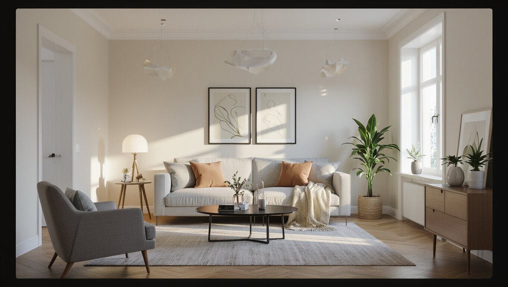
Living room and family room
A few simple choices will set the mood in your living or family room: crisp white brightens and modernizes, while warm cream softens and invites coziness.
Choose white if you want airy, gallery-like spaces that highlight art and clean-lined furniture.
Pick cream to layer textures, warm wood tones, and plush seating for relaxed gatherings.
Balance with trim and lighting.
Kitchen and dining room
When you want a bright, clean backdrop that makes cabinets and countertops pop, white is the go-to; it reflects light, hides splashes in glossy finishes, and gives small kitchens a more open feel.
Meanwhile, cream brings warmth to dining areas, softening stainless steel and wood and creating a cozy mood for meals and conversation.
Use white for prep zones; choose cream to encourage lingering at the table.
Bedroom and nursery
Although bedrooms and nurseries both need calm, you’ll choose white when you want crisp, airy sleep spaces and cream when you want softness and warmth.
For adult bedrooms, white brightens and lets artwork or bedding pop; cream adds cozy intimacy.
In nurseries, white feels clean and modern, while cream soothes and hides scuffs.
Pick based on light, décor, and maintenance needs.
Bathroom
If you want a fresh, spa-like feel, choose white to reflect light and make small bathrooms feel larger; pick cream if you prefer a warmer, more forgiving backdrop that hides water stains and pairs well with brass or wood accents.
White emphasizes clean lines, tile and chrome; cream softens glare, complements natural textures, and masks imperfections—choose based on light, fixture finishes, and maintenance preferences.
Hallways and entryways
Because hallways and entryways set the tone for the whole home, choose white to create a bright, airy welcome that reflects light and showcases architectural details, or pick cream to offer a warm, forgiving backdrop that hides scuffs and complements wood and brass accents.
Use white if you want maximum light and contrast with trim; use cream if you prefer softness and camouflage for high-traffic areas.
Home office and study
When you need focus and clarity for long work sessions, white keeps the room crisp, reflecting light and making colors pop on screens and paper.
Cream softens the glare and creates a calmer, more comfortable backdrop for reading and video calls.
Choose white if you want maximum contrast and alertness; choose cream for warmth, reduced eye strain, and a cozier, less clinical atmosphere.
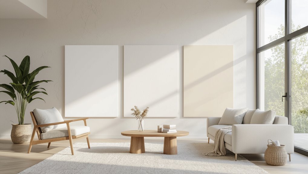
Visual Effects and Design Outcomes
When you choose white, you’ll notice rooms feel more open and suit modern, minimalist schemes.
Cream pulls a space toward warmth and a traditional, cozy mood that complements wood and warm metals.
Think about how trim, ceilings, and accent walls can layer with either shade to balance contrast with stone, metal, and wood tones.
How white impacts perceived space and modern/minimal aesthetics
Space feels bigger in white: the color reflects light, blurs edges, and gives your room a breathable, open quality that trick designers rely on for modern and minimal interiors.
You’ll notice cleaner lines, stronger contrast with furnishings, and a neutral backdrop that highlights shape and texture.
White simplifies visual clutter, amplifies negative space, and keeps focus on form and function.
How cream impacts warmth, traditional/cozy aesthetics
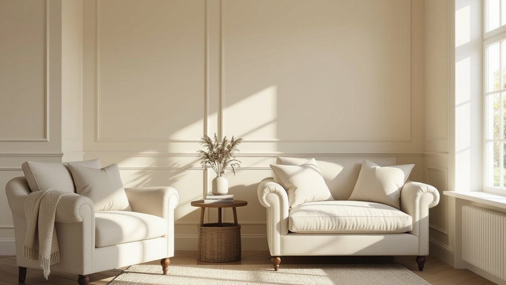
Although it still brightens a room, cream wraps the space in warmth and softness, creating a cozier, more traditional feel than stark white.
You’ll notice rooms feel inviting and lived-in, with colors and patterns settling gently.
Cream lets textiles and antiques read as intentional rather than starkly contrasted, so you can build layered, comforting interiors that encourage relaxation and timeless charm.
Interaction with wood tones, metals, and stone
If you want warmth and cohesion, cream naturally harmonizes with wood tones, metals, and stone by softening contrasts and letting materials feel more integrated.
You’ll notice oak, walnut, and brass gain depth while stone appears warmer. Cream supports mixed materials without competing, so fixtures and furniture read as part of a unified palette.
It’s forgiving with varying undertones and aging finishes.
Layering neutrals: trim, ceiling, and accent walls
When you layer neutrals—choosing paint for trim, ceilings, and accent walls—you control depth, light, and perceived scale.
So small shifts in tone change how a room feels and reads. Use brighter whites on ceilings to lift, slightly warmer creams on trim to frame, and a deeper neutral for an accent wall to anchor space.
Test swatches under real light.
Comparison: White vs Cream (Pros and Cons)
You’ll want to weigh practical issues like maintenance and touch-ups against how each shade shows up in photos and appeals to buyers. Below is a quick at-a-glance comparison to help you decide. Use it to match your priorities—ease of upkeep, market neutrality, or how the color photographs.
| Consideration | White | Cream |
|---|---|---|
| Maintenance & Staining | Shows marks more; easier to touch up with pure white | Hides minor stains better; touch-ups may need color match |
| Resale Appeal | Very neutral and modern for many buyers | Warmth can attract some buyers but may feel dated to others |
| Photographic/Lighting | Reflects light cleanly but can look stark in photos | Photographs warmer, softer under various lighting conditions |
Maintenance, staining, and touch-up considerations
One clear trade-off to weigh is how white and cream handle wear: white shows scuffs and grime more quickly but lets you spot-clean and touch up with exact matches more easily, while cream hides minor stains better but can be harder to match precisely as pigments age.
You’ll clean whites more often; creams tolerate fingerprints and fading, yet demand careful color sampling for repairs.
Resale appeal and market neutrality
Because buyers often picture their own furnishings in a neutral space, choosing white usually feels safer on the market: it reads clean, bright, and universally compatible, making rooms look larger and photos pop.
Meanwhile, cream can add warmth and character but risks feeling dated or too specific for some buyers.
You’ll favor white if you want maximum appeal; choose cream selectively for targeted charm.
Photographic and lighting variability (how they photograph)
How do white and cream behave under different lighting and on camera?
You’ll find white reflects light cleanly, showing cool or warm casts from bulbs and sky, often appearing stark in flash photos.
Cream absorbs subtle warmth, rendering softer tones and forgiving highlights.
For photography, choose white for crisp modern looks and cream for cozy, flattering images—test shots under your actual lighting before deciding.
Common Mistakes to Avoid
Don’t pick a color from a tiny swatch under store lighting—you’ll be surprised how different it looks at home.
Watch undertones and how colors flow into adjacent rooms, and always test large patches in different light rather than trusting digital previews.
Also avoid relying solely on “pure” neutrals; add texture or warmer accents so the space doesn’t feel flat.
Choosing from a small sample under store lighting
Ever wonder why a paint chip that looked perfect in the store reads totally different on your wall?
Stores use bright, even lighting that flattens color.
Don’t rely on a tiny swatch; paint multiple quarter-sheet samples and view them at different times and angles in your room.
Check next to furniture and trim so you see how the hue truly performs.
Ignoring undertones and mismatching adjacent rooms
Because white and cream carry subtle undertones, picking a shade without checking them can make adjoining rooms clash instead of flow.
Walk between rooms at different times, compare swatches against trim and furniture, and note how warm or cool tones read in each space.
Coordinate undertones so shifts feel intentional; don’t assume one neutral will suit every connected room.
Skipping large patch tests and assuming digital previews are accurate
When you rely solely on tiny swatches or on-screen previews, you risk a look that’s flat, wrong, or simply surprising once it’s on your walls—so always test big.
Paint several large patches in different light, check at morning and evening, and live with them for days.
Digital tools help, but they don’t capture sheen, room scale, or real undertones—trust real samples.
Over-relying on ‘œpure’ neutrals without texture or warmth
If you lean too heavily on “pure” whites or creams without adding texture or warm accents, your room can feel cold, flat, or museum-like.
Balance crisp neutrals with textiles, wood tones, layered lighting, and plants to introduce depth and softness.
Mix matte and tactile finishes, warm metals, and area rugs so your space feels inviting rather than clinical.
Best Practices and Expert Tips
When choosing trim and ceiling colors, think about contrast and continuity so moldings anchor the room without competing with the walls.
Use textiles and artwork to temper walls that feel too bright or too warm, and pick a sheen that balances durability with the look you want.
Also adjust lamp temperature and bulbs seasonally to keep whites and creams reading true in changing light.
How to pick complementary trim and ceiling colors
1 simple rule will keep your room looking intentional: let trim and ceiling colors support, not compete with, your walls.
Choose a slightly lighter or cooler trim to frame white or cream without stark contrast.
Paint ceilings a touch lighter than walls to lift the space.
Use semi-gloss trim for durability and soft matte ceilings to minimize reflections.
Test swatches in different light.
Using textiles and art to balance too-bright or too-warm walls
A few well-chosen textiles and pieces of art can quickly tame walls that feel too bright or overly warm, giving you control without repainting.
Layer neutral throws, rugs, and curtains with muted patterns to cool intensity.
Introduce art with cooler undertones or larger dark elements to anchor the room.
Swap metallics and wood tones to fine-tune warmth until balance feels right.
Selecting sheen levels for durability and appearance
Although sheen might seem like a small choice, it changes both how your walls wear and how your color reads, so pick it with purpose.
Choose flat or matte for low-sheen bedrooms and textured walls to hide imperfections.
Use eggshell or satin in living areas for washability without shine.
Reserve semi-gloss or gloss for trims, doors, and high-traffic, moisture-prone spots.
Seasonal and lighting adjustments (lamp color temperature, bulbs)
When daylight fades or seasons shift, you’ll notice the same white or cream paint look warmer or cooler depending on your bulbs and lamp color temperature.
So choose lighting that complements the undertones you want to emphasize. Use warm (2700–3000K) bulbs to cozy creams or cool (4000–5000K) for crisp whites.
Swap bulbs seasonally or add dimmers to fine-tune mood and color perception.
Quick Decision Scenarios (If you want a fast pick)
If you want a bright, modern feel, pick white; if you want a cozy, inviting vibe, pick cream.
Planning to sell soon? Go with white for broad appeal.
For a small room with low light, choose warm white or a soft cream to keep the space feeling open and comfortable.
I want a bright, modern feel pick this
Because you want a bright, modern feel, pick crisp white with cool undertones—it reflects light, sharpens architectural lines, and makes furnishings pop, so rooms look clean and contemporary with minimal effort.
Choose matte or eggshell for subtle sophistication, pair with black or metallic accents, keep trim bright white, and use layered lighting to maintain depth without softening the room’s sharp, airy character.
I want a cozy, inviting feel pick this
Switching from a crisp white to a warmer cream will instantly make your space feel more welcoming and snug.
Choose creams with yellow, peach, or soft beige undertones to deepen warmth. Pair with textured fabrics, wood tones, and layered lighting to enhance coziness.
Cream softens contrasts, hides wear, and complements warm metallics—perfect when you want a comfortable, lived-in atmosphere without gloom.
I’m selling my home soon pick this
When you’re prepping to sell, pick crisp white to maximize perceived space and buyer appeal; it creates a clean, neutral backdrop that helps buyers mentally move in and makes photos pop.
White reads modern and amplifies light, so list shots look brighter. It’s safe for open houses, pairs with any staging style, and lets buyers focus on layout rather than bold color choices.
Small room with low light pick this
If your small room gets little natural light, go with a warm cream—its subtle yellow undertone reflects what light you do have and makes the space feel cozier without shrinking it.
Choose a mid-tone warm cream rather than a pale or stark white. Pair with matte or eggshell finish, soft lighting, and light-reflecting accents to maximize warmth and perceived space.
FAQ
Got questions? You’ll want to know whether white or cream makes a small room feel larger, how to read undertones on samples, and whether mixing the two in adjacent rooms will work.
Also ask about the best trim colors for each and whether white truly reflects more light or saves energy.
Will white or cream make a small room look bigger?
Wondering whether white or cream will make a small room look bigger?
White reflects more light, so it visually expands tight spaces and feels airier.
Cream adds warmth and can still open a room if you pick a pale, low-contrast shade.
Use consistent trim, minimal clutter, and good lighting to maximize the effect regardless of white or cream choice.
How do I know the undertone of a white or cream sample?
How can you tell what undertone a white or cream sample has?
Hold the sample next to pure white paper and natural light; cooler undertones look bluer or grayer, warmer show yellow, pink, or beige.
View at different times of day and against nearby furnishings.
Compare multiple swatches and test a large painted patch on the wall before committing.
Can I mix white and cream in adjacent rooms?
Once you’ve identified undertones and tested swatches, you can decide whether to mix white and cream in adjacent rooms.
Yes — mixing works if you keep undertones consistent and consider light flow. Use one shade for connected spaces and a coordinating shade for the other to create subtle contrast.
Test changes at different times of day to guarantee harmony and avoid abrupt shifts.
What trim color works best with white vs cream?
Pick a trim color that either reinforces or subtly contrasts your wall choice: crisp bright white trim sharpens a cream wall and keeps a modern, clean edge, while a softer off‑white or warm cream trim blends with white walls for a gentler, unified look.
Use high‑gloss for durability and definition, or matte for a softer shift; consider undertones to avoid clashes.
Are there energy or light-reflecting advantages to white over cream?
Curious whether white really makes a room brighter or saves energy? You’ll get slightly higher light reflection from pure white than cream, boosting natural and artificial illumination.
That can reduce need for extra lighting and marginally cut energy use. However, the practical difference is small; finish, sheen, room layout, and bulb choice often matter more than exact wall tint.