How to Make Wall Paint Look Like Watercolor for a Dreamy, Artistic Effect
You can get a dreamy watercolor wall by thinning latex or acrylic paint with glaze or water, then brushing or sponging thin, translucent washes onto a primed, smooth surface. Work wet-on-wet for soft blooms and wet-on-dry for sharper accents, layering and blending each coat as it dries. Use soft brushes, sponges, and a mist bottle to feather edges and lift pigment. Follow proper prep and sealing tips to keep the finish lasting — keep going for full step-by-step guidance.
Quick Answer Achieve a Watercolor Wall Look in Minutes
You can get a soft, watercolor-like finish by diluting latex paint with water and applying it in thin washes with a damp brush or sponge.
This quick technique works best on smooth, primed walls or lightly textured plaster where the washes can blend evenly.
Use it in living rooms, nurseries, or accent walls when you want a subtle, painterly look without a big time investment.
One-sentence summary of the technique
If you want a watercolor wall fast, dilute latex paint with water, apply it in thin washes using a large brush or sponge, and blend while it’s wet to get soft, translucent layers that dry like paint-on-paper.
You’ll learn how to make wall paint look like watercolor by working quickly, layering diluted tones, lifting excess pigment, and letting each misty wash settle before adding subtle depth.
Best situations and surfaces for this effect
A smooth, primed wall in a low-traffic room gives the most reliable watercolor effect, because diluted latex lays down evenly and stays workable long enough for blending.
Choose bedrooms, nurseries, or feature walls; avoid textured surfaces, high-moisture areas, and outdoors. Use drywall, plaster, or well-prepped wood.
Test small sections first, and verify good ventilation and proper lighting to judge color saturation.
What Is a Watercolor Wall Finish and Why Choose It
A watercolor wall finish gives you soft, translucent washes and gentle color blends that mimic paper watercolor paintings, often with subtle gradients and visible brush textures.
You’ll find it more forgiving than crisp faux finishes—it’s great at masking imperfections and creating a relaxed, artistic vibe without rigid patterns.
Use it in bedrooms, nurseries, living rooms, or any space aiming for a dreamy, coastal, or bohemian style.
Definition and visual characteristics
Think of a watercolor wall finish as paint that behaves like liquid pigment on paper—soft, translucent layers that blend and bloom to create depth without heavy texture.
You’ll notice gentle color gradients, visible wash edges, subtle overlaps, and a luminous, airy feel.
It reads as painterly and organic, with irregular shapes and delicate veiling rather than solid, uniform color fields.
Advantages compared to other faux finishes
Moving from how a watercolor finish looks to why you’d pick it, you’ll find practical and aesthetic advantages over other faux techniques.
You get softer, more organic shifts, less labor-intensive layering, and easier corrections. Watercolor finishes read as art rather than texture, so they feel lighter and modern.
They’re versatile, forgiving for DIYers, and blend with varied color schemes without overpowering a room.
Ideal rooms and design styles for a dreamy watercolor look
Because a watercolor wall finish reads as soft, layered color rather than heavy texture, it suits spaces where you want mood and calm without visual clutter.
Use it in bedrooms, nurseries, living rooms, and serene bathrooms. It complements coastal, Scandinavian, modern farmhouse, and soft-boho styles.
Keep furniture simple, textiles tactile, and accents minimal to let the walls set the tranquil tone.
Materials, Tools, and Paint Types You’ll Need
You’ll want to gather the right paints—acrylic or latex thinned with glaze or look for watercolor-wash formulas—plus a selection of brushes, rollers, sponges, sprayers, rags, and palette knives.
Stock up on additives and supplies like glaze medium, retarders, masking tape, and drop cloths to control flow and protect surfaces.
Finally, pick a recommended color palette and try a few sample combinations on boards to see how they blend and layer.
Paint types (acrylic, latex, glaze, watercolor wash formulas)
Choosing the right paint and medium makes the watercolor effect on walls both achievable and durable.
You’ll pick based on dilution, opacity, and longevity: acrylics give vibrant, flexible color; latex thins well for washes and cleans up easily; glazing medium blends with existing paint for translucent layers.
Choose pigments and water ratios to control bleeding and drying time.
- Acrylic
- Latex
- Glaze/wash
Brushes, rollers, sponges, sprayers, rags, and palette knives
Tools make the difference between a muddy wash and a luminous watercolor wall, so pick brushes, rollers, sponges, sprayers, rags, and palette knives that match the effect you want.
You’ll choose soft synthetic rounds for blends, foam rollers for even washes, and varied sponges or rags for texture. Keep a small palette knife for lifting and subtle scraping.
- Brushes
- Rollers & foam
- Sponges, rags, knife
Additives and supplies (glaze medium, retarders, masking, drop cloths)
After you’ve picked brushes and texture tools, grab the additives and supplies that help paint behave like watercolor instead of house paint.
You’ll use glaze medium to thin and add translucency, retarders to slow drying for blending, and basic protection like masking tape and drop cloths.
Pick quality brands and mix small batches to test washes before committing.
- Glaze medium
- Retarder
- Masking + drop cloths
Recommended color palettes and sample combinations
1–3 tested palettes will save you time and keep your washes harmonious: pick one dominant hue, one contrasting accent, and a neutral to ground the composition, then swatch them together at varying translucencies using your glaze medium so you can see how they layer and shift when thinned.
Try: dusty blue + coral + warm gray; sage + ochre + off-white; lavender + slate + beige.
Preparing the Wall Surface Prep and Priming
Before you start painting, inspect the wall for cracks, holes, or uneven texture and patch anything that will show through thin glazes.
Clean and sand the surface so the primer bonds evenly, then apply a suitable primer to control absorption and color.
Finally, tape off trim and protect floors and fixtures so your watercolor effect stays clean and controlled.
Inspecting and repairing the wall (cracks, holes, texture)
While you’re prepping for a watercolor-look wall, take time to inspect every inch for cracks, holes, and uneven texture so the final wash lays down smoothly and looks intentional.
Patch holes with lightweight spackle, press mesh into larger cracks, and feather compound for a flush finish.
Let repairs dry fully, then lightly scrape high ridges so your watercolor effect won’t catch or shadow.
Cleaning, sanding, and priming for even absorption
Once repairs are dry and smooth, clean the wall so paint adheres evenly and your watercolor wash won’t blotch.
Wipe with a mild detergent solution, rinse, and let dry.
Lightly sand repaired or glossy areas for uniform tooth, then remove dust with a tack cloth.
Apply a high-quality, low-sheen primer suited to your wall type to guarantee consistent absorption and true color.
Taping and protecting trim, floors, and fixtures
When you’re ready to paint, protect trim, floors, and fixtures so your watercolor wash stays crisp and the cleanup stays easy.
Use painter’s tape along edges, drop cloths over floors, and plastic sheeting for fixtures. Press tape firmly to prevent bleed. Remove tape while paint is tacky, not fully dry, for clean lines.
- Tape edges tightly
- Cover large areas
- Shield hardware and outlets
Core Method Step-by-Step: How to Paint a Watercolor Effect
Start by mixing your chosen colors and testing them on swatches to get the right translucency.
Then apply a diluted base wash, follow recommended dilution ratios and drying times, and build depth with layered translucent washes using wet-on-wet or wet-on-dry techniques.
Finish by softening edges with brushes or sponges and adding controlled blooms, drips, and organic textures for a natural watercolor look.
Step 1: Mix paints and trial swatches
Gather your palette and mix small batches of each color you’ll use, thinning them with water until they reach the translucent, ink-like consistency of watercolor paint.
Test swatches on poster board, noting pigment strength and drying shift. Label each sample with mix ratios and drying time.
Adjust opacity by adding water or paint, aiming for balanced washes and predictable layering before you commit to the wall.
Step 2: Apply base wash (technique, dilution ratios, drying times)
Lay a soft, even base wash across your wall to set the tone and control subsequent layers. Dilute latex or acrylic paint with 30–50% water for translucence; test on scrap.
Use a large synthetic brush or roller, working quickly in horizontal strokes. Allow 30–60 minutes to dry between coats (longer in humidity).
Aim for uniform coverage without heavy pigments or drips.
Step 3: Layering translucent washes for depth (wet-on-wet vs wet-on-dry)
With your base wash dry and even, begin building depth by applying additional translucent layers—this is where the watercolor look comes alive.
Work wet-on-wet for soft, diffused color blooms, then switch to wet-on-dry for sharper, controlled accents.
Vary dilution and layer count, let each translucent coat dry before adding contrast, and step back to judge cumulative depth and balance.
Step 4: Blending and softening edges with brushes and sponges
Step 4 focuses on softening changes and blending layers so your wall reads like a loose watercolor rather than layered paint; you’ll use soft brushes and natural sponges to gently feather edges, lift pigment, and merge washes without muddying colors.
Work quickly while paint’s damp, swipe with light pressure, dab to lift excess, and alternate brush and sponge to keep shifts airy and seamless.
Step 5: Creating blooms, drips, and organic textures intentionally
Now that you’ve softened edges and merged washes, you can introduce controlled imperfections—blooms, drips, and organic textures—to give the wall that instinctive watercolor character.
Work wet-on-wet for circular blooms by dropping diluted paint into damp areas. Tilt for gentle drips, and use crumpled plastic or salt to create subtle granulation.
Let each effect dry slightly before refining to avoid muddying.
Step 6: Adding accents and contrast (glaze highlights, metallics)
Introduce contrast and sparkle sparingly to lift the washes—glazed highlights will sharpen form and tiny metallic touches catch the eye without overpowering the translucent look.
Add thin glaze layers to emphasize edges, reflect light, and suggest depth. Use a fine brush for pinpoint highlights, feather edges for softness, and dab metallics selectively.
Step back frequently to ascertain balance and subtlety.
Step 7: Sealing the finish and final protective topcoat
After you’ve balanced highlights and metallic accents, lock everything in with a clear protective coat that preserves the watercolor look while guarding against scuffs, moisture, and fading.
Choose a low-sheen, water-based polyurethane or acrylic varnish for subtle protection.
Test on a small area, apply thin even coats with a synthetic brush or roller, sand lightly between coats, and let cure fully before furnishing.
Alternative Techniques and Tools
You can achieve watercolor effects without traditional brushwork by using stains or dyes, sprayers for ultra-soft gradients, or stencils and masking to combine washes with crisp patterns.
Try diluted skim coat or plaster to add subtle texture that catches washes differently across the wall.
I’ll outline pros, tools, and quick setup tips so you can pick the right approach for your space.
Faux watercolor with stains or dyes
While traditional paint techniques work well, stains and dyes give your wall a softer, more translucent look that mimics true watercolor washes.
You’ll dilute stains or fabric dyes with water, test tones on cardboard, then apply in thin, overlapping layers with sponges or soft brushes.
Control saturation by blotting and rinsing tools. Seal with a matte clear coat to protect the delicate finish.
Sprayer methods for ultra-soft gradients
If you want the softest, most seamless watercolor gradients on a wall, sprayers give you control and speed that brushes and sponges can’t match.
Thin paint to a milky consistency, test pressure on cardboard, and work in sweeping, overlapping passes.
Keep the nozzle moving to avoid drips, feather edges for organic shifts, and clean frequently to maintain a consistent mist.
Stenciling and masking for mixed watercolor + pattern effects
Although watercolor walls sing with soft, flowing washes, adding stencils and masking lets you introduce crisp shapes and repeatable patterns without losing that ethereal look.
Use low-tack painter’s tape and reusable stencils, anchor edges, and apply thinned paint with a sponge or soft brush for translucence.
Layer lightly, lift stencils while paint’s damp for soft edges, and plan repeats for balanced composition.
Using diluted skim coat or plaster for textured watercolor looks
Try diluting a skim coat or lightweight plaster to create a translucent, textured base that reads like a watercolor wash with tactile depth.
You’ll apply thin layers with a wide trowel or sponge, letting each semi-dry coat vary in opacity.
Sand lightly between applications, stain or glaze over the surface, and seal with a matte clear coat to preserve texture without shine.
Color Selection and Composition Strategies
Start by picking a harmonious palette—analogous, complementary, or a single-tone wash—to set the mood.
Plan where your focal areas and graduated washes will land so the eye flows naturally across the wall.
Adjust color intensity based on room size and light: softer, diluted hues for small or dim spaces, bolder washes where space and light can handle them.
Choosing harmonious palettes (analogous, complementary, monochrome)
When you pick a palette for a watercolor-style wall, think about how colors relate rather than just which ones you like; choose schemes that set mood and blend softly.
Try these approaches to keep harmony and contrast simple:
- Analogous: pick neighboring hues for a serene, layered wash.
- Complementary: use opposites for soft pop and balance.
- Monochrome: vary tint and saturation for subtle depth.
Planning focal areas and graduated washes
After you’ve locked in a harmonious palette, map where eyes should land and how colors will flow across the wall.
Decide one or two focal zones—around art, furniture, or an architectural feature—and soften edges with graduated washes that fade outward.
Use stronger pigment near focal points, blend with damp brushes or sponges, and maintain negative space so the composition breathes.
Scaling color intensity for different room sizes and lighting
Because room size and light change how pigments read on a wall, you’ll want to scale watercolor intensity to the space and its lighting so colors feel balanced rather than overpowering.
In small or dim rooms, dilute pigments, favor pale washes and cool neutrals to open the space.
In large, bright rooms, increase saturation, use layered glazes, and anchor with deeper tones for depth and cohesion.
Common Mistakes and How to Fix Them
You’ll run into a few predictable problems when trying a watercolor wall—muddy colors from overworking, streaky or uneven sheens, and drips or unwanted texture.
You’ll learn quick fixes like lifting excess pigment, feathering edges for even sheen, and sanding or re-glazing to remove runs.
If colors shift as they dry, you’ll get simple adjustment techniques to match your desired palette.
Overworking the paint and muddy colors quick fixes
Stop fussing with a dry edge—overworking is the fastest way to lose that soft, watercolor look and end up with flat, muddy colors.
Step back, let layers dry, and thin subsequent coats with water or glazing medium.
Lift excess with a damp sponge or soft brush while wet, and test color mixes on scrap paper to avoid heavy pigments that kill luminosity.
Uneven sheens or streaks diagnosis and correction
If your painted wash shows shiny patches or visible brush tracks, don’t assume the paint itself is to blame—uneven sheen usually comes from inconsistent dilution, varying drying times, or leftover gloss in the finish.
Check for areas with thicker binder, sand lightly with fine grit, re-dilute and mist thin coats, and maintain consistent drying conditions to blend sheen and restore a uniform, watercolor-like look.
Drips, runs, and unwanted texture preventive and corrective steps
When paint starts to run or form ridges, it’s usually because the wash was too wet or you kept working an area past its tacky stage; prevent this by applying thinner, quicker passes and by loading your brush or sponge lightly so gravity and surface tension can’t pull pigment into drips.
If runs appear, blot with a damp sponge, let dry, sand lightly, then recoat with a drier wash.
Color mismatch after drying adjustment techniques
Once the surface is even and dry, you’ll likely notice that wet-to-dry shifts can make colors look different than you expected.
If tones dry darker or paler, test small touch-ups mixing the original with glaze or water to match.
Blend edges with a damp sponge, layer translucent washes, and step back often.
Seal with matte varnish once satisfied to lock the hue.
Best Practices and Pro Tips for a Professional Look
Pay attention to lighting and viewing distance so your washes read well from where people will actually stand.
Time your layers and monitor humidity and temperature to avoid tacky or uneven dries, and mix consistent batches while keeping color notes for touch-ups.
Know when a pro’s steady hand and equipment will save time and money versus a DIY approach.
Working with lighting and viewing distance
Although soft, even light flatters watercolor-like walls most, you’ll want to contemplate both the light source and where viewers stand: position ambient lighting to minimize glare, add low-angle accent lights to reveal washes’ texture, and avoid harsh downlights that flatten color.
Keep focal areas visible from typical sightlines—seating, entryways—and test from several distances to guarantee gradients read naturally without losing subtle detail.
Timing between layers and environmental considerations (humidity, temp)
Because water-based washes react to moisture and temperature, you’ll need to plan drying intervals deliberately: let each glaze feel tack-free before applying the next, but don’t wait so long that edges harden and you lose seamless blending.
Work in moderate humidity (40–60%) and 60–75°F. Use small test patches, adjust drying with a fan or dehumidifier, and avoid direct sun or cold drafts.
Mixing consistent batches and keeping color notes
When you mix paint for a watercolor wall, keep each batch consistent by measuring pigments and extender precisely and jotting formulas as you go; that’ll make it easy to recreate exact hues for touch-ups or additional coats.
Keep a dedicated notebook or photo log, note ratios, base paint code, and drying tests.
- Record exact measurements.
- Photograph mixed swatches.
- Note batch date and conditions.
When to hire a pro vs DIY
Keeping careful notes on mixes makes touch-ups easier, but you’ll still face choices about whether to tackle a watercolor wall yourself or call in a pro.
If you’re patient, precise, and comfortable blending washes, DIY saves money and allows personal control.
Hire a pro for large spaces, complex fades, high ceilings, or if you want flawless, photographed results—they’ll finish faster with consistent, durable outcomes.
Cost, Time Estimate, and Project Planning
You’ll want a clear budget upfront, including typical material costs and a few budget-friendly substitutions like diluted acrylics or sample-size paints.
Estimate time by room—a small bedroom can take a weekend while large or detailed walls may be a multi-day project—and factor drying between layers.
Use a simple checklist and timeline to decide whether to tackle it over a single weekend or spread tasks across several days.
Typical material costs and budget-friendly substitutions
A basic watercolor-wash wall project can cost as little as $30–$75 for materials if you already have basic tools, but expect $100–$250 for mid-range supplies and more if you hire pros or buy premium pigments. You can swap student-grade paints, 2-in brushes, and plastic trays for pricier items to cut costs without losing effect.
| Item | Mid-range | Budget swap |
|---|---|---|
| Paint | $25–$60 | student tubes |
| Brushes | $15–$40 | 2-in synthetics |
| Mediums | $10–$30 | water/gloss |
| Tape | $3–$8 | painter’s tape |
| Drop cloth | $5–$20 | plastic sheeting |
Time breakdown by room size and complexity
For a straightforward watercolor-wash, plan on 2–6 hours for a small bedroom, 6–12 hours for a medium living room, and 1–3 days for larger or more detailed spaces.
These estimates include prep, painting, and clean-up but not drying time between layers.
Factor in extra time for intricate blending, textured walls, repairs, or multiple color shifts, and schedule buffer windows for unexpected delays.
Checklist and timeline for a weekend vs multi-day project
Pick a weekend or a multi-day timeline based on room size, drying time, and how much prep you can realistically handle without rushing.
Plan costs (paint, glaze, tools), block time for taping/priming, and stagger coats to allow drying.
Pack supplies and set milestones.
- Prep & priming: 2–6 hours
- Painting & glazing: 4–12 hours
- Touchups & cleanup: 1–3 hours
Before-and-After Case Examples and Inspiration
Start by picturing a small bedroom with a watercolor accent wall that softly frames your bed and makes the space feel larger.
Then look at a living room transformed by a full-wall dreamy gradient that ties furniture and art together.
Finally, consider a bathroom treated with moisture-resistant watercolor techniques so you get the same soft look without compromising durability.
Small bedroom watercolor accent wall
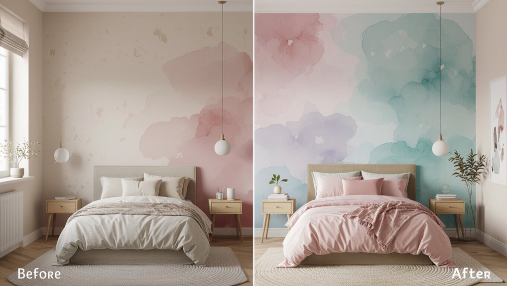
Wondering how a soft, painterly wash can transform a cramped bedroom without overwhelming it? You can add a single watercolor accent wall behind the bed to create depth and focus.
Use diluted pigments, horizontal strokes, and a light-to-medium value gradient. Keep surrounding walls neutral, choose compact furniture, and layer sheer textiles so the wash reads airy, not heavy, in small spaces.
Living room full-wall dreamy gradient
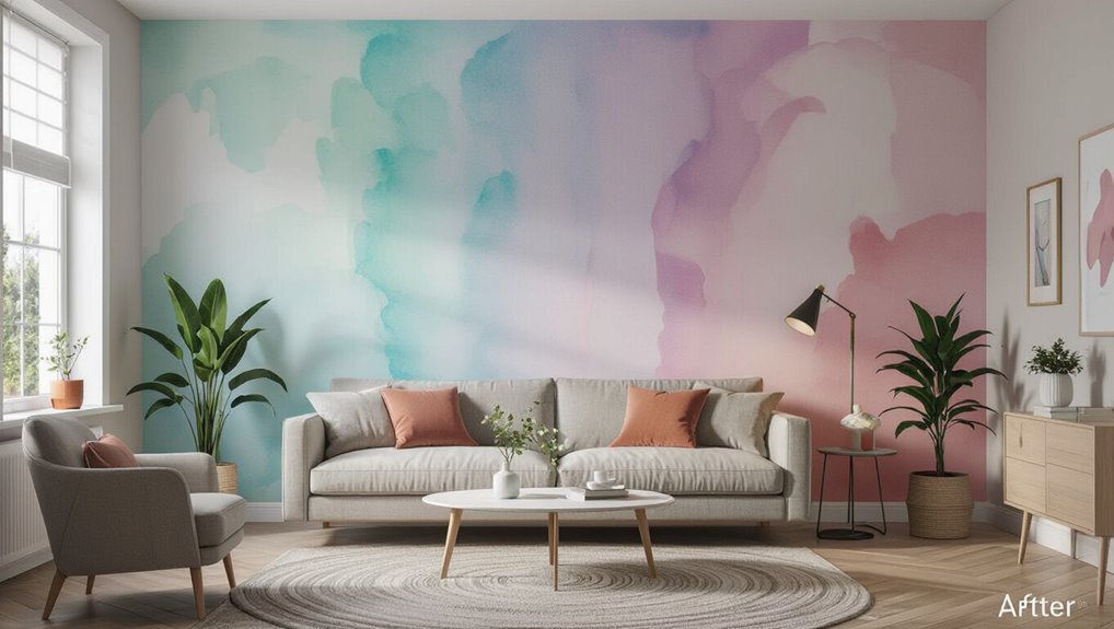
When you cover an entire living-room wall with a soft, watercolor gradient, the space breathes—colors melt into one another to stretch the room visually and add a serene focal point that feels effortless.
Choose two or three muted hues, blend wet edges with a large brush or sponge, and step back often.
Pair with neutral furnishings and varied textures to keep the effect airy and intentional.
Bathroom moisture-resistant watercolor approach
If you want a watercolor wash in a bathroom without worrying about peeling or mildew, choose moisture-resistant products and application techniques that stand up to humidity.
Seal drywall with a mold-resistant primer, use high-quality satin or semi-gloss paint, and dilute colors for soft washes.
After: a serene, diffused look that resists moisture.
Before-and-after shots show improved longevity and cleaner finishes.
FAQ Frequently Asked Questions
You probably have a few practical questions about watercolor wall finishes — how long they last, how to maintain or remove them, and whether they’re right for bathrooms.
You’ll also want to know how to match a patch or extend the design and which paints or additives are safest for indoor air quality.
Below are clear answers to those common concerns.
How long does a watercolor wall finish last and how do I maintain it?
A well-executed watercolor wall finish can last 5–10 years in low-traffic rooms and 2–5 years in busier areas, depending on factors like paint quality, surface prep, and exposure to moisture or sunlight.
To maintain it, dust gently, wipe stains with a damp microfiber and mild soap, avoid abrasive cleaners, control humidity and UV exposure, and touch up small areas with matching glaze as needed.
Can I remove or repaint over a watercolor finish easily?
Wondering whether you can remove or repaint over a watercolor wall finish? Yes—you can.
Light washes and glazes strip or sand off more easily than heavy textured layers.
For repainting, clean, sand glossy spots, and prime to seal uneven absorption. Use solvent-based primers on stubborn glazes.
Test a small area first to verify adhesion and a smooth, even topcoat.
Is watercolor wall paint suitable for high-moisture areas like bathrooms?
How well will a watercolor wall finish hold up in a bathroom? You can use watercolor techniques, but moisture, steam, and splashes can blur or lift delicate washes.
Choose a moisture-resistant primer, latex paint base, and a clear, satin or semi-gloss protective topcoat.
Ventilate well and avoid direct water exposure; treat high-splash zones with tile or waterproof panels for durability.
How do I match the finish if I need to patch or extend the design?
If you need to patch or extend a watercolor-style finish in a bathroom, start by matching materials and application methods so the new area weathers and reflects light like the original.
Test small sections to match pigments, glaze ratio, and brush or sponge strokes.
Feather edges, layer translucent washes, and let each coat cure fully.
Blend seams gently until invisible.
What are the safest paints and additives for indoor air quality?
When you’re choosing paint for a bathroom watercolor finish, pick low-VOC or zero-VOC latex paints and water-based glazes so you keep indoor air quality safe without sacrificing translucence or durability.
Use odorless, non-toxic additives like acrylic retarders or pH-neutral extenders sparingly. Avoid oil-based paints, ammonia cleaners, and fragrance-heavy primers.
Ventilate well and let each coat cure fully for healthiest results.