Can You Paint Trim the Same Color as Walls? The Design Case For and Against
You can absolutely paint trim the same color as your walls — it simplifies rooms, hides minor imperfections, and makes spaces feel larger and more modern. It works especially well in small rooms, minimalist or contemporary homes, and open-plan layouts where continuity matters. But it can also flatten ornate molding, reduce visual interest, and look muddy in low light or with deep hues. Keep finish, lighting, and style in mind, and keep going to learn practical tips and alternatives.
Can You Paint Trim the Same Color as Walls? Quick Answer and Summary
Yes—you can paint trim the same color as the walls, and it often creates a sleek, modern look that makes rooms feel larger.
It’s a good idea when you want a seamless, minimalist aesthetic or to downplay architectural details, but it’s not ideal if you rely on trim to define spaces, highlight moulding, or hide imperfections.
Below is a brief bullet snapshot of when it works and when it doesn’t.
Direct answer in one paragraph
Curious whether you can paint trim the same color as the walls? Yes — you can paint trim the same color as walls to create a seamless, modern look that visually enlarges space and emphasizes architecture.
You should weigh finish choices, light, and room size, since matching trim and walls changes perceived depth and detail.
Consider contrast alternatives before committing.
When it’s a good idea and when it’s not (bullet snapshot)
When you want a clean, contemporary look that makes rooms feel larger, painting trim the same color as the walls works really well; but avoid it when you need architectural detail to stand out or when finishes and lighting will muddle edges.
- Small rooms: unify for spaciousness.
- Minimalist spaces: keep lines simple.
- Ornate trim: highlight with contrast.
- Poor lighting/gloss mismatch: avoid blending.
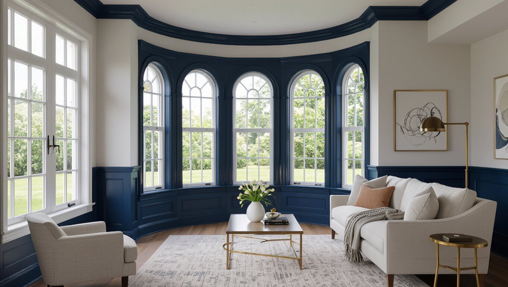
What ‘œPainting Trim the Same Color as Walls’ Means
When you talk about painting trim the same color as the walls, you mean applying the wall paint to elements like casing, baseboards, moulding, and door/window trim so they visually recede.
Traditionally trim is painted a contrasting color — usually white or a semi-gloss — to frame rooms, but the same-color approach creates a unified, subtler look.
In the next sections you’ll compare typical conventional techniques with the effects and practicalities of matching trim to walls.
Definitions: trim, casing, baseboards, moulding, door/window trim
Trim refers to the finished wood or composite pieces that frame and protect the edges where walls meet floors, ceilings, doors, and windows. Casing specifically surrounds door and window openings, baseboards run along the bottom of walls, and moulding (or molding) includes decorative profiles like crown or chair rail.
You’ll see door/window trim, sills, and jambs named separately; together they shape visual shifts and influence paint decisions.
Typical conventional approaches vs same-color approach
Although most traditional interiors favor a crisp contrast between walls and trim, you can also paint trim the same color as the walls to create a unified, modern look.
You’ll choose conventional white or gloss trim to highlight architectural details and resist scuffs, or match trim to wall paint for seamless flow, softer sightlines, and the illusion of larger, less cluttered rooms.
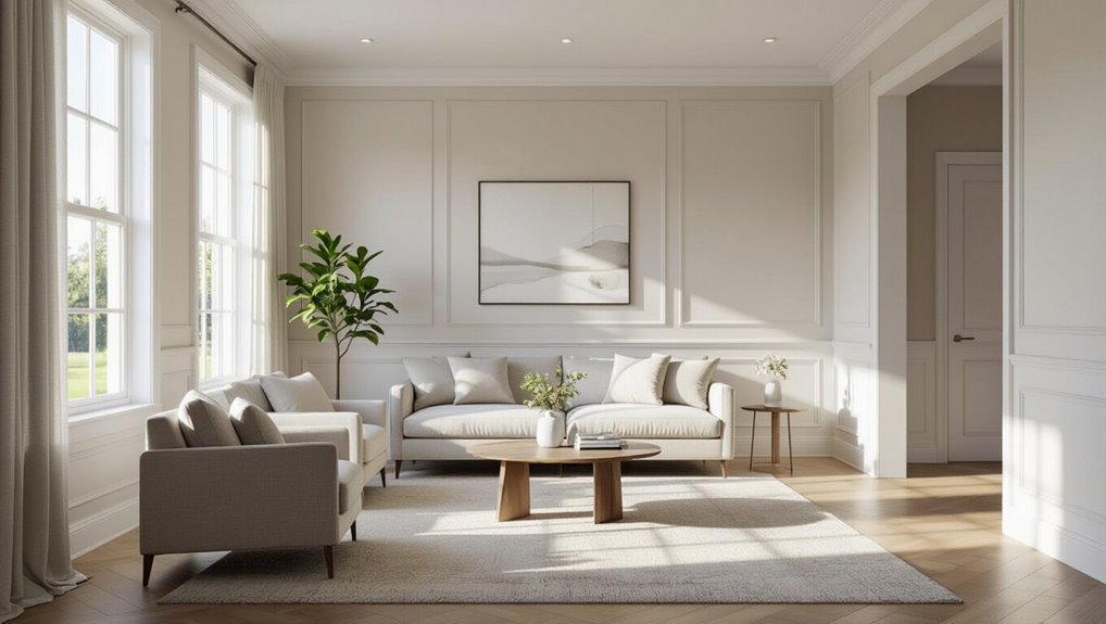
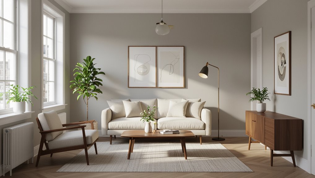
Design Case For Painting Trim the Same Color as Walls
When you paint trim the same color as the walls, it creates a seamless visual flow that can make rooms feel larger and more modern.
You’ll also hide small imperfections in molding and corners while keeping touch-ups and color matching simple.
For minimalist or contemporary spaces, this approach emphasizes form and light instead of contrasting details.
Visual effects and benefits
If you want a room to feel larger and more cohesive, painting the trim the same color as the walls does that work quietly but effectively.
You’ll create a seamless backdrop that highlights furniture and artwork, reduce visual interruptions, and simplify maintenance with fewer contrasting edges.
The effect feels modern and understated, letting textures, lighting, and accessories become the focal points without competing with bold trim.
Perceived space and flow improvements
Because matching trim to the walls removes visual breaks, you’ll notice doorways and moldings recede and rooms feel more continuous and open.
That seamless look lets sightlines flow between spaces, making narrow corridors and small rooms seem larger.
You’ll also create easier connections between connected rooms, guiding movement and reducing visual clutter so your home reads as a cohesive, airy whole.
Modern and minimalist aesthetics
Though rooted in restraint, painting trim the same color as walls instantly sharpens a modern, minimalist interior by removing ornate contrast and letting form and texture take center stage.
You’ll create clean, uninterrupted planes that emphasize silhouettes and materials. That uniform finish reduces visual clutter, highlights architectural lines, and supports a calm, curated atmosphere—ideal when you want simplicity and cohesion to define the space.
Hiding architectural imperfections
When you paint trim the same color as the walls, it visually recedes so minor flaws—uneven joints, small gaps, or mismatched profiles—become far less noticeable.
You’ll draw attention to overall form instead of details, making rooms feel cleaner. That subtle camouflage helps conceal age-related wear and imperfect craftsmanship without major repairs, letting the space read as intentional and cohesive.
Practical benefits: easier touch-ups and paint matching
If you stick with the same paint for walls and trim, touch-ups get simpler and matching colors becomes nearly foolproof.
You won’t hunt for a trim-specific shade or worry about sheen differences clashing. Keep leftover cans handy, blend edges invisibly, and repair scuffs quickly.
That consistency saves time, reduces waste, and makes future repainting more predictable and less stressful.
Design Case Against Painting Trim the Same Color as Walls
If you paint trim the same color as the walls, you can lose architectural detail and the contrast that defines doorways and moldings.
That approach also risks making rooms feel washed-out or monotonous, and it can hide scuffs that make maintenance trickier over time.
For traditional-style homes or buyers who expect classic trim, matching trim to walls may hurt resale and curb appeal.
Loss of architectural detail and contrast
Although painting trim the same color as the walls can create a seamless look, it often dulls the room’s architectural details and robs you of visual contrast that defines edges and shapes.
When trim disappears, moldings, door frames, and window casings lose definition, and you miss opportunities to highlight craftsmanship.
You’ll sacrifice depth and the crisp lines that give spaces character.
Risk of washed-out or monotonous rooms
When trim fades into the wall, the room can start to feel flat and unremarkable.
You’ll lose focal points and visual depth, making spaces seem smaller and less dynamic.
Without trim contrast, patterns, furniture, and art must carry all interest.
If you want energy or defined edges, same-color trim risks creating a bland, washed-out atmosphere that undercuts intentional design.
Durability and maintenance trade-offs
Because trim takes the brunt of scuffs, fingerprints, and vacuum bumps, painting it the same color as the walls can hide fewer wear patterns and force more frequent touch-ups, especially in high-traffic areas.
You’ll notice chips and dirt sooner against painted walls, and matching sheen and repair paint becomes harder.
Opting for a durable, contrasting trim finish reduces upkeep and simplifies spot repairs.
Impact on resale and traditional-style homes
If you’re aiming to sell or preserving a traditional look, painting trim the same color as the walls can undermine both market appeal and architectural integrity.
Buyers often expect crisp contrast that highlights moldings and period details. You’ll risk making spaces feel unfinished or less valuable.
For older or classic homes, keep trim distinct to preserve character and broaden resale interest.
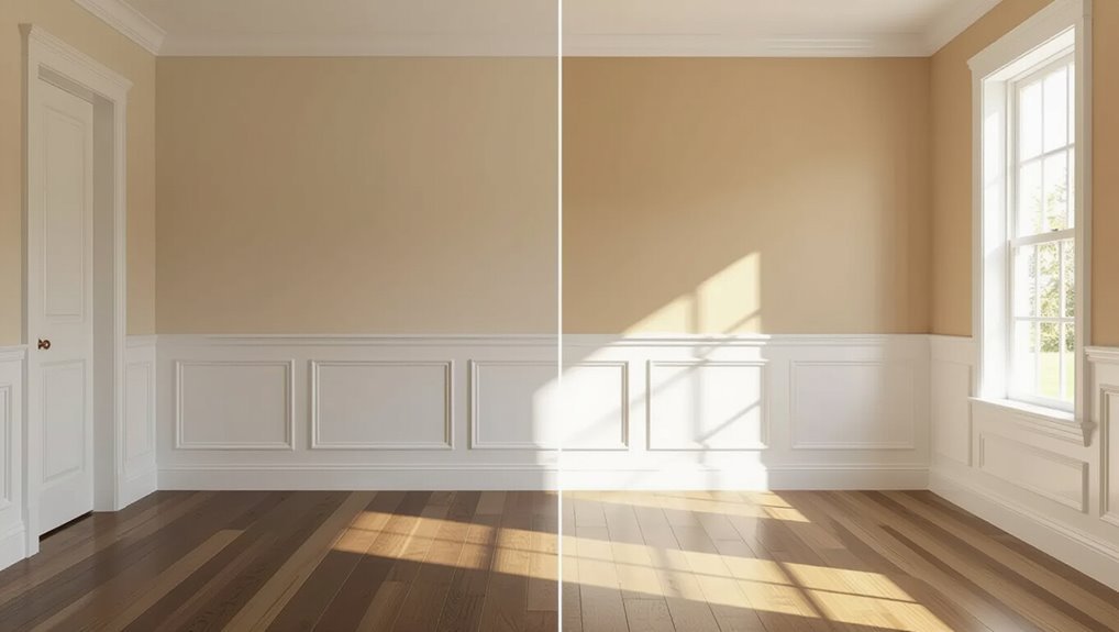
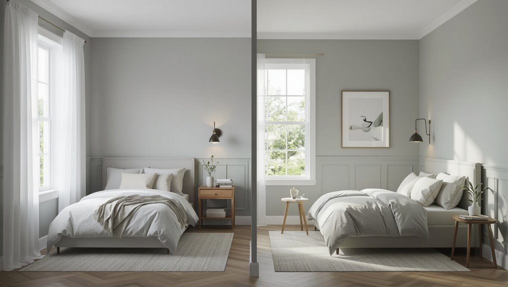
When It Works Best Room Types, Styles, and Conditions
You’ll find same-color trim works especially well in bedrooms and contemporary living rooms where a calm, unified look is wanted.
It’s a natural fit for modern and Scandinavian styles, but you should avoid it in historic houses or rooms with ornate moulding that benefit from contrast.
Also consider lighting and color saturation—low light or very saturated paints can make trim disappear or feel muddy, so test samples first.
Best room types (bedrooms, contemporary living rooms)
When you paint trim the same color as the walls, bedrooms and contemporary living rooms are ideal places to try it because they benefit from the seamless, calming look—bedrooms feel cozier and less visually busy, while modern living spaces get a sleek, gallery-like finish that highlights furniture and art instead of woodwork.
- Use in small bedrooms to simplify sightlines.
- Try in master suites for a restful vibe.
- Apply in open-plan living for clean flow.
- Choose for rooms showcasing artwork or statement furniture.
Architectural styles that suit same-color trim (modern, Scandinavian)
Bedrooms and contemporary living rooms show how same-color trim streamlines a space, but certain architectural styles make that effect even stronger.
In modern and Scandinavian interiors, clean lines and minimal detailing let same-color trim reinforce unity and calm.
You’ll emphasize geometry, light, and texture instead of contrast, creating a serene backdrop that highlights furnishings and architectural proportion without competing trim accents.
When to avoid it (historic homes, ornate moulding)
Although same-color trim can simplify many interiors, you should skip it in historic homes or rooms with ornate moulding because those details were meant to read as architectural highlights.
You’ll want contrast to showcase carved profiles, cornices, wainscoting, and period millwork.
Preserve patina or paint trim a complementary accent so craftsmanship reads clearly, maintains historic character, and avoids visually flattening richly detailed spaces.
Lighting and color saturation considerations
In rooms with ample natural light, painting trim the same color as the walls can read crisp and intentional, while in dimmer spaces it risks making everything look muddy—so match your trim choice to both the light source and the color’s saturation.
You’ll favor same-color trim with bright, saturated hues or soft neutrals; use contrasting trim when light is low or colors are deep to preserve definition.
How to Decide: Practical Decision-Making Steps
Start by looking at your room’s architecture and style so you know what details you’ll want to highlight or hide.
Then check how natural and artificial light changes the paint, try samples and mock-ups, and pick sheens that stand up to wear.
Finally, weigh how choices affect resale value against your personal preference before committing.
Step 1: Assess architectural features and style
Architectural details guide your decision: walk the room and note trim profiles, moulding depth, window and door styles, and any period features that define the space.
Decide whether trim should read as feature or fade away. For ornate, historic trim you’ll likely contrast; for simple, modern profiles matching trim and walls can streamline sightlines.
Record choices before testing paint samples.
Step 2: Evaluate natural and artificial lighting
Now that you’ve noted the trim’s profile and how prominent you want it to be, look at the room’s lighting next: natural light, its direction and intensity, and the types and placement of artificial fixtures will change how colors read on both walls and trim.
Note warm or cool light, shifting daylight through the day, and fixture color temperature; these affect contrast and perceived cohesion.
Step 3: Test paint samples and mock-ups
Once you’ve observed how light plays in the room, bring paint samples and mock-ups into the space so you can compare colors in real conditions. Tape a few 4×4″ swatches of the wall color and an equal number of trim samples at eye level in areas that get both daylight and artificial light.
- View samples at different times.
- Photograph from typical angles.
- Note contrast and edge definition.
- Live with samples for several days.
Step 4: Consider durability and sheen choices
Step 4 narrows your focus to finish type because trim sees more wear than walls, so durability and sheen matter: choose a tougher, washable paint for trim and pick a sheen that balances longevity with how much you want the trim to stand out.
Use semi-gloss or satin on trim for scuff resistance and easy cleaning; use lower sheens on walls to hide imperfections and reduce glare.
Step 5: Factor resale value and personal preference
Because buyers and future occupants often notice finish details, weigh resale value alongside your personal taste when choosing whether to match trim to walls.
If you plan to sell soon, favor neutral contrast—classic white or subtle trim tones—since they appeal broadly.
If you’ll live there long-term, prioritize what you love: matching trim can feel modern and cohesive, while contrast adds crisp definition.
Paint Selection and Application Tips
When you paint trim the same color as walls, pick a sheen that balances durability with the subtle contrast you want.
Pay attention to undertones and prime bare wood or patched areas so the finish looks uniform.
Choose your application method—brush for edges, roller for flats, or spray for a seamless coat—and plan simple touch-up steps to keep trim looking sharp.
Choosing the right sheen for trim painted same as walls
Although matching trim and walls in the same color can simplify your palette, choosing the right sheen matters because it changes how the finish looks and holds up; you’ll want a balance between durability and subtlety.
Use satin or eggshell on trim for moderate sheen and wipeability, or flat to minimize reflection in low-traffic rooms.
Reserve semi-gloss where cleaning is essential.
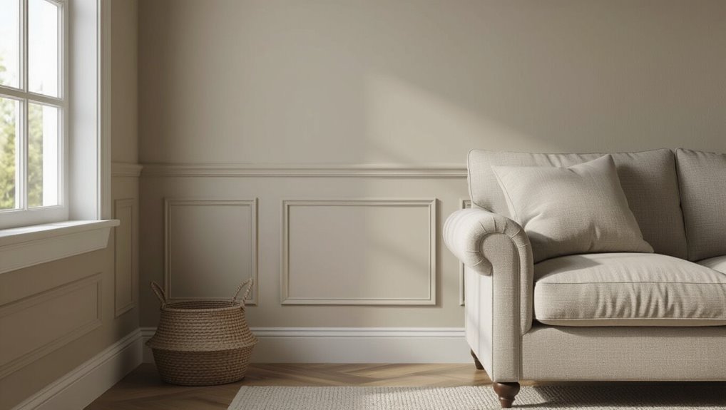
Selecting colors and undertones to maintain subtle contrast
How do you keep trim from disappearing into the walls while still using the same color?
Pick a trim shade slightly lighter or darker by one to two steps, or choose a cooler or warmer undertone to separate edges subtly.
Test swatches in different light, view from various angles, and favor contrast through undertone shifts rather than stark value differences.
Preparation and priming tips for trim surfaces
Start by sanding and cleaning your trim so paint has a clean, dry surface to bond to.
Fill gaps and nail holes with appropriate wood filler, then sand smooth.
Remove dust with a tack cloth.
Apply a quality primer suited to your trim material—wood, MDF, or previously painted surfaces—to seal and promote adhesion.
Let primer cure fully before topcoating.
Brush vs. roller vs. spray: best methods for clean edges
When you want crisp, professional-looking edges, choosing the right application method matters: brushes give precise control for corners and cuts, rollers speed coverage on flat faces, and sprayers deliver the smoothest, fastest finish for complex profiles.
Use a high-quality angled brush for cut-ins, a short-nap roller for flat trim, and a HVLP or airless sprayer for consistent, fine results on detailed moldings.
Touch-up and maintenance recommendations
Keep a small stash of the exact paint and finish you used so you can touch up chips and scuffs quickly; mismatched sheen or color shifts are the usual giveaways that trim was repainted separately.
Store extra in labeled, sealed containers. Clean surfaces before touching up, feather edges with a small brush, and match application method (brush, roller, or spray).
Refinish high-traffic trim annually as needed.
Common Mistakes and How to Avoid Them
Don’t assume the same sheen will work everywhere—test it first to see how it wears and reflects light.
Watch for undertones that shift the trim’s look, and check samples at different times of day and under artificial lighting.
And don’t skip proper prep, since poor sanding or priming will make the finish look uneven no matter how careful you are.
Mistake: Using the same sheen without testing
Although matching wall and trim color seems simple, using the same sheen without testing can create unintended visual issues.
You might pick a flat wall finish and satin trim, or vice versa, then assume identical sheens won’t matter.
Test small samples under real light, view from different angles, and let coatings cure.
That reveals reflections, texture differences, and helps you choose the right sheen.
Mistake: Ignoring undertones that change perception
When you ignore underlying undertones, a trim color that looked like a perfect match on the swatch can read as noticeably different once it’s on your walls, because light and surrounding colors shift how pigments register.
You should compare undertones—warm, cool, or neutral—against flooring, cabinetry, and textiles.
Match undertones rather than exact shades to guarantee cohesive, intentional results.
Mistake: Not testing in different light conditions
How will the same paint read in morning sun, dim evening light, or under cool LED fixtures?
You should test samples on trim and wall areas, observing them at different times and with varied bulbs.
Note shifts in warmth, contrast, and reflectivity.
Photograph scenes and live with samples for several days before committing so you avoid surprises and guarantee cohesive appearance.
Mistake: Poor prep leading to uneven finish
You’ve checked samples in different lighting, but even the best color can look sloppy if the surface isn’t prepped properly.
Sand, clean, and fill gaps so paint adheres smoothly; remove gloss with deglosser or sandpaper.
Prime bare wood or repaired areas to prevent blotchy absorption.
Take your time—skip shortcuts and you’ll avoid streaks, lap marks, and uneven sheen on trim and walls.
Alternatives and Compromise Solutions
If you like the idea of matching trim to walls but want some definition, try choosing trim a shade lighter or darker for subtle contrast.
You can also paint only select trim elements—like baseboards or window casings—the same as the walls to balance cohesion and detail.
Another option is to reserve accent-colored trim for focal areas and match the rest to the walls for a unified look with strategic pops.
Slightly darker or lighter trim than walls for subtle contrast
When you want a subtle distinction without the starkness of white trim, choose a trim shade just a few tones darker or lighter than the wall color; it creates depth and definition while keeping the overall look cohesive. You’ll get gentle contrast that frames rooms, hides imperfections, and feels intentional.
| Benefit | Effect |
|---|---|
| Depth | Defines edges |
| Cohesion | Soft, unified look |
Painting only certain trim elements the same color (e.g., baseboards only)
A subtle shift from matching trim to walls is to paint only selected trim elements—like baseboards or window casings—the same color as the walls while keeping others in a contrasting tone.
You can simplify visual flow and make rooms feel larger by blending lower trim, yet preserve architectural definition with contrasting crown molding or door surrounds.
This balances cohesion and detail.
Using accent trim in focal areas and matching elsewhere
Looking to draw the eye without overwhelming the room? Use bold trim on focal features—around a fireplace, built-ins, or an entryway—and paint other trim to match walls.
You’ll create intentional emphasis while keeping cohesion. This compromise balances drama and unity: focal trim pops, sightlines stay calm, and maintenance stays simple because most trim shares the same finish and color as the walls.
Cost, Time, and Resale Considerations
Painting trim the same color as your walls can save time and money compared to traditional two-tone work, but you’ll want rough cost and labor estimates before you start.
Consider how a monochromatic look may influence buyers—some will see it as modern and streamlined, others as unfinished—so weigh resale expectations in your market.
If you lack experience or your trim has damage, hire a pro; otherwise a careful DIY can be faster and cheaper.
Comparative cost and time estimates vs traditional trim painting
If you match trim to the wall, you’ll usually save on both materials and labor because you skip the extra coats, specialized trim paint, and tedious edging that traditional high-gloss trim requires; however, exact savings depend on room size, paint type, and whether you DIY or hire pros.
Expect lower paint usage, faster prep and cutting-in, and reduced labor hours—professionals may charge 10–25% less versus classic trim work.
How same-color trim affects perceived home value
When you choose to paint trim the same color as the walls, you’ll usually lower immediate costs and speed up the project.
However, that choice can subtly influence buyer perceptions and resale value. Buyers often read trim as finish quality; seamless trim can feel modern and streamlined, while others may see it as masking detail or cheapening craftsmanship.
This perception can potentially narrow appeal and affect offers.
When to hire a pro vs DIY
Because your budget, timeline, and resale goals differ, you’ll want to weigh pros and cons before deciding whether to tackle same-color trim yourself or hire a pro.
If you’re handy, DIY saves money and lets you control timing, but expect prep and risk of uneven edges.
Hire a pro for flawless finish, faster turnaround, and stronger resale appeal when buyers expect polished details.
Case Studies and Visual Examples
You’ll see how a small-room makeover used matching trim to simplify the space and make it feel larger.
Then look at an open-plan home where a unified trim color created flow between zones.
Finally, learn from a historic house where same-color trim didn’t work and what that taught the owners.
Small-room makeover with same-color trim
If you’re working with a compact bedroom or a narrow hallway, painting the trim the same color as the walls can visually expand the space and simplify the overall look.
The following case studies show how subtle shifts in finish, tone, and lighting make a big difference.
Try matte trim for a seamless backdrop, slightly darker trim for depth, and satin for highlights—adjust warmth to complement natural or artificial light.
Large open-plan space using unified trim color
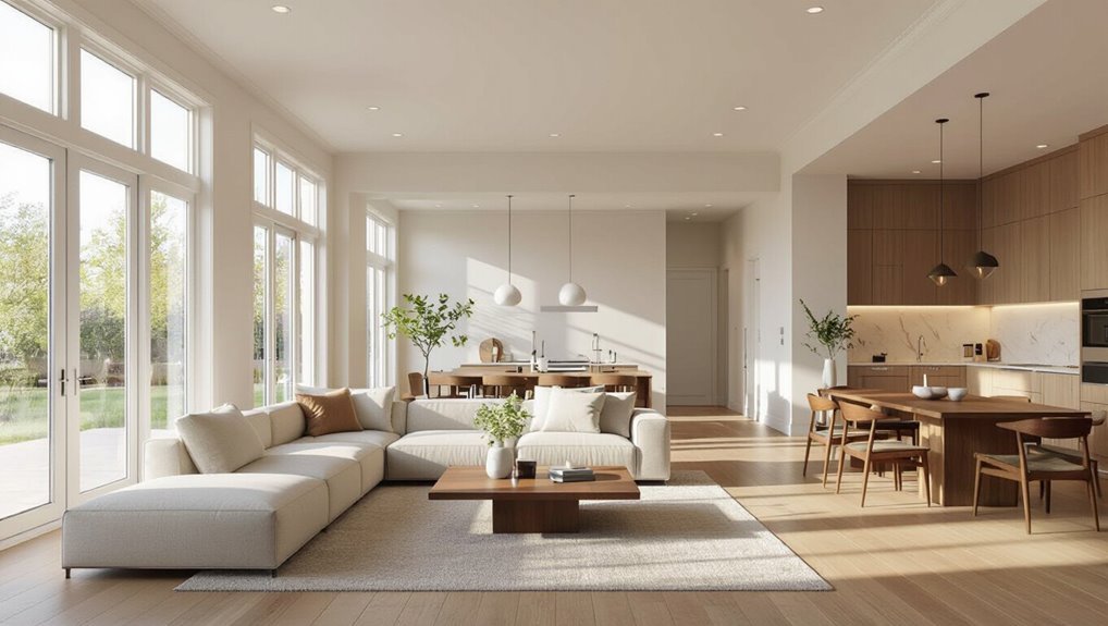
Moving from small, contained rooms to a sprawling open-plan area calls for a different approach to same-color trim: here the goal is to create cohesion across adjoining zones while preserving visual flow.
You’ll use consistent trim to tie living, dining, and kitchen areas together, vary finishes or subtle tones for depth, and rely on furniture, rugs, and lighting to define zones without interrupting sightlines.
Historic home where same-color trim failed lessons learned
Although the intention was to simplify, painting the trim the same color as the walls in this 1890s Victorian erased the home’s molded details and made rooms read flat and unfinished.
You lost depth, shadow lines, and the historic character that defined each room.
Lesson: preserve contrast or use subtle glaze/highlights to honor architectural profiles while modernizing color.
Frequently Asked Questions (FAQ)
Got questions about same-color trim? You’ll find answers here on whether it shrinks a room, which sheen to choose, how to handle stained or varnished wood, ways to test it in your space, and how it might affect resale.
Read on for clear, practical guidance.
Will painting trim the same color make my room look smaller?
Will painting trim the same color as your walls make the room feel smaller? Not usually—matching trim minimizes visual breaks, so surfaces read as continuous, which can actually expand perceived space.
However, if you choose a very dark, saturated hue in a small room with limited light, uniform color can feel heavy.
Balance tone and lighting to avoid a cramped atmosphere.
What sheen should I use if I want trim and walls the same color?
If you liked the way matching trim opens a room, you’ll want the sheen to support that seamless look—sheen affects how color reads more than most people expect.
Use the same low-sheen finish (matte or eggshell) on both walls and trim to keep surfaces visually unified.
Reserve semi-gloss only when you need durable, easy-clean trim in high-traffic or moisture-prone areas.
Can I paint wood trim the same color if it’s stained or varnished?
Wondering whether you can paint over stained or varnished wood trim the same color as your walls? Yes — but prep matters.
Sand or degloss, clean thoroughly, and use a quality primer designed for slick surfaces to guarantee adhesion. Choose a paint compatible with the primer and finish you want.
If trim has deep grain or damage, consider filling or replacing for a smooth, painted result.
How do I test whether same-color trim will work in my home?
How do you know if same-color trim will work in your space? Start by painting a small trim section and observe at different times and light angles.
Use sample boards with both wall and trim finishes nearby. Live with the swatch for several days to check contrast, sheen reflection, and how fixtures or furniture interact.
Trust what looks balanced, not trends.
Does same-color trim affect resale value?
Will choosing same-color trim hurt your home’s resale chances? It can, but it depends.
Buyers often expect contrast and crisp detailing; same-color trim suggests a modern, streamlined look that appeals to some but not all.
If your market favors traditional finishes, consider repainting to neutral contrast before listing.
Otherwise, document quality and style to help buyers see the intentional design.