Does Paint Look Darker or Lighter When It Dries
Paint usually dries slightly lighter and less glossy than it looks when wet, so you’ll likely see a subtle shift as solvents evaporate and the binder forms a film. Thinner coats, lower pigment load, surface color, sheen, and humidity all change how the final tone reads. Primers, tinted bases, and topcoats further affect the result, and full-wall samples under real light give the best preview—keep going to learn how to predict and control it.
Does Paint Usually Dry Darker or Lighter?
Wondering whether paint will dry darker or lighter? You’ll usually see a slight shift, and whether it’s darker or lighter depends on color consistency and paint formulation.
Oils and some lacquers often deepen as solvents evaporate, while lighter, water-based paints can dry a touch paler. Sheen changes and pigment concentration affect perceived shade, so thin coats may look different than thick ones.
You’ll also notice that uniform mixing preserves desired hue, while inconsistent batches produce uneven drying. Expect subtle shifts rather than dramatic flips; test a sample on the actual surface to confirm the final appearance before committing.
Quick Summary: Key Factors That Change Color as Paint Dries
Because several variables interact as paint dries, you’ll usually see only subtle shifts in tone rather than dramatic changes. You’ll notice pigment concentration, binder type, and solvent evaporation affect hue and saturation, influencing color perception.
Because multiple factors interact as paint dries, expect subtle tone shifts—pigment, binder, and solvent alter hue and saturation.
Surface texture and sheen change how light scatters, altering apparent depth. Application thickness and drying conditions—temperature and humidity—modify final color and uniformity.
Primer choice and underlying substrate can shift warmth or coolness, so test samples.
Finally, formulation and additives govern long-term stability; they affect paint durability and resistance to fading. Track these factors to predict outcomes and choose coatings that meet your needs.
Wet vs. Dry: How Light Reflection Changes
When paint is wet, you’ll notice it looks glossier because the smooth surface reflects more light.
As it dries, the surface becomes more matte and starts scattering and absorbing light, which can make the color seem darker or less vibrant.
Understanding that shift in reflectivity versus absorption helps you predict the final appearance.
Wet Paint Reflectivity
Although wet paint can look brighter at first, it’s actually reflecting light differently than dry paint does. You notice a sheen from the liquid surface that scatters specular highlights, altering perceived hue and saturation. That glossy veil can make colors feel more vivid, which affects color psychology by influencing mood until the finish mattes.
As you watch drying, microtextures emerge and change reflectivity; light scatters more diffusely, so the same pigment reads differently. Remember finish choices also link to paint durability—glossier finishes resist wear differently—so consider how temporary wet reflectivity versus long-term appearance serves your space.
Dry Paint Absorption
How does dry paint change the way light behaves compared with its wet state? You’ll notice that as paint dries, solvent leaves and pigments settle, altering paint texture and creating tiny air gaps.
Those micro-structures scatter light differently, usually absorbing more and reflecting less than the glossy wet layer. Drying speed affects how uniform those structures form: fast drying can trap irregularities, increasing diffusion and perceived darkness.
Slow drying yields smoother films that reflect more evenly. To judge final color, you should wait until full cure; only then will absorption and surface texture reveal the paint’s true light-handling behavior.
Pigment Concentration and Perceived Color
How much pigment you pack into a paint — the pigment load — directly changes how rich and dark the dried color looks.
The binder-to-pigment ratio also matters because more binder can make a color appear paler or glossier as it dries.
Don’t forget that lightfastness and tinting strength determine how the hue holds up and mixes with other colors over time.
Pigment Load Effects
When you change a paint’s pigment concentration, you change how saturated and opaque the color appears once it dries. You’ll notice heavier pigment loads deepen hue and reduce translucency, affecting mood through color psychology and altering perceived brightness. Lighter loads let underlying surfaces show, making colors seem paler.
- Higher pigment load: richer, darker finish; better coverage.
- Lower pigment load: lighter, more transparent; needs more coats.
- Balanced load: predictable drying shade; economical use.
Consider that pigment choice also carries environmental impact—some pigments are more sustainable or toxic—so pick concentrations that match performance and responsibility.
Binder-to-Pigment Ratio
Shifting from pigment load, the binder-to-pigment ratio determines how that pigment sits and looks once the paint cures. You’ll notice that higher binder proportions can make colors appear slightly lighter and glossier because binder interaction fills gaps, increasing light reflection.
Conversely, dense pigment concentration with less binder often yields a richer, deeper tone as particles crowd, reducing surface sheen. Pay attention to pigment settling during application: too little binder lets heavier particles sink, creating uneven color and darker patches where pigments concentrate.
Lightfastness And Tinting
Why does a pigment’s lightfastness matter as you tint and concentrate colors? You’ll see shifts in color saturation as pigments fade or shift, especially when you boost concentration to deepen tone. Lightfast pigments keep hue integrity; weaker ones alter over months, changing the dried film’s perceived color and contrast.
Also note solvent choice can affect paint odor and indicate volatile components that might accelerate change.
- Choose high-lightfast pigments to maintain saturation.
- Test concentrated tints under real light before committing.
- Minimize strong solvents to reduce paint odor and potential pigment instability.
Why Solvents and Binders Alter Wet-to-Dry Appearance
Because the liquid components evaporate and the binder film forms, paint often looks different as it dries than it did when wet. You’ll notice solvents make wet paint appear darker by increasing sheen and spreading pigments.
Because solvents make wet paint darker and shinier, colors often change as liquid evaporates and the binder forms
As solvents evaporate, the binder traps pigments and restores color consistency. Binders also change refractive index, so light reflects differently once the film cures.
If pigment stability is high, colors remain true despite solvent loss. Unstable pigments can shift or fade.
Understanding how solvent evaporation and binder chemistry interact helps you predict wet-to-dry shifts and choose formulations that minimize unexpected color change.
Sheen Basics: Matte, Eggshell, Satin, Gloss
When you pick a paint sheen, you’re choosing how much light it reflects and how durable the finish will be. Matte, eggshell, satin, and gloss sit on a spectrum from low to high reflectivity and toughness.
You’ll notice sheen influence on appearance: matte hides imperfections but shows less depth, eggshell offers subtle warmth, satin balances sheen and cleanability, and gloss maximizes reflectivity and durability.
Consider maintenance and color fading risk.
Quick guide:
- Matte — low reflectivity, hides flaws, higher apparent color saturation.
- Eggshel — soft sheen, easier to clean.
- Satin/Gloss — higher reflectivity, tougher finish.
Why Dark Paints Can Dry Lighter : And Vice Versa
Curious how a deep navy you chose can look milky on the wall? You’ll notice dries lighter when pigments scatter light as binders cure and solvents evaporate, altering perceived hue. Temperature, humidity, and surface absorbency shift contrast, tapping into color psychology: mood changes with subtle value shifts. Conversely, lighter paints can read darker when they level glossy or trap shadow. Consider paint durability too—formulation affects pigment stability over time, so aging can shift tone.
| Cause | Effect |
|---|---|
| Pigment scattering | Lighter appearance |
| Binder sheen | Darker appearance |
| Environmental factors | Variable shift |
How Paint Thickness and Application Method Affect Tone
Although paint color comes from pigment, the thickness of the coat and how you apply it have a big impact on the tone you see, so subtle changes in technique can shift a shade from rich to muted. You’ll notice effects depending on method and layer count:
- Thin coats: produce lighter, more translucent tones and reveal undertones; good for subtle color psychology cues.
- Thick coats: deepen color, increase sheen, and hide substrate; they can enhance paint durability.
- Brushing vs rolling/spraying: brush strokes add texture and variation; spray gives uniform depth.
Adjust technique to control mood and longevity.
Primer’s Role in Final Color
Because primer evens out porosity and blocks strong undertones, it directly influences the hue and vibrancy you’ll see once topcoat dries. You’ll notice colors read truer over a neutral, sealed base; primer prevents splotches and uneven sheen that can make tones look muddy or patchy.
Choosing the right primer supports paint durability, reducing peeling and helping pigments sit evenly.
Psychologically, consistent color affects mood and color psychology responses—you want the desired warmth, calm, or energy to register.
Prep with quality primer so your final color matches expectations, lasts longer, and communicates the emotional tone you aimed.
Do Tinted Primers Prevent Color Shifts?
If a neutral primer already helps colors read truer, tinting that primer can further reduce surprises by counteracting strong undertones or boosting a weak base hue. You’ll notice improved color consistency because tinted primer evens surface influence before topcoat application.
Consider practical uses:
- Block stains and warm or cool cast prior to finishing.
- Use a slight complementary tint to cancel unwanted undertones.
- Match primer tint to final color family for fewer coats.
Primer effects matter when you want predictable results, less repainting, and truer final appearance. Tinted primers don’t guarantee perfection, but they greatly reduce visible shifts.
How the Underlying Wall Color Changes the Finished Look
When you paint over a bold or dark base, the topcoat has to overcome that underlying color, so the finished hue can look richer, muddier, or noticeably darker than the swatch. You’ll notice subtle shifts if the old paint peeks through or if a tinted primer wasn’t used.
Lighter colors may require extra coats; darker bases can change mood through color psychology, making a room feel cozier or smaller. Choose high-quality primer and topcoat to protect appearance and guarantee paint durability.
Test patches reveal real results on your wall before committing to a full repaint.
Humidity and Temperature: Impact on Drying and Color
Although you mightn’t notice it at first, humidity and temperature directly affect how paint dries and how its final color appears, so you should control them whenever possible. You’ll see shifts if conditions vary: high humidity slows drying and can deepen sheen; heat speeds evaporation and may lighten perceived tone.
Humidity and temperature subtly change drying and color — control them to avoid sheen shifts and unexpected tones.
Think about Historical techniques and Cultural influences that adapted schedules and materials to climates.
- Work at stable 40–60% humidity and moderate temperature.
- Use dehumidifiers or heaters to regulate drying.
- Test small panels under room conditions before committing.
Controlling environment prevents uneven finish and unexpected color shifts.
Color Changes by Drying Stage (Tacky → Cured)
Because paint goes through distinct drying stages, you’ll often notice its color shift from tacky to fully cured. Wet or tacky paint usually reads darker and glossier, then gradually mattes and lightens as solvents evaporate and the binder sets.
As you watch tacky paint, reflexive sheen traps light and deepens hue. As it enters dry-through and cure, microsurface changes scatter light more and reveal the final value.
Understanding paint chemistry helps you predict timing and manage expectations.
Color psychology explains why that temporary darkness affects mood and decisions, so wait for full cure before judging or documenting color choices.
How Room Lighting Reveals Wet vs. Dry Differences
You’ve seen how drying stages change a paint’s value; room lighting then determines how obvious those differences look to your eye. Your lighting angle and intensity interact with paint texture, revealing wet sheen or matte cure and guiding perceived color transformation.
Consider these simple checks:
- Bright direct light highlights sheen on tacky paint, making it look darker.
- Diffuse ambient light minimizes glare, so cured areas blend and appear more even.
- Low light hides subtle shifts, masking the wet-to-dry progression until you move.
Use consistent fixtures when comparing samples, because changing bulbs will alter what you judge.
Colors That Shift Most When Drying (And Why)
When paints dry, some hues change noticeably more than others, and knowing which colors shift helps you avoid surprises. Deep blues and greens often dry darker because pigments settle and binders become less reflective; you’ll notice richer, moodier tones that influence color psychology by altering perceived warmth or calm.
Pale neutrals and pastels can dry lighter as gloss reduces and undertones show, so test swatches. High-chroma reds and oranges may shift unpredictably due to pigment chemistry, affecting both aesthetics and paint durability if formulation is poor.
Always sample full-size patches and allow complete curing before judging final color.
Metallic and Pearlescent Wall Paints: Unique Behavior
If you’re aiming for shimmer or subtle iridescence, metallic and pearlescent wall paints behave very differently from standard mattes and glosses. You’ll notice a metallic sheen or a pearl shimmer that shifts with viewing angle and light, so drying changes focus on binder clarity and particle orientation rather than pigment depth.
Consider these practical points:
Consider these practical points—surface direction, light type, and layering all shape metallic and pearlescent finishes.
- Surface direction: brushing vs. rolling alters how flakes align, affecting intensity.
- Light type: warm vs. cool bulbs change perceived warmth and sparkle.
- Layering: thin coats may look muted; full coverage reveals true effect.
Test in situ to set expectations.
When to Use Tinted Primer for Color Stability
Because primer evens out porosity and blocks previous colors, tinting it toward your final shade can prevent the paint from needing extra coats and keep the hue consistent, especially over dark or stained surfaces. You should use tinted primer when switching from deep to light tones, when stains or tannins show through, or when you want stronger color psychology effects with fewer coats. Tinted primer also supports paint durability by improving adhesion and hiding undertones. Below is a quick reference:
| Situation | Recommendation |
|---|---|
| Dark to light change | Tint primer toward final shade |
| Stained surfaces | Use pigmented primer |
| Bold accent walls | Tint for color pop |
| High-traffic areas | Primer for durability |
How to Test Paint Samples for True Dried Color
Although swatches can look perfect wet, the true color only shows after the paint fully cures, so you should test samples on your actual wall under real lighting.
Apply small patches of your chosen Historical palettes and Eco friendly options, then wait the full cure time listed. Check at different times of day and with artificial light.
- Paint three 6×6″ patches spaced apart; label each with brand and sheen.
- Observe after 24 hours, 72 hours, and one week; note shifts.
- Photograph patches in each lighting condition for comparison before deciding.
Making Accurate Paint Patches on Different Surfaces
When you make test patches, match the surface texture—flat, glossy, or rough—to see how finish and grain change the dried color.
Keep patches a consistent, reasonable size and shape so you can compare areas accurately.
Check them under the same lighting you’ll use in the room to avoid surprises once the paint’s dry.
Surface Texture Matters
If you want an accurate paint patch, match the test spot’s texture to the actual wall—smooth, eggshell, or heavily textured finishes reflect light differently and change how color reads once it dries.
You’ll notice texture variation shifts color perception: rough surfaces scatter light, making hues look softer; glossy, smooth areas deepen saturation.
When testing, do these three checks:
- Apply paint to a smooth sample to see true sheen.
- Test on an eggshell or low-sheen patch to gauge everyday appearance.
- Try a textured patch to observe light scattering and subtle hue shifts.
Match texture, then judge dry color.
Patch Size And Shape
Because the size and shape of your test patch change how light hits it and how well you can judge the dried color, pick patches that mimic the real painted area—large enough to show full opacity but small enough to fit the surface.
You’ll test on both flat and curved spots, keeping edges similar to the final job so color consistency stays reliable.
Use the same brush techniques you’ll use for the full coat, matching stroke direction and pressure.
Shape patches to avoid drips and pooling; irregular edges can skew perception.
Label each patch and record substrate and application notes for comparison.
Lighting During Testing
Now that you’ve matched patch size, shape, and application technique to the real job, pay close attention to lighting while testing—light changes hue, intensity, and gloss perception, so it can make the same wet paint read much darker or lighter on different surfaces.
Test patches under consistent conditions to evaluate color consistency and drying speed accurately. Use these steps:
- Check patches in the room at different times (morning, noon, evening).
- Inspect under the actual fixtures you’ll use and under neutral daylight.
- Compare samples on each surface type, noting sheen shifts and perceived value.
Record conditions so you can reproduce true results.
How Many Coats to Reach True Dried Color
When you’re wondering how many coats it takes to see the paint’s true dried color, remember that coverage depends on pigment strength, base tint, and surface porosity.
Wonder how many coats to reveal true dried color? Coverage hinges on pigment strength, base tint, and surface porosity.
You’ll usually need two coats of quality paint for solid, even color; high-pigment or deep hues may demand a third.
Thin or watery paint consistency can reduce hiding power, so maintain proper thickness and stir for uniform color blending.
Primer matters on porous or drastically different substrates—use it to avoid extra topcoats.
Always let each coat fully dry before evaluating; otherwise you’ll misjudge opacity and risk unnecessary recoating.
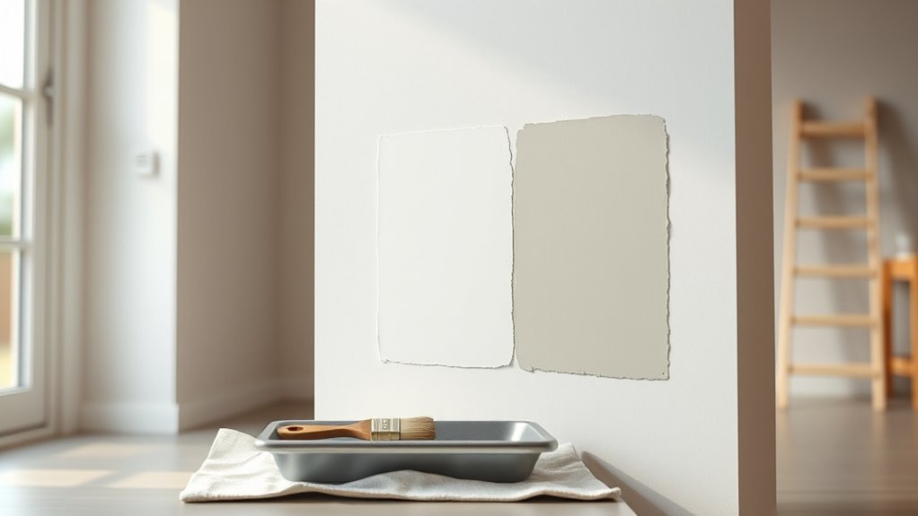
Reading Swatches vs. Full-Wall Samples Correctly
When you hold a small swatch, the lighting and surrounding colors can make the tone look different than it will on a full wall.
You’ll notice color shifts as the paint covers a larger area and interacts with room light throughout the day.
Always test a full-wall sample to see the true dried color before you commit.
Swatch Lighting Differences
Because small swatches only show paint under limited light and angle, they can mislead you about the color you’ll see across a whole wall. You should test swatches in varied lighting to catch shifts and spot how color fading might appear over time and how paint durability affects finish.
Try these quick checks:
- View swatches morning, noon, and evening to note directional light effects.
- Hold swatches near corners and large surfaces to compare reflected and direct light.
- Observe swatches on different wall orientations to understand tone changes before committing.
These steps help you avoid surprises and choose wisely.
Full-Wall Color Shift
Small swatches gave you a preview, but a painted wall can read noticeably lighter or darker once it covers a larger area. You’ll notice color fade differently across sunlit and shaded sections; a full wall reveals undertones that tiny samples hide.
Texture transformation matters: roller stipple, drywall seams, or glossy trim change perceived depth and value. Paint absorbs and reflects light variably over broad surfaces, so test full-size panels on different walls and observe them at morning and evening.
Move furniture and view from several angles. Only then can you judge the final tone and avoid surprises.
How Sheen and Room Size Change Color Perception
Although sheen seems like a minor choice, it changes how light reflects off your walls and can make the same paint look noticeably different in rooms of different sizes. Sheen affects color saturation visually—glossier finishes boost perceived vibrancy but also highlight flaws, while flatter sheens mute hue and hide texture.
Consider how room scale interacts with sheen and paint durability when choosing finish.
- Small rooms: gloss can bounce light, making color feel brighter.
- Large rooms: flat reduces glare, keeping tones even.
- Transitional spaces: eggshell balances saturation and durability.
Using Lighting to Preview the Final Dried Color
When you test paint, look at your samples under the same lights you’ll use every day—natural daylight, overhead fixtures, and any lamps—since light temperature and direction change how a dried color reads on the wall. Move samples at different times, note warm vs cool shifts, and consider color psychology for mood. Check glossy areas for highlights that affect perceived shade and evaluate paint durability under bright light. Use this quick guide to compare.
| Light Type | Effect on Hue | What to Check |
|---|---|---|
| Daylight | True tone | Morning vs afternoon |
| Warm lamp | Warmer look | Mood shift |
| Cool LED | Cooler look | Glare |
How to Avoid Surprises When Color-Matching Existing Paint
When color-matching existing paint, test samples in the different lighting the room gets so you’re seeing the true dried shade. Make sure the sheen of your match is the same as the original finish, since gloss level changes how a color reads.
If you’re touching up, blend by feathering the edges so the repair fades into the old paint instead of making a hard patch.
Test In Different Light
Because light changes throughout the day, you should view paint samples under multiple lighting conditions before committing—natural morning light, midday sun, evening shade, and the room’s artificial lighting can all shift how a color reads.
Consider how color fade and texture influence perception; rough surfaces and sun exposure can make tones appear duller. Test small swatches on the wall and check them across times.
- Morning: cool, indirect light reveals undertones.
- Midday: bright sun shows true saturation.
- Evening/artificial: warm bulbs deepen shades.
Record observations and choose the sample that reads best in your typical lighting.
Match Paint Sheen
If you want a seamless repair or repaint, match the paint sheen as carefully as you match the color—sheen affects how light reflects off the surface and can make an exact color mix look noticeably different. You’ll check existing finish (flat, eggshell, satin, semi-gloss, gloss), note sheen influence on perceived tone, and buy matching sheen or adjust technique. Color consistency depends on both pigment and finish; don’t assume a color chip alone tells the whole story. Use small test patches on the wall and view them in daylight and artificial light before committing.
| Surface | Sheen |
|---|---|
| Wall | Eggshell |
| Trim | Semi-gloss |
| Cabinet | Gloss |
| Ceiling | Flat |
| Door | Satin |
Blend With Feathering
Want to hide a small patch without a noticeable edge? Feathering blends new paint into old so color consistency reads as one. Match paint formulation and sheen, thin the edge, and work quickly while the wet edge remains.
Follow this simple sequence:
- Dry-brush outward from the patch to soften the border.
- Lightly thin the final coat where it meets old paint for smoother gradation.
- Step back, check in different lights, and add tiny adjustments rather than heavy layers.
You’ll avoid obvious seams and surprise shifts if you prioritize blend technique, matched formulation, and careful observation.
Fixes When the Dried Color Is Too Dark or Too Light
When the dried paint ends up darker or lighter than you expected, don’t panic—you can correct it without starting over. Consider how color perception and the drying process affected the result, then choose a fix.
When dried paint reads too dark or light, don’t panic—adjust with tints, glazes, or subtle touch-ups.
If it’s too dark, thin a topcoat with a lighter shade or use a tinted primer to subtly lift value.
If it’s too light, glaze or add a translucent wash of a deeper tone to build depth without heavy layering.
For spot corrections, sand lightly, feather new paint, and blend edges. Always test fixes on a small area and let samples fully dry.
How to Tint Paint for Better Dried-Color Accuracy
Start by matching the tint to the base paint tone so the dried color sits where you expect.
Adjust tint intensity gradually—small increments make a big difference once the paint dries.
Always test your mix on the actual surface and let it fully cure before committing.
Match Base Paint Tone
Curious how to get the dried color you expect? Match the base paint tone before tinting so the final shade stays true. You’ll use color psychology and consider paint durability while choosing a base that complements the hue.
- Prime neutral: pick a white or gray base that shifts toward the target undertone to reduce surprises.
- Sample small: apply swatches on different walls and view them at various times to judge how the base alters perception.
- Record formula: note base and tint proportions so you can replicate color and maintain consistency for touch-ups.
Trust the base — it anchors the final dried result.
Adjust Tint Intensity
If you want the dried color to match your vision, adjust the tint intensity carefully so the paint dries to the expected depth and undertone. You’ll begin by adding tints incrementally—small doses, stir, note results—because over-tinting shifts hue and value dramatically when solvent evaporates.
Consider color psychology: stronger tints evoke mood and perceived warmth or coolness, so tweak intensity to suit the room’s purpose. Use eco-friendly formulations when possible; they often behave differently, so consult product guides.
Keep records of amounts and base codes, and aim for subtle changes rather than big jumps to achieve accurate dried-color outcomes.
Test On Actual Surface
Because paint can look very different on a primed sample board than on your wall, always test tints on the actual surface and under the room’s real light. You’ll see how paint chemistry and the drying process alter hue and sheen.
Apply small swatches where they won’t be noticed, let them dry fully, then evaluate at different times of day.
Try this quick checklist:
- Clean and prime a small patch, apply each tint separately.
- Wait through the full drying process—check after 1, 6, and 24 hours.
- View in morning, midday, and evening light before deciding.
Topcoats and Sealers: Effect on Final Color
When you apply a topcoat or sealer, it doesn’t just protect the paint — it can change how the color looks by altering sheen, depth, and saturation. You’ll notice glossier clear coats deepen hues and boost saturation, while matte sealers mute reflections and can make tones appear lighter.
Choose the right topcoat to preserve color consistency across walls or trim, and test small areas to confirm the effect. Besides appearance, pick products that improve finish durability against wear, moisture, and UV.
Apply thin, even layers and follow curing times so the sealed color settles predictably and lasts.
Tools, Apps, and Meters That Predict Dried Color
Although paint can shift as it cures, you don’t have to rely on guesswork—today’s tools, apps, and meters help you predict the dried color with surprising accuracy. You’ll use them to preview hues, consider color psychology, and factor in paint durability so your choice endures. Try these options:
- Smartphone apps that simulate room lighting and show how colors age.
- Spectrophotometer meters that read wet samples and estimate final LAB values.
- Online visualizers linked to brands that include durability ratings and maintenance tips.
Use measured readings, not memory, to pick a color you’ll still love when it’s dry.
Common Mistakes That Cause Unexpected Dried Color
If you skip proper surface prep, ignore lighting, or apply paint too thickly, you’ll often end up with a dried color that surprises you. You’ll also misjudge hues when choosing samples under different bulbs, trusting photographs, or mixing leftover cans. Using eco friendly paints can change sheen and drying behavior; consider how finish alters perceived tone. Remember color psychology: small shifts in value affect mood more than you expect. Below are common slip-ups to watch for.
| Mistake | Effect |
|---|---|
| Poor prep | Patchy absorption, darker spots |
| Wrong lighting | Hue shifts after installation |
| Thick coats | Deeper, uneven tone |
| Old paint mix | Muted, unpredictable color |
Quick Checklist to Predict and Control How Paint Will Dry
Think about how paint shifts as it dries, since pigment concentration and binder evaporation can make it look darker or lighter.
Check the surface and texture—you’ll get different results on glossy, porous, or rough substrates.
Also consider lighting and finish, because sheen and ambient light will change the perceived color once the paint’s cured.
How Paint Changes
When paint dries, its color can shift for predictable reasons, so use this quick checklist to anticipate and control whether a finish will look darker, lighter, or the same once cured. You’ll judge changes by formulation, environment, and application—each affects final tone and perception, tying into color psychology and paint durability.
- Check sheen and binder: glossier or different binders usually dry darker; test swatches.
- Control humidity and temp: slower drying can deepen color; speed drying may lighten it.
- Monitor coats and thinning: more coats deepen saturation; over-thinning reduces pigment strength, altering the healed hue.
Surface And Texture
Because surface and texture change how light scatters, they directly affect whether a paint looks darker or lighter after drying. You should focus on surface preparation to remove gloss, fill imperfections, and create a consistent base. Texture variation—smooth vs. rough—alters perceived value: smoother surfaces reflect more, seeming lighter; rough surfaces trap light, seeming darker. Match prep and application to the desired outcome and test small areas first.
| Surface Type | Effect on Perception |
|---|---|
| Smooth | Appears lighter |
| Rough | Appears darker |
| Semi-primed | Variable |
Lighting And Finish
Although lighting and finish might seem like minor details, they determine how paint color reads after drying and help you predict final results. You’ll notice matte soaks up light and reads richer, while gloss reflects and appears lighter. Consider color psychology when choosing finish to match mood. Check paint branding for sheen descriptions and sample chips.
- Test samples under day and artificial light to see shifts.
- Match finish to room use—high gloss for trim, eggshell for walls.
- Note directional lighting; spotlighting intensifies highlights and can alter perceived hue.
Control light and finish to get predictable dried color.
Frequently Asked Questions
Will Paint Color Shift Over Years Due to UV Exposure and Fading?
Yes — you’ll see paint oxidation and color fading over years from UV exposure, so pigments and binders break down, causing hues to shift, lighten or yellow; periodic maintenance and UV-resistant finishes will slow that process.
Can Wall Texture (E.G., Orange Peel) Change Perceived Dried Color?
Like a fabric’s weave, yes—you’ll notice texture influence: orange peel scatters light, so perception variation makes color seem lighter or darker depending on viewing angle and sheen. You’ll judge hue differently across textured surfaces.
Do VOC Levels or Low-Voc Paints Affect Wet-To-Dry Color Shifts?
Yes—you’ll notice VOC impact on wet-to-dry shifts: low-VOC paints can improve color consistency, but formulation and pigment concentration still cause variations, so you should test samples under your lighting before committing.
Will Mixing Different Paint Brands Cause Unexpected Dried Color?
Yes — mixing different brands can cause unexpected dried color shifts. You’ll risk color consistency issues and finish variations because pigments, bases, and additives differ; test samples first to confirm the final hue and sheen before committing.
Can Paint Look Different When Viewed Through Glass or From Outdoors?
Yes — you’ll notice subtle surprises: color perception shifts through glass or outside because lighting conditions and reflections soften or brighten hues, so what looked familiar indoors can seem invigoratingly different outdoors or behind panes.
Conclusion
You’ll usually find paint dries a shade different than it looked wet, so test first and don’t trust a single swipe. Consider sheen, pigment load, and solvents—each will nudge the tone. Use samples, light boxes, or a colorimeter to be sure, and remember topcoats can deepen or soften the hue. With a tad of patience and a scrap panel, you’ll avoid surprises and get the finish you want—like consulting an oracle, not a soothsayer’s crystal ball.